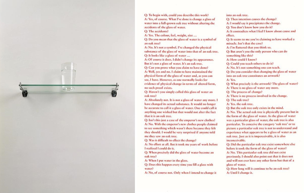
Michael Craig Martin, An Oak Tree, Assorted Objects and printed text, 1973
I view this work as an intellectual argument into what something is or appears to be. It is a challenge to the observer to take a step back and think again.
I am reminded of the work of Rene Magritte as in his painting titled ‘Cesi n’est pas une pipe – this is not a pipe’ which indeed it isn’t. It is a painting of a pipe. Therefore it is a representation of a pipe but it is not a pipe.
In the case of ‘An Oak Tree’ Michael has taken this argument a stage further. We are presented with what is clearly at first sight a glass of water on a glass shelf. However Michael informs us, the viewer, that we are in fact looking at an Oak tree. The objects are accompanied by a text in which we are informed why it is an oak tree. The text, written by the artist, in the form of an interview, challenges him to explain himself and ask why it is an Oak tree. The process of creating the Oak tree is presented along with the statement that the Oak tree exists in the mind and is physically present but in the form of a glass of water.
The piece is an example of conceptual art whereby the act of presentation, coupled with the dialogue, questions us to examine and think about what we perceive about the world in which we exist. In this example the artist describes what he has presented to us and explains why it is what it is.
This is better explained by the Michael in an interview on his website titled ‘I’m interested in language’. In this interview he states “I am interested in language and the way in which we interpret the world, understand the world, through the things we create.”
I do not intend to compare and contrast these two artists but rather explore their individual approaches to making art with words. I have not made extensive research into their individual practices. My intention was to examine a single work by each artist. To examine each piece and the impact that the artist was intending to illicit in the viewer. In both cases my interest was in trying to identify what cultural influences may have informed the work.
I’ll start with Bob and Roberta Smith. This is the pseudonym of Patrick Brill, a British contemporary artist, writer, musician, art education advocate and keynote speaker. Patrick comes from the leftfield canon of British artists. Although part of the established art movement he remains very much his own person choosing to do things his way. He comes from an artistic upbringing, his father was the landscape artist Frederick Brill who was head of the Chelsea school of art.
The work that I have chosen to examine is titled ‘Make art not war’ 1997. These words and other phrases are claimed to have been spoken to him by his father on his deathbed. Firstly what does the painting look like. It is square, 153 x 152 cm, painted on plywood using commercial paint. The background is split into two halves divided horizontally, the top section is painted white and the lower pale orange. Over this are painted the four words ‘Make Art Not War’. The typeface that Patrick has used is known as Signwriter’s block. This was developed in 1920 and was chosen, the artist explains in a video about the painting, as he enjoys the disciplined structure of the typeface. The letters are mostly black or blue except for two, one being white the other red.
The painting is part of a series of works that use humorous slogans which to promote art over violence. A further example being ‘Easels not guns’. The meaning of these paintings is fairly explicit in that their intention is to challenge the viewer to question human morality.
The simple message brought into the setting of an art gallery or museum forces the viewer to confront the message and to challenge their ideas of what a painting is. On its own a single painting can not change the world but it does set up a dialogue in which an alternative outlook is possible. In my opinion the painting is an expression of the culture and times in which it was created which has informed the artist. However the artist is not merely responding but is choosing to influence, is not making concessions but directing.
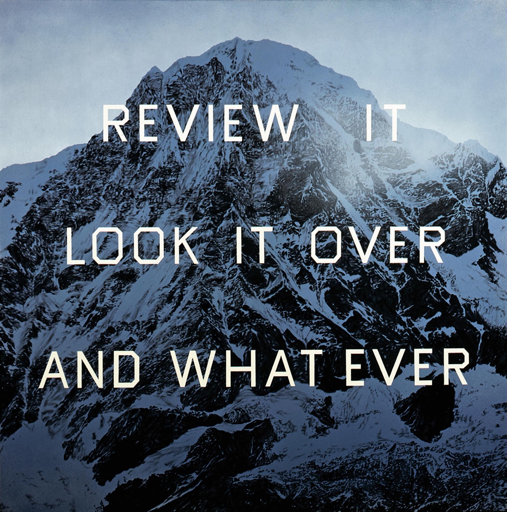
The second artist and second painting is by an artist who comes from a different cultural back ground. Edward Ruscha is an American artist who is associated with the Pop art movement of the 1960’s. He is well known for his paintings, collages and photographs. Originally from Oklahoma he states that his eyes were opened and that his work is heavily influenced by Los Angeles. His interest in words and typography have provided the primary subject of his paintings, prints and photographers. The words either comes from conversations, jotted down or are taken from dictionaries.
The painting that I selected to examine is called ‘Review it, look it over and what ever’. It was completed in 2004. The painting is on a square canvas, 152 x 152 cms. The background image is a mountain rendered in monochrome of Payne’s grey. It has been created with acrylics, pencil and charcoal. Over the background image of the mountain the words, (1) Review it (2) look it over (3) and what ever, are written in three lines evenly spaced using a simple typeface. All letters are the same size.
In trying to understand the meaning of the painting I visited Tate Moderns website and found a video of Edward discussing his art and the processes he employs. In the video he explains that his backgrounds are just that backgrounds but then goes onto say why he often uses mountains tops as backgrounds. They suggest glory, beauty and evoke the sound of trumpets playing although there is no noise present. When words are added it creates tension. To me, a question is raised in that as the viewer you are immediately drawn to the words and to think about what they could mean? Why have they been placed in this setting? The words or phrase ask to be contemplated. Had they been written on a page in a book would I have stopped and thought about them? I think that this would be unlikely. In this case the phrase is in three parts. The first is a command ‘Review it’ followed by an instruction as to how to ‘look it over’. The conclusion ‘ and what ever’ is yours. It is left to the individual no answer is provided.
You, the observer, are challenged, questioned and instructed by a painting to do something more than merely to observe and then left free to move on. To me this is an instruction to look beyond what is presented or given to you, draw your owns conclusions and from there follow your own path.
Edward Ruscha, Review it look it over and what ever, Acrylic pencil and charcoal, 152 x 152 cms, 2004
Whilst carrying out research into suggested artists I came upon an interesting blog. It was written by an art blogger who was explaining the methodology that they utilise when approaching an artists work.
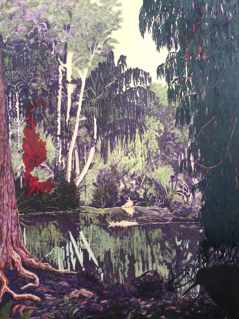
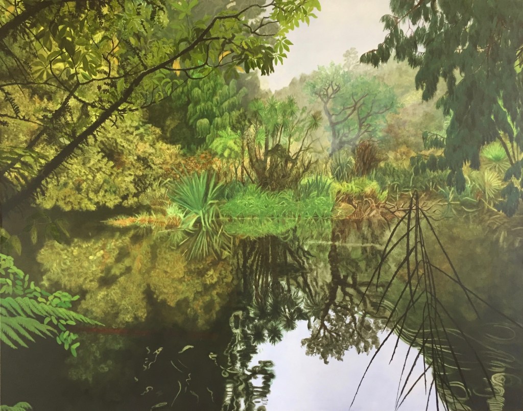
Robyn Litchfield was the winner of the Jackson’s Painting prize 2020 in the Landscape / Seascape / Cityscape category. The winning painting, The Hollow Place, which is shown below immediately drew me in. I saw a link to a topic that I wanted to attempt but had, to date, avoided. It also resonated with the work that I had been completing for “Exercise 1.3 – The mirror as a stage”.
Robyn Litchfield, The Hollow Place, Oil on linen, 92 x 68cm, 2020
Robyn is based in New Zealand and her inspiration comes from the primeval landscapes there. She works both from photographic images from the 19th century and photographs taken by herself . Her working method is similar to my own in that she works from sketches, smaller painted studies then larger canvases. Her paintings capture landscapes and often use reflections to amplify space. The colour palette for each painting is limited and subdued. This gives the paintings a coherence. The colours are not typically representational of the actual colours. Most of her works have an amorphous shape which is added as an unconscious act.
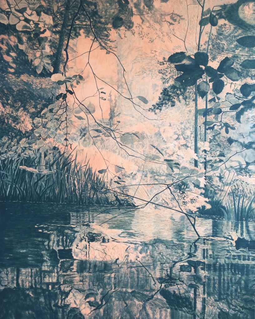
Two more of her paintings are replicated below.
Robyn Lichfield, Forest Gloaming, Oil on linen, 120x95cm, 2018
Robyn Litchfield, Ship Creek, Oil on linen, 41x51cm, 2019
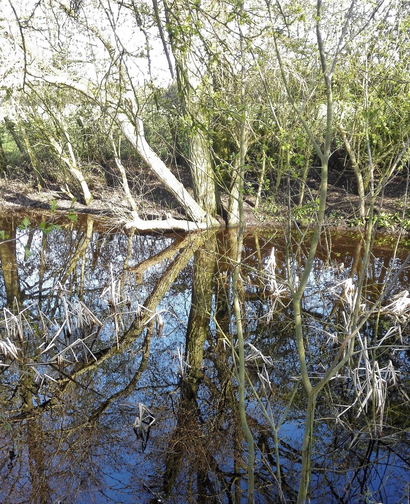
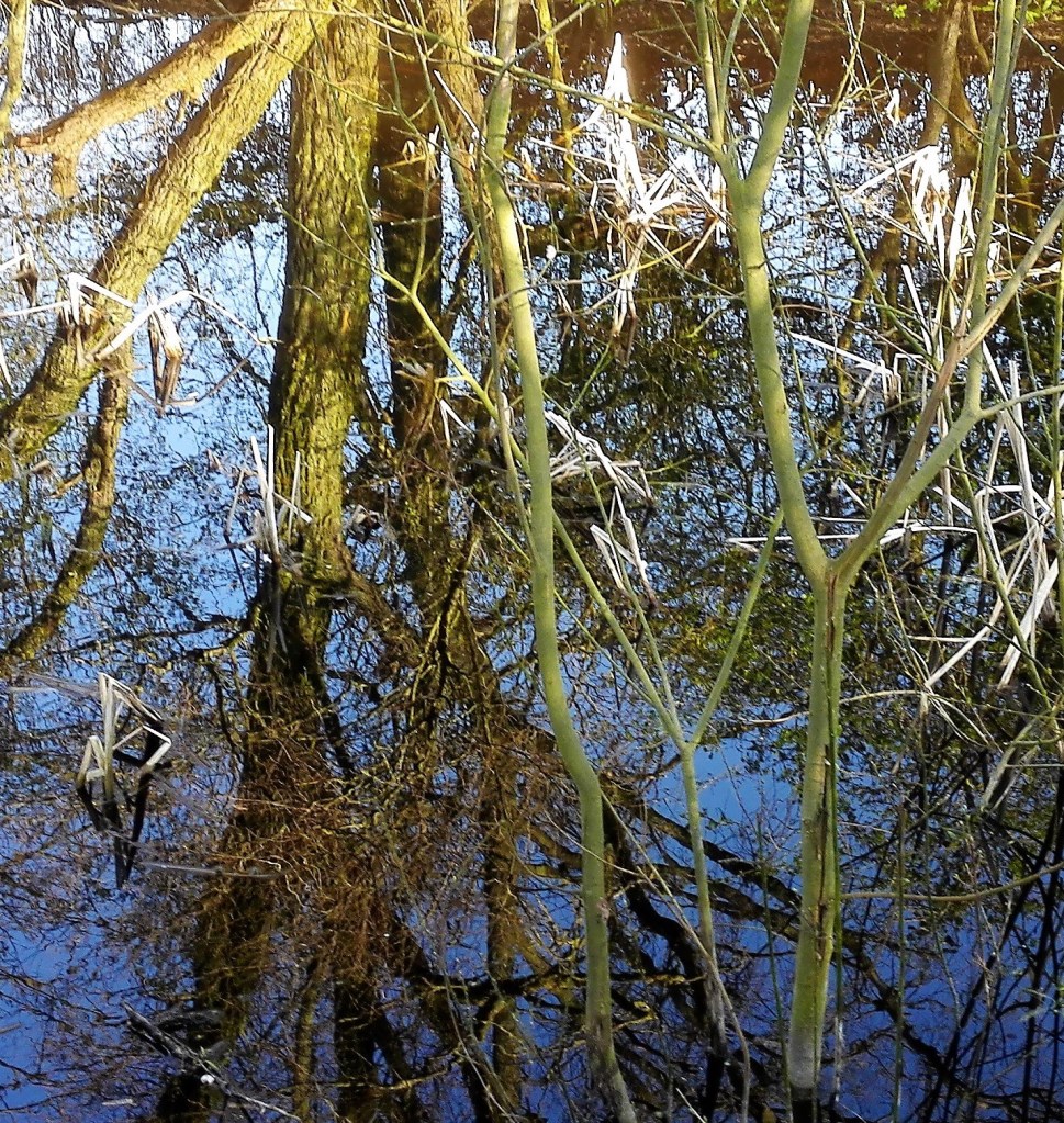
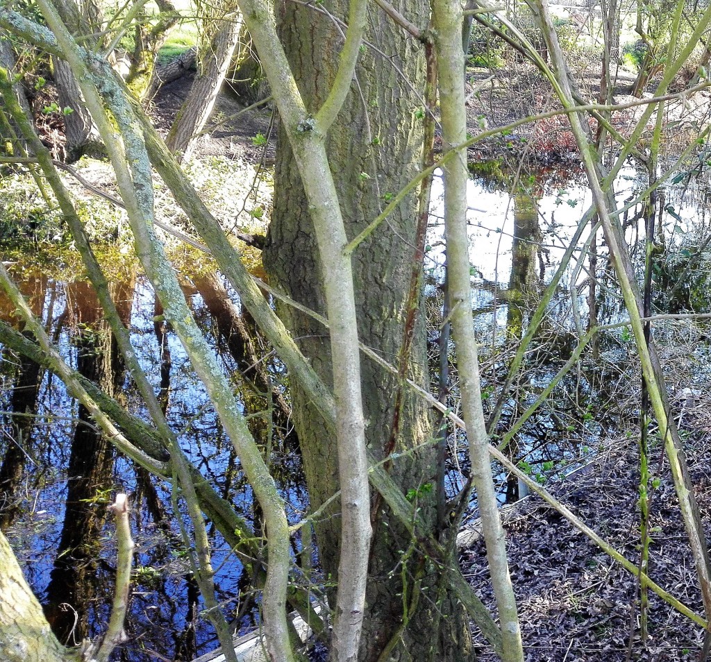
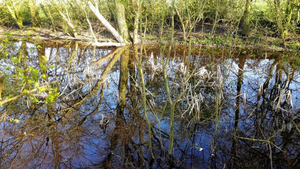
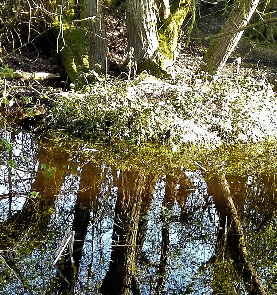
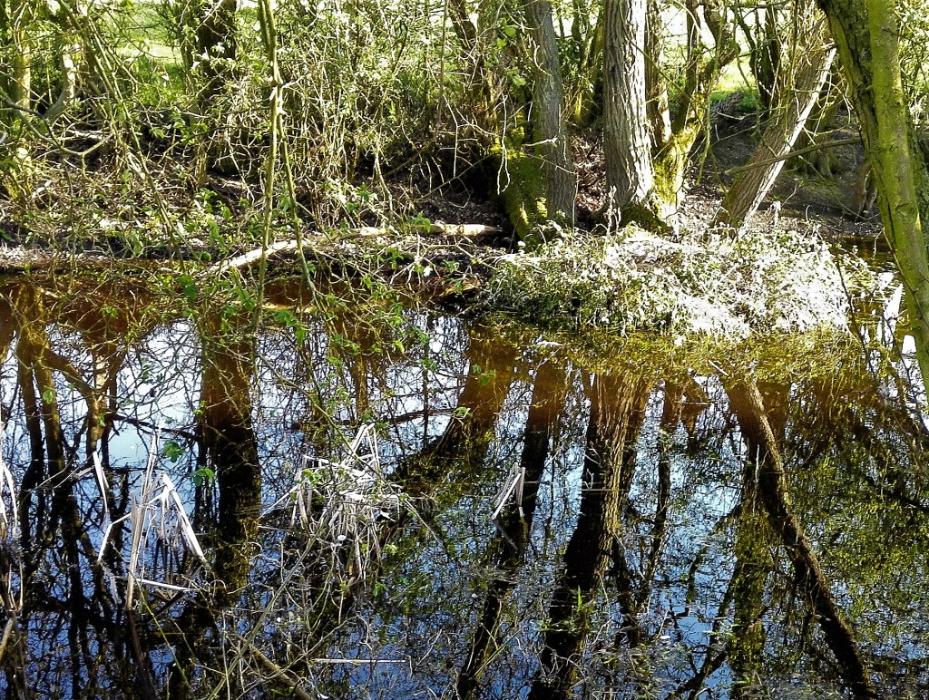
As stated earlier in this blog I am drawn to these paintings and see links to where I would like to take some of my work. I have a set of photographs which examine a similar topic, see below, which I will attempt to turn into a painting which will be my Assignment Three piece.
Link 32, Katerina Grosse, these were large scale paintings which are part of the architecture of the building. The use of spray guns helped to increase her reach. The painting envelopes the buildings interior which in turn envelopes the viewer or occupant of the building as they move through it.
Link 33, The multiplication of being, or a reflective abyss? Mirrors
An essay into the role, mystery and intrigue that can be created by mirrors and reflective surfaces.
“Daguerreotype” process the first publicly available photographic process widely used during the 1840 -50s.
Examples of artists mirrors and mirrored surfaces.
Robert Smithson
Six mirrors, chalk, Oxted Quarry, England
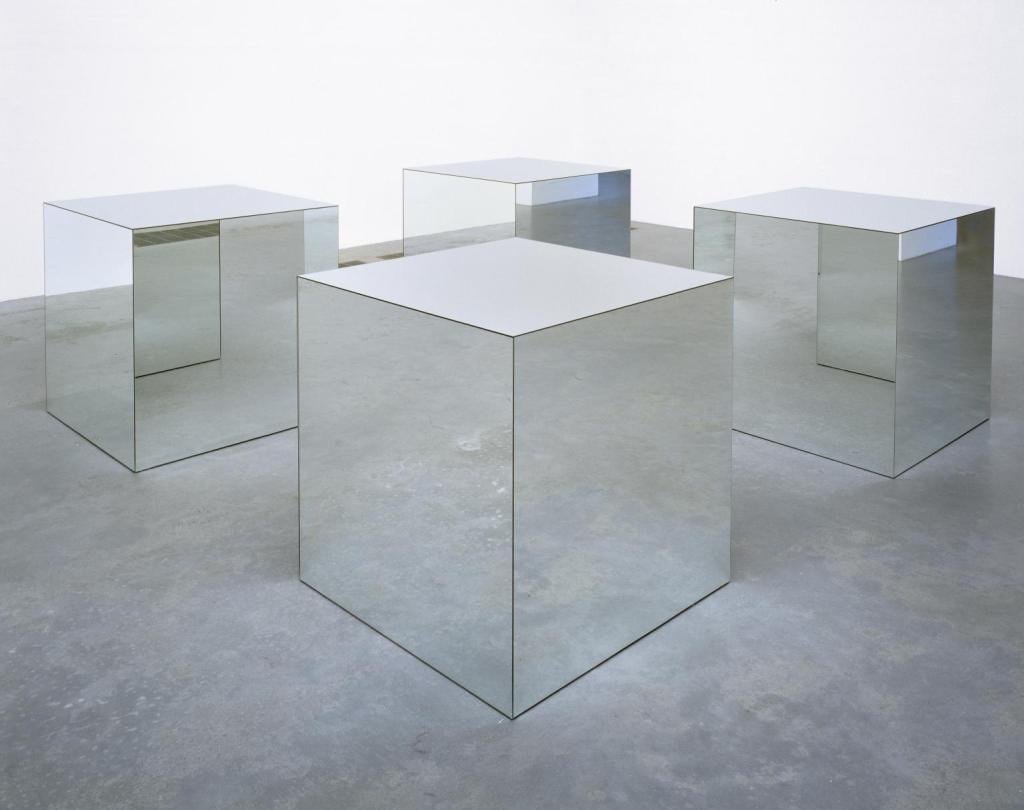
Robert Morris, minimalist
Untitled 1965, reconstructed 1971 Robert Morris
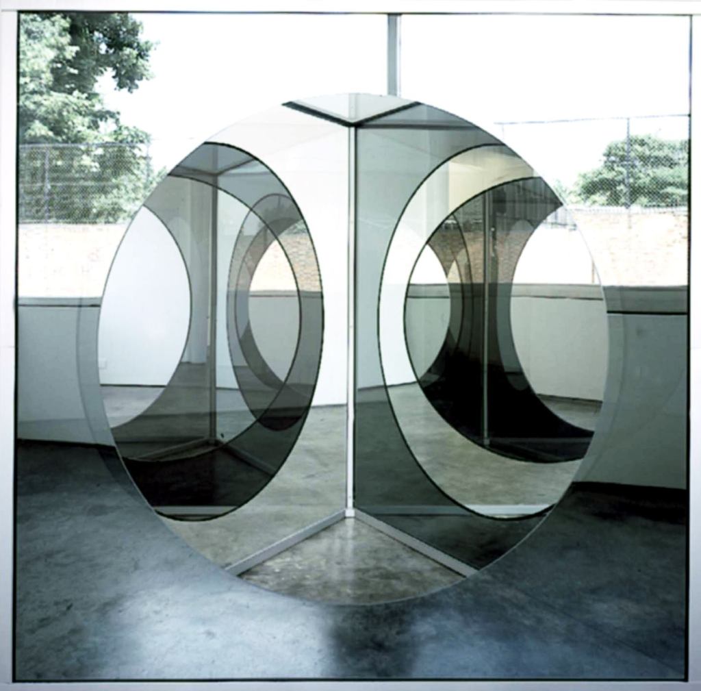
Dan Graham, installations and structures
Pavillions
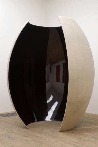
Anish Kapoor, specialising in installation art and conceptual art. The piece below I have visited in Tate modern on more than one occasion. The surface of the work is highly polished. Its presence changes as you wander around and into it.
Draft of Voice over for split screen, Poem by Lisa Robertson, Paintings and animation by Amy Sillman. The piece is an animated split screen video to which a poem has been set. I guess that the poem was the starting point for the work. The poem consists of a number of repeating sentences which are then linked to the changing images. To start with this was easy to follow but I found I got a little lost over the six plus minutes. However I didn’t find that this distracted as I was making continual links between the imagery and the dialogue. I found that the meaning of the repeated sentences changed over the duration of the piece. I guess that this was the intention. To my mind the words and images complemented each other and I believe it would be hard to watch the video without the dialogue. I don’t feel that it would make any sense. The poem without the imagery would still have meaning although the pictures would have to be made by the listener.
Jutta Koether – Seasons and sacraments, the video consisted of a talk by Jutta through her exhibition and the links and meaning of the works displayed within it. The exhibition, consisting of two rooms, is inspired by Nicolas Poussin. The first room is in response to his paintings ‘The Four Seasons’ and second room ‘The seven sacraments’. The talk consists of the challenge that the viewer is confronted with trying to make connections and find their way through the exhibition. There is a dialogue throughout the work. Without the back story or the knowledge of the Poussin paintings I feel it would be difficult to make sense of the work. My assumption is that there was information available to the visitors, this was not apparent from the video.
The reading point Link 31 consisted of a long text by James Elkins. the main thrust of the piece was the depiction or the use of time within art. I found it informative and through. There were plenty of interesting point that I need to reflect upon further.
A couple of shorts notes regarding these reading points.
Sherrie Levine ‘Statement’ 1982 extract “A paintings meaning lies not in its origin but in its destination. The birth of the viewer must be at the cost of the painter” my interpretation of this extract is that it is the contract that exists between the painter and the completed painting. Once it is handed over it takes on a new life which the painter no longer controls. It’s life is now determined by the viewer(s).
Link 28, Apropos Appropriation: Why stealing images today feels different. article written / published 2007. I found that this was not the most entertaining read but a useful insight into how the appropriation of objects, art, images has changed over time. My thoughts turned to how different the article may have been if its was re-written in 2020. The rate and number of images being shared globally now has expanded exponentially so that it has become difficult to ascertain the original source.
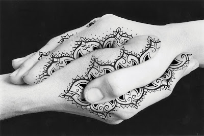
A tool, a symbol, a weapon just three of the many possible focuses or reasons that hands define art.
The following is extracted from a Google search: Hands are an organ for performance, serves as eyes for the blind, the mute talk with them and the deaf hear with them. They are a symbol of salutation, supplication and condemnation. The hand has played a part in the creative life of every known society.
When I consider hands in art I think of them as the ultimate artists tool. The hand holds the brush or pencil to make the marks on the support to convey the artists vision. Hands can also be used directly to apply material, smearing, rubbing, scratching etc. There are alternatives such as the mouth or the foot but but these lack the dexterity of the hand. I have long supported the Mouth and Foot painting artists charity and am always surprised by quality of the paintings. However the mouth or foot is used due to circumstance rather than preference.
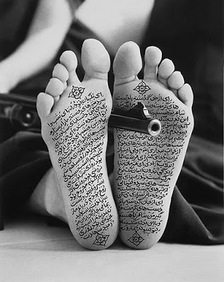
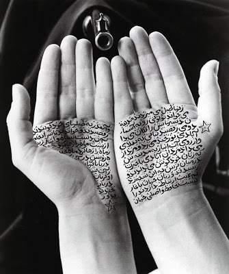
Shirin Neshat, an Iranian visual artist who works primarily in film, video and photography. Her work centres on the contrasts between Islam and the West, femininity and masculinity, public life and private life, antiquity and modernity and bridging the space between these subjects. She often uses test in her work, writing across photographs of faces, hands and feet. These images are used to get across messages, particularly pertaining to feminine suppression in Iran. They create awareness of the repression facing Muslim women and their pursuit of freedom.
Examples of Shirin Neshat’s work
Douglas Gordon’s installation ‘The divided self I and A divided self II, 1996 on display at Tate Scotland is a two channel video installation. I read it as a battle between the two halves of the self. An expression of the internal dialogue that we have within ourselves. This manifests itself in the contradiction of the image of ourselves that we present to the world, sane, ordered and the private identity that we keep hidden from view. All the contradictions that we withhold from the mirror view of ourselves and our place in the world.
Cindy Sherman, works exclusively in photographic self-portraits depicting herself in many different contexts and imagined characters. Whilst initially interesting I found that I quickly became bored with the photographs.
Boo Ritson, using paint, props and make up to clone the sitter into an image of themselves in another role / life. The results give a caricature of the person which when examined takes on the aspects of a painting, a photograph and a sculpture. The tonal changes are caused by the actual light rather than the paint itself. The paint is layered on thickly which gives a pasty quality to the painting and to the sitter.
Rachel Russell, in this video the artist paints a version of Philip Guston’s “The Studio”. Dressed as a shark an using Guston’s iconographic images. I found it interesting initially but soon became tired of the video.
A mixed bag of different ideas which cross various disciplines, painting, sculpture, theatre and film. A melting pot of ideas.
Paula Rego using props and puppets as models for drawings. Outfits used to give form and inspire imagination into her work.
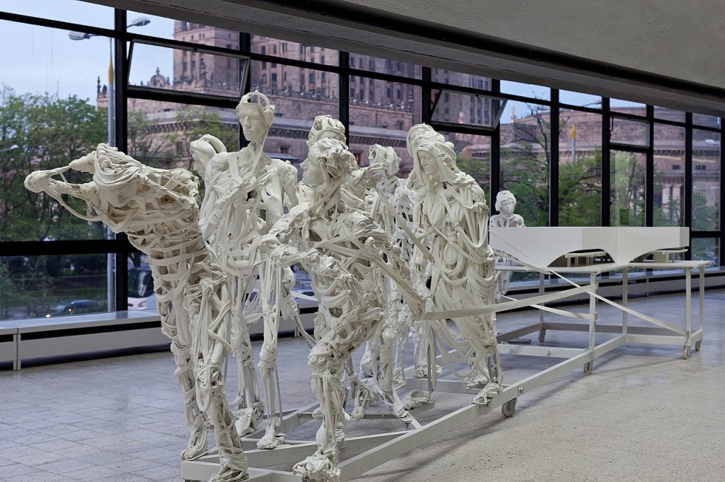
Pawel Althamer’s life size sculptures that appear to be made from strips of cloth and bones. The ability to be able to see through the sculptures gives them a sense of movement and an ephemeral ghostly appearance. (See example at the top of this blog)
Lisa Milroy uses clothing and paintings of clothing and often invites the viewer / observer to arrange the work into a composition that they like.