Category: Research & Exhibitions

Regular Artist Research – Part Two (11-20)

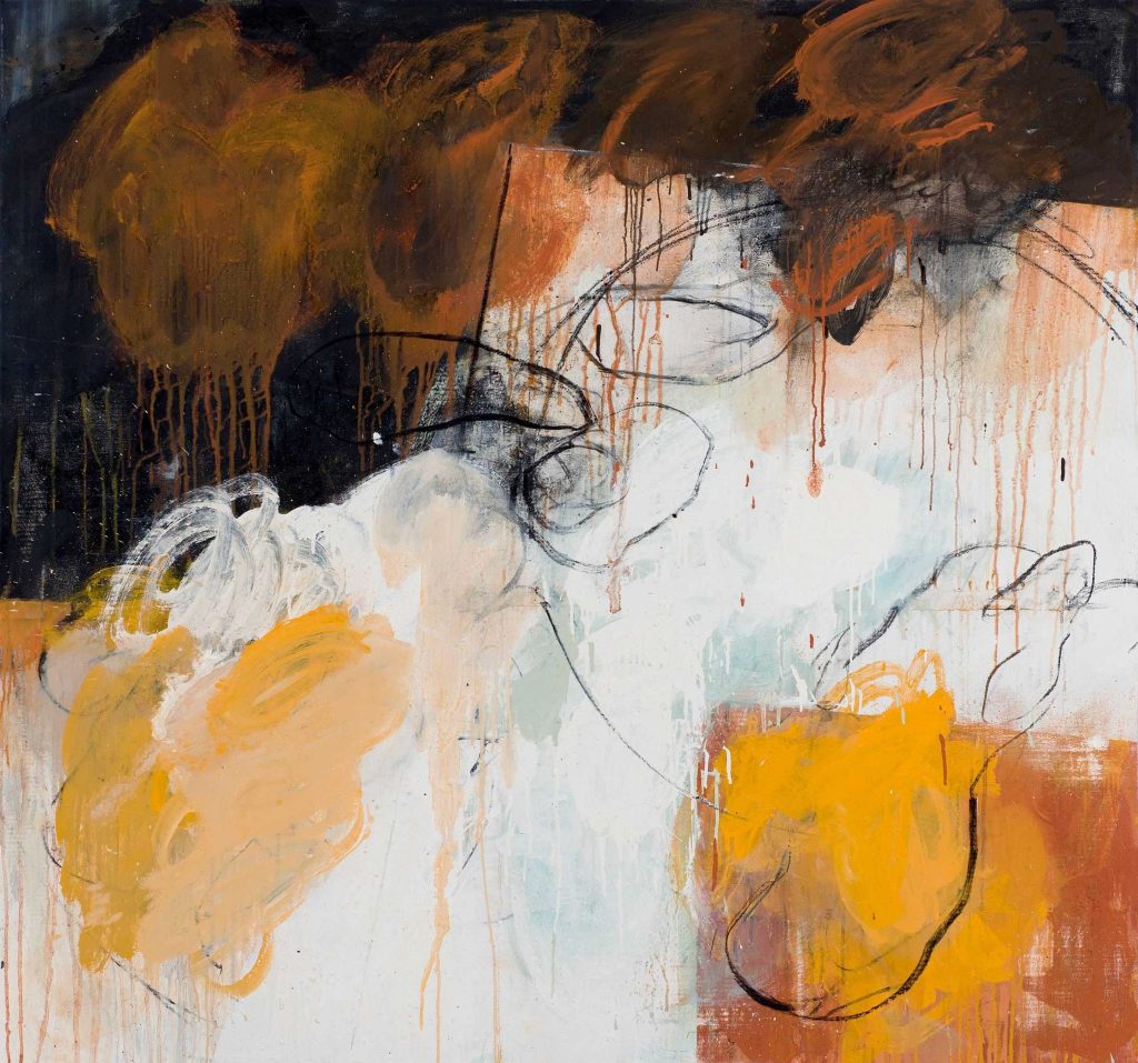
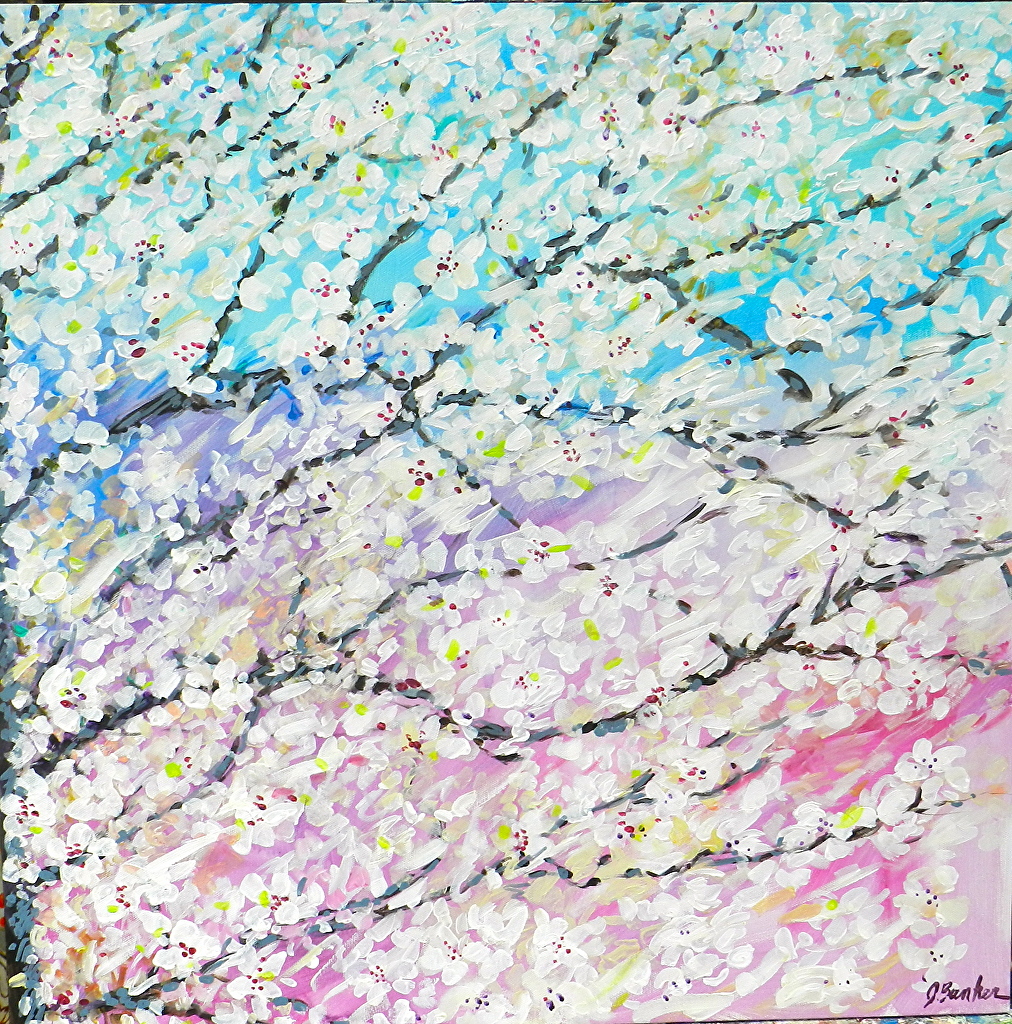
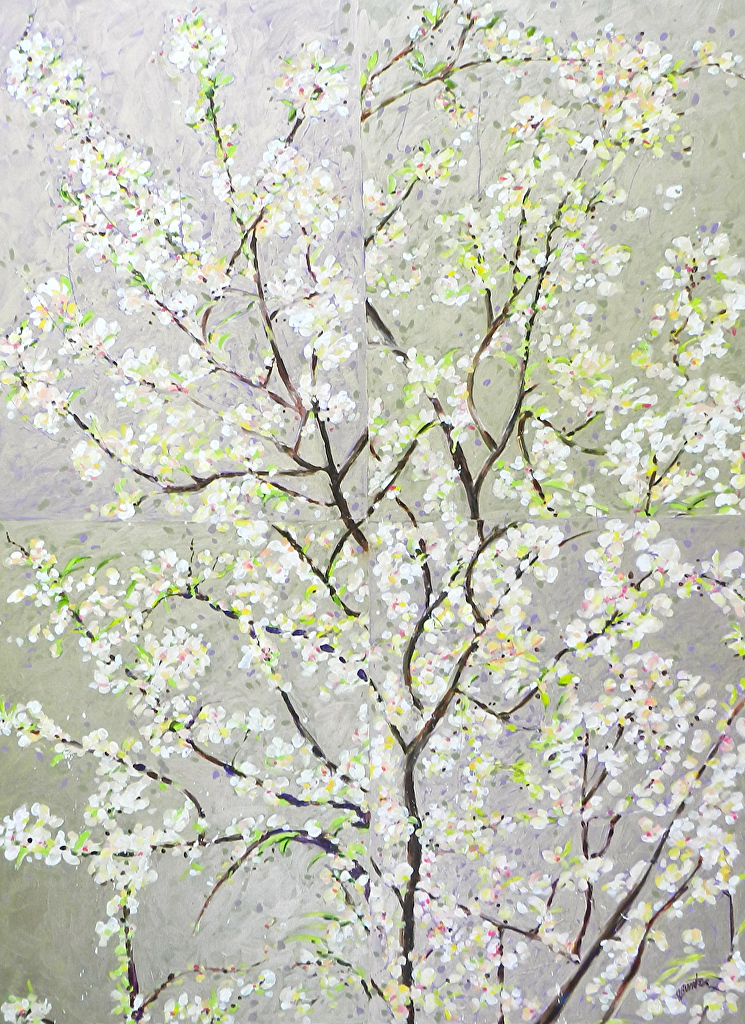
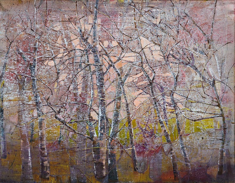
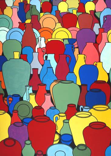
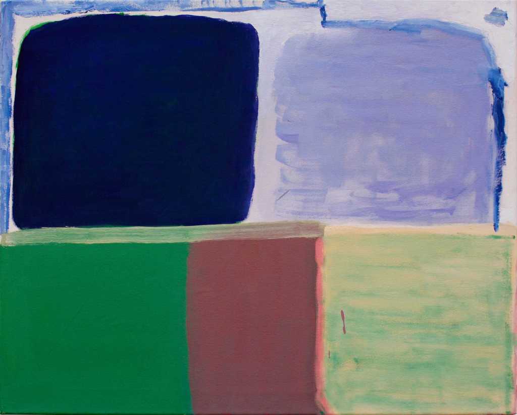
11. Simon Carter (16/5/2020), artist based on the Essex coast. I have reproduced sections from his artists statement.

“I use the elements of the coast, the creeks and estuaries, saltings and seawalls as an archive of shapes and colours, of weather and objects. I try to find dynamism and passion in the paint that will match those oin the landscape whilst retaining a structural clarity that allows fact to become something pictured and true.”

To me the words are more descriptive than the paintings. although these are two amongst the six that I enjoy as I can see a link between that landscape experienced and the painting, these are shown below.

Simon Carter, Decoy, acrylic on canvas, 2017, 77x87cm
Simon Carter, Quay lane sluice, 2017, acrylic on canvas, 110x120cm

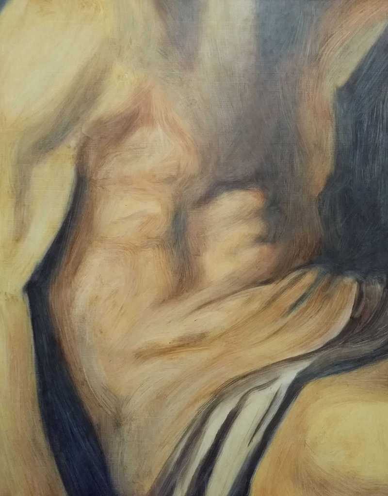
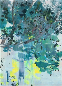
12. Jules Clarke (18/5/2020), the fluidity of paint is used to explore one moment becoming another, allowing figures and their environment to break down. working from photographs on screens allowing both image and surface interference to direct the painting. I noted that all the painting in the selection of six were the same size, 50x40cm. On further investigation into the artist’s website I noted that she seems to work on collections of paintings of the same dimensions. The paintings themselves emerge as blurred and shimmering as the two examples below show.

In both paintings there is a suggestion of human form, a ghostly presence somewhere between this world and another.

I was reminded of a short video clip that I had shot which shows shadows and light silhouetted on our living room floor.

Living Room Floor

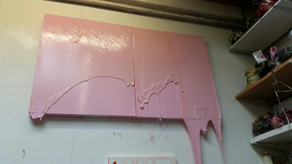
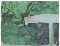
13. Deb Covell, (19/5/2020), her practice is concerned with bringing a form into being by exploring the material and sculptural potential of paint.

Technique: painting layers of acrylic paint onto stretched plastic sheets which are then peeled off to create a support. These are then creased, cut and collapsed. The colour tends to be singular with the reflected or ambient light creating tone and revealing texture in the work. some of the paintings are quite small including the example below which has dimensions of 18x28cm. The technique would be interesting to try out.

Deb Covell, Blue Pleat, Acrylic paint, 2018, 18x28cm

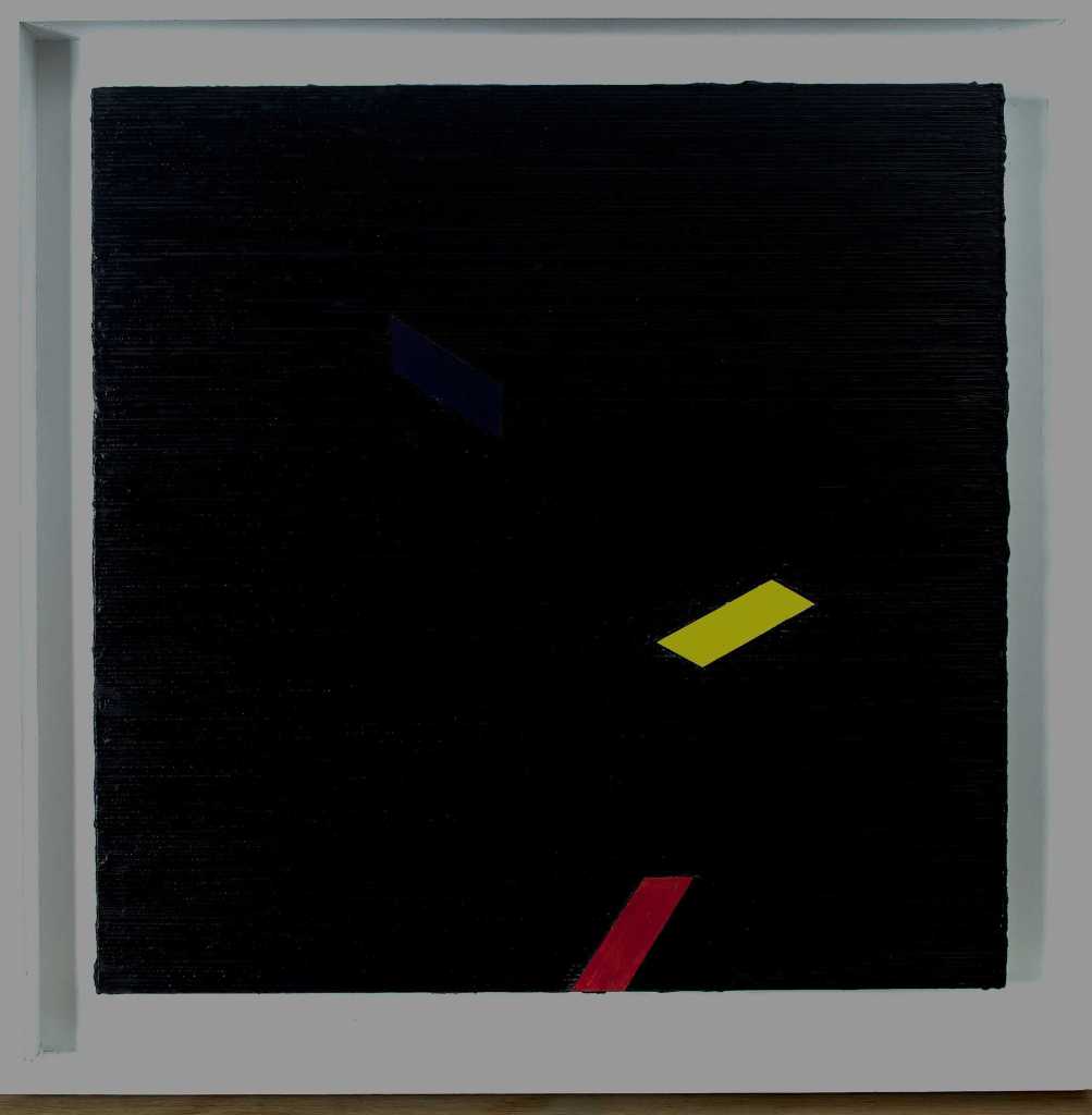
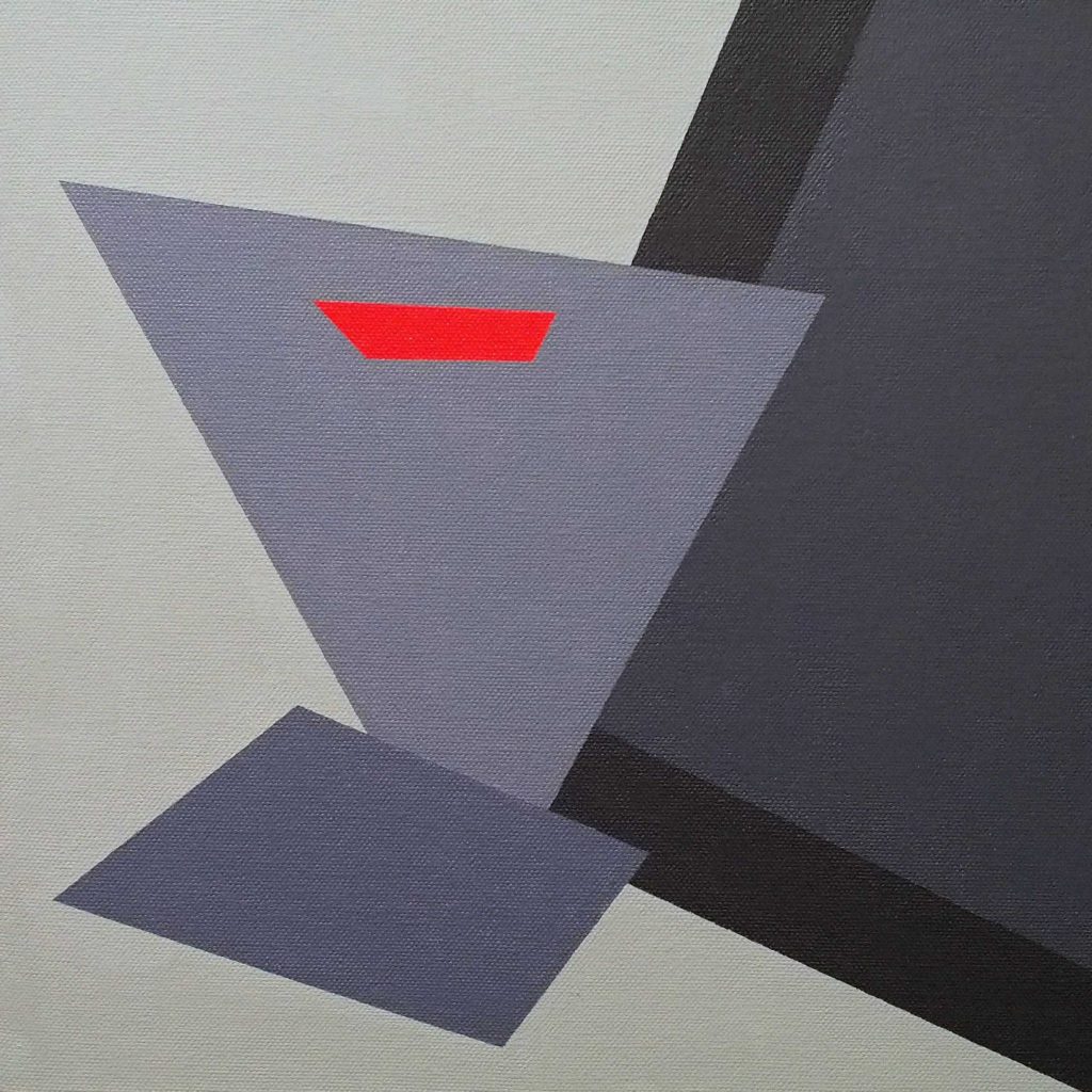
14. Lucy Cox, (21/5/2020), initial impact. Plying with shapes and perspectives. Notes from artist’s statement: Spatial ambiguity, a fascination with the relationship between two and three dimensional space, colour and rhythm, and figure and ground.

My thoughts: The Chair, acrylic on canvas 30x30cm, 2019, shown below.

Simple shapes, skewed perspectives and a minimal colour palette of, off white, greys and black with a small rectangular red section. The composition suggests a chair without quite resolving it. I found the other three paintings less interesting, they had a collage aspect. Two of them reminded me of Matisse’s snail but less refined. On closer inspection on the artist’s website the close up reveal more interest in the coloured shapes, patterns and textures are found.

Lucy Cox, The Chair, acrylic on canvas, 30x30cm, 2019

15. Andrew Crane, (23/5/2020), Self taught painter who studied graphics at the Central school of art. A love of letter forms, numerals and the written word. Sometimes uses cement as a medium.

Quote from artist’s statement “Lately when I show up at a canvas my head is pretty empty. This ‘not knowing’ hold fear and excitement in equal measure, but with trust comes progress and the fear receded. colour and the touch of the brush on canvas is more prevalent now, like sharing of intimate vulnerability”.

The six paintings shown are abstract works. The titles indicate the mood or the subject, give a suggestion as to what is being portrayed. It seems it is then for the observer to discover the meaning, if there is one at all. Blocks of colour, rectanguar.

Andrew Crane, A landscape with clouds, 2020, oil on canvas, 61x76cm

16. Gordon Dalton, (24/5/2020) No links or other information.

Gordon Dalton

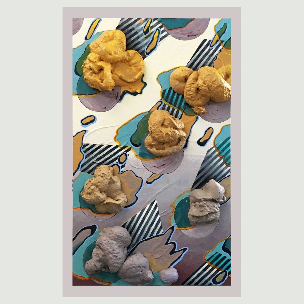
17. Pen Dalton, (24/5/2020), an artist involved in socially contextualised arts and feminist art proactive in issues of identity, sexuality and subjectivity.

Modernist abstract paintings using acrylics and other materials, often involving repeated but subtlety changing patterns. suggestions of human form or human detritus. The painting chosen is titled ‘Gutsy’ which was made using acrylic paint, expanded foam, screen printed Tegujo paper on board. The expanded foam creates a three dimensional aspect to the painting taking on the look of blobs of ice cream or peanut butter. It has a Pop art look and feel to it.

Pen Dalton, Gutsy, 2020, acrylic paint, expanded foam, screen printed Tegujo paper on board, 95x55x2cm

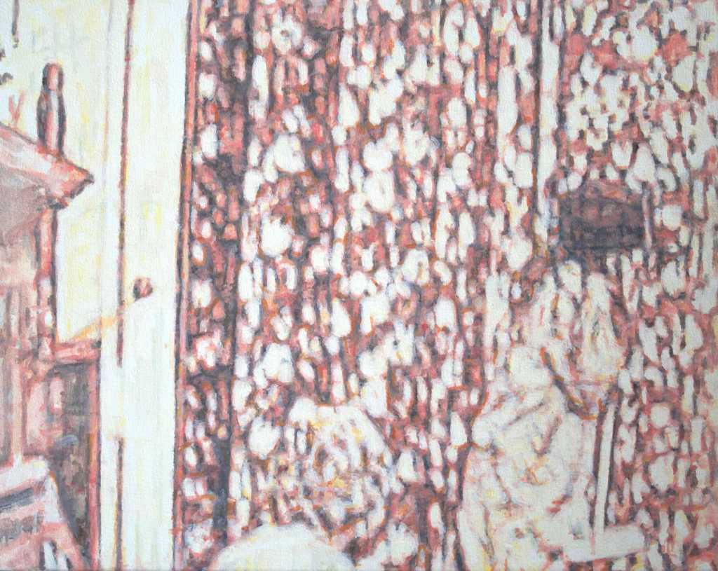
18. Jeff Dellow, (25/5/2020), Contemporary abstract artist, member of the London group. I found the script accompanying the paintings distracting, they didn’t help me to understand the work or the artist’s intentions. I spent a while just looking at the six paintings and choose one of the to explore. ‘Azure’ it reminded me of the dazzling brightness of a Mediterranean harbour.

Jeff Dellow, Azure, 2020, oil on canvas, 51x71cm

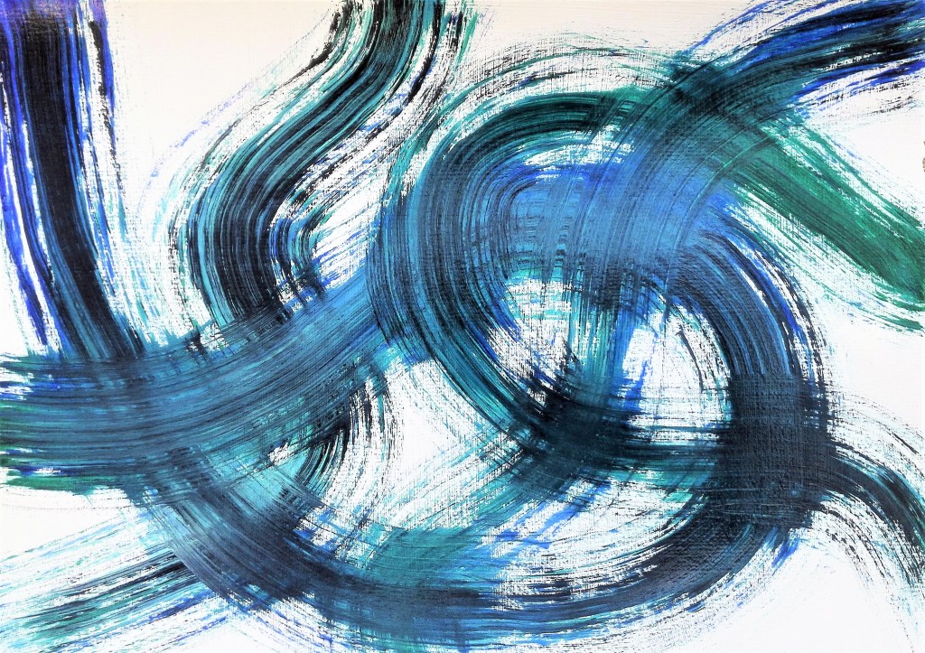
19. Lisa Denyer, (26/5/2020), only one painting exhibited in the gallery. ‘Pushgo’, shown below. The brushwork, which is a constant in her work, has similarities to Amanda Ansell, Julian Brown and to some paintings of mine where I have used a similar technique. with Lisa’s painting the addition of collage or painted geometric shapes help to break up the compositions. Looking at her website the brush technique is prevalent in her work. There is a consistency of style which I find pleasing. colours tend towards pastel but are vibrant. I noted that there has been a honing over her style over time and the more recent paintings are more accomplished.

Lisa Denyer, Pushgo, 2018, acrylic and collage on plywood, 45x63cm

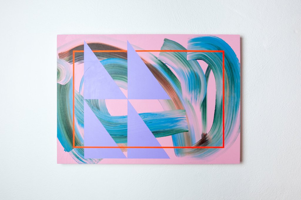
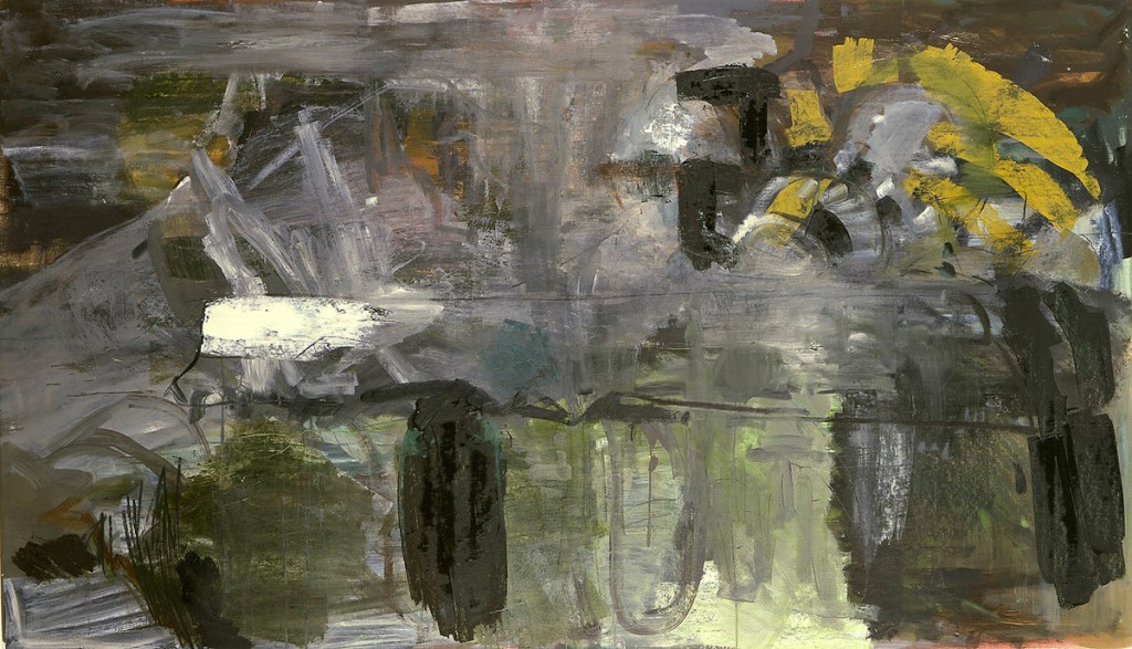
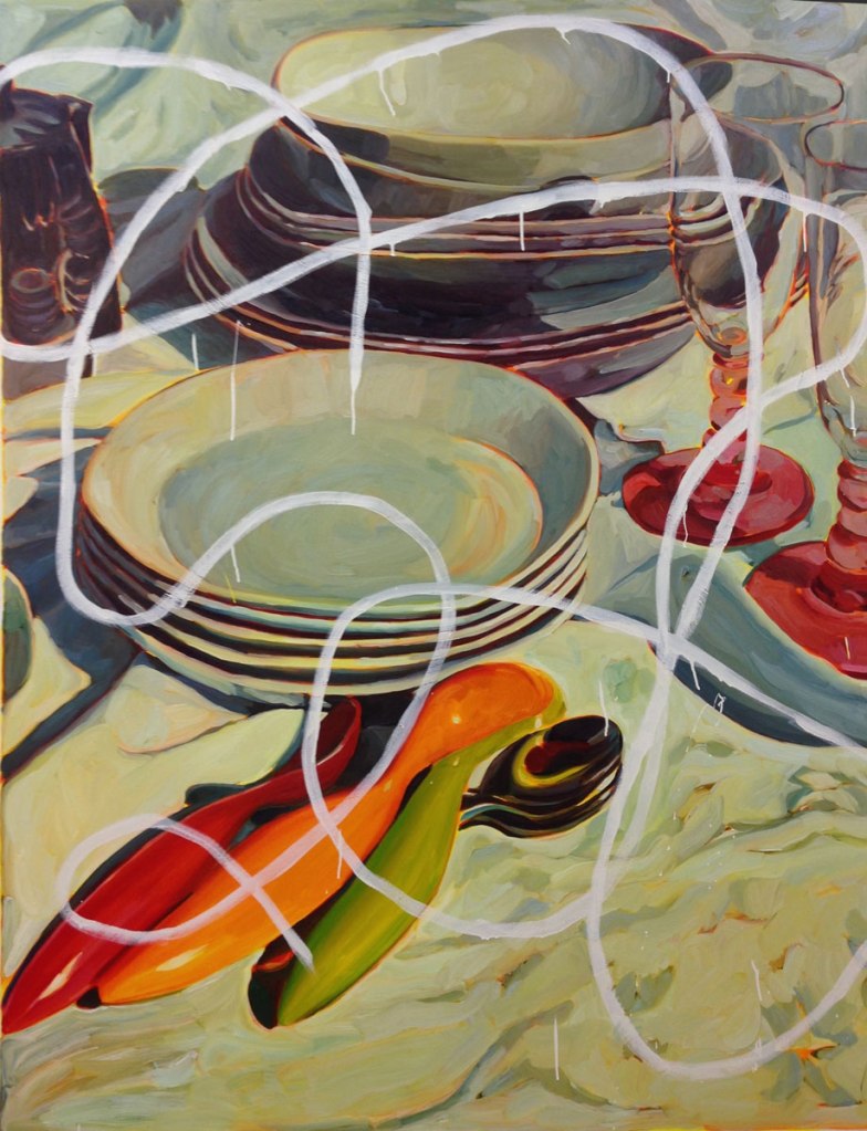
Two examples of my paintings where I have used a similar painting technique.

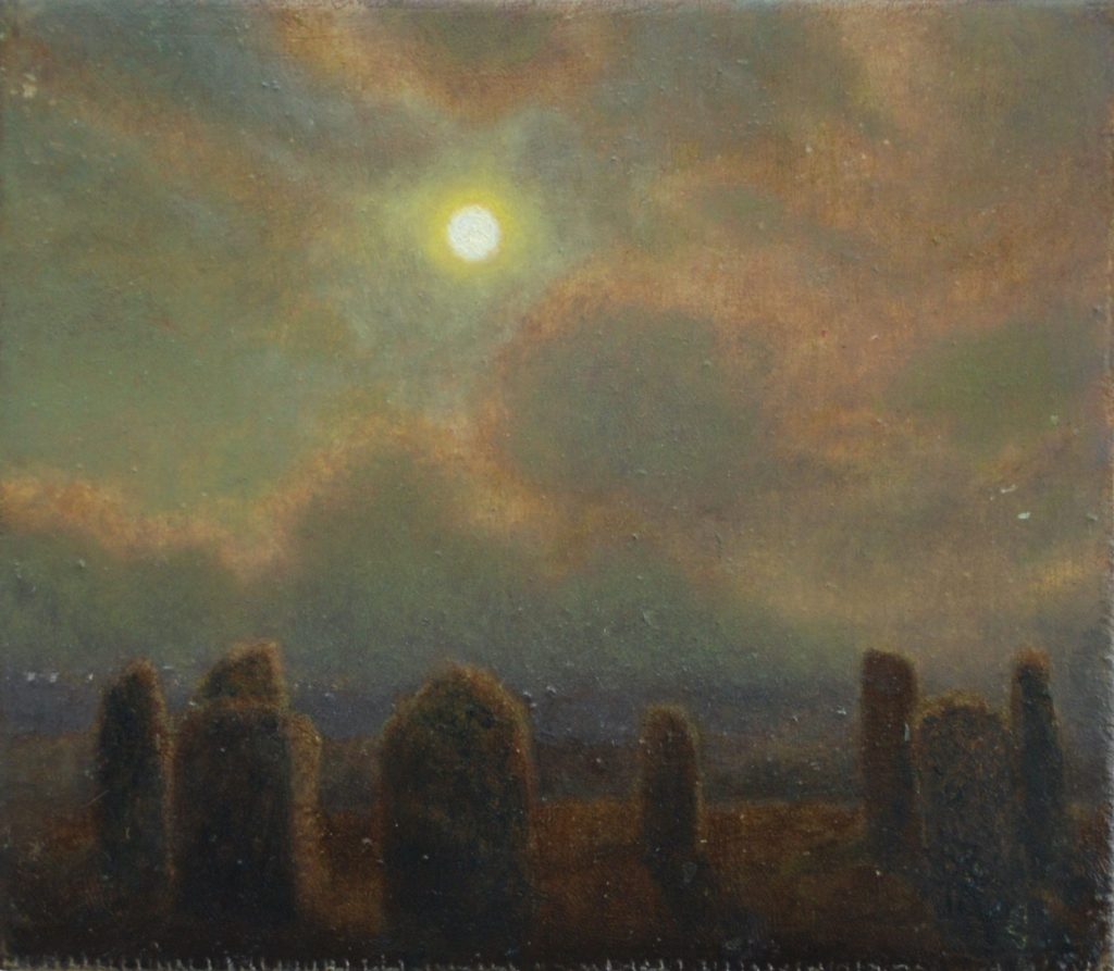
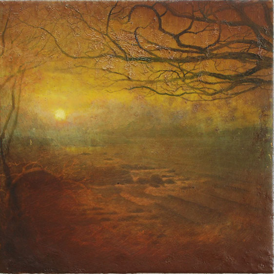
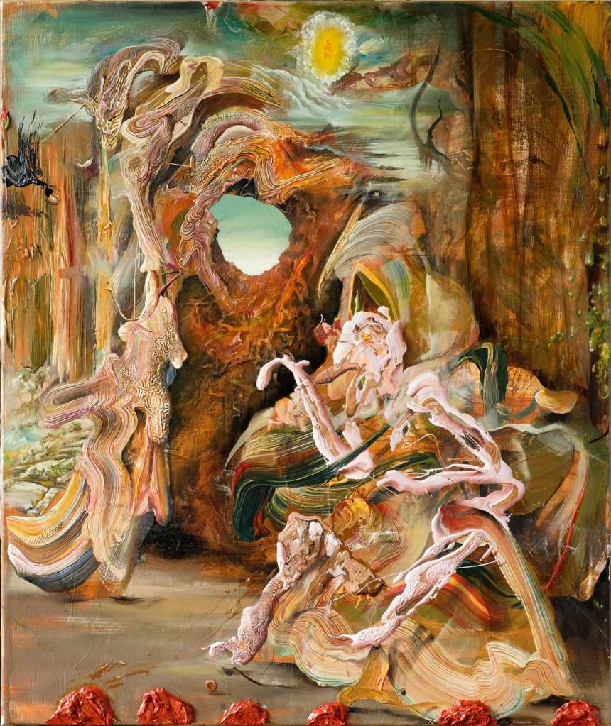
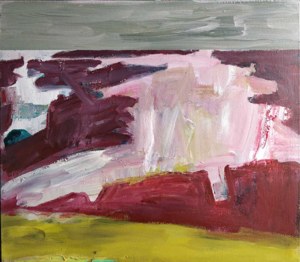
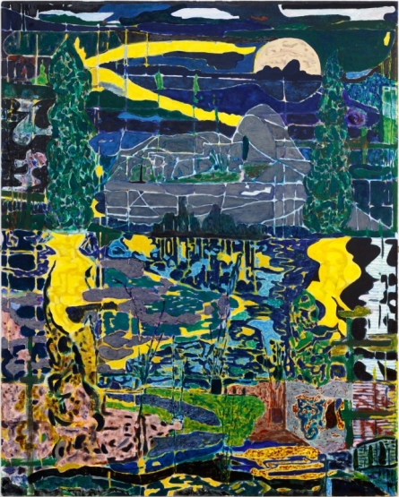
20. Sam Douglas, (28/5/2020), atmospheric landscapes with strange, mysterious sponge like shapes in the foreground. They appear to me to be substitutes for the human mind. (written before reading the artists statement).

Quote from artists statement “I’m always working on a lot of paintings at once in the studio, building up and sanding back layers of paint and varnish. In a way I like to think of as akin to the geological process of sedimentation and erosion. Beneath my painting is often the strata of previous images that sometimes emerge like archaeological remnants”

On visiting the artists website I found paintings that appealed to me more than those on the Contemporary artists site. The paintings had a similar melancholy feel but dispensed with the dystopian imagery. There are two examples below the first from the Contemporary artists website site and the second, the one I prefer from the artists own website.

Sam Douglas, Stone circle on the moor, oil on board, 2019, 204 x 178cm
Sam Douglas, Red Storm Cloud, 2018, oil on board, 23x23cm

Part Three – Reading points

A couple of shorts notes regarding these reading points.

Sherrie Levine ‘Statement’ 1982 extract “A paintings meaning lies not in its origin but in its destination. The birth of the viewer must be at the cost of the painter” my interpretation of this extract is that it is the contract that exists between the painter and the completed painting. Once it is handed over it takes on a new life which the painter no longer controls. It’s life is now determined by the viewer(s).

Link 28, Apropos Appropriation: Why stealing images today feels different. article written / published 2007. I found that this was not the most entertaining read but a useful insight into how the appropriation of objects, art, images has changed over time. My thoughts turned to how different the article may have been if its was re-written in 2020. The rate and number of images being shared globally now has expanded exponentially so that it has become difficult to ascertain the original source.

Part Three – Research point 3 – Symbolism of hands in art

A tool, a symbol, a weapon just three of the many possible focuses or reasons that hands define art.

The following is extracted from a Google search: Hands are an organ for performance, serves as eyes for the blind, the mute talk with them and the deaf hear with them. They are a symbol of salutation, supplication and condemnation. The hand has played a part in the creative life of every known society.

When I consider hands in art I think of them as the ultimate artists tool. The hand holds the brush or pencil to make the marks on the support to convey the artists vision. Hands can also be used directly to apply material, smearing, rubbing, scratching etc. There are alternatives such as the mouth or the foot but but these lack the dexterity of the hand. I have long supported the Mouth and Foot painting artists charity and am always surprised by quality of the paintings. However the mouth or foot is used due to circumstance rather than preference.

Shirin Neshat, an Iranian visual artist who works primarily in film, video and photography. Her work centres on the contrasts between Islam and the West, femininity and masculinity, public life and private life, antiquity and modernity and bridging the space between these subjects. She often uses test in her work, writing across photographs of faces, hands and feet. These images are used to get across messages, particularly pertaining to feminine suppression in Iran. They create awareness of the repression facing Muslim women and their pursuit of freedom.

Douglas Gordon’s installation ‘The divided self I and A divided self II, 1996 on display at Tate Scotland is a two channel video installation. I read it as a battle between the two halves of the self. An expression of the internal dialogue that we have within ourselves. This manifests itself in the contradiction of the image of ourselves that we present to the world, sane, ordered and the private identity that we keep hidden from view. All the contradictions that we withhold from the mirror view of ourselves and our place in the world.

Cindy Sherman, works exclusively in photographic self-portraits depicting herself in many different contexts and imagined characters. Whilst initially interesting I found that I quickly became bored with the photographs.

Cindy Sherman, Untitled, 2016

Research Point 2 – Boo Ritson & Rachel Russell

Boo Ritson, using paint, props and make up to clone the sitter into an image of themselves in another role / life. The results give a caricature of the person which when examined takes on the aspects of a painting, a photograph and a sculpture. The tonal changes are caused by the actual light rather than the paint itself. The paint is layered on thickly which gives a pasty quality to the painting and to the sitter.

Rachel Russell, in this video the artist paints a version of Philip Guston’s “The Studio”. Dressed as a shark an using Guston’s iconographic images. I found it interesting initially but soon became tired of the video.

Research Point 1 – Paula Rego, Pawel Althamer and Lisa Milroy.

Pawel Althamer, Bulacy, 2012

A mixed bag of different ideas which cross various disciplines, painting, sculpture, theatre and film. A melting pot of ideas.

Paula Rego using props and puppets as models for drawings. Outfits used to give form and inspire imagination into her work.

Pawel Althamer’s life size sculptures that appear to be made from strips of cloth and bones. The ability to be able to see through the sculptures gives them a sense of movement and an ephemeral ghostly appearance. (See example at the top of this blog)

Lisa Milroy uses clothing and paintings of clothing and often invites the viewer / observer to arrange the work into a composition that they like.

Lots of interesting ideas.

Reflection – Different ways of using Oil paint. Short piece comparing three paintings

The three examples given show how oil paint can be used in different ways to convey a multitude of moods, feelings, textures, light and tone. In all three the palette is muted and the colours nearly monotone. Philip Guston’s, “The Coat, 1977” has exaggerated forms which have been simplified into basic shapes. minimal tonal effects have been utilised. Vincent Van Gogh’s “A pair of shoes, 1886” is all about the richness of the paint and the thickness with which it has been applied to the canvas. The clever use of tonal contrasts conveys a bleakness in the painting. In Lisa Milroy’s “Shoes, 1985” the paint shines. On first glance the pairs of shoes could be confused as opened mussels. The wetness of the insides of the mussels amplified in the shine of the shoes.

In all three the paint has been laid down quickly but different techniques used. In Guston the paint has been applied thinly and mixed on the canvas. Mixing the paint on the canvas is also apparent in the Van Gogh painting. However in this painting the paint has been laid down generously in thick brush strokes. In the Milroy painting the paint has a sheen, carefully applied and the tonal highlights have been emphasised.

Exhibitions Regular Research – 15 minutes with a new, to me, artist’s work

A challenge that I set myself during this time of lockdown was to spend 15 minutes per day exploring an artists work. Whilst doing this I would write up a few notes on what I liked or disliked about their work. The aim initially was for this to be a daily exercise. I haven’t quite kept to this but in the nineteen days since I started this initiative I have notes on eleven artists. On some of the intervening days I will have been carrying out course research.

The aim of this challenge was to make looking at other artists work part of my daily routine. The benefit that I expect to gain from this is an exposure to different painting styles, techniques and subjects. I certainly do not expect to like them all and will mention this in my notes. Whilst I’m completing this course I will write up my notes, along with examples of the paintings, in the Exhibition section of my blog. I will limit each blog to ten artists to prevent any blog from becoming too long.

My source for the first group of artists is a website Contemporary British Paintings, http://www.contemporarybritishpainting.com. This website was part of the suggested reading / viewing from Part Two feedback. The site currently lists the work of 71 artists. Each artist has a short artist’s statement and a selection of their work, normally about six paintings. I shall work through these alphabetically.

  1. David Ainley – (29/4/2020) minimalist art exploring mined and quarried places reflecting the act of human labour on the landscape. I found his paintings challenging in that they didn’t have much in them, minimalist. However what they did have was very carefully observed and put together.
David Ainley, Canary Flag Bat In mine, acrylic and oil on four part panel, 2020, 61x61cm

2. Ian Andrews – (30/4/2020), an art phycologist! his paintings were fantasy paintings which play with links to old masters and art history. He uses thick paint, suggested shapes and human forms to depict surreal, slightly grotesque folk tales. I detected a Dali infuence to some of the paintings.

Ian Andrews, Corvus corax St Anthony 2

3. Amanda Ansell – (1/5/2020), abstract expressionism. I have observed similar paintings, with gestural movements, to these and have tried to emulate this type of painting in my own work.

Amanda Ansell, watch the shadows grow, oil on canvas, 82x92cm

4. Karl Bielik – (2/5/2020), experimental, abstract expressionist artist who works on up to 30 paintings at once and lets them slowly emerge from the physical process of painting. Sometimes leaving them for weeks or months before completing them.

Karl Bielik, Dealer, 187.6×204.8cm

5. Claudia Bose – (3/5/2020),a passion for history and art made by women. She works in a church tower in Suffolk. Her art is predominately abstract pieces made using oil, watercolour and mixed media. The paintings are expressionistic and gestural with the material being applied liberally. They include signs of scratching and removal of paint. Also the paint is allowed to run. The colour palettes are minimal within each painting, probably 6-7 colours maximum usually less. I feel that this gives the paintings a cohesion. Sizes are not large 90x90cm the largest and 14x13cm the smallest in the selection that I observed. I downloaded a painting called “Staying Alive” as its title resonated with me during these lockdown times.

Claudia Bose, Staying Alive, 2012, 90x90cm

6. Day Bowman – (4-5-2020), her paintings are large scale canvases which try to echo the marks, lines and shapes made in the wet, grey sand of her hometown beach. working on multiple canvases at the same time using random mark making, gesture and colours in both controlled and random manner to echo light, tides and movement. Limited palette of colours, whites, greys and yellow ochre and occasional blue with charcoal. I enjoyed these paintings.

Day Bowman, Fortress 2

7. Julian Brown – (7/5/2020), Influenced by the folk art from his Polish mother and heavily influenced by nostalgic visions of the 1980’s. Handmade geometric quality with a playful primitive relevance to the world that we now live in. I downloaded two paintings the second of which I will try to make my version of.

Julian Brown, A Fairy tale of Gdansk, 2016, 65x65cm
Julian Brown, Gamma, 2012, 50x40cm

8. Simon Burton – (9-5-2020), these was no link to this artist’s statement or other paintings.

9. Marco Cali – (11-5-2020), his paintings focus on figurative subjects influenced by renaissance and surreal traditions. The paintings I observed were mainly torsos and where the was heads the facial features were omitted. Mostly oil on paper or oil on canvas.

Marco Calli, Andie, oil on canvas, 60x75cm
Marco Cali, Untitled, oil on paper, 2019, 40x50cm

10, Ruth Calland – (13/5/2020), gestural and visceral paintings that look to explore emotional experience. To me they are highly coloured, non pictorial but gestural captures of mood and form. The painting technique is crude-ish with colours being mixed on the canvas. Two examples below.

Ruth Calland, Bone Island, Oil on canvas, 2019, 51x61cm
Ruth Calland, Island Life, 2019, 51x61cm

Assignment Two – Feedback – Suggested Artists to research

As part of the feedback from Assignment Two and the work completed for Part Two I received a list of suggested artists to view and research. These suggestions were based on the the conversation and ideas that had been discussed during the feedback session. Although this is quite a long blog I have deliberately kept the text brief.

The following are my notes and thoughts:

Vincent Hawkins, 1959 – , painter / draftsman working in acrylic on canvas, cardboard and paper. Influences cited as Picasso, Paul Nash and his work has been compared to that of Matisse and Klee. The expressive nature of his abstract paintings contain an energy that remind me of Jackson Pollock’s floor paintings. The palette is similar but there is more structure to the composition.

Vincent Hawkins, Untitled IV, 2016, Water based woodblock medium on paper, 55x75cm

John Bunker – colourful flower inspired collages, paintings with blossom. I enjoyed the blossomed tree paintings but hose with human nymph like images I found a bit twee.

John Bunker, Cherry Blossoms B, Acrylic, 24x24inches
John Bunker, Quadrant branch blossom memory, acrylic on canvas, 48x36inches

Alison Watt, paintings of white fabric, very large paintings where the tonal quality and subtle adjustments seems to envelope the observer and comfort them.

Alison Watt at work
Alison Watt, Fabric study

Alexis Harding, layered paintings that have a skin to them, lumpy large canvases where often the paint seeps beyond the limitations of the canvas or support.

Alexis Harding, Untitled

Angela De La Cruz, her paintings seems to exist in a place that is somewhere between painting and sculpture. There is an exploration of the nature of paint itself in her work.

Angela De La Cruz, Ready to wear (Red)

Simon Callery, his work is somewhere between painting, combines and sculpture. The works have a sculptural quality to them. I find these works difficult to read.

Simon Callery, Another Something

Peter Doig, 1959 – , I had looked at Peter Doig’s work previously. This time as suggested I concentrated on his landscape paintings. Those that I found resonated with me were those that had a European, perhaps Scottish, feel to them. I was less captivated by the Caribbean influenced paintings. I will consider whether to base my critical review on Peter Doig’s landscape paintings. The other artist suggested to me is George Shaw whose work I feel is perhaps closer to my own. Returning to Peter Doig one of the key aspects of his landscape paintings is the inclusion of a human element. An example of this is his painting ‘Echo Lake’. This painting, see below, has a narrative to it. The lakeside setting appears to be on the outskirts of a town. The lights from the town can be seen behind the dark trees. The scene is lit by the headlights of the police car and the reflective quality of the water. This highlight the tress to the right of the painting. These trees fade into the night sky. There is a symmetry to the composition, the telegraph pole on the left, the trees on the right, the police car just offset from the centre of the painting. The white shore line about a third of the way up and the reflections in the lake all work together to give the painting a cohesiveness. The storytelling narrative comes from the policeman, presumably, who is calling, shouting out to the observer across the lake. What is he shouting? Is he shouting at us? What is happening in / on the lake? These questions remain unanswered but give the painting a drama.

Peter Doig, Echo Lake, 1998, Oil on canvas, 230x360cm

Elizabeth Magill, 1959 -, I have downloaded a number of Elizabeth’s paintings as these really resonate with me. The capturing of the delicacy of trees and the timid light that surrounds them is something that I have tried to capture in my work. Two examples are reproduced below.

Hurvin Anderson 1965 – , depictions of Caribbean landscapes often verging on abstraction. Student of Peter Doig.

Hurvin Anderson, Cloning, 2016

Mamma Andersson 1962 – , influenced by the Swedish landscape which she grew up in her paintings are inspired by filmic imagery, theatre sets and period interiors. Her landscapes are melancholic and dreamlike.

Mamma Andersson, Cuckoo Hill, 2019, Oil on linen, 90x118cm

Per Kirkeby 1938 – 2018, Danish, part of Danish experimental art school “eks-skolen” working primarily as a painter, sculptor, writer and lithographic artist. His works was informed by geology and nature. The two examples below are abstracted paintings which explore the colours and solidity of harsh landscapes.

Per Kirkeby, Fram, 1982, oil on canvas, 118x200cm
Per Kirkeby, Rublick III, 1987, oil on canvas, 200x200cm

Calvadonga Valdes , Spanish artist using the landscapes of Spain, England, Italy and Swedish Lapland to create surreal paintings, often group of paintings on a theme. Two examples are a series called “Homeland” where the reflection of trees are observed in small pools of water and puddles. The second series “Vascular” uses the heart and vascular system as a vehicle to organise the paintings. Examples of both of these series are replicated below.

Covadonga Valdes, Homeland II, paintings from Homeland series
Covadonga Valdes, painting from Vascular series

Part Two – Project 5 – Research Point 5 and Reading points – Combines

I started my blog on Exercise 1.4 with a few words regarding the Rauschenberg exhibition that I had attended at Tate Modern in 2017.

Exhibition Guide

Prior to this exhibition I had confronted Abstract art, installations, and avant-garde sculpture but had not confronted Combines. The exhibition covered all of Rauschenberg’s career and only a part, room 3, included the Combines. This room along with ‘Material Abstraction’ were the two largest rooms. The Combines were different. They seemed to be about painting but had other aspects to them which at the time I didn’t come to terms with. I couldn’t make sense of them. As I recall the one that made most sense was ‘Bed’ which was completed in 1955 at the beginning of his Combine period.

Bed, 1955

It was obvious what it was but why was it contained with a frame with paint. It was a painting that utilised oil paint and pencil on pillow, quilt and sheet. It now makes more sense having worked on my own Combine and also having read more about Combines. The bed itself is an ordinary object. It is usually confronted as horizontal. Here it is presented to the viewer vertically within a frame. this was the intention to endow ordinary objects with a new significance. This topic is explored further in the article ‘On Rauschenberg – Art Theory 1900-2000’ which is similar in content with the Exhibition guide. The guide walks through Rauschenberg’s artistic life in a chronological order and explains his development. The many collaborations, the challenge to conceptions and continual experimentation with the art form.

Returning to the Combine’s they started to make more sense after reading Leo Steinberg’s lecture piece on ‘Other Criteria – The Flatbed picture plane’ in which he explains how the picture plane

was moved from the Renaissance picture plane, which are experienced in the normal erect posture, to the work of Rauschenberg whose work challenged and overcame this so that the pictures no longer simulate vertical fields but opaque flatbed horizontals. They no more depend on head to toe correspondence with human posture than a newspaper does.

Having read these pieces and reflected upon them I returned to Link 21 and looked to explore a couple more Combines. I selected two which are reproduced below along with my comments.

Collection, 1954/55

Rauschenberg’s Combine painting ‘Collection’ looks on first glance to be just what its title suggests, a collection of coloured shapes on which paint and been very loosely applied and allowed to run and mix. It is only when it is viewed close up that it starts to reveal a greater collection of materials and information.

On closer examination the support appears to be made up of three wood panels. However the painting is described as being on canvas. Is this a play with the idea of the triptych or another use of the title word ‘Connection’? To the frame of the paintings further wooden pieces have been added along the top. These pieces of wood have paint and fabric attached to them. Were they found like this or have they been added by the artist? The painting is made up of pieces of fabric and cloth, torn pieces of newspapers, magazines and comics which have been randomly adhered to the support. Hardly any of these have been placed in a position to be read naturally, often they are upside down or at various haphazard angles. Paint of many different colours and texture has been loosely applied by daubing, dripping and painting. Much of this paint has been allowed to run and to be absorbed into the fabric. The paint partly obscures the paper, some of it is translucent allowing the viewer to look behind. The whole painting looks faded. To me it is a collection of ideas, materials and, paints.

Magician, 1959

Oil, fabric, wood, printed paper, printed reproductions and metal on canvas with fabric pouch and string.

I find this painting very difficult to read. The techniques involved are similar to that used for ‘Collection’ but to me it is more refined. I guess that this is mainly due to it being painted 4/5 years later. The paint is more restrained, more refined and the whole composition is more coherent. However although I can observe this attributes I struggle to make an association between the painting and its title. Is there meant to be one? I note that there is another painting titled ‘Magician II’ which was painted two year later in 1961. Is this a companion piece or perhaps a follow on piece. There appears to be little connection between the two. I will return to these paintings and I hope over time some more of their secrets will reveal themselves.

Lastly I found it pertinent given the global crisis currently being endured that the strapline at the top of the Rauschenberg website is

“Artists always have been the first to rally around any national or international problem, acting as a conscience.”

Research – Six artists

This is the final blog, rather long, following my investigation into the suggested artists from Formative feedback from Part One. The suggested artists show a wide variety of different styles and techniques. I have selected two or three paintings from each of them and have commented on the paintings and why I was drawn to them.

1. Patrick Caulfield

In these paintings the subjects have been reduced to a simple shape. The emphasis has moved to the colour, form and perspective. I choose the three paintings as they seem to follow each other in there scale of ambition. The first depicts a simple sweet bowl placed on a table. The viewpoint is from slightly above the rim of the bowl so that we see the sweets and the perspective of the table. The second painting, Pottery, again reduces the objects into simple geometric shapes with plain colours. However the scope of the perspective has increased. The composition drags the eye from the pots at the bottom which are seen from just above to those in the middle which are seen square on to those at the top which are seen from slightly below. The use of negative spaces between some of the pots and plates heightens the solidity of them and suggests shadows. The third painting expands upon the theme of the changing perspective but in this example, a much more complex scene, is reduced into its many lines of perspective. there is a playfulness in the way the fish-tank is set against a landscape painting. Other than the painting, which in itself uses both aerial and linear perspective, the only other colour is the orange of the fish themselves.

Sweet Bowl 1967 Patrick Caulfield 1936-2005
Pottery 1969 Patrick Caulfield 1936-2005
After Lunch 1975 Patrick Caulfield 1936-2005

2. Ben Nicholson

In these two paintings the subjects are depicted into flattened shapes the second has close ties to early cubism whereas the first has a much grander scope. It is a view through a window over the roof tops to a harbour and landscape in the distance. Similar to the Still Life in the second painting the objects on the tray on the windowsill are flattened and the rooftop and buildings kept to simple shapes. However the boats in the harbour retain more form. The use of aerial perspective also gives the painting a cohesive feel.

1943-45 (St Ives, Cornwall) 1943-5 Ben Nicholson OM 1894-1982
1945 (still life) 1945 Ben Nicholson OM 1894-1982

3. Henri Matisse

The scope of these two paintings is similar. Both are looking out on the world from within a room. The emphasis is on shape although the objects retain some form and tone, particularly in the first painting. The cohesiveness of the compositions is retained by the use of the window and doorway to frame the view and draw the eye. The predominant colours are used in the titles of both paintings.

Henri Matisse, The Blue Window, 1912
Henri Matisse, Red Interior Still Life on a table, 1947

4. Gillian Carnegie

In these two paintings the subjects are reduced to simplified forms. The palette is monochrome which focuses attention on form. The use of shadows in both paintings is what makes them compelling and reveals the form of the subjects and creates the sense of perspective.

Coney 2004 Gillian Carnegie born 1971
Untitled 4 2004 Gillian Carnegie born 1971

5. Hannah Maybank

Initially when looking at the paintings of Hannah Maybank I was distracted by the flower motives that populated most of her work. Once I had got past this distraction I started to observe the settings and the use of tone and texture. In the first painting the leaves and flowers seem to emerge from the background. The lighter tones emphasise the middle tones and focus the eye. In the second paintings it is the deteriorating, peeling paint that creates the image of the flowerheads. It is as if a faded wallpaper is returning to nature. In both paintings the title references ghosts. In the first suggested emergence, the second a fading away.

Hannah Maybank, I begin a Ghost
Hannah Maybank, I am Ghost

6. Rebecca Scott

These paintings on first view look traditional in scope and content and have an illustrative feel. This is particularly true of the first painting which is all about light and shadows and has an impressionistic feel to it. The second utilises a similar technique. It is the composition A Still Life set against the backdrop of African skies and the unusual collection of objects on the table which adds interest. The third painting is a standard Still life which has partly defaced by the addition of white lines and drips. It suggest that the Still life is being viewed through a window on which graffiti has been daubed.

Rebecca Scott, Damson Afternoon, 2006
Rebecca Scott, Still Life under African skies, 2007
Rebecca Scott, Plastic spoons and bowls

Summary

An diverse range of artists in which their paintings tackle some of the many different approaches to Still Life. I have tried to look beyond my initial responses look to uncover something more in each painting.