This is the final selection of paintings from the Contemporary British Painting website:
With this final selection I have taken a different approach to my review and commentary on the paintings. I have selected my preference from the five or six paintings of each artist and will write my response to the selected work. This will be performed without any reference back to the site to read the artists or curators statements. My aim is to capture my feelings and to try and articulate them without any influence or expectation.
51 : Barbara Peirson
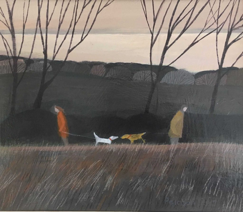
This painting appeals to the sentimental side of me. It is all about the point of near contact between the two dogs. In a naïve way it suggests the scene by Michelangelo on the Sistine chapel where the fingers of God and man nearly touch. This is what Comes across to me in that transitory moment where the two dogs introduce themselves. That the two humans are ambivalent of this interaction typifies how many of us pass each other by without acknowledgement. The autumnal scene is communicated in stripped back simplistic style which nonetheless is expressive.
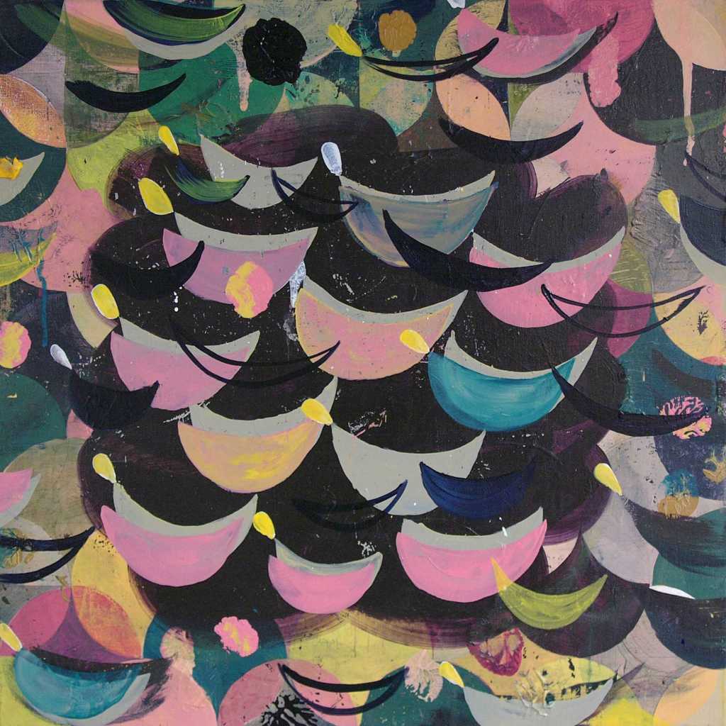
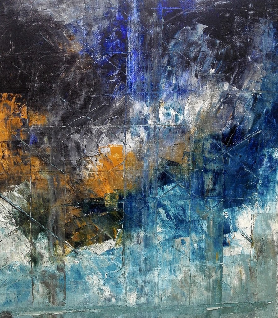
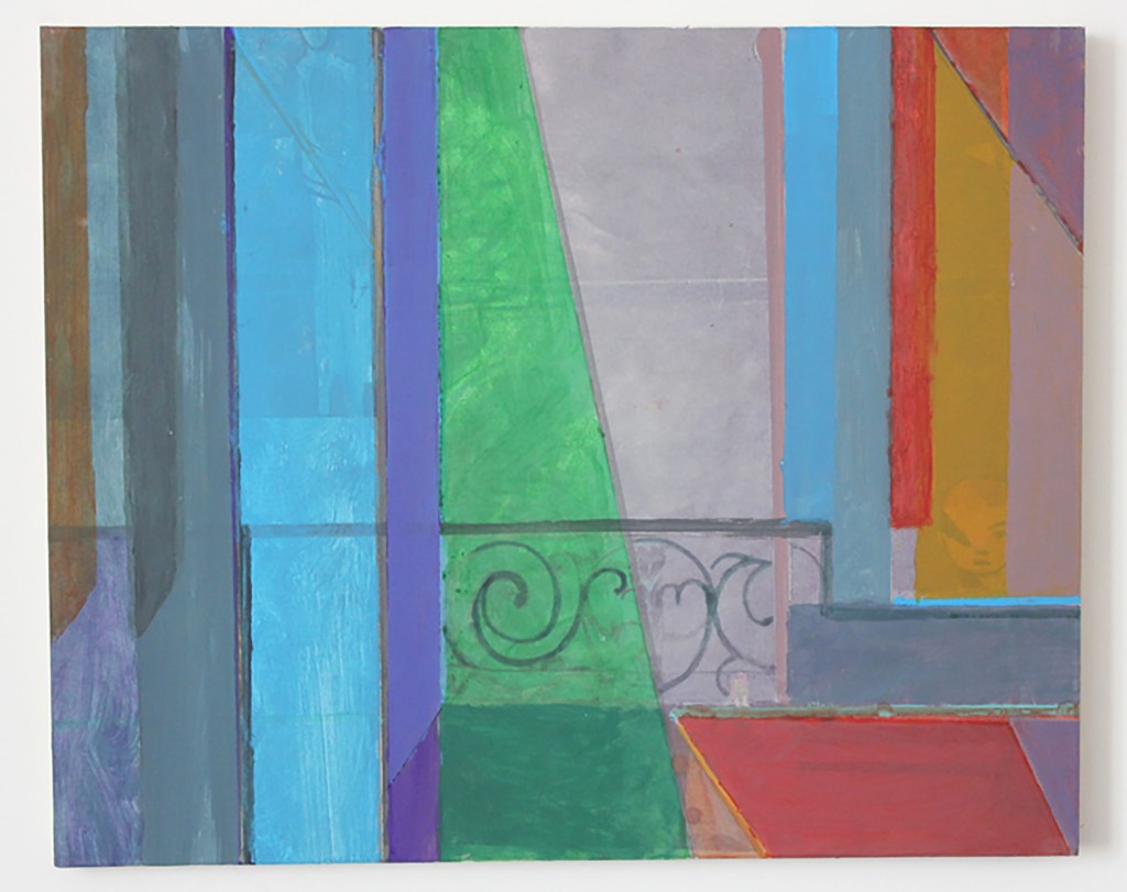
52. Ruth Philo
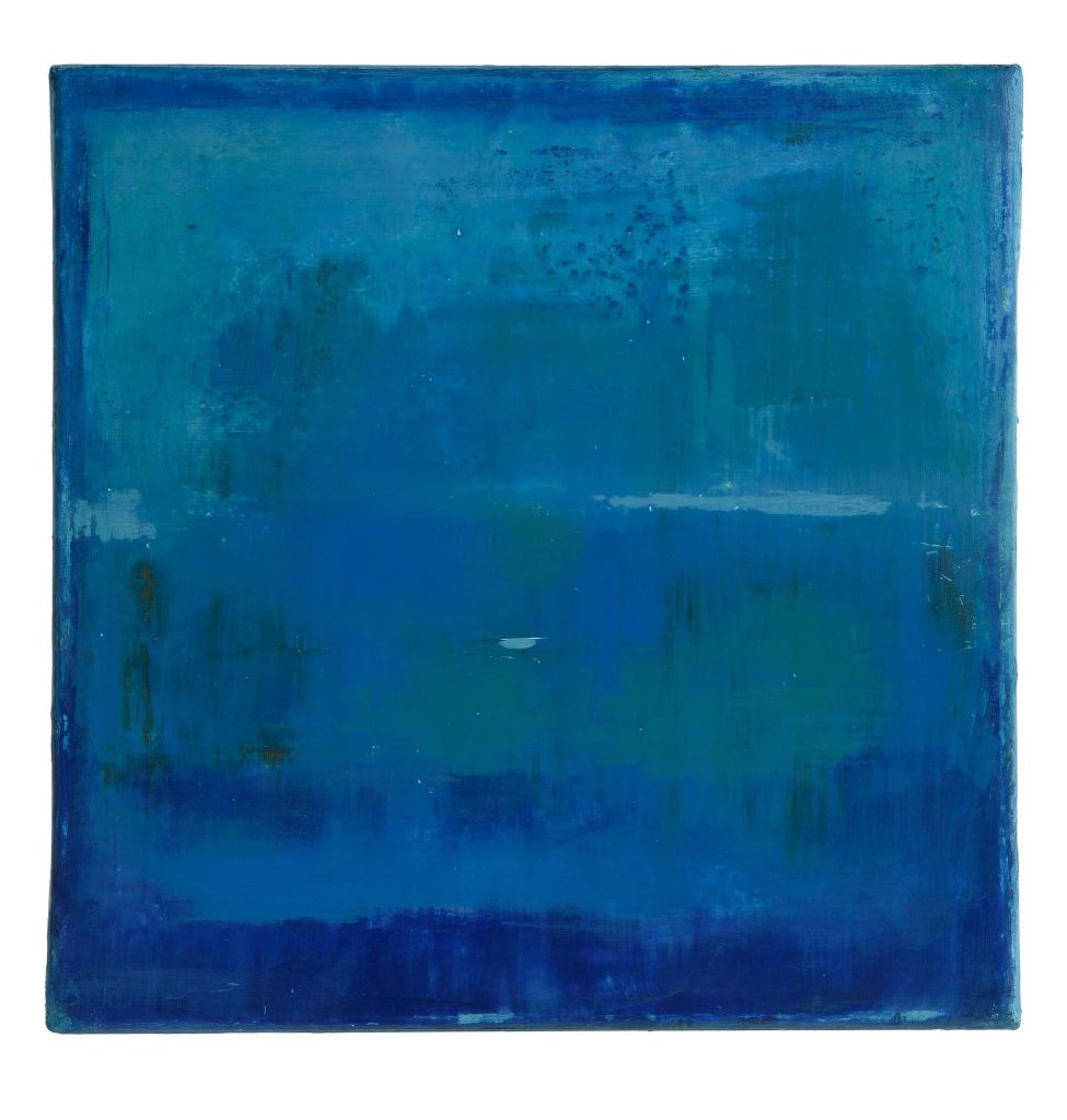
I was drawn to this abstract painting due to it’s similarity to the paintings of Mark Rothko. The Seagram murals by Rothko at Tate Modern, where I have spent much time looking at the paintings, are brought to mind. Once you relax in front of these paintings and allow the mind to wander a myriad of shapes and forms play across the canvas. Obviously the painting above by Ruth Philo doesn’t have the grandeur of the Seagram Murals as it is only 30 x 30 cms but perhaps it represents a small section. I am also reminded of an abstract painting of mine which has a similar quality. I have also now given this painting an ambiguous title.
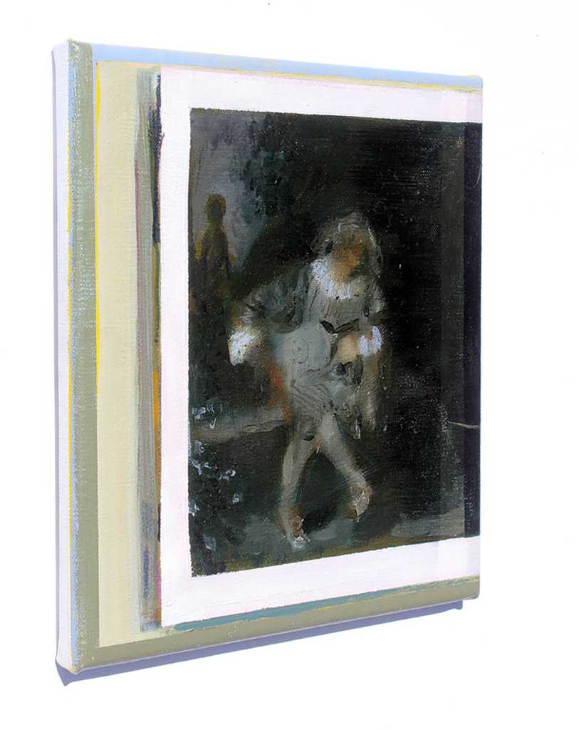
53. Alison Pilkington
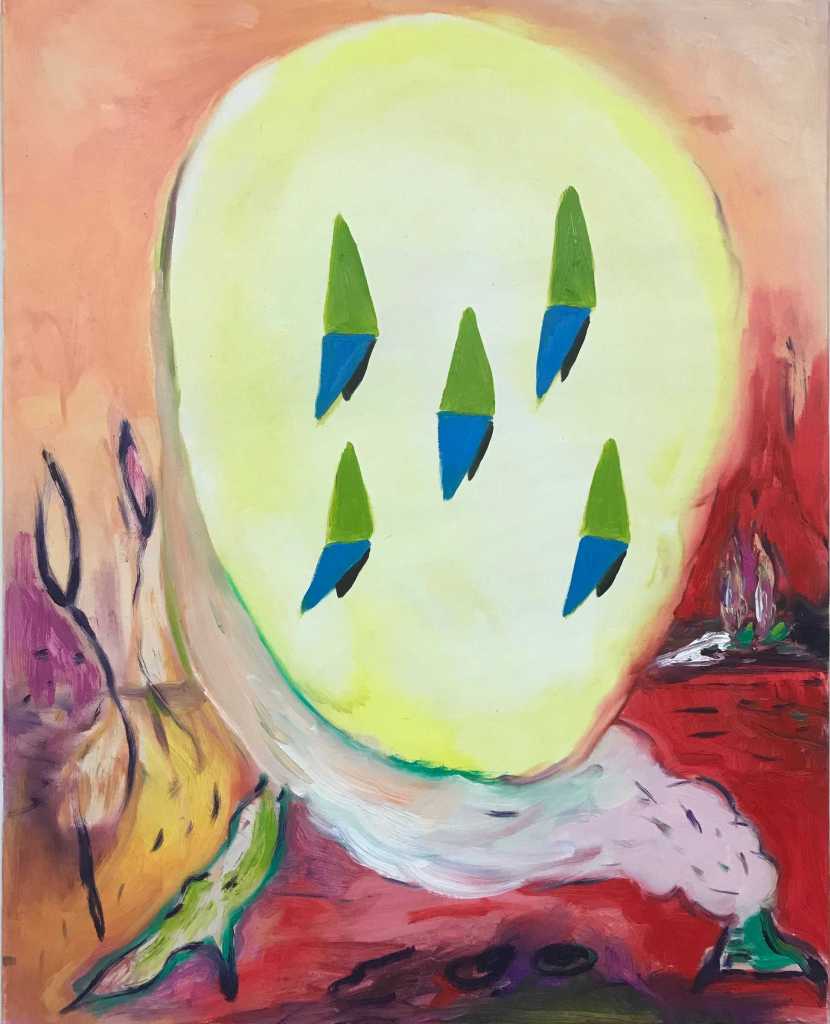
I find this painting hard to read. It is a figurative study that has an unsettling look as it hovers somewhere between dream and reality. Is it forming or dissolving?
The title ‘A sculpture that will never get made’ indicates that the subject has form but this is partly negated by the ephemeral wisps of forms that surround it. Could it be that the sculpture can’t be made as it is in a transient state?
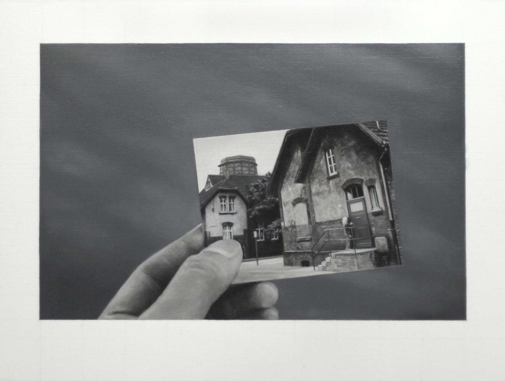
54. Narbi Price
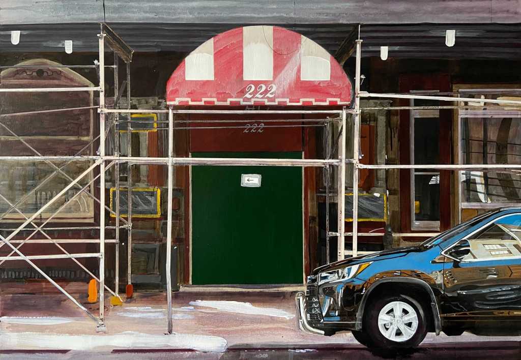
I wonder whether this painting is of the same Chelsea Hotel that was the title and setting for the famous song by Leonard Cohen. Whether it is or not wouldn’t detract from the photorealistic depiction. At first glance the painting could easily be assumed to be a photograph. It is only on closer examination that the meticulous brush strokes and finely applied paint reveals itself. I am also struck by the gleaming, highly polished car situated at the bottom right of the painting. The images of the surrounding buildings, which are reflected in the mirror like surface, are finely observed and handled.
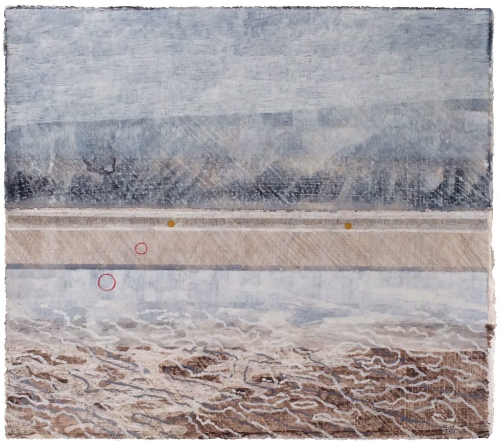
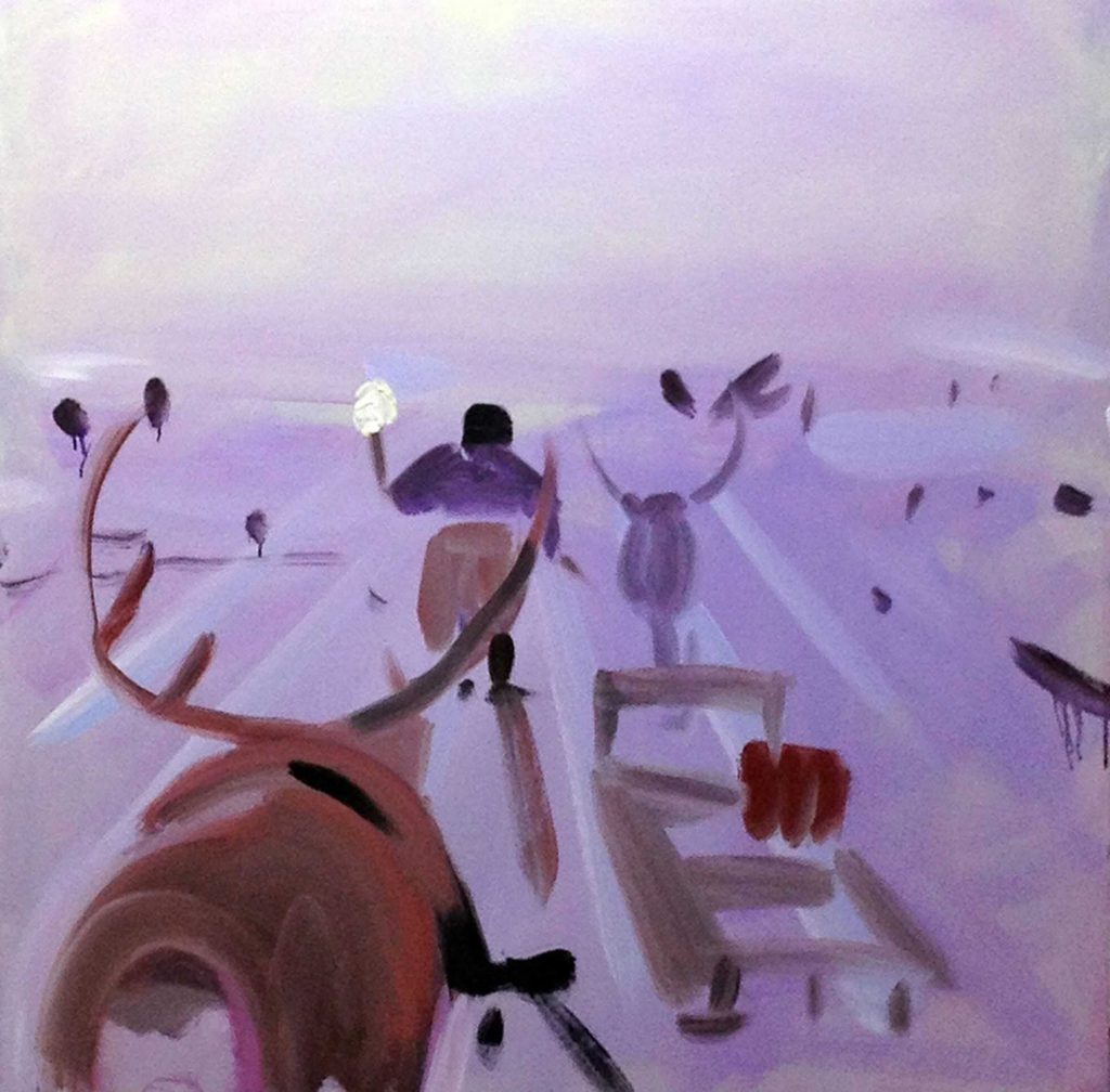
55. Freya Purdue
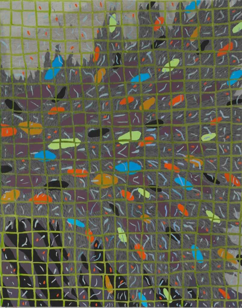
The water is flowing beneath the grid that our feet we are standing on. The colour pebbles and fish flicker against the river bed and the vegetation. This is what I see when I look at this painting. Was this the intention of the artist, I don’t know.
56. James Quin
This painting was one of a collection where the artist created a blurred reproduction of a painting from art history. In each one they give a clue to the original in the title, in this example ‘after Watteau’. Is the artist intending to blur the links back to the original works or remind us of the past?
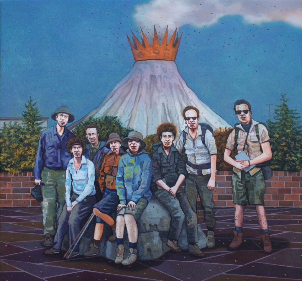
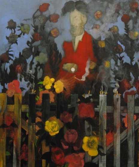
57. Greg Rook
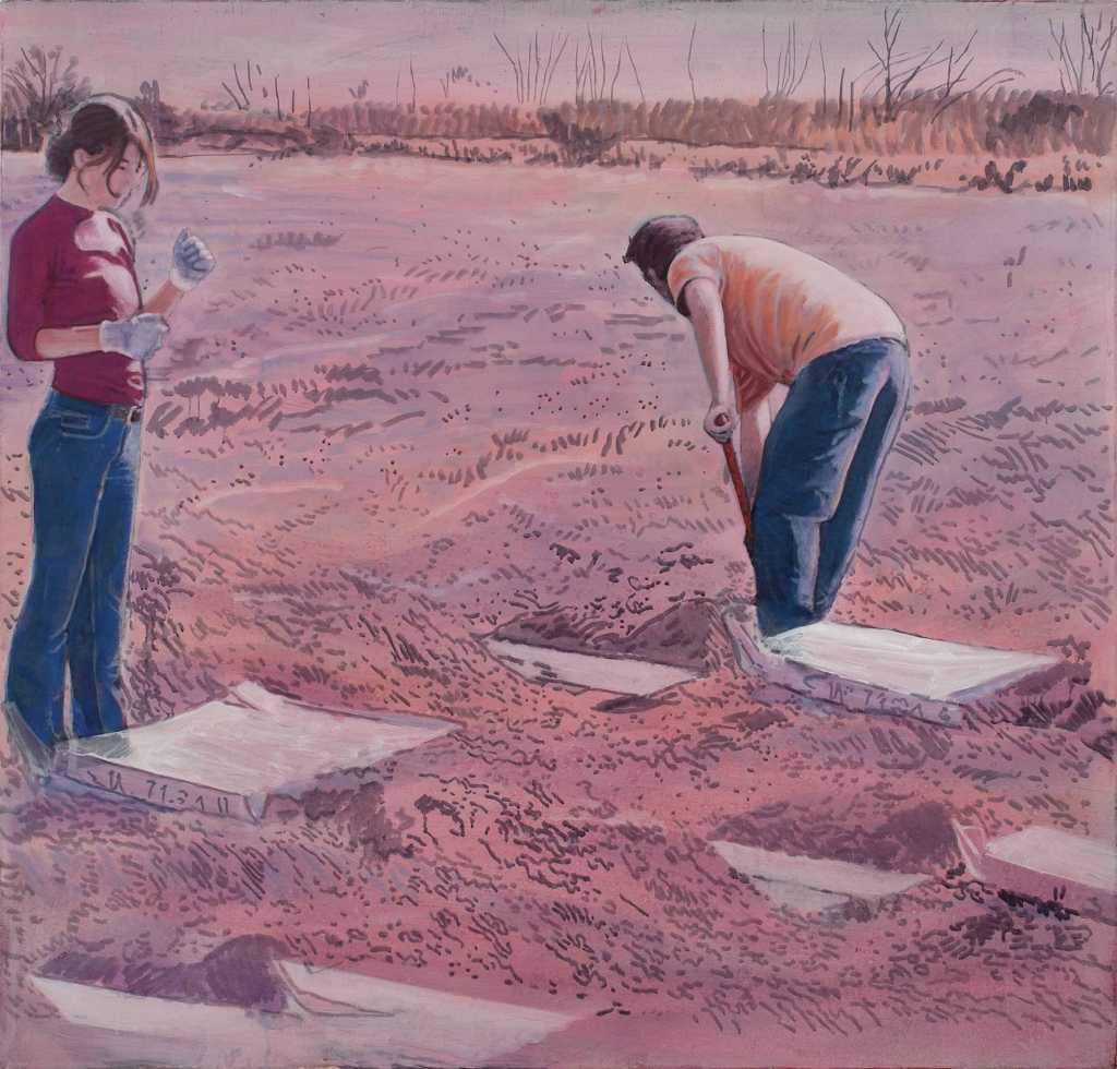
In the year of Covid 19 this painting takes on a poignant significance. I note that it was completed in 2019 and therefore could act as a prediction. However it is more likely to reference a conflict or conflicts in general where the outcome has not been good. The male figure digs the graves whilst a woman looks on. The soil is thin and sandy, orangey red in colour and the background bleak with leafless trees. The title hints at the circle of life returning the bodies to whence they came.
58. Katherine Russel
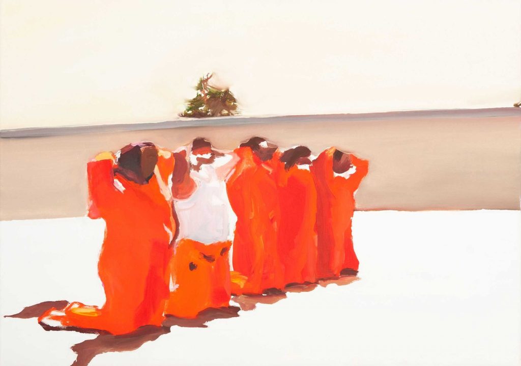
The blurred forms of five kneeling men, hands above their heads await there fates. They are all dressed in identical orange clothes except for one whose top is absent and reveals a white t-shirt. The shadows of the men are more or less directly below them suggesting that the sun is high above, beating down on the hard white surface. A high wall in the background with a tree top just visible above it completes the scene. A depiction of imprisonment and fear.
59. Wendy Saunders
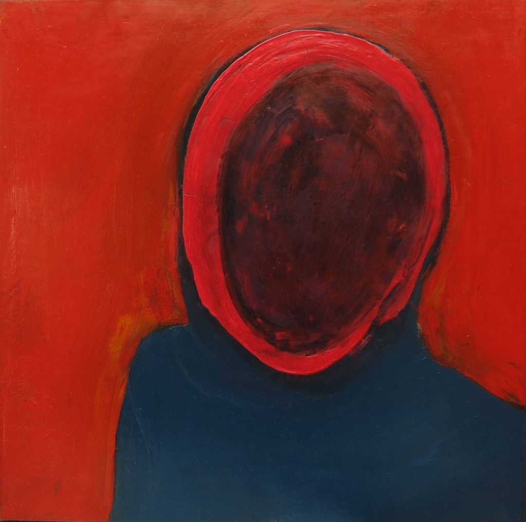
The key to this painting is in its title where it references Pussy Riot the Russian feminist protest punk rock and performance art group. The groups membership has always been numerous and changeable making the individuals members of less importance. They are often photographed wearing knitted balaclavas to hid their identities. Wendy Saunders painting uses this anomality to great effect, the simple figure is featureless, the pose is threatening and the colours bold and challenging.
60. Stephen Snoody
The influences of Henri Matisse run through this painting. The blocks of pastel colours, the suggestion of looking out of a room towards the view outside are an amalgamation of idea and parts of paintings by Matisse. Stephen Snoody has been honest with the viewer as to the influences which, I feel, enhances the experience of looking at this painting.
61. David Sullivan
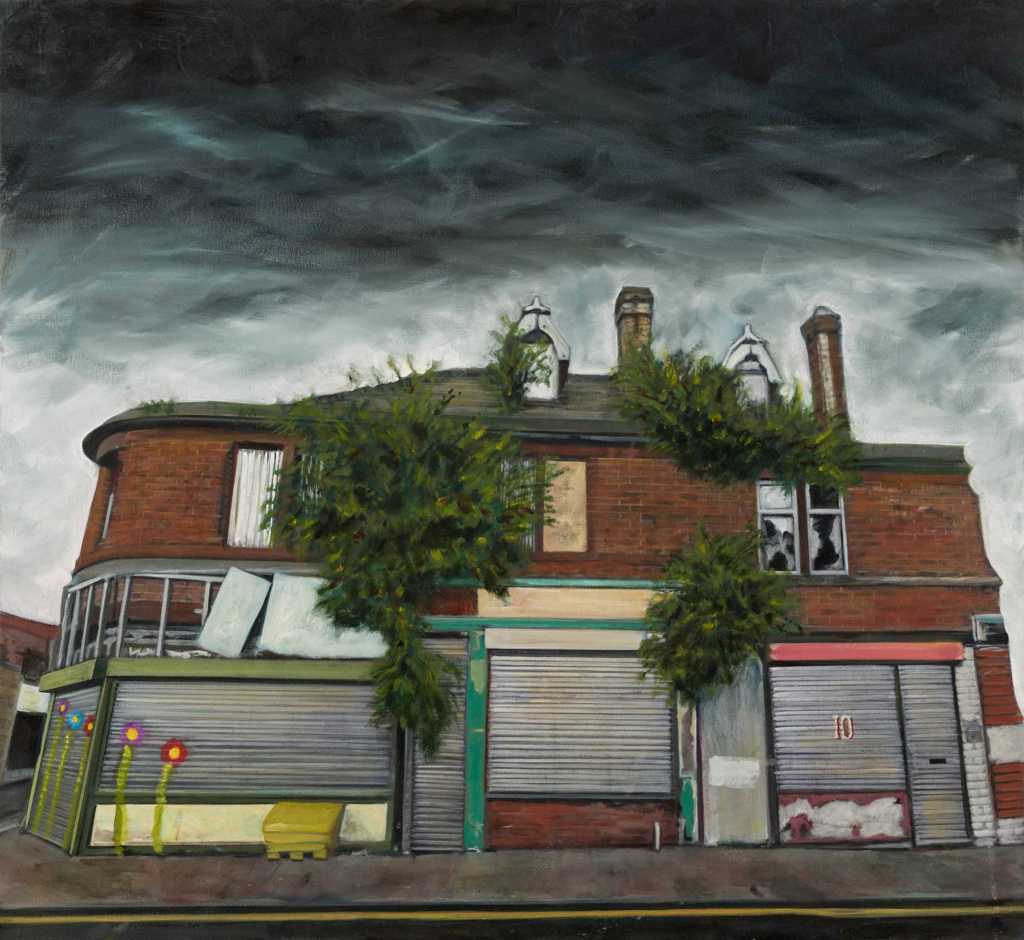
This painting immediately resonates with me as there are numerous links to my own practice and subjects matters. The painting depicts a row of run down shop fronts which are all part of a decaying building. There are shrubs growing out of the brickwork, the windows are either smashed or boarded up and the shop fronts are covered by shutters some of which carry graffiti. The scene is depicted under on ominous looking leaden sky. To top it all there is a direct reference to the political and social economic situation in which the scene exists as the title of the painting is ‘All the riches of Britain’.
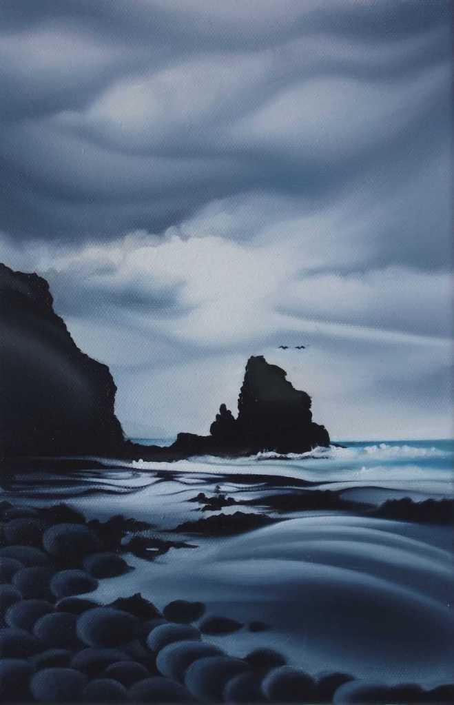
62. Harvey Taylor
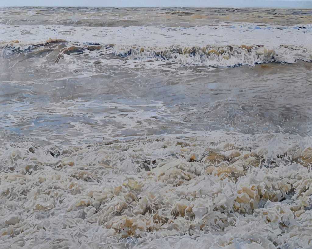
A moving, as in the movement of the subject, study of the sea making landfall. It is not a particularly rough sea just a typical series of waves meeting what I suspect is a pebbled beach. The foreground is all foamy, bubbling whiteness, the middle ground is the sea taking breath in readiness for the next wave which can be seen forming just behind it, this leads to the choppy sea behind and in the background a thin line of distant sky. The whole scene is wonderfully observed and meticulously painted.
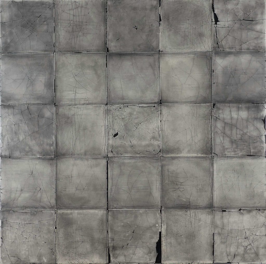
63. Molly Thompson
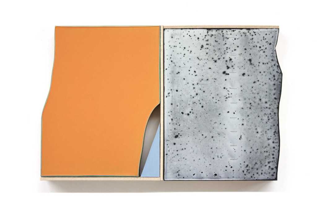
This painting is much harder to read than the previous ones. I struggle to get past the literal interpretation of what I see. It is a near photorealistic painting of two wall tiles, one pale orange the other speckled grey, which have been presented to us partially framed and displayed on a white wall. The tiles have broken edges which the orange tile casts a shadow which although realistic doesn’t follow the contour of the broken edge. I guess that there is a clue to the work contained in the idiosyncratic title but it passes me by.
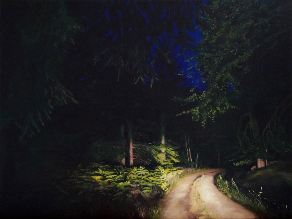
64. Judith Tucker
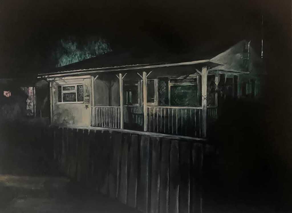
This painting very much resonates with my own practice. There are similarities in topic, composition, style and technique. In Judith’s painting we are shown what looks to be a holiday home, a chalet, perhaps situated neat to the coast. It is late, maybe the middle of the night, the chalet has a ghostly appearance hovering in the half light. There are shadows all around the building and there is no light emanating from it. All is quiet. What happens here, what has happened here? Nothing is revealed it is left to our imagination. The whole scene and the storytelling is supported by the cryptic title ‘I only come here when the weathers good’
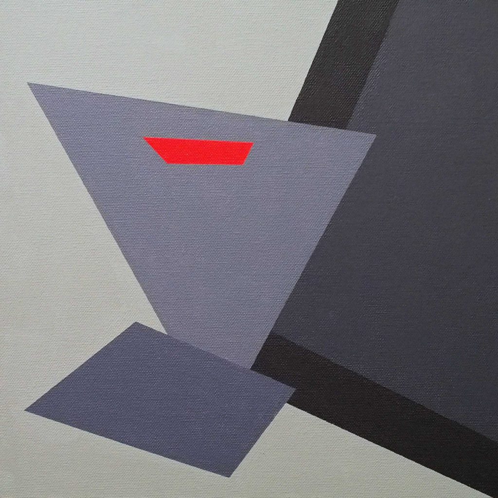
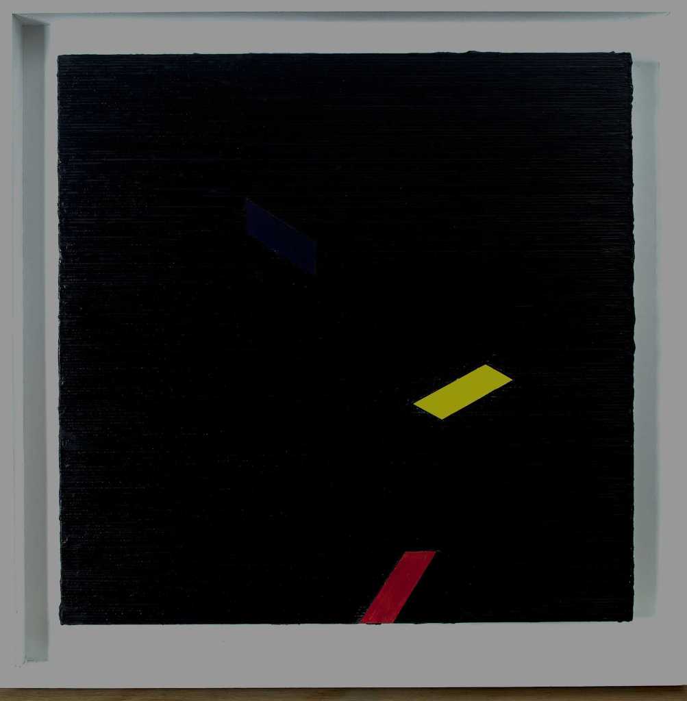
65. Mary Webb
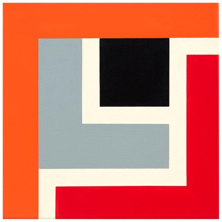
When I was selecting this painting I recall that is was one of a series of works that in concept and appearance were similar to each other. All the paintings are on square canvas’s which are divided into straight lined rectangles, square and L shapes. The blocks are painted in single colours consisting of, toned down, red, orange, black and grey and the dividing lines are left white. The overriding link between the paintings is partially in common title ‘Utah’ and the homage that they pay to the paintings and ideas of Piet Mondrian.
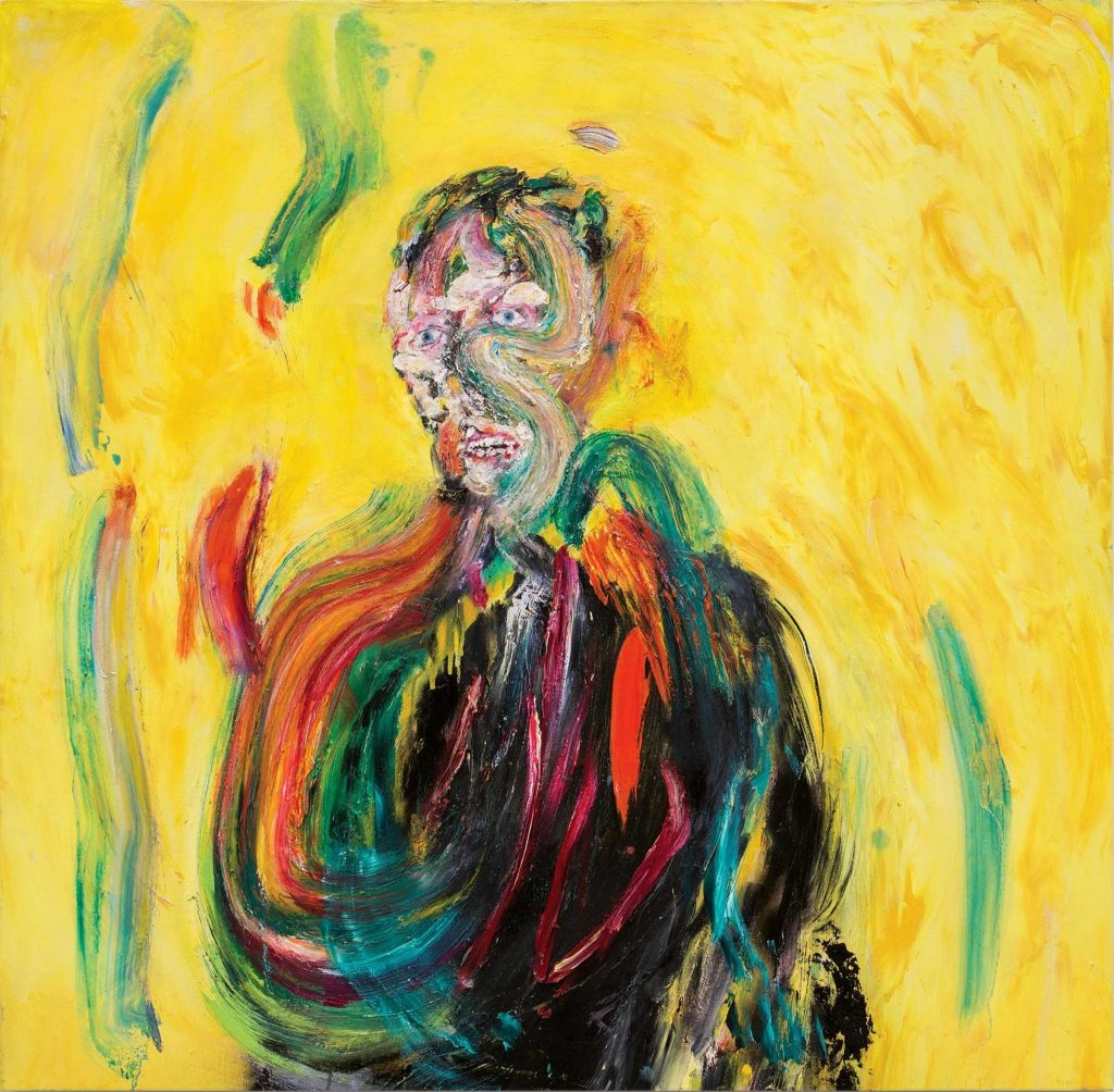
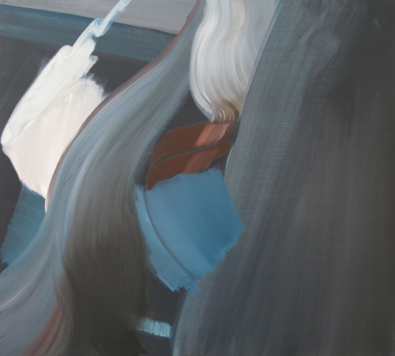
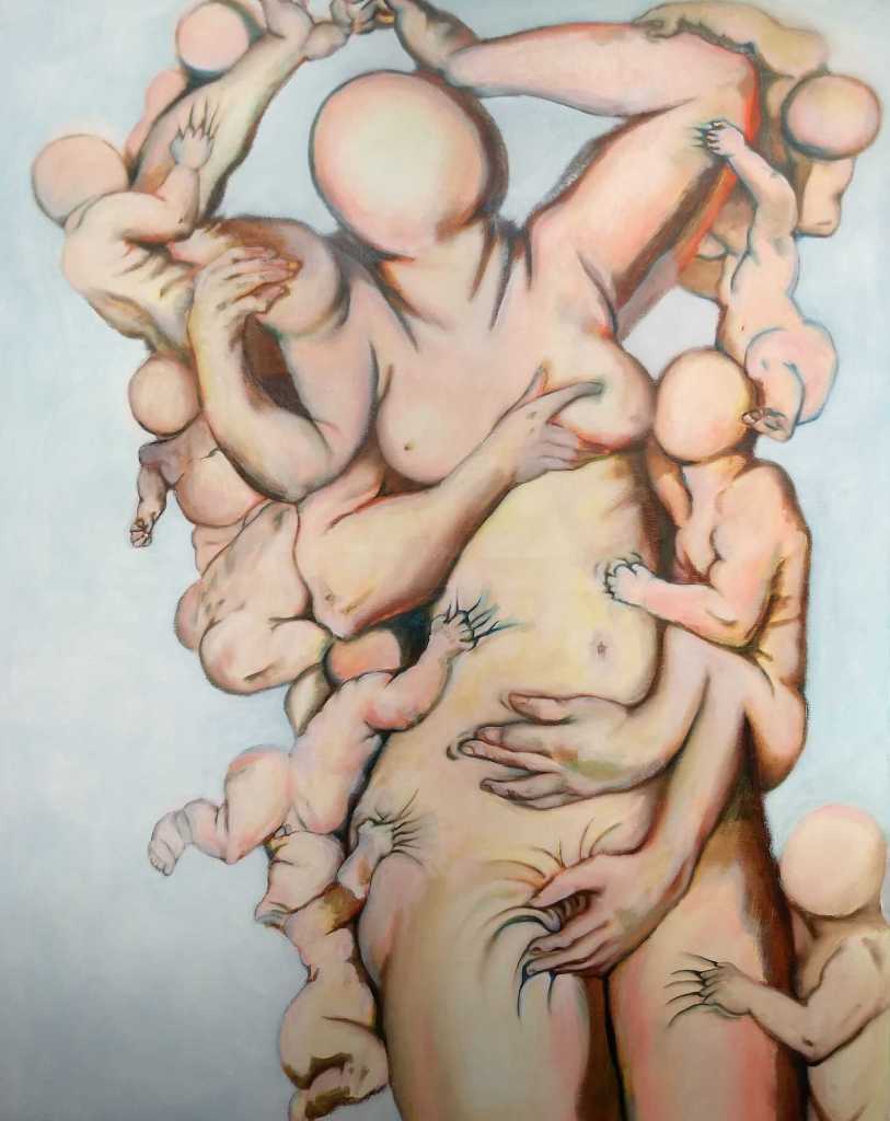
66. Casper White
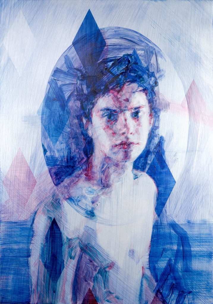
With a minimal palette of colour, basically blue and red on a white background, the paint has been loosely scrapped and applied in layers to build up a haunting image. The figure emanates from intense gazing eyes that draw you towards the face. It is only when you manage to look away from the eyes and head that you notice that the body supporting it is really not there.
67. Joanna Whittle
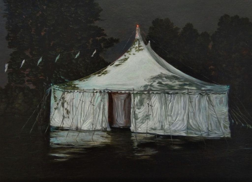
This painting is one of a series where Joanna Whittle uses Marquees, tent and big tops in imaginative and slightly surreal ways. The painting above is a good example of where a seemingly banal subject matter is raised to an object of shimmering beauty which also suggest an underlying menace. The marquee has a ghostly demeanour. Its stark whiteness glows against the black background and shadowy exterior and it appears to hover in its space. Large parts of the painting are either dark shadows with minimal flecks of dull grey which emphasises the marquee. The most intriguing aspect is the entrance to the marquee, which is central to the painting. White canvas obscures our view of the dark interior. There is nothing welcoming. What horrors lie within?
68. Sean Williams
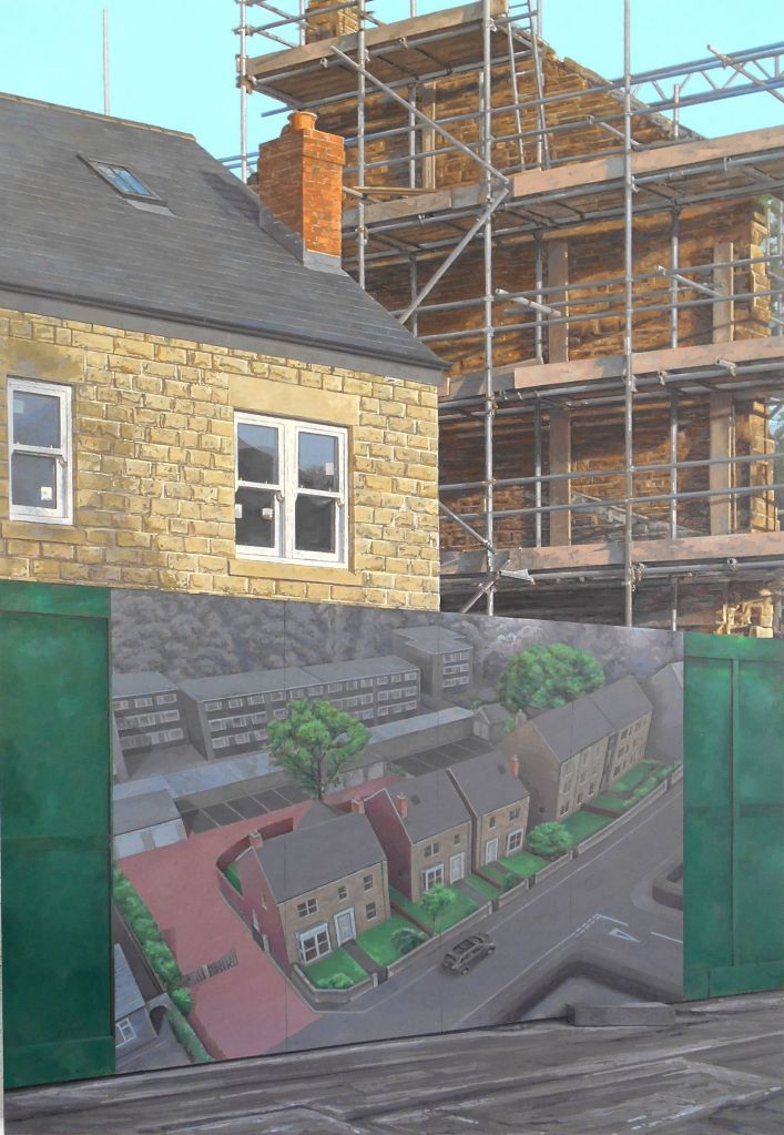
This painting could almost be an advertising photograph for a new housing estate. It is a tour de force in linear perspective coupled with photo-realism but, for me, lacks feeling, it feels cold. The intricate work that has been completed, especially on the scaffolding, has been painstakingly rendered and I suspect took the artist many hours to complete. The title adds an air of intrigue ‘ It Haunts It’ as it raises a question as to what is haunting what? To my mind it is the idealistic, ‘artists impression’, of the housing development which sits in front of the building work which is challenging the builders to replicate it. I also imagine a quiz question asking the where the hoarding is located.