Category: Part 2 – Contenporary approaches to still life

Contextual focus point – Michael Fried’s essay ‘ Art and Objecthood’ and resonances with my experiences of making

I found that this was a challenging essay which took me some time to understand. I will start with my understanding of the essay and later describe how it resonates with my personal experiences.

Analysis of the essay

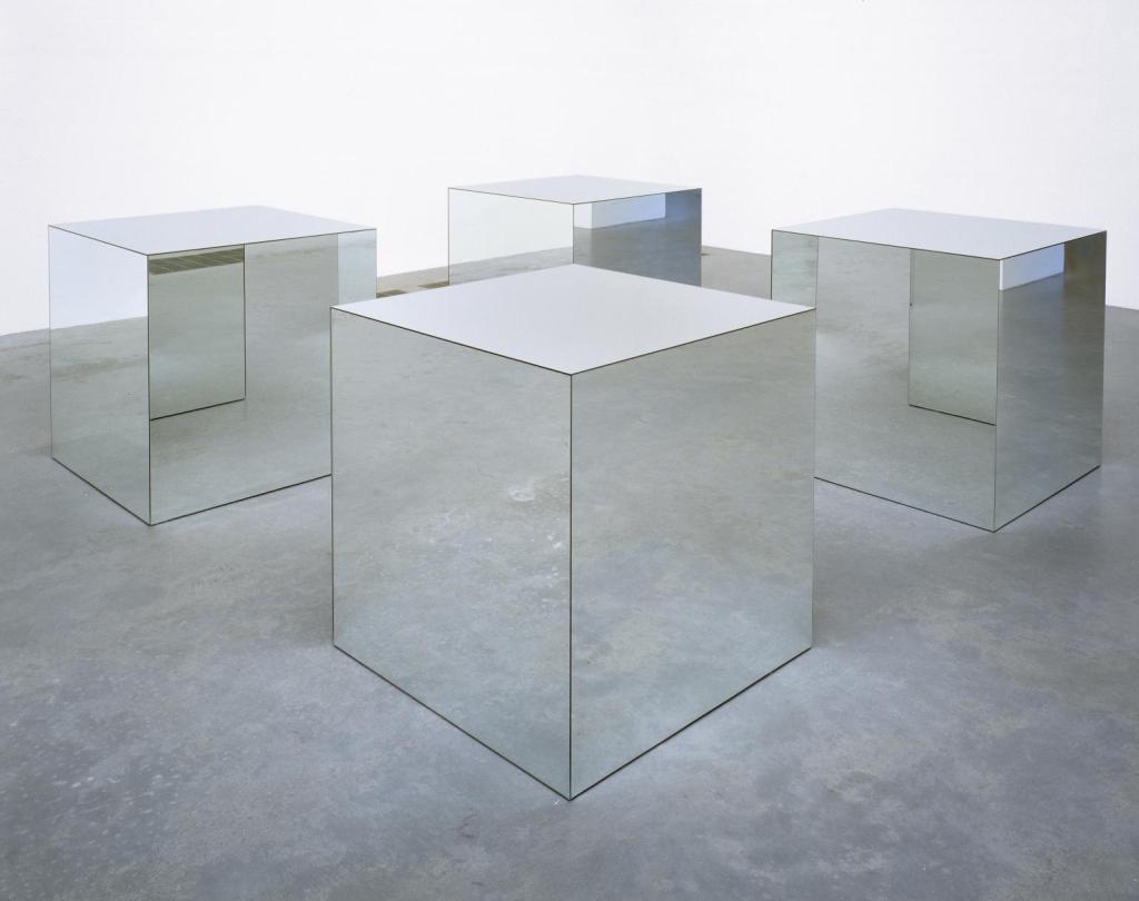
The use of the term Literalist art to describe Minimalism was initially distracting. I found that the Tate’s description of Minimalism was helpful to my understanding.

Minimalism = extreme form of abstract art developed in the USA in the 1960’s which typically composed of simple geometric shapes based in the square and rectangle.

I found that when I researched the work of the artists highlighted in the essay it was easier to understand the points that Martin Fried was making.

The essay starts with an explanation of what Martin considers to be literalist art and how it aspires to displace modernist painting and modernist sculpture as a way to establish itself. In many ways it is about the shape of an object. It is what it is, a whole, and not the sum of its parts. To quote from the essay ‘What is at stake in this conflict is whether the paintings or objects in question are experienced as paintings or as objects: and what decides their identity as paintings is their confronting of the demand that they hold as shapes. Otherwise they are experienced as nothing more than objects.’ The object has to suspend its own objecthood. The concept of non art is discussed and how the look of non art has moved beyond painting and onto sculpture. The term objecthood is adopted to encompass what literalist art is. However by doing this it becomes theatrical in how it confronts the beholder. The experience of literalist art is of an object in a situation. That much literalist work is large forces the beholder to keep their distance from it and be confronted by it. The object includes the beholder, large scale but not overpowering, too large. The object confronts the beholder, perhaps unexpectedly, by being in his way.

The theatricality of literalist art is inherent as the object is a statement of confrontation. In trying to explain theatre as an experience or situation as a work of art, which it isn’t, the experience of theatre is replaced by the object but the object is not there. Paintings and sculpture are not objects but by comparison literalist art assimilates objects to be art.

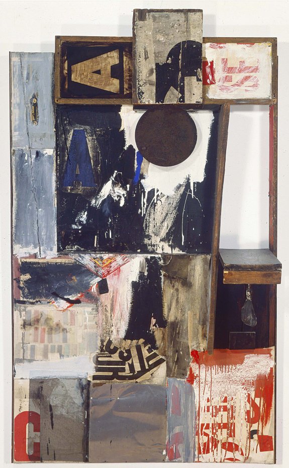
In trying to break or suspend objecthood the work of David Smith is held up as the prime example. His work occupies a space in which its part become entirely optical, part of ambient space but are still seen in terms of objecthood. The sculptor Anthony Caro’s work resists objecthood by imitating the efficacy of gesture.

To be able to defeat theatre literalist art degenerates in that the work only needs to be interesting. This is not a mark of quality. There is also a literalist preoccupation with time, with the duration of the experience which in turn is theatrical. The argument, essay, comes full circle in that in summary it states that we are all literalists most of our lives.

How does this resonate with my own experiences?

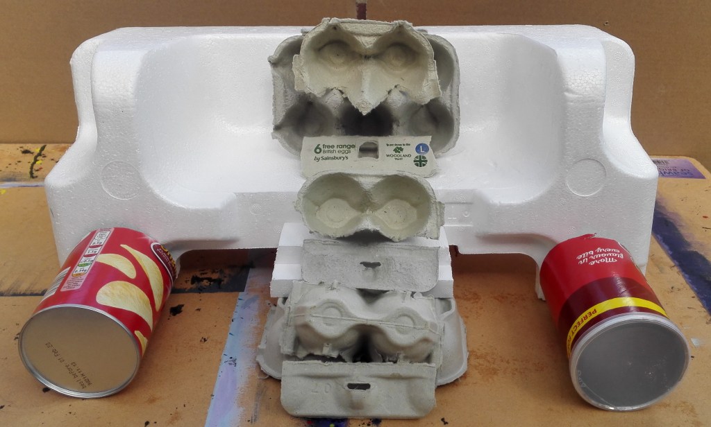
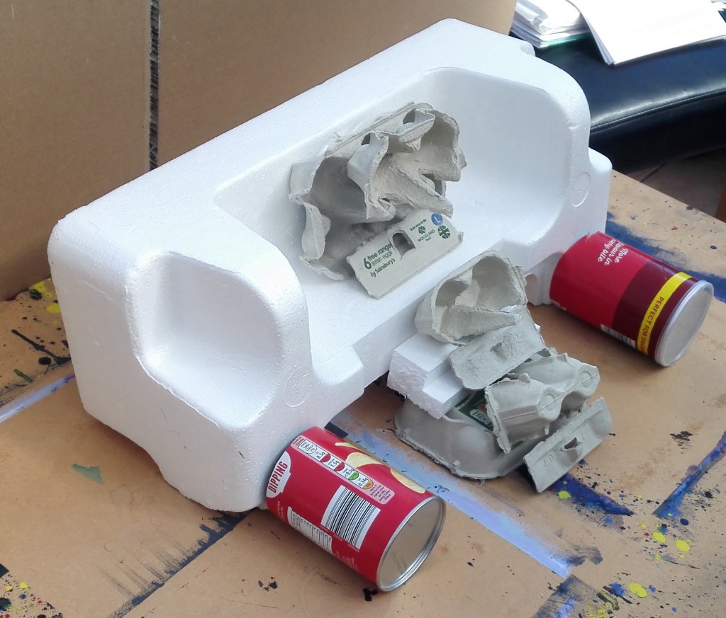
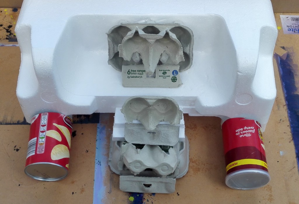
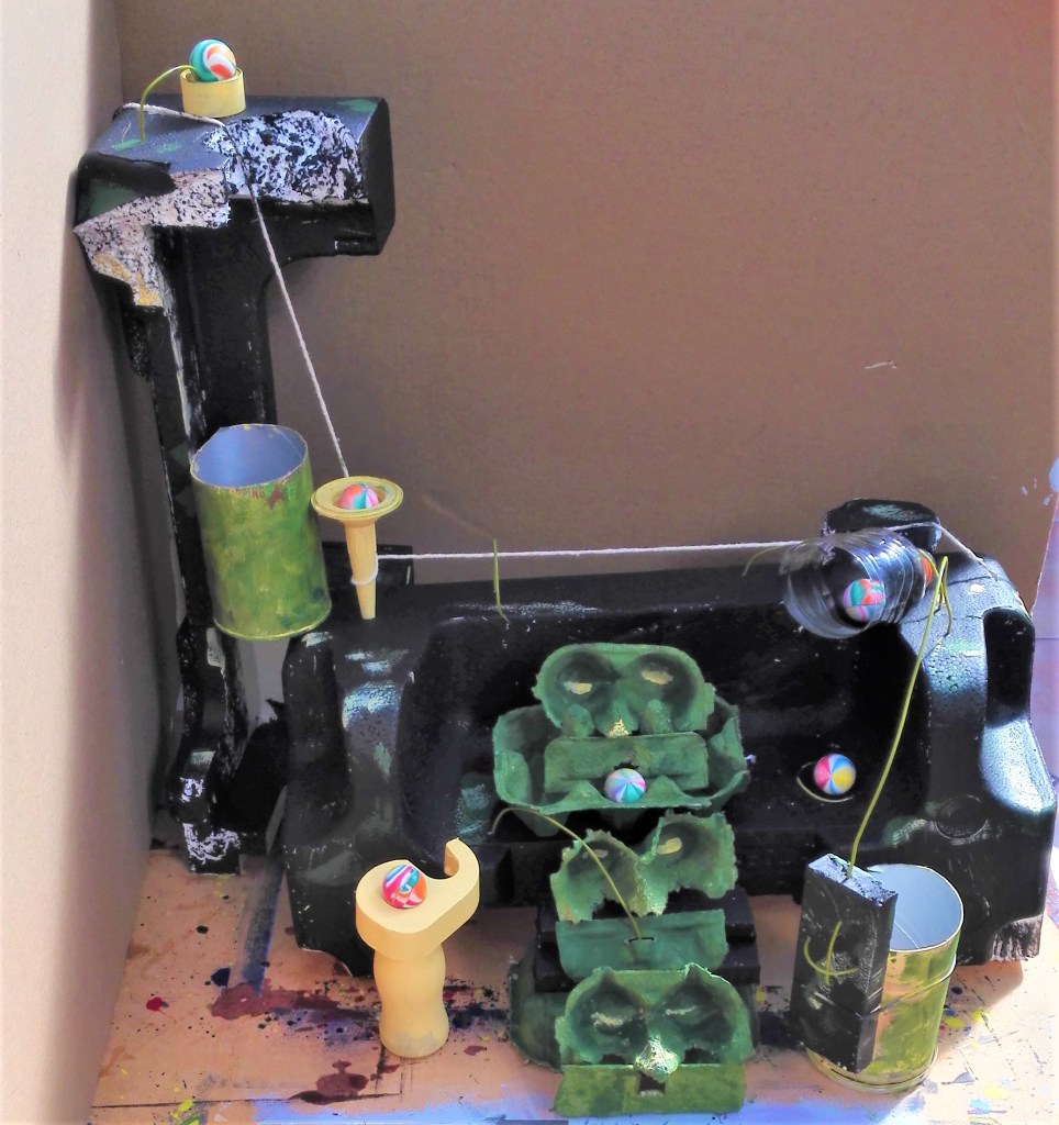
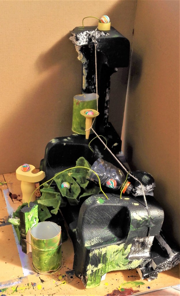
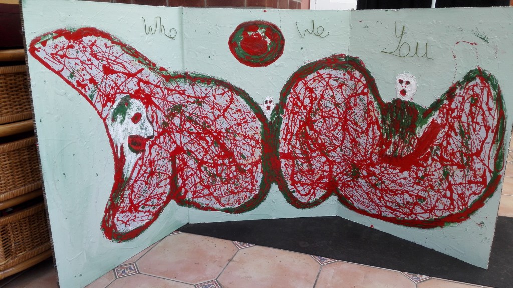
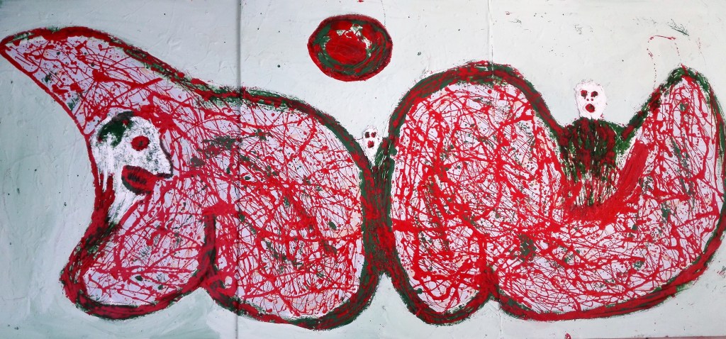
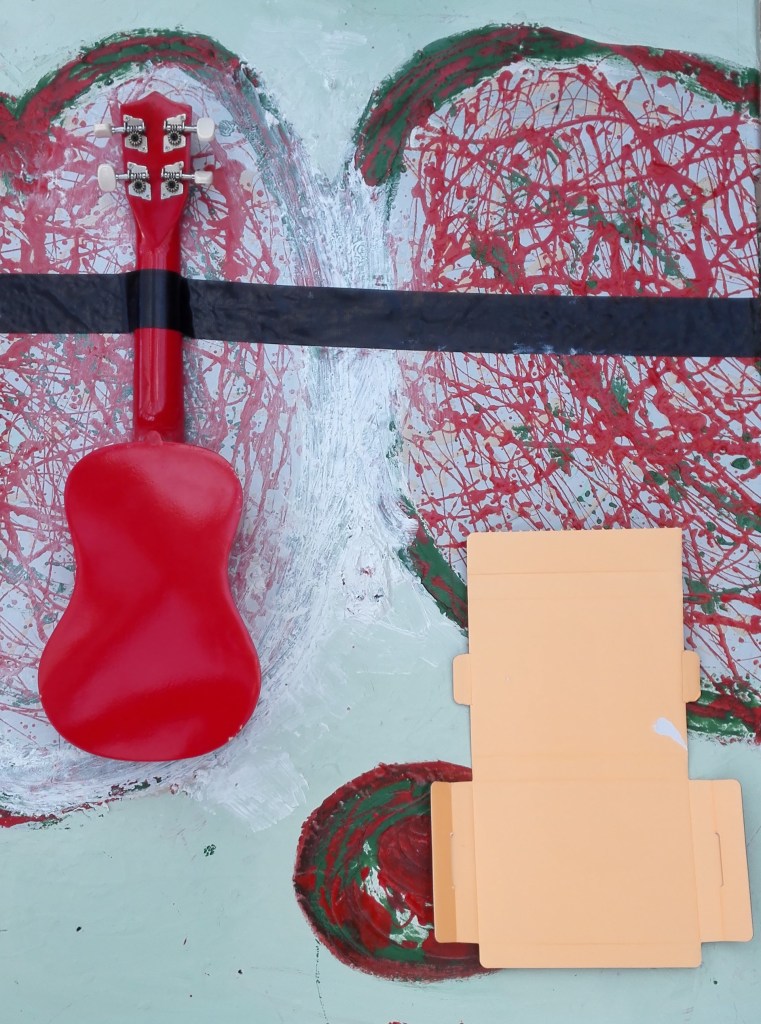
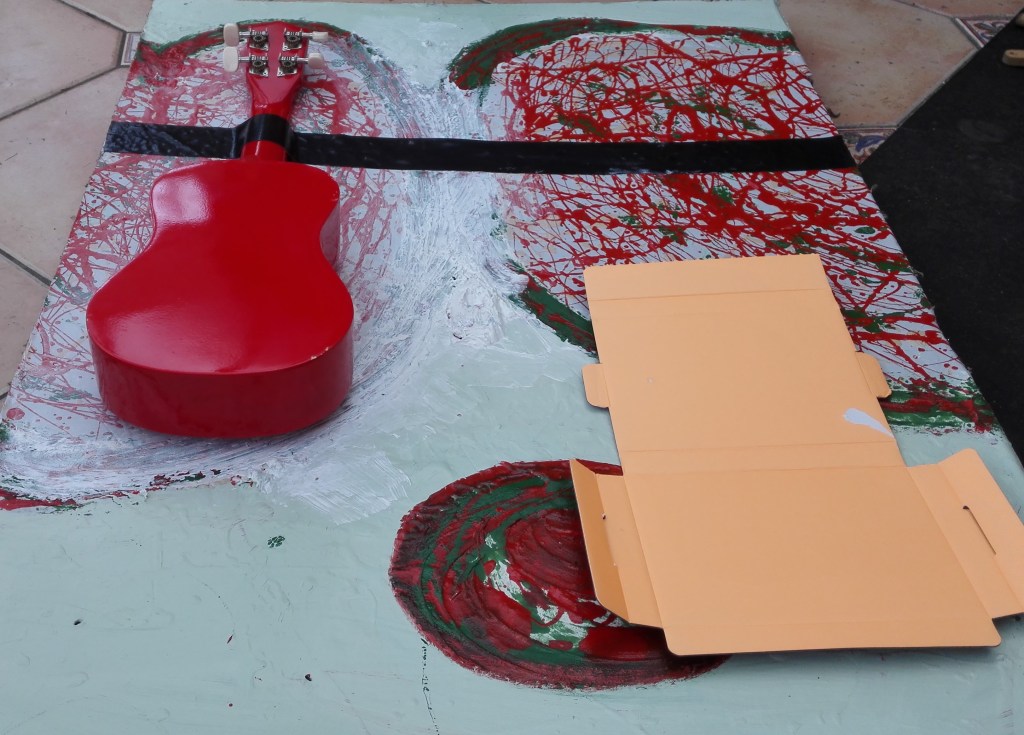
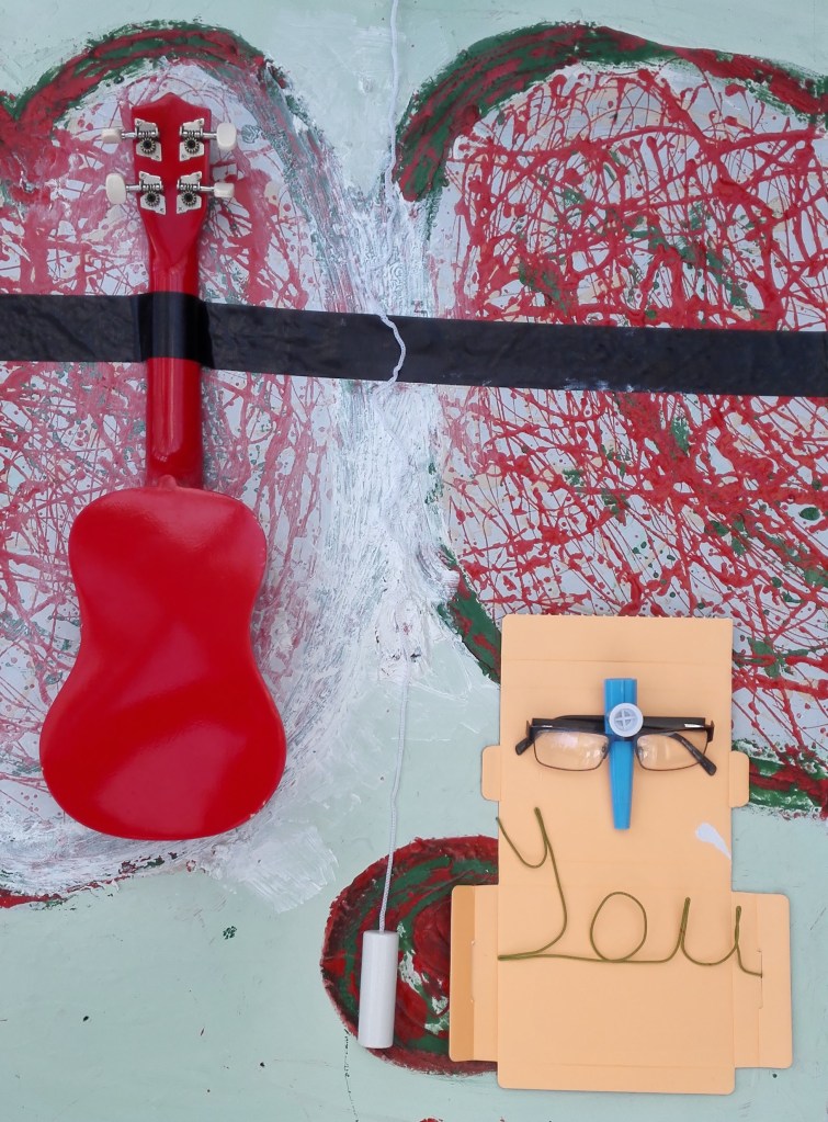
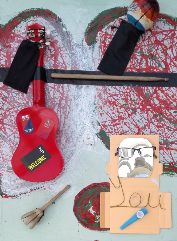
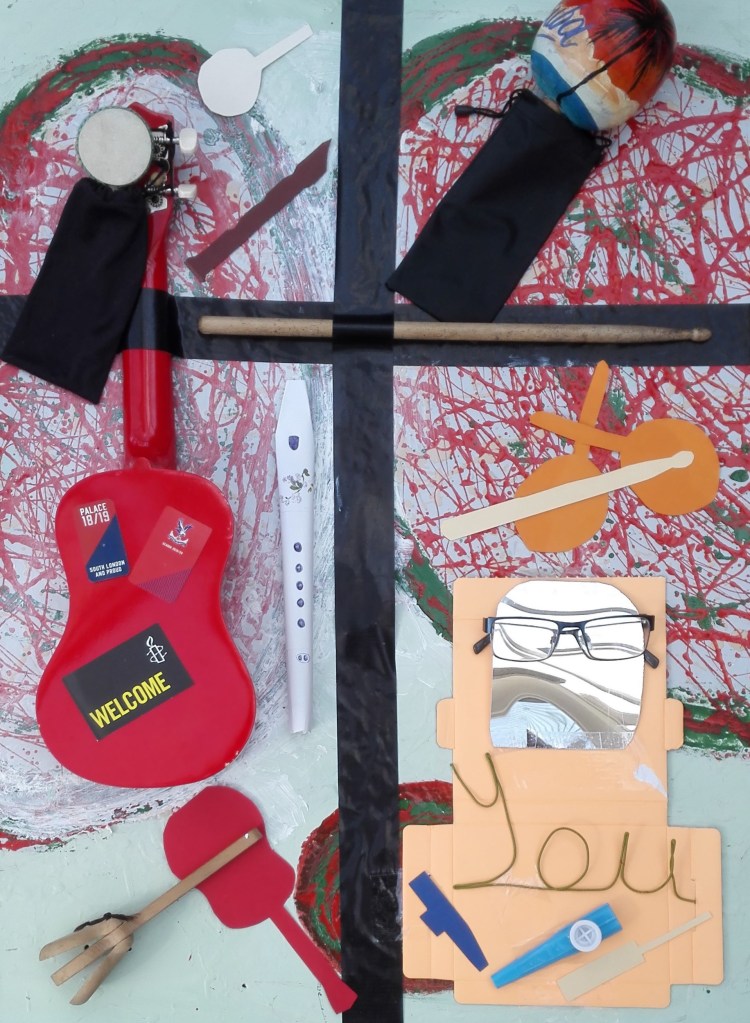
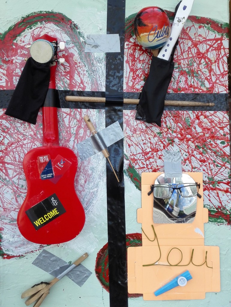
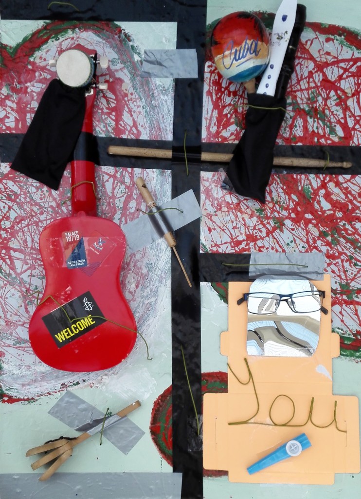
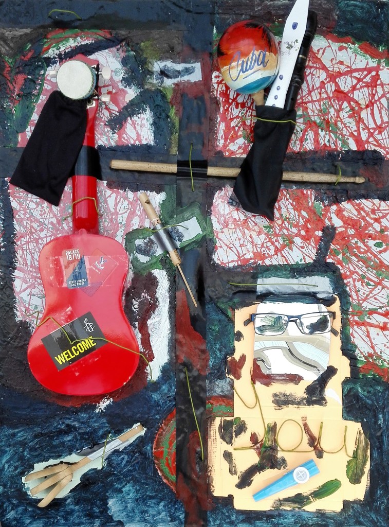
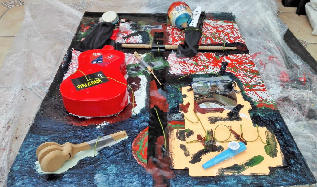
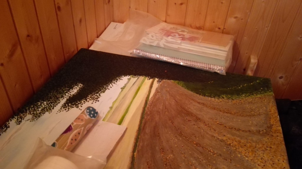
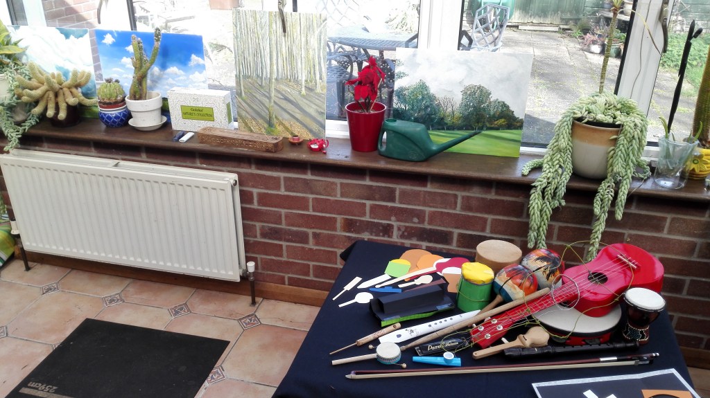
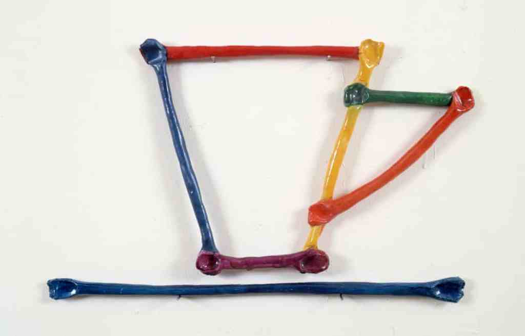
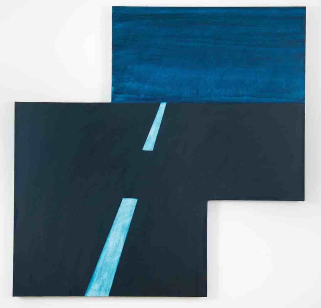
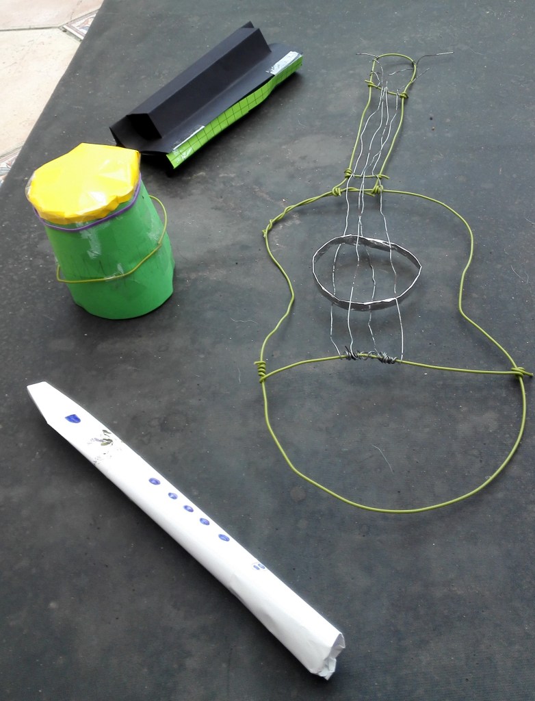
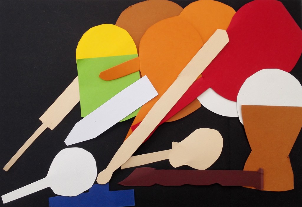
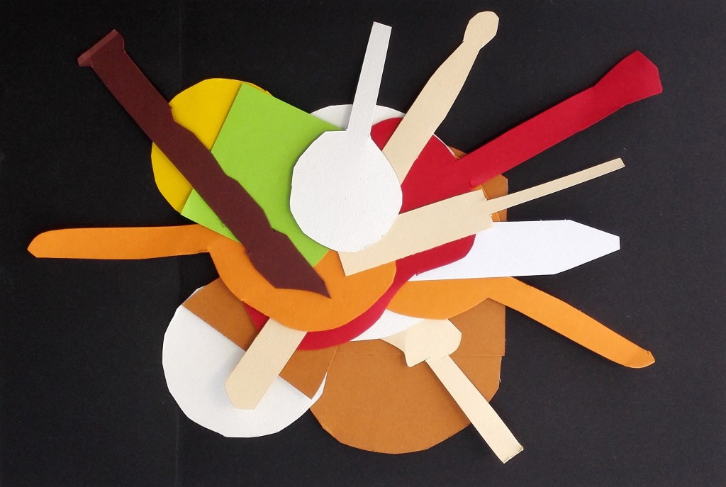
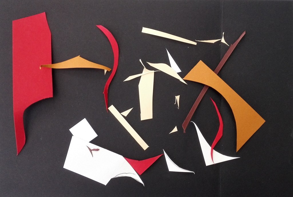
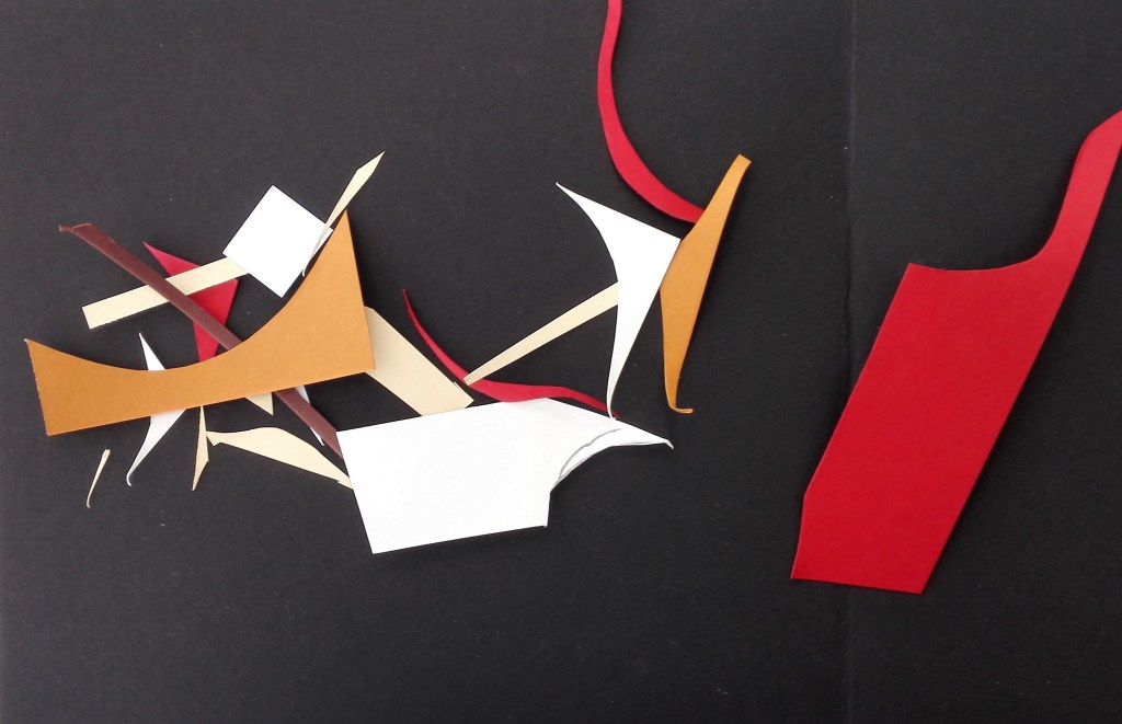
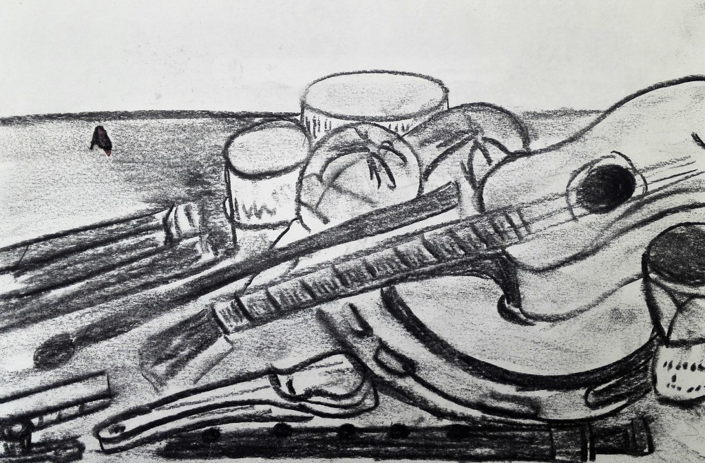
I can’t honestly say that I thought about my making during Part two in terms of literalist or minimalist art. I hadn’t considered questioning whether painting or even Combines were objects. They were the sum of their parts and presented as a work. I was trying to understand the language of working in a new way. Using new materials to create and assimilate into my work. It is only with hindsight that I can see parallels with the challenges that confronted artists such as Robert Morris in that I was considering the shape of objects. However I was nowhere near trying to limit the scope of the shapes down to simple geometric forms. That the literalists were trying to remove the association with anthropomorphism was contrary to what I was attempting. I wanted my work to be relatable and to contain gesture. I do remember having to consider the confines of the support. To me. the confines were in two dimensions and I didn’t really feel that I was working on a sculpture. This I feel was even true when working on the construction piece. I felt that I was assembling rather than sculpting.

My conclusion is that after reading the essay, and the points documented therein, I can see that the logical extension to pursuing a path of trying to simplify form and present work as an object removed from anything else would lead towards literalist or minimalist art. This was not a conscious consideration in my making. I was working to create pieces that had form and were, I hoped, aesthetically pleasing.

Untitled 1965, reconstructed 1971 Robert Morris born 1931 Purchased 1972 http://www.tate.org.uk/art/work/T01532

Part Two – Project 5 – Exercise 1.5 Painting in the round

It took some time for me to embrace this exercise. I read through the requirements and was not inspired to get started. I needed to stop and think about how I was going to tackle it. As a distraction I embarked on a painting of a photograph I had recently taken. It was whilst completing this painting that I collected some objects together and started trying to manipulate them. The brief asked that the initial ideas be based upon the collection of objects pulled together for exercise 1. This I did more in idea than in using the actual objects. My main material was going to be polystyrene. The intention was that it could shape to replicate the shapes from the table. Easier thought about than done. I found that cutting and shaping the polystyrene was much more difficult than I had expected. I fashioned a piece that resembled the shape of a harmonica other shapes would be problematical. At this point I looked for other materials that I could manipulate, cut up, re-arrange. An empty crisp tube and egg boxes were added. I had a vague idea of using music as an underlying idea, perhaps creating a representation of a radio or boombox or alternatively some sort of stage.

The objects were not too large but large enough to need to be placed on a table. This could be moved around and worked upon from different aspects. The initial construction is shown in three photographs below.

The initial construction was extended. The work started to take on its own life. Another piece of polystyrene was added which gave the work height and another piece was used to provide support. I continued to move the object around and supplemented them with further objects. An empty yoghurt pot, garden wire, a cellotape dispenser, small bouncy balls, string and elastic bands. The piece grew.

I now had a relatively fixed idea of how the objects would be arranged and connected. The next step was to consider colour.

I followed the links to the work of Jessica Stockholder and Katherina Grosse. It struck me that colour and paint was used both as a skin and a way of bringing the objects together and blurring the edges between them. Colour itself has a quality, it is ephemeral and embodied. Its application is also part of its quality, applied by hand, applied in gestural ways with brushes or other tools. I would try to incorporate these ideas into my work.

For the main blocks I thought that black would give them a look of solidity. All painting would be by brushes but I would keep it as loose as possible not worrying whether any underlying colour was visible. I would end up using three colours, black, Naples yellow and green earth. Other colour would come from the coloured balls and garden wire. After painting their was a connection between the objects and pieces that had not been apparent before.

Painted pieces

The task that remained was to construct the pieces into one coherent work. I would use the garden wire for two purposes, to aid in stabilising the work and as a link between the separate parts.

I found that the completed work was difficult to photograph and video without getting interference from its surroundings. It needs its own space in which to exist so that it can be itself. I used some cardboard to separate it from its surroundings. I then set about photographing and videoing the work. Whilst I was a non instructive name for the piece arose, Construction 1. Detailed photographs below.

What did I learn from this exercise?

I found it problematic to find inspiration. I was limited by what materials I had available and therefore had to adapt. The importance of colour in providing unity was revealing. I have continued to think of other ways I can create similar works and my approach to creation of work has been expanded.

Two photographs of construction 1 below. I also have four videos which will be added when I am able to.

Construction 1

Part Two – Project 5 – Research Point 5 and Reading points – Combines

I started my blog on Exercise 1.4 with a few words regarding the Rauschenberg exhibition that I had attended at Tate Modern in 2017.

Exhibition Guide

Prior to this exhibition I had confronted Abstract art, installations, and avant-garde sculpture but had not confronted Combines. The exhibition covered all of Rauschenberg’s career and only a part, room 3, included the Combines. This room along with ‘Material Abstraction’ were the two largest rooms. The Combines were different. They seemed to be about painting but had other aspects to them which at the time I didn’t come to terms with. I couldn’t make sense of them. As I recall the one that made most sense was ‘Bed’ which was completed in 1955 at the beginning of his Combine period.

Bed, 1955

It was obvious what it was but why was it contained with a frame with paint. It was a painting that utilised oil paint and pencil on pillow, quilt and sheet. It now makes more sense having worked on my own Combine and also having read more about Combines. The bed itself is an ordinary object. It is usually confronted as horizontal. Here it is presented to the viewer vertically within a frame. this was the intention to endow ordinary objects with a new significance. This topic is explored further in the article ‘On Rauschenberg – Art Theory 1900-2000’ which is similar in content with the Exhibition guide. The guide walks through Rauschenberg’s artistic life in a chronological order and explains his development. The many collaborations, the challenge to conceptions and continual experimentation with the art form.

Returning to the Combine’s they started to make more sense after reading Leo Steinberg’s lecture piece on ‘Other Criteria – The Flatbed picture plane’ in which he explains how the picture plane

was moved from the Renaissance picture plane, which are experienced in the normal erect posture, to the work of Rauschenberg whose work challenged and overcame this so that the pictures no longer simulate vertical fields but opaque flatbed horizontals. They no more depend on head to toe correspondence with human posture than a newspaper does.

Having read these pieces and reflected upon them I returned to Link 21 and looked to explore a couple more Combines. I selected two which are reproduced below along with my comments.

Collection, 1954/55

Rauschenberg’s Combine painting ‘Collection’ looks on first glance to be just what its title suggests, a collection of coloured shapes on which paint and been very loosely applied and allowed to run and mix. It is only when it is viewed close up that it starts to reveal a greater collection of materials and information.

On closer examination the support appears to be made up of three wood panels. However the painting is described as being on canvas. Is this a play with the idea of the triptych or another use of the title word ‘Connection’? To the frame of the paintings further wooden pieces have been added along the top. These pieces of wood have paint and fabric attached to them. Were they found like this or have they been added by the artist? The painting is made up of pieces of fabric and cloth, torn pieces of newspapers, magazines and comics which have been randomly adhered to the support. Hardly any of these have been placed in a position to be read naturally, often they are upside down or at various haphazard angles. Paint of many different colours and texture has been loosely applied by daubing, dripping and painting. Much of this paint has been allowed to run and to be absorbed into the fabric. The paint partly obscures the paper, some of it is translucent allowing the viewer to look behind. The whole painting looks faded. To me it is a collection of ideas, materials and, paints.

Magician, 1959

Oil, fabric, wood, printed paper, printed reproductions and metal on canvas with fabric pouch and string.

I find this painting very difficult to read. The techniques involved are similar to that used for ‘Collection’ but to me it is more refined. I guess that this is mainly due to it being painted 4/5 years later. The paint is more restrained, more refined and the whole composition is more coherent. However although I can observe this attributes I struggle to make an association between the painting and its title. Is there meant to be one? I note that there is another painting titled ‘Magician II’ which was painted two year later in 1961. Is this a companion piece or perhaps a follow on piece. There appears to be little connection between the two. I will return to these paintings and I hope over time some more of their secrets will reveal themselves.

Lastly I found it pertinent given the global crisis currently being endured that the strapline at the top of the Rauschenberg website is

“Artists always have been the first to rally around any national or international problem, acting as a conscience.”

Part Two – Project Five, Still life and the Combine – Exercise 1.4 Collect, combine, construct

When I read through the requirements for this exercise I expected a challenge. I had confronted Combines previously when visiting Tate Modern and took the opportunity to visit the Rauschenberg exhibition in 2017.

I found the Combines confusing and very difficult to read. Thinking back I was looking for a narrative to the paintings. At the time I was far more comfortable with representational work. I feel that my studies have now brought me to a place where I am better able to make some sense of Combines. However this exercise was asking for me to try to construct my own Combine. This started a train of thought as to how I could go about the process?

It took me some time to make progress. I started with trying to solve basic problems like what support to use? What to use? How to use it? A further limitation on the process was the prevention of going out to purchase a suitable support as the country had entered lock down due to the Coronavirus pandemic. This situation, in hindsight, was a benefit as it forced me to consider what I had available. The brief pointed in the direction of a canvas. I wanted to work quite large and the only two large canvases I had were used. Should I paint over these or incorporate them into the work. Whilst not my best paintings I felt that both were representative of a phase in my evolving practice and therefore I should preserve them. The two paintings are replicated below.

I reflected on what solutions I had used during ‘Concepts in Practice’ and remembered a large work that I had completed called ‘Who, we, you’ where I had used the cardboard that had come with the delivery of our washing machine. The work was now stored in the loft and was unlikely to see the light of day again. I could use a section of the cardboard for the Combine. Prior to its re-use I made a video of the work for my records. Two photographs of it are shown below.

I now spent a lot of time thinking about what to do? How to do it? Thinking about what to incorporate, solving problems, searching and finding objects, considering them, dismissing them. I seemed to be making little actual progress. It was all planning and no action but it certainly wasn’t procrastination. Eventually I decided on a way forward and started on the construct phase. The laying out of a couple of objects on the support and then the attaching of them broke the impasse and I now had a physical work in progress.

The physicality of what I was doing was far removed from the act of painting but it felt creative. A process was unfolding where I was adding, taking away, moving, arranging, considering and reacting to what I was placing on the support. Did the objects look and feel right? What was I trying to say about them? did I need to say anything about them?

A pleasing aspect of the process was that I didn’t feel constrained. I felt an energy towards the work. It was tactile to move objects around and to move around the work. Whilst working I took time out to look at Rauschenberg’s Combines and to try and draw inspiration from them.

Combine – Work in progress video

I noted that many of Rauschenberg’s combines were titled and my mind considered many options for naming my work most of which I thought were pretentious. I should allow the finished piece to convey its own meaning if it has one at all. The last step was to add paint. Again I spent more time considering, reflecting and pondering how to add paint, what colours to use, controlled or random application. I finally arrived at applying paint loosely using a brush.

Combine – finished work

The addition of paint seemed to bring the work together and gave it a coherence that wasn’t previously present. The objects now had a relationship to each other became unified. Have I completed a Combine that can be read, does it say something, is it interesting to look at? I am unsure. I enjoyed the process, particularly the act of creation, but wonder at the result.

I did make a couple of short videos where I moved around the painting and spoke about it. The video of the finished can be found vis the link below.

Combine Finished Work Video

Part Two – Project 4 – Exercise 1.3 Studio Reflections

My Studio

This is the place where I spend more of the daylight hours than anywhere else. It is situated in the conservatory at the back of the house. The room is entered via the sitting room. I still consider it to be a shared space but in reality I am the only one who uses it. It can be cold in winter and hot in summer but mostly it is a pleasant place to be. The view from the studio is to the back garden to which there is a door.

The room contains all of my art equipment, materials and supports which are all easily accessible. I do feel the need to keep the room reasonably tidy. I consider it to be part of the living space of the house but as said before I am the only one who uses it. It does have a dart board and dart mat which I like to keep free for practice and distraction. Rather unusually the room also contains a sauna and shower room. The sauna is rarely if ever used and currently I use it as a storeroom for supports, canvases and paper, and old paintings. The space above the sauna is where I keep old sketch books and packing materials.

Whilst considering my studio for this piece I feel that it could do with some reorganisation. It was partly reorganised so that I could set up the table of objects required for exercises 1.0 – 1.2, this is still in place.

The table of objects with background of plants and paintings

I tend to keep on display the paintings that I have recently completed, I live with them for a while until I have moved on to new works. My desk has been described in an earlier blog. It always has my laptop, my OCA course book, my sketchbook, my notebook, my diary and my ipad mini which is mainly used for listening to music. Listening to music is a constant. sometimes I am not really listening.

My studio is a pleasure to be in. I like working in it, sitting in it. It is comfortable. I take my breakfast into the studio everyday. It is part of my routine which if I have no other commitments runs something like this.

9-10am Breakfast, emails, actions and update my diary

10am – 1pm Current OCA projects

1pm – 3pm Lunch and walking the dog

3pm to 5pm More work and painting

5pm – 11pm Other activities, I’m not usually in the studio during this time, often out.

A Day in the Studio – Uri Aran

My first impression when looking at Uri’s studio was that it had an area displaying completed works and an area with work in progress. The works area is messy and confused and Uri explains why it is so. He states that a lot of his work is trying to organise, make sense of things, waiting, thinking, reflecting, trying out ideas and what I found most interesting, letting things age together. His process is about trying to tell a story and to represent this story using the objects in his studio. I was curious to find out how objects made there way into his studio but that I another activity. Collection and selection.

Valerie Mrejens ‘Start working’

This is a piece about procrastination.

Whilst I can sympathise with the feeling and notions expressed I have over the years been driven by deadlines. In my professional life, before retirement, my life was a series of deadlines, daily, weekly, monthly and annually. I seem to have retained this discipline and use the setting of Assignment deadlines as one of my motivations to complete the next task and keep moving forward. I do read ahead and try to ascertain what the next projects are and think about how long they may take. Is the deadline realistic? Do I need to get a move on? I keep a record of how much time I spend on my OCA studies. This helps to assure me that I am on course. I do put other tasks on hold at times so as to prioritise my studies. There is plenty of work to do in the garden as spring is here, what gets done gets done what doesn’t is left undone.

Where I sometimes struggle is with inspiration and this can lead to procrastination. This is particularly true if the task or project doesn’t resonate with me. It is then that I have to try alternative strategies. This can involve anything from walking the dog, going and playing my guitars and ukuleles, listen to music or perhaps painting something I want to paint. Once I regain focus on a task I find that I tend to get on with it, often with a rush to finish before the inspiration goes. The danger with this is that the full realisation of the idea or project is left without being fully explored.

Part Two – Research & reading point 3

Gertrude Stein – Tender Buttons & The Cubists

Initially I found this difficult to read. It took me some time to adjust to how the words and phrases were put together and I had to change how I read. In many respects the work felt like a long poem. Images were placed in my mind that made me think about why they had been written. Where was the connection? Often I found that Stein was describing what something isn’t and at other times describing an aspect of an object that would not immediately be what I would choose to describe it. As an example of this I choose the following extract

A PURSE

A purse was not green, it was not straw colour, it was hardly seen and it had a use a long use and the chain, the chain was never missing, it was not misplaced, it showed that it was open, that is all it showed.

From this I take that it was an empty purse and that would be the only aspect of the purse that would be observed. All other information being superfluous. It doesn’t matter what colour it is. Its use is of no importance. That it had a chain and the fact that the chain wasn’t missing was only an afterthought. The salient point was that it was open and that was all it showed. It contained nothing.

We are used to language giving us information that we take for granted. It has how we have been conditioned to see and respond to the world around us. A representational language that describes what we see. To me there are obvious parallels to how the cubists represented the visual world. They challenged the conventional representational art. They painted multiple views of objects from many angles and perspectives. Different facets and multiple views can all be seen at the same time. This is how the eye sees the world before the brain processes it a makes sense of it. You are able to move around the an object or see a view and relate to it by moving around it or through it.

A S Byatt discusses Henri Matisse’s ‘The Red Studio’

In this discussion A S Byatt describes her fascination and admiration for the paintings of Henri Matisse and in particular ‘The Red Studio’. She describes how every aspect of the composition from its collection of objects, how they are described and painted the colours used has been carefully considered. Everything is where it is supposed to be, its form, its perspective and their relationship to each other and the spaces between the objects. The eye can wander around and through the studio. The red colour carefully chosen exudes a feeling of warmth.

Part Two – Research point 2 – The influences of Cubism and challenging the conventions of western perspective

It strikes me that Western art had been stuck within the confines of perspective, whether linear or atmospheric, since its inception. The artist has always had the challenge of facing a two dimensional plane and attempting to convey a three dimensional view. Cubism took this challenge further by suggesting that the view of an object is seen from different viewpoints as our eyes move across it. We can move around an object and see it from a number of perspectives and the relationship between it and other objects that are in proximity to it alter as we move around. The challenge was to dissect the subject and present it viewpoint by viewpoint presenting a fragmented image of multiple viewpoints. The first exponents of Cubism were Georges Braque and Pablo Picasso. An example of an early cubist work is shown below.

Pablo Picasso, Girl with Mandolin, 1910, Oil on canvas, MOMA, New York

In this example the eye can move over the painting and explore the subject from different viewpoints. The colours are simplified so as not to distract from structure and form and are painted in flat slabs. Initially the paintings look confusing and challenging but by looking harder and longer they start to make sense.

Cubism developed and can be split into two distinct phases, Analytical Cubism 1908-12, and Synthetic Cubism 1912-14. The examples above are from the analytical cubism period. Synthetic Cubism developed as artists started adding more texture and pattern to their paintings and also started experimenting with collage. An example of Synthetic cubism is shown below.

Bottle of Vieux Marc, Glass, Guitar and Newspaper 1913 by Pablo Picasso 1881-1973

Synthetic Cubism swept away the last traces of illusion of a three dimensional space by flattening out the image. Synthetic Cubism painting often included the use of collaged real elements, papier collie, a French term which translates as pasted paper. A further example of this is Juan Gris’s, The Sunblind, shown below.

The Sunblind 1914 by Juan Gris 1887-1927
The Sunblind 1914 by Juan Gris

Cubism opened the way for many later abstract styles such as constructivism, neo-plasticism, constructivism and Automatism (example below).

Forest and Dove 1927 by Max Ernst 1891-1976
Dove 1927 by Max Ernst 1891-1976

As a conclusion to this blog I have reproduced a photograph cut up that I produced as part of my work during the ‘Concepts in Practice’ course.

Follow up reflection on Exercise 1.2 and comparison

Whilst reading, researching and thinking about the exercises that I have recently completed I made some comparisons with my work to the suggested artists. Firstly Mary Heilmann, whose work looks fairly simple on first look but on close observation reveals perspective, line and colour. An example of this is her ‘Cup drawing, 1983’ where the object has been shown flat against a white background and reduced to seven coloured lines using oil on ceramic. The raised aspect of the ceramic creates a shadow around the lines which gives a slight indication of depth.

Mary Heilmann, Cup Drawing, 1983

A second example ‘Maricopa Highway, 2014’, below, is deceptively simple. The broken straight line of the of the road marking forces the eye up to the horizon line. A dusky sky is portrayed by a dark blue wash where elements of light creep through. The dark blue has been echoed through from the road and the lighter blue from the road markings. The composition is further skewed by being set on two offset canvases.

Mary Heilmann, Maricopa Highway, 2014

I make comparisons between these two paintings and some aspects of my recent work. The ‘Cup drawing’ is conceptually similar to the wire maquette of a ukulele that I fashioned. ‘Maricopa Highway’ uses concepts and ideas that I explored in the blocks of coloured paper and playing with space and perspective. My works are obviously much less sophisticated.

Part Two – Project 3 Contemporary approaches to still life: exploring space – Exercise 1.2 On perspective

I took a slightly different approach to the creation of colour studies. rather than making the colour studies I used some thick coloured paper from which I cut shapes to match most of those that were on the table. I used black to mirror the colour of the cloth and then spent some time arranging the shapes into different compositions. The cut-out are not exactly to scale but approximately keep a similar relationship to each other. Apart from the two drums, where I have included both the top and side of the drums, The shapes are created as simple shapes. My first attempt was to arrange the cut outs in a similar layout as the objects on the table.

1. As Display

With this arrangement the cut-outs appear to be more cluttered than the actual display. The space around them has been reduced due to their flattening out. The three dimensions of the objects has been reduced to two and therefore one dimension of space has been taken away.

With this arrangement I looked to place the cut-outs in a manner that would not be possible with the objects themselves. Either on top of each other or spilling over the edge. I did similar with the next arrangement which is in a landscape format.

3. Landscape

For the next arrangement I returned to the Portrait format. This time my aim was to keep all the cut-outs within the confines of the composition, nothing spilling outside the edges.

4. Portrait 2

Thinking about other ways to display the cut-outs I arranged them in a regimented line up. This necessitated having to have overlaps.

5. In a line

Next was to move the objects to the edge and create a composition whereby the cut-outs were mostly outside the edge. This was followed up by grouping and overlapping them all in the centre.

6. At the edge
7. In the centre

The cut-outs at this stage seemed to have taken on their own life and appeared to me to have a cartoon existence. I could imagine a time-lapse film whereby they marched across the screen forming different patterns amongst themselves.

Having, for the time, reached an end point I noticed the remnants from the cut-out process. The discarded pieces of coloured paper. I used these to create three compositions where I dropped the remnants onto the surface in a random manner. The three compositions are shown below. These have some interest but I feel that it is more to do with the shapes and colours than it is do with any representational look.

I hadn’t previously considered randomly dropping the cut-outs and now set about doing this. I feel that this process didn’t work and there is no cohesion in the resultant images.

How would someone else respond to the challenge of making a composition from the cut-outs? To this end I asked Marian to arrange the cut-outs in a manner that pleased her. She came up with the arrangement below and also gave it a name, Musical direction. It was interesting to learn that the cut-outs were seen to represent the objects that they were based on. It was also interesting to note that the cut-outs had been arranged separately from each other, no overlaps. I had moved away from this and had begun to see them and shapes and colours with which to create patterns.

13. Marian’s musical direction

For the last composition I returned to the remnants and this time made a considered arrangement.

14. Remnants arranged

Final thoughts. The experimentation that I have worked through in exercises 1.0, 1.1 & 1.2 has reconnected me to trying to look at objects and views and to consider different ways of representing them. In some ways it is a repeat of some of the work that I carried out during the early part of the ‘Concepts in Practice’ course that I successfully completed in December 2019. I note that the next research points look at Cubism and Henri Matisse it will again be interesting to re-engage with these. I have an urge to move my practice further away from representational work and take these opportunities to explore different ways of working as a way in.

Part Two – Project Two – Exercise 1.1 Observe / Record

I made one quick sketch of the display, due to the cluster of objects it was quite confusing to draw. I would need more time to pick out the detailed relationships, colours, contours and lines to make a coherent depiction of the arrangement.

The objects have been on the table for a few days now, see photographs above. I have got used to how I have placed them and pleased with how they relate to each other and as a whole. The display has been commented on by others. One comment was, oh I like that. I investigated further as to why and received the reply that there was a coherence to it. There was also a suggestion that the orientation of the recorder and the paper model of the recorder could be switched, I tried this out, and agreed with the suggestion which is now how the arrangement looks. Additionally one specific object, the swivel drum, was picked out as having interest in how the striking bits looked animated. On a further separate occasion my son, who was visiting picked up, without asking, the aforementioned swivel drum and started playing with it. Fortunately he didn’t disturb anything else on the display so it could be placed back in the arrangement. However even if he had of moved other objects I already had sufficient photographs to be able to reassemble.

As mentioned I had already photographed the table from several angles and viewpoints and had also discussed the relationship with the edge of the table in my previous blog for Exercise 1.0. I decided to explore the internal relationships in a bit more detail with the emphasis on the special relationships between the objects that were close, on top and under each other. This involved looking from some previously unexplored views. I took a series of photographs which are reproduced below. I will discuss my thoughts on these below.

Photograph 1, it looks cluttered, not much space and little if any relationship between the objects of which none are seen in their entirety.

Photograph 2, similar to photograph one, cluttered but in this one there is more symmetry. The lines are all moving in the same direction including the strings on the Ukulele.

Photograph 3, this explores further the symmetry in the lines of the objects as the display approaches its tail.

Photograph 4, four circular objects in close proximity. The objects with rounded edges were deliberately placed near to or on top of each other.

Photograph 5, There is little to be gleaned from this. A mixture of shapes, colours that have very little relationship to each other.

Photograph 6. This angle explored how the height of the display has been built up with objects placed on top of each other and sloped downwards.

I made six sketches, three in black and white and three in colour. These were more detailed. In them I looked to examine different aspects of the display. All the sketches were drawn quite quickly as I wanted to try to capture my intuitive responses.

The first examines the whole display. Here I was trying to make sense of the whole arrangement and the relationship of the objects to each other.

Observational Study 1

For the second sketch I focused in on the tail end of the display where the straight and longer items converge. As much as the objects themselves I was looking at the negative spaces in between them, this is highlighted by the black cloth.

Observational Study 2

For the third sketch I focused in closely on a part of the recorder. for this sketch I was looking to bring out the tonal aspects. When I look at this sketch now I note that I should have made more emphasis of the darkness of the cloth.

Observational Study 3

For the forth sketch I moved to colour and picked out a close study of the blue kazoo. I was also interested in the subtle tonal changes on the plastic surface and tried to capture these too.

Observational Study 4

The fifth sketch focuses on the back of the Red Ukulele and the way the light is reflected on its surface. I didn’t have a red of similar intensity as the ukulele. however by adding orange and rubbing the red I was able to give an indication of the sheen.

Observational Sketch 5

And lastly in the sixth sketch I was looking to capture the animal skin on the drum and contrast this with the lively colours of the maquette drum and the colours of the maraca.

Observational Sketch 6

Reflection on Exercise 1.1

I was struck with how complicated and interlinked the objects had become. Yes it was my aim to try to make them into a coherent display and to reduce their appearance away from what the viewer knows them to be. In doing so I wanted to try to suggest an alternative view. It was when I began to observe the arrangement closely that I realised how entangled the objects had become and that it was now difficult to separate them. This was very apparent when attempting to draw the whole thing. There were so many different angles, lines, perspectives, foreshortening and tonal variations that it would be a difficult task to replicate the arrangement in a representational drawing. The most pleasing images were the photographs, in particular, the black and white ones. These took the focus away from the colours and made the eye concentrate on both the form of the objects, their relationship to each other and to the whole arrangement.

A final observation came to me when writing this review and that was that the maquette ukulele that I had made out of wire doesn’t feature prominently in either the photographs or the sketches. It is as if it becomes unseen but when looking at the whole display. I do feel that it helps to hold it the whole together and is an integral part of the arrangement.