Initially I found this difficult to read. It took me some time to adjust to how the words and phrases were put together and I had to change how I read. In many respects the work felt like a long poem. Images were placed in my mind that made me think about why they had been written. Where was the connection? Often I found that Stein was describing what something isn’t and at other times describing an aspect of an object that would not immediately be what I would choose to describe it. As an example of this I choose the following extract
A PURSE
A purse was not green, it was not straw colour, it was hardly seen and it had a use a long use and the chain, the chain was never missing, it was not misplaced, it showed that it was open, that is all it showed.
From this I take that it was an empty purse and that would be the only aspect of the purse that would be observed. All other information being superfluous. It doesn’t matter what colour it is. Its use is of no importance. That it had a chain and the fact that the chain wasn’t missing was only an afterthought. The salient point was that it was open and that was all it showed. It contained nothing.
We are used to language giving us information that we take for granted. It has how we have been conditioned to see and respond to the world around us. A representational language that describes what we see. To me there are obvious parallels to how the cubists represented the visual world. They challenged the conventional representational art. They painted multiple views of objects from many angles and perspectives. Different facets and multiple views can all be seen at the same time. This is how the eye sees the world before the brain processes it a makes sense of it. You are able to move around the an object or see a view and relate to it by moving around it or through it.
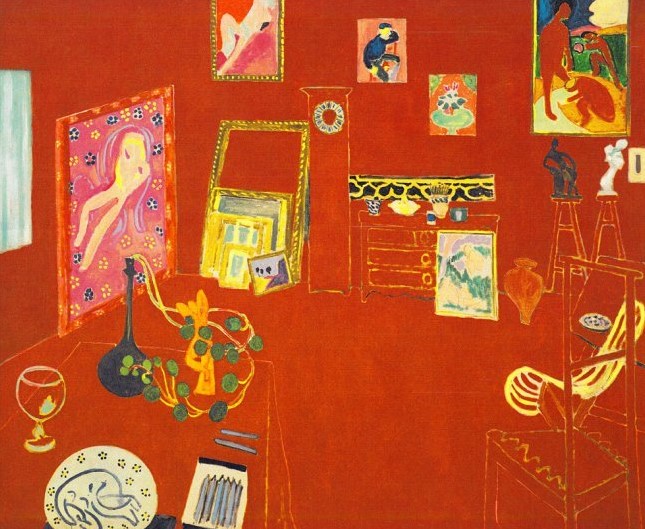
A S Byatt discusses Henri Matisse’s ‘The Red Studio’
In this discussion A S Byatt describes her fascination and admiration for the paintings of Henri Matisse and in particular ‘The Red Studio’. She describes how every aspect of the composition from its collection of objects, how they are described and painted the colours used has been carefully considered. Everything is where it is supposed to be, its form, its perspective and their relationship to each other and the spaces between the objects. The eye can wander around and through the studio. The red colour carefully chosen exudes a feeling of warmth.
It strikes me that Western art had been stuck within the confines of perspective, whether linear or atmospheric, since its inception. The artist has always had the challenge of facing a two dimensional plane and attempting to convey a three dimensional view. Cubism took this challenge further by suggesting that the view of an object is seen from different viewpoints as our eyes move across it. We can move around an object and see it from a number of perspectives and the relationship between it and other objects that are in proximity to it alter as we move around. The challenge was to dissect the subject and present it viewpoint by viewpoint presenting a fragmented image of multiple viewpoints. The first exponents of Cubism were Georges Braque and Pablo Picasso. An example of an early cubist work is shown below.
Pablo Picasso, Girl with Mandolin, 1910, Oil on canvas, MOMA, New York
In this example the eye can move over the painting and explore the subject from different viewpoints. The colours are simplified so as not to distract from structure and form and are painted in flat slabs. Initially the paintings look confusing and challenging but by looking harder and longer they start to make sense.
Cubism developed and can be split into two distinct phases, Analytical Cubism 1908-12, and Synthetic Cubism 1912-14. The examples above are from the analytical cubism period. Synthetic Cubism developed as artists started adding more texture and pattern to their paintings and also started experimenting with collage. An example of Synthetic cubism is shown below.
Bottle of Vieux Marc, Glass, Guitar and Newspaper 1913 by Pablo Picasso 1881-1973
Synthetic Cubism swept away the last traces of illusion of a three dimensional space by flattening out the image. Synthetic Cubism painting often included the use of collaged real elements, papier collie, a French term which translates as pasted paper. A further example of this is Juan Gris’s, The Sunblind, shown below.
The Sunblind 1914 by Juan Gris
Cubism opened the way for many later abstract styles such as constructivism, neo-plasticism, constructivism and Automatism (example below).
Dove 1927 by Max Ernst 1891-1976
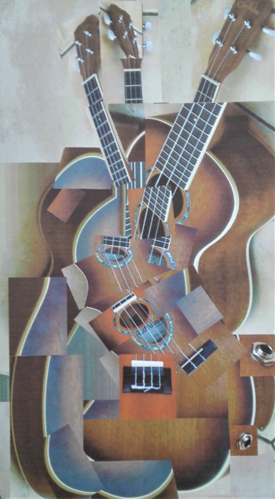
As a conclusion to this blog I have reproduced a photograph cut up that I produced as part of my work during the ‘Concepts in Practice’ course.
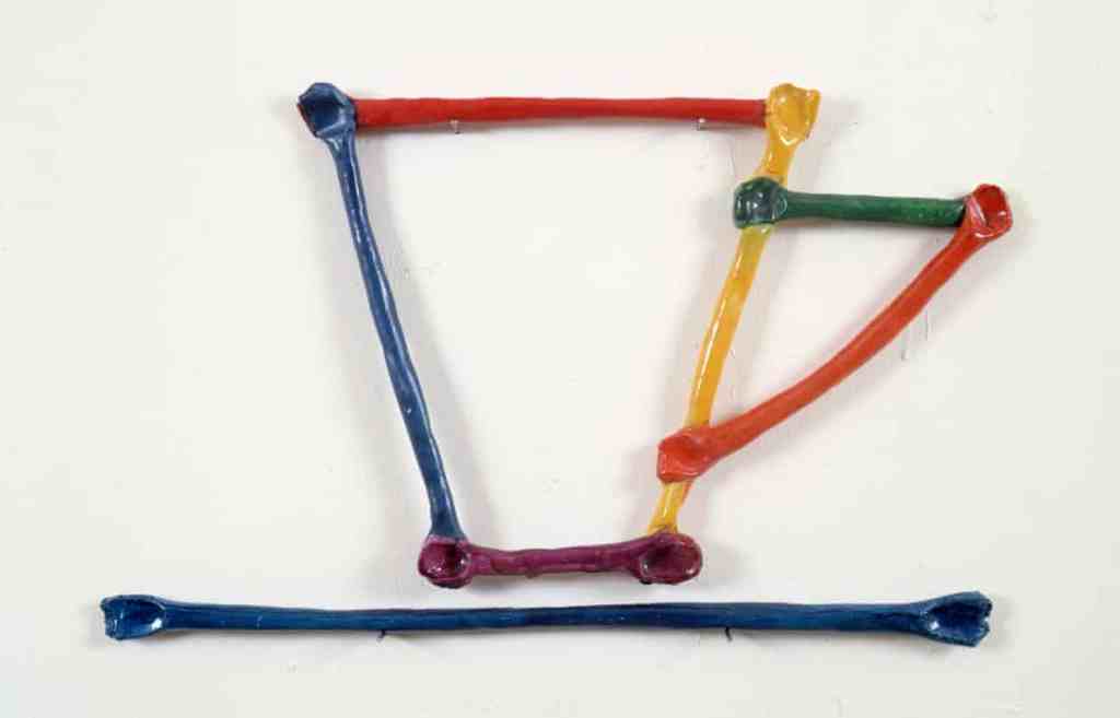
Whilst reading, researching and thinking about the exercises that I have recently completed I made some comparisons with my work to the suggested artists. Firstly Mary Heilmann, whose work looks fairly simple on first look but on close observation reveals perspective, line and colour. An example of this is her ‘Cup drawing, 1983’ where the object has been shown flat against a white background and reduced to seven coloured lines using oil on ceramic. The raised aspect of the ceramic creates a shadow around the lines which gives a slight indication of depth.
Mary Heilmann, Cup Drawing, 1983
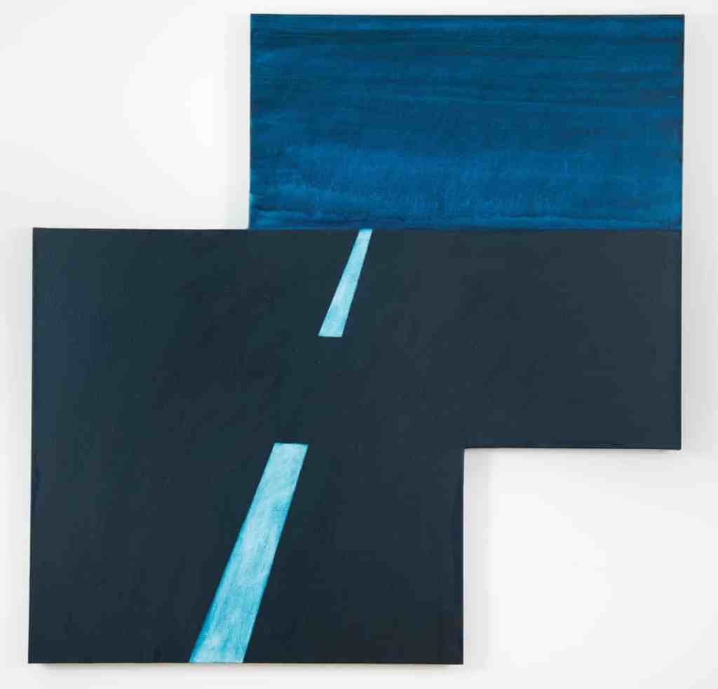
A second example ‘Maricopa Highway, 2014’, below, is deceptively simple. The broken straight line of the of the road marking forces the eye up to the horizon line. A dusky sky is portrayed by a dark blue wash where elements of light creep through. The dark blue has been echoed through from the road and the lighter blue from the road markings. The composition is further skewed by being set on two offset canvases.
Mary Heilmann, Maricopa Highway, 2014
I make comparisons between these two paintings and some aspects of my recent work. The ‘Cup drawing’ is conceptually similar to the wire maquette of a ukulele that I fashioned. ‘Maricopa Highway’ uses concepts and ideas that I explored in the blocks of coloured paper and playing with space and perspective. My works are obviously much less sophisticated.
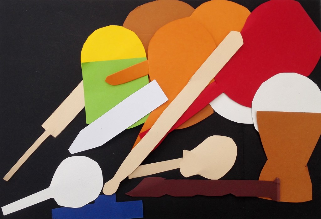
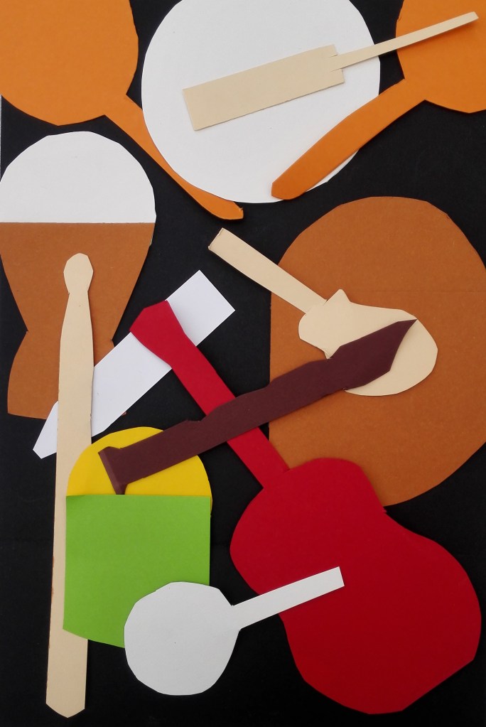
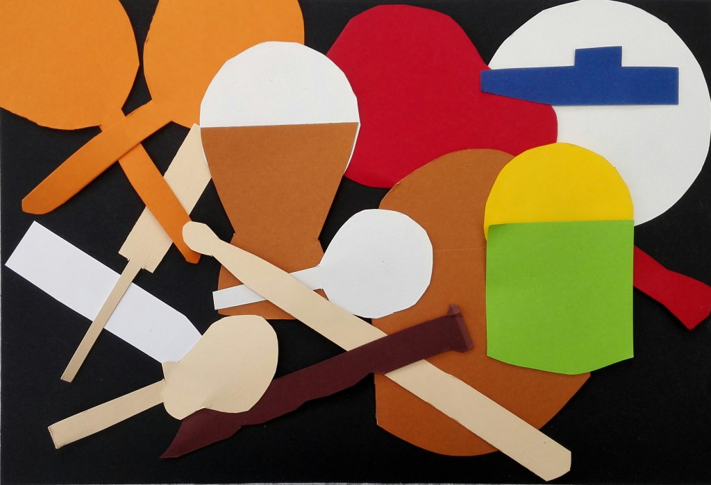
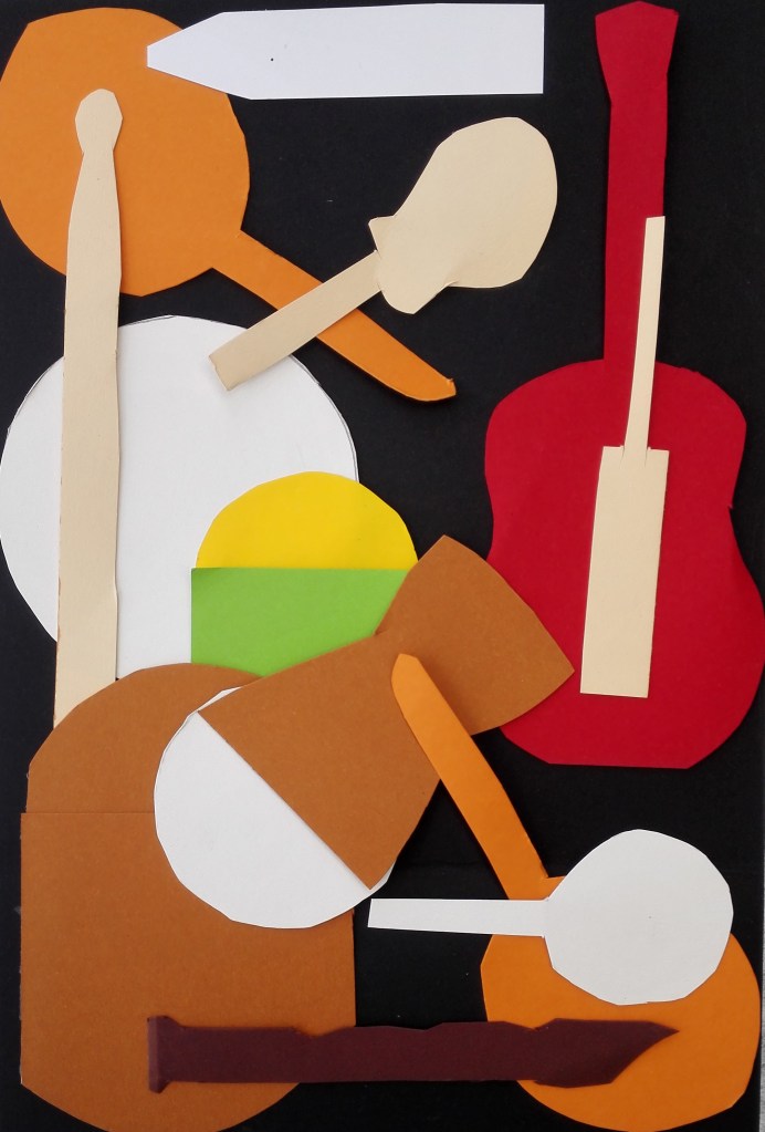
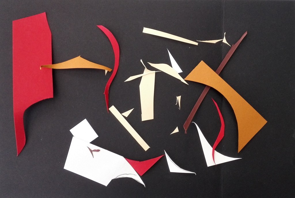
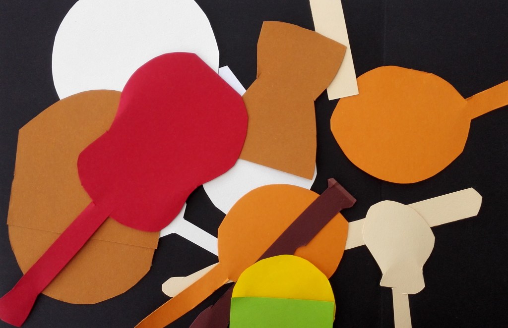
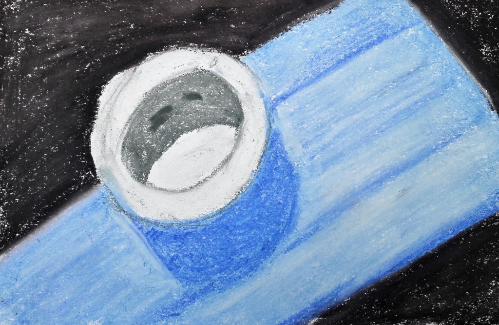
I took a slightly different approach to the creation of colour studies. rather than making the colour studies I used some thick coloured paper from which I cut shapes to match most of those that were on the table. I used black to mirror the colour of the cloth and then spent some time arranging the shapes into different compositions. The cut-out are not exactly to scale but approximately keep a similar relationship to each other. Apart from the two drums, where I have included both the top and side of the drums, The shapes are created as simple shapes. My first attempt was to arrange the cut outs in a similar layout as the objects on the table.
1. As Display
With this arrangement the cut-outs appear to be more cluttered than the actual display. The space around them has been reduced due to their flattening out. The three dimensions of the objects has been reduced to two and therefore one dimension of space has been taken away.
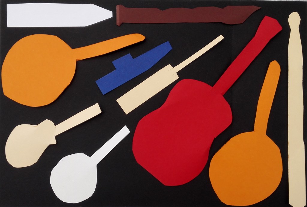
2. Portrait
With this arrangement I looked to place the cut-outs in a manner that would not be possible with the objects themselves. Either on top of each other or spilling over the edge. I did similar with the next arrangement which is in a landscape format.
3. Landscape
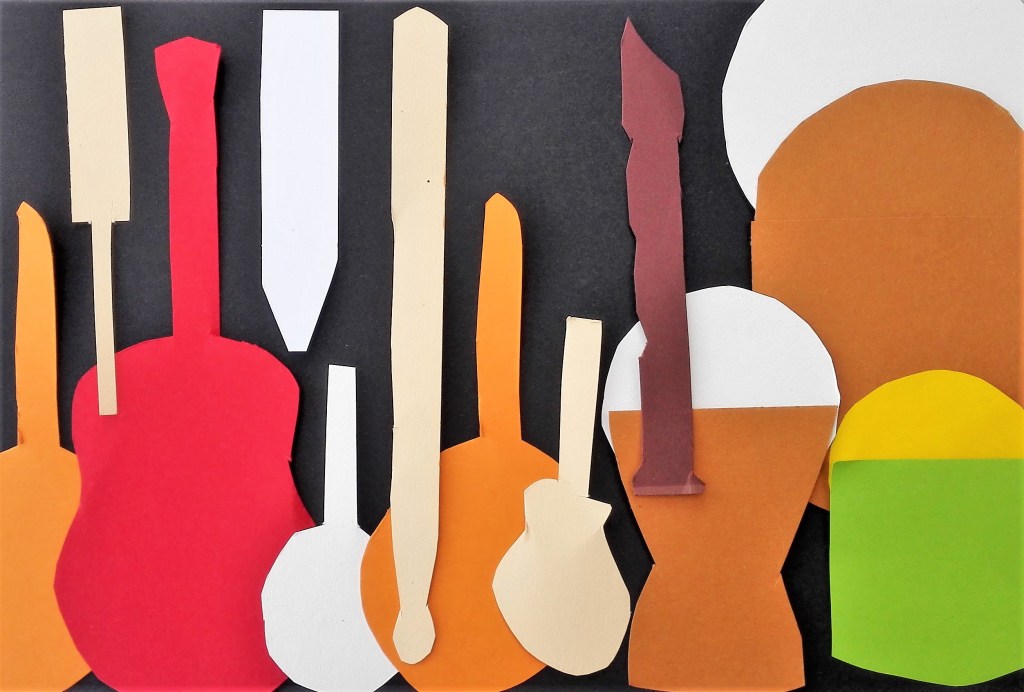
For the next arrangement I returned to the Portrait format. This time my aim was to keep all the cut-outs within the confines of the composition, nothing spilling outside the edges.
4. Portrait 2
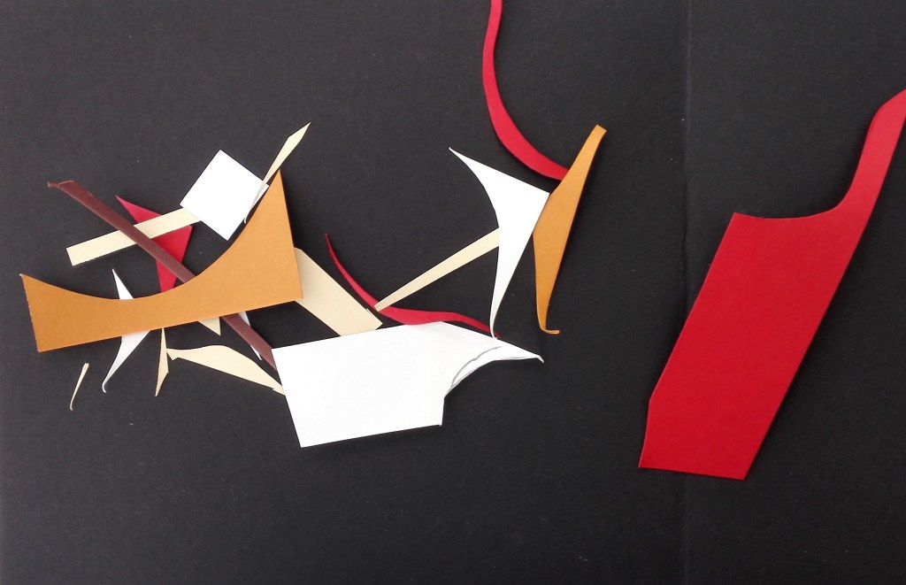
Thinking about other ways to display the cut-outs I arranged them in a regimented line up. This necessitated having to have overlaps.
5. In a line
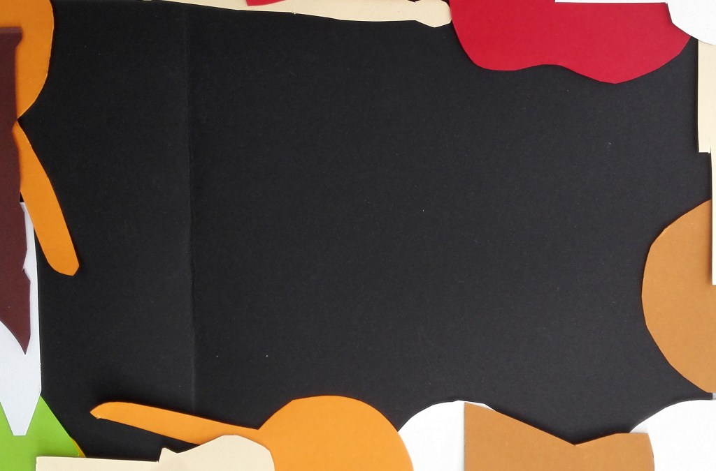
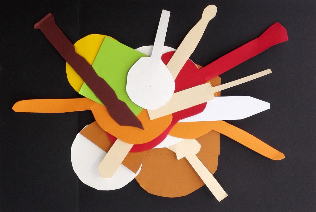
Next was to move the objects to the edge and create a composition whereby the cut-outs were mostly outside the edge. This was followed up by grouping and overlapping them all in the centre.
6. At the edge
7. In the centre
The cut-outs at this stage seemed to have taken on their own life and appeared to me to have a cartoon existence. I could imagine a time-lapse film whereby they marched across the screen forming different patterns amongst themselves.
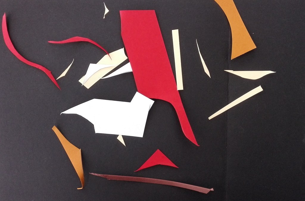
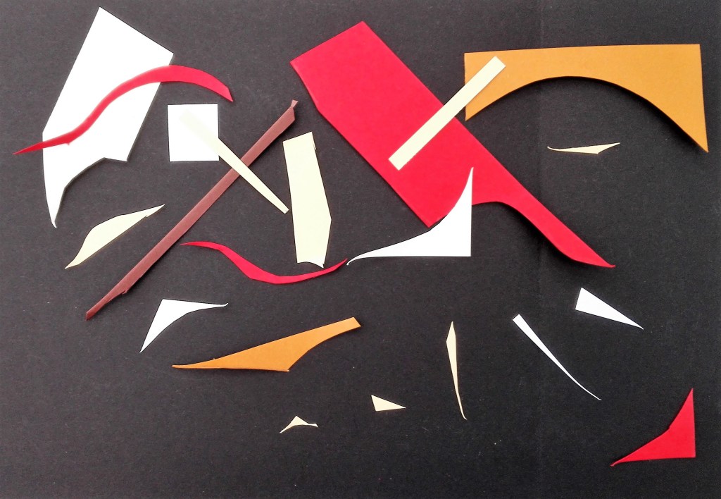
Having, for the time, reached an end point I noticed the remnants from the cut-out process. The discarded pieces of coloured paper. I used these to create three compositions where I dropped the remnants onto the surface in a random manner. The three compositions are shown below. These have some interest but I feel that it is more to do with the shapes and colours than it is do with any representational look.
8. 9. & 10. Remnants
I hadn’t previously considered randomly dropping the cut-outs and now set about doing this. I feel that this process didn’t work and there is no cohesion in the resultant images.
11. & 12. Dropped
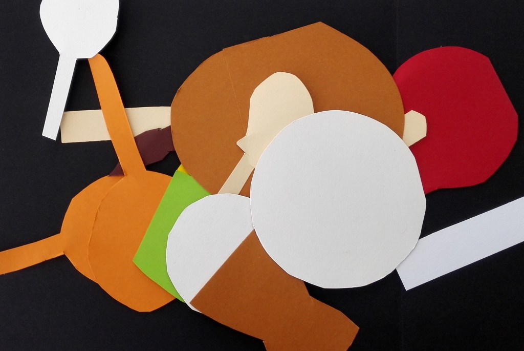
How would someone else respond to the challenge of making a composition from the cut-outs? To this end I asked Marian to arrange the cut-outs in a manner that pleased her. She came up with the arrangement below and also gave it a name, Musical direction. It was interesting to learn that the cut-outs were seen to represent the objects that they were based on. It was also interesting to note that the cut-outs had been arranged separately from each other, no overlaps. I had moved away from this and had begun to see them and shapes and colours with which to create patterns.
13. Marian’s musical direction
For the last composition I returned to the remnants and this time made a considered arrangement.
14. Remnants arranged
Final thoughts. The experimentation that I have worked through in exercises 1.0, 1.1 & 1.2 has reconnected me to trying to look at objects and views and to consider different ways of representing them. In some ways it is a repeat of some of the work that I carried out during the early part of the ‘Concepts in Practice’ course that I successfully completed in December 2019. I note that the next research points look at Cubism and Henri Matisse it will again be interesting to re-engage with these. I have an urge to move my practice further away from representational work and take these opportunities to explore different ways of working as a way in.
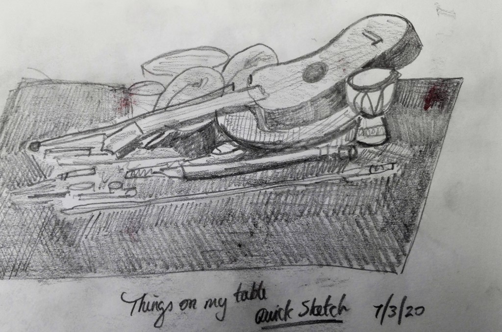
I made one quick sketch of the display, due to the cluster of objects it was quite confusing to draw. I would need more time to pick out the detailed relationships, colours, contours and lines to make a coherent depiction of the arrangement.
The objects have been on the table for a few days now, see photographs above. I have got used to how I have placed them and pleased with how they relate to each other and as a whole. The display has been commented on by others. One comment was, oh I like that. I investigated further as to why and received the reply that there was a coherence to it. There was also a suggestion that the orientation of the recorder and the paper model of the recorder could be switched, I tried this out, and agreed with the suggestion which is now how the arrangement looks. Additionally one specific object, the swivel drum, was picked out as having interest in how the striking bits looked animated. On a further separate occasion my son, who was visiting picked up, without asking, the aforementioned swivel drum and started playing with it. Fortunately he didn’t disturb anything else on the display so it could be placed back in the arrangement. However even if he had of moved other objects I already had sufficient photographs to be able to reassemble.
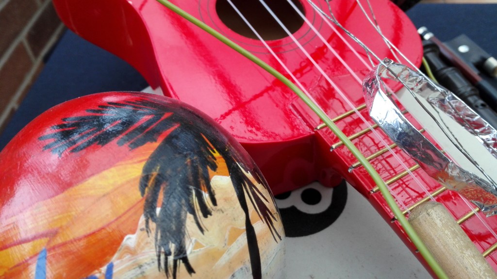
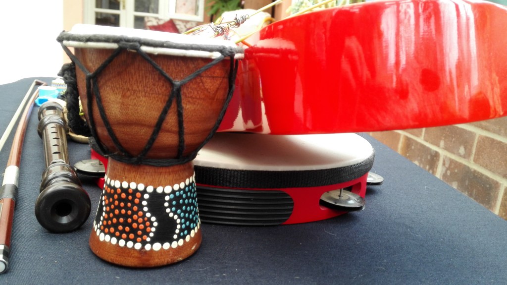
As mentioned I had already photographed the table from several angles and viewpoints and had also discussed the relationship with the edge of the table in my previous blog for Exercise 1.0. I decided to explore the internal relationships in a bit more detail with the emphasis on the special relationships between the objects that were close, on top and under each other. This involved looking from some previously unexplored views. I took a series of photographs which are reproduced below. I will discuss my thoughts on these below.
Close Ups
Photograph 1, it looks cluttered, not much space and little if any relationship between the objects of which none are seen in their entirety.
Photograph 2, similar to photograph one, cluttered but in this one there is more symmetry. The lines are all moving in the same direction including the strings on the Ukulele.
Photograph 3, this explores further the symmetry in the lines of the objects as the display approaches its tail.
Photograph 4, four circular objects in close proximity. The objects with rounded edges were deliberately placed near to or on top of each other.
Photograph 5, There is little to be gleaned from this. A mixture of shapes, colours that have very little relationship to each other.
Photograph 6. This angle explored how the height of the display has been built up with objects placed on top of each other and sloped downwards.
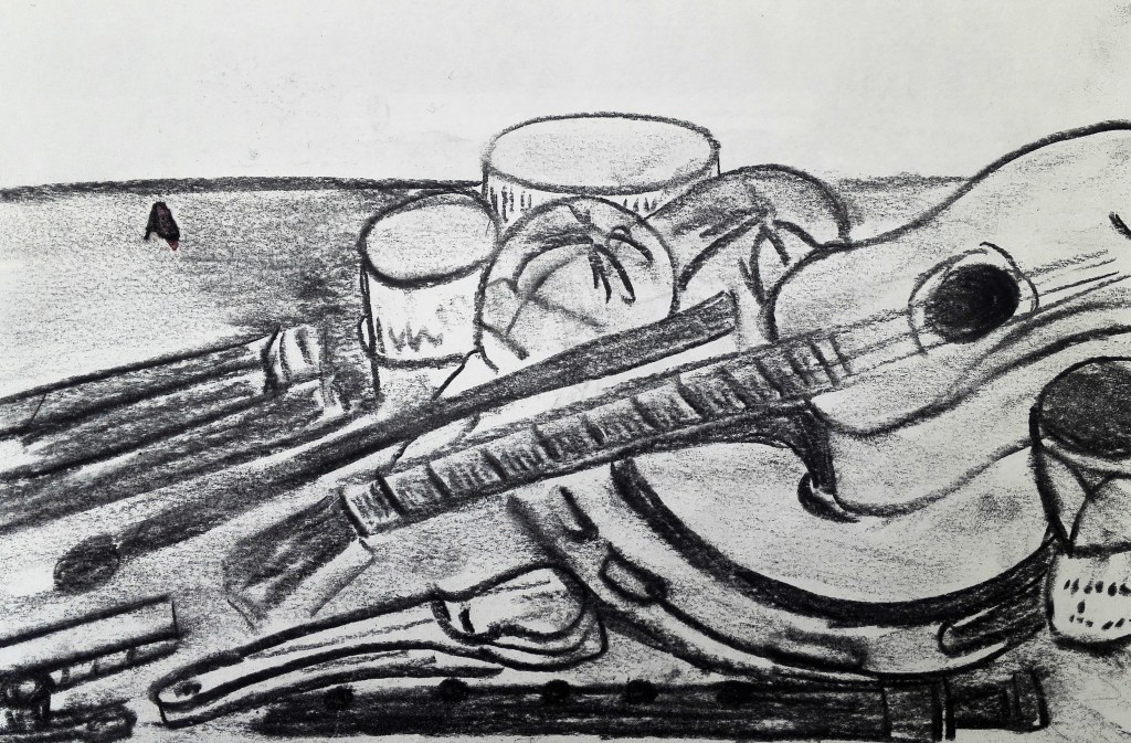
I made six sketches, three in black and white and three in colour. These were more detailed. In them I looked to examine different aspects of the display. All the sketches were drawn quite quickly as I wanted to try to capture my intuitive responses.
The first examines the whole display. Here I was trying to make sense of the whole arrangement and the relationship of the objects to each other.
Observational Study 1
For the second sketch I focused in on the tail end of the display where the straight and longer items converge. As much as the objects themselves I was looking at the negative spaces in between them, this is highlighted by the black cloth.
Observational Study 2
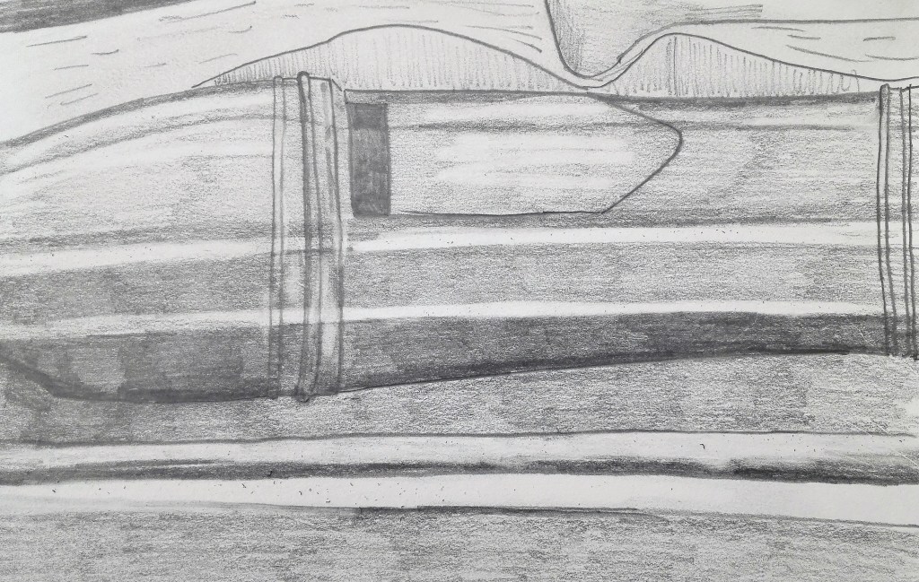
For the third sketch I focused in closely on a part of the recorder. for this sketch I was looking to bring out the tonal aspects. When I look at this sketch now I note that I should have made more emphasis of the darkness of the cloth.
Observational Study 3
For the forth sketch I moved to colour and picked out a close study of the blue kazoo. I was also interested in the subtle tonal changes on the plastic surface and tried to capture these too.
Observational Study 4
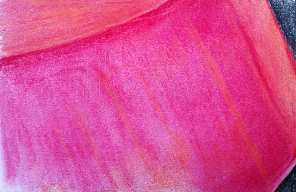
The fifth sketch focuses on the back of the Red Ukulele and the way the light is reflected on its surface. I didn’t have a red of similar intensity as the ukulele. however by adding orange and rubbing the red I was able to give an indication of the sheen.
Observational Sketch 5
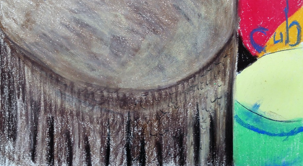
And lastly in the sixth sketch I was looking to capture the animal skin on the drum and contrast this with the lively colours of the maquette drum and the colours of the maraca.
Observational Sketch 6
Reflection on Exercise 1.1
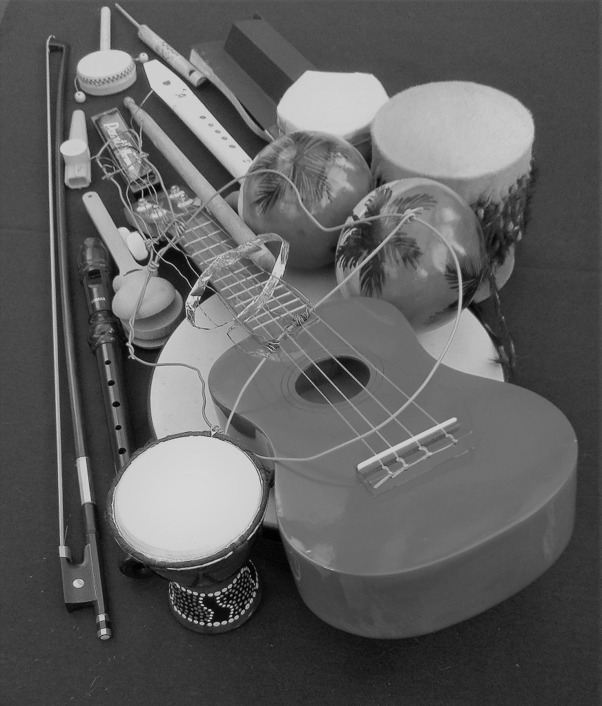
I was struck with how complicated and interlinked the objects had become. Yes it was my aim to try to make them into a coherent display and to reduce their appearance away from what the viewer knows them to be. In doing so I wanted to try to suggest an alternative view. It was when I began to observe the arrangement closely that I realised how entangled the objects had become and that it was now difficult to separate them. This was very apparent when attempting to draw the whole thing. There were so many different angles, lines, perspectives, foreshortening and tonal variations that it would be a difficult task to replicate the arrangement in a representational drawing. The most pleasing images were the photographs, in particular, the black and white ones. These took the focus away from the colours and made the eye concentrate on both the form of the objects, their relationship to each other and to the whole arrangement.
A final observation came to me when writing this review and that was that the maquette ukulele that I had made out of wire doesn’t feature prominently in either the photographs or the sketches. It is as if it becomes unseen but when looking at the whole display. I do feel that it helps to hold it the whole together and is an integral part of the arrangement.
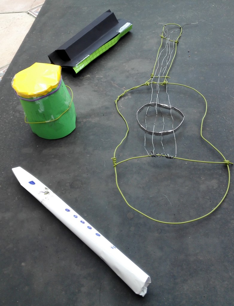
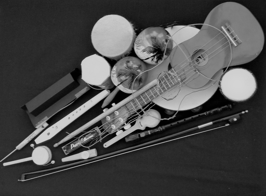
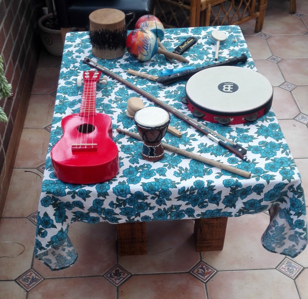
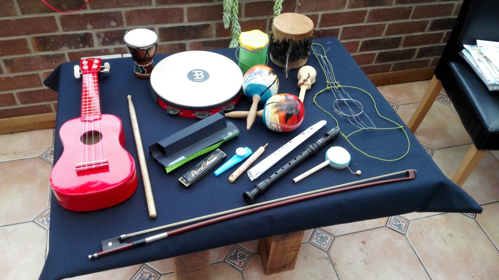
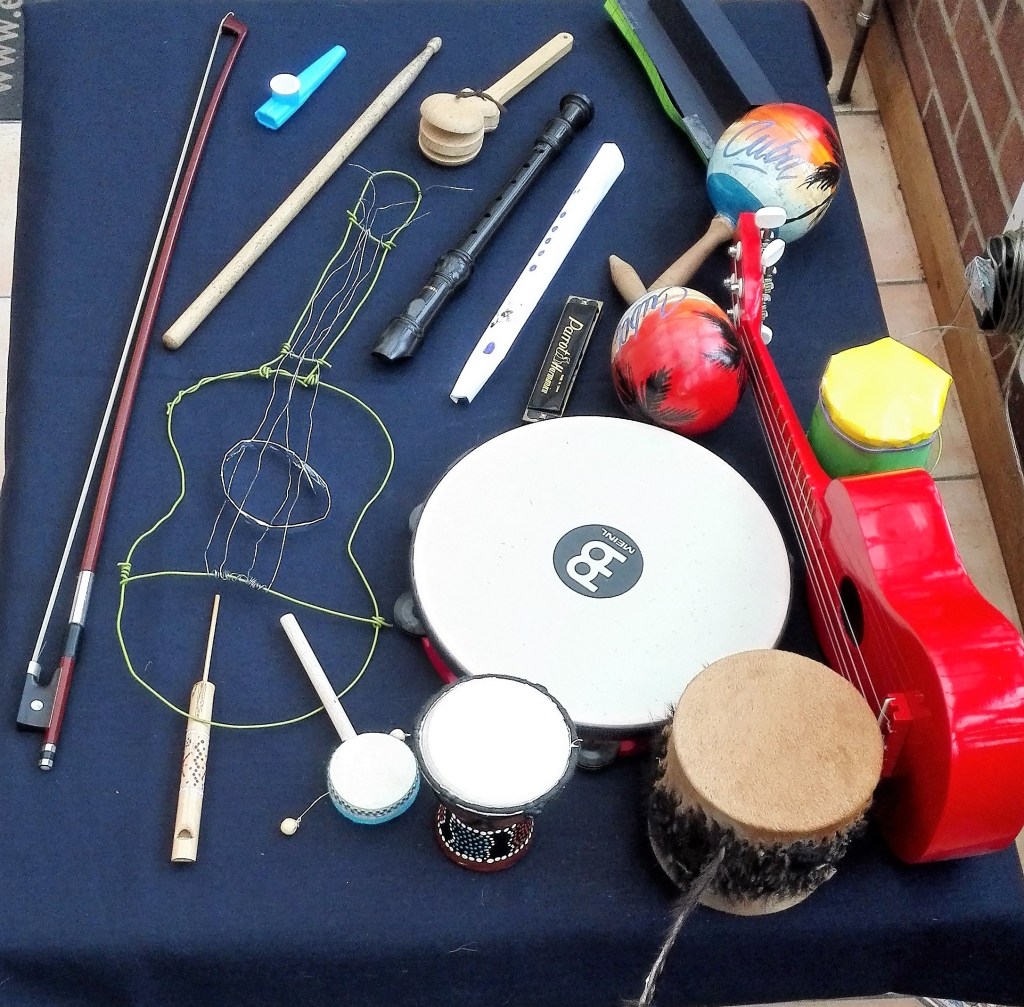
My first thought, and the one that I went with, was to make use of to make use of the various peripheral musical instruments that I have. The ones that I chose are those that I do not expect to use over the coming weeks. In fact most of them are never used. When I think about what unites them, their common language, is that predominantly they tend to be wooden objects that are either blown or hit. The choice of using these is an easy one for me but it is also one that will hold my interest due to my love of music and music making. I wonder whether I should also add guitars and ukuleles but refrain from doing so as these would be too big for the temporary table that I have constructed in my “studio”. This is in fact our conservatory but it is where I carry out most of my artwork. There is a table but this is usually cluttered with my day to day stuff, laptop, OCA course book, notepad, ipad, pens, mobile, magazines and other paraphernalia. There are many similarities with George Perec’s description with objects on his work-table. I guess that this is the same for millions of work-spaces. My work-table was de-cluttered as part of the preparation for part two and I did consider using it. As I write this blog it is fast accumulating more stuff and will continue to do so until the next tidy up session.
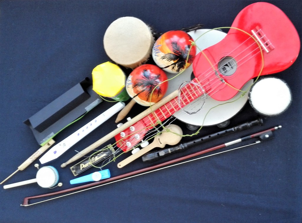
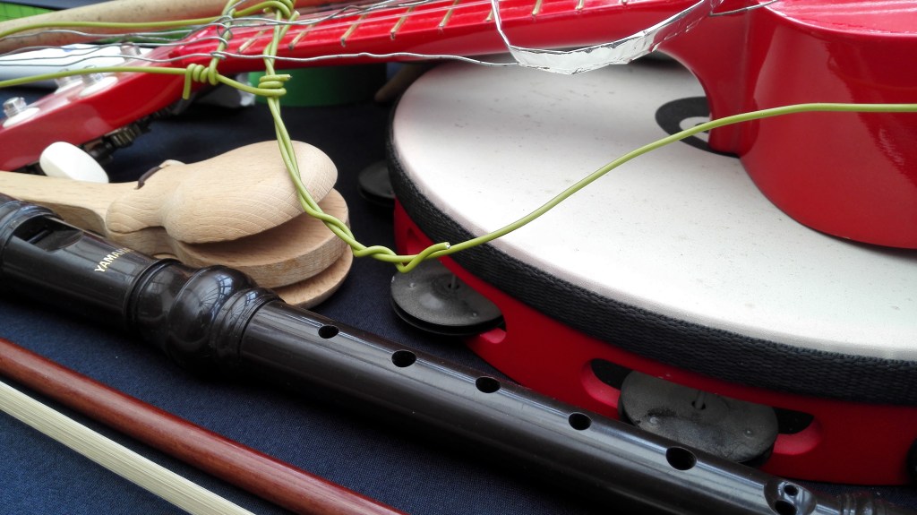
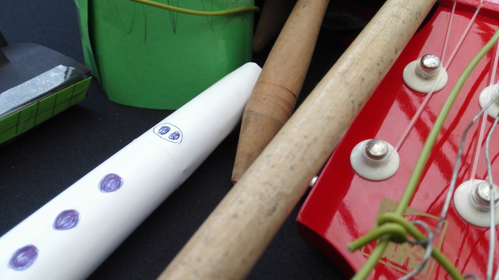
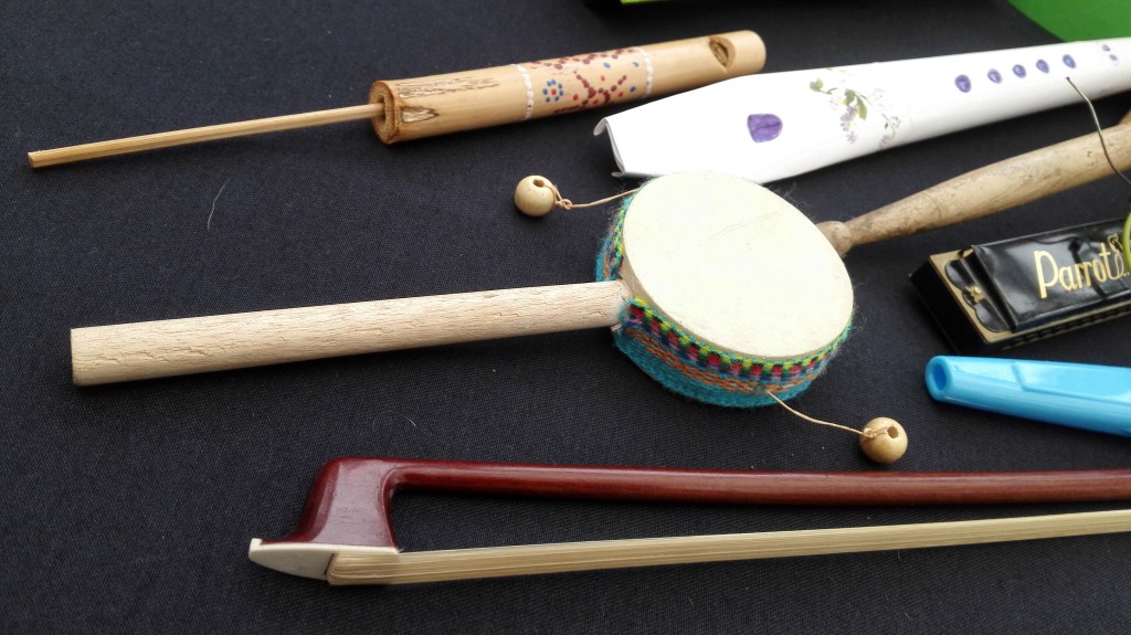
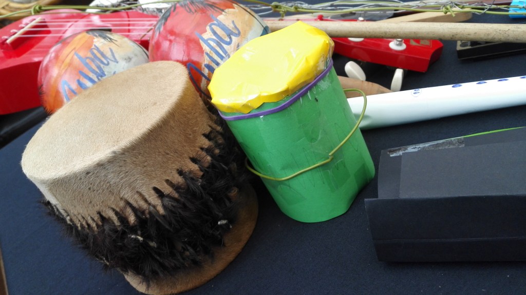
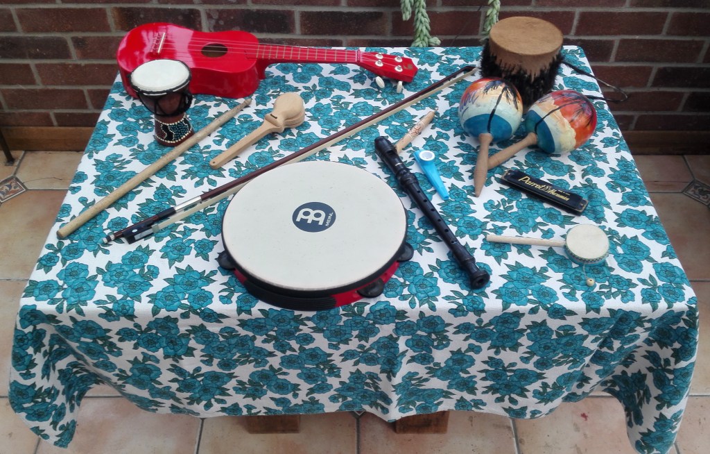
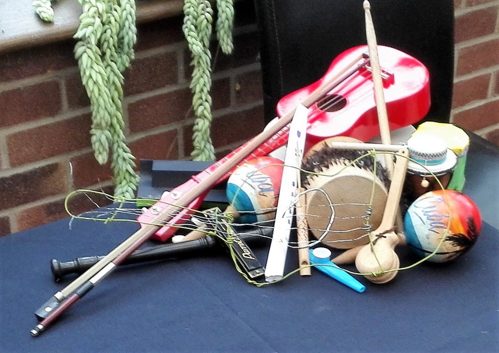
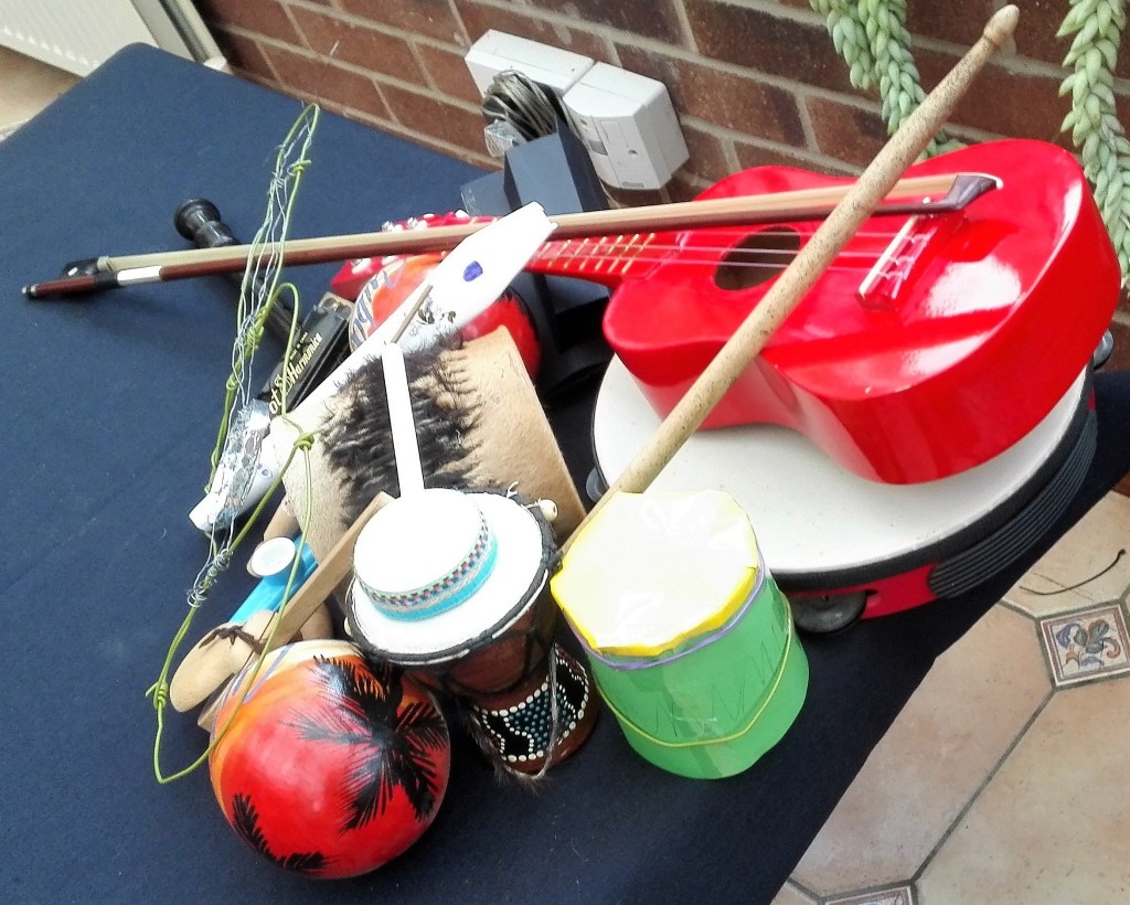
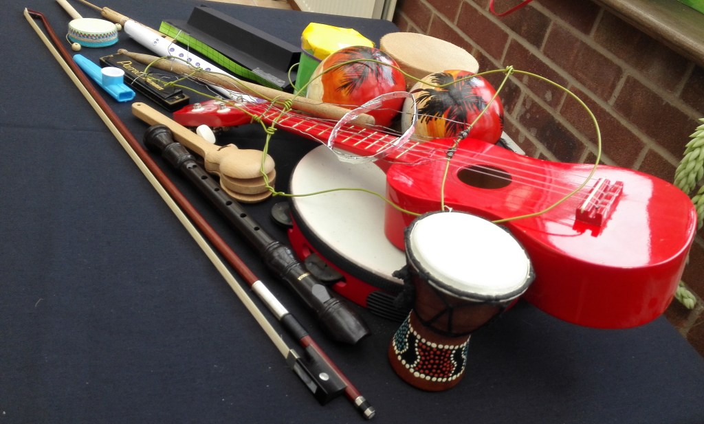
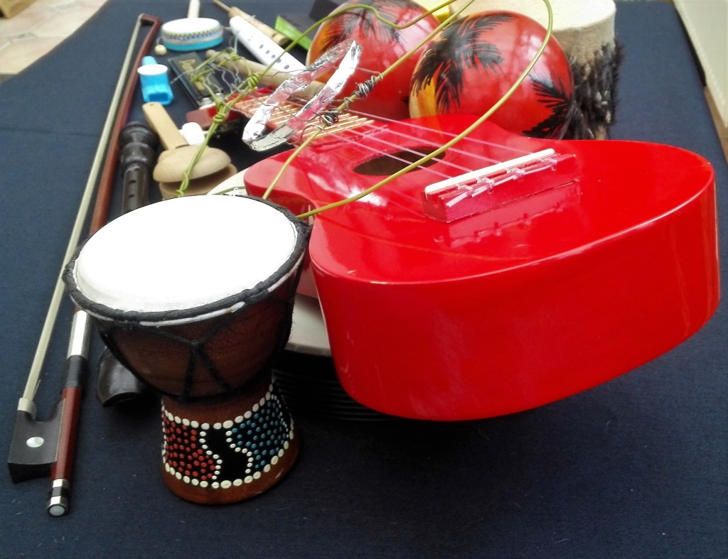
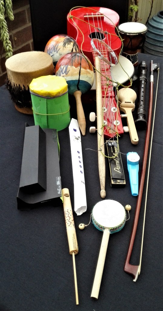
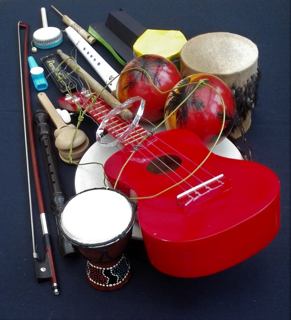
Back to the collection of objects for the table the so far I have:
A tambourine, maracas, a violin bow, a harmonica, a kazoo, a drum stick, a red (toy) ukulele, a small African drum, a whistle, Spanish clackers, Morrocan swivel drum, an African bongo and a recorder.
Some photographs.
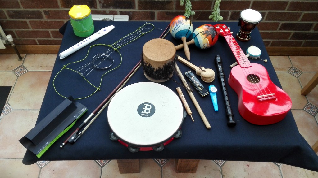
I have already noted that the pattern on the tablecloth for the table top is distracting. It will be changed.
Make
I made an list of actions in my note book inspired by Richard Serras’ ‘Verb list’
My Verb-list
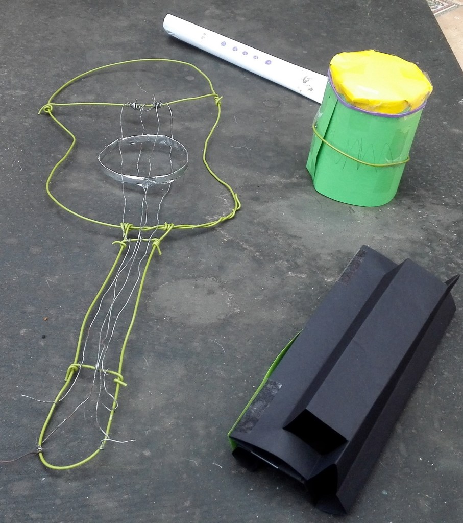
Next step creating some maquettes, not a word that I had come across before. Using paper, sellotape, elastic bands and wire I fashioned four models to add to the collection. These are photographed before being added to the table collection. The most interesting piece is the wire ukulele, it is very primitive in look but has a bizarre charm. The paper recorder or flute also has merits the harmonica less so.
Maguettes
Arrange
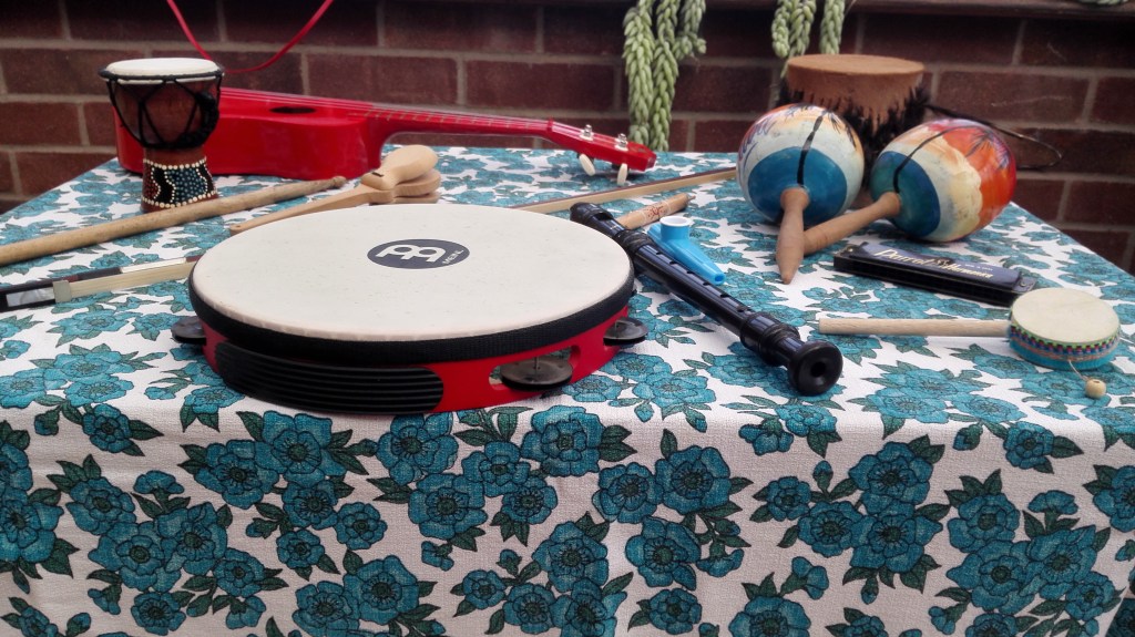
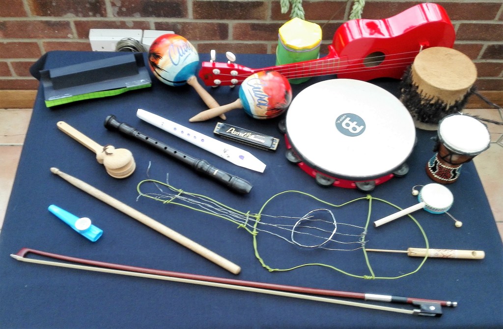
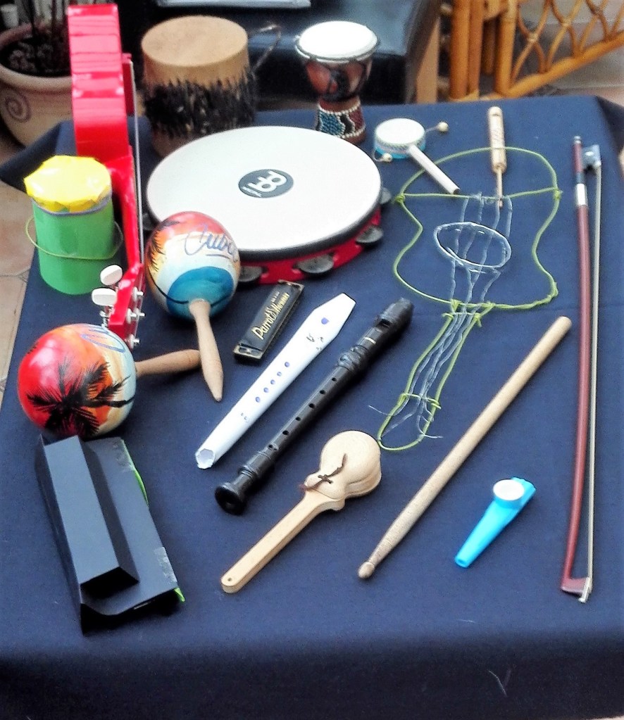
I made a couple of arrangements where I placed the objects on the table without too much consideration as to their relationship with each other or their shapes and colours. The main consideration was fitting them all on the surface.
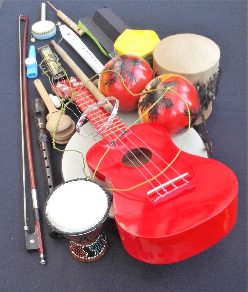
Having read Declan Long’s article on Uri Aran’s mysterious work-tables and listened to Gabriel Orozco I set about thinking how I could look at the objects differently, how they might interlock and perhaps convey something else. Their size and shape and colours rather than their function. Note that the tablecloth has changed from the patterned cover to plain black. I feel that this helps to focus the eye on the objects.
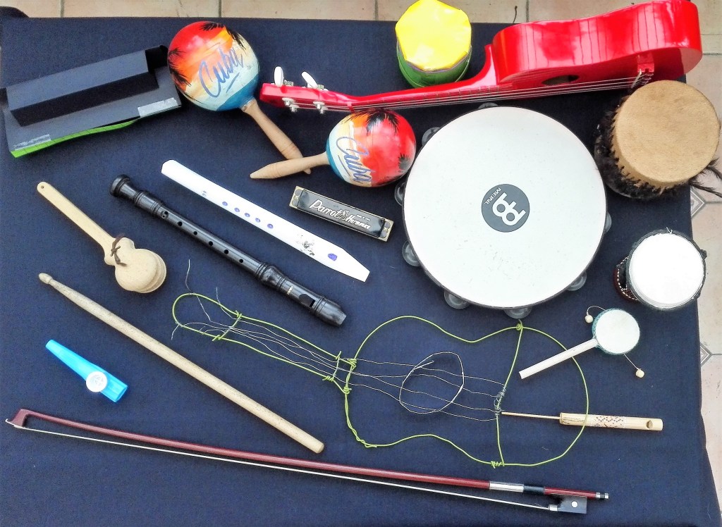
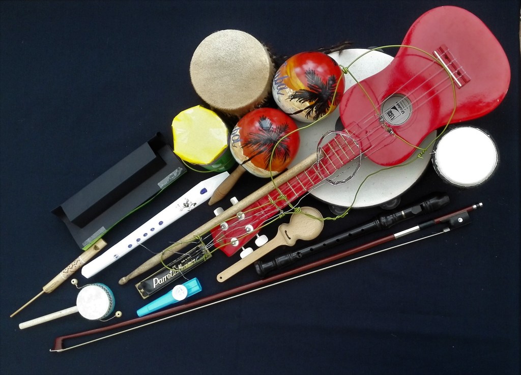
My first two attempts at some sort of considered arrangement are shown below. For the first I was looking to try to group the objects by shape and size to try to express their commonality and at the same time pick out their differences. It occurred to me that basically I had a collection of objects that were either basically round or straight, circles and lines.
Arrangement 2
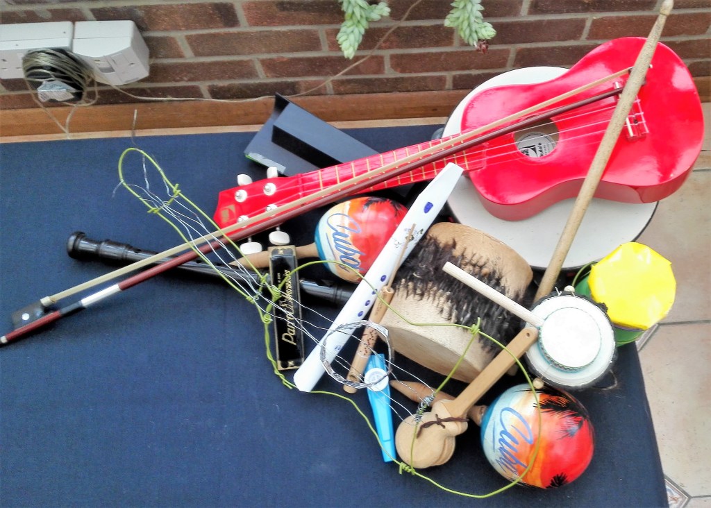
The second attempt was to look to interlock the objects by laying them on top of each other or by placing them against each other.
In both arrangements I became increasingly aware of the edge of the table. In the second arrangement I deliberately tried to extend the arrangement over the edges of the table. The limitations of the table became even more apparent when photographing the arrangements as it was not possible to get a photograph without having at least a hint of their surroundings.
Arrangement 3
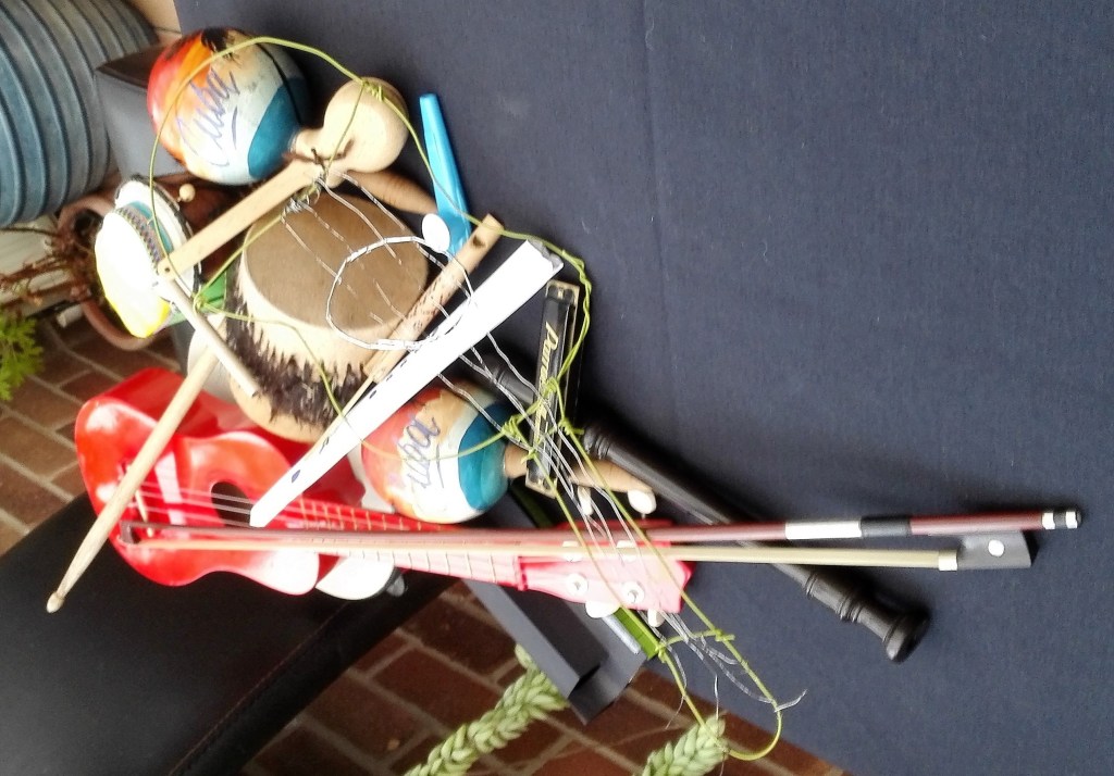
There were aspects of each arrangement that had positive points. The flow of the first vs the cluttered, claustrophobic feel of the second. I considered both by looking repeatedly at the photographs. My next and final arrangement would be to try and combine the strengths of each. To start with a cluttered arrangement which flows outwards. I would also aim to keep all the objects within the frame of the table in such a way as I could get at least one photograph that eliminated the surroundings.
The final arrangement is shown below. Firstly the arrangement from several angles and then two photographs where the surroundings have been eliminated, one from behind and the second from above.
Final arrangement
Final arrangement from behind
Final arrangement from above
It is noticeable in the photograph from above that the objects have a coherence and create their own object. From behind there is a hint of them falling away and leading into the distance.
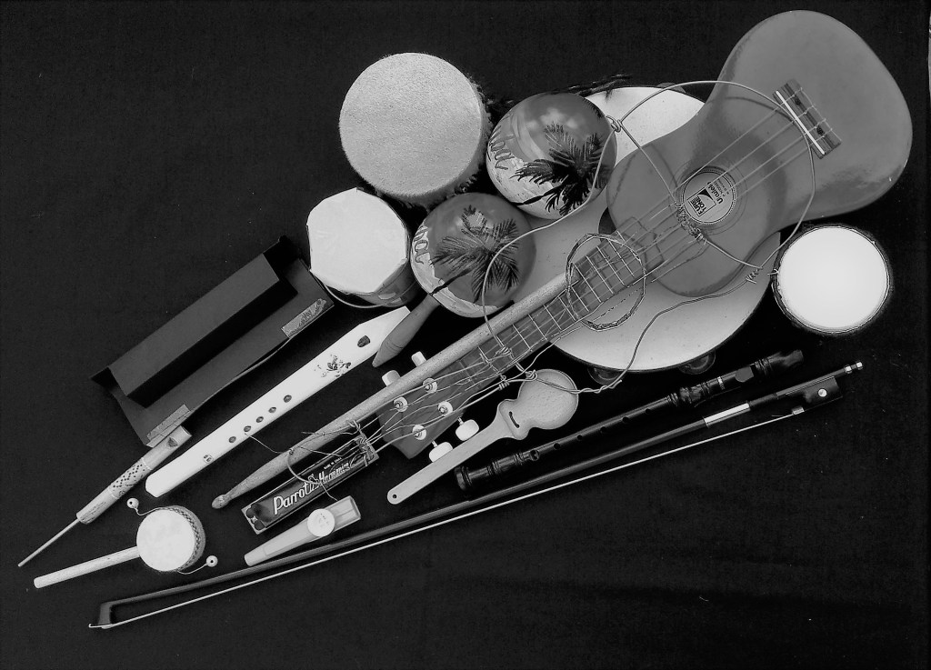
To look at the arrangement in a slightly difference way I changed the filter on the photographs to Vanilla. In doing this I was trying to focus on tone, light and shade.
Final arrangement from behind – VanillaFinal arrangement from above – Vanilla
By eliminating colour the shapes are more apparent at there is even more cohesiveness in the arrangement.
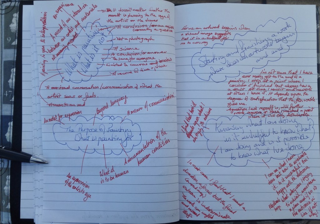
The scope of this essay was considerable, the questions asked were: What do I feel painting is and what it isn’t? The purpose of painting and what it is for? Starting and finishing a work: where does an artwork begin and end? Knowing what I am doing: Is it unhelpful to know what I’m doing and is it possible to know when I’ve done?
To set the tone a to provoke questions it was suggested that I read a text by Lee Ufan entitled ‘Robots and Painters’. This discussed how, with the ever increasing of sophistication of robotics and computer generated graphics, robots can paint. The question that arises is, Is this really painting? Or Is it the production of a predetermined result? The robot can be made to carry out precise actions beyond the most technically gifted artist. However these actions have to be given, programmed, there is no learning or critical assessment. How does the robot know what to paint? Can it have an emotional involvement in the work? In breaking down the process of painting into data the emotional connection is lost. The act of painting is, I believe, more than a series of commands. There is an interaction between the artist and his materials. To quote from the text “the art of painting belongs in a different dimension from the system of knowledge” There are not a set of rules but an infinite range of possibilities and possible outcomes”. Robots and computers only reduce the possibilities.
To try to condense my thoughts and also to structure them in such a way that I could write a coherent piece I draw up a simple mind map and proceeded to document my thoughts on each of the questions.
What do I feel painting is and what it isn’t?
In simple terms painting is a record of an interaction between artists and their materials. It doesn’t matter whether the results are pleasing to the artist or the viewer. The finished work is the result of a number of actions, thought processes and decisions. Painting is open to interpretation it is a visual conversation between the artist and the viewer. It is what the artists sees or feels.
It is not a conclusion or answer. More often than not it asks questions. It is not limited to canvas and brushes. There are many different ways that an artist can paint, many supports that can be painted on and many ways materials can be applied. Painting is not photography but can be a record of a time or place. Painting is not a science there are no rules. Painting is not the same for everyone.
The purpose of painting: what is it for?
It is a means of communication. What the artist was thinking or feeling. An outlet for expression. It is beyond language. A documentation of the human condition. A representation of the artists thoughts.
Starting and finishing a work: where does an artwork begin and end?
For me an artwork starts with an idea. This can be suggested by an image, a scene, a feeling and the desire to try to communicate this. The inspiration can be fleeting, a certain light momentarily caught, or a growing urge to convey something about what I see.
Finishing a work is always more problematic. I am not sure that I have ever really got to the end of a painting. I reach a point where I stop working on it but is this the end, is it finished? I always have a doubt. Sometimes I will revisit a work and rework sections. at other times I leave it. It depends on the level of satisfaction that the work gives me. A question I ask myself is, will further work improve it, have I reached a point where further work will only detract and the work will deteriorate? The answer to these questions is never fully resolved but at some point I stop.
Knowing what I am doing: Is it helpful to know what I am doing and what I have done?
To answer this question I have to ask myself what I was, am, trying to achieve with the work. In most cases I feel that I need a direction, a focus, a route towards what I want to communicate. The final outcome will be indeterminate and the work will unfold as I proceed. I will make decisions as the work progresses.
At some point during the process I will try to evaluate what I have done. Is it successful, what were my intentions, what was I trying to achieve? This is a feedback loop that goes round and round until I reach the point where I stop. The internal questioning is easier when I have some concept of where I was heading. This is more difficult with experimental works as the outcome is not defined. The question remains the same am I happy with the outcome if not what needs to be done.
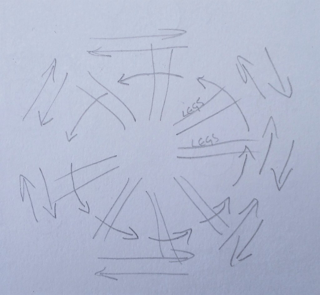
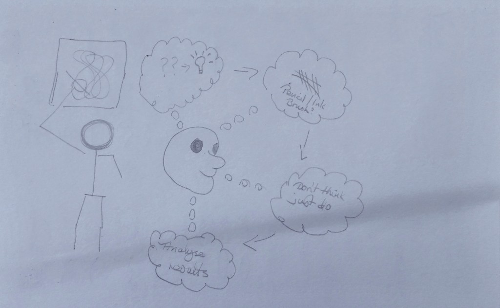
Although I had a number of ideas I struggled to get going with this exercise. I had already moved past this exercise and completed Project 4 Exercise 1.3 which I have already documented in this blog. Finally I decided to try and get my thoughts down in a diagrammatic and visual form.
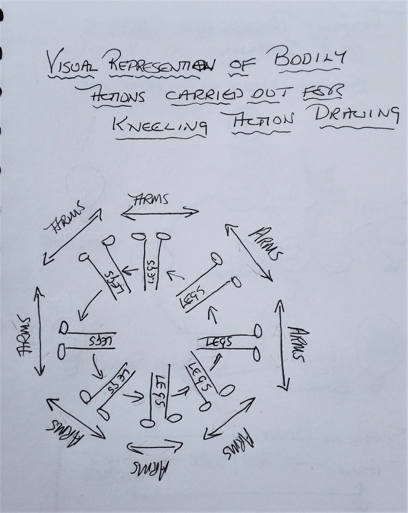
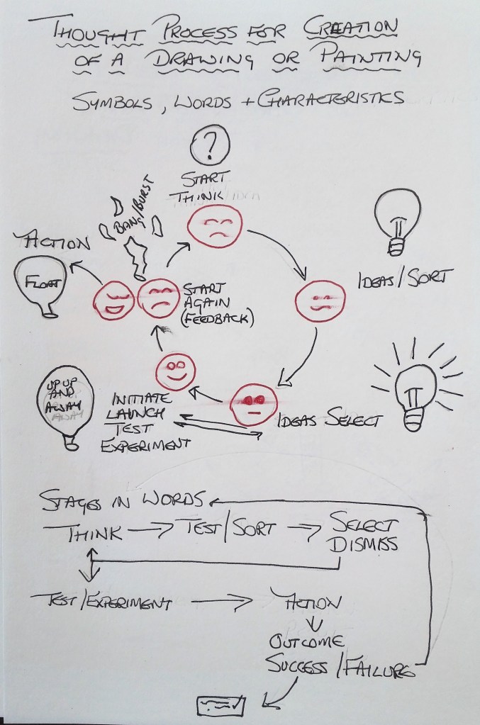
I started by thinking about the Kneeling Drawing exercise that I completed and tried to put down my actions in a diagrammatic form. By using a series of line and arrows I represented the movements of my legs and hands. Quickly following on from this I tried to show in symbol form the thought process that I usually go through when thinking about commencing a painting or drawing. Lastly I thought about the process of thinking itself and the physical act of drawing or painting.
The initial diagrammatic drawings and sketches that I produced are shown below.
Diagrams and drawing from sketchbook
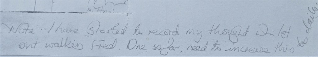
I had already taken note of the mention to record my thoughts and to the end I made a mental and physical note to regularly do this when I walk Fred, our dog.
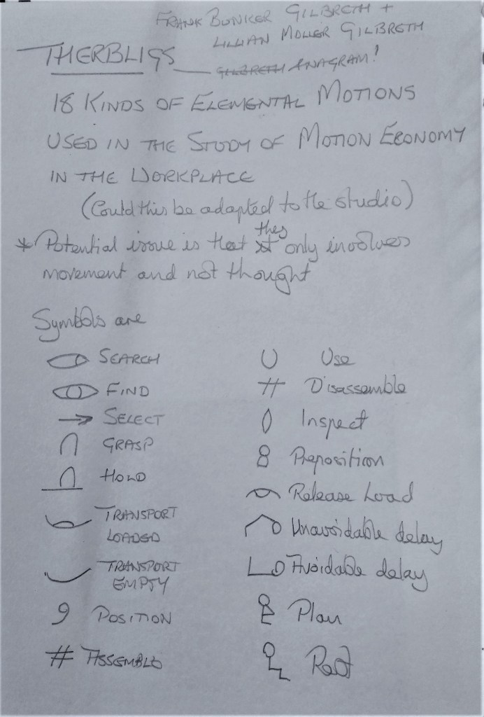
It was whilst thinking about how to record human movements that I remembered a technique called THERBLIGS. I had come across this whilst completing my Accountancy studies many years ago. It is a system developed by Frank Bunker Gilbreth & Lilian Moller Gilbreth to record movements in time and motion studies. Therblig is an anagram of Gilbreth.
I looked up Therbligs on Google and noted that it consists of 18 kinds of Elemental motions used in the study of motion economy in the workplace. I wondered whether I could adapt this to the actions used in the studio. I’m sure that it could be adapted but even if successful it would only record the physical movements of the artist and not the thought process which is equally if not more important.
Therbligs
I further developed the physical diagram for the bodily actions carried out during the kneeling drawing.
What does this tell me about the drawing or the process? It gives an idea of the how the drawing was created but not the why or any evaluation of the outcome. In this respect I find it unsatisfactory.
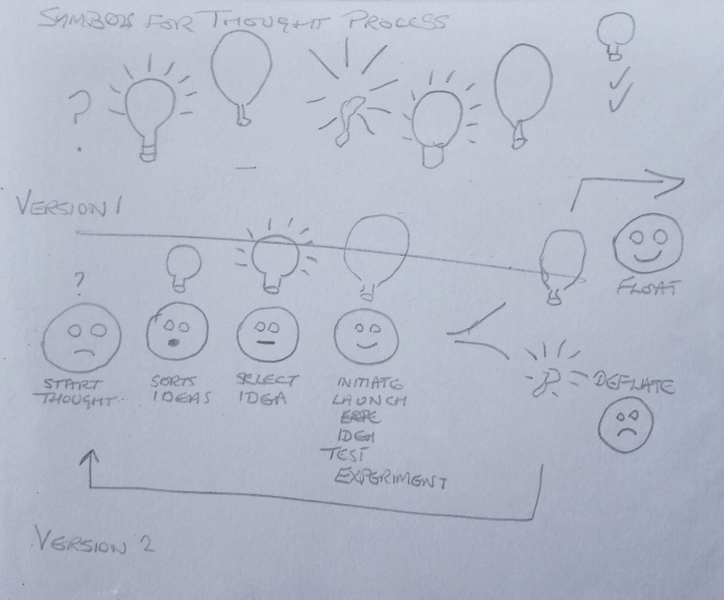
Moving onto the thought process I developed the symbols, words and facial characteristics of the process that I go through when trying to create a drawing or painting. In some cases this process is more or less instantaneous at other times it can be drawn out over days, weeks or months. The process is the same. I have represented it in the diagram below in two separate ways. In the first instance I used a combination of symbols, words and facial characteristics in a circular flow diagram and for the second I used words only.
Could this be helpful to me. In a fairly basic way I believe that it could as it could point out where I am in th2 creative process. I feel I could develop the “ideas / thought” , ” ideas / select” and “experimental” phases further. To me this is the taking of an idea through the sketchbook phase to the embarking on a final piece. I suspect that I will refer to the processes documented in the diagram in my head rather than noting them down. However I will try to use the process when reflecting on completed work. Will it give me an indication as to where the successes and failures were?
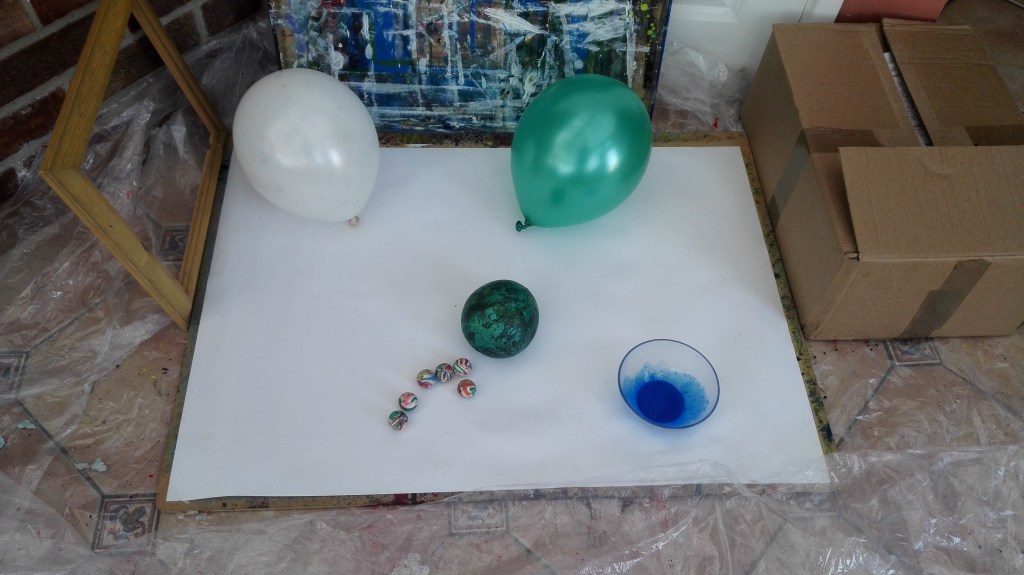
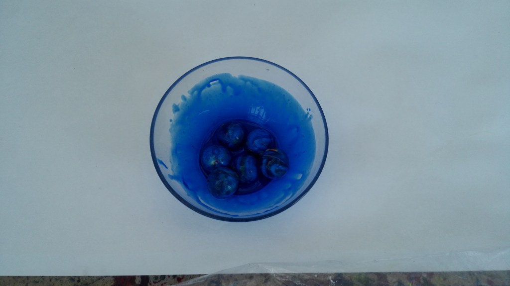
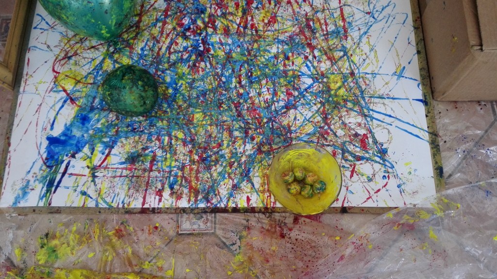
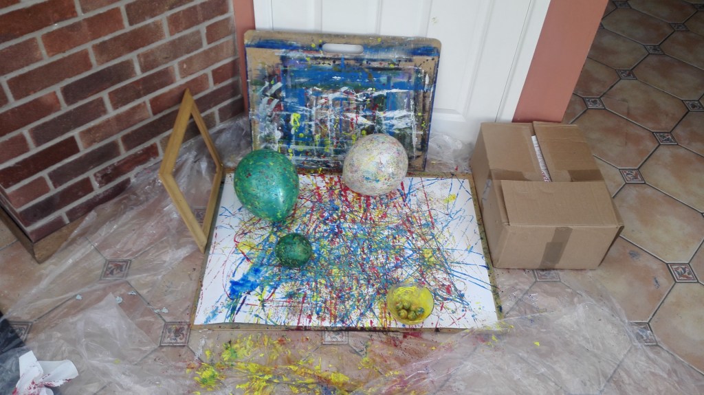
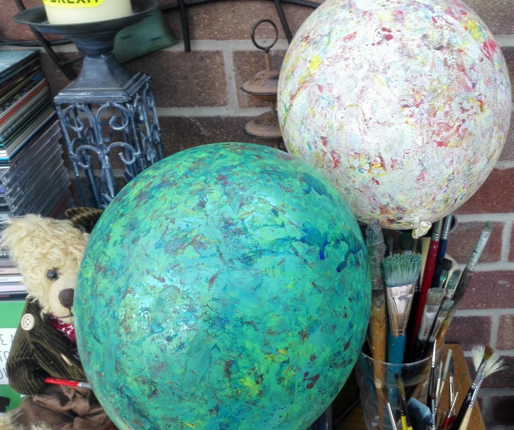
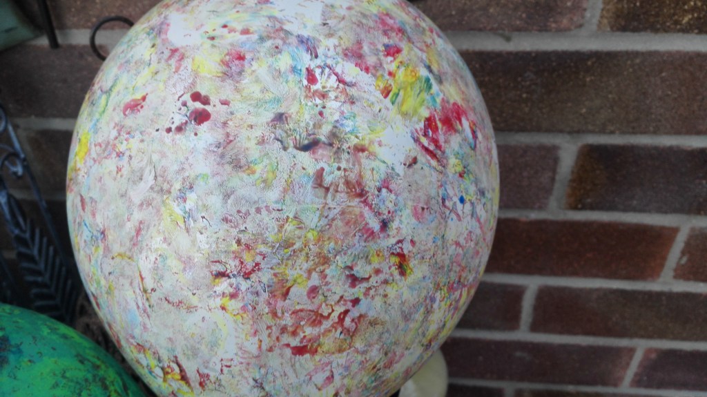
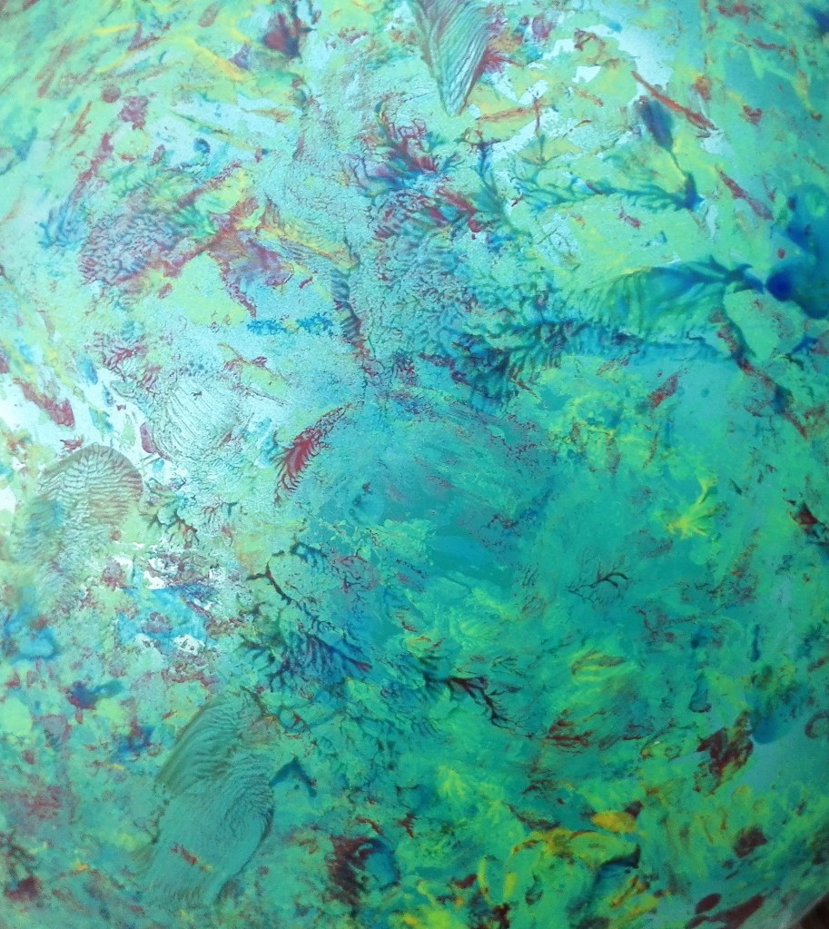
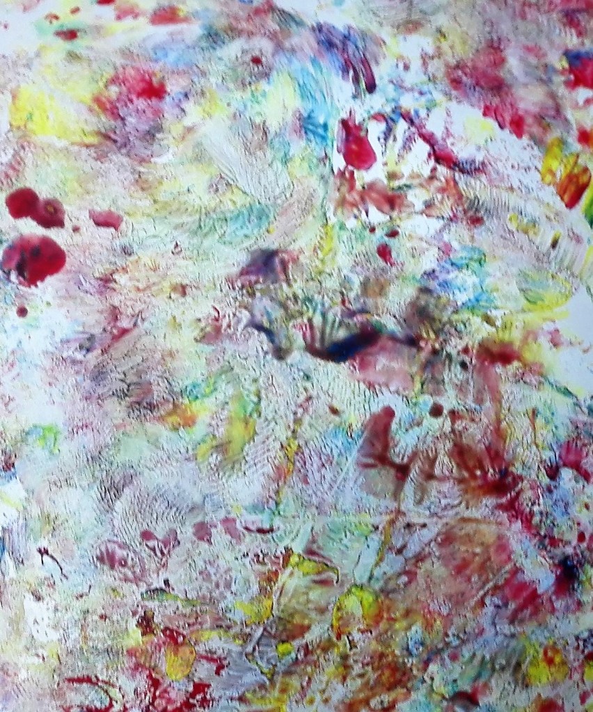
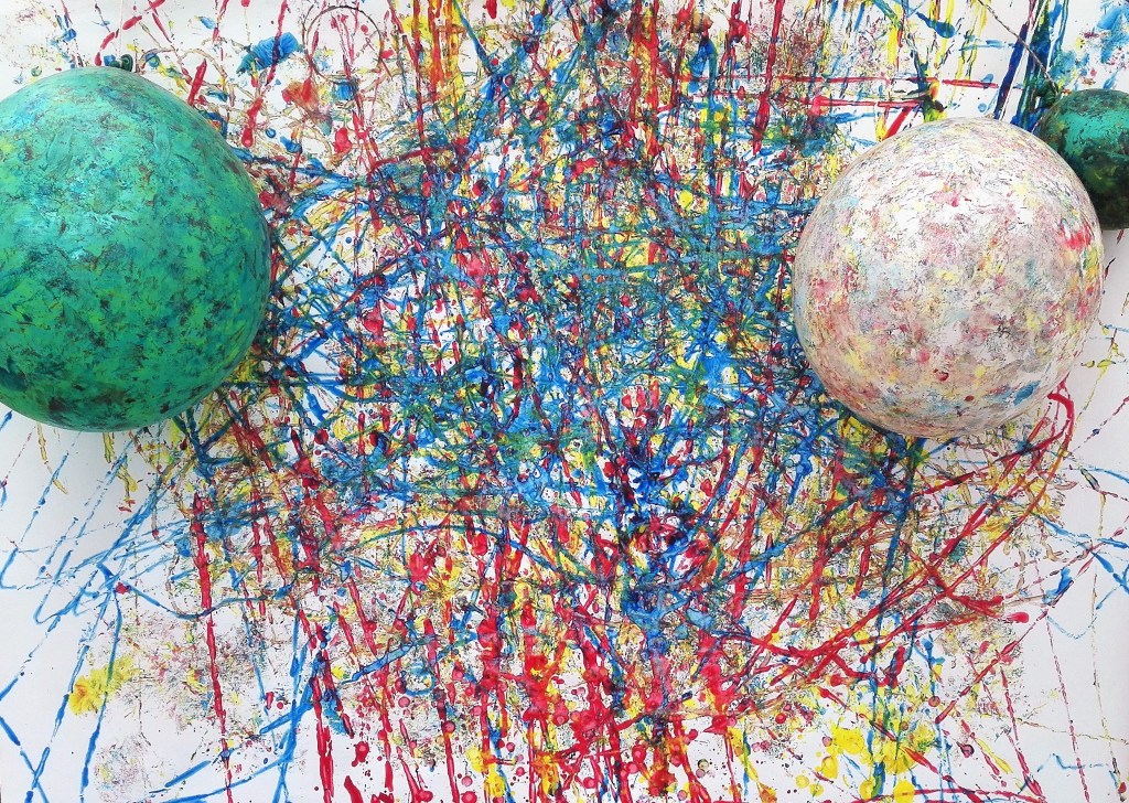
For this painting I used small bouncy balls and balloons. The ball were bounced across the support after being covered in blue, red and finally yellow acrylic paint. When this part of the painting was complete the two balloons were bounced repeatedly onto the painting, this mixed the paints on the support and created texture and drama to the marks made by the balls. An unexpected outcome was that the balloons became decorated with interesting random patterns.
The set up and a bowl of blue balls
I did think about whether I could use the balloons in the final painting and in a version of the final work I attached them to the painting.
The painting nearly complete
The effect of the paint on the balloons.
Below are two are the two versions of the painting, with and without balloons. I think that similar to the other painting in these two experiments the resultant painting has a party feeling. Whether this is a inferred connection due to the used of the balloons or how they have effected the painting in unclear to me.
Finished painting without balloonsFinished painting with balloons
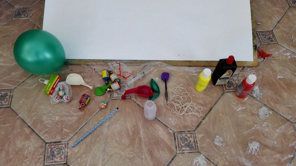
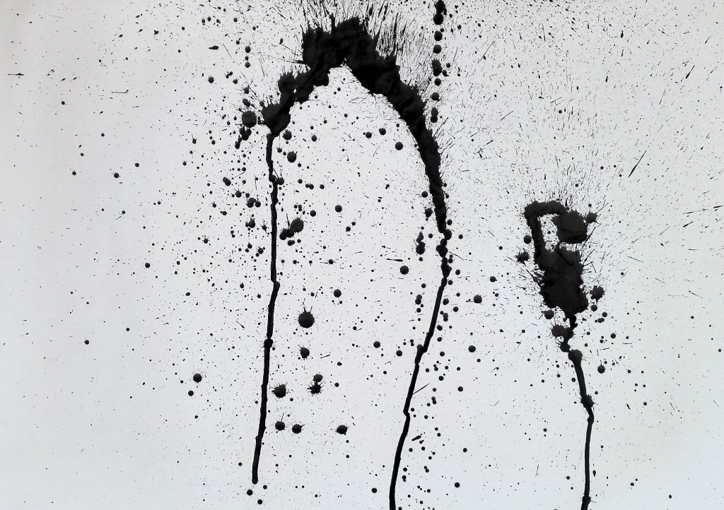
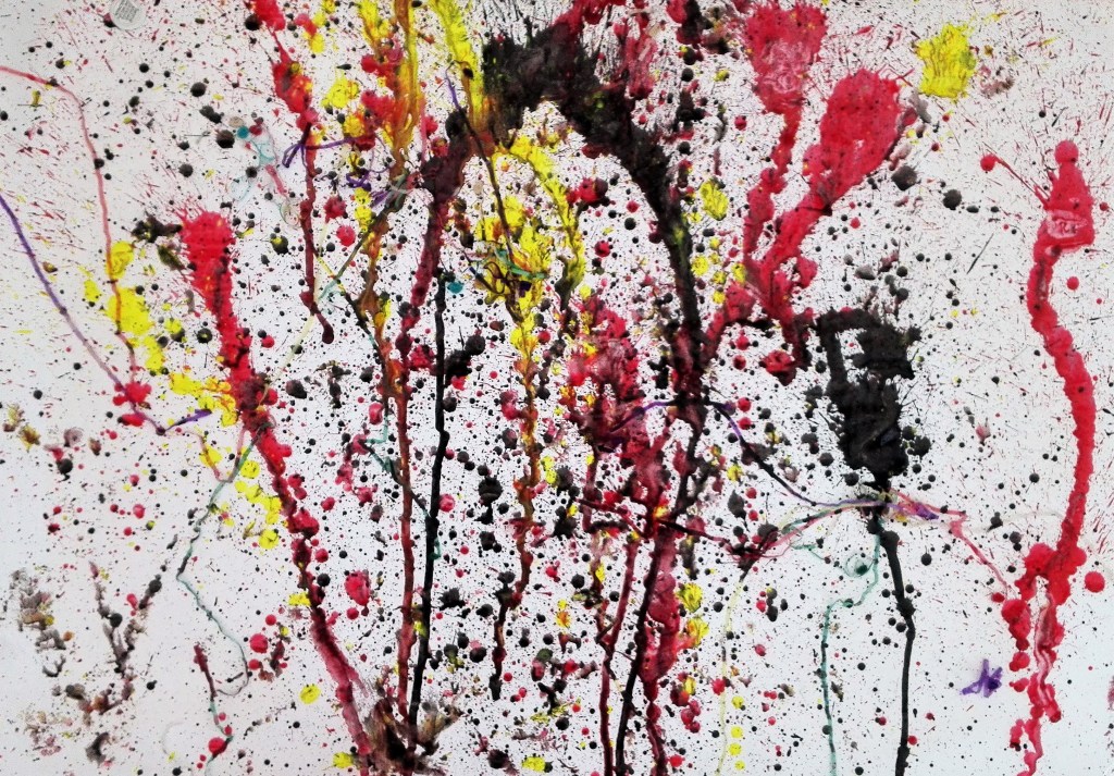
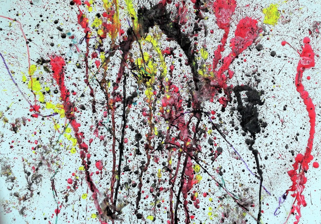
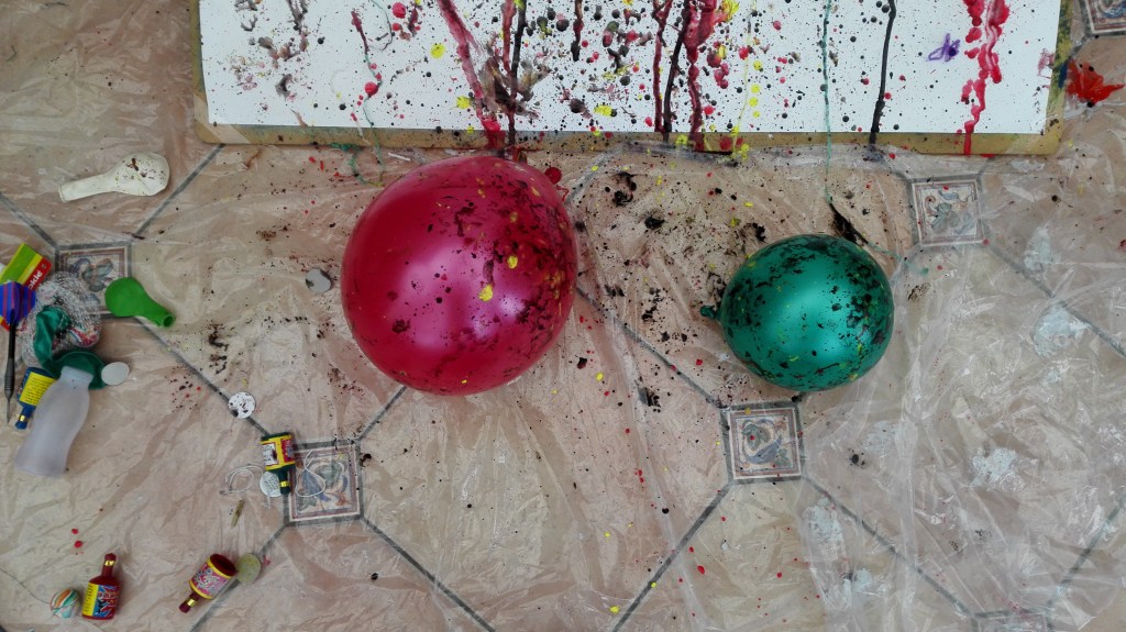
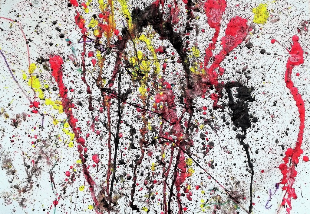
For this experimental painting I assembled an array of equipment, no brushes. I had balloons, party poppers, a straw, a dart, string, six small bouncy balls, a food syringe, a small yoghurt pot, black drawing ink and yellow and red acrylic paint.
The artist’s tools
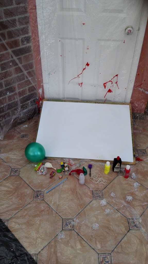
A board was set up at a 25 degree angle on the floor and paper (580mm x 790mm) taped to the board.
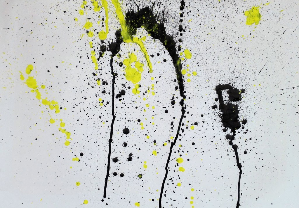
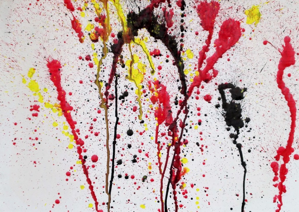
The ink and paint was fired at the support, starting with the black ink and then the red acrylic paint and lastly the yellow. Then balloons were bounced over the paper in random ways. I threw a dart at one of the balloons, popping it. However this made little impression. The last action I carried out was to fire the party poppers at the painting. These stuck to the paint and drooped across the painting.
I took photographs as I progressed, see below.
The painting in progress
The equipment after use.
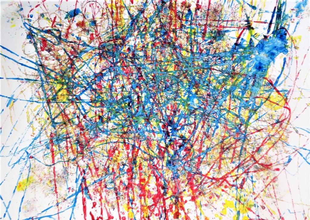
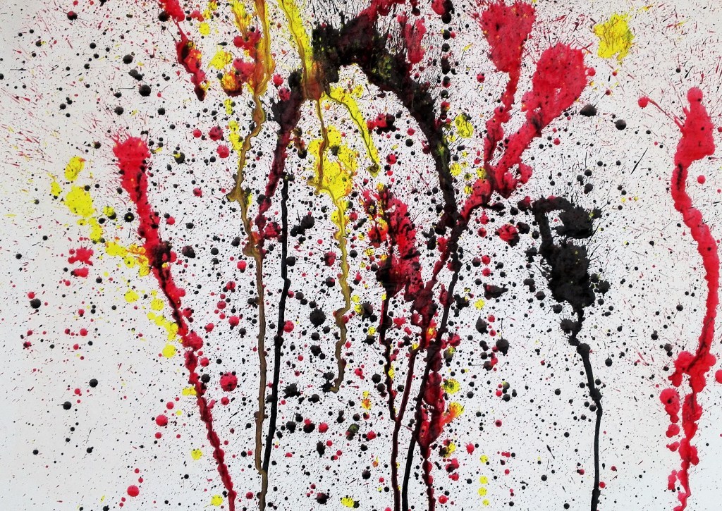
The finished painting can be seen below. I like it, it has a party feel to it, exploding fire crackers or fireworks. the paint that has run down the painting creating trails which are reminiscent of rockets. The techniques could be refined and perhaps more colours could be used. I do wonder whether the black ink was a good choice. An alternative approach could be to perform a similar painting on a black support. however I feel that this would be moving away from the random element of its construction. The random aspects of the process would be compromised and it would to a contrived and conceived piece.