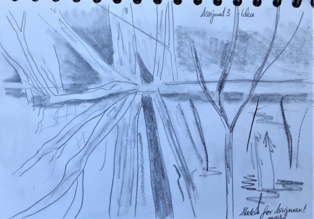
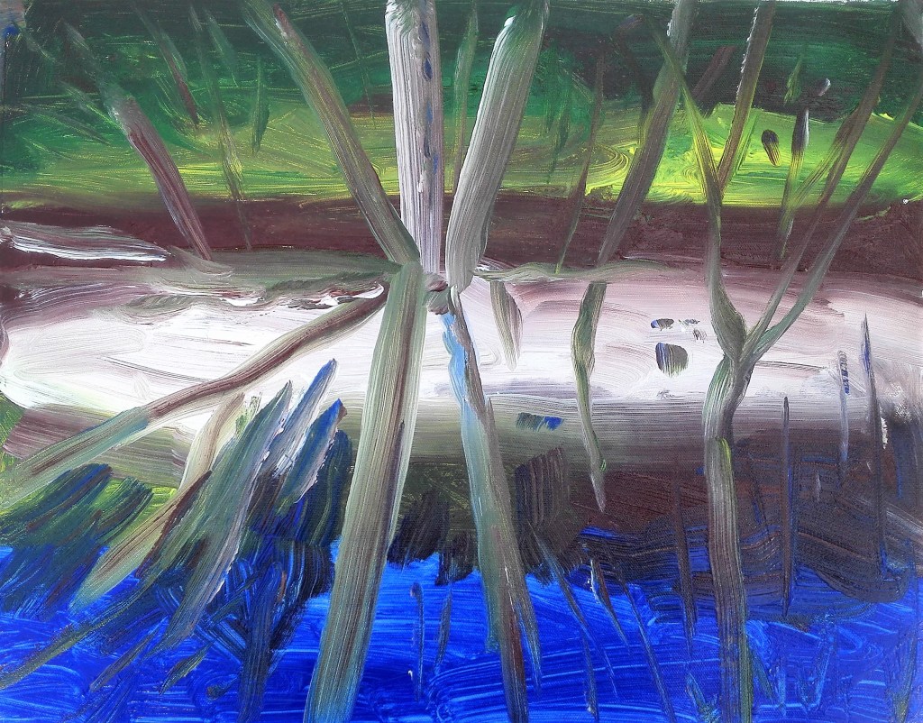
In my eagerness to progress with Part Four I had completed Projects 1 and 2′ and numerous works, before I stepped back to look at the suggested artists from my Part Three feedback. What follows is a reflection, by artist, on the research that I have now completed.
Esther Donaldson, I am now following this artist on Instagram
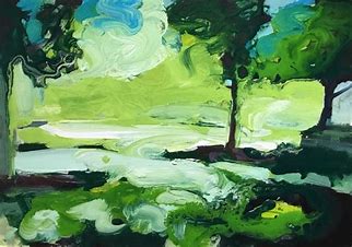
I find that Esther’s paintings are expressive. She uses nature and the garden as her inspiration. The transitory aspect of nature and the changing seasons, the short life of flowers, moments, colours and moods are explored. Her painting medium is mainly acrylics which are applied richly, gesturally and allowed to drip and run. Trees and plants are suggested as rough shapes with lots of cool greens and yellows. Her painting, above, titled ‘In the shadows’ is a good example of her work.
Clare Woods (Daddy Witch)
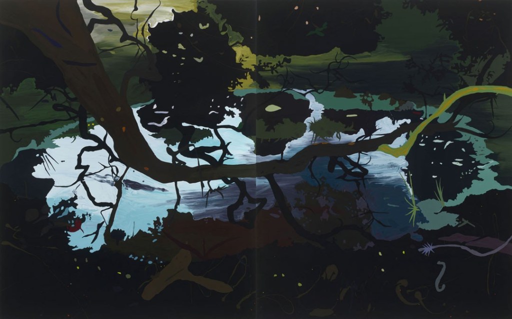
The painting is two panels both 218.5 x 175.3 cms.
On researching this painting it was obvious why it had been recommended. There are aspects of my work in part three that allude to it. My attempts were much less successful. What I pick up from Clare’s work is the simplification of the scene which is carefully broken down into a concise composition. The colour palette is harmonious and subtle.
Extract from Arts council description “The painting, Daddy Witch, pictures an inverted pool bathed in moonlight, reflecting the shadowy brush. Dark shapes emerge from the surface as the viewer is witness to nocturnal happenings and latent drama.” This sums up the painting succinctly.
John Bunker
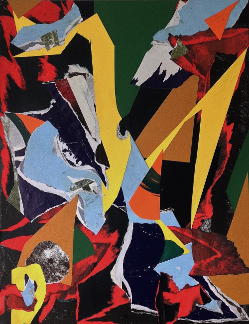
I found this work of less interest to me in so much as I don’t anticipate that I will use the technique of collage extensively in my work. Although I do feel that the juxtaposition of shapes and colours is a great method of breaking up the support and challenging the viewer to make sense of the painting.
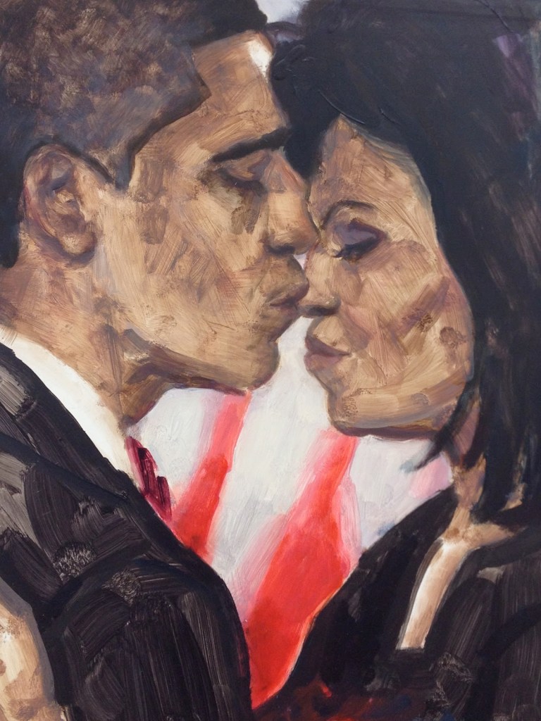
Elizabeth Peyton the suggestion here was for her still life and landscapes paintings. however I found mainly portraits of friends, lovers, heroes, admirations, inspirations and fascinations. The portraits I found to be intimate studies. They observed the spirit of the person. An example of this is the joint portrait of Barrack and Michele Obama.
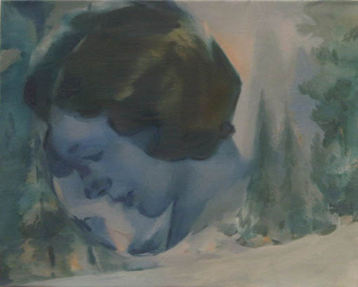
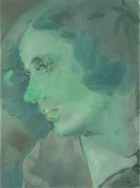
Kay Donachie b 1970, blurred, faded, muted ephemeral portraits, mainly heads, which have a filmic, film noir or retrospective quality. figurative imagery relating to modernism, domesticity, longing utopian counter cultural movements.
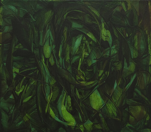
Michele Fletcher, the garden paintings, a series of abstract paintings inspired by gardens and plants I found to be the paintings that I was drawn to most. Although I found it difficult to fully embrace them. In the example below the bramble appears menacing.
Michael Porter,
Michael’s paintings are about landscape but do not necessarily depict landscape as we would expect to see it. He uses landscape as an inspiration. Taking what he sees beneath his feet to create visions of what the landscape is as he sees it. The paintings are carefully, meticulously painted often using abstract patterned background to indicate dense undergrowth.
Michele Whiting, In looking at her paintings I came upon a series where the subject of landscape is in evidence but is only suggested in abstract forms. The series is limited to a pared back palette of colours, browns, ochres, white, Payne’s grey and light blue. The paint is applied in soft translucent washes of colour, loose gestural brushwork with added lines and contours.
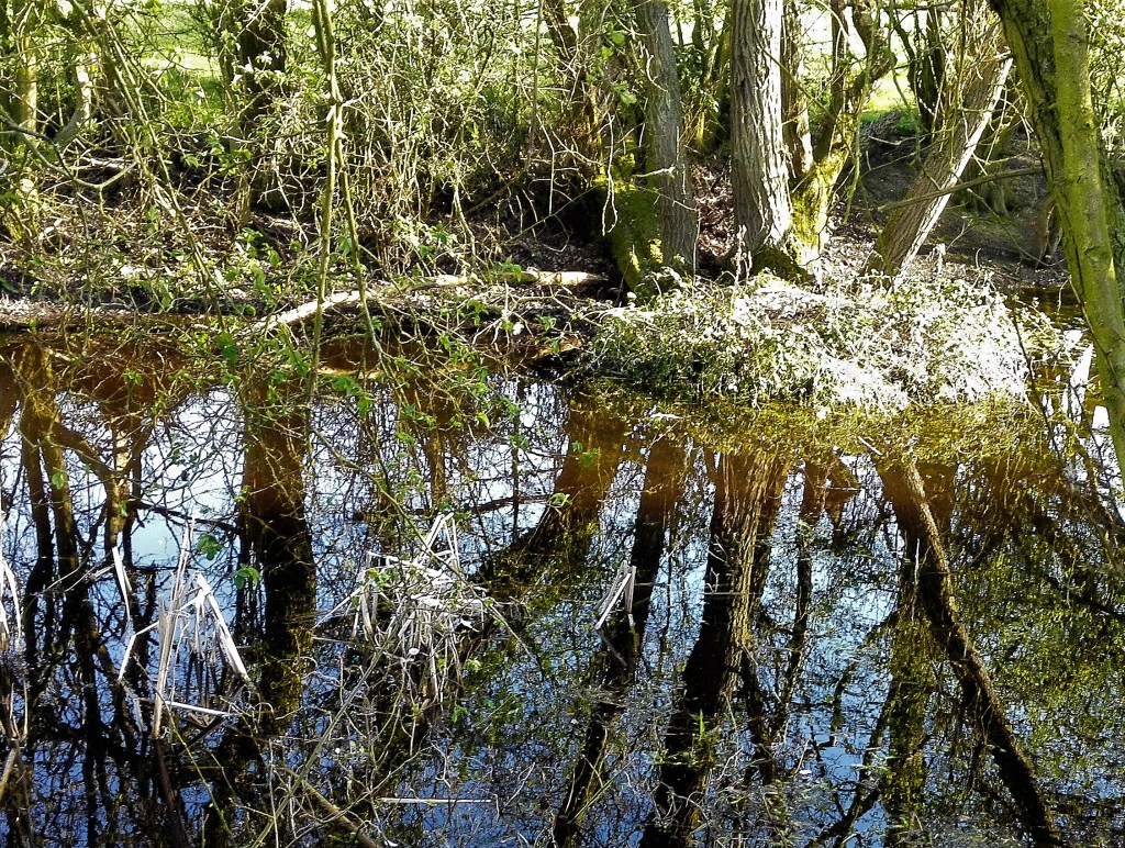
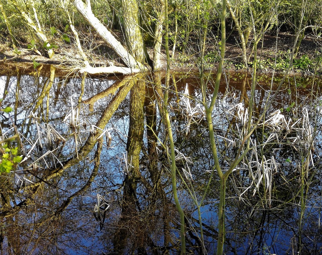
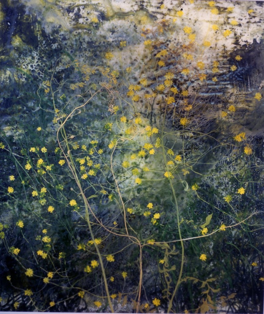
Frances Ryan, of the selection of artists that were suggested it is between Frances’s and those of Justin Mortimer that I found resonated most with me. Frances’s paintings are abstract visions of nature incorporating plants, shapes and lovely bright patches of colour. In some ways her paintings are all the things my Assignment 3 painting ‘Hidden away’ wasn’t. I need to reference the three examples, plus others, when I look to make further paintings in a similar vein.

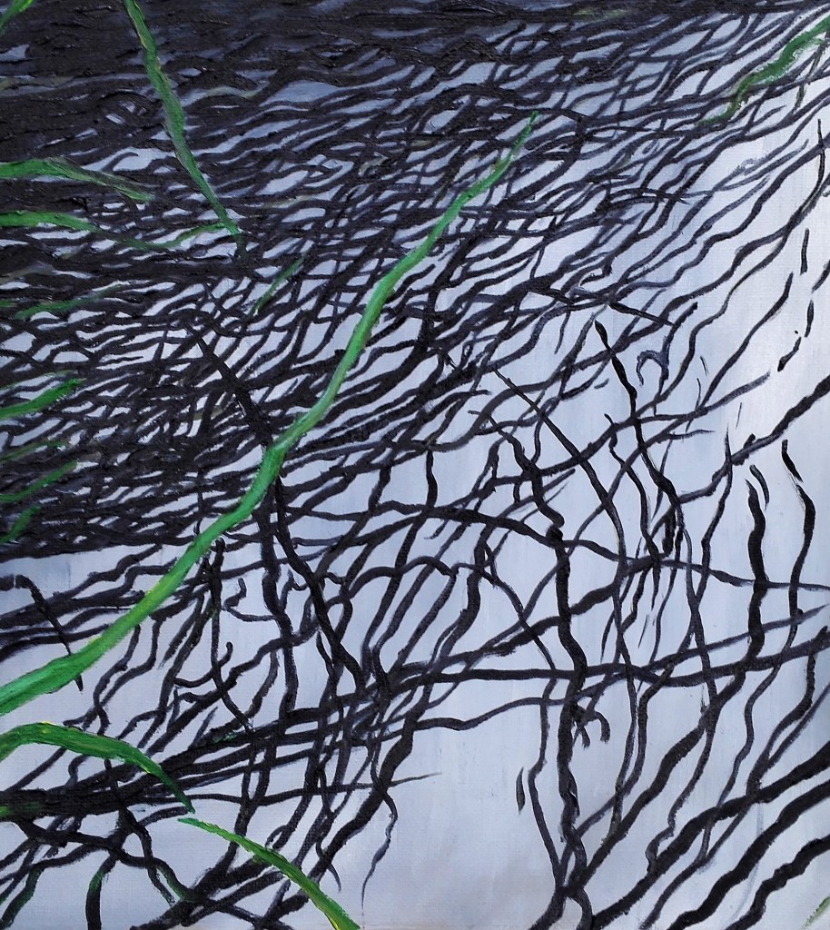
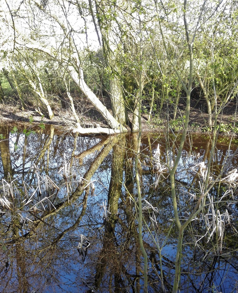
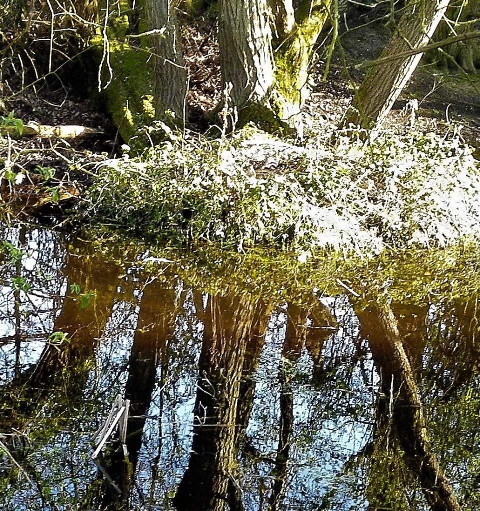
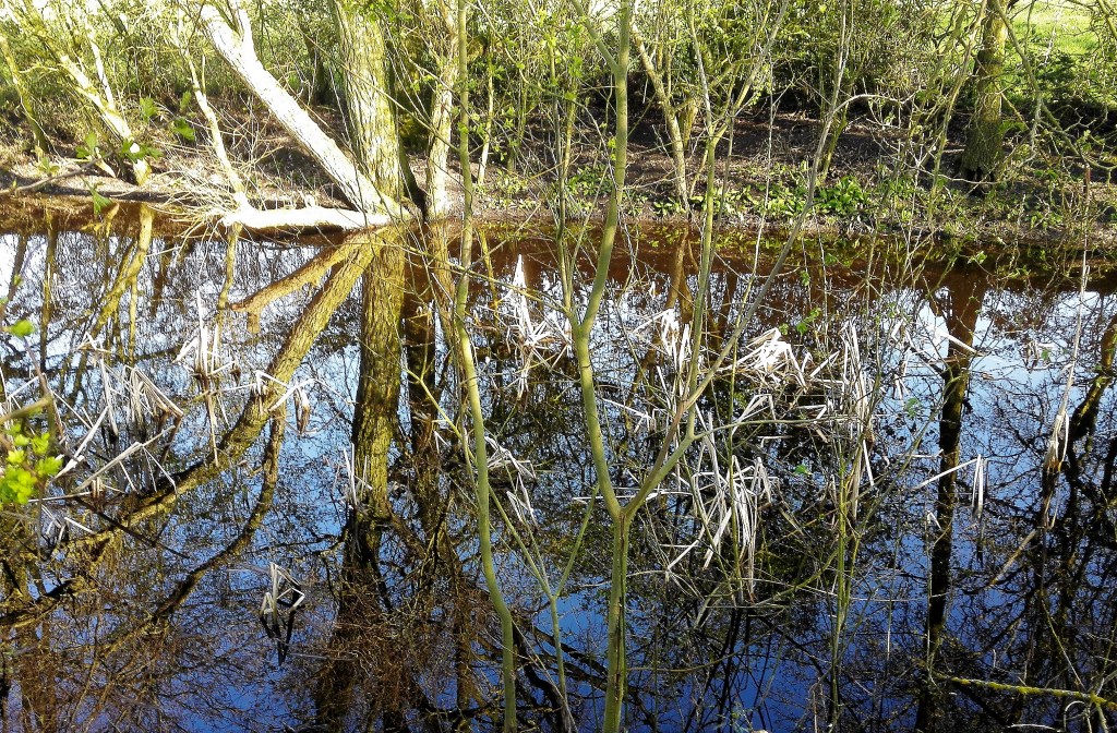
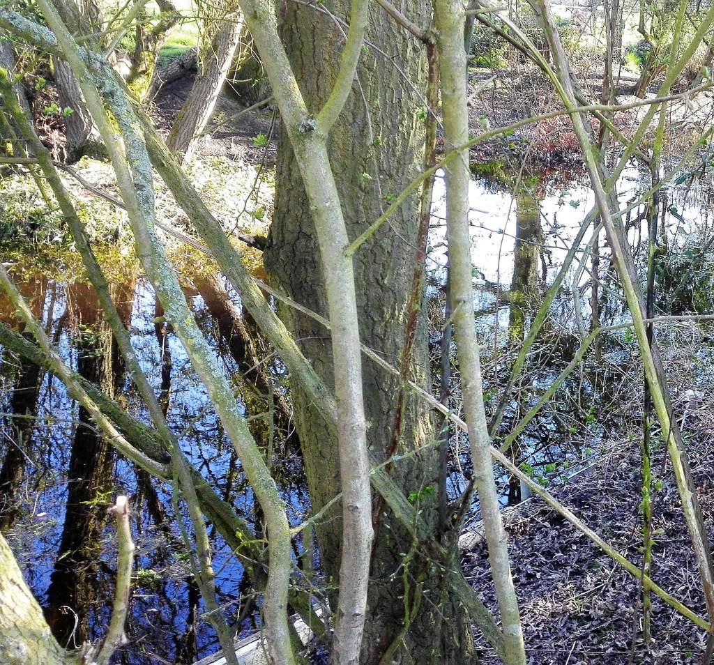
Flow, 80 x 100 cm, 2019 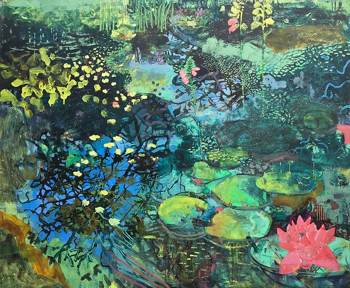
Pond Life 1, 100 x 120 cm, 2018 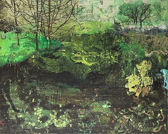
Winter Culvert, 80 x 100 cm, 2019
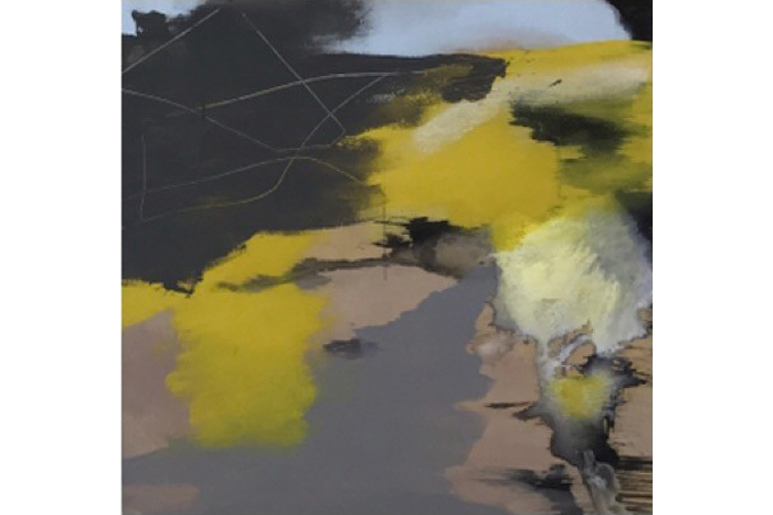
Justin Mortimer, viscosity of paint was the pointer in the suggestion to examine the paintings of Justin. I started with his most recent works which are somewhere between abstraction and still life. Plants are suggested by smearing, smudging and scrapping. Swirls of paint, poured and layered. His website has his paintings in a chronological sequence. I went to the earlier works and discovered in 2002-07 a series of paintings that I should use as inspiration for my parallel project. In these painting buildings are described that are in states of disrepair. Blocks of dark, brooding colours, greys and dark greens are used to describe the form of the buildings. The paint is laid down in visceral slabs which contrast with burst of light. The painting below is a good example of this.
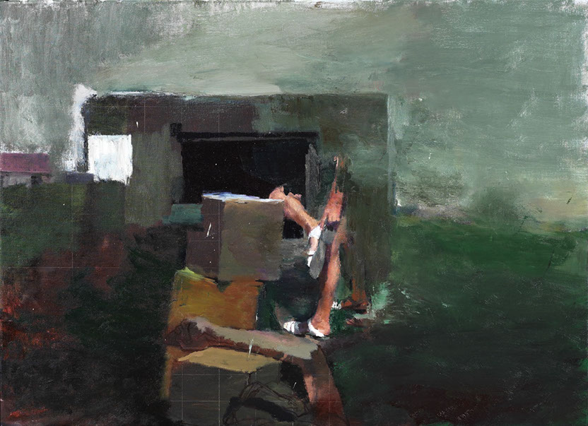
Following his work through the subsequent years the buildings became only occasionally in evidence as they were replaced by human forms. The paintings from 2012 – 2014 have a dystopian feel to them. They reminded me of the mood, look and feel of the television drama of the Chernobyl disaster, gritty, dark and melancholic. These are followed in the subsequent years 2015 -2017 by paintings in which the human figures are dressed in Personal Protective Equipment and are seen fighting chemical spillages. From the perspective of 2020 they would appear to be invoking the pandemic to come.
Carol Rhodes 1959 – 2018,
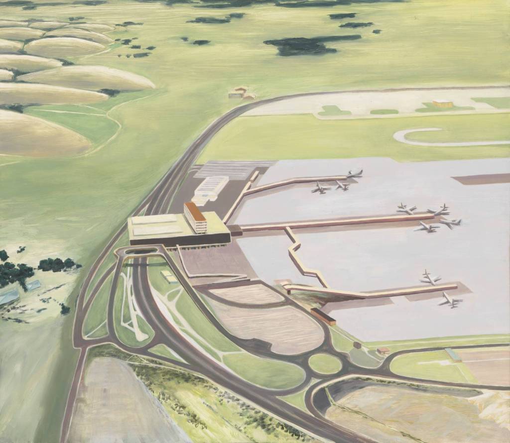
The aerial perspective of carol’s landscapes show parts of the landscapes and leave other parts to the imagination. the paintings run outside the edge of the support into the mind.
Conclusion: I have gathered a lot of information in completing this research and I will need to unpick it further to enable myself to incorporate the inspiration and ideas into my own work.