A couple of shorts notes regarding these reading points.
Sherrie Levine ‘Statement’ 1982 extract “A paintings meaning lies not in its origin but in its destination. The birth of the viewer must be at the cost of the painter” my interpretation of this extract is that it is the contract that exists between the painter and the completed painting. Once it is handed over it takes on a new life which the painter no longer controls. It’s life is now determined by the viewer(s).
Link 28, Apropos Appropriation: Why stealing images today feels different. article written / published 2007. I found that this was not the most entertaining read but a useful insight into how the appropriation of objects, art, images has changed over time. My thoughts turned to how different the article may have been if its was re-written in 2020. The rate and number of images being shared globally now has expanded exponentially so that it has become difficult to ascertain the original source.
A tool, a symbol, a weapon just three of the many possible focuses or reasons that hands define art.
The following is extracted from a Google search: Hands are an organ for performance, serves as eyes for the blind, the mute talk with them and the deaf hear with them. They are a symbol of salutation, supplication and condemnation. The hand has played a part in the creative life of every known society.
When I consider hands in art I think of them as the ultimate artists tool. The hand holds the brush or pencil to make the marks on the support to convey the artists vision. Hands can also be used directly to apply material, smearing, rubbing, scratching etc. There are alternatives such as the mouth or the foot but but these lack the dexterity of the hand. I have long supported the Mouth and Foot painting artists charity and am always surprised by quality of the paintings. However the mouth or foot is used due to circumstance rather than preference.
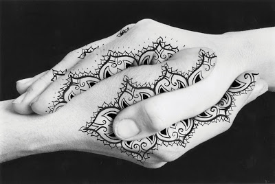
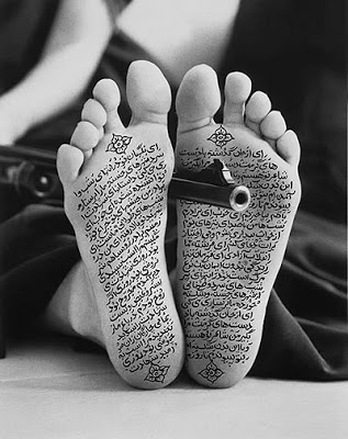
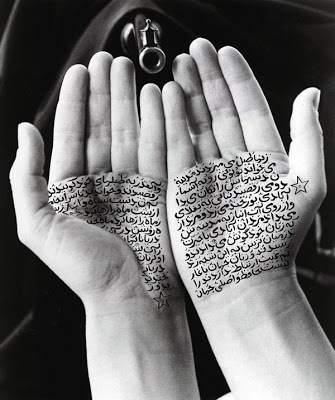
Shirin Neshat, an Iranian visual artist who works primarily in film, video and photography. Her work centres on the contrasts between Islam and the West, femininity and masculinity, public life and private life, antiquity and modernity and bridging the space between these subjects. She often uses test in her work, writing across photographs of faces, hands and feet. These images are used to get across messages, particularly pertaining to feminine suppression in Iran. They create awareness of the repression facing Muslim women and their pursuit of freedom.
Examples of Shirin Neshat’s work
Douglas Gordon’s installation ‘The divided self I and A divided self II, 1996 on display at Tate Scotland is a two channel video installation. I read it as a battle between the two halves of the self. An expression of the internal dialogue that we have within ourselves. This manifests itself in the contradiction of the image of ourselves that we present to the world, sane, ordered and the private identity that we keep hidden from view. All the contradictions that we withhold from the mirror view of ourselves and our place in the world.
Cindy Sherman, works exclusively in photographic self-portraits depicting herself in many different contexts and imagined characters. Whilst initially interesting I found that I quickly became bored with the photographs.
I took a different approach to that indicated in the outline for this exercise. Rather than restaging an image using my own body I restaged a painting using props and photographs of myself and then used these to create a painting of the outcome.
My focus was to concentrate on hands.
Albrecht Durer, Praying hands
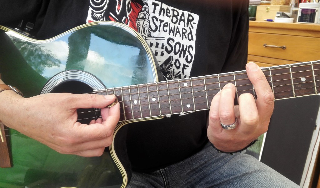
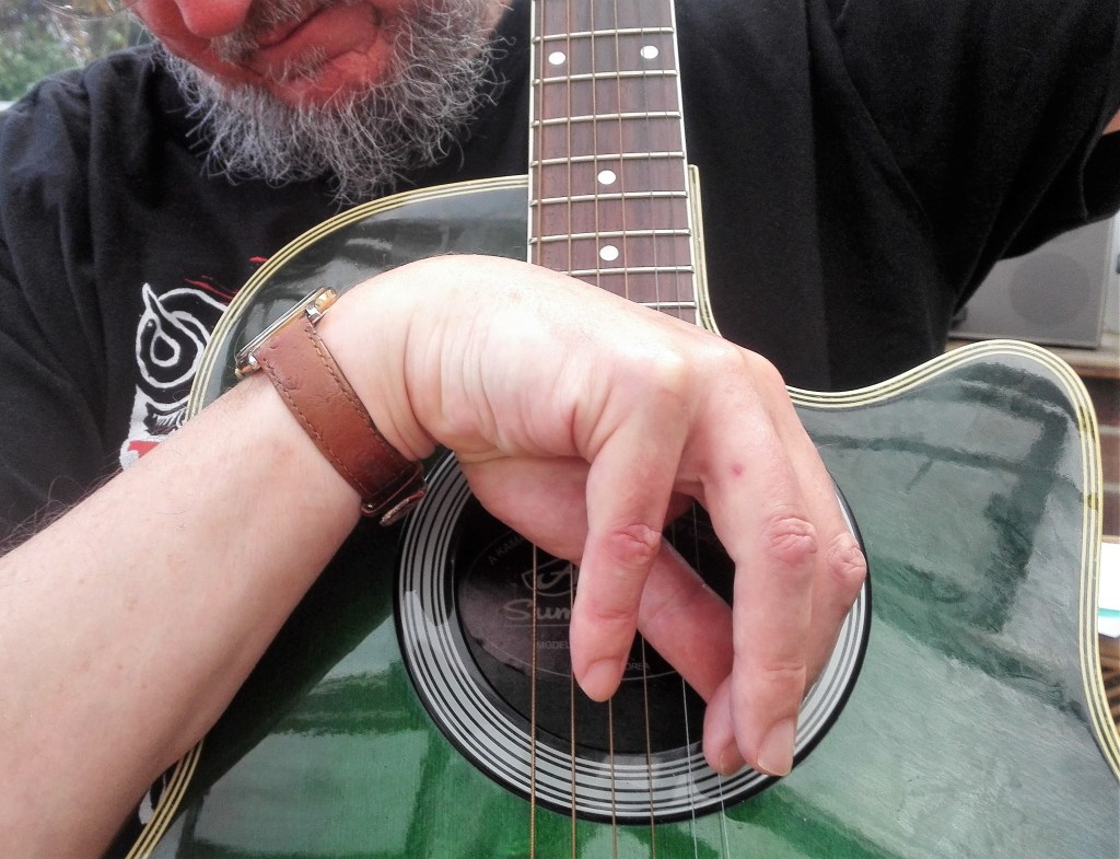
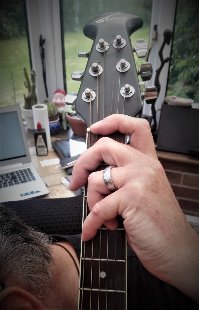
Being an amateur guitarist and having a strong interest in music I considered this an ideal opportunity to bring this interest into this particular exercise.
The first step was to look for some interesting images of guitarists hands via a Google image search. As expected there were thousands but I reduced these down to three images. Two photographs and one drawing / painting.
Guitarist’s hands
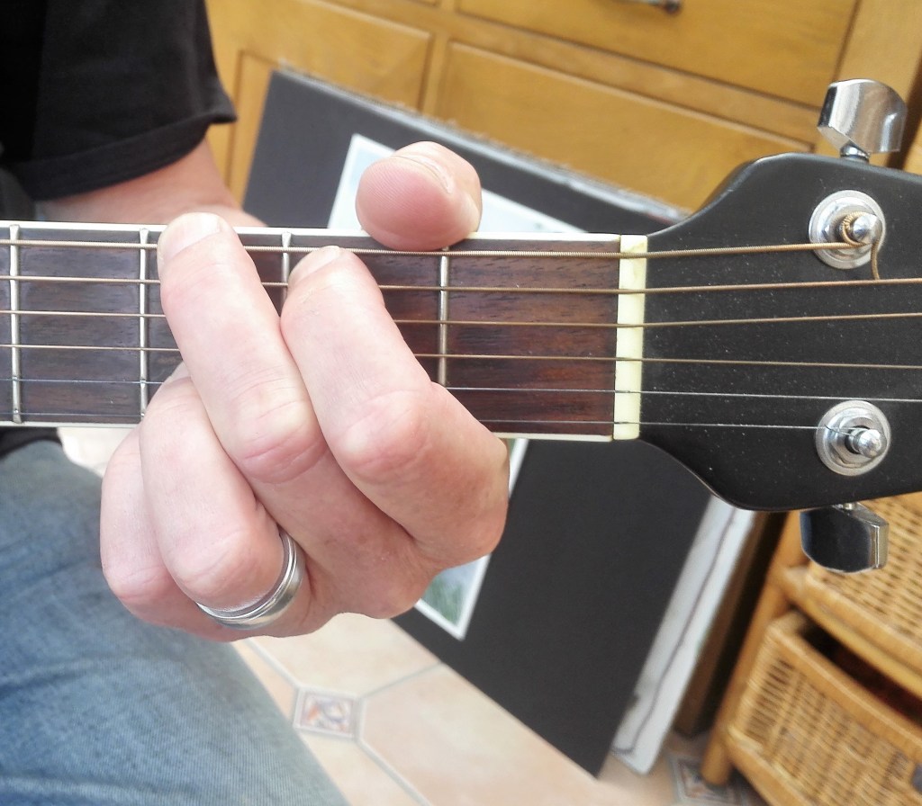
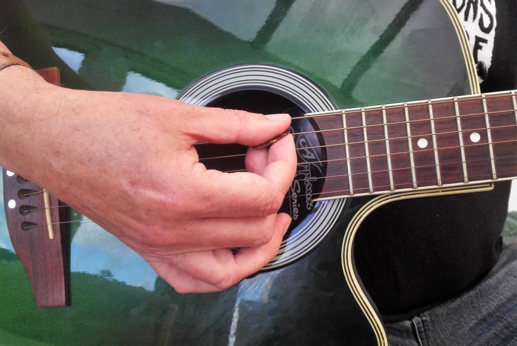
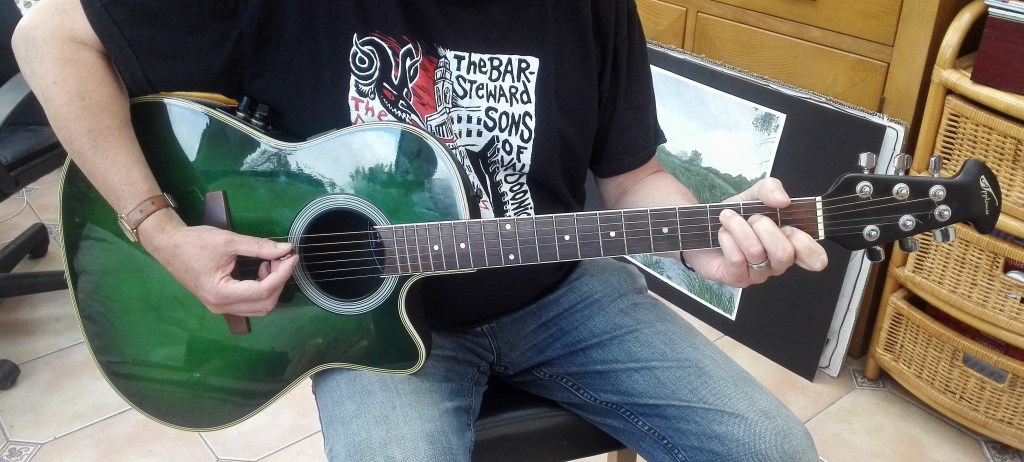
The next step was to take some photographs of myself playing guitar. I enlisted Marian, my wife’s, assistance for this. A few examples below:
Me playing guitar
Whilst these were interesting a would make good subjects they didn’t fulfil the prop, appropriation, enactment or restaging brief. However I did make a couple of sketches to familiarise myself with the shapes and challenges of drawing / painting hands.
Two sketches of my hands playing guitar
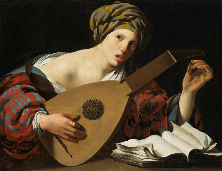
I had in mind two paintings that i was familiar with to try to stages the re-enactment part. The first is a painting that I came across in the Fitzwilliam museum in Cambridge. It is a painting by Hendrick ter Brugghen entitled “Young woman tuning a Lute”
Hendrick ter Brugghen, Young woman tuning a Lute, oil on canvas, circa 1626.
Whilst this would be an interesting painting to restage, the hands are well defined and the woman’s expression is that of being startled or caught. The painting is well lit using chiaroscuro techniques to emphasis the highlights. Additionally the fabric of the clothes that she is wearing is wonderfully observed. Despite all this it wasn’t what I was looking for. I had another painting in mind.
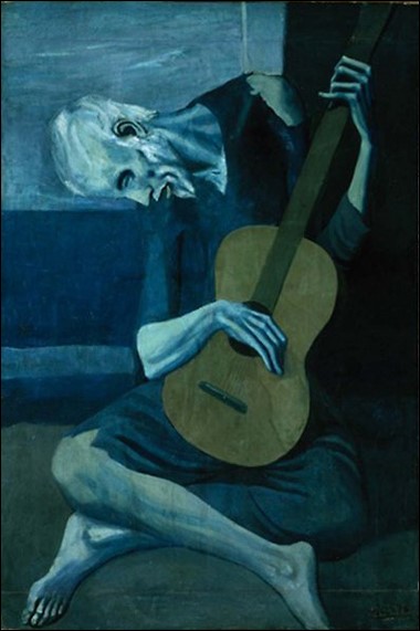
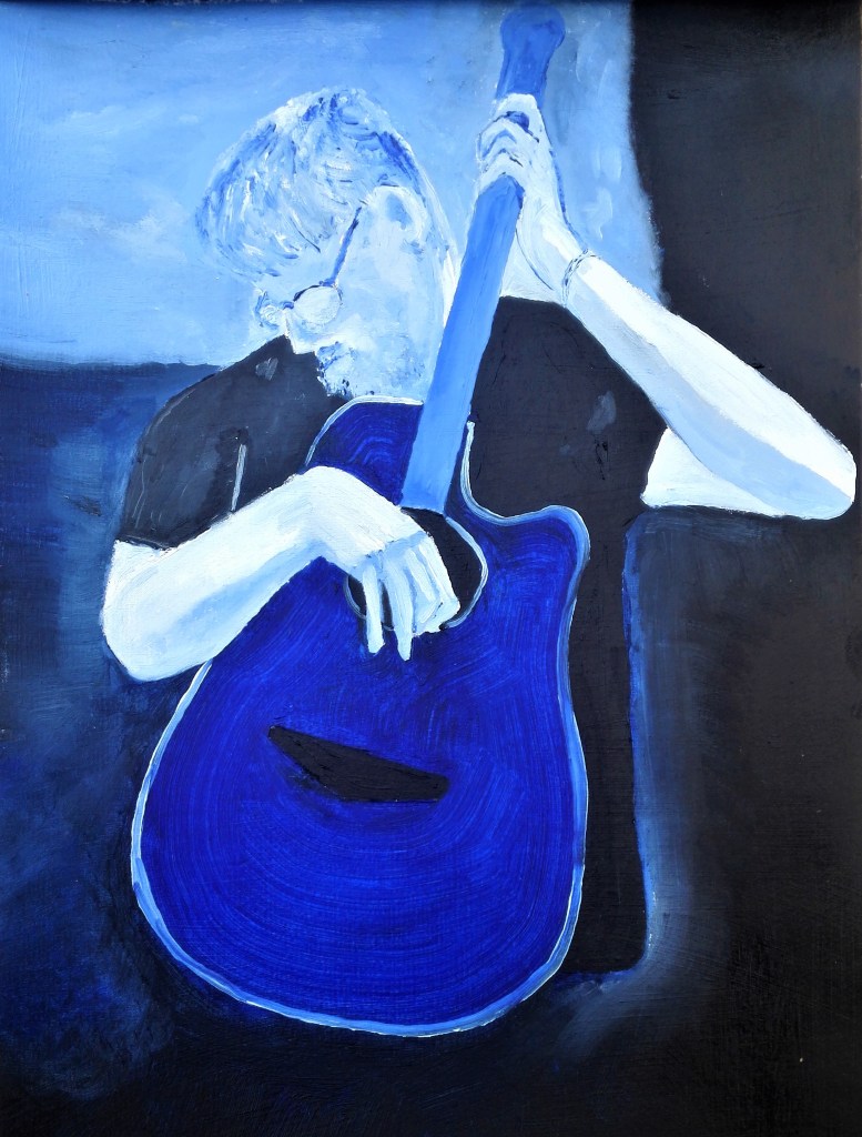
I recalled a painting by Pablo Picasso from his Blue period titled ‘The Old Guitarist’ which I remembered as having an unusual pose. The body looks contorted but appears natural. There is an emphasis on the hands which seems to be caressing, enveloping and clinging to the guitar.
Pablo Picasso, The Old Guitarist, 1903, Oil on panel, 122.9x 82. 6cm
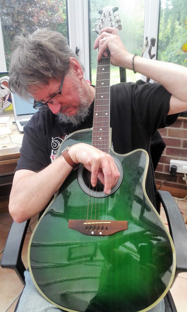
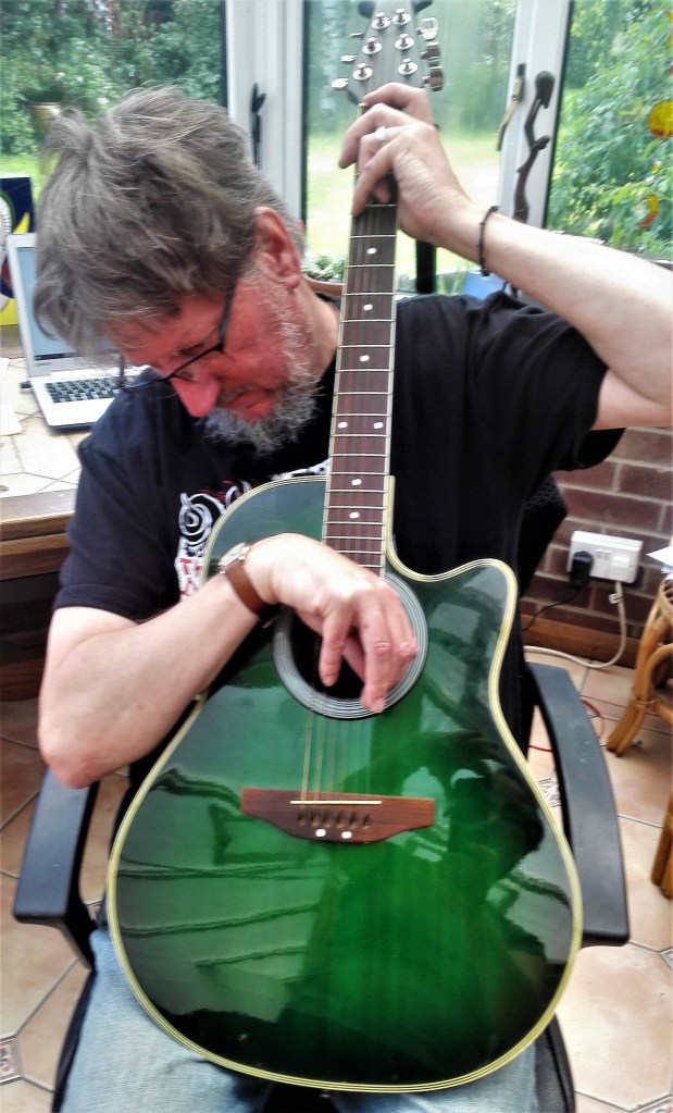
Again I got Marian’s assistance in taking some photographs of myself trying to assume a similar pose. Examples below:
Photographs of me trying to assume the pose
From a guitarists perspective there was nothing natural about the pose. I wouldn’t be able to play the guitar hunched up like this. I did get the feeling that I was close up and intimate with the guitar.
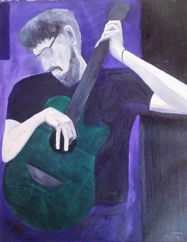
I would use the photographs and ‘The old guitarist’ as a source of reference and inspiration to complete a painting of my own. The emphasis of which would be the hands.
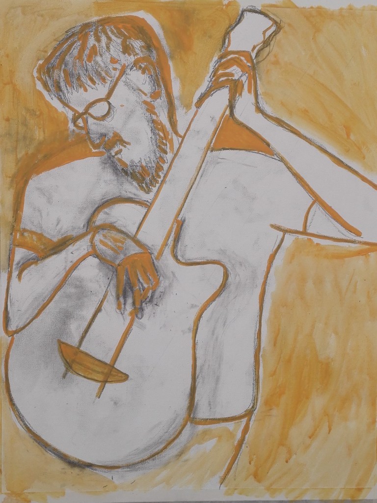
Two sketches were made and this was followed by a small painting.
Two sketches ‘Man with guitar’
‘Man with Blue guitar’ oil on paper, 21×29.7cm
The painting whilst being a little crude had captured the essence of what I was trying to achieve. The player appears to be listening carefully to the guitar and thoughtfully enjoying the sounds that it is making. there is a focus on the hands particularly the right hand picking at the strings. Given the success of this trial painting I decided to complete a further work. Larger scale and less influenced by Picasso’s ‘The Old guitarist’
Man with guitar -work in progress
The completed painting is shown below. I’m pleased with the outcome of this painting. I managed to maintain the feeling of the draft painting and keep the feel of the caress of the guitar whilst maintaining the focus on the hands.
In the context of the exercise I believe that I have explored my response to the challenge and dealt with it in a painterly manner. Becoming an image was the exercise title which I became.
Man with guitar, oil on canvas paper, 38x48cm
Postscript: trying to photograph this painting was more difficult than I usually find. I think that this is partly due to it being fairly dark and the contrast between the matt finish of the man and the shiny lustre of the guitar. Getting the light correct was problematic. The painting works much better when seen by the naked eye.
Boo Ritson, using paint, props and make up to clone the sitter into an image of themselves in another role / life. The results give a caricature of the person which when examined takes on the aspects of a painting, a photograph and a sculpture. The tonal changes are caused by the actual light rather than the paint itself. The paint is layered on thickly which gives a pasty quality to the painting and to the sitter.
Rachel Russell, in this video the artist paints a version of Philip Guston’s “The Studio”. Dressed as a shark an using Guston’s iconographic images. I found it interesting initially but soon became tired of the video.
A mixed bag of different ideas which cross various disciplines, painting, sculpture, theatre and film. A melting pot of ideas.
Paula Rego using props and puppets as models for drawings. Outfits used to give form and inspire imagination into her work.
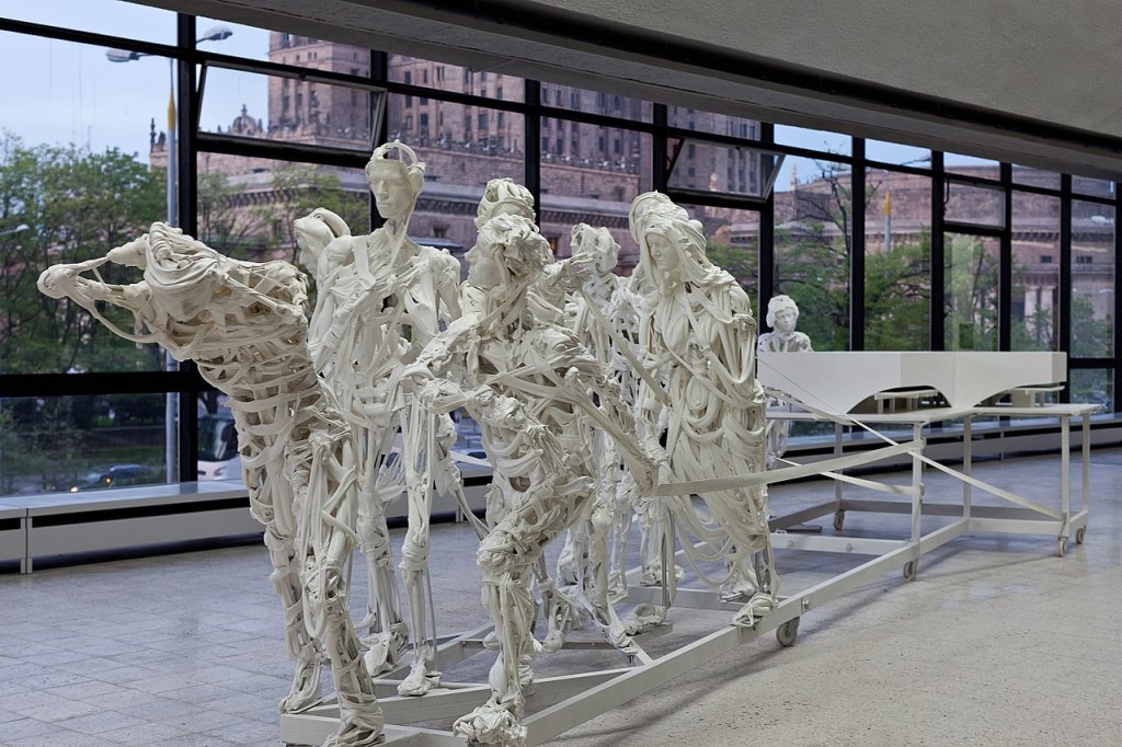
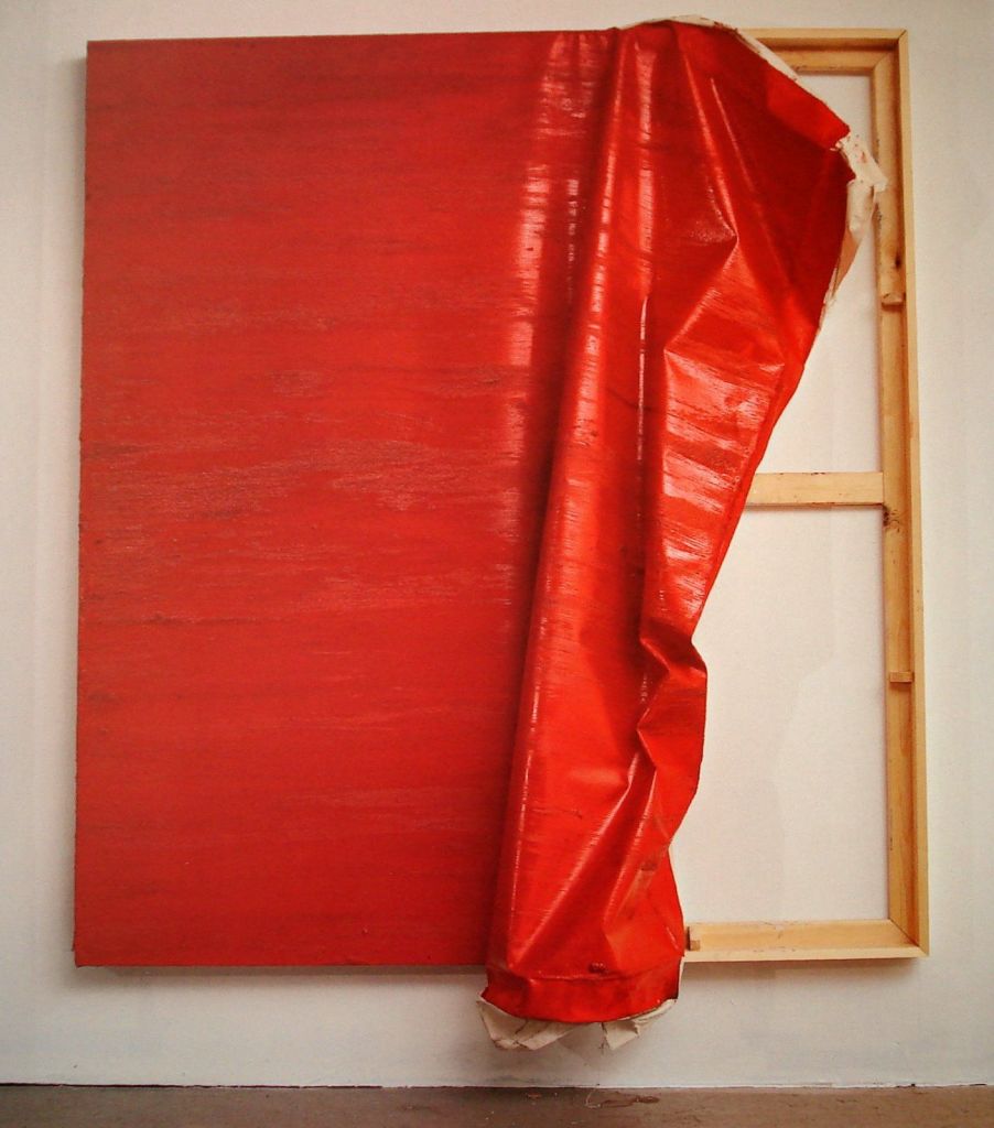
Pawel Althamer’s life size sculptures that appear to be made from strips of cloth and bones. The ability to be able to see through the sculptures gives them a sense of movement and an ephemeral ghostly appearance. (See example at the top of this blog)
Lisa Milroy uses clothing and paintings of clothing and often invites the viewer / observer to arrange the work into a composition that they like.
The three examples given show how oil paint can be used in different ways to convey a multitude of moods, feelings, textures, light and tone. In all three the palette is muted and the colours nearly monotone. Philip Guston’s, “The Coat, 1977” has exaggerated forms which have been simplified into basic shapes. minimal tonal effects have been utilised. Vincent Van Gogh’s “A pair of shoes, 1886” is all about the richness of the paint and the thickness with which it has been applied to the canvas. The clever use of tonal contrasts conveys a bleakness in the painting. In Lisa Milroy’s “Shoes, 1985” the paint shines. On first glance the pairs of shoes could be confused as opened mussels. The wetness of the insides of the mussels amplified in the shine of the shoes.
In all three the paint has been laid down quickly but different techniques used. In Guston the paint has been applied thinly and mixed on the canvas. Mixing the paint on the canvas is also apparent in the Van Gogh painting. However in this painting the paint has been laid down generously in thick brush strokes. In the Milroy painting the paint has a sheen, carefully applied and the tonal highlights have been emphasised.
A challenge that I set myself during this time of lockdown was to spend 15 minutes per day exploring an artists work. Whilst doing this I would write up a few notes on what I liked or disliked about their work. The aim initially was for this to be a daily exercise. I haven’t quite kept to this but in the nineteen days since I started this initiative I have notes on eleven artists. On some of the intervening days I will have been carrying out course research.
The aim of this challenge was to make looking at other artists work part of my daily routine. The benefit that I expect to gain from this is an exposure to different painting styles, techniques and subjects. I certainly do not expect to like them all and will mention this in my notes. Whilst I’m completing this course I will write up my notes, along with examples of the paintings, in the Exhibition section of my blog. I will limit each blog to ten artists to prevent any blog from becoming too long.
My source for the first group of artists is a website Contemporary British Paintings, http://www.contemporarybritishpainting.com. This website was part of the suggested reading / viewing from Part Two feedback. The site currently lists the work of 71 artists. Each artist has a short artist’s statement and a selection of their work, normally about six paintings. I shall work through these alphabetically.
David Ainley – (29/4/2020) minimalist art exploring mined and quarried places reflecting the act of human labour on the landscape. I found his paintings challenging in that they didn’t have much in them, minimalist. However what they did have was very carefully observed and put together.
David Ainley, Canary Flag Bat In mine, acrylic and oil on four part panel, 2020, 61x61cm
2. Ian Andrews – (30/4/2020), an art phycologist! his paintings were fantasy paintings which play with links to old masters and art history. He uses thick paint, suggested shapes and human forms to depict surreal, slightly grotesque folk tales. I detected a Dali infuence to some of the paintings.
Ian Andrews, Corvus corax St Anthony 2
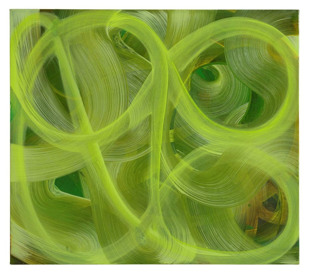
3. Amanda Ansell – (1/5/2020), abstract expressionism. I have observed similar paintings, with gestural movements, to these and have tried to emulate this type of painting in my own work.
Amanda Ansell, watch the shadows grow, oil on canvas, 82x92cm
4. Karl Bielik – (2/5/2020), experimental, abstract expressionist artist who works on up to 30 paintings at once and lets them slowly emerge from the physical process of painting. Sometimes leaving them for weeks or months before completing them.
Karl Bielik, Dealer, 187.6×204.8cm
5. Claudia Bose – (3/5/2020),a passion for history and art made by women. She works in a church tower in Suffolk. Her art is predominately abstract pieces made using oil, watercolour and mixed media. The paintings are expressionistic and gestural with the material being applied liberally. They include signs of scratching and removal of paint. Also the paint is allowed to run. The colour palettes are minimal within each painting, probably 6-7 colours maximum usually less. I feel that this gives the paintings a cohesion. Sizes are not large 90x90cm the largest and 14x13cm the smallest in the selection that I observed. I downloaded a painting called “Staying Alive” as its title resonated with me during these lockdown times.
Claudia Bose, Staying Alive, 2012, 90x90cm
6. Day Bowman – (4-5-2020), her paintings are large scale canvases which try to echo the marks, lines and shapes made in the wet, grey sand of her hometown beach. working on multiple canvases at the same time using random mark making, gesture and colours in both controlled and random manner to echo light, tides and movement. Limited palette of colours, whites, greys and yellow ochre and occasional blue with charcoal. I enjoyed these paintings.
Day Bowman, Fortress 2
7. Julian Brown – (7/5/2020), Influenced by the folk art from his Polish mother and heavily influenced by nostalgic visions of the 1980’s. Handmade geometric quality with a playful primitive relevance to the world that we now live in. I downloaded two paintings the second of which I will try to make my version of.
Julian Brown, A Fairy tale of Gdansk, 2016, 65x65cm
Julian Brown, Gamma, 2012, 50x40cm
8. Simon Burton – (9-5-2020), these was no link to this artist’s statement or other paintings.
9. Marco Cali – (11-5-2020), his paintings focus on figurative subjects influenced by renaissance and surreal traditions. The paintings I observed were mainly torsos and where the was heads the facial features were omitted. Mostly oil on paper or oil on canvas.
Marco Calli, Andie, oil on canvas, 60x75cm
Marco Cali, Untitled, oil on paper, 2019, 40x50cm
10, Ruth Calland – (13/5/2020), gestural and visceral paintings that look to explore emotional experience. To me they are highly coloured, non pictorial but gestural captures of mood and form. The painting technique is crude-ish with colours being mixed on the canvas. Two examples below.
Ruth Calland, Bone Island, Oil on canvas, 2019, 51x61cm
As part of the feedback from Assignment Two and the work completed for Part Two I received a list of suggested artists to view and research. These suggestions were based on the the conversation and ideas that had been discussed during the feedback session. Although this is quite a long blog I have deliberately kept the text brief.
The following are my notes and thoughts:
Vincent Hawkins, 1959 – , painter / draftsman working in acrylic on canvas, cardboard and paper. Influences cited as Picasso, Paul Nash and his work has been compared to that of Matisse and Klee. The expressive nature of his abstract paintings contain an energy that remind me of Jackson Pollock’s floor paintings. The palette is similar but there is more structure to the composition.
Vincent Hawkins, Untitled IV, 2016, Water based woodblock medium on paper, 55x75cm
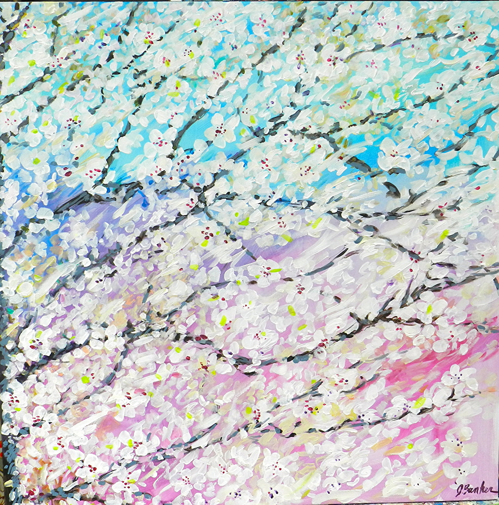
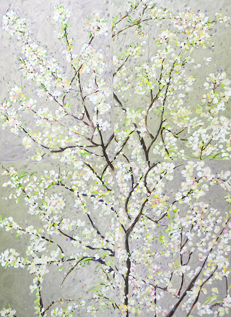
John Bunker – colourful flower inspired collages, paintings with blossom. I enjoyed the blossomed tree paintings but hose with human nymph like images I found a bit twee.
John Bunker, Cherry Blossoms B, Acrylic, 24x24inches
John Bunker, Quadrant branch blossom memory, acrylic on canvas, 48x36inches
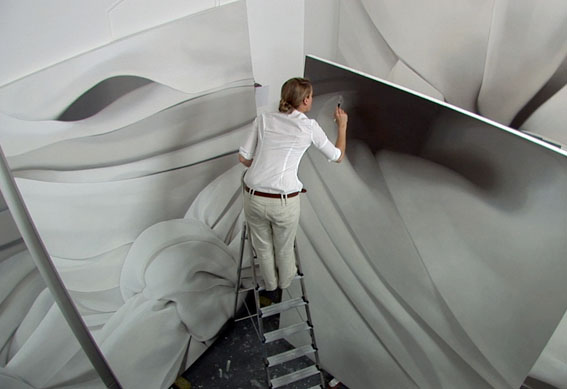
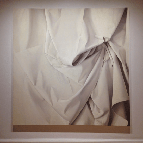
Alison Watt, paintings of white fabric, very large paintings where the tonal quality and subtle adjustments seems to envelope the observer and comfort them.
Alison Watt at work
Alison Watt, Fabric study
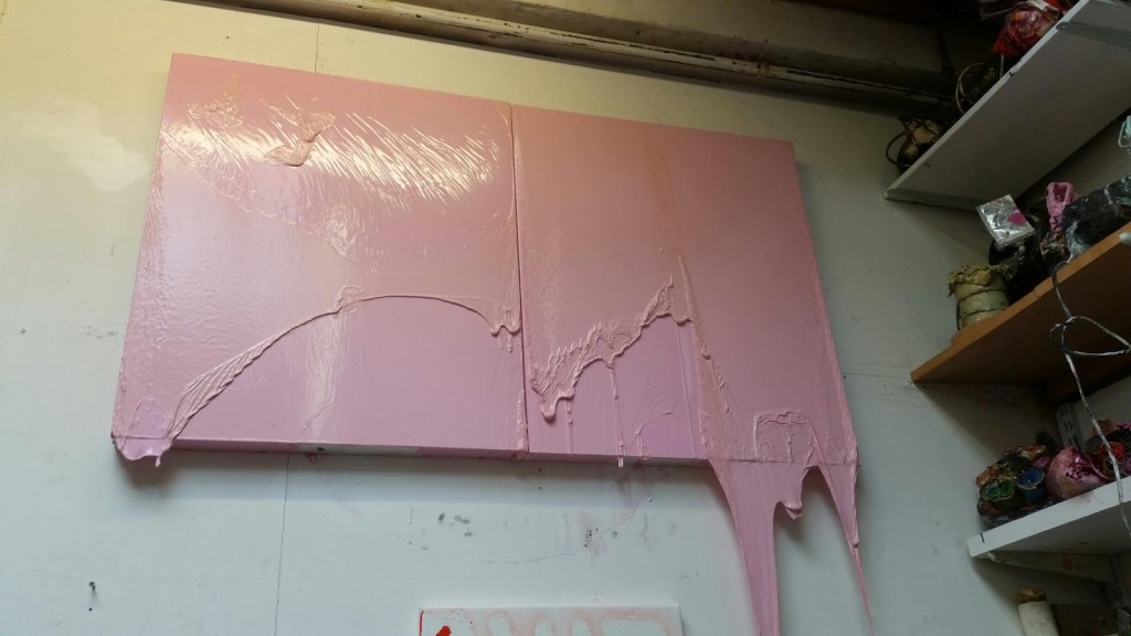
Alexis Harding, layered paintings that have a skin to them, lumpy large canvases where often the paint seeps beyond the limitations of the canvas or support.
Alexis Harding, Untitled
Angela De La Cruz, her paintings seems to exist in a place that is somewhere between painting and sculpture. There is an exploration of the nature of paint itself in her work.
Angela De La Cruz, Ready to wear (Red)
Simon Callery, his work is somewhere between painting, combines and sculpture. The works have a sculptural quality to them. I find these works difficult to read.
Simon Callery, Another Something
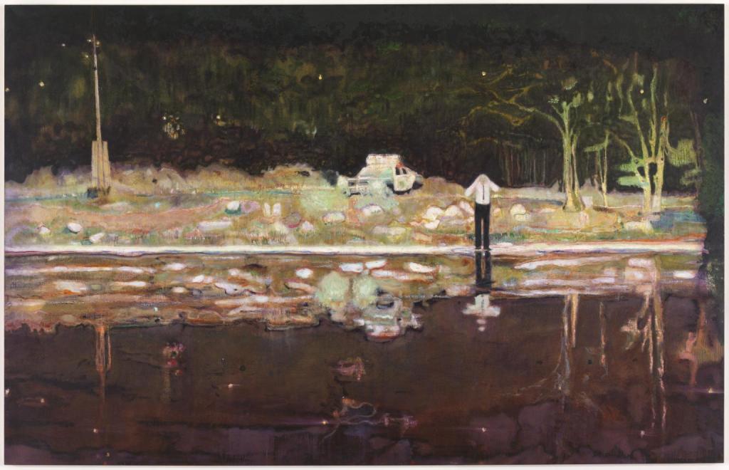
Peter Doig, 1959 – , I had looked at Peter Doig’s work previously. This time as suggested I concentrated on his landscape paintings. Those that I found resonated with me were those that had a European, perhaps Scottish, feel to them. I was less captivated by the Caribbean influenced paintings. I will consider whether to base my critical review on Peter Doig’s landscape paintings. The other artist suggested to me is George Shaw whose work I feel is perhaps closer to my own. Returning to Peter Doig one of the key aspects of his landscape paintings is the inclusion of a human element. An example of this is his painting ‘Echo Lake’. This painting, see below, has a narrative to it. The lakeside setting appears to be on the outskirts of a town. The lights from the town can be seen behind the dark trees. The scene is lit by the headlights of the police car and the reflective quality of the water. This highlight the tress to the right of the painting. These trees fade into the night sky. There is a symmetry to the composition, the telegraph pole on the left, the trees on the right, the police car just offset from the centre of the painting. The white shore line about a third of the way up and the reflections in the lake all work together to give the painting a cohesiveness. The storytelling narrative comes from the policeman, presumably, who is calling, shouting out to the observer across the lake. What is he shouting? Is he shouting at us? What is happening in / on the lake? These questions remain unanswered but give the painting a drama.
Peter Doig, Echo Lake, 1998, Oil on canvas, 230x360cm
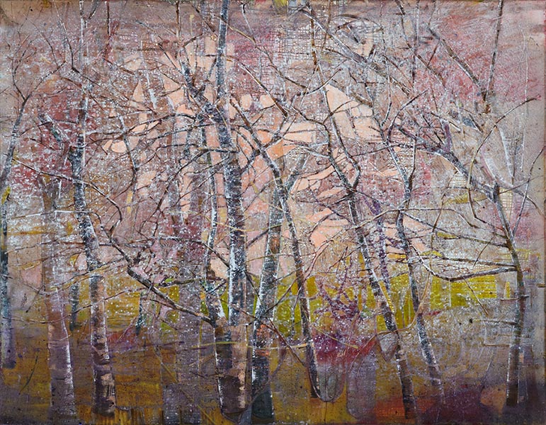
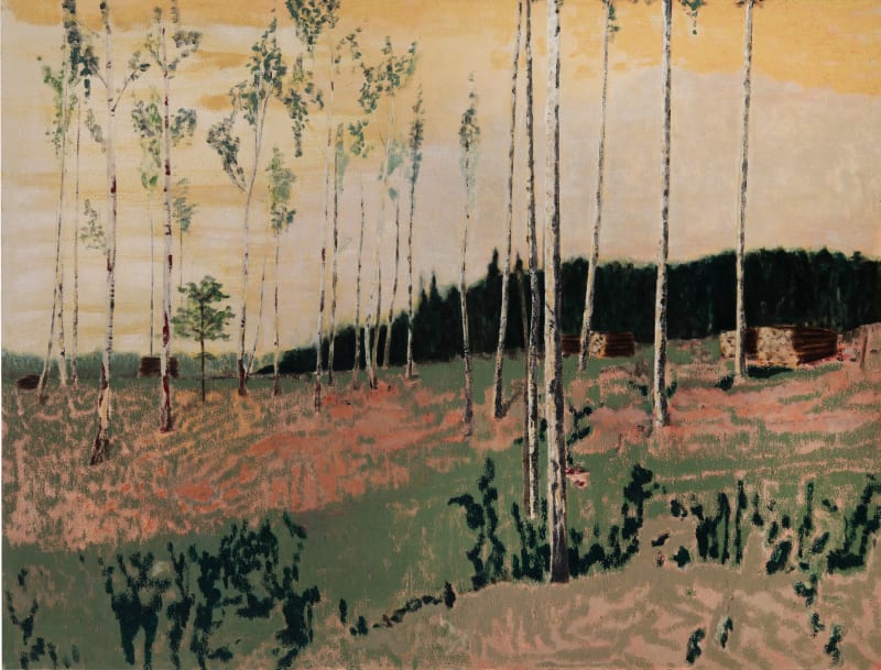
Elizabeth Magill, 1959 -, I have downloaded a number of Elizabeth’s paintings as these really resonate with me. The capturing of the delicacy of trees and the timid light that surrounds them is something that I have tried to capture in my work. Two examples are reproduced below.
ElizabethMagill, Betula Pendula, & Dendriform 10, both oil on canvas, 168x198cm & 214×277 respectively
Hurvin Anderson 1965 – , depictions of Caribbean landscapes often verging on abstraction. Student of Peter Doig.
Hurvin Anderson, Bridge Study, 2013
Hurvin Anderson, Cloning, 2016
Mamma Andersson 1962 – , influenced by the Swedish landscape which she grew up in her paintings are inspired by filmic imagery, theatre sets and period interiors. Her landscapes are melancholic and dreamlike.
Mamma Andersson, Cuckoo Hill, 2019, Oil on linen, 90x118cm
Per Kirkeby 1938 – 2018, Danish, part of Danish experimental art school “eks-skolen” working primarily as a painter, sculptor, writer and lithographic artist. His works was informed by geology and nature. The two examples below are abstracted paintings which explore the colours and solidity of harsh landscapes.
Per Kirkeby, Fram, 1982, oil on canvas, 118x200cm
Per Kirkeby, Rublick III, 1987, oil on canvas, 200x200cm
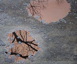
Calvadonga Valdes , Spanish artist using the landscapes of Spain, England, Italy and Swedish Lapland to create surreal paintings, often group of paintings on a theme. Two examples are a series called “Homeland” where the reflection of trees are observed in small pools of water and puddles. The second series “Vascular” uses the heart and vascular system as a vehicle to organise the paintings. Examples of both of these series are replicated below.
Covadonga Valdes, Homeland II, paintings from Homeland series
I knew that this exercise would be a challenge as soon as I had read the brief. Undaunted I would plunge into it although I did procrastinate for a few days. I prefer to think of it as time to get my thoughts together and subconsciously explore options as to how to approach the task. An option that I considered was to make a mannequin using old clothes. This I dismissed as it didn’t seem to be in the spirit of the exercise. It seemed to be more akin to making a ‘Guy’ as in, Penny for the Guy, which I remember doing as a boy. The process that I undertook and the results are documented on a separate blog.
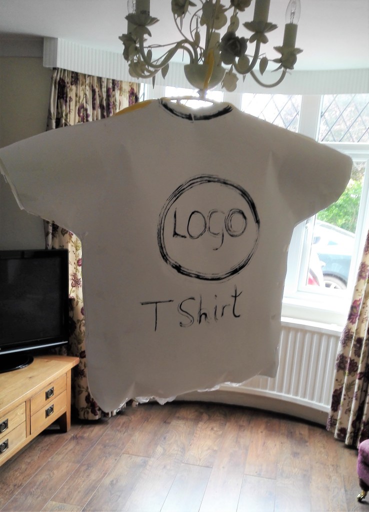
My reflections on the results are as follows. the initial cut-out t-shirt shapes and the fashioning of these into a stand in for the garment were disappointing. This was for two reasons. The first was my limitations as a model maker. The re-made t-shirt was cumbersome, stiff, plain and unrealistic as a stand in for the actual object. The second was that although it inhabited a space it did not act as a stand in for the human form. It looked to be what it was, a model. This was true in whatever situation that I placed it in. Some were slightly less incongruous than others.
Four photographs of initial model
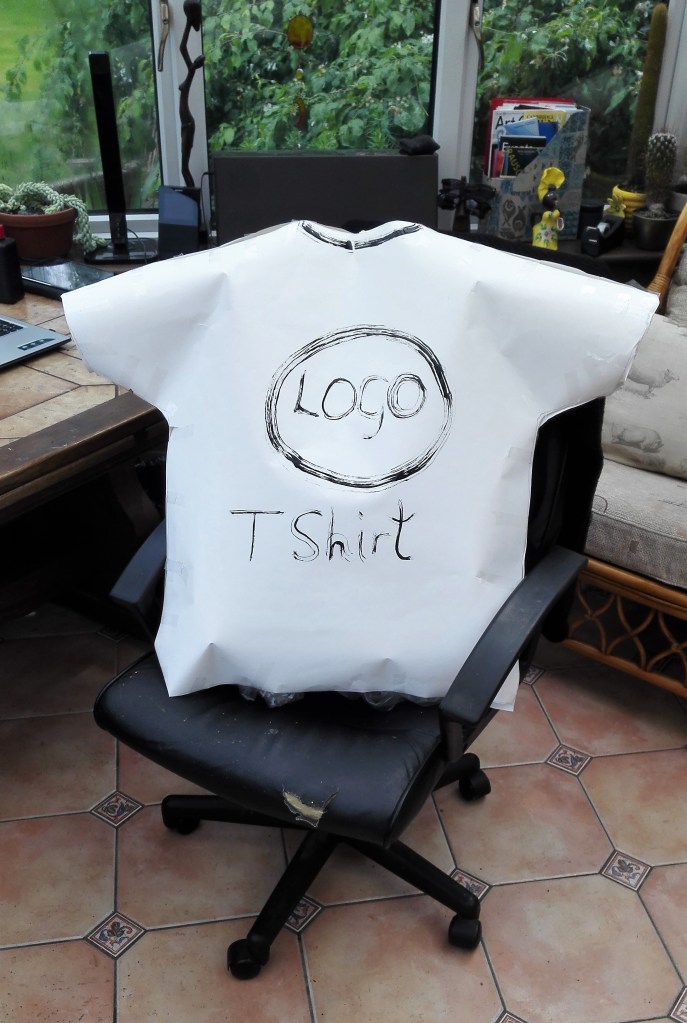
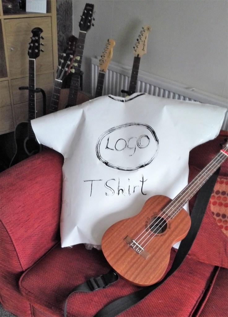
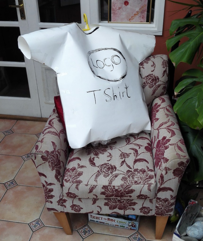
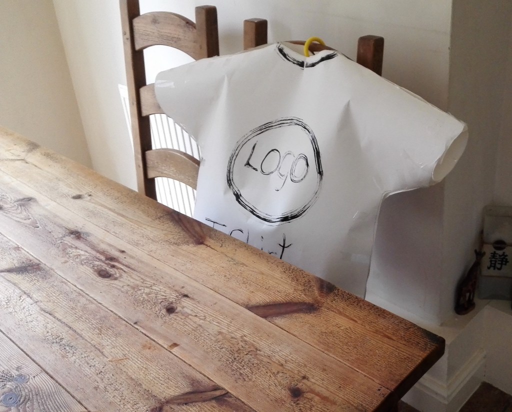
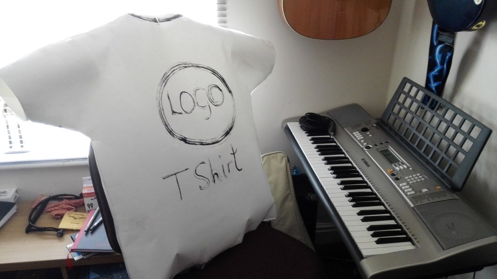
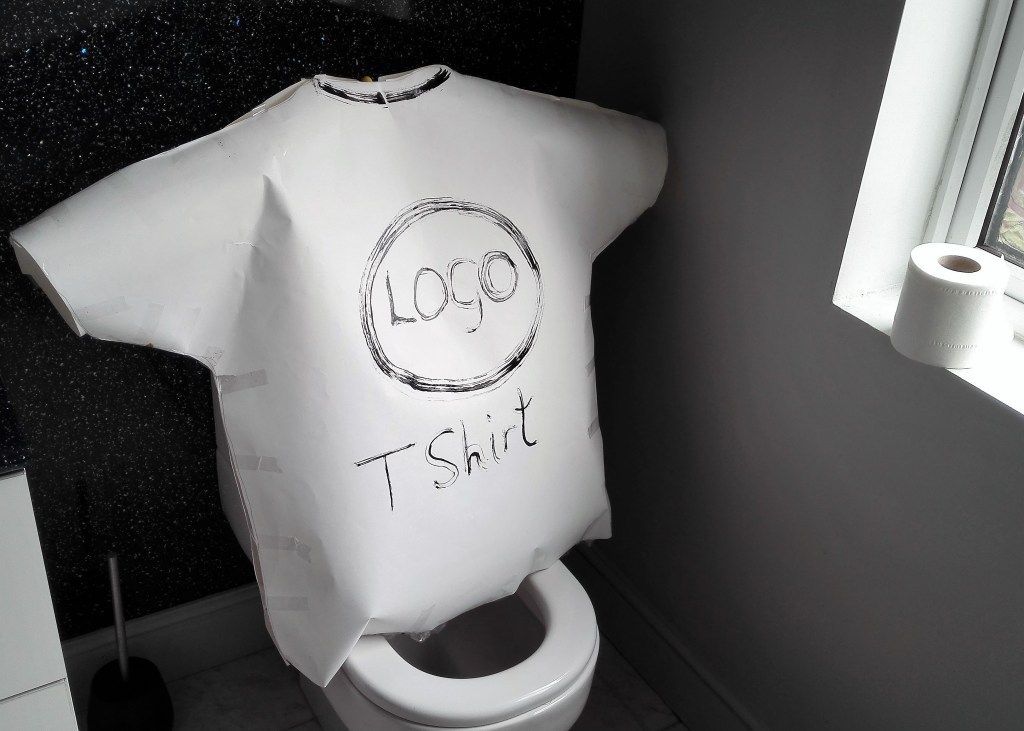
The second phase was to try to make the model more true to the t-shirt. This was done by the addition of a logo ‘Logo’ and a label ‘T shirt’. This had the immediate impact of breaking down the visual barriers and it started to take on more of a life of its own. The notion that it was a stand in for the human form became more apparent. The model not only occupied a space but represented form, albeit in a crude manner. The photographs from this stage have a curious interest to me.
Four photographs of painted model
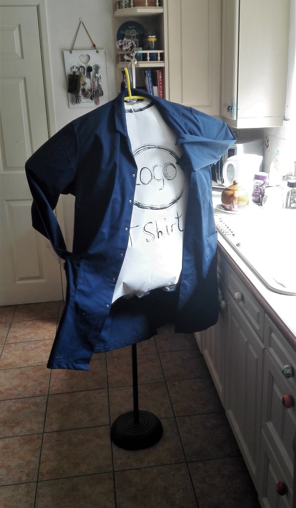
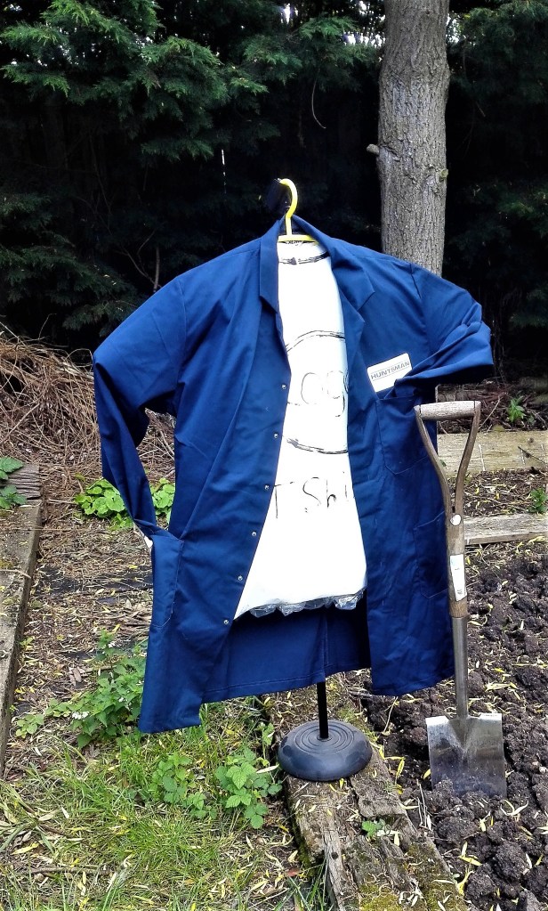
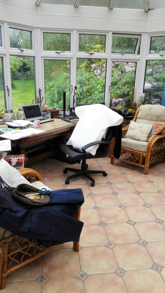
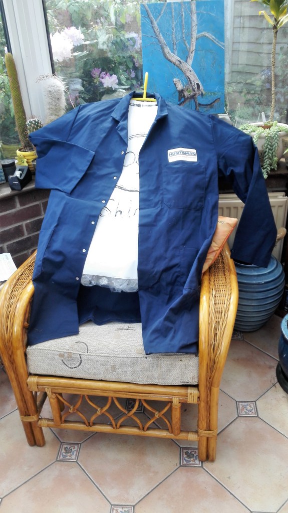
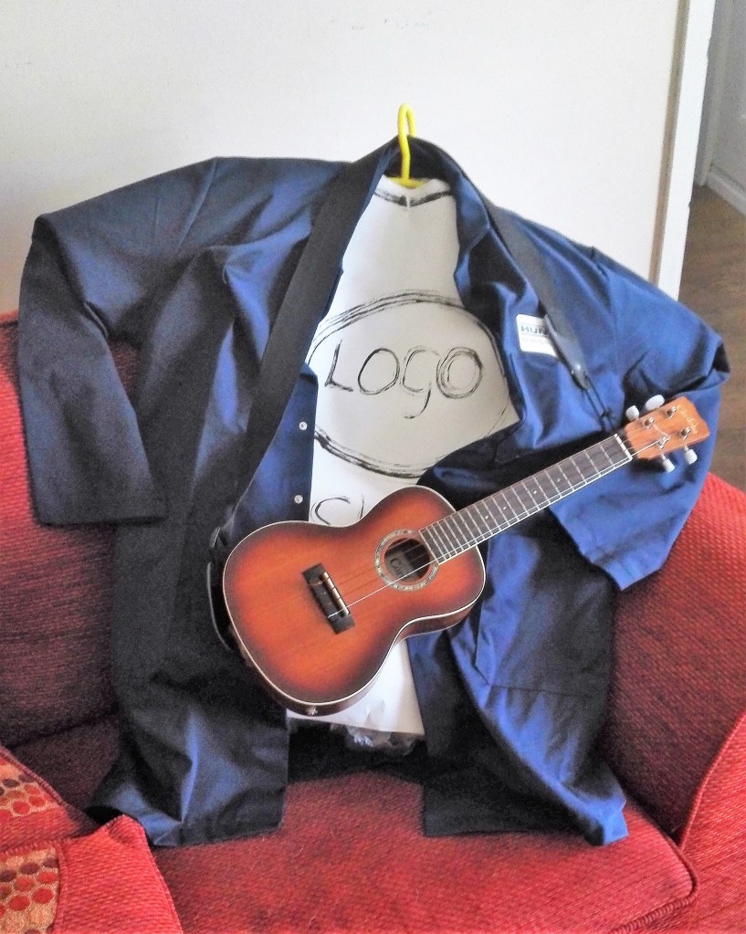
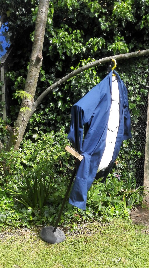
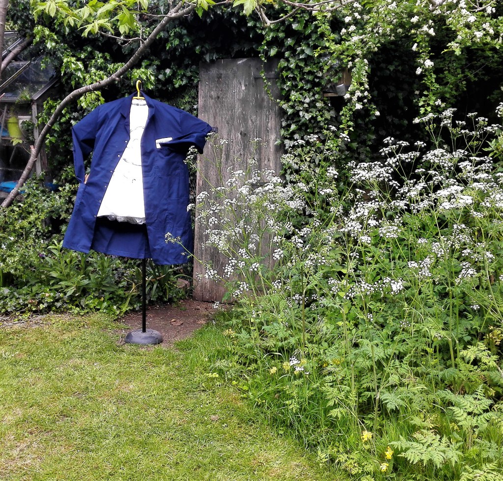
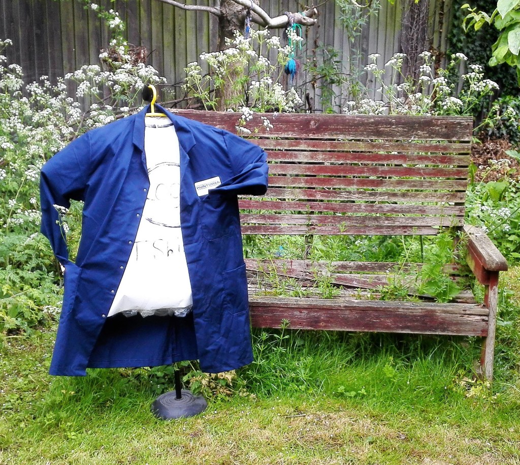
I still felt that I hadn’t explored how the model could replace the human body. Although not in the spirit of the exercise I clothed the model in a lab coat. This immediately gave it a greater presence. The lab coat indicated greater form. The arms gave it gestural qualities which were enhanced and accentuated by the flow and form of the coat. The photographs from this stage are much more satisfying. I was able to pose the model in various situations where it took on a replacement for the body. It could be placed in a position and had a presence.
Four photographs of lab coat clothed model
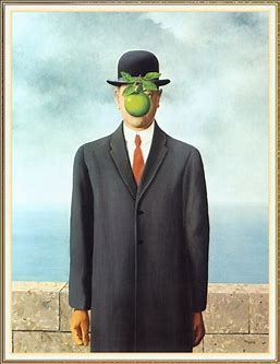
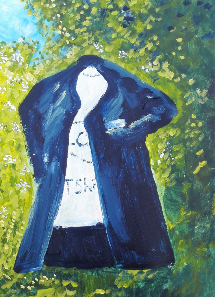
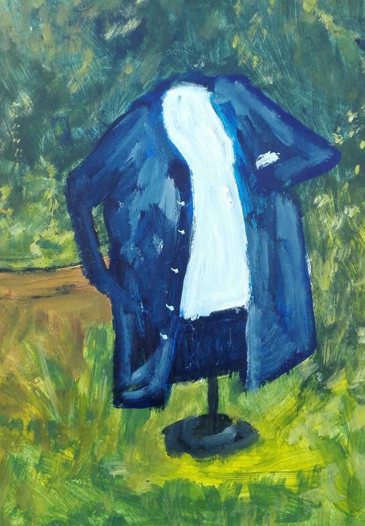
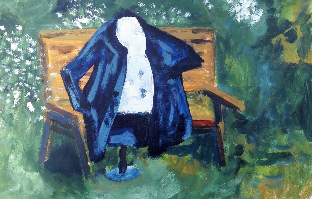
The last stage, and the most satisfying, was to revert to painting. The four paintings that I made were completed quickly, each one taking less than 30 minutes. There is a definite feeling in the paintings that the model is occupying a space of its own. It is animated, it suggests the presence of a human body. In one of the paintings in particular it hovers and remind me of some of Rene Magritte’s surrealists paintings particularly ‘Son of Man, 1964’. although my painting doesn’t possess the religious significance inherent in Magritte’s painting.
Rene Magritte, Son of Man, Oil on canvas, 1964
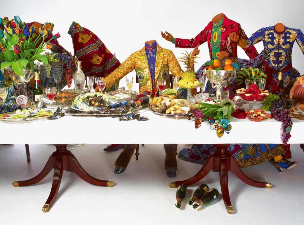
A further inspiration for the headless prop that I used was inspired by the suggestion in the course material to examine the work of Yinka Shonibare and his use of headless models. In these he is exploring cultural identity, colonialism and post-colonialism. His choice of working in Dutch Wax fabric is much more colourful than a Lab coat and manufactured t-shirt.
In summary the exercise was a challenge which forced me to confront territory that I wouldn’t ordinarily have considered. The final outcome resulted in four paintings which successfully resolve the process. They also help to confirm to me that I consider myself a painter rather than a sculptor or a model maker.
This blog is about the process that I undertook for this exercise. I will write a further blog on my reflections and learning from the exercise in a separate blog.
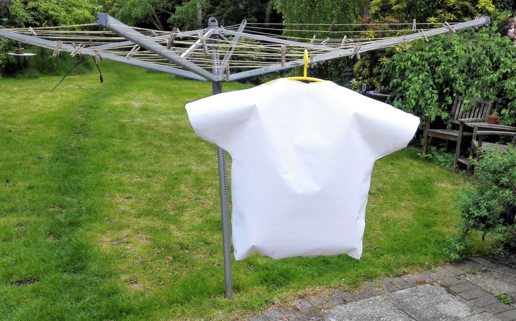
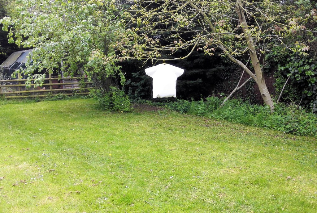
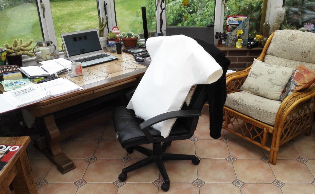
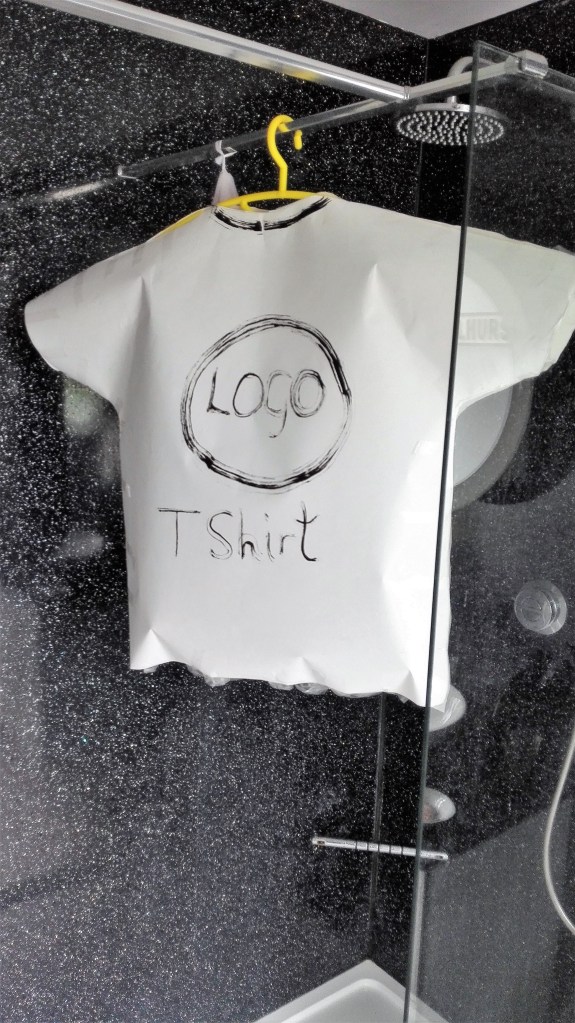
I selected an old t-shirt and jeans as my initial items and only ended up using the t-shirt as a model.
I made a 1:1 scale model in paper, held together with cellotape, stuffed with plastic and a coat hanger. I photographed the cut out shapes, these were more interesting than the model.
Cut-outs
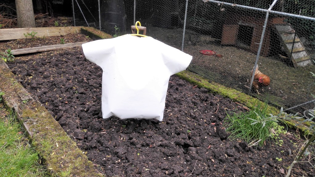
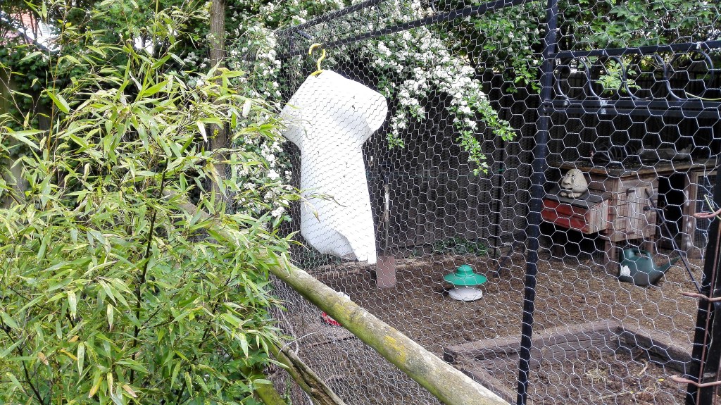
It looked a pale parody of the original garment. However armed with it I set about photographing it in various locations around the house and garden. The results were mixed the best of which are reproduced below.
Photographs of model T-shirt around the house and garden
The biggest disappointment was that the model was not taking the part of the human form but only as itself. I made some amendments to the model first painting it and later clothing it. I then made a further series of photographs.
Painted photographs, from around the house. These are slightly more animated than the previous set of photographs. This is mainly due to the settings that I put the model into. As previously it seems to be representing itself rather than as a stand in for the human form.
Photographs of painted object around the house
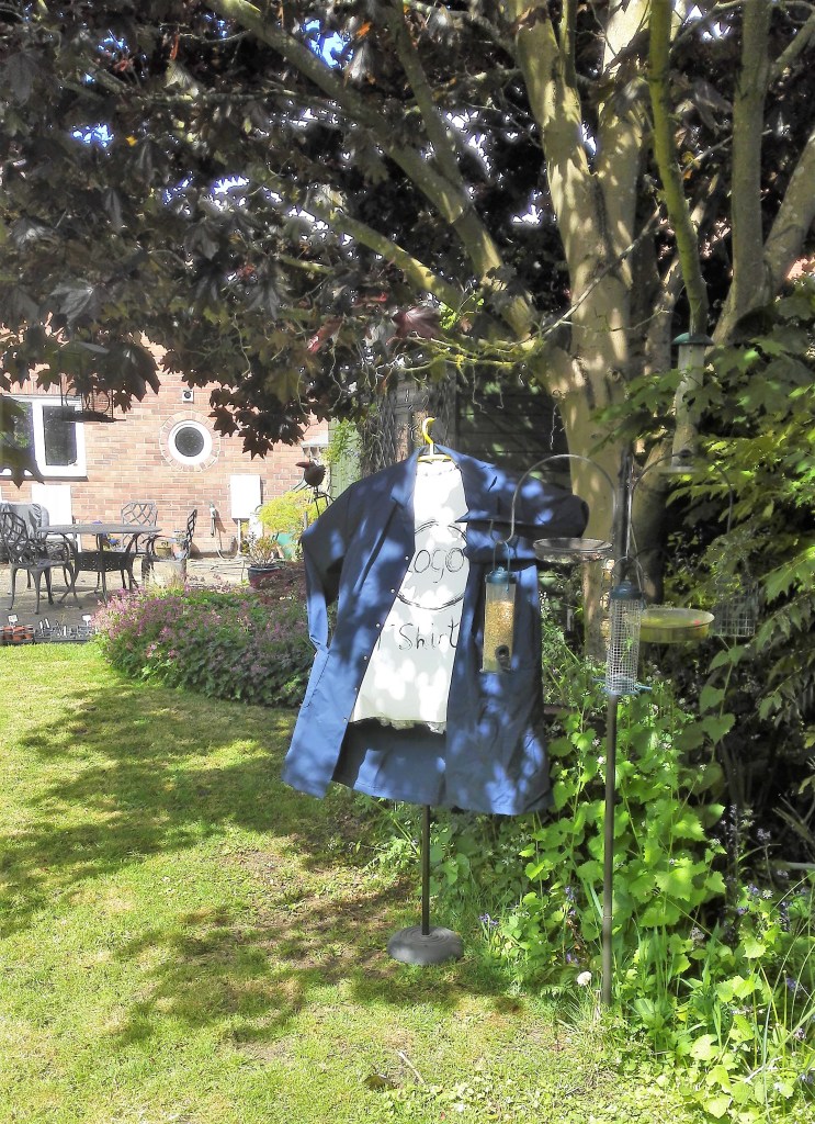
This is now the third day of living with my clothing object. Today it has taken a new form in that I have clothed it in a lab coat. As previously I have taken it around the house and garden and taken a series of photographs. The addition of the lab coat, the use of a microphone stand and the positioning of the arms of the coat has given the prop an animated quality which was not apparent previously.
Photographs of clothed object around the house and garden
The last part of this exercise was to make some quick paintings of the object in various positions. I made four paintings. One indoors from one of the photographs and three outside in the garden. I worked quickly using acrylics trying to capture light and feel rather than accuracy. The four paintings are shown below.
I’m happy with the outcome and as I stated earlier will write up a separate blog regarding my reflections on the process and the results.