Assignment Three – Hidden Away

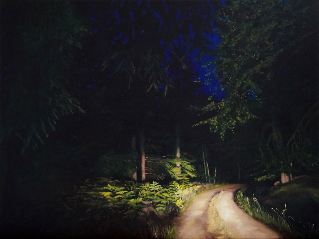
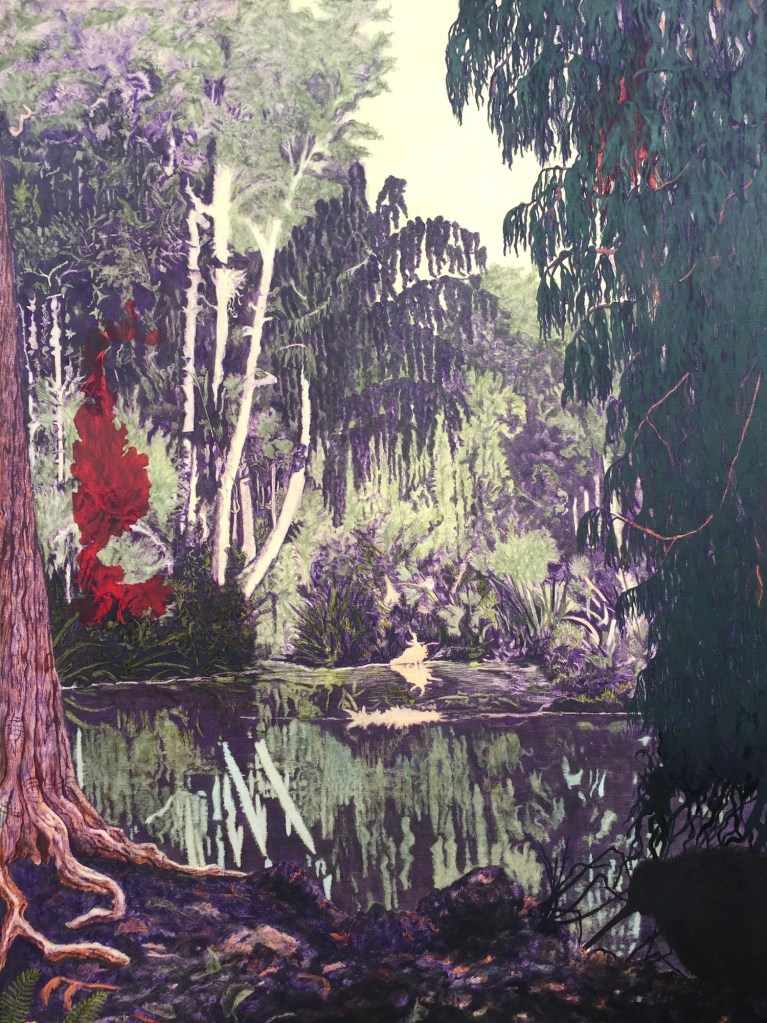
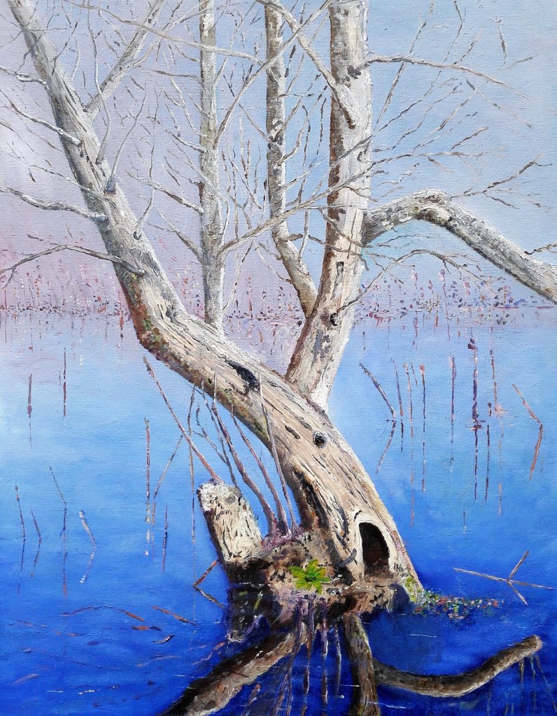
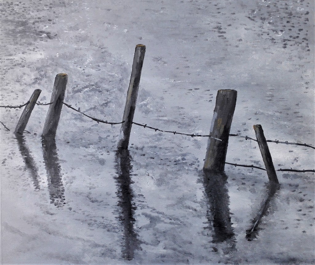
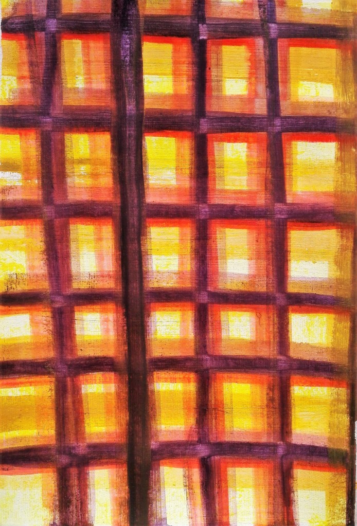
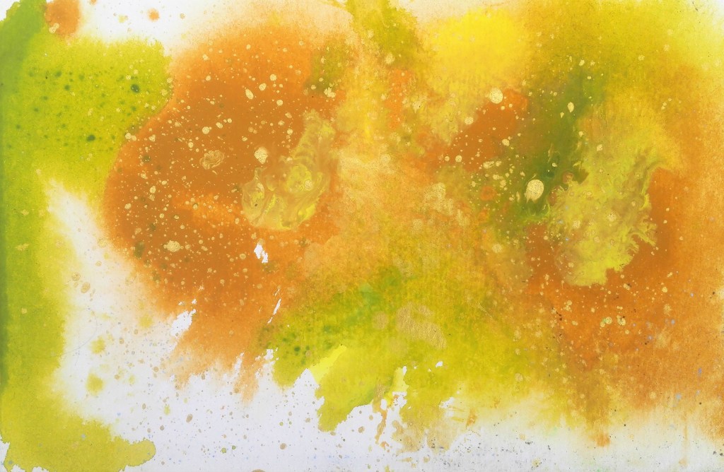
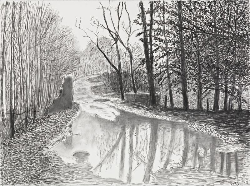
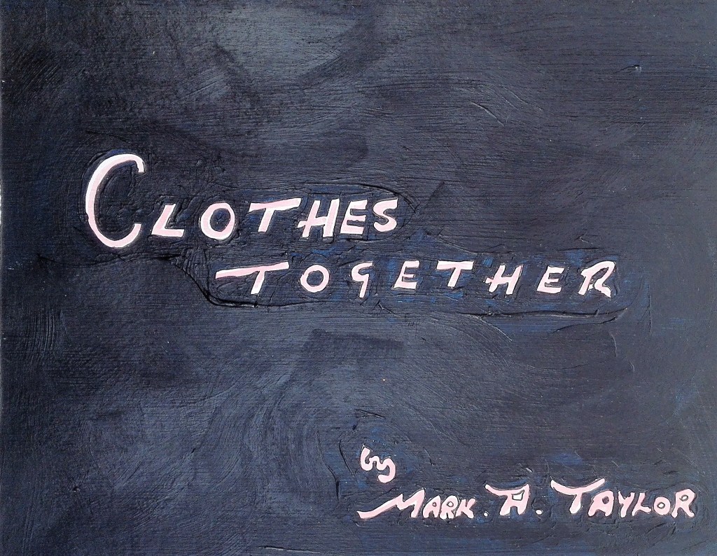
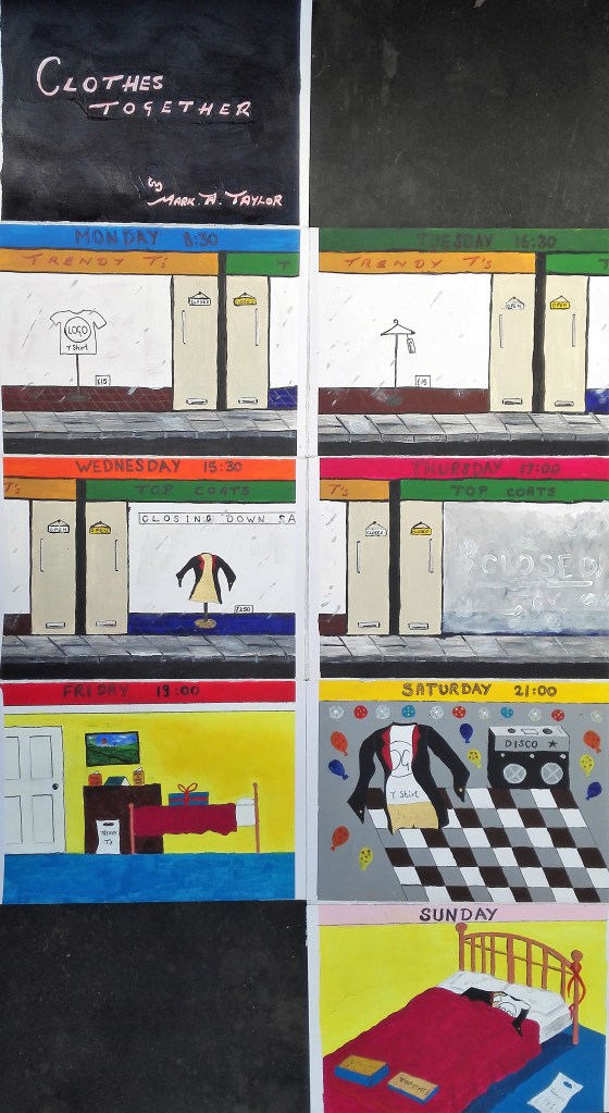
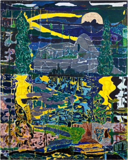
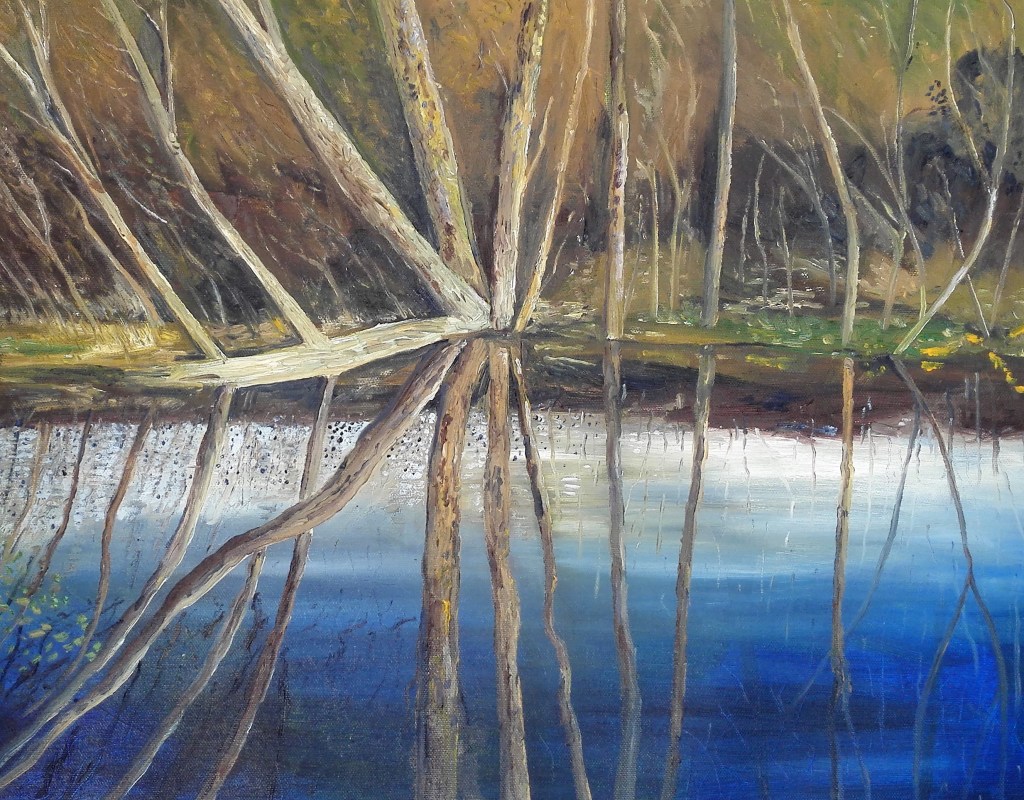
I will start this written piece by posting the finished painting and then I will go through my thoughts and reflections on its creation and outcome.

Hidden Away, Oil on canvas paper, 40.6 x 50.8

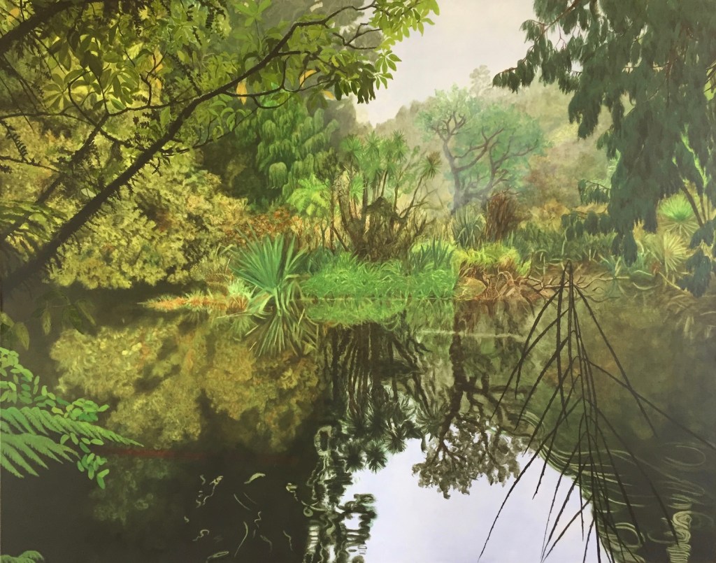
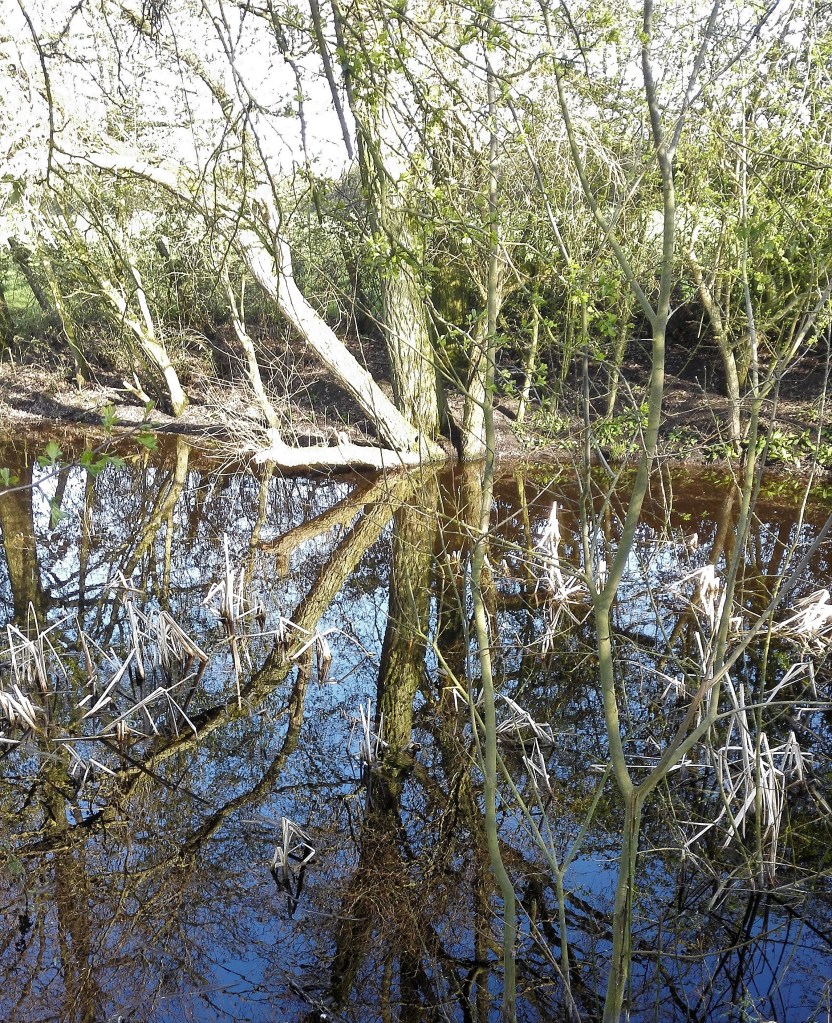
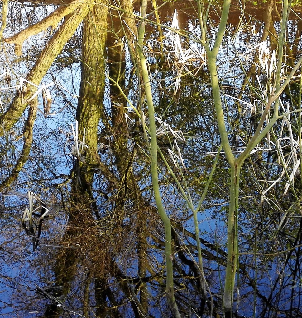
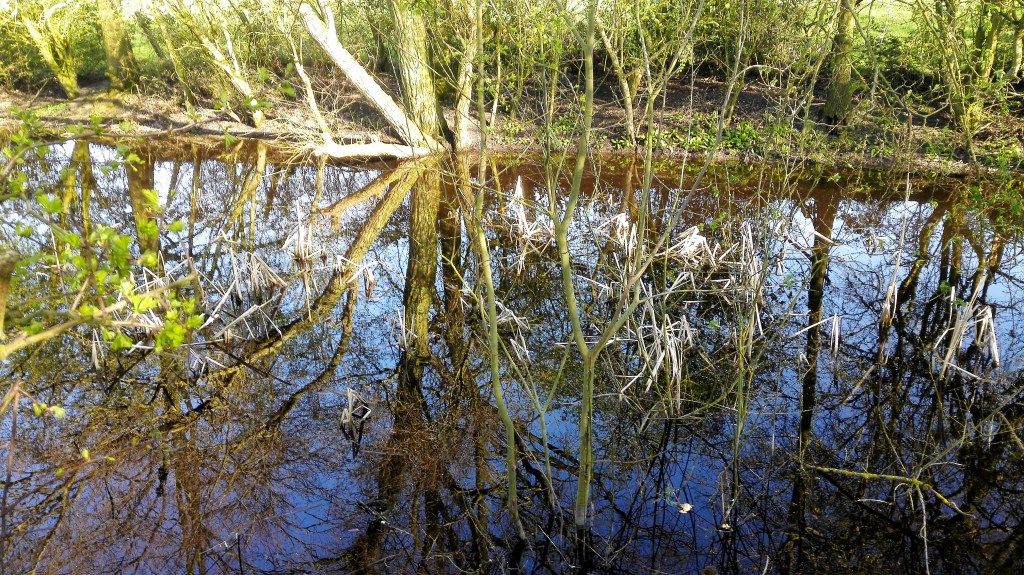
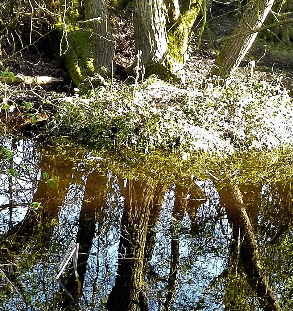
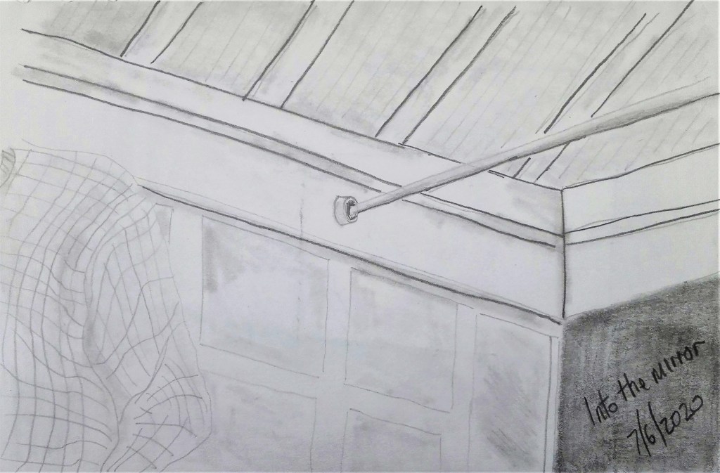
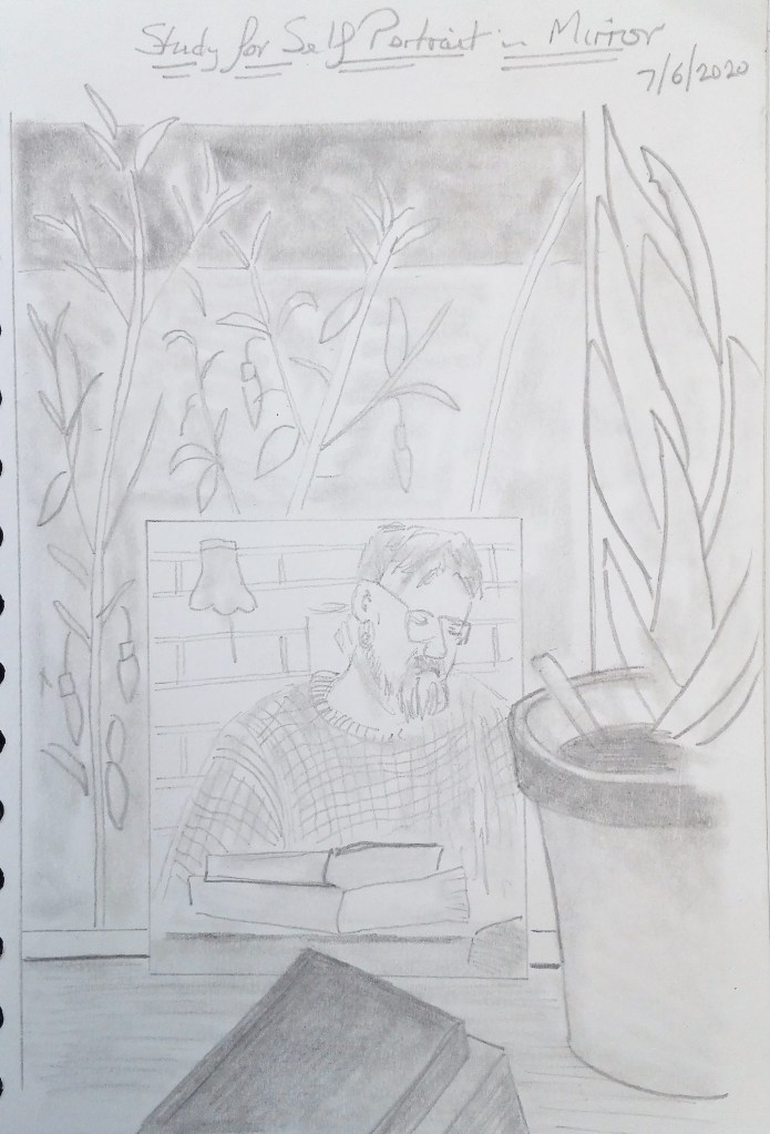
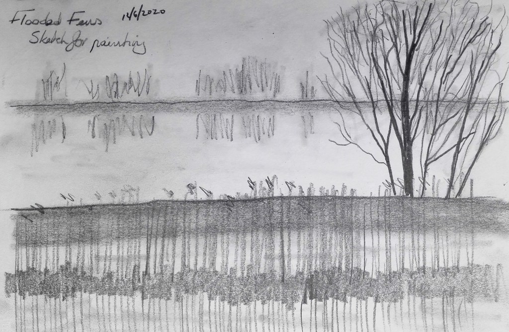
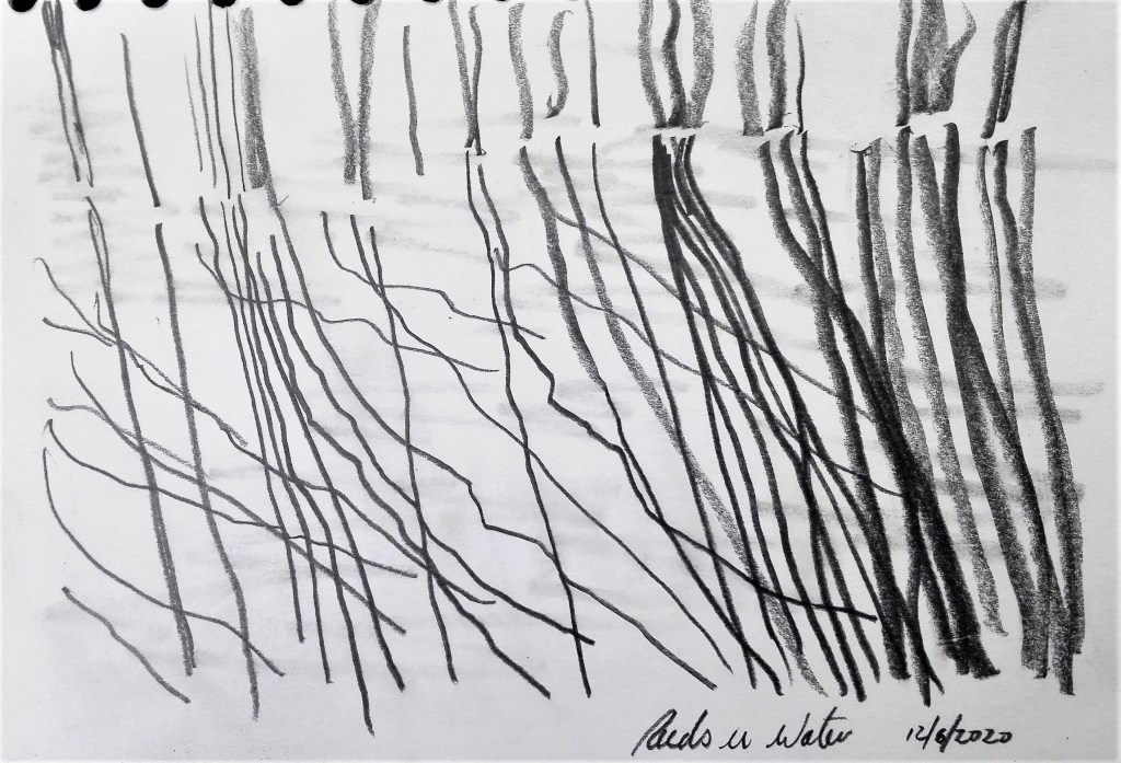
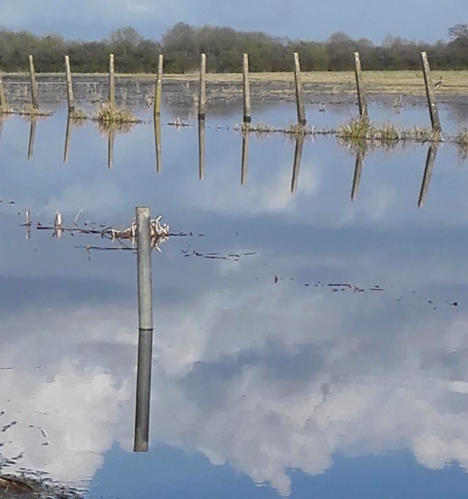
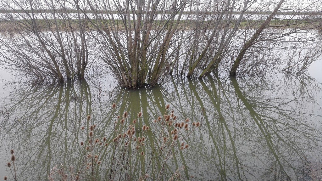
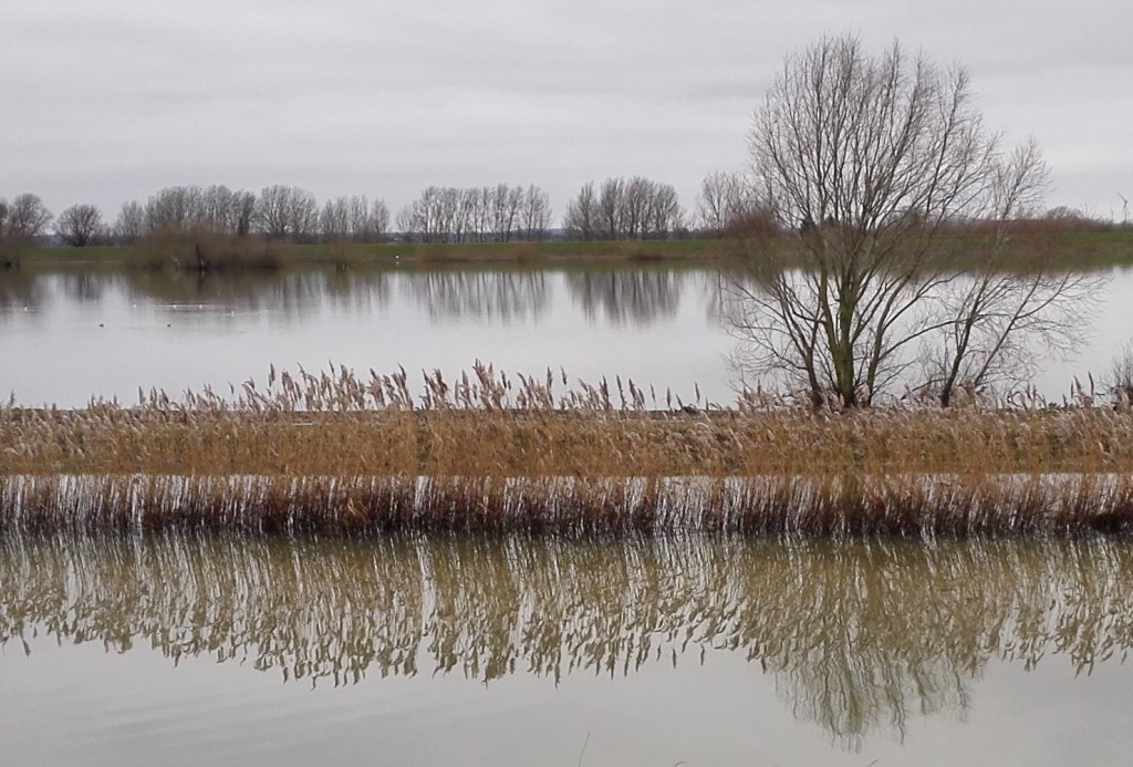
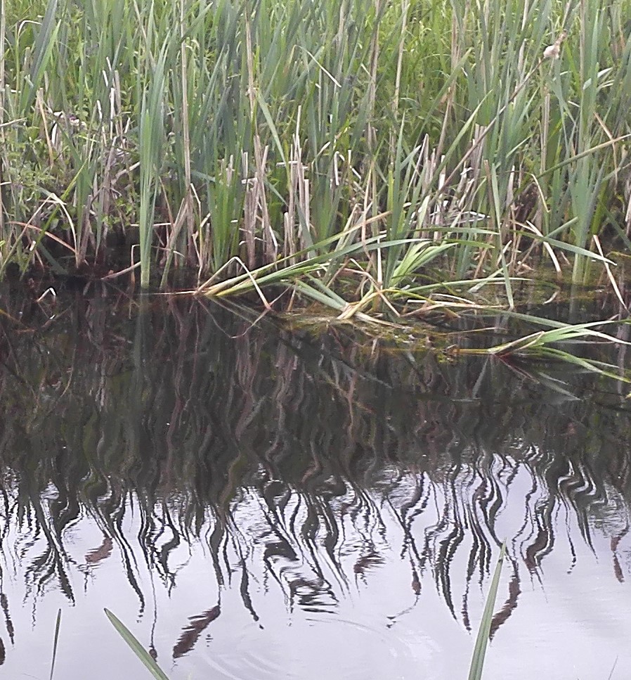
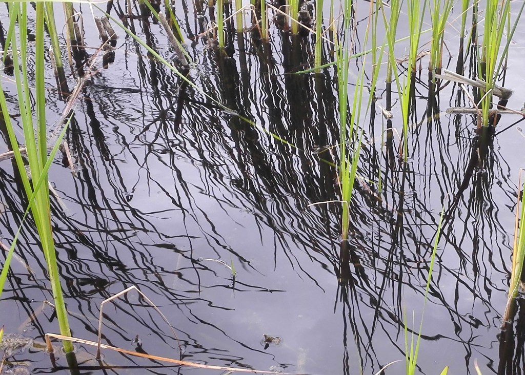
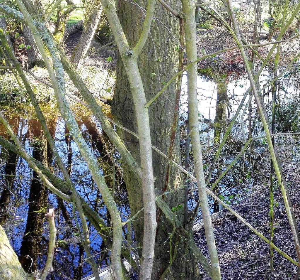
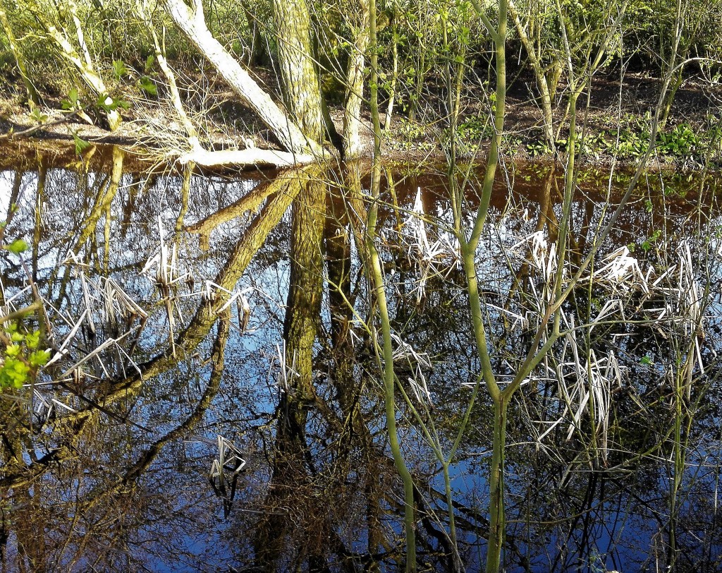
This painting is very much a follow on from Exercise 1.3 ‘The mirror as a stage’. The subject of reflections has been a line of investigation for me for some time. I have made a series of paintings, going back to the start of my previous OCA course ‘ Concepts in Practice’ which explore the reflective qualities of water, particularly in the landscape. My investigations have explored both the mirror aspect of bodies of water and the act of looking into water. It’s ability to be looked through and to reflect back at one and the same time. For this particular painting I wanted to make use of a small series of photographs I took earlier in the year. They focus on part of a Fenland drain that is usually hidden from view. The photographs were taken in early spring before the foliage obscures the view. The water at this part of the drain also dries up and the reflective qualities disappear.

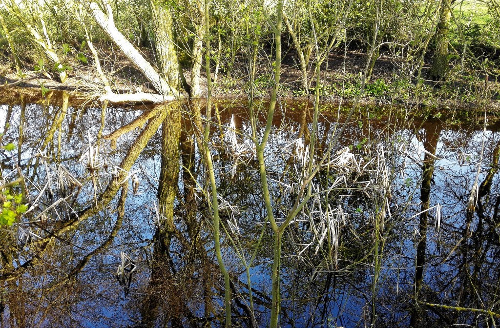
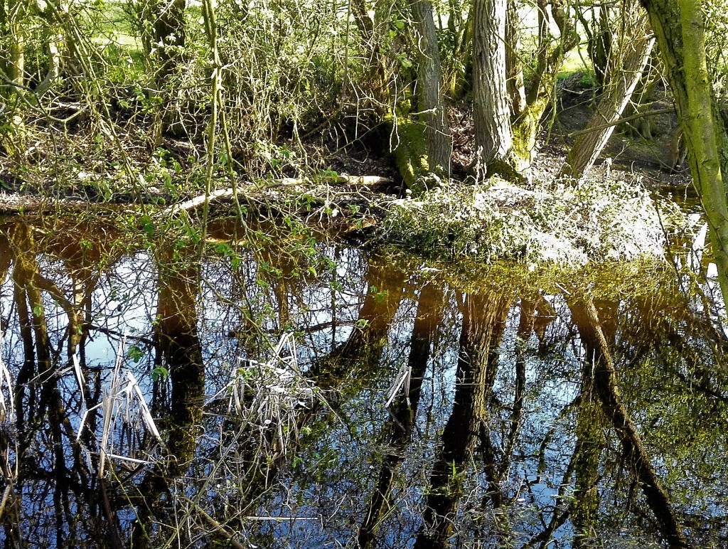
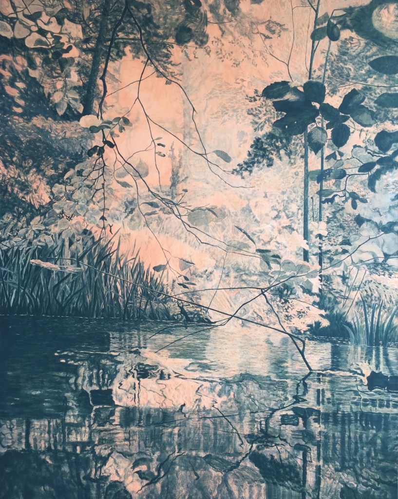
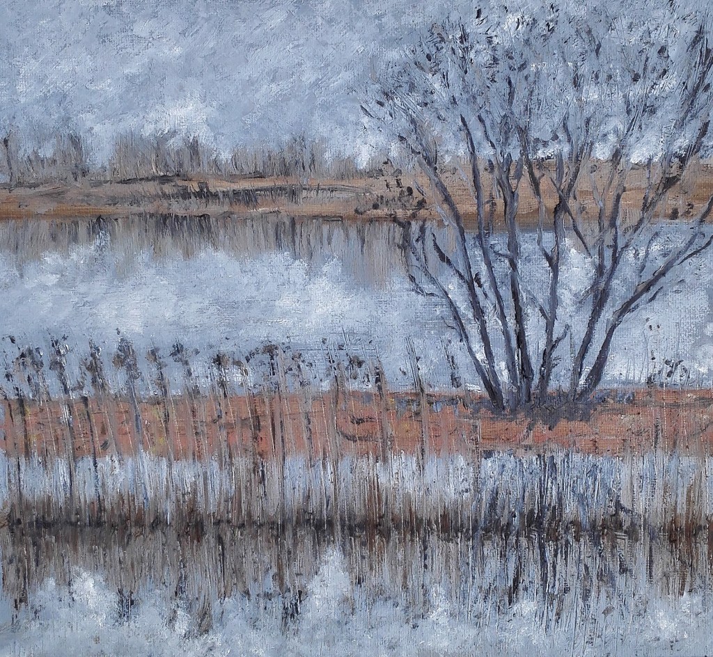
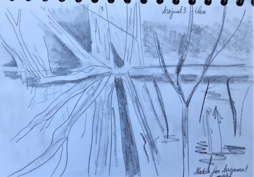
There is considerable information in the photographs which I would need to edit in order to try to convey the subject in a clear way. This started by making an edit of one of the photographs which would then become the template for the composition.

Edit for painting

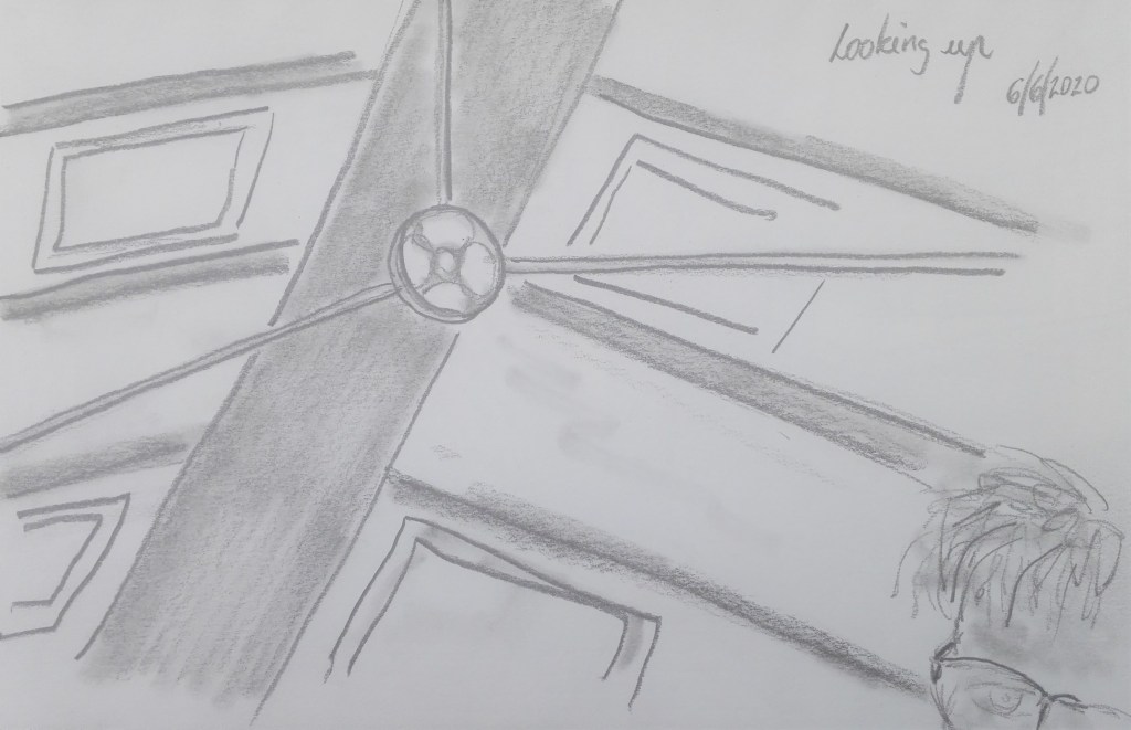
A quick sketch was made before I embarked upon the painting.

Quick sketch

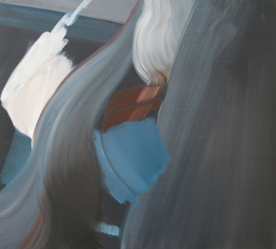
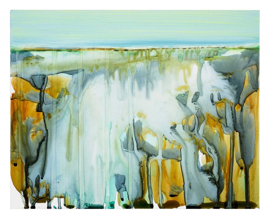
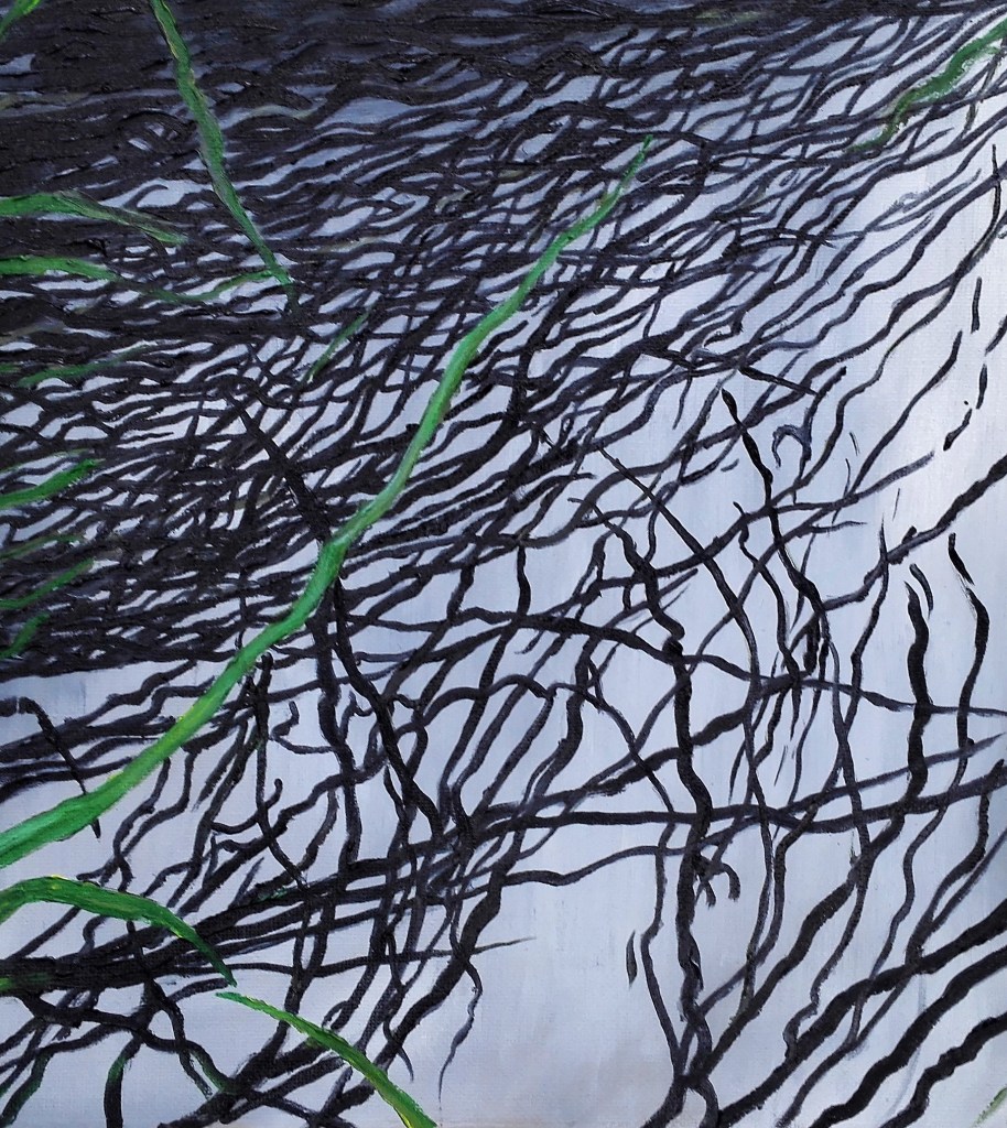
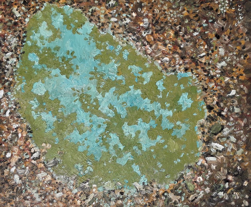
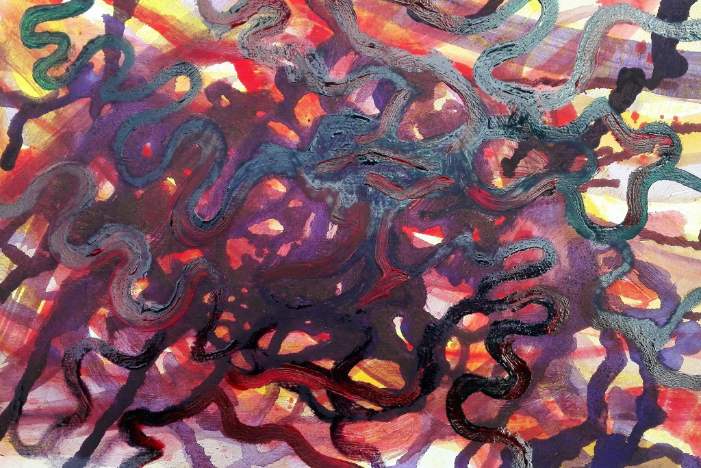
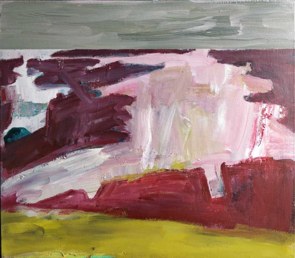
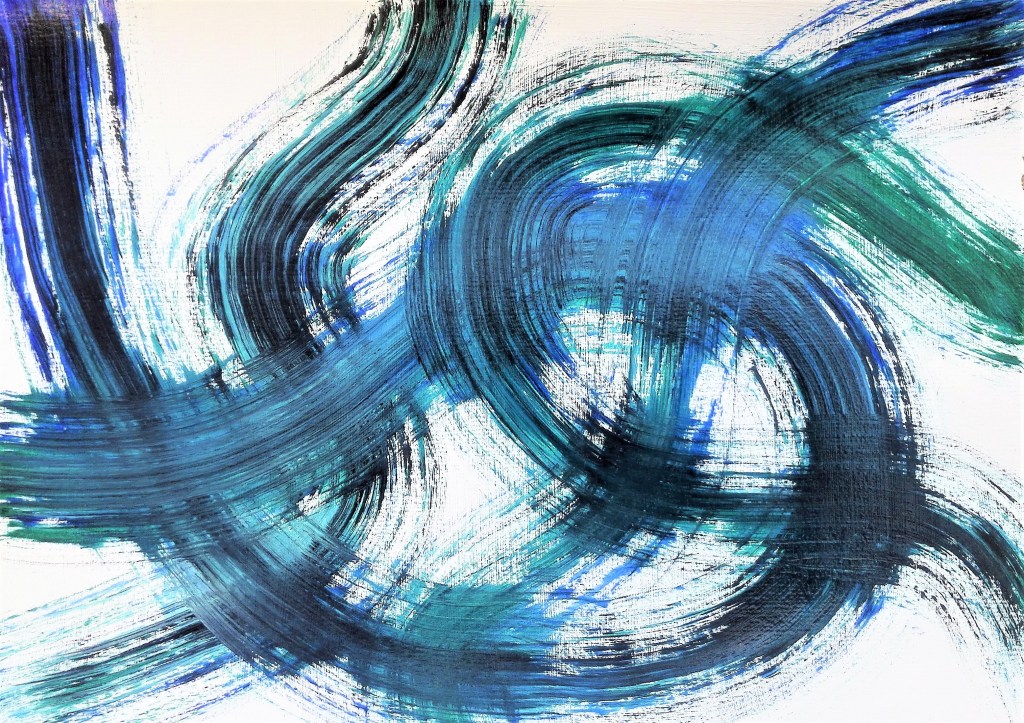
At this stage I was stuck in two minds as to how to approach the painting. I had a number of different outcomes in mind ranging from a painting that was more abstract in nature to a more pictorial one. It was during the initial laying down of acrylic paint for the underpainting that I stopped when I realised that I had a loose painting that encapsulated much of what I had envisaged as a potential abstraction. This became a work in itself.

Hidden Away, Abstraction, Acrylic on canvas paper, 40.6 x 50.8

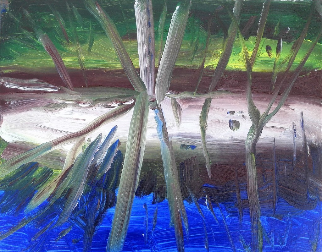
What I enjoy about this painting is the way in which the light, yellow and green, on both the banks behind the trees and the white reflected on the water contrast with the dark shadows. The trees themselves are crudely suggested by vigorous lines dragged through the background paint with a loaded brush but appear believable.

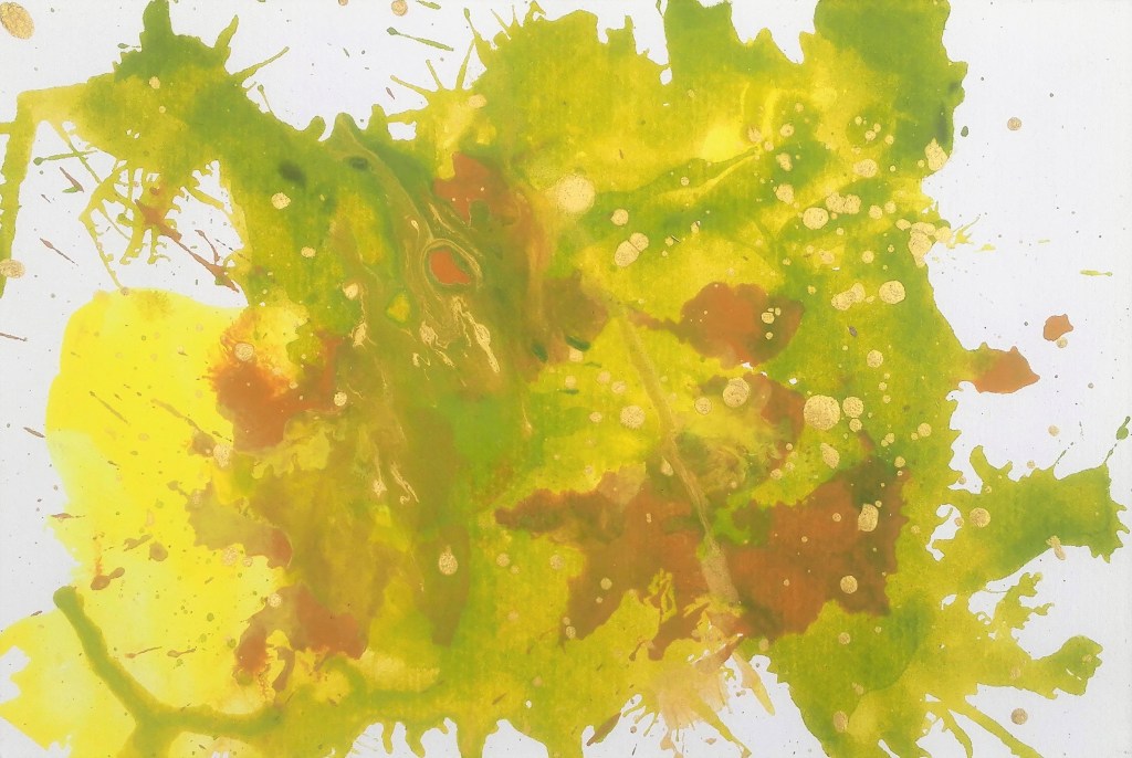
I started again, this time I would not stop at the underpainting, it wasn’t as good. It had many of the qualities of the first painting but lacked something.

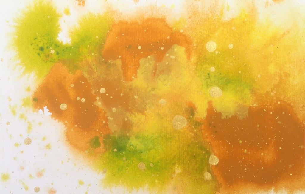
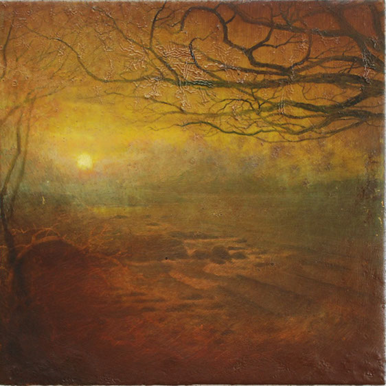
The second, completed painting which I used to open this blog, is a more focussed painting. It is also more pictorial in intent and outcome whilst taking some liberty with the colour palette which makes it less naturalistic. The temptation to overwork it and potentially lose some of its vitality was strong.

Whilst being content with the outcome I feel that I still have more to do before I feel satisfied within myself with this style of work. There are elements of my practice that I am trying to resolve. This will take time and practice and will evolve.

Hidden Away, Oil on canvas paper, 40.6 x 50.8

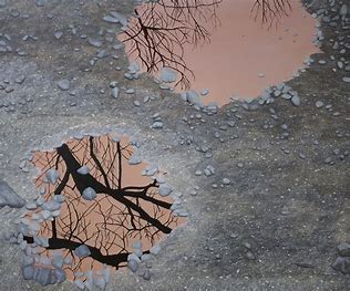
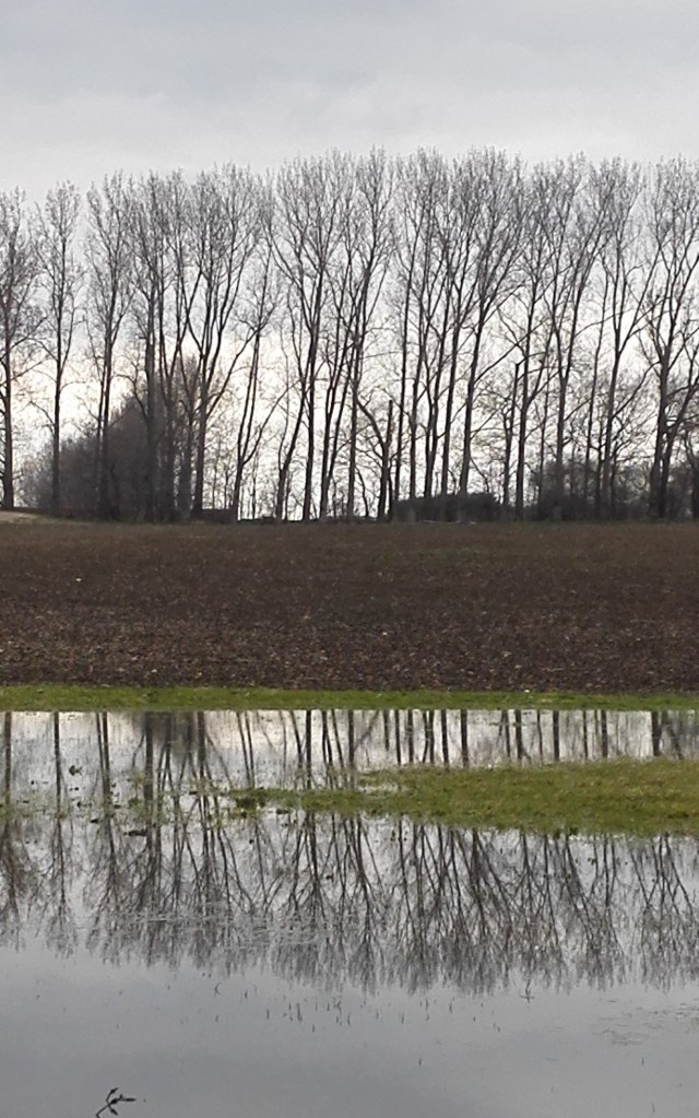
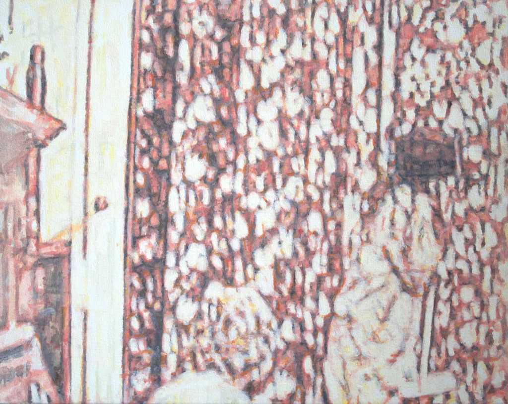
I have discovered a dilemma with this painting in that whilst editing the photograph, rotating the image, it struck me that the painting also looks good upside down. In fact it takes on different qualities. It has more depth as the what is the water now becomes a receding landscape. I am not entirely convinced. I will live with it hung this way for a few days and make a final decision.

Hidden away – upside down

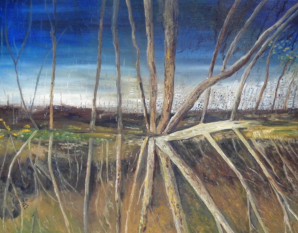
This has become my preferred way of displaying this painting. The positive feedback that I received was that it had the appearance of exposed roots at waters edge. The reflected light in the water becomes a receding skyline. There is a sense of desolation a barren landscape beyond the trees. A foreboding gloom in the sky as day moves into night.

Daily Artists Research (Part Three) 21 – 30

21. Annabel Dover, (31/5/2020), (no links)

Annabel Dover

22. Natalie Dowse (31/5/2020), initial reaction, a mixed bag, two different types or styles of painting on exhibition in the six paintings. Between dog and wolf paintings are obviously part of a series, Woodland landscapes illuminated by car headlights, something almost Lynchian about them. The other are a series of closeup portraits with tears.

Artists statement: working from and using photographs often in a series but displayed randomly to construct alternative narratives and mark moments that are irrevocably in the past.

Natalie Dowse, Between Dog and Wolf 1, 2018, oil on canvas, 120x90cm

23, Fiona Eastwood, 2/6/2020, (no links)

Fiona Eastwood, No further information

24, Nathan Eastwood, (2/6/2020), his paintings are made on primed gesso boards using enamels. The source material for the paintings are snapshot photographs. A quote from the artist ‘I just want to paint life as I see it, everyday realism, the ordinary person (the proletariat) getting on with life, social realities” The images are often captured using his camera phone and the paintings have an element of photo realism but retain loose brushstrokes and include trapped detritus in the paint. I found that the paintings reminded me of the stylised, simplified iconography of punk, ska or two tone.

Nathan Eastwood, Food Bank, Enamel on board, 2016, 53x64cm

25. Geraint Evans, (4/6/2020), my initial thoughts on the six paintings that were on the Contemporary Artists website were that they were figurative studies which juxtaposed the figures against pre-historic images and cavemen. The paintings had the look of book illustrations. On the artists statement he refers to his styles as ‘stylised pictorial language’. He uses this to explore the idea that landscape is largely a social and cultural constraint.

There is humour and imagination in the paintings which are carefully constructed. From my perspective they lack visual interest beyond the initial focus. The work on the artists website was similar but had a wider vocabulary.

Geraint Evans, Ramblin’, oil on canvas on board, 2020, 204.8 x 190.5cm

26. Susan Gunn (12/6/2020) my initial impressions, the paintings are about texture and tension. Cracks appear in jagged and flowing lines to create interest on the surface of the support. A range of materials is used to construct the paintings.

Curators statement extract: there is a subtle tension between the golden section formalism of their geometry and the unruliness of the free form cracking.

Artists website: similar work. many are monochromatic. When colour is used it tends to be a single colour perhaps a light and dark shade of the same colour.

Susan Gunn, Where are we now, DB linseed oil – encaustic wax – natural earth pigment – gesso, 204.8 x 203.9, 2016

27. Susie Hamilton (14/6/2020) fairly primitive style, loose painting technique, gestural, pared back palette colour, figures present in all paintings.

Artists statement: I paint figures in wilderness either a natural wilderness or a bleak, urban space such as a superstore or shopping mall.

‘iconoclastic’ painting method

There is an energy to the paintings which I like. The unfinished look I find challenging.

Susie Hamiltion, Polar Twilight, Acrylic on canvas, 100 x 100cm, 2018

28. Alex Hanna (17/6/2020), initial impressions: monochromatic paintings oil on canvas or board. The titles suggest or indicate a subject matter that is, on first glance, not apparent. Paint applied loosely in a sculptural manner. Of the oil painting three are thick impasto works and three are more painterly in approach.

Artists statement: working on ideas based around the ‘ambiguous’ and materiality. Reductive colour system. Exploring the boundary between representation and abstraction and how the material qualities of paint become the subject.

Artists website: amongst the topics is a predilection for radiators, pill packs, incubators, linen, plastic bags and pillows. The works are about texture and tone, subtle tonal changes.

Alex Hanna, Row of Pill packs, Oil on panel, 20x25x4cm, 2019

29. Suzanne Holtom (20/6/2020), surreal fantasy, mystical paintings, figure hiding, suggested, amorphous forms, landscapes with illustrative qualities, muted pastel colours set against drawn lines.

Artists statement: paintings are heavily influenced by mythology. For inspiration the paintings of Rubens and the landscapes of Chuck Jones (Wily Cayote and Roadrunner) have been instrumental.

Interesting ideas and shapes, flowing forms and colours.

Suzanne Holtom, Scortcher, Oil on canvas, 130 x 150cm, 2020

30. Barbara Howey (22/6/2020), initial impact, gestural paintings, very loose application of paint which is allowed to flow and mix. I found that they varied greatly in quality and impact. Painting 1, circular support with rough blue and white cloudlike markings left me cold. (I did later learn the context of this painting which helped me to understand its meaning, I didn’t make me like it though. Painting 4, shown below, which felt like an abstract landscape I enjoyed. The flow of the the paint, the receding horizon line and the vibrant but limited palette all come together to give a pleasing composition.

Artist’s statement: Past three years her work has concentrated on the human destruction of the landscape brought about by the effects of industrial waste, fracking, agrichemicals and solar radiation management.

Artist’s website: I enjoyed most of the paintings in particular a number of the figure studies where I found her approach and style fresh.

Barbara Howey, Poison Idyll 3, Acrylic and watercolour on board, 2017, 8x10inches

Research – Jacksons email – Prize winner interview with Robyn Litchfield – Link to Exercise 1.4 & Assignment 3

Robyn Litchfield was the winner of the Jackson’s Painting prize 2020 in the Landscape / Seascape / Cityscape category. The winning painting, The Hollow Place, which is shown below immediately drew me in. I saw a link to a topic that I wanted to attempt but had, to date, avoided. It also resonated with the work that I had been completing for “Exercise 1.3 – The mirror as a stage”.

Robyn Litchfield, The Hollow Place, Oil on linen, 92 x 68cm, 2020

Robyn is based in New Zealand and her inspiration comes from the primeval landscapes there. She works both from photographic images from the 19th century and photographs taken by herself . Her working method is similar to my own in that she works from sketches, smaller painted studies then larger canvases. Her paintings capture landscapes and often use reflections to amplify space. The colour palette for each painting is limited and subdued. This gives the paintings a coherence. The colours are not typically representational of the actual colours. Most of her works have an amorphous shape which is added as an unconscious act.

Two more of her paintings are replicated below.

Robyn Lichfield, Forest Gloaming, Oil on linen, 120x95cm, 2018
Robyn Litchfield, Ship Creek, Oil on linen, 41x51cm, 2019

As stated earlier in this blog I am drawn to these paintings and see links to where I would like to take some of my work. I have a set of photographs which examine a similar topic, see below, which I will attempt to turn into a painting which will be my Assignment Three piece.

Part Three – Project 4 – Exercise 1.3 ‘The mirror as a stage’ – Blog 3 “The Paintings”

I will set up a separate section of my blog to highlight additional paintings that I have completed whilst working through ‘Studio Practice’. These are often an idea or an image that I have found that I want to try and draw or paint. However I will start this blog with a painting that I had completed during Part Two that I wasn’t happy with. It is a painting of a sunken tree. I was drawn to the image whilst out walking. I took a photograph of it and committed myself to reproducing it in paint. I returned to it during Part Three and having made some improvements to the painting I felt that it fitted in with the brief for Exercise 1.3. The topic is as much about the reflective property of water as it is about the tree.

Sunken Tree – Rework 5 , Oil on board, 35 x 45cm

The background , its colour and image is a creation made up in the studio. In earlier versions of the painting I had dispensed with a horizon line which made the painting look flat and lacking depth. The addition of the horizon line and the blurred, misty background brings the whole composition together.

The second painting in this series exploring reflections is a more formal representational painting. It is a self portrait painting using a mirror against a window. The view through window, the objects on the table and windowsill along with the background behind myself. I have described the image in a literal manner. The self portrait whilst representing a likeness does make me look sombre with a vacant expression. Perhaps this is a reflection on the time that it was painted, during Lockdown. I feel that the painting works as a composition, maybe it lacks interest to the left side. I was tempted to add some plants but decided to leave these out to emphasis the empty feeling of Lockdown.

Self Portrait – During Lockdown, Acrylic on canvas paper, 37 x 48cm

Painting 3 is a study in the reflective qualities of water. The painting is taken from a section of a photograph where I was looking into the water and seeing the refection of the grasses and reeds. I feel that this is important to point out as when I showed this painting it was commented that it wasn’t obvious what it was or what it was supposed to represent. To me it was obvious but then I knew of the source material and how I had arrived at the image. Despite this I feel that it works as a painting.

Grasses reflected in water, Acrylics, 25x23cm

Painting four, the last in this series, is another exercise in trying to depict the reflective qualities of water. This painting, a Fenland landscape, attempts to capture how the reflections amplify the size and scale of the landscape. In hindsight I made the greys slightly too dark which has taken some of the life out of what I wanted to convey and made the painting more gloomy than I had intended.

Flooded Fenland scene, oil on canvas paper, 25 x 23cm

As I mentioned in Blog One on this exercise the Fenland landscape, its atmosphere, the water, the reflections in the water are all aspects that I want to explore further in my work. It is amongst the confusion of ideas that I will focus in on a topic for my parallel project.

Before I started work on my painting for Assignment Three I completed a further two quick studies examining the topic of reflections in water.

Fence posts, oil on canvas paper, 25x23cm

…and the second one

Puddle, Oil on canvas paper, 25x23cm

In summary I am happy with the outcome of this Exercise and the differing ways that I have approached the topic of mirrors and reflections. I suspect, that it is a subject I will continue to return to often as I find the topic offers endless fascination. It forces me to look carefully and consider what I’m looking at.

Research Point 5 and Links 32 & 33 – Short notes

Link 32, Katerina Grosse, these were large scale paintings which are part of the architecture of the building. The use of spray guns helped to increase her reach. The painting envelopes the buildings interior which in turn envelopes the viewer or occupant of the building as they move through it.

Link 33, The multiplication of being, or a reflective abyss? Mirrors

An essay into the role, mystery and intrigue that can be created by mirrors and reflective surfaces.

“Daguerreotype” process the first publicly available photographic process widely used during the 1840 -50s.

Examples of artists mirrors and mirrored surfaces.

Robert Smithson

Six mirrors, chalk, Oxted Quarry, England

Robert Morris, minimalist

Untitled 1965, reconstructed 1971 Robert Morris

Dan Graham, installations and structures

Pavillions

Anish Kapoor, specialising in installation art and conceptual art. The piece below I have visited in Tate modern on more than one occasion. The surface of the work is highly polished. Its presence changes as you wander around and into it.

Ishi’s Light 2003 Anish Kapoor

Part Three – Project 4 – Exercise 1.3 ‘The mirror as a stage’ – Blog 2 “Sketches and Experimental paintings”

I wanted to explore this Exercise in more than one direction. The idea of using paint as a mirror or reflective surface was one topic. The second was the use of a mirror to construct a composition and the third was to incorporate reflections into a painted study.

Experimental paintings, the two paintings below were produced simultaneously. Working from light to dark using thin washes of water soluble oil paint, Jackson Aqua oil, I built up the two paintings. There was very little preconceived notions other than in one I would use fluid movements and in the other I would restrict myself to straight lines.

Experimental Reflective Painting 1
Experimental Reflective Painting 2

Both of these paintings are fairly small scale 21 x 29.7cm. In the first I feel that I went one step too far and lost the translucent quality that I had built up. The addition of the dark, heavily oiled paint was an attempt to rescue the work. It reflects the light. I’m not sure it entirely works. The second painting ended up being more about the light and dark rather than reflections. It reminds me of the thick glass skylights that are found on city streets, but with colour.

Whilst completing the paintings above I remembered some painting trials that I completed earlier in the course. These were not enacted with any preconceived idea but they did now have a link to the challenges of this exercise. The four paintings were constructed using a thin, nearly wash like paint. Allowing the paint to be absorbed into the paper and using different ways of spreading the paint the resultant four paintings contrast with each other. There is a symmetry to them. Returning to the previous exercise of storyboard, the paintings could a series, the evolving of shape from a gaseous mix.

Following these painting experiments I turned to a more considered approach to the task. I set up a mirror in my studio and proceeded to make a number of sketches looing into and around the mirror. The aim was to make a pictorial study of my surroundings whilst working. It was whilst performing these sketches that I decided that I would try to produce a self portrait using the mirror to provide the setting. The last of the sketches below became the main idea for the composition.

Compositional sketch for Self Portrait

The other topic that I wanted to explore as part of this exercise was to look at reflections in the landscape. This is something that has been an interest for me for sometime and as mentioned in Blog 1, on this exercise, it may become the topic for my parallel project. I reviewed the photographs I had, see blog 1, and choose two to make preliminary sketches .

This point was the end of sketch and experimental stage at I now looked to produce some paintings which explored the topic of mirrors and reflections. The results of which can be seen in the third blog on this exercise.

Part Three – Project Four – Exercise 1.3 ‘The Mirror as a stage’ – Blog 1 “Research”

I have separated the blog for this exercise into three parts. The first, this one, will look at the research and inspiration that I referred to complete the exercise. This research lead, in turn, to the sketches and experimental paintings and then onto the two paintings that I completed.

The subject of reflections, reflected images, reflective surfaces is a source of interest and fascination for me. I find interest in how light is turned upon itself to create mirror images of objects. The flat landscape of the Fens, where I live, is magnified in the reflected light in the water. This creates a grand canvas upon which the landscape and nature of the Fens can be observed. As I work through this course and consider potential topics for my parallel project I am increasingly drawn to focusing in on reflections in water.

I have used mirrors in my paintings and sketches in previous courses as can be seen in the sketches and paintings below.

Mirror sketch – Produced as part of Concepts in Practice
Mirror painting – Produced as part of Concepts in Practice

The topics explored in these sketches and paintings will be explored in the first painting that I produced for this exercise, see blog 3. The use of mirrors is a device that has been used extensively in art history. I am reminded of both Van Eyck and Massys.

Having attempted to bring reflections into my paintings with varying degrees of success I looked for examples of artists who performed this successfully.

The first example, which I recalled from visiting the David Hockney exhibition at Tate Modern in 2018, was one of his large charcoal drawings of Yorkshire. A rain puddle on the roadway is used to give the drawing depth, scale and interest.

David Hockney, Woldgate 6-7 February 2013, Charcoal

A further example is the work of Covadonga Valdes who, it was suggested, that I research as part of the feedback I received from Assignment 2.

Covadonga Valdes, Homeland II, Painting from Homeland series

Just two examples of many that have helped to inspire and challenge me.

The continual source of inspiration and fascination, as touched on earlier, is the Fenland landscape where I live. I have numerous photographs which I have taken over the years which explore the reflections. Some of these are close ups others look at the landscape from a wider, larger perspective and use the reflective qualities of the water to expand the view. The examples below are recent additions.

I will continue to use this resource to educate my practice.

Part Three – Research Point 4 – Amy Sillman / Lisa Robertson – Jutta Koether and Reading point, link 31

Draft of Voice over for split screen, Poem by Lisa Robertson, Paintings and animation by Amy Sillman. The piece is an animated split screen video to which a poem has been set. I guess that the poem was the starting point for the work. The poem consists of a number of repeating sentences which are then linked to the changing images. To start with this was easy to follow but I found I got a little lost over the six plus minutes. However I didn’t find that this distracted as I was making continual links between the imagery and the dialogue. I found that the meaning of the repeated sentences changed over the duration of the piece. I guess that this was the intention. To my mind the words and images complemented each other and I believe it would be hard to watch the video without the dialogue. I don’t feel that it would make any sense. The poem without the imagery would still have meaning although the pictures would have to be made by the listener.

Jutta Koether – Seasons and sacraments, the video consisted of a talk by Jutta through her exhibition and the links and meaning of the works displayed within it. The exhibition, consisting of two rooms, is inspired by Nicolas Poussin. The first room is in response to his paintings ‘The Four Seasons’ and second room ‘The seven sacraments’. The talk consists of the challenge that the viewer is confronted with trying to make connections and find their way through the exhibition. There is a dialogue throughout the work. Without the back story or the knowledge of the Poussin paintings I feel it would be difficult to make sense of the work. My assumption is that there was information available to the visitors, this was not apparent from the video.

The reading point Link 31 consisted of a long text by James Elkins. the main thrust of the piece was the depiction or the use of time within art. I found it informative and through. There were plenty of interesting point that I need to reflect upon further.

Part Three – Project Three – Exercise 1.2 Before and after

I found this exercise an interesting challenge and ultimately a rewarding outcome. Initially, I found the limitations set in the exercise of creating a narrative using the paintings made in the previous exercises problematic. I could imagine a whole range of different scenarios regarding the ‘Man with a guitar’ painting but none that I found grabbed my interest.

Man with guitar – Painting for Exercise 1.1

Rejecting this train of thought I turned to the prop that I had constructed for Exercise 1 and the subsequent paintings that I had made.

I considered whether I could incorporate any of these paintings into a narrative but this seemed limiting. A better option would be to try to construct a new narrative involving the T-shirt and the Lab coat. The Lab coat would soon become a proper coat as I tried to imagine how they two garments could have come together. A storyboard narrative seemed to be the best way of articulating this and the days of the week seemed to be a good way of forcing the story into a chronological narrative. I put my ideas down in a sketched storyboard.

Storyboard idea

There was nothing subtle about the story and the narrative was obvious but I enjoyed its playful aspect. It would also be interesting to paint the different scenes. There would be certain constraints in that the same scene is observed on consecutive days and therefore there would be the need for consistency in the way the paintings were constructed. I created a further set of sketches.

The project was certainly coming together. However I thought that the story needed a conclusion on the Sunday. I made a final sketch.

Storyboard – Sketch 6

At this point I set about working on the paintings. Each painting would be in landscape orientation painting on 21×29.7cm acrylic paper using acrylic paints. The paper would be primed with Gesso. Securing the individual sheets to a large board I worked on the Monday to Saturday at the same time. Concentrating on Monday to Thursday to start with and then Friday and Saturday. Lastly I worked on Sunday and the cover. When complete the separate sheets would be joined together to create the complete storyboard and also to enable them to be stored together as one.

The whole process was a joy to work on. There was a discipline required in trying to keep the consistency in the paintings. I had adopted a flat comic book come pop art style which helped in maintaining the conformity. Using colour more or less straight from the tube with very little mixing helped. Additionally the use of words and dialogue with the addition of symbols assists in the telling of the tale and makes the narrative obvious.

Each of the paintings is shown individually in chronological order below followed by the complete storyboard.

Conclusion and final thoughts. I’m tempted to make a short video with perhaps some music or dialogue however I have resisted this as I don’t feel it will add to the project. The aspects of creating as series of paintings on a theme is something that I have embraced before particularly in my Assignment 5 paintings for Painting 1. It will be my aim to produce a series of paintings on a theme for Assessment. I very much doubt that they will have such an obvious narrative but will be linked.

Regular Artist Research – Part Two (11-20)

11. Simon Carter (16/5/2020), artist based on the Essex coast. I have reproduced sections from his artists statement.

“I use the elements of the coast, the creeks and estuaries, saltings and seawalls as an archive of shapes and colours, of weather and objects. I try to find dynamism and passion in the paint that will match those oin the landscape whilst retaining a structural clarity that allows fact to become something pictured and true.”

To me the words are more descriptive than the paintings. although these are two amongst the six that I enjoy as I can see a link between that landscape experienced and the painting, these are shown below.

Simon Carter, Decoy, acrylic on canvas, 2017, 77x87cm
Simon Carter, Quay lane sluice, 2017, acrylic on canvas, 110x120cm

12. Jules Clarke (18/5/2020), the fluidity of paint is used to explore one moment becoming another, allowing figures and their environment to break down. working from photographs on screens allowing both image and surface interference to direct the painting. I noted that all the painting in the selection of six were the same size, 50x40cm. On further investigation into the artist’s website I noted that she seems to work on collections of paintings of the same dimensions. The paintings themselves emerge as blurred and shimmering as the two examples below show.

In both paintings there is a suggestion of human form, a ghostly presence somewhere between this world and another.

I was reminded of a short video clip that I had shot which shows shadows and light silhouetted on our living room floor.

Living Room Floor

13. Deb Covell, (19/5/2020), her practice is concerned with bringing a form into being by exploring the material and sculptural potential of paint.

Technique: painting layers of acrylic paint onto stretched plastic sheets which are then peeled off to create a support. These are then creased, cut and collapsed. The colour tends to be singular with the reflected or ambient light creating tone and revealing texture in the work. some of the paintings are quite small including the example below which has dimensions of 18x28cm. The technique would be interesting to try out.

Deb Covell, Blue Pleat, Acrylic paint, 2018, 18x28cm

14. Lucy Cox, (21/5/2020), initial impact. Plying with shapes and perspectives. Notes from artist’s statement: Spatial ambiguity, a fascination with the relationship between two and three dimensional space, colour and rhythm, and figure and ground.

My thoughts: The Chair, acrylic on canvas 30x30cm, 2019, shown below.

Simple shapes, skewed perspectives and a minimal colour palette of, off white, greys and black with a small rectangular red section. The composition suggests a chair without quite resolving it. I found the other three paintings less interesting, they had a collage aspect. Two of them reminded me of Matisse’s snail but less refined. On closer inspection on the artist’s website the close up reveal more interest in the coloured shapes, patterns and textures are found.

Lucy Cox, The Chair, acrylic on canvas, 30x30cm, 2019

15. Andrew Crane, (23/5/2020), Self taught painter who studied graphics at the Central school of art. A love of letter forms, numerals and the written word. Sometimes uses cement as a medium.

Quote from artist’s statement “Lately when I show up at a canvas my head is pretty empty. This ‘not knowing’ hold fear and excitement in equal measure, but with trust comes progress and the fear receded. colour and the touch of the brush on canvas is more prevalent now, like sharing of intimate vulnerability”.

The six paintings shown are abstract works. The titles indicate the mood or the subject, give a suggestion as to what is being portrayed. It seems it is then for the observer to discover the meaning, if there is one at all. Blocks of colour, rectanguar.

Andrew Crane, A landscape with clouds, 2020, oil on canvas, 61x76cm

16. Gordon Dalton, (24/5/2020) No links or other information.

Gordon Dalton

17. Pen Dalton, (24/5/2020), an artist involved in socially contextualised arts and feminist art proactive in issues of identity, sexuality and subjectivity.

Modernist abstract paintings using acrylics and other materials, often involving repeated but subtlety changing patterns. suggestions of human form or human detritus. The painting chosen is titled ‘Gutsy’ which was made using acrylic paint, expanded foam, screen printed Tegujo paper on board. The expanded foam creates a three dimensional aspect to the painting taking on the look of blobs of ice cream or peanut butter. It has a Pop art look and feel to it.

Pen Dalton, Gutsy, 2020, acrylic paint, expanded foam, screen printed Tegujo paper on board, 95x55x2cm

18. Jeff Dellow, (25/5/2020), Contemporary abstract artist, member of the London group. I found the script accompanying the paintings distracting, they didn’t help me to understand the work or the artist’s intentions. I spent a while just looking at the six paintings and choose one of the to explore. ‘Azure’ it reminded me of the dazzling brightness of a Mediterranean harbour.

Jeff Dellow, Azure, 2020, oil on canvas, 51x71cm

19. Lisa Denyer, (26/5/2020), only one painting exhibited in the gallery. ‘Pushgo’, shown below. The brushwork, which is a constant in her work, has similarities to Amanda Ansell, Julian Brown and to some paintings of mine where I have used a similar technique. with Lisa’s painting the addition of collage or painted geometric shapes help to break up the compositions. Looking at her website the brush technique is prevalent in her work. There is a consistency of style which I find pleasing. colours tend towards pastel but are vibrant. I noted that there has been a honing over her style over time and the more recent paintings are more accomplished.

Lisa Denyer, Pushgo, 2018, acrylic and collage on plywood, 45x63cm

Two examples of my paintings where I have used a similar painting technique.

20. Sam Douglas, (28/5/2020), atmospheric landscapes with strange, mysterious sponge like shapes in the foreground. They appear to me to be substitutes for the human mind. (written before reading the artists statement).

Quote from artists statement “I’m always working on a lot of paintings at once in the studio, building up and sanding back layers of paint and varnish. In a way I like to think of as akin to the geological process of sedimentation and erosion. Beneath my painting is often the strata of previous images that sometimes emerge like archaeological remnants”

On visiting the artists website I found paintings that appealed to me more than those on the Contemporary artists site. The paintings had a similar melancholy feel but dispensed with the dystopian imagery. There are two examples below the first from the Contemporary artists website site and the second, the one I prefer from the artists own website.

Sam Douglas, Stone circle on the moor, oil on board, 2019, 204 x 178cm
Sam Douglas, Red Storm Cloud, 2018, oil on board, 23x23cm