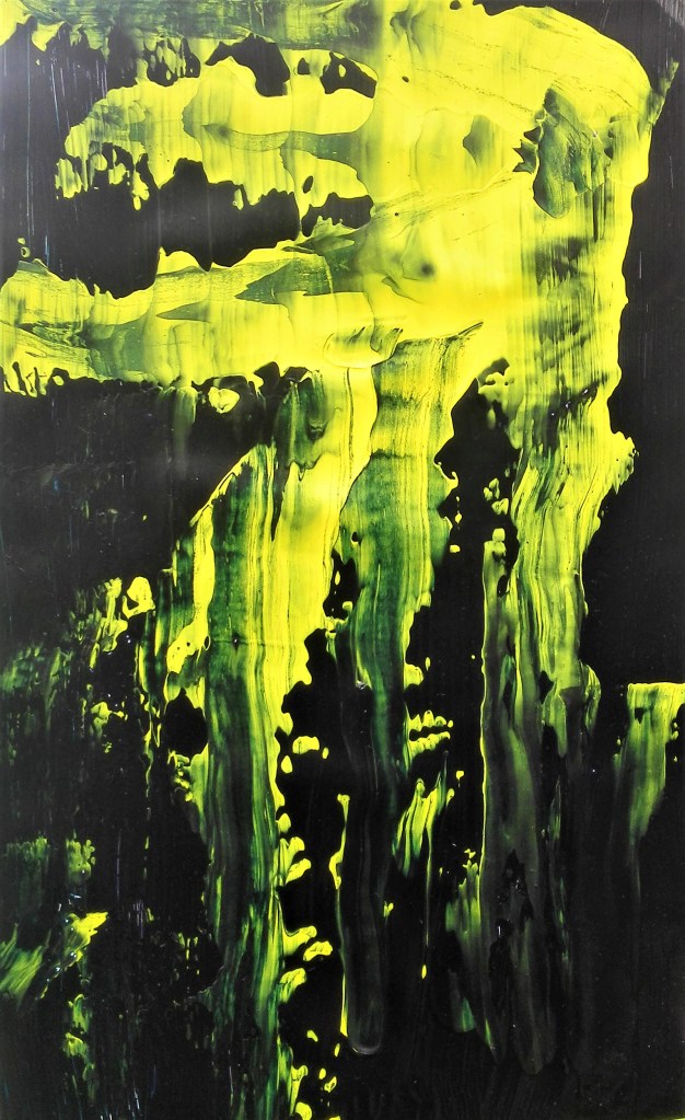
I’ll start with the quote “What does it mean to give agency to the material, to follow the material and to act with the material?”
I look at that quote and wonder whether it is something that I am learning to do. My relationship with the materials that I use, have used continues to change and develop. More and more I am finding that I am allowing materials, particularly paint, dictate the direction of a painting. This is particularly true for my experimental work, less so for my paintings where the pictorial considerations are more apparent. I have in my mind the notion that I should allow, give agency, to the materials I use, but how much? Am I comfortable to be dictated to by material, to give it control over my painting? Would this remove me from the process?
I believe that the answer to these questions will be seen in my work as I search for further refinement to my style. It seems to me that there will be a line that will be drawn where there is a balance between how much agency I give to the material and how much I retain. The best examples of this in my work outside of the experimental pieces are two of the paintings recently completed as part of my Parallel project. These paintings may not end up as the pieces I submit as part of the project, but at this stage they show a direction of travel, whereby I am allowing the paint itself to inform the work. I am allowing the material to have some agency. Is this right, should not agency be demanded, taken for itself. If so can material really have agency?
A comment or quote that is often used by artists is ‘happy accident’. I feel that this is a useful but misleading phrase. In most cases the artist has made conscious decisions to place materials, colours and prepared surfaces in direct competition with each other and is looking for a result. That the actual result is unknown is not entirely true. It is expected that the confrontation will give something back. This can then be accepted, changed or removed. The artist is making these decisions not the materials. Agency has been given to the materials but in a controlled manner. To me this is the nature of experimentation and discovery. A continual process of gaining knowledge and experience.
I have done this the wrong way round. Having completed Project 1 & 2 and the relevant exercises I have got round to researching the artists that were recommended to investigate. I will assess in this blog whether I believe they would have influenced the work that I have completed.
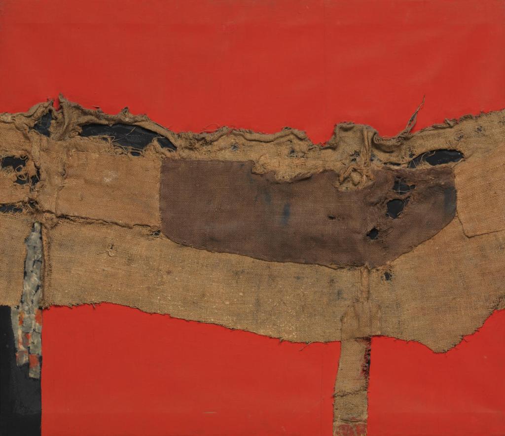
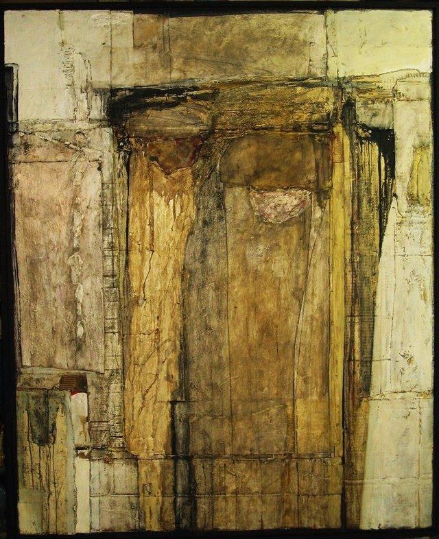
The first artist that was suggested was Alberto Burri, 1915 – 1995, who apart from being a painter was also a visual artist, sculptor and physician. The two painting that interested me were ‘Sacking & Red’ and ‘Assemblage’ both of which I have added below. It appears to me that I have explored similar techniques in my work. Although I note that the colours are much more muted than mine. Should I explore further but use a more harmonious, Fenland inspired, palette?
Sacking and Red 1954 Alberto Burri 1915-1995
Assemblage
Two paintings by Alberto Burri
The work that I looked at by Will Kendrick, 1983 -, was more a mixture of installations and sculptural works. The work ‘Architecture of a Spectral city’, shown below, is a colourful mixture of sculpted objects against a layered background.
Jason Martin, 1970 -, works in both two and three dimensions, seemingly at the same time. The works are somewhere between painting and sculpture. Often his works are in pure colour, the example below, ‘Rajah’, is created from pure pigment on panel.
Jason Martin, Rajah, Pure pigment on panel, 65 x 56 cm
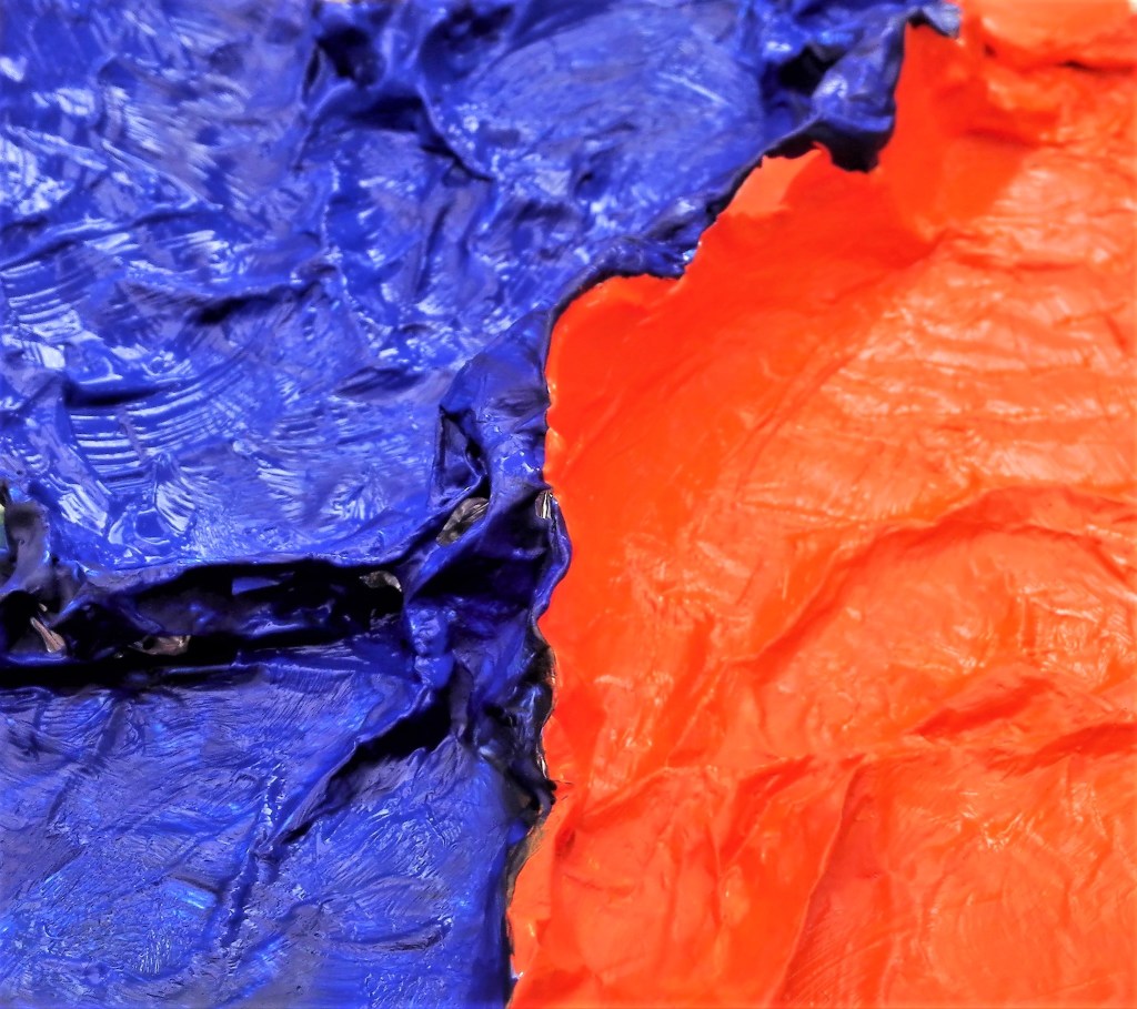
I find that there are similarities between this and the experimental work that I completed. The paintings I made were on kitchen foil which enabled me to create a textured surface.
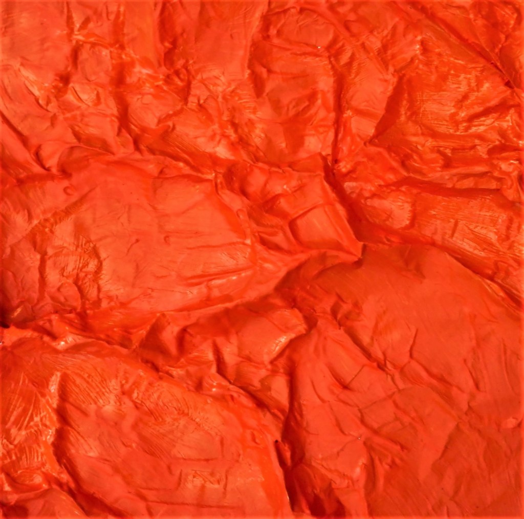
Painting 1, Orange on kitchen foil – Painting 2, Orange and Ultramarine on kitchen foil
I took the following quote from a blog by Tracey Harnish writing about Jason’s exhibition at L. A. Louver in 2011. “the work is seemingly abstract and minimal yet it doesn’t sit there quietly unassuming. Instead it powerfully vibrates outwardly drawing you in, close up and personal, taking you on big meaning by involving you in its physicality”
I have viewed some of Frank Stella’s work as an abstract painter previously. The painting below is a good example of his work. There are aspects that have influenced some of my experimental pieces.
Frank Stella, Gobba Zoppo Collotoro, 1985
Lastly I examined the pioneering work of Eva Hesse, 1936 – 1970. She created works using materials such as latex, fibre glass and plastics. However the pieces that I was drawn to when re-examining some of her art was a drawing and a painting. The drawing looks like it has been stitched together.
Untitled, 1965, Eva Hesse , Ink and gouache on paper
Whilst the painting has an untutored, scribbled look. The figures are barely described but convey vulnerability and menace in equal measures.
Eva Hesse, No Title, 1960
Conclusion: Would I have changed my approach to the exercise if I had completed this research prior to commencing on the exercises? I don’t think so. However, it is always good to experience and look at other artists works and to draw something from them. This is part of the continual learning experience. The culture of the art thief. Picking up ideas and inspiration from each other and melding it into their own practice.
In my eagerness to progress with Part Four I had completed Projects 1 and 2′ and numerous works, before I stepped back to look at the suggested artists from my Part Three feedback. What follows is a reflection, by artist, on the research that I have now completed.
Esther Donaldson, I am now following this artist on Instagram
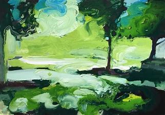
Esther Donaldson, In the shadows, Acrylic on board, 2018
I find that Esther’s paintings are expressive. She uses nature and the garden as her inspiration. The transitory aspect of nature and the changing seasons, the short life of flowers, moments, colours and moods are explored. Her painting medium is mainly acrylics which are applied richly, gesturally and allowed to drip and run. Trees and plants are suggested as rough shapes with lots of cool greens and yellows. Her painting, above, titled ‘In the shadows’ is a good example of her work.
Clare Woods (Daddy Witch)
Clare Woods, Daddy Witch, Enamel and oil on aluminium, 2008
The painting is two panels both 218.5 x 175.3 cms.
On researching this painting it was obvious why it had been recommended. There are aspects of my work in part three that allude to it. My attempts were much less successful. What I pick up from Clare’s work is the simplification of the scene which is carefully broken down into a concise composition. The colour palette is harmonious and subtle.
Extract from Arts council description “The painting, Daddy Witch, pictures an inverted pool bathed in moonlight, reflecting the shadowy brush. Dark shapes emerge from the surface as the viewer is witness to nocturnal happenings and latent drama.” This sums up the painting succinctly.
John Bunker
John Bunker, Jackdaw, Mixed media collage, 91x71cm, 2015
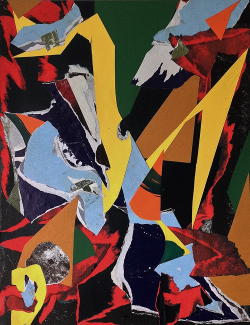
I found this work of less interest to me in so much as I don’t anticipate that I will use the technique of collage extensively in my work. Although I do feel that the juxtaposition of shapes and colours is a great method of breaking up the support and challenging the viewer to make sense of the painting.
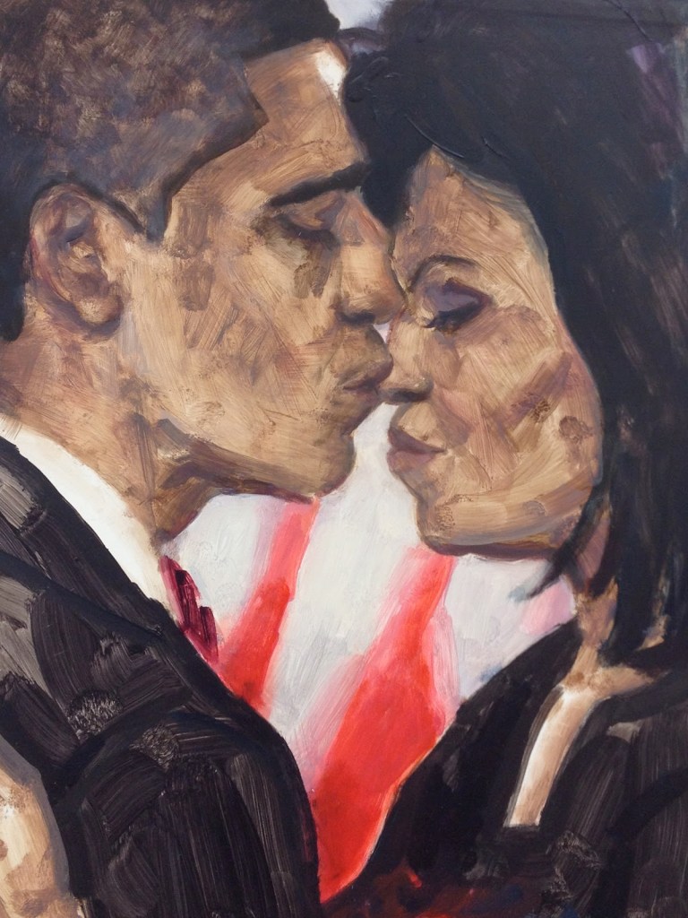
Elizabeth Peyton the suggestion here was for her still life and landscapes paintings. however I found mainly portraits of friends, lovers, heroes, admirations, inspirations and fascinations. The portraits I found to be intimate studies. They observed the spirit of the person. An example of this is the joint portrait of Barrack and Michele Obama.
Elizabeth Peyton, Barrack and Michele Obama
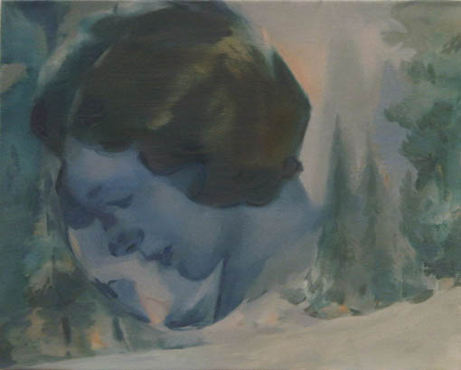
Kay Donachie b 1970, blurred, faded, muted ephemeral portraits, mainly heads, which have a filmic, film noir or retrospective quality. figurative imagery relating to modernism, domesticity, longing utopian counter cultural movements.
Kay Donachie, Fade away & Sorrow like ceaseless rain
Michele Fletcher, the garden paintings, a series of abstract paintings inspired by gardens and plants I found to be the paintings that I was drawn to most. Although I found it difficult to fully embrace them. In the example below the bramble appears menacing.
Michele Fletcher, Bramble, Oil on linen, 40 x 35 cm, 2020
Michael Porter,
Michael Porter, Beneath the Tree
Michael’s paintings are about landscape but do not necessarily depict landscape as we would expect to see it. He uses landscape as an inspiration. Taking what he sees beneath his feet to create visions of what the landscape is as he sees it. The paintings are carefully, meticulously painted often using abstract patterned background to indicate dense undergrowth.
Michele Whiting, In looking at her paintings I came upon a series where the subject of landscape is in evidence but is only suggested in abstract forms. The series is limited to a pared back palette of colours, browns, ochres, white, Payne’s grey and light blue. The paint is applied in soft translucent washes of colour, loose gestural brushwork with added lines and contours.
Michele Whiting, Image 19
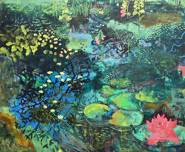
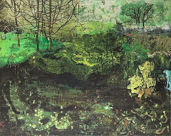
Frances Ryan, of the selection of artists that were suggested it is between Frances’s and those of Justin Mortimer that I found resonated most with me. Frances’s paintings are abstract visions of nature incorporating plants, shapes and lovely bright patches of colour. In some ways her paintings are all the things my Assignment 3 painting ‘Hidden away’ wasn’t. I need to reference the three examples, plus others, when I look to make further paintings in a similar vein.
Flow, 80 x 100 cm, 2019
Pond Life 1, 100 x 120 cm, 2018
Winter Culvert, 80 x 100 cm, 2019
Three paintings by Michele Whiting
Justin Mortimer, viscosity of paint was the pointer in the suggestion to examine the paintings of Justin. I started with his most recent works which are somewhere between abstraction and still life. Plants are suggested by smearing, smudging and scrapping. Swirls of paint, poured and layered. His website has his paintings in a chronological sequence. I went to the earlier works and discovered in 2002-07 a series of paintings that I should use as inspiration for my parallel project. In these painting buildings are described that are in states of disrepair. Blocks of dark, brooding colours, greys and dark greens are used to describe the form of the buildings. The paint is laid down in visceral slabs which contrast with burst of light. The painting below is a good example of this.
Justin Mortimer, Beach Fatigue, 80 x 110 cm, 2007
Following his work through the subsequent years the buildings became only occasionally in evidence as they were replaced by human forms. The paintings from 2012 – 2014 have a dystopian feel to them. They reminded me of the mood, look and feel of the television drama of the Chernobyl disaster, gritty, dark and melancholic. These are followed in the subsequent years 2015 -2017 by paintings in which the human figures are dressed in Personal Protective Equipment and are seen fighting chemical spillages. From the perspective of 2020 they would appear to be invoking the pandemic to come.
The aerial perspective of carol’s landscapes show parts of the landscapes and leave other parts to the imagination. the paintings run outside the edge of the support into the mind.
Conclusion: I have gathered a lot of information in completing this research and I will need to unpick it further to enable myself to incorporate the inspiration and ideas into my own work.
Whilst carrying out research into suggested artists I came upon an interesting blog. It was written by an art blogger who was explaining the methodology that they utilise when approaching an artists work.
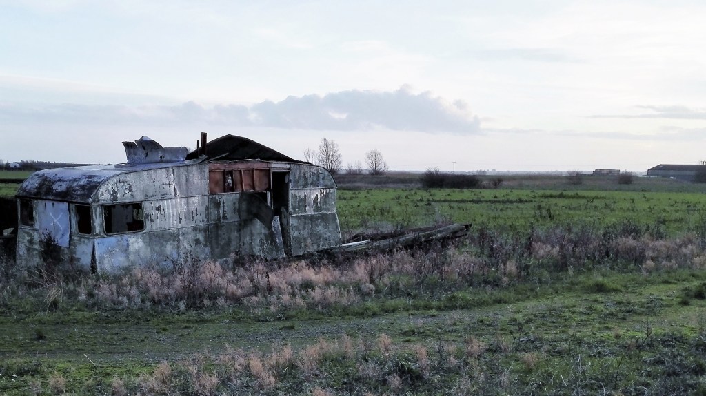
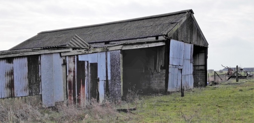
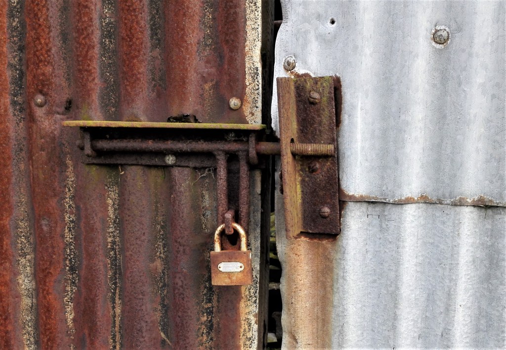
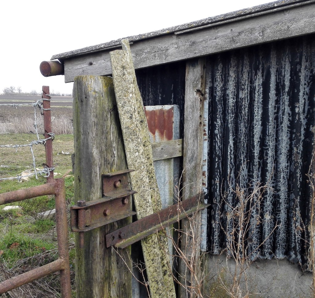
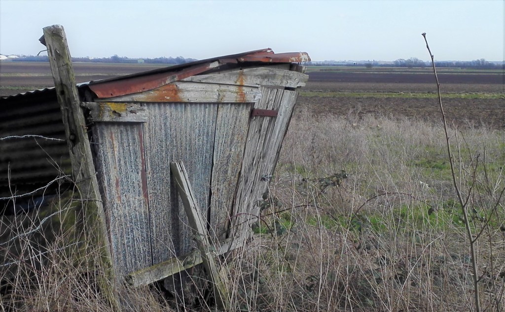
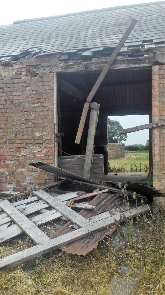
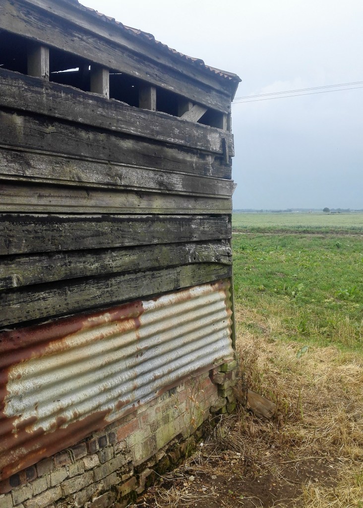
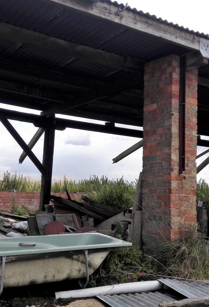
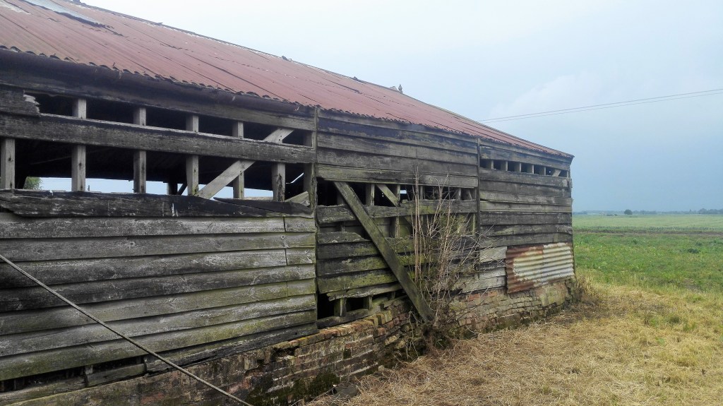
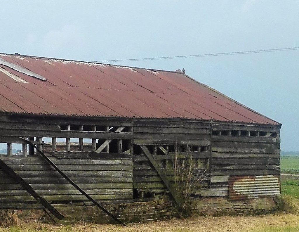
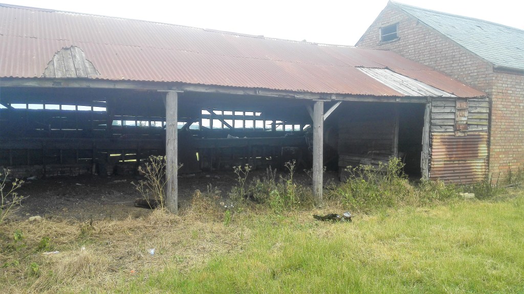
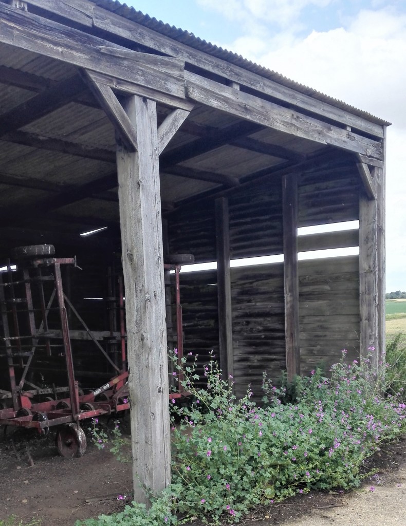
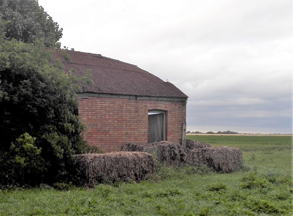
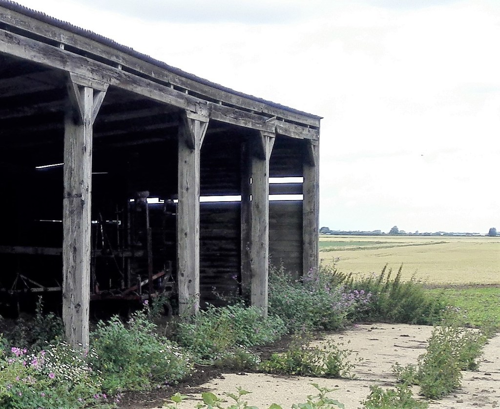
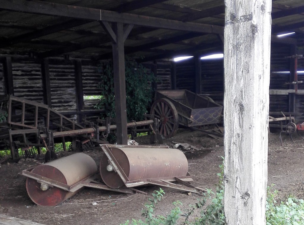
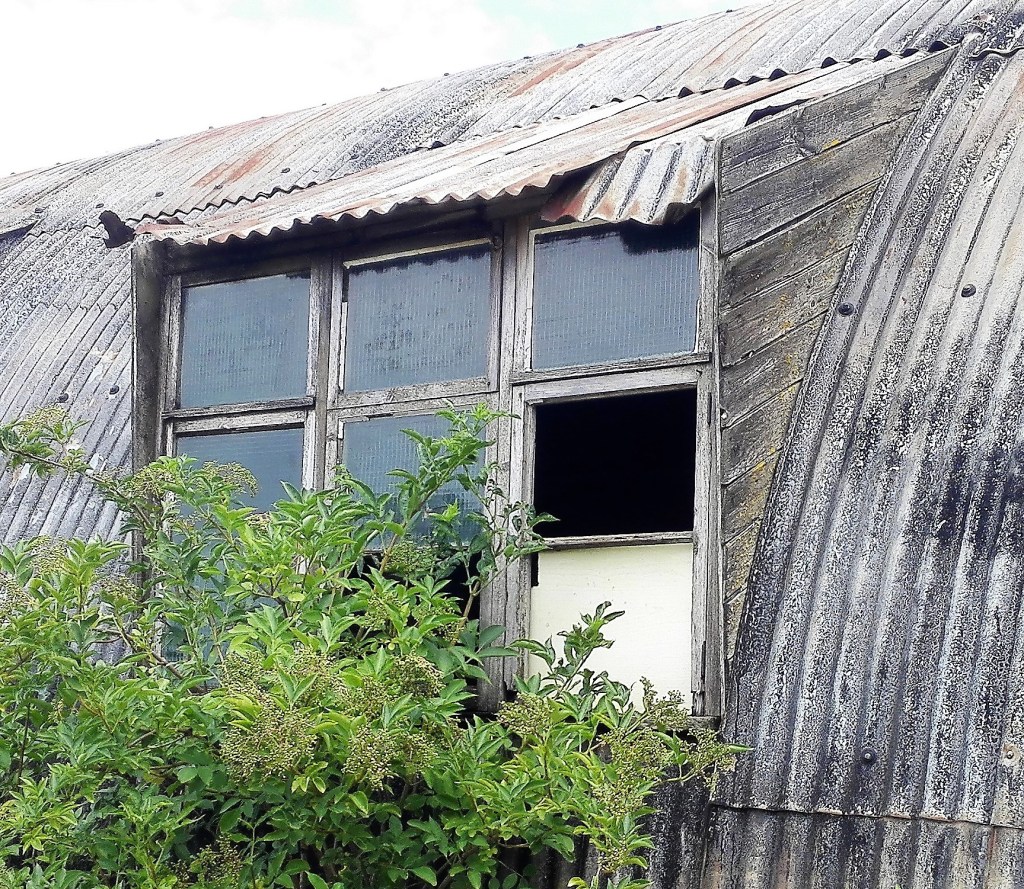
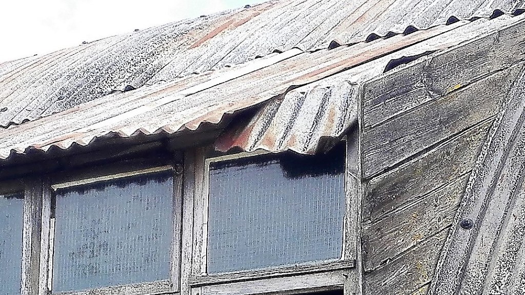
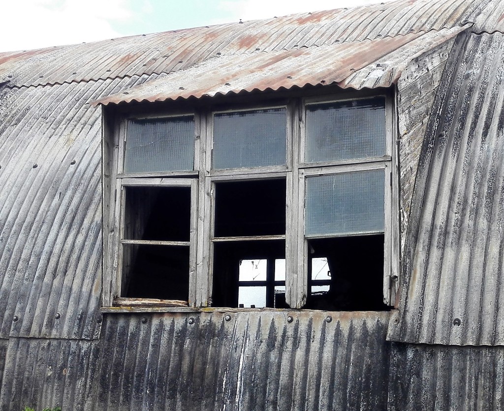
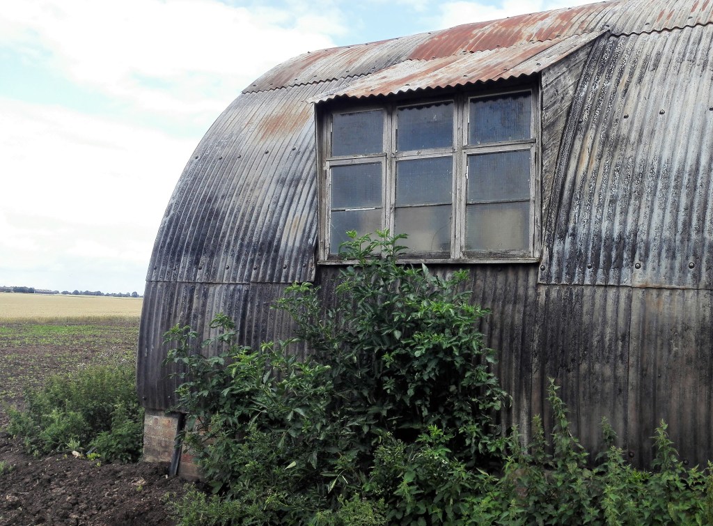
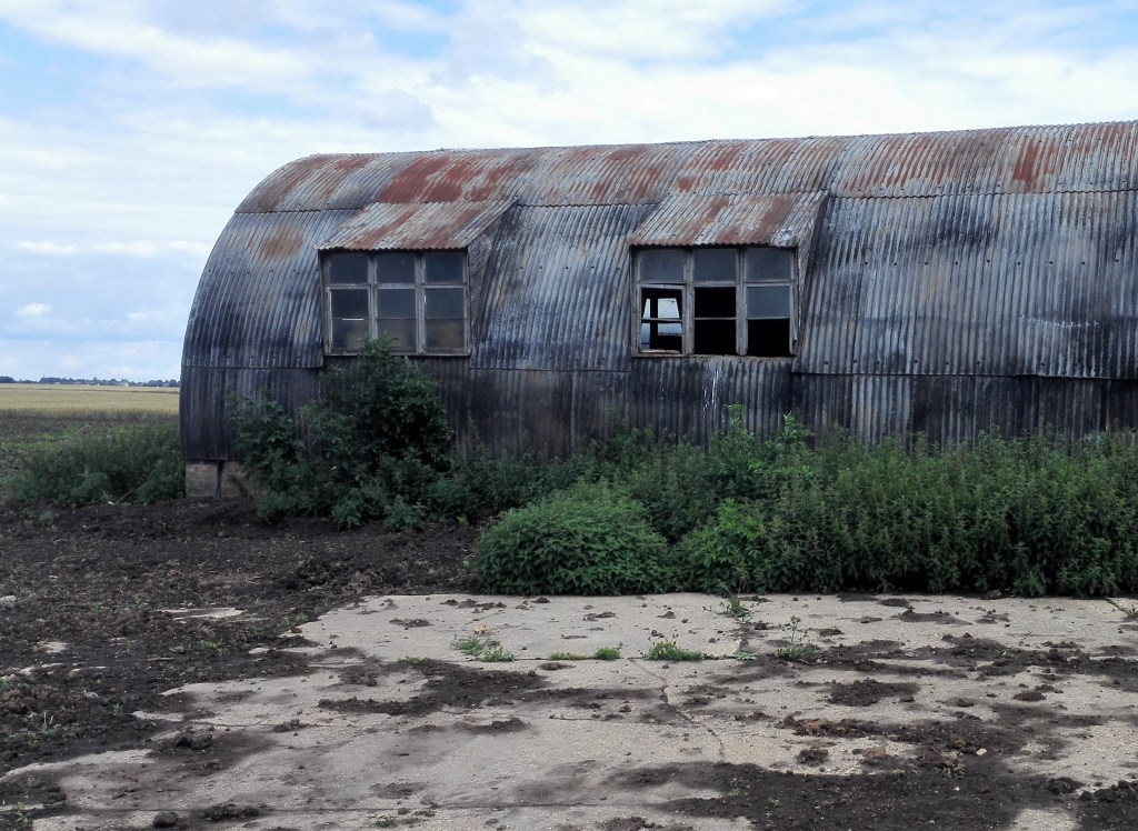
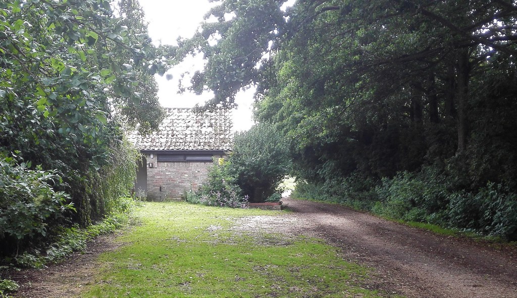
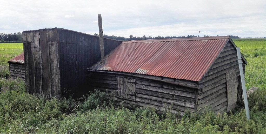
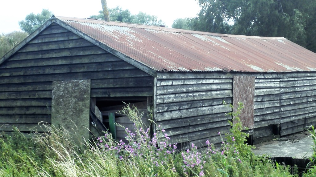
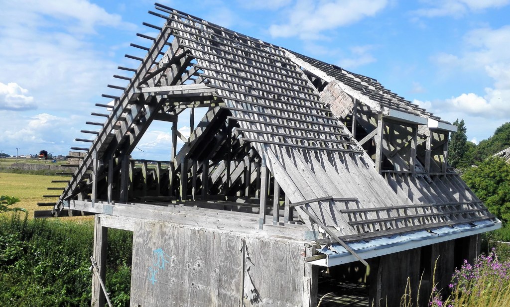
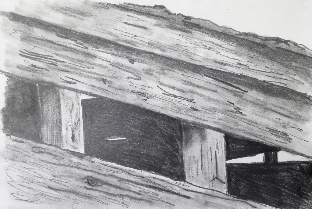
Having discussed my idea for potential topics for my Parallel project, during my Part Three assignment review, it was time for these ideas to be put into my blog. It had always been my intention to use the Fenland landscape in some form as the subject matter. My quandary was how to represent it in a series of paintings in which I could focus in and make connections between the paintings. My idea was to look at abandoned, decaying and delipidated farm buildings. These would become the subject matter. The next step was to try and look at ways of representing these buildings in a way that emphasises the passing of time, the loss of purpose, the neglect and at the same time making the paintings interesting to look at.
My starting point was to travel around my local habitat and take photographs of these buildings. I would try to up close and personal. Look for unusual angles, colours and tone but at the same time try to retain a sense of place. The atmosphere and the recreation of it would, I felt, be a key ingredient in making a successful set of paintings.
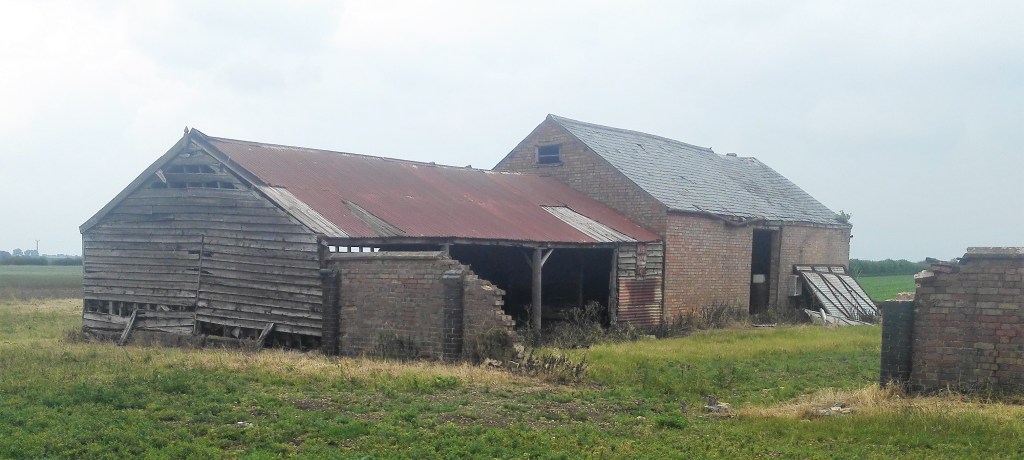
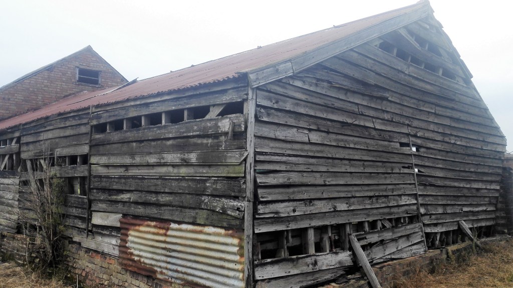
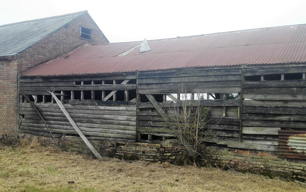
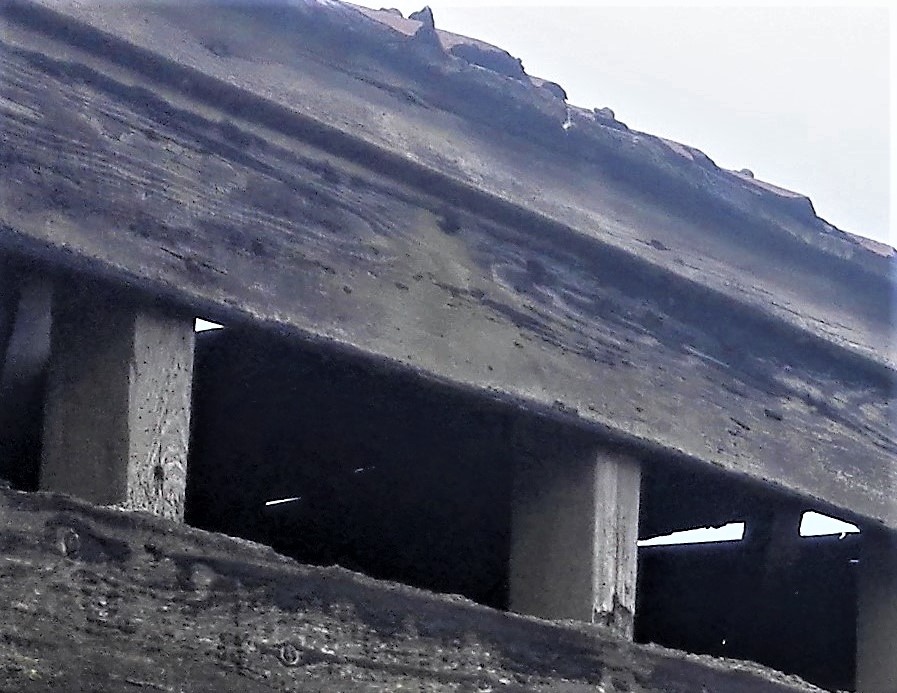
Below is a selection of photographs that I have collected together so far.
40 photographs
These photographs and others would be edited, some of the above already have been, to look for exciting things to paint which also fit with the project goals.
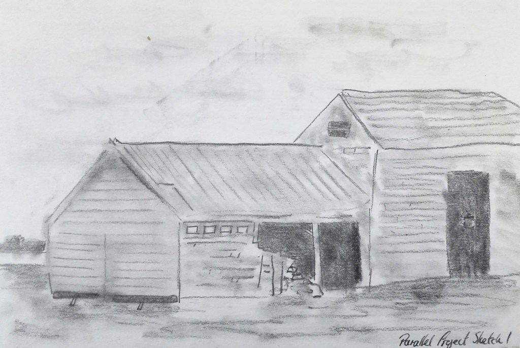
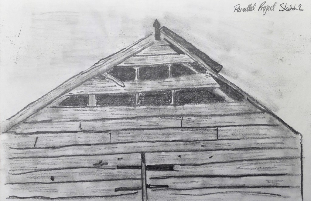
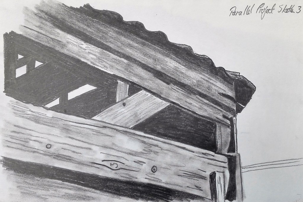
I looked to start my explorations by making an initial set of six sketches. Using what making these sketches told me about the subject I would then look to paint a first study.
Initial 6 sketches
The best sketch from this initial batch is number 5. I would bear this one in mind for a future painting. For now I would look focus on aspects of sketches 3 and 6 but would expand the view.
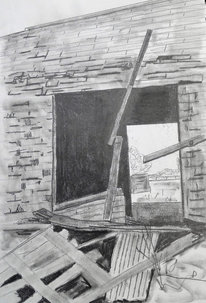
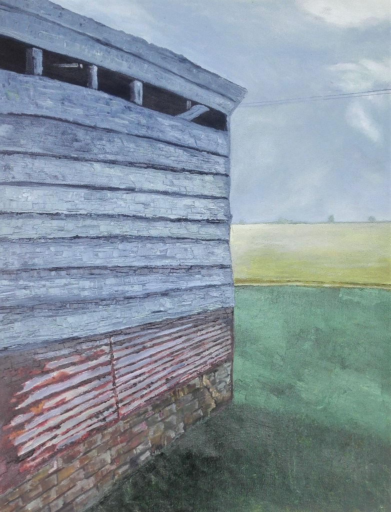
The photograph that suggested itself for this study was this one. The interest would be provided by the varied construction materials, brick, corrugated iron and wood panels. The view into the distance providing aerial perspective.
A quick colour study was painted prior to commencing work on the actual painting.
Colour study – Acrylic on light cardboard, 59 x 40 cm
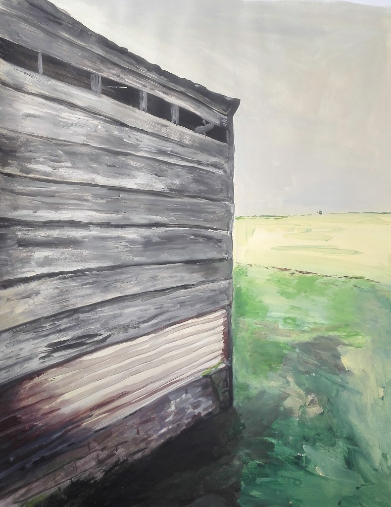
I followed this by completing a more thorough study. The resultant painting is shown below.
Derelict Out-building
My thoughts having completed the painting and hung it near to where I paint and study is that it is a competent painting. I have successfully captured a pictorial representation of the scene from the photograph. There are some small issues with perspective particularly with the wall at the bottom of the building but this is not what I find disappointing with the work. The painting says nothing about where it is or what it felt like to be there. It lacks a sense of place. Part of the issue, I feel, is to do with the composition which is too contrived. In looking for an interesting angle, zooming in, and obscuring much of the landscape the sense of the buildings place in the landscape is lost. Alternatively I could have gone further in and dispensed with the landscape altogether. In doing this I could have focused upon the nature of the deterioration itself. The painting is stuck somewhere between these two alternatives and suffers by not being one thing or another. Additionally the application of paint is very controlled and inexpressive. Whilst this conveys the scene it doesn’t add to it. It lacks any sense of feeling.
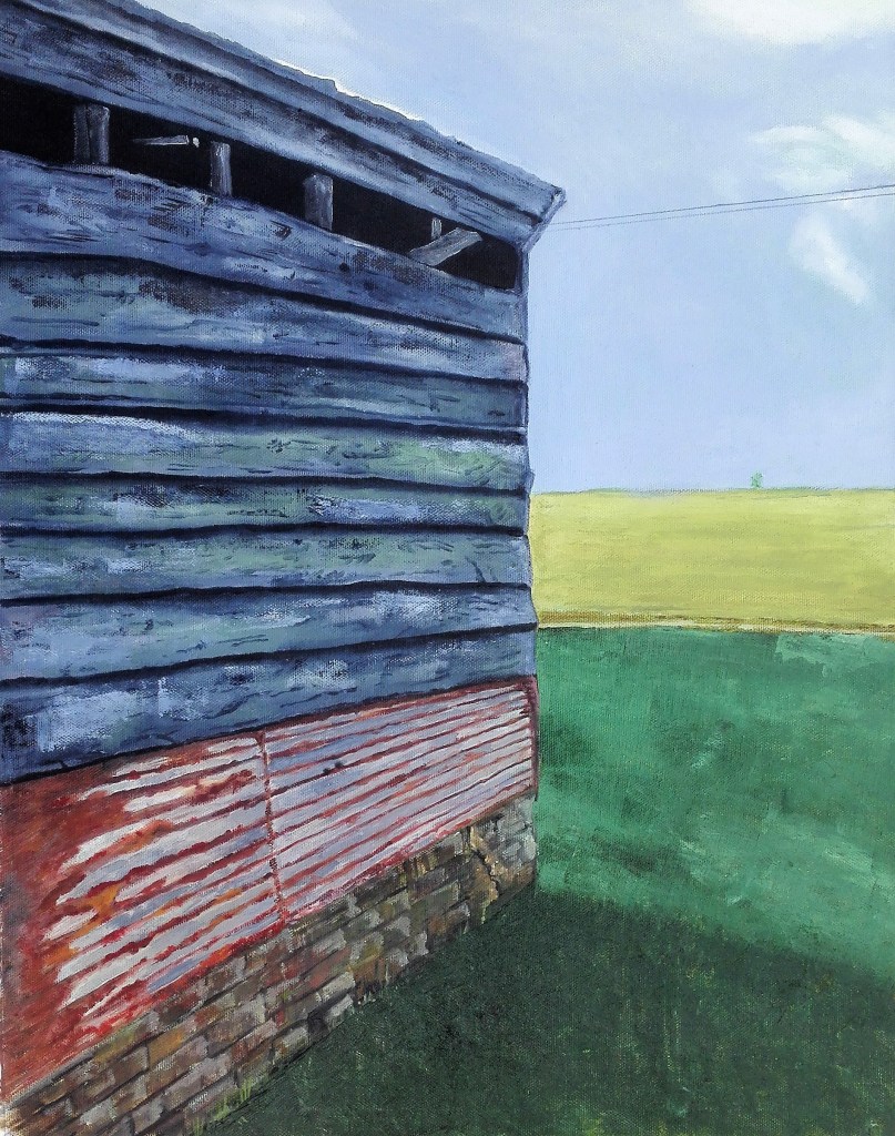
Post script 11/8/2020, I returned to this painting and reworked it. Not dramatically but enough so that I feel more comfortable with the result. It still lacks any sense of drama. It doesn’t tell of the state of the building but I now feel that it is located in the landscape. It sits more naturally against the fields which I have toned down and enhanced the aerial landscape perspective.
Derelict Out-building (Reworked)
The positive learning that I gained from this initial study is that I need to be bolder in my choice of composition. A good photograph is often not a good choice for a painting as everything about the scene has already been captured and there is not much more to be said or communicated. I also need to be bolder in how I apply paint. This I have done in much of my experimental work. I now need to try to incorporate these experiments and techniques into my compositional paintings. I expect that there will be an element of trial and error in this process but I must embrace this to enable myself to break through this barrier.
I had occasionally worked on A4 size acetates during the course and had found that these were a good support on which to smear paint. In doing this it created fascinating colour mixes, gradations of tone, layers and texture. The next step would be to use this as a foundation to for a more considered painting. To move it back from abstraction by adding form whilst maintaining the random elements.
With these thoughts in mind set about making two paintings on A4 size acetate. I would loosely base the paintings on two photographs where I zoomed in on old iron work from a disused pumping station. The photographs were used to guide both my colour palette and to provide form and structure, composition. No preliminary work, I suppose all of the above is preliminary work that has lead to this point, just straight into application of paint to support.
The photographs
Both paintings were made using acrylic paint which was applied by both palette knives and brushes. Painting 1 below. Although I worked on these paintings concurrently this is the one that I completed first.
Painting 2 – Old Pump 1
I am pleased with the result. The subject of the photograph is not apparent, it is an abstracted image. In the painting I have taken the rough structure of form and created a painting which compels the viewer to look at. It does not matter what it is or what it wants to be, it suggests. The colours are well balanced and muted. The tonal variations are quite stark from the black lower third to the near white highlights. The overall effect is of ageing, corrosion and the effect of time passing.
Painting 3 – Old Pump 2
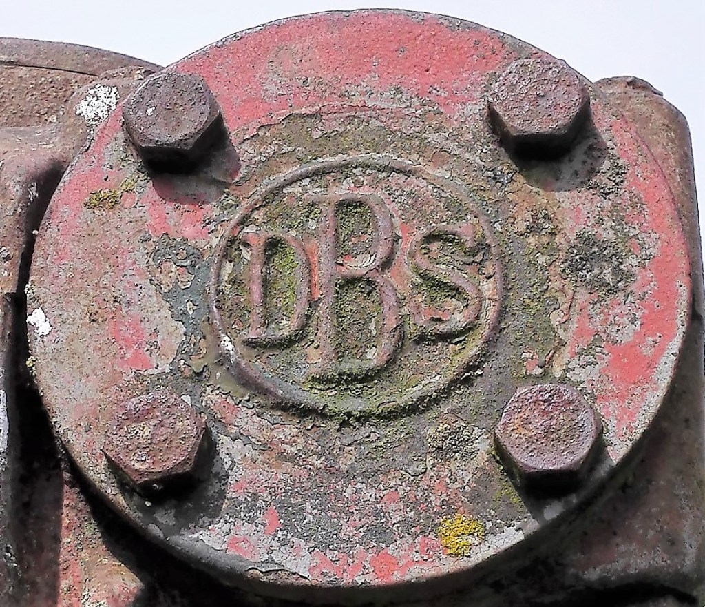
In this second painting which I am also pleased with the subject matter is more apparent. This is true of the photograph too. Although what it is remains unrevealed. The interest lies in the shapes and colours. In the painting the colours are exaggerated but not to the point where they become unbelievable. As in the previous painting they sit together comfortably. The suggestion of light hitting the surface of the iron against the darker shaded parts gives the form strength and depth. It looks like it has stood against the elements for a number of years and will remain doing so for many more. The corrosion is only colouration. The perspectives of the four bolts are not harmonious in respect of each other but they do allow the eye to stop and focus on different parts of the painting.
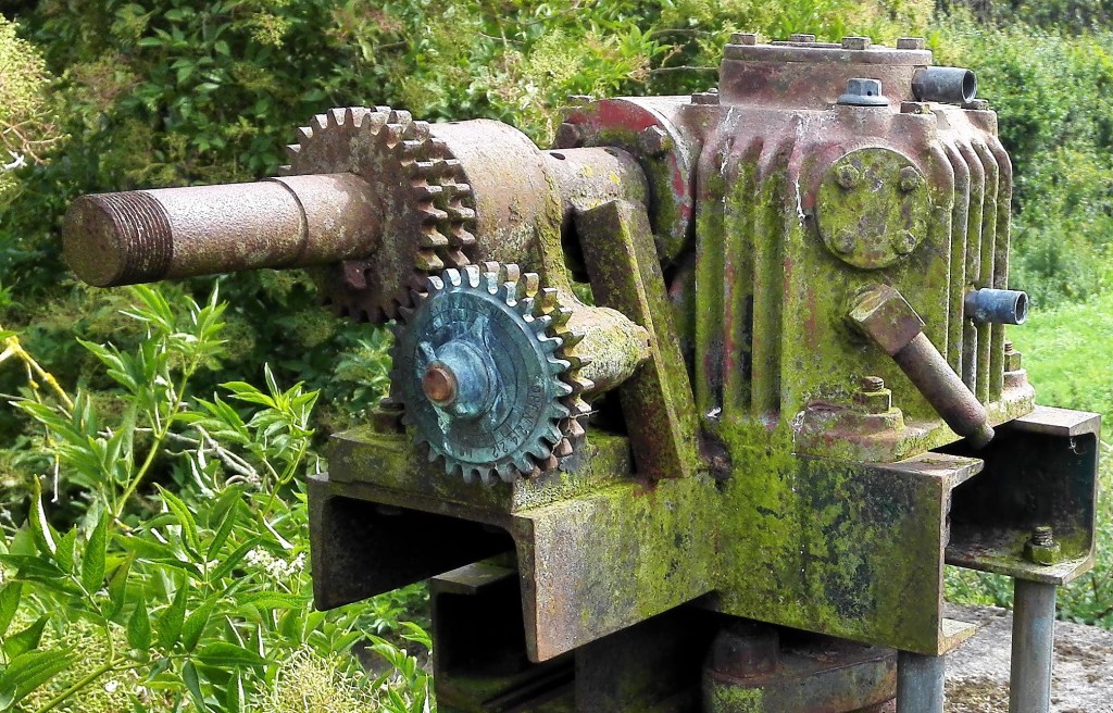
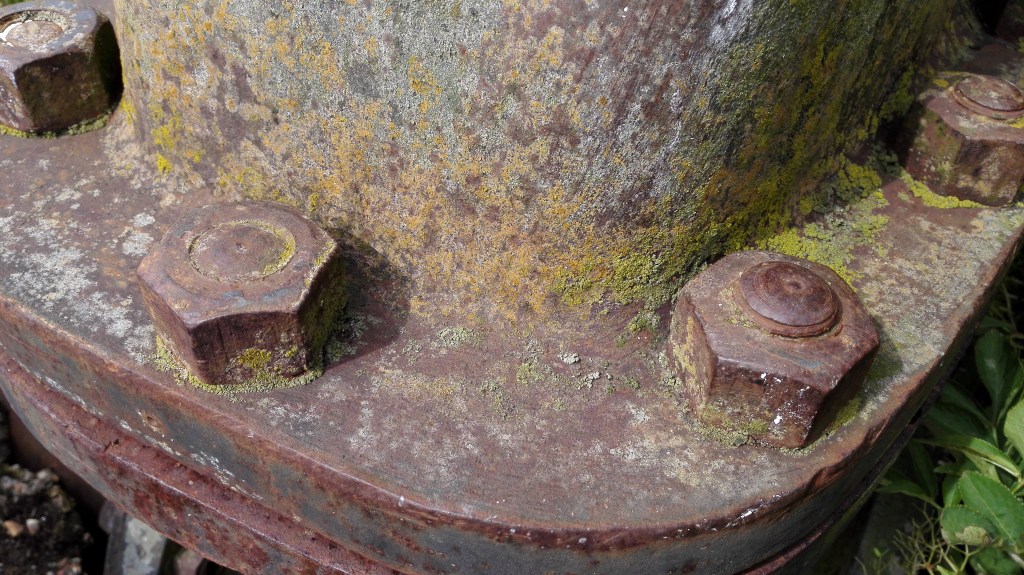
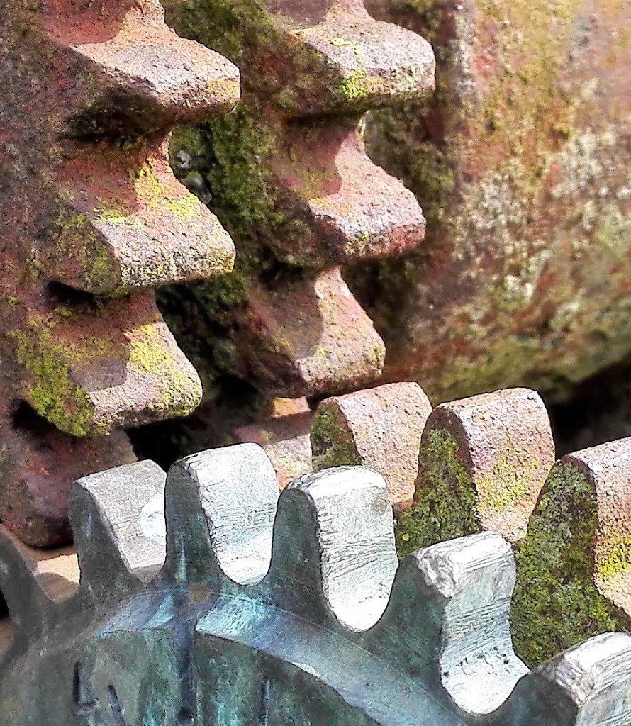
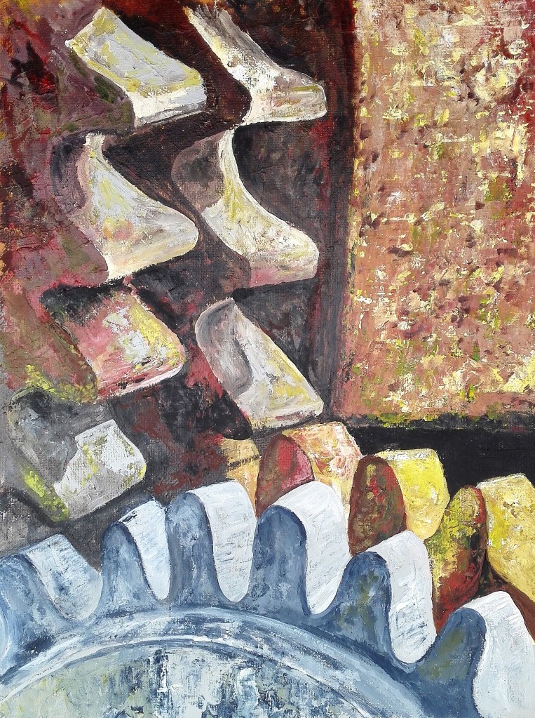
Moving on from these two paintings I used similar techniques to paint my next work. For this I would again zoom in on a aspect of the derelict pump. The photograph that I would use for this study is below.
Photograph for Painting 4
Using acrylic paints with brush and palette knife on 30 x 40cm handmade linen board I laid down a rough layer of mixed browns, Payne’s grey, greens and grey and then built up the painting. The result is below.
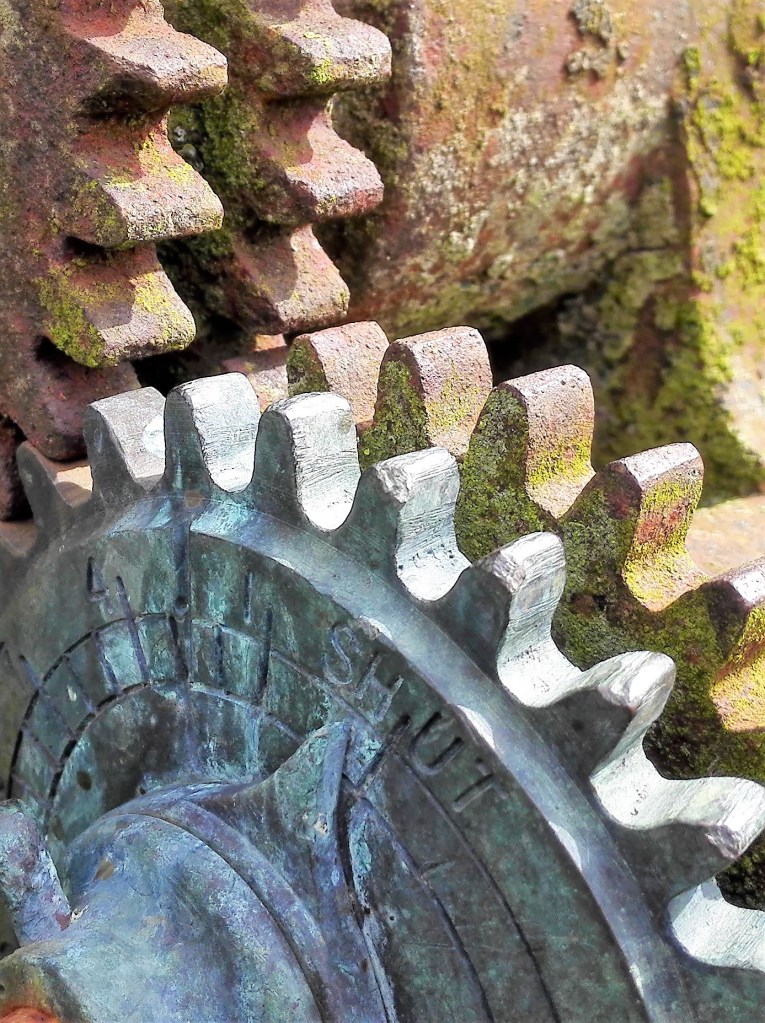
Painting 4 – Cogs, Acrylic on linen board, 30 x 40cm
The key to this painting is the contrast between dark and light which are quite dramatic. The light is clearly coming down from right to left and casting deep shadows on the rusted iron work and in the foreground the cleaner metal. The act of zooming in close to the cogs removes the identity of the larger object. This is important for the composition of the painting as the viewer is forced to examine the cogs. These have been degraded and discoloured by the passing of time but have retained their form. The observer is asked to wonder what these cogs were used to drive? When were they last in use? Where are they? The answers are not revealed.
At this point I decided to post this blog. It will be followed up with further blogs as I continue to work on my Parallel project. As I reflect on my work to date and the direction I am heading in I can see a step change in my approach. I have refined my original ideas and focused in on the subject. I anticipate that I will make further twists and turns as I progress with the project.
These two projects merged into one. I created a series of paintings whereby I experimented with, material, form, supports, tools, processes and application. Some of these would fall into one or other of the two exercises. Exercise 1.0 ‘Stretch, stitch, fold, crease, wrap’ and Exercise 1.1 ‘Exploring form’. In the end I decided to combine all the work into one larger blog and to document and comment on them here. Research points 1 and 2 plus link 34 to the art of Anj Smith will be the subject of separate blogs.
At the start it is worth pointing out that the results of the experiments were a mixed bag. They ranged from poor to pleasing. Some of the pleasing results I will explore further and try to incorporate the methodologies into my practice. In total I created over 30 paintings and other pieces. These are discussed in, more or less, the chronological order in which they were created.
Experiment 1: The first three paintings were a quick rough experiment the results of which are varied. To White and black primed gesso paper I loosely applied acrylic paint and manipulated it with brushes and a palette knife.
Paintings 1, 2 & 3 Acrylic on white and black gesso primed paper, 18.5 x 27cm
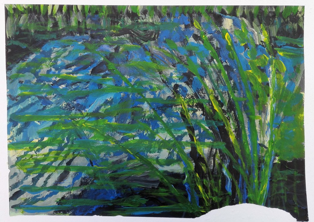
I feel that I was still thinking of reflections from the last exercise from Part Three and my Assignment piece. I was referring to some of the photographs I took and trying to apply the paint loosely. Painting 1 has some redeeming qualities in that the mixture of the blues is interesting. Some happy accidents have created a textured feel. The second, whilst looking non-naturalistic does invoke the look of reeds and water. There is sufficient in this painting for it to be worked up into a more finished piece. The third painting is just poor and has no redeeming qualities.
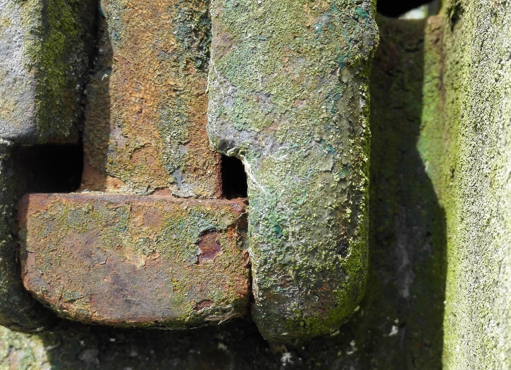
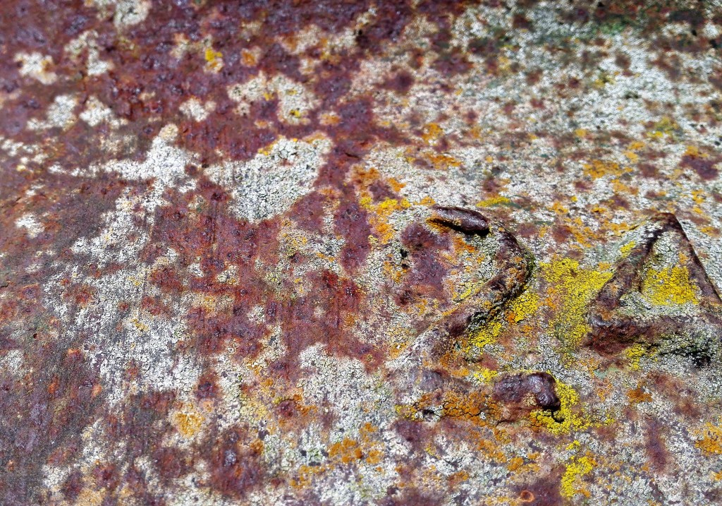
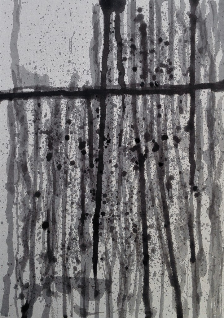
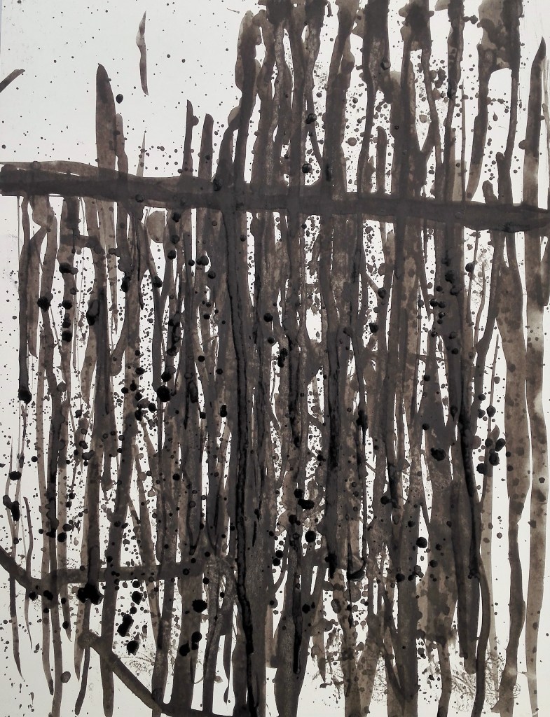
Experiment 2: For these two paintings I used two types of card, one with a shiny surface the other not. The idea was to apply black ink and allow it to run. The inspiration for this was a photograph I had taken a few years previously of a piece of corrugated iron where the paint or bitumen had been eroded by weather and time.
Photograph of weathered corrugated iron
For the most part I did allow the ink to react to the forces of gravity. However I did apply a minimal amount of brushwork.
Ink paintings, 21 x 28cm
The two different surfaces produced the sort of effects that I expected. In first on normal cardboard absorbed the ink and required more to build it up. This created a layered effect which whilst not mimicking the photograph is a more pleasing result. The second, on the shiny card lacks depth. The addition of flicked ink creates a little more interest. In hindsight I should have also looked to apply bleach and observe the impact of this.
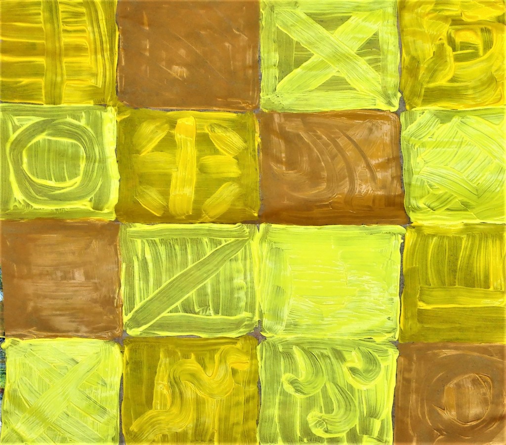
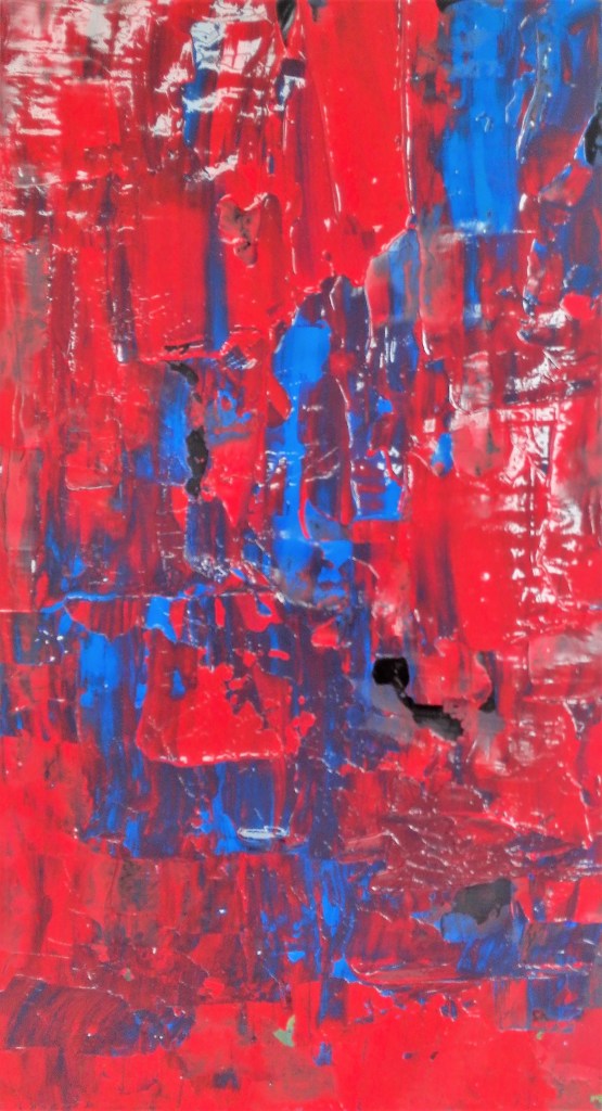
Experiment 3: for this series of experimental work I used kitchen foil as the support. The intention was that the foil could either be pre-creased or creased after it had been painted. This would give texture to the paintings.
I started by painting a single colour onto the kitchen foil that had been partly creased. The results were encouraging. Using acrylic paint it adhered to the surface well and created a richly textured surface.
Acrylic paint on kitchen foil, 14 x 14cm
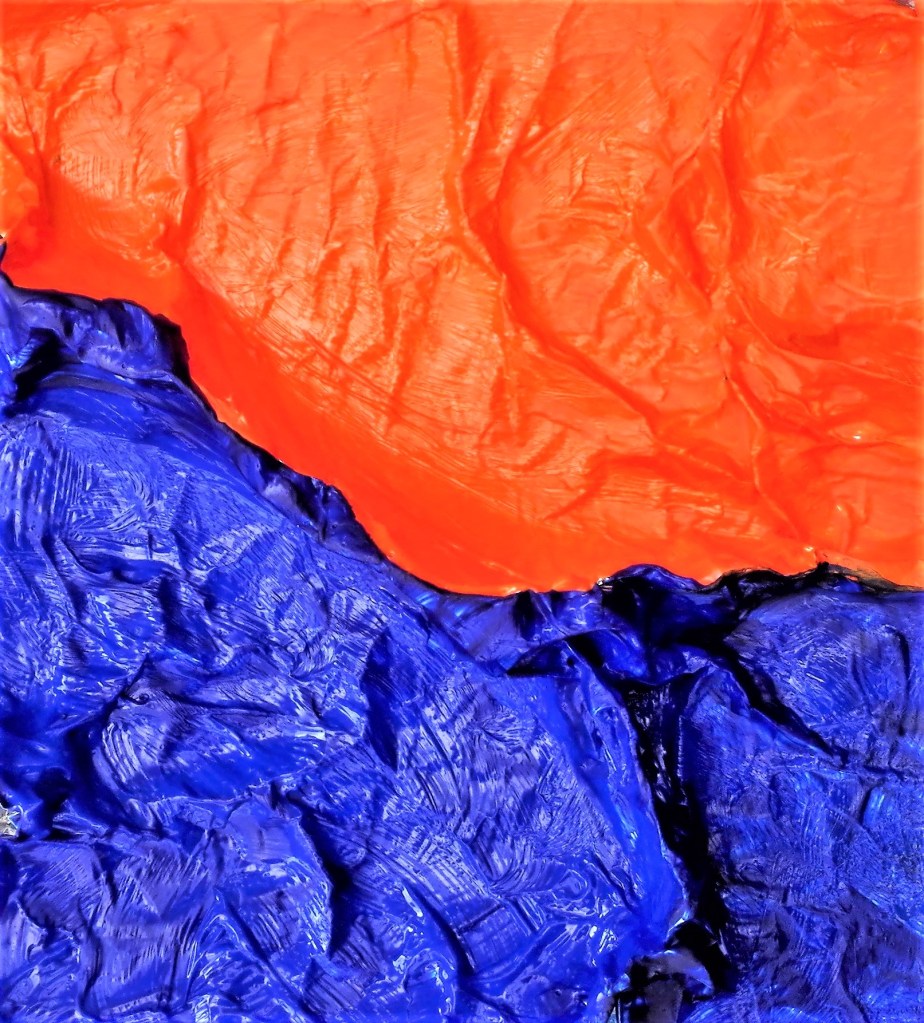
I now created a further painting using orange and its complementary colour blue. This worked well the two colours highlighted each other and tonal interest was created depending on where the light source was coming from. I have banked this idea and intend to created a larger painting perhaps combing several pieces of kitchen foil.
Orange and Blue acrylic on creased kitchen foil, 14 x 14 cm
So far I had used randomly creased kitchen foil. I would now try painting onto foil that had been folded into patterns.
Example:
Folded Kitchen Foil
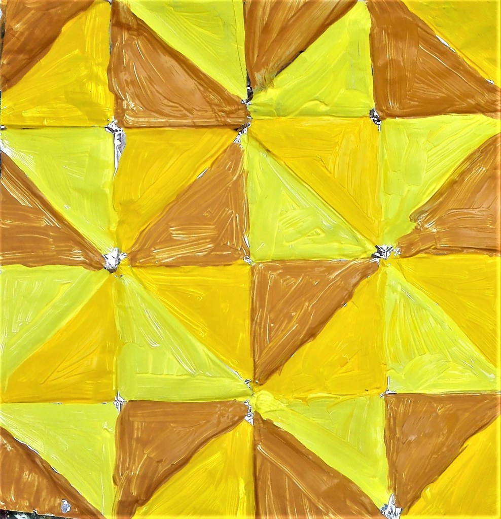
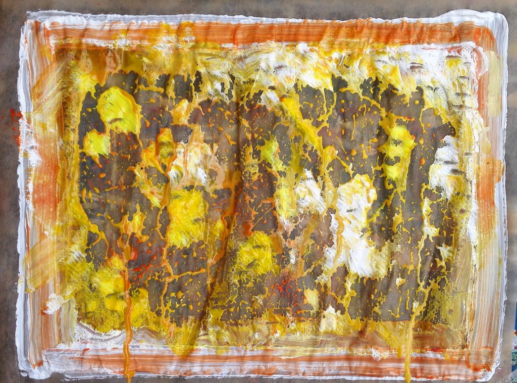
Using three yellows, mid yellow, lemon yellow and yellow ochre, I painted the foil. The results are satisfactory but don’t inspire me to create further works using this methodology.
Acrylic on folded kitchen foil, 14 x 14 cm
I completed one further painting on kitchen foil where I applied the paint directly onto the foil and manipulated it with the handle end of a brush. The resultant painting was messy.
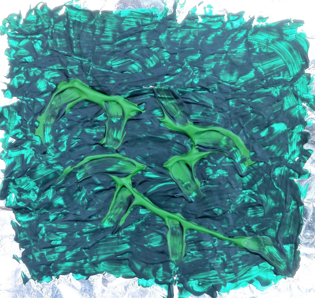
Viridian and light green acrylic on kitchen foil, 14 x 14 cm
Following the cloth and greaseproof paper experiments, documented below, I returned to kitchen foil and produced two further abstract paintings. With these I was looking to build up the paint in layers, allowing some of the previous layers to be visible. The result was patchy at best.
Abstract paintings, acrylic on kitchen foil
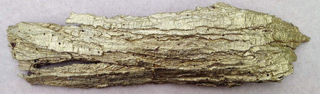
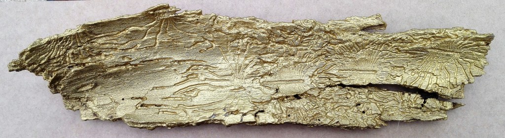
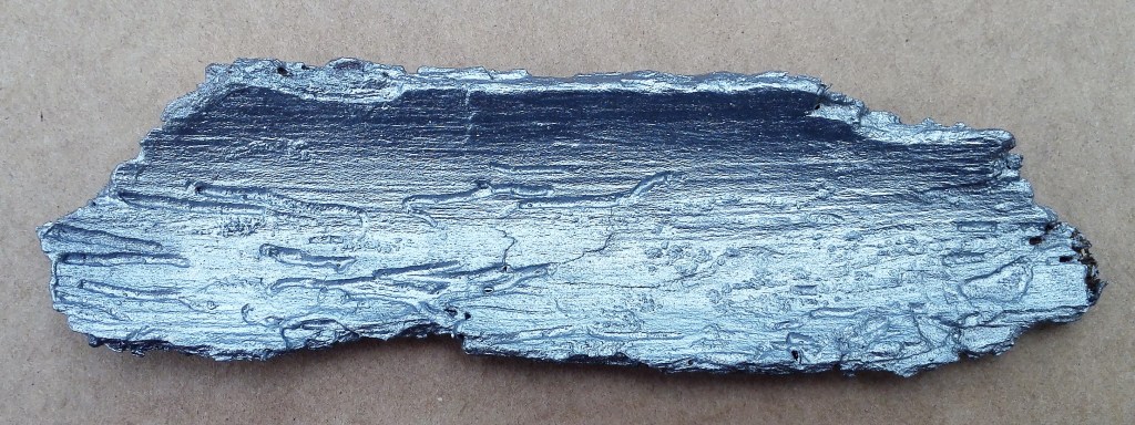
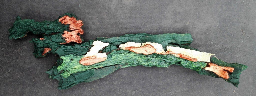
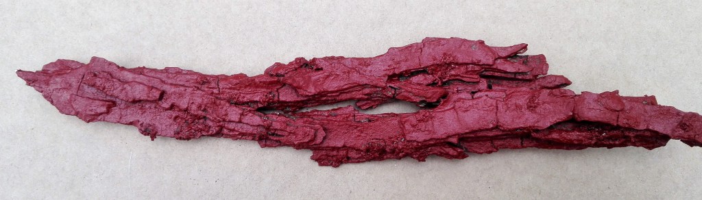
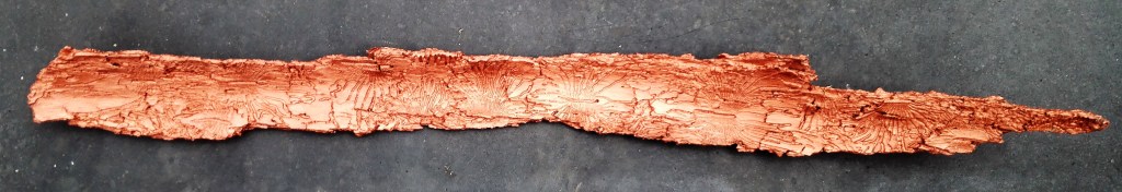
Experiment 4: Using some found material, tree bark, as a support I painted it. The result is pleasing although I feel that on its own it isn’t enough. I have transformed it into a decorative object but is it enough? Does it become art? Could I do more with, for example incorporating it into a more considered work? For the time being I have left the pieces lying in the studio for potential consideration into a future project.
Painted Bark – Seven pieces
Experiment 5: for this I would paint directly onto cloth, a dish cloth, that was pinned to a board and primed with gesso.
Prepared cloth
Splitting the cloth into two sections I made two paintings using photographs as references.
Cloth painting 1, 36 x 27 cm
Cloth painting 2, 36 x 27 cm
The paint was quickly absorbed into the cloth which due to its roughness caused me to use scumbling brushwork. The resultant paintings have a loose feel that I like, they have an airy atmospheric quality. The cloth is clearly visible through the paint which accentuates the rough look. Direct painting onto fabric is something that I will look to try out again.
The painted cloth, hung
Experiment 6: Greaseproof paper was the next support that I would experiment with. I would try different materials, inks and acrylics and different application methods. I started by using a single colour and found that I needed to apply several coats of paint to cover the paper. I tried to create texture but this was not as easy as it had been with the kitchen foil.
Deep red acrylic on greaseproof paper, 17 x 16cm
Next I painted an imagined scene.
Imagined scene, Acrylics on greaseproof paper, 21 x 18.5 cm
The paint was easy to apply and manipulate however when dried it had a translucent quality which I didn’t like. The photograph of the painting above doesn’t show this too well. I felt that the paint lost its vibrancy and looked washed out. I next experimented with inks. This was more satisfactory. The ink wasn’t absorbed into the support. I was able to manipulate it via blowing with a shortened straw and lift the paper to allow the ink to run. Applying several layers enabled a gradual build up of colour, this enhanced the tonal value of the painting. Where the acrylics had looked washed out the ink retained its vibrancy. However these effects can be achieved using cartridge paper. I didn’t feel that the greaseproof paper was bringing any specific benefits.
Ink on greaseproof paper
Similar to the work on kitchen foil using pre-folded greaseproof paper to create a pattern and used the same three yellows for the painting. Again the result was disappointing.
Mid Yellow, Lemon Yellow & Yellow ochre acrylic on greaseproof paper, 21 x 18 cm
I proceeded to make a further investigation using acrylics. This time I would apply the paint thickly by pouring it directly onto the support. The painting went through several stages as I manipulated the paint searching for something that looked and felt right. I didn’t have a clear idea what, I was just playing with the paint.
Painting in progress, addition, manipulation and removal of paint
Finally I added some red with a brush and also tipped a little ink. After all the stages I was left with an unsatisfactory painting. My conclusion being that acrylic paint on greaseproof paper is not a good mix. Greaseproof paper is not a support that I will be turning to.
Finished painting, acrylics and ink on greaseproof paper, 34 x 26 cm
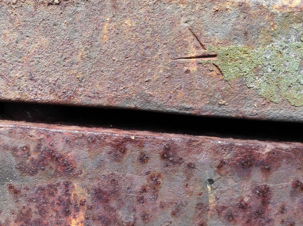
Experiment 7: this was less an experiment and more a return to familiar support and materials. I used a close up photograph of a piece of rusty farm equipment as source material. My materials were water soluble oil paint applied with palette knives. The support was linen based canvas paper.
The photograph
Dragged oil on canvas paper, 25 x 22 cm
The photograph of the painting greatly enhances the painting which in the flesh lacks the vibrancy that is apparent in the image. Further layers of paint would improve this. I may return to it later. As stated this was more an escape to a methodology that I have investigated before.
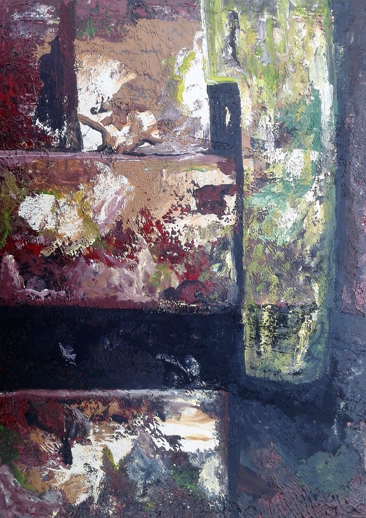
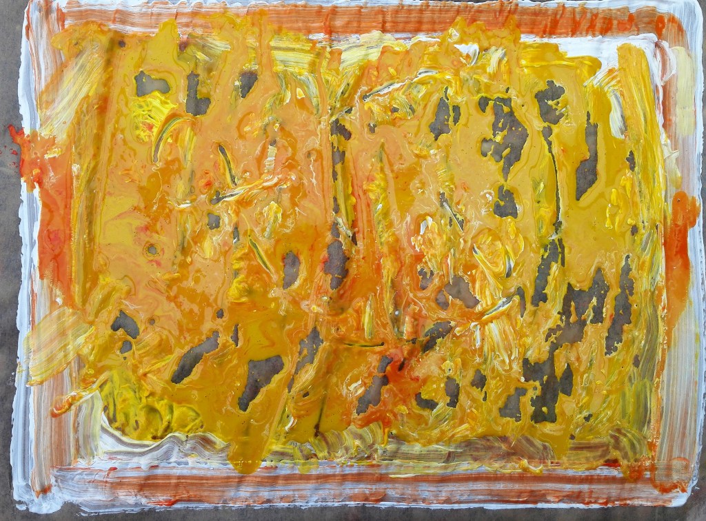
I revisited this subject again. This painting started as a way of using up excess paint that I had on my palette after completing the Pump plate painting, see Parallel project. However I ended up using much more paint than I had leftover. The resulting painting is below.
Dragged Aqua oil on acetate
Detail from ‘Dragged oil on acetate’
The white and raw sienna works well it has a chalkiness to it which the traces of red enhances. In hindsight it would have been better to have continued this theme below the Payne’s grey band. the use of just four colours works well in so much as the eye is not assaulted with too much colour. I noted that the paint took a long time to dry as nothing is absorbed into the support. I will test its rigidity when it eventually dries. The detail section gives an idea of the lushness of the paint. Thick and creamy.
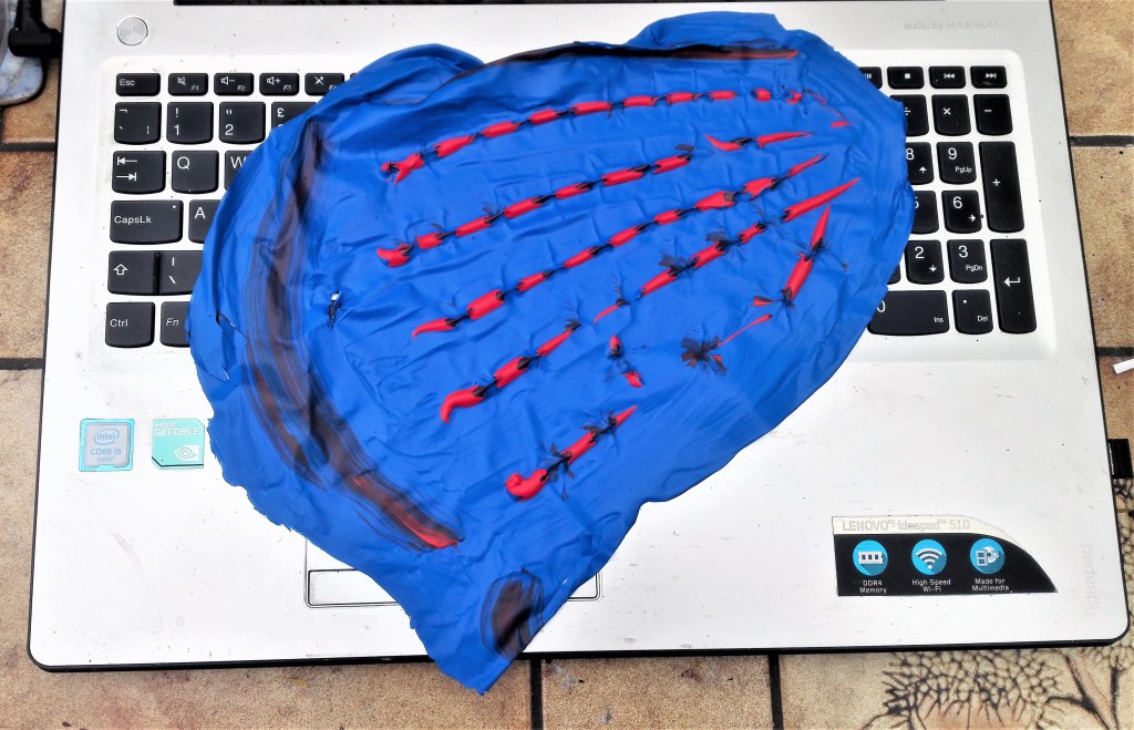
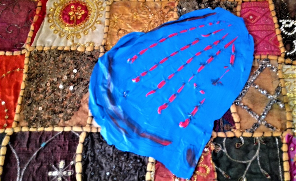
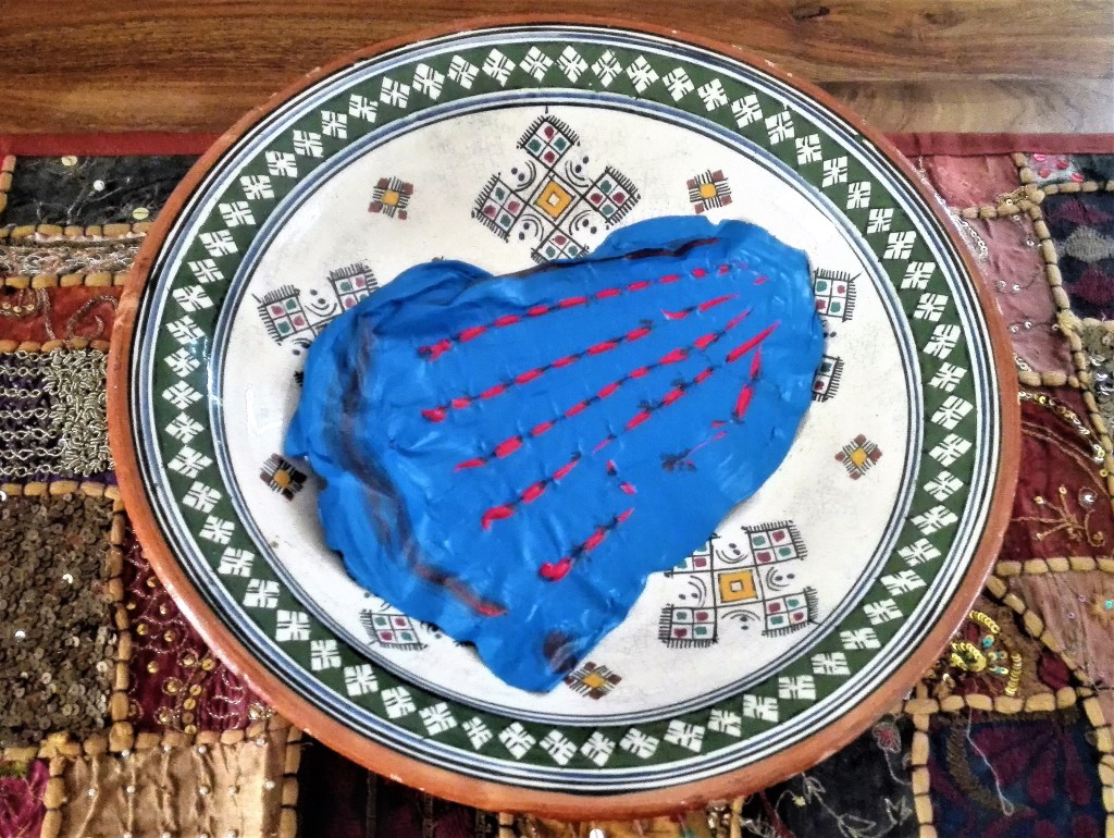
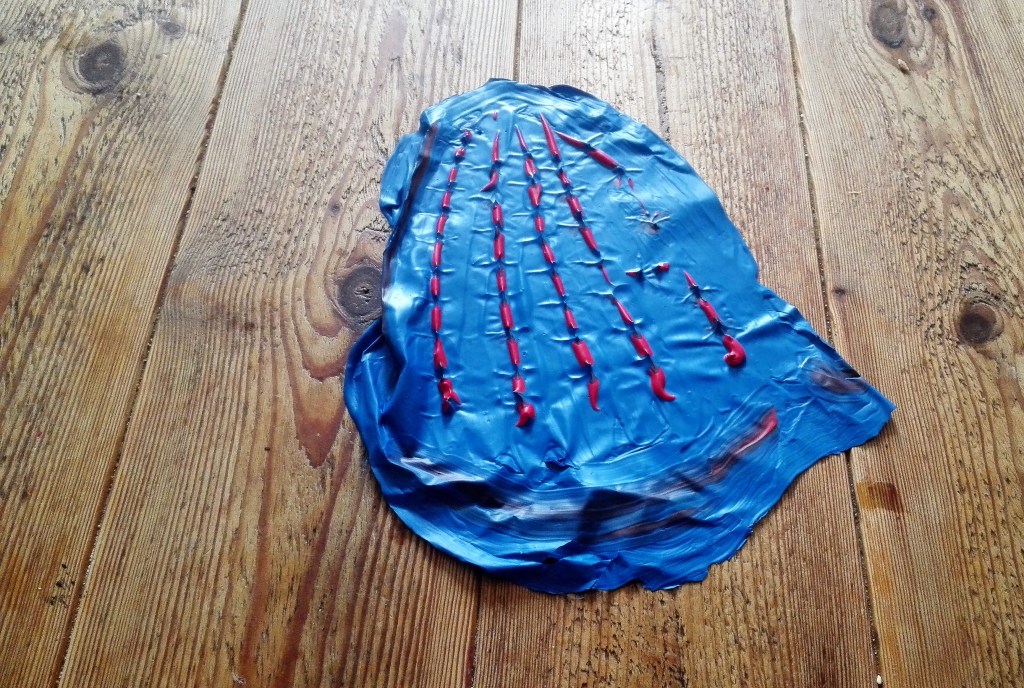
Experiment 8: this evolved into a long series of explorations investigating the impact of applying acrylic paint to plastic. The materials were applied directly from, tubes, manipulated with palette knives, brushes, sticks and other tools. In some cases PVA adhesive was painted onto the dried paint to give it strength and allow it to be removed from the plastic support. Below is the result of these explorations, the paintings and the different ways I have tried to use them to create further works.
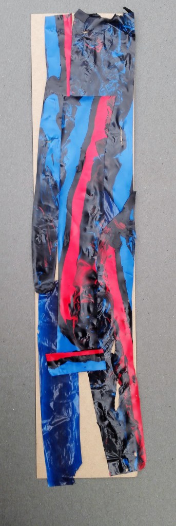
Collaged figure
The individual pieces prior to putting them together and securing with PVA adhesive.
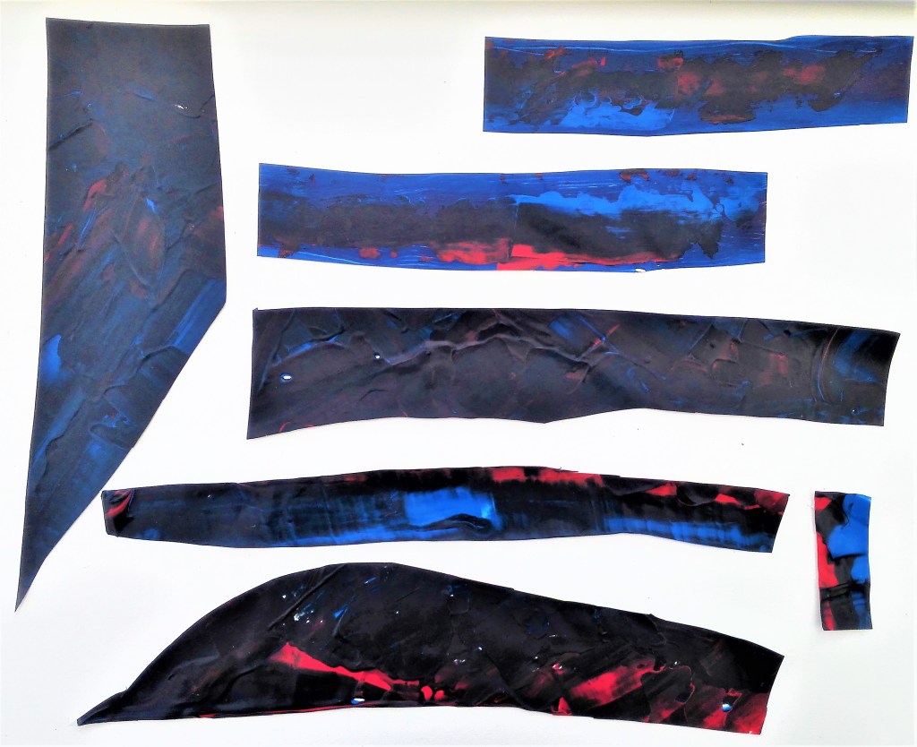
Collaged figure, acrylic paint strips on card, 8 x 39cm
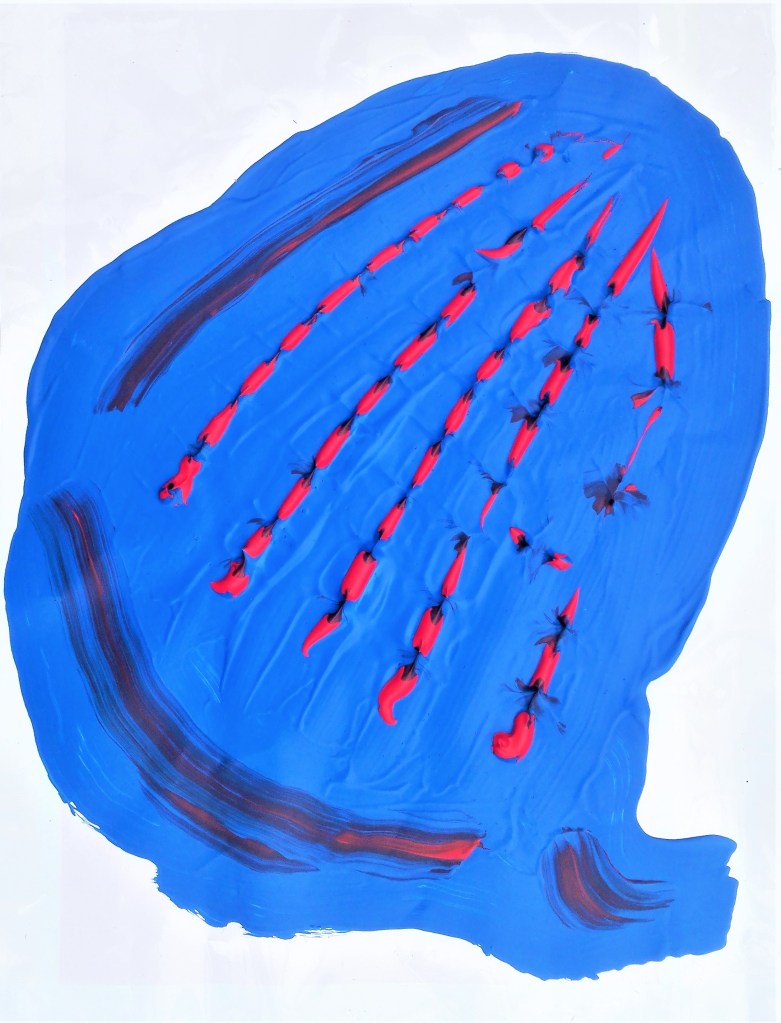
2. Blue frog
Blue frog, thick acrylic, 23 x 27cm
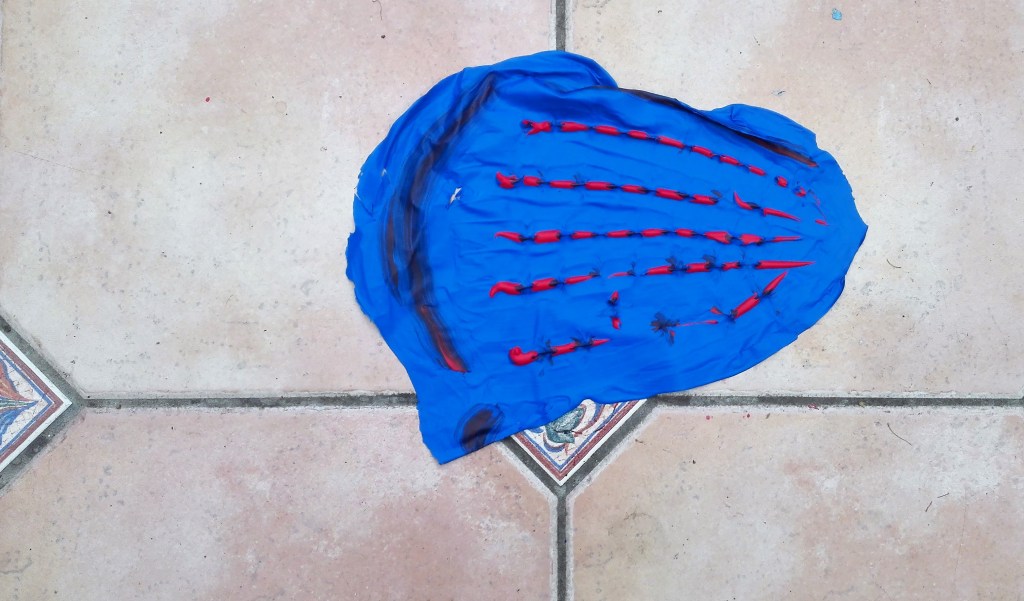
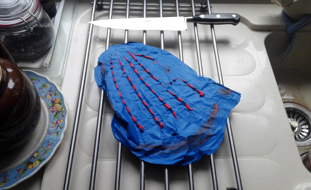
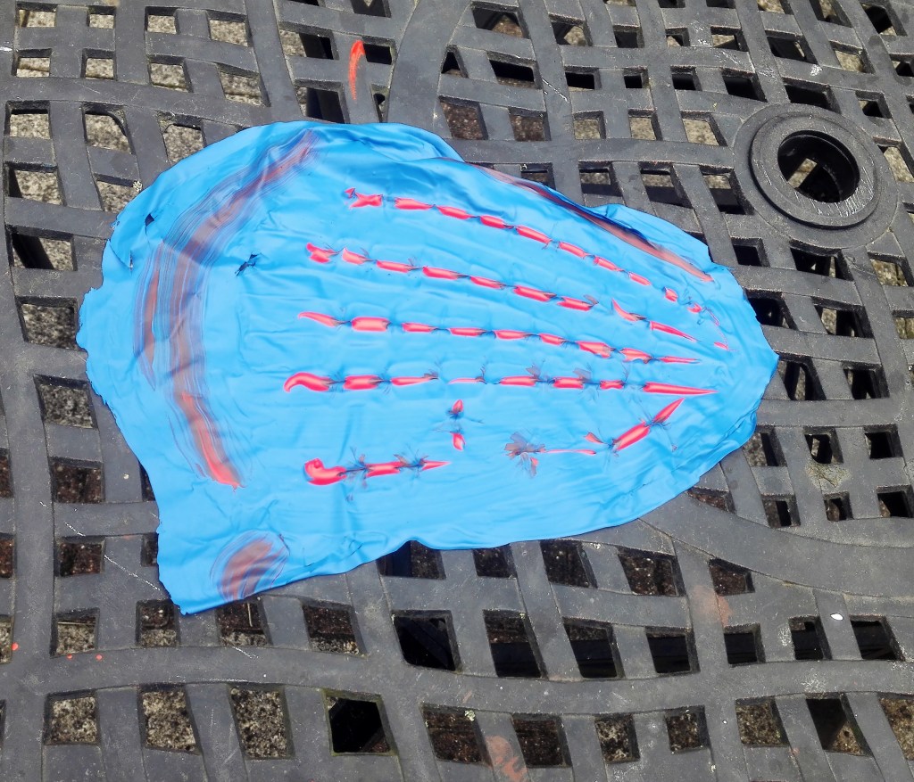
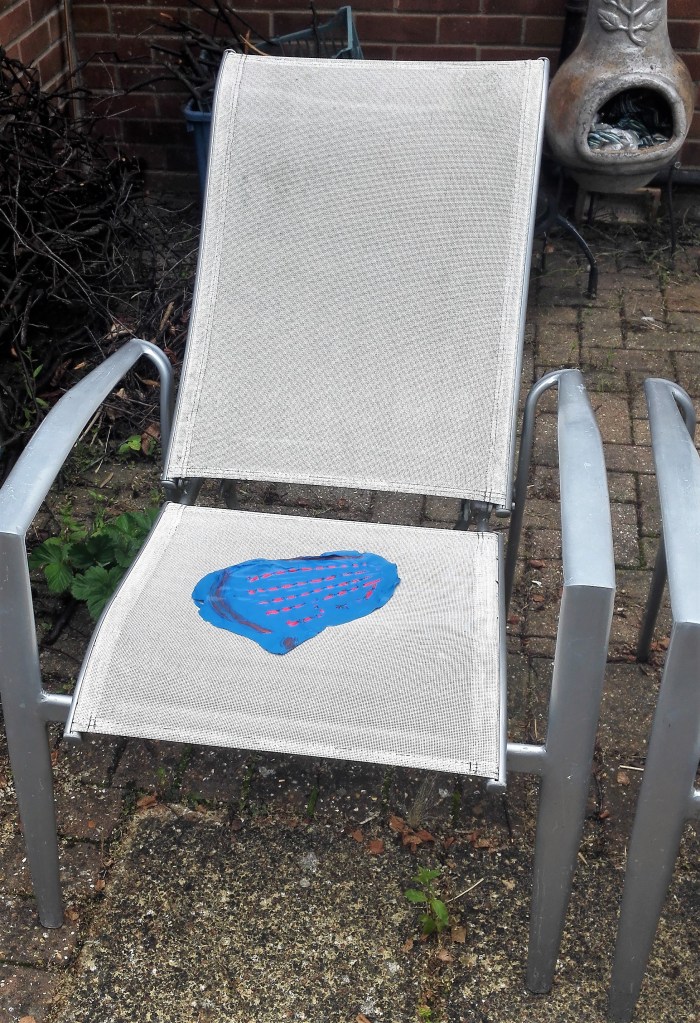
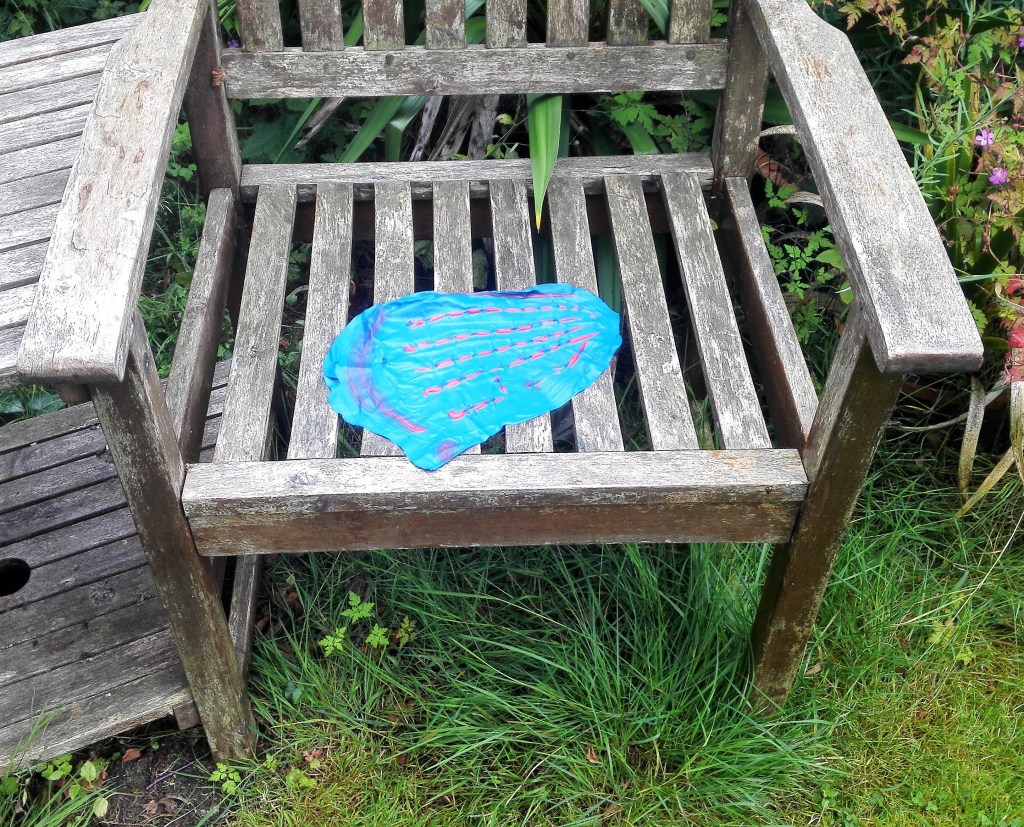
I moved this painting around the house and garden and photographed it in a number of locations. Its forms and appearance changed dependant upon where it was located. The idea of being able to move painting from the confines of the support began to intrigue me. It was notable how the location of the painting had an effect on both it and its surroundings. In some of the photographs it appears to take on form.
The adventures of Blue Frog
3. Four paintings on plastic bags. The plastic bags used were of a good quality, a thick plastic. I found that this helped in the application and manipulation of the paint which was mainly done with palette and painting knives. The paintings need to remain on the plastic as I feel that removing them from it would damage them. The resultant paintings are pleasing, particularly paintings 1,2 & 3 where both the colour and texture of the paint looks rich and textured. I feel that painting 4 looks less cohesive. It does have an look of Scotland about it though.
Painting 1, 20 x 32 cm
Painting 2, 18 x 31 cm
Painting 3, 34 x 23 cm
Painting 4, 20 x 34 cm
I considered what further I could do with these paintings after having these paintings on display in my studio for a couple of weeks. Could I bring them together into one larger work. Knowing that my assignment piece would be an expansion on work completed during Part Four could these paintings become the basis. These considerations are currently ongoing.
I made a further two paintings on plastic. with these I applied the paint thickly and built it up to a level where I would be able to remove it from the support. The two paintings are displayed below.
As with the four paintings on plastic bags I wanted to do something with the paintings. To display them in a manner that was outside the usual framed, hanging on a wall but how.
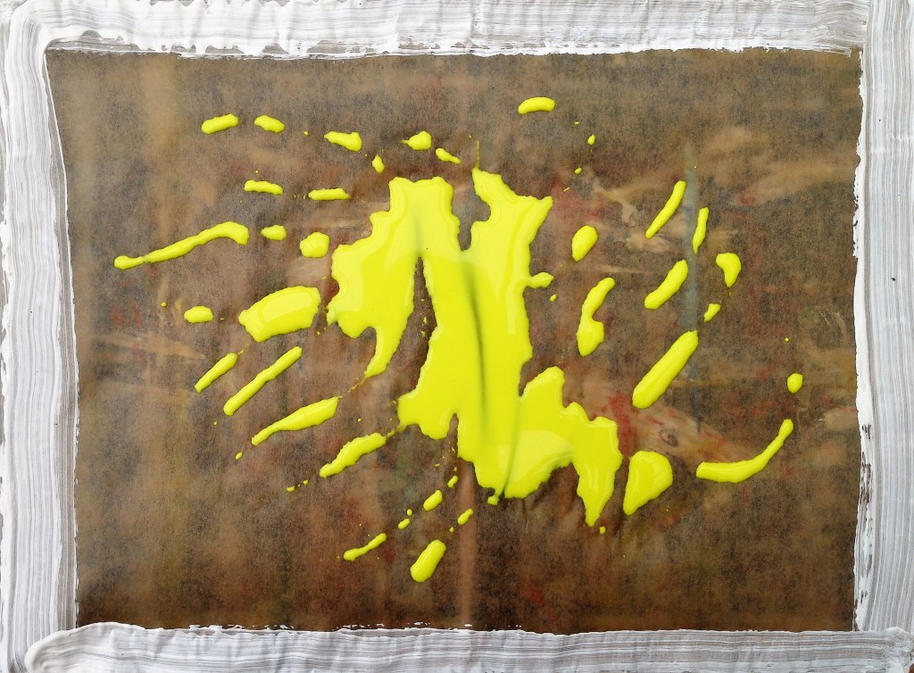
Experiment 9, Whilst thinking about how to display / use the paintings above I had obtained some A4 size acetates. These should be good to apply paint to as it would not need to be removed and the resultant paint could be viewed from either side.
Using the acetates I painted two works. The first:
Acrylic on acetate1
The second:
Acrylic on acetate 2
Painting on acetates produced a good outcome. Both of these paintings have a number of pleasing aspects. They can be viewed from both sides, although the backs were less interesting as only the base layer of paint can be seen. They can be displayed on glass windows which allows them to be backlit. Also the acetate support gives the paintings strength and enables the painting to be displayed in positions other than flat.
A number of options and ideas were beginning to present themselves. I took one of the plastic bags paintings, the thickest one, and carefully removed the bag from it and adhered it to an acetate. Placing this on a window gave it a new light. Before and after are shown below.
Painting 21 – Before and after removal from plastic bag and adhering to acetate
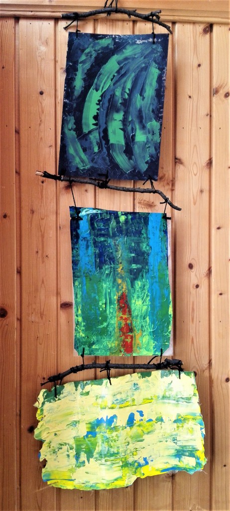
Experiment 10, the object of this experiment was to try to move beyond the obvious way of displaying paintings. I looked to join three paintings into one piece. I would use one of the paintings made directly onto acetate, one that had been fixed to an acetate and lastly one that the paint was thick enough to support itself. The paintings would be tied to large twigs with wool and joined together. An abstract hanging triptych.
Abstract hanging triptych
Conclusion, this is a long blog that has documented a series of experiments and explorations into paint, ways of applying paint, use of different supports and different way of displaying the resultant paintings. The process has given me many ideas that I shall take forward into my practice. I anticipate that it will impact my parallel project and also the way that I will approach future exercises and assignments.
+++++++++++++++++++
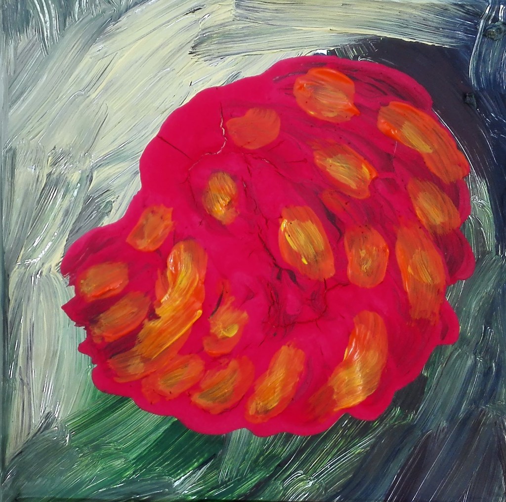
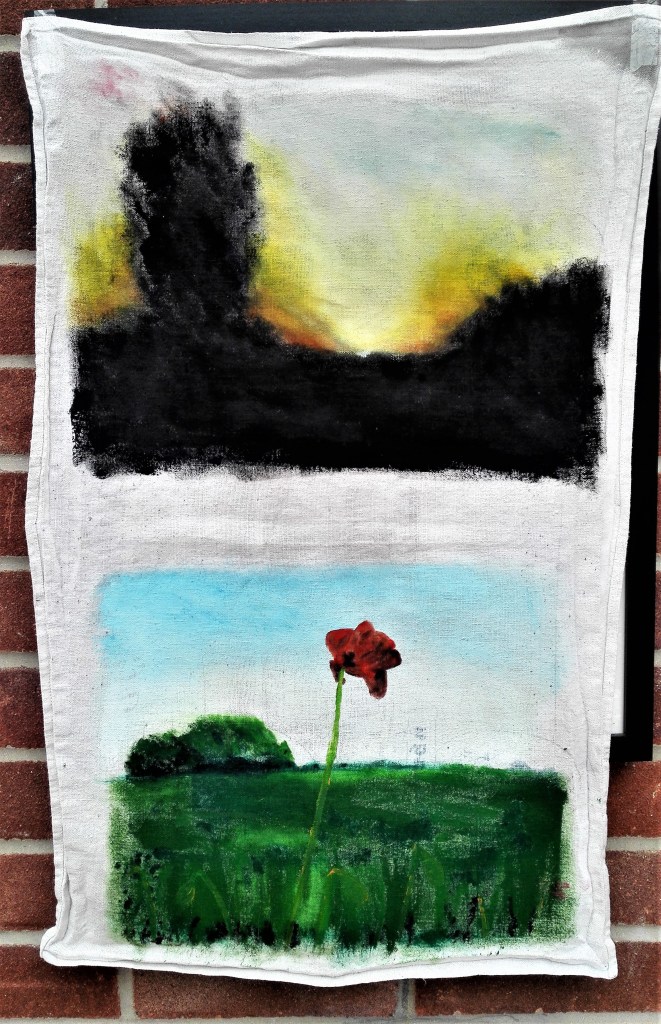
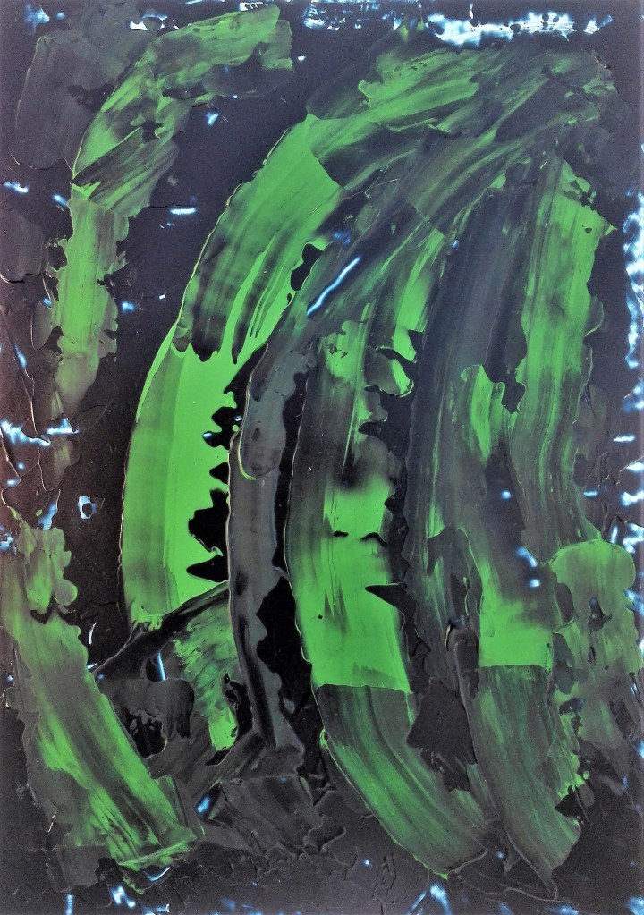
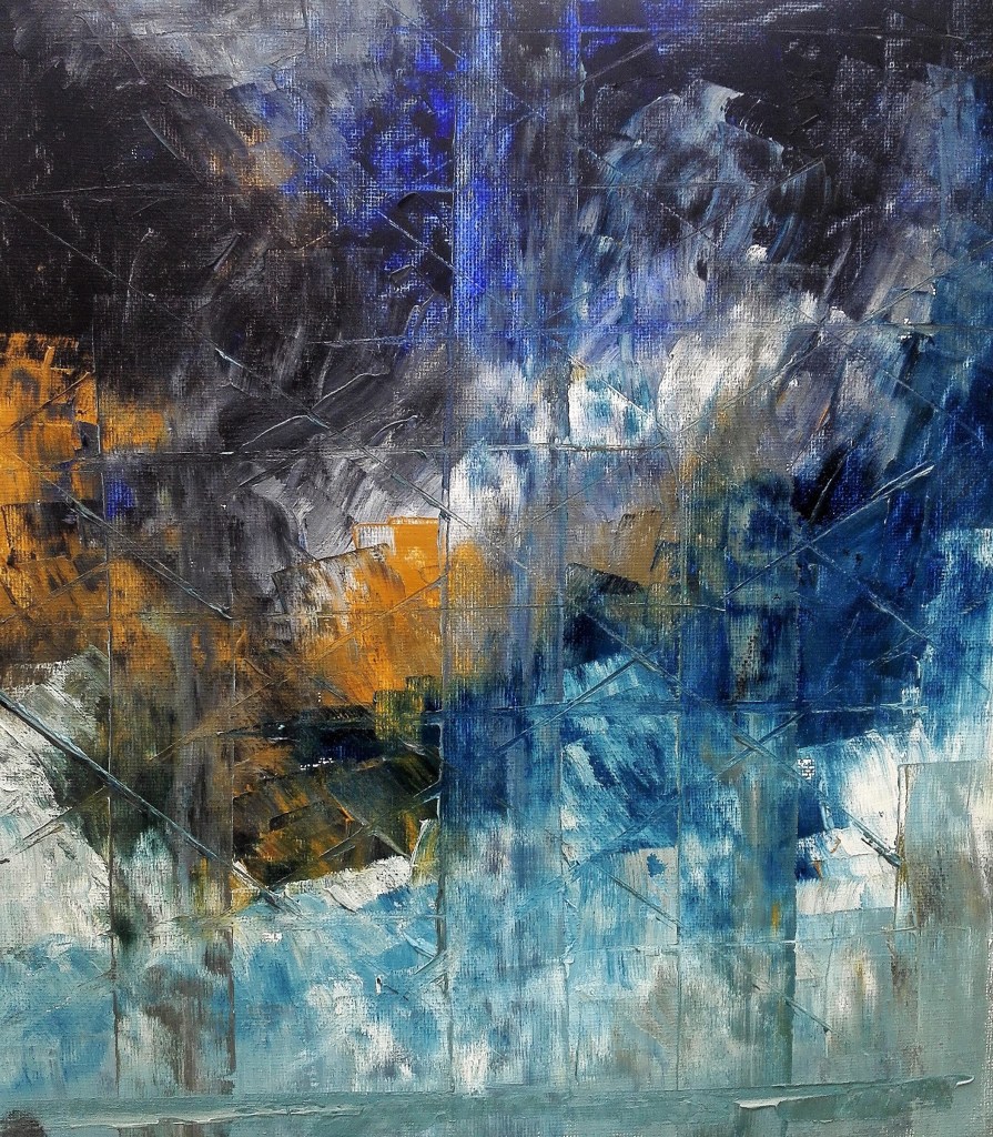
A further work completed later which I feel deserves to be included in these exercises is shown below. It is an abstract work, untitled, which has movement and drama.
This blog has nothing to do with Part Four of this course. I have documented it here as it occurred at the point where I working on this part of the course. The notes are in bullet point form.
Noted 23 participants of which 5 males.
These are the notes that I made from the discussions included in the meeting which was supported by five HE6 students.
How well prepared did you think you were before starting HE6?
Jane, felt ready, wanted to paint rather than sit behind a computer.
Dawn, completed CIP, smooth transistion to HE6.
Patricia, felt ready, 11 years study, thinking differently about self.
Naomi, rollercoaster, emotional experience, light hearted and fun at previous level. Made self uncomfortable, intense. Communicating with the art world.
Rachel, juggling with work comittments, essay was a struggle. Book ‘How to write about Contemporary Art’ Risk taking.
Two project at once, essay writing difficult. Alternating between two courses.
*Essays need to be on something that you are interested in*
Major project and contextual studies interlinked.
ESSAY IS KEY TO HOW YOU GET YOUR HONOURS
Librarian is a good resource to be used.
UCA Library website – Journal of Contemporary Painting – sign up for
Organising an exhibition(s), sending invitations, digital platforms. Exhibiting gives / provides a drive to continue working and improve painting practice.
Lots of ideas or very disciplined, allow things to evolve, same subject but different ways of seeing and representing.
Overall the meeting and subsequent comments were positive. In an earlier blog on my personal assessment I rated my work against the assessment criteria. In this I explained how I had adapted the exercises to allow myself to explore the topics via painting. In so doing it had allowed a freedom to express myself and respond to the challenges. The resultant work varied in style and technique and used a variety of sources to create inspiration. In amongst these were some specific pieces which were singled out for positive comment.
In Exercise 1.0 where I created a series of four sketchy paintings it was one where despite there being obvious issues with the perspective it was felt that the background wall texture and the chair was well rendered. The composition was tonally balanced.
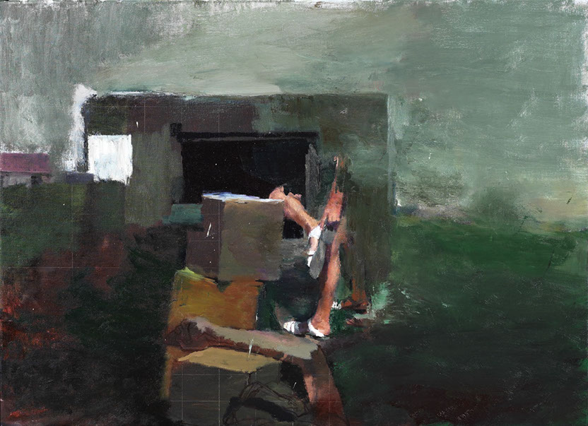
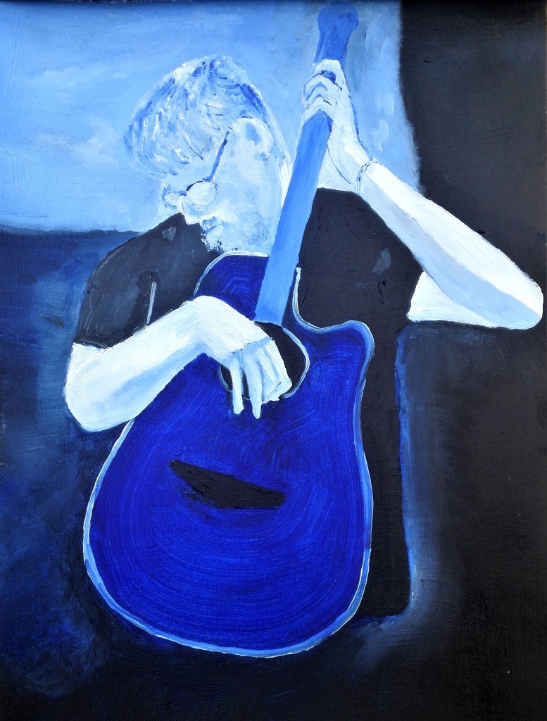
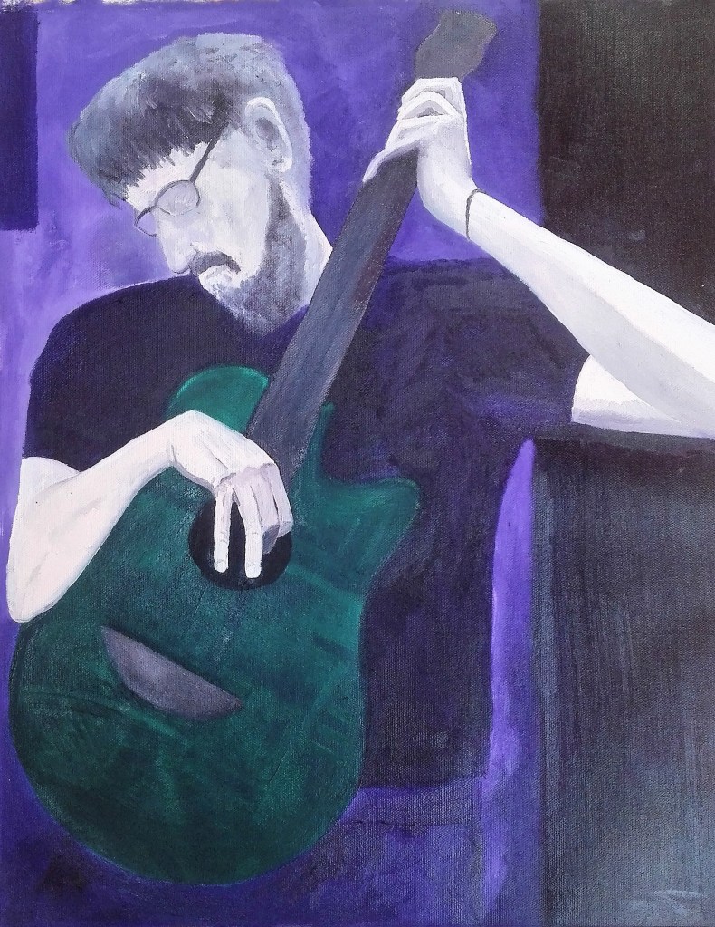
For Exercise 1.1 ‘Body as canvas’ the way I had interpreted the exercise was interesting. Of the paintings it was commented that the smaller blue painting had a better body shape than than the larger one where the right side of the body, the left side of the painting, appeared to be squeezed in to fit the canvas.
Two paintings of man with guitar
Whilst I agree with the observation I feel that the tenderness, the caressing of the instrument, is better observed in the second painting.
The series of paintings completed for Exercise 1.2 ‘Before and after’ were commented on a having a charming and playful quality that was found to be amusing. The main learning points from this exercise, for me, was the requirement to keep a consistent format and style across the pieces. this had necessitated planning, organising and not plunging into the work which, at times, I am prone to do. It was suggested that I research George Shaw’s Payne’s Grey paintings as a source of inspiration as to how to create narrative over several works by the consistent use of a limited palette.
The exercise for which I created the most work and made the most investigations was Exercise 1.3 ‘The mirror as a stage’. It was this exercise where the most in depth conversations and comments were directed. The overriding comment that I highlighted from the feedback was the possibility to start making more connections between subject and process. How can I integrate some of the more successful experiments and techniques into my parallel project of exploring aspects of Fenland landscapes.
Some of the more successful paintings were:
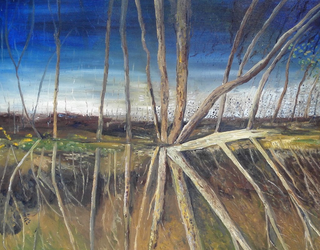
For my Assignment piece I had selected an image from a photograph which, it was felt, had created difficulties, for myself. The photograph didn’t have sufficient tonal variations and the focal point lacked emphasis. The result was that the final piece became overworked. The quicker study was preferred to the final painting. The alternative orientation of displaying the final piece upside down from its intentional orientation has now become my preferred way of hanging the painting. It was commented that it reminded of exposed tree roots along a river bank. I also feel the it has a dark, gloomy quality in which the landscape looks desolate under an foreboding sky.
Hidden Away – Preliminary painting and finished piece
The final part of the review concentrated upon my ideas for both the Parallel project and the Critical Review. I outlined my ideas to create a series of painting where I would explore abandoned, run down, decaying Fenland farm buildings looking for unusual angles and perspectives. The idea included a comparison to and inspiration from the suburban landscape paintings of George Shaw. I would also use George Shaw as the main topic for my critical review where I will look to examine his paintings of the mundane, the discarded, the back alleys and the familiar sights of our day to day existence. This would be compared to other artists working in similar fields both in painting and other artistic fields.
A number of artists were suggested for research which I will do in due course and will write up my thoughts and reflections in my blog. In this I will endeavour to increase the depth into which I investigate.
To assess the outcomes that I have achieved I have broken this section down into the key elements.
Materials:
The materials that I used during Part Three were those that I would expect to use, oil and acrylic paints, pencils, charcoal for the paintings and drawings. However for the creation of the stand in for the human form I used old clothes and fashioned a t-shirt from paper.
Techniques:
There were a number of different painting techniques that I utilised to create the varied styles that I utilised in responding to the exercises. These ranged from loose gestural application of paint to tightly controlled.
Observational skills:
I believe that I have demonstrated a depth of observation throughout Part Three. I have looked to complete the exercises in a variety of ways whilst at the same time looking to resolve them with a painting.
Visual awareness:
The exercises forced me to address how I looked at, around and into objects, their positions and relationship to their surroundings. In doing so I found that I expanded my knowledge and responses to visual challenges.
Design and compositional skills:
I had to utilise a number of different design and compositional skills for the exercises. The most notable example was the storybook paintings that created for exercise 1.2 ‘before and after’. In this exercise I needed to create and consistent and clear design to enable the story to unfold and be understandable.
Quality of Outcome
I feel that I have produced throughout part three has been of a consistently good quality. There are some pieces which I believe are amongst the best paintings that I have made.
Demonstration of Creativity
In trying to resolve the exercises with painted solutions I have needed to look beyond the obvious solutions.
Context
My learning log details a lot of my thoughts and reflections on both the work that I have completed and my thought processes. I would have liked to have complimented some of the exercises with visits to exhibitions but this has not been possible during lockdown. In response to this I have utilised on line resources. These do not compensate for the experience of confronting art in the flesh. I have set up a regular, not quite daily, routine of exploring a new, to me, artist. For each one I have written a short blog about their work and my reaction to it.
Summary
Overall I have enjoyed Part Three and can look back on the work that I have undertaken and the resulting paintings with satisfaction.
I had been warned that Part Three could be a challenge as it would take me into areas of art which I would not normally venture. However it was also mentioned that I should look to embrace these challenges whilst also looking at ways to respond to them via painting. It is painting that is my primary artistic drive. I feel that in the work that I have completed during Part Three I have managed to marry both the objective of exploring the tasks in an open way and found ways to articulate these tasks with painting. In doing so I have created a body of work in which I have explored a number of different styles which have also encompassed a variety of techniques. This has ranged from near cartoon like, illustrative painting through to more standard pictorial painting, expressionist work and also abstract works. In completing these I have worked in both the studio and outside, ‘en plein air’. I feel comfortable moving amongst these different styles but I do have some minor concerns that my own personal style has not emerged.
Whilst working through the exercises, responding to the research topics and taking time out to work on some personal projects, I have also been cognisant of the need to be considering both the Parallel project and the Critical review. In both of these areas I have made progress in bringing my thoughts and ideas together. I have yet to create any work in respect of either beyond making notes and starting to make a resource archive of photographs. I will be discussing my ideas with my tutor as part of the Formative feedback review for Part Three. At this stage I have plenty of time to fully realise both of these challenges.
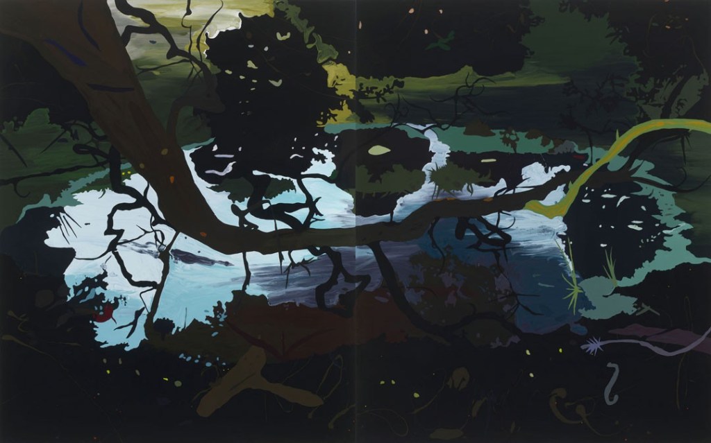
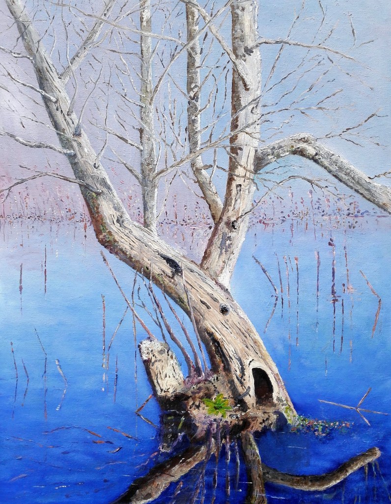
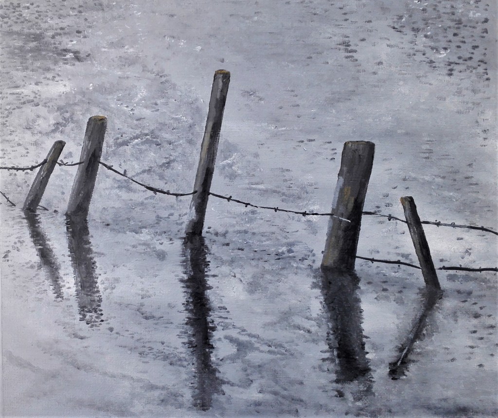
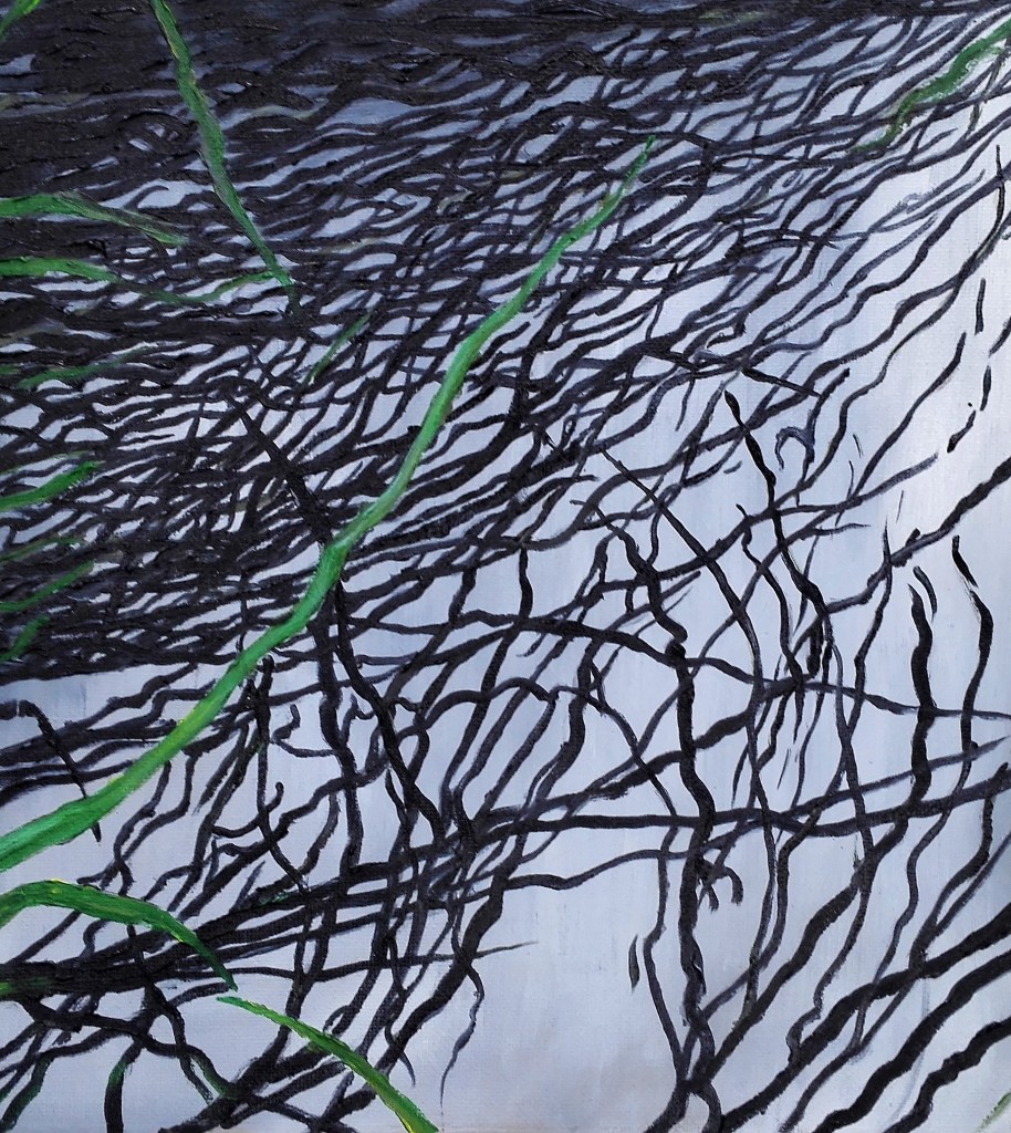
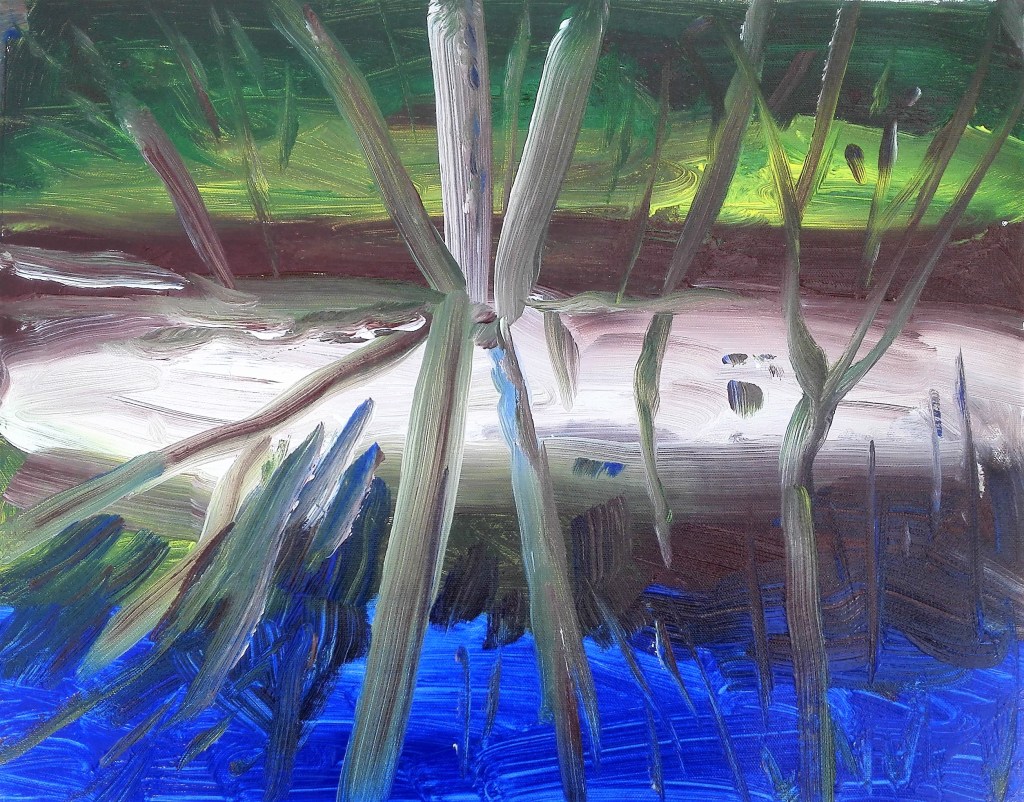
Of the exercises it was Exercise 1.4 ‘ The mirror as a stage’ which I was best able to respond to. This wasn’t a surprise to me as the topic of reflections is an area that I have explored before. It also aligns closely with my Fenland landscape paintings where water acts as both a reflective surface and a mirror. Unsurprisingly, to me, I created six paintings exploring aspects of this topic and I also went on to to complete a further work for my Assignment Three piece.
In summary despite the challenges thrown up during this stage I have enjoyed confronting them. They have forced me to look at my practice and style of painting which has in turn moved in a number of complimentary directions. I look forward embarking on Part Four.