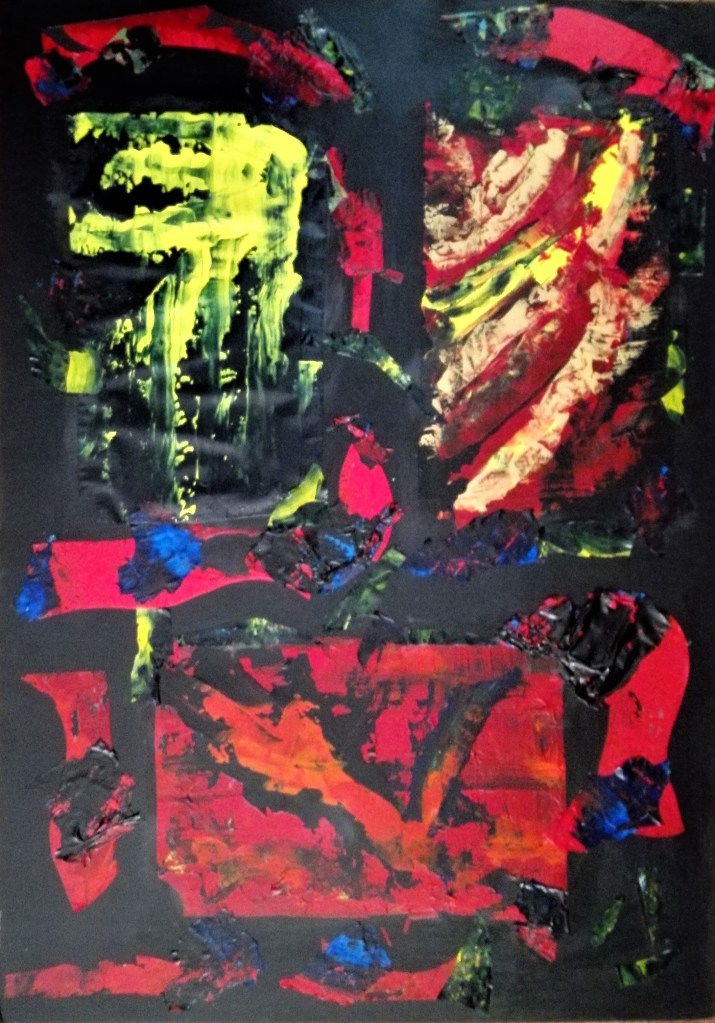
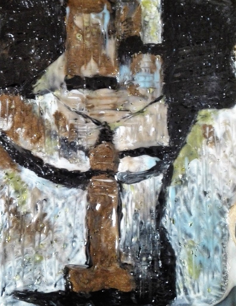
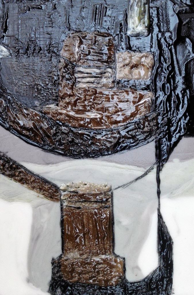
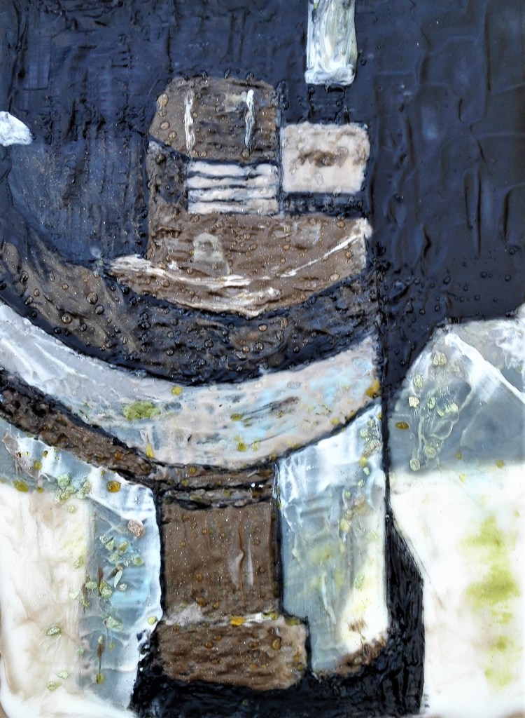
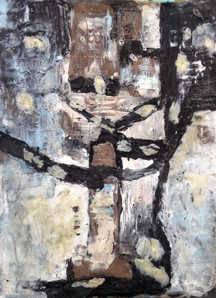
A further two paintings which examine the impact of time passing on painted machinery. With both of these paintings I have tried to interpret the image in my own way. I have toyed with the texture of the paint to create interest in the surface of the painting. Zooming into the subjects has created abstract images which have a form without revealing their identity. I am finding that this juxtaposition of form, paint and colour is resulting in paintings that are both challenging and interesting to explore.
The first painting is on canvas paper, 25 x 20 cm painted using Aqua oils.
Farm Machinery, Aqua oils on canvas, 25 x 20 cm
The second painting is on acetate, 20 x 29 cm, painted with both acrylic and aqua oils.
Machine Part, Acrylic and aqua oils, 20 x 29 cms
The focus of my Parallel project has moved in a direction that I wouldn’t have originally predicted. I await feedback on this.
To assess the outcomes that I have achieved I have broken this section down into the key elements. This is a similar approach to that which I have taken for the previous Assessments.
Materials:
The materials that I used during Part Four expanded upon those that I would expect to use. The usual oil and acrylic paints, pencils and charcoal was supplemented by feathers and soap. For supports I used acetates, kitchen foil, greaseproof paper and linen t-towels. In doing so I fully embraced the requirements of the exercise for Part Four. In addition to experimenting with new and unusual materials I also experimented with different methods of application of traditional materials. The results of these investigation are covered in the separate blogs in my coursework.
Techniques:
Further from the materials utilised during Part Four the methods of application had to be modified and adapted. This was particularly true where I used soap as the material. In addition a number of the investigations into the properties of both the supports and materials required thick application of paint. This in turn resulted in new ways to explore the properties of the materials and the techniques used in their application.
Observational skills:
The utilisation of new, to me, materials, supports and techniques necessitated looking at the world around me in a new light. It was clearly obvious to me that taking a pictorial approach was not going to result in a satisfactory outcome. My observations became more concerned with colour and form.
Visual awareness:
Being confronted with the challenges of the exercises, and my approaches to them, has resulted in an expansion to how I see things and how I respond to the visual stimulations. I have found that I am looking far more a the textures of objects and trying to find ways to replicate what I see in my own way. The evidence for this is in the preparatory work and paintings that I have completed as part of my Parallel project. The focus of which has changed to the effects of deterioration rather than placing the impact in a setting, usually a landscape. I am now interested to explore this further.
Design and compositional skills:
Following on the from the change in focus on the impact of deterioration and ageing on objects I have changed how I try to convey the subject. My focus has moved into trying to pick out the colour of decay. In doing so I have tried to maintain elements of composition. This is evident in the way I try to give the impression that the decay is happening to something real. Aspects of the object will still be evident but its full self is not revealed. I haven’t resolved how far I want to move ways from the object itself and into more abstract composition. At present I’m hovering between the two and enjoying the conflict.
Quality of Outcome
The quality of the work has been extremely varied. some of the experimental pieces have been poor at best but still worthwhile. Of the successful work two of the pieces, which are not paintings, look like they will be part of my studio display for some time. On the positive side I feel that some of the paintings I have produced are some of my best work. My aim now is to expand upon these successes and take them through to the work that I am looking to complete for the Parallel project.
Demonstration of Creativity
In all parts of Part four I have looked to find new ways to explore the exercises. I have tried to use materials, supports and techniques in a range of unusual ways. Exploring their possibilities, testing limitations and working in new and inventive ways.
Context
I have reflected in my learning log / blog my thoughts and reflections on both the work that I have completed and my thought processes and the results. As I approach the end of the course it is my intention to expand my contextual reflections. This will be particularly required for the Critical review. I have completed some initial research in this respect which I will be expanding on. It has been a source of frustration that visiting exhibitions and galleries has not been possible. Whilst I note that there has been a concerted effort by the art world, particularly galleries, to offer an virtual alternative to physical visiting, I find that these are a poor substitute to being able to observe work in the flesh. I have continued to research new artists and write up my thoughts and experiences. These tend to be quite short pieces. I will look to expand some of them.
Summary
The volume of work that I have completed during Part Four is testament to the enthusiasm that I have felt towards most of the challenges. The encouraging aspect is the new avenues that I have opened for exploration. I also look back on some of the work created with satisfaction.
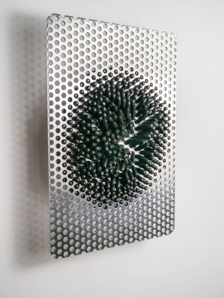
31. Phil Illingworth (23/6/2020), today i started by reading the artist’ / curator’s statement. Quotes “Phil Illingworth’s painting practice is almost entirely experimental. Respect for the long tradition of the craft of painting. At the same time I play games. I’m also trying to push the limit of what a painting can be”
My thoughts: I found the works challenging in a positive way. I enjoyed the clean lines, the gentle undulating shapes, the choice of materials and the combination of materials. There is an element of the future, sci-fi inhabiting the works. I can also see the humour and playfulness present in them. They sit on the cusp between painting and sculpture.
The piece I downloaded, Shangri La, see below, typifies Phil’s work. There is almost something living about this piece. Is the black polymer coming out of receding. It appears to be in a state of flux.
Phil Illingworth, Shangri La, pigmented polymer and aluminium, 10x15cm, 2018
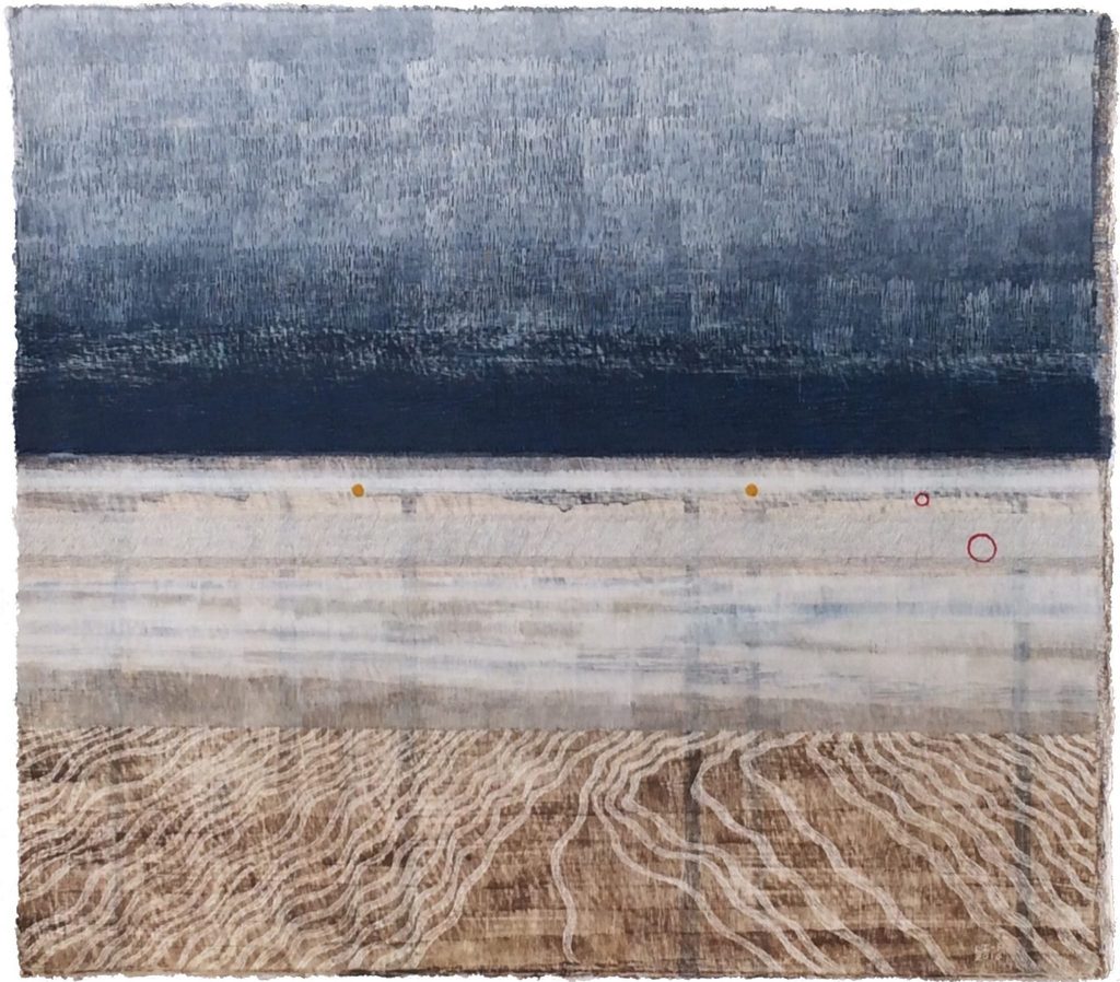
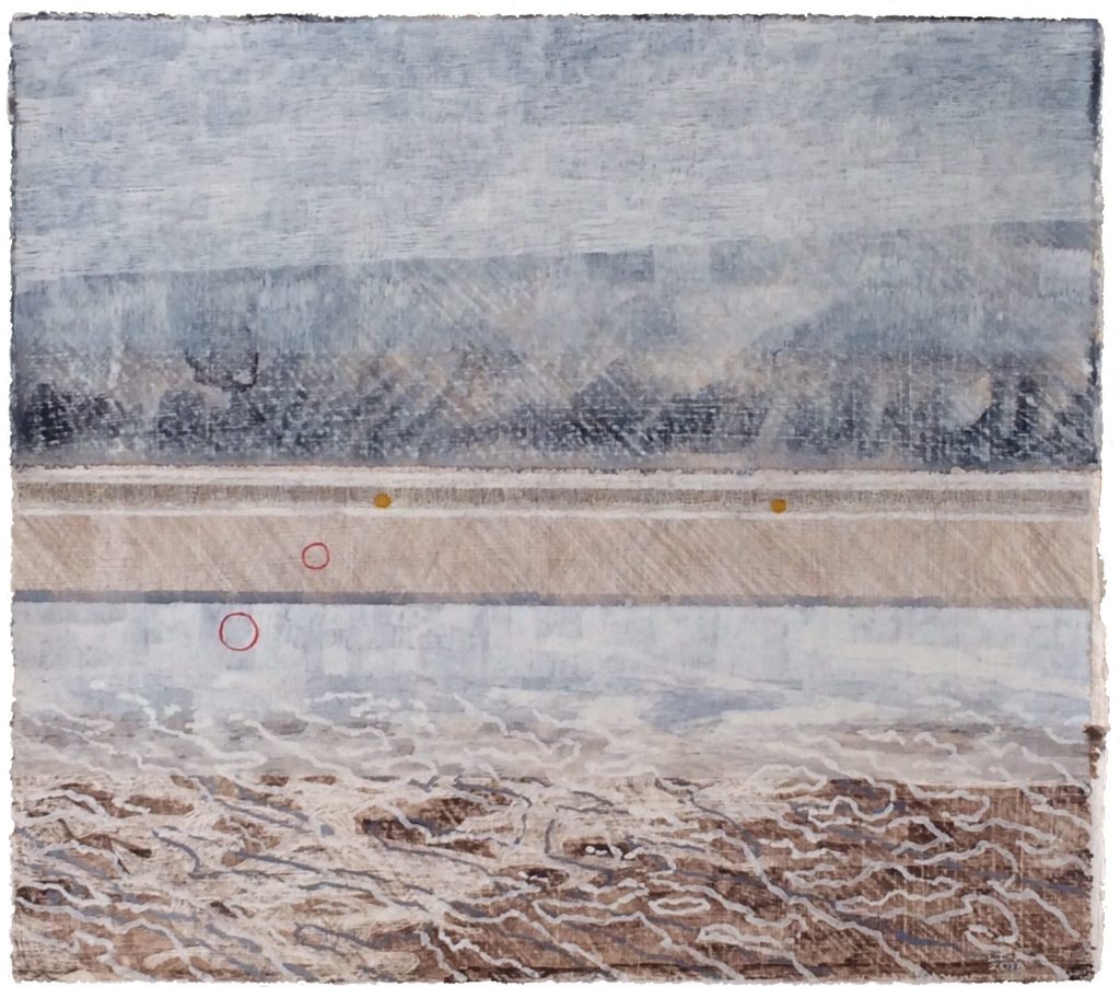
32. Linda Ingham, 26/6/2020 content includes a number of drawings with watercolour, silver point and ink. Mixture of topics and influences including abstract landscapes that capture a feeling of emptiness and loneliness, particularly her Far and Near series.
In her Artists statement she states that her process led practice is based on personal engagement with landscape and place. Increasingly involved with botany and folk histories of plants observed on location where she walks and her allotment. Pieces are often created using gathered plants and their traces within the layers.
The two paintings the I selected from her works are both interesting landscapes.
Linda Ingham, Far Near 2 & 3, Watercolour jet and silverpoint on paper, 2016
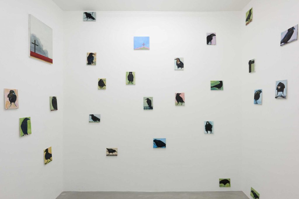
33. Matthew Krishanu (30/6/2020) strapline which I presume is from a curator “Matthew Krishanu’s recent paintings construct narratives exploring themes from memory, childhood and art history.”
My thoughts, there seems to be a focus on reminiscing, a look back to childhood. The figures are roughly painted, nearly crude but have a warmth. Of the paintings my favourite was ‘House of Crows’ see below. It has a nostalgic feel to it invoking Hitchcock’s ‘The Birds’ slightly menacing. I found ot later that the image that I was looking at was in installation view. This didn’t impact my enjoyment of it.
The paintings on the artists website, although belonging to the same style have more variation to them.
Matthew Krishanu, House of birds, 2019, installation view
34. Bryan Lavelle, (5/7/2020) an investigation into the proerties of his chosen materials and the process of painting. No layers of hidden meaning or narrative waiting to be uncovered, nor does it elude to be anything that it isn’t, through making external references outside of the work itself. He sees his role as a facilitator, that is, he brings together, materials and process, (MDF, paint and gravity), and allows a dialogue to take place.
The works are all about the process and allowing the paint to do its work. I’m unsure as to how this process works, probably tipping. Interestingly I noted on the Degree art website where his paintings are for sale that the prices range from £400 to £1,250. Do I like them? Initially yes, but I feel that I would quickly become bored with them.
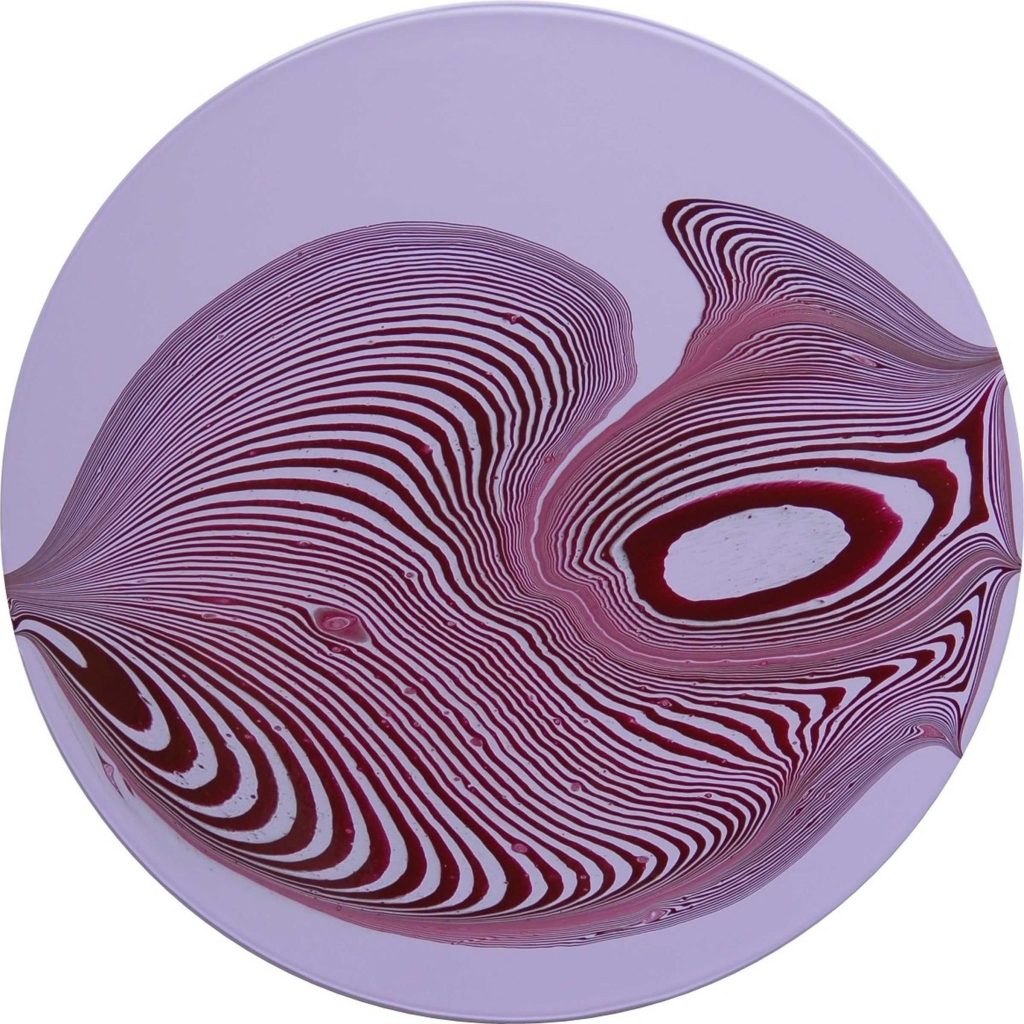
Bryan Lavelle, Tipping Point, Permanent light violet & burgandy #2, acrylic on MDF, 60cm round, 2019
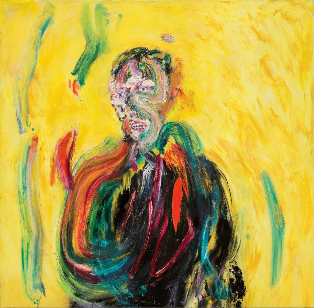
35. Andrew Litten (15/7/2020), first impressions were that the paintings had something of the Edvard Munch and Francis Bacon about them. Ghostly figures represented in multicoloured forms. Angry, agitated brushwork which indicates and then distorts features and form. The would seem to be an emotional input into the work.
Artists statement – Andrew’s work explores raw human existence. Like so many expressionist artists, Georg Baselitz comes to mind, in Andrew’s work the rawness is also the vulnerability. Andrew is searching for poetry, the poetry of living, loving, hurting and dying, the vulnerable, the powerful, the human.
Andrew Litten, A sudden involuntary chemical withdrawal, Oil on canvas, 120 x 120cm, 2016
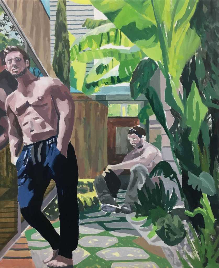
36. David Lock (20/7/2020), my first impression was that the paintings suggested homo-eroticism. A number of the paintings of the paintings are titled ‘Misfits’. The figures are expressive and shown in various positions, often confrontational in demeanour, often posing. The painting relies on strong tonal variation. A collage effect is often employed which breaks the paintings down into sections with colour variations marking the tears in the work.
Artists statement: David Lock’s paintings explore men and masculinities in a process of becoming. the painting utilises a collage approach. In the process of creating his ‘Misfit’ paintings he makes collages culled from advertisements and imagery from mainstream magazines. In their making, the collages and subsequent paintings, have a performance quality.
David Lock, El Muniria, Oil on canvas, 61 x 46cm, 2017
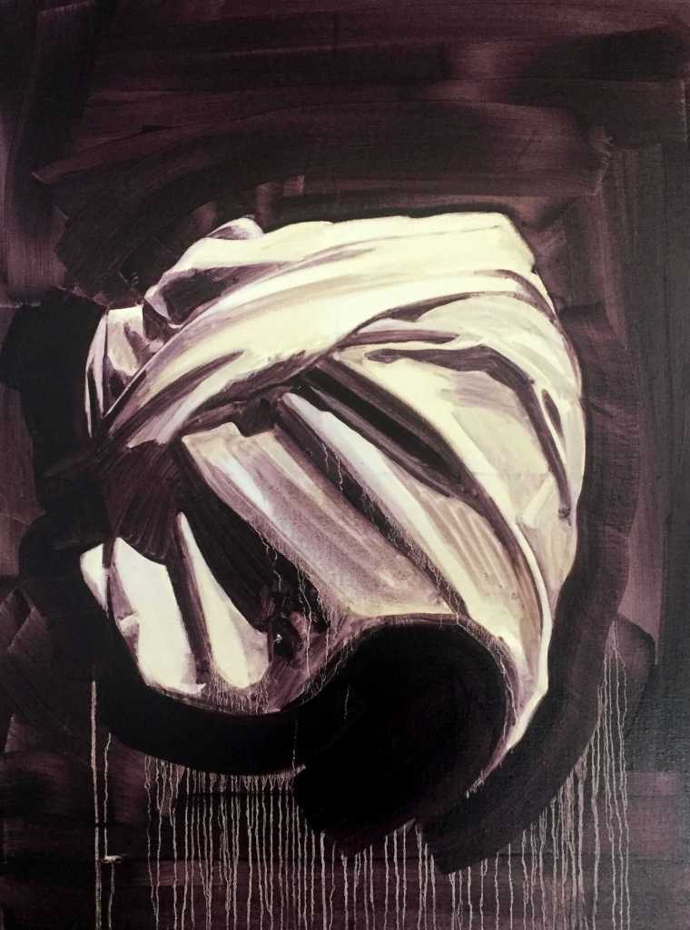
37. Paula McArthur, (4/8/2020),
Paula describes her painting as contemporary interpretations of traditional memento mori and vanitas painting. I can certainly see this in much of her work. I was drawn to the fabric painting below which is not one of these. It had echoes of the work that I had completed during Part Three, Object as a stand in for the body. The fabric has not only taken on the aspect of the human form but it has also assumed a gesture of embrace. The title of the painting ‘To be next to you’ also helps to confirm this notion.
Paula McArthur, To be next to you, oil on canvas, 2017
38. David Manley(19/8/2020), abstract artist who uses words / written text in his recent work. His comments on his recent works explain that he draws on a number of sources, observations of both land and seascapes, incidental details in them, basic geometry and in trying to complicate the structures within the pictures, often inspired by recent poetry, fifties interior design and 50’s – 60’s Jazz amongst other topics.
The painting below seems to be typical of his recent work. I was particularly drawn to the vibrant colours which contrast vividly against the pastel blues. The drips and drawn circles suggest droplets of water on a hard surface which gives the painting depth and and feeling of movement. The geometric shapes lay somewhere both on and beneath the surface of the painting. The words framing the picture add to the intrigue, they suggest rather than inform.
David Manley, On the margin, acrylic on canvas, 66 x 85 cm, 2020
39. Enzo Marra, 27/8/2020 Figurative paintings that distil the image down to simple lines and sparse colours. The paintings initially appear to be naïve but on closer inspection reveal considered compositions. The proportions are well observed and executed. I noted from looking at his earlier works that they were grander in conception and design than his current works. This is supported by the comments of the artist himself who refers to this by stating that he has been attempting to further reduce the detail within the finished images. This can be seen from the two paintings reproduced below. Current work first.
Enzo Marra, Immersive Studio, oil on canvas, 61 x 51 cm, 2020
Enzo Marra, Frank Auerbach, 45.7 x 61.9, pre 2010
40. Monica Metsers, 28/8/2020 Surreal fantasy paintings created by layering and building up oil paint. The paintings are sometime based on actual places, as in the example below, or are imagined scenes. Lots of melding of the paint to create soft flowing shapes and patterns. a number of the paintings reminded me of the album cover artwork of 70’s Prog bands, think Yes, Genesis etc (Roger Dean). On the whole the paintings didn’t appeal to me although I know that I have tried to paint similar work in the past. To me it is the lack of grit, feeling of reality that I found with the paintings that disappointed. They seemed to be closer to fairy tale images than I would like. The example below is a case in point. what could have been a gritty, melancholic painting has been softened so that it now appear to be more akin to a photograph taken on a long shutter exposure time.
Monica Metsers, Talisker Beach – Isle of Skye, Oil on canvas, 20 x 30 cms, 2019
My aim in the completion of this work was to try to combine a number of the pieces, that I had completed during Exercises 1 & 2, into a more considered final piece. To do this I would look to deconstruct some work, and add it to other pieces. The support for the work would be a 84 x 59 cm board. I was looking for both a cohesiveness in the colour and to the feel of the work but at the same time wanted some clashes of colour to excite the eye of the observer. The nature of needing to take deconstructed parts of other paintings and applying them to another support meant that the surface of the new work would have a textural quality. This in turn should make the surface have some life and interest as different light would have an impact upon it.
The process involved using three experimental paintings completed for Exercises 1 & 2 in their complete form. To these were added parts of other works that were torn apart, arranged and re-arranged until across the support until I had a composition that I felt worked. The result was then adhered to the support with PVA adhesive. Further black acrylic was added which was also painted over with a diluted layer of PVA adhesive to try to create a harmonious surface.
The completed work is a collage but in its finished state this is not is not immediately obvious. It has been brought together into one coherent work. There are elements that to tend to try to work against the coherent whole. These are the more reflective sections which catch the light and can distract from the whole. This is tempered by the consistent black background which holds the piece together.
An issue that I hadn’t encountered previously, with my work, was the difficulty in photographing the work. The reflective parts coupled with the size of the painting made it hard to get a consistent light over the whole painting. The reproduction below is the best that I achieved. When confronting the painting in the flesh the observers eye automatically makes adjustments for the light as it roams across the painting. The whole work is only momentarily contemplated.
Assignment Four – Combined experimental work, Acrylic paintings on panel board, 84 x 59cms
Summary: I feel that there is an argument for expanding the colour from the separate collaged parts of the painting over some of the back background. Would this further enhance the cohesiveness of the work? I will await feedback on this thought. As it stands it is a good representation of the work completed for this part of the course.
List of names for colour in which I noted that a number were flowers or plants. I particularly liked Garrulous, Yearning, Insolence, Indignant and Abstinence although I have no idea what colours these would be.
As a bit of fun I came up with names for the colours on my 3D colour chart.
Working from left to right and top to bottom these are the names that I came up with.
Tender
Bruised
Clay
Stormy
Rust
Bleak
Slippery
Dowdy
Fall
Cautious
Coffee
Tepid
Bridesmaid
Cocteau
Deep
Wine
Slate
Dread
Leveller
Smile
Raw
Fresh
Scum
Devil
I challenged Marian to match the name to the colour, it wasn’t a great success.
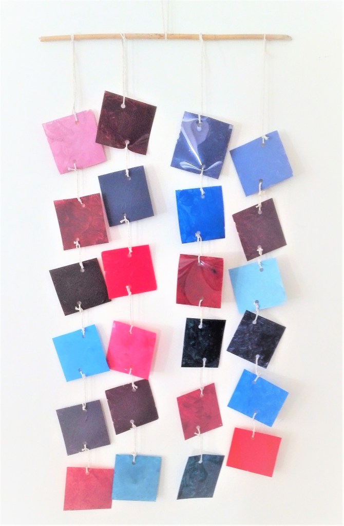
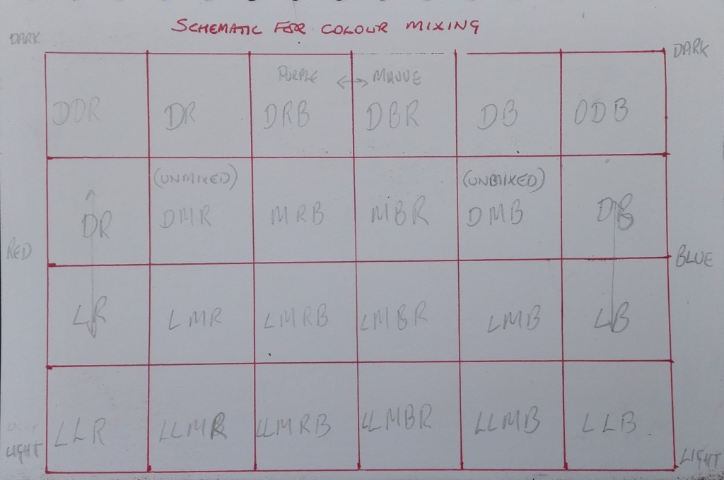
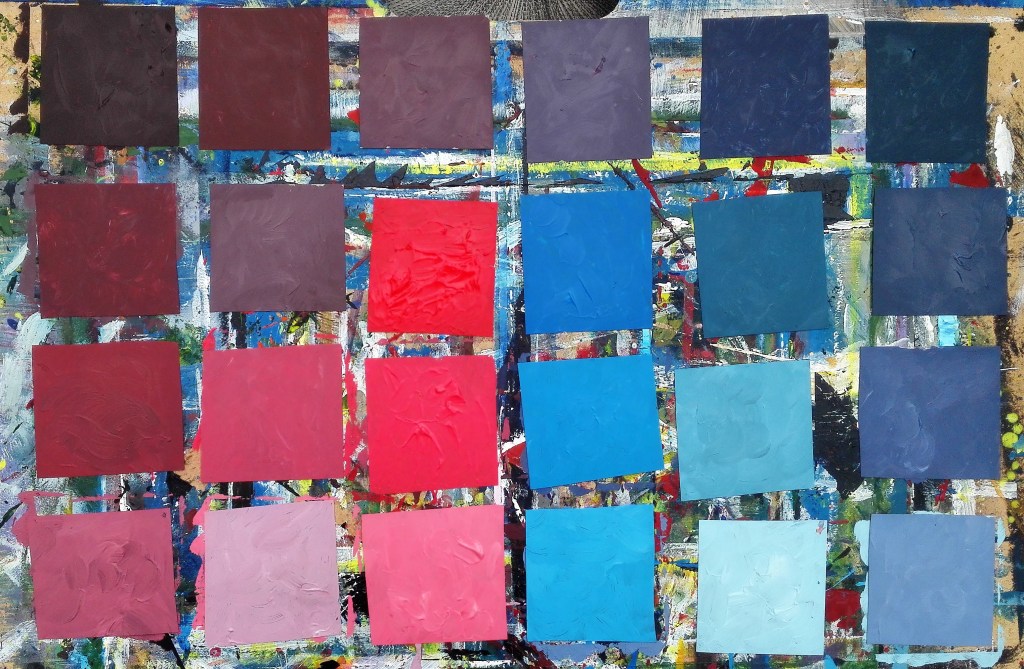
Following on from the previous blog on Part 1 of this exercise. I had already planned how I was going to try to replicate and represent the colours recorded in the photographs on acetates. My main consideration now was how I was going to display the chart. The idea that occurred to me was to try to suspend the coloured acetates by hanging them via some sort of mobile. Before doing this I devised a way of creating the various colours and tones from dark to light. To do this I used the schematic shown below. This took the two primary colours, Red and Blue, from dark to light and various mixes of the two colours with the addition of white or black.
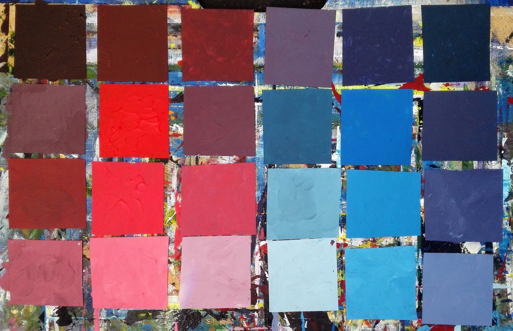
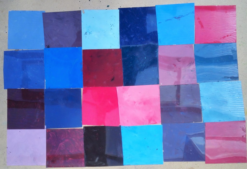
The next step was to cut up the acetates into the required number of squares and to paint them. The result is shown below.
Coloured acetates as per schematic
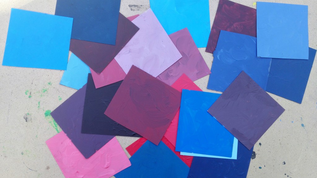
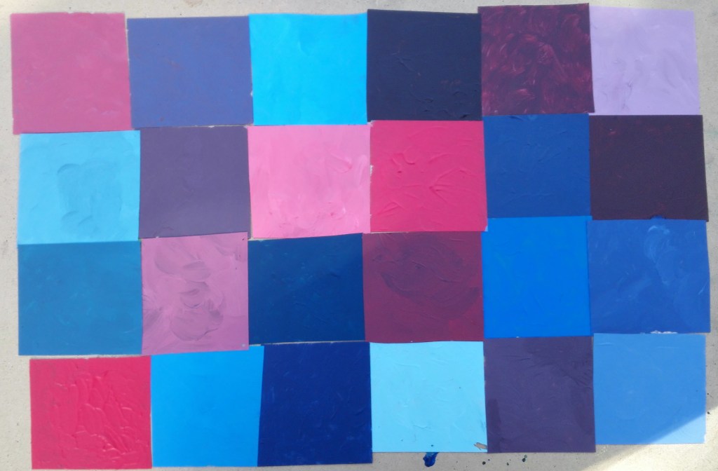
Once the squares were arranged I challenged the order that they should be displayed. It wasn’t clear that the colours ran from dark to light and from red to blue. I was also noticeable that I hadn’t mixed a purple colour that was near to the colour of the purple lid. Partly, I feel, this was due to the red paint that I used which was towards the pinker end of the reds rather than the orange end. First I tried a couple of slightly altered arrangements before dispensing with any sense of order. After shuffling the squares I arranged them in random order until I happened upon an order that pleased me.
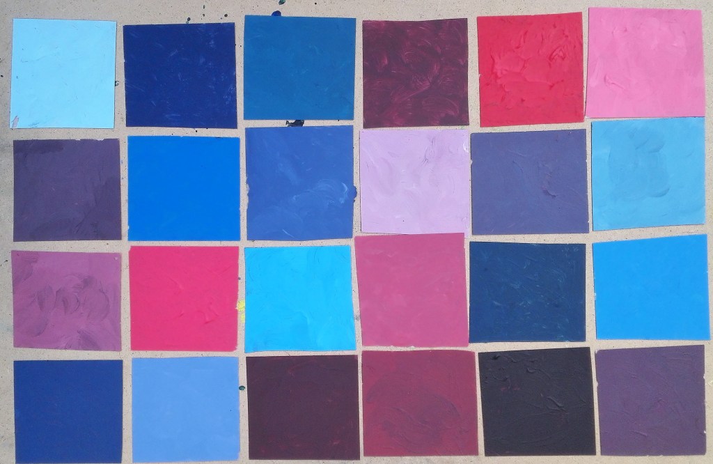
Slightly re-arranged order
Shuffling
Random orders 1- 4
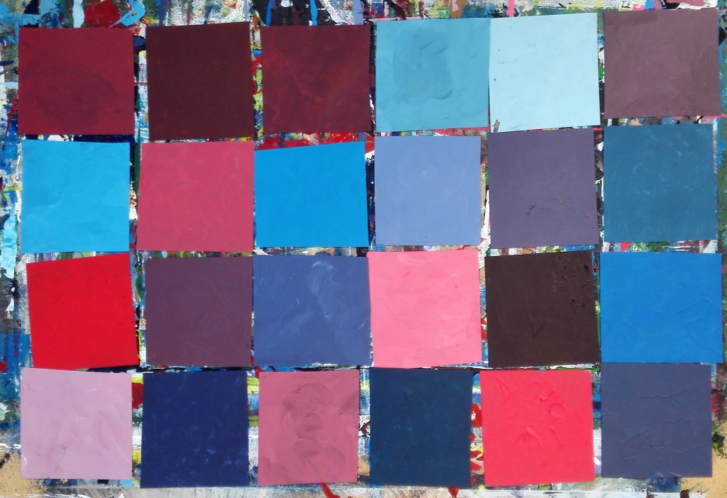
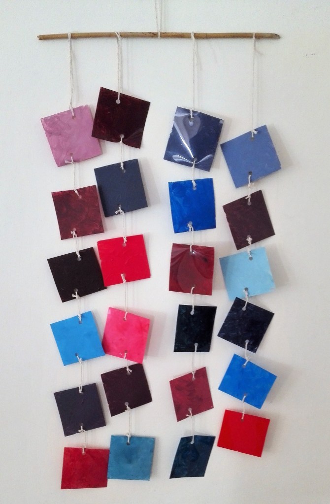
I finally settled on the random order that can be seen in the image below. .
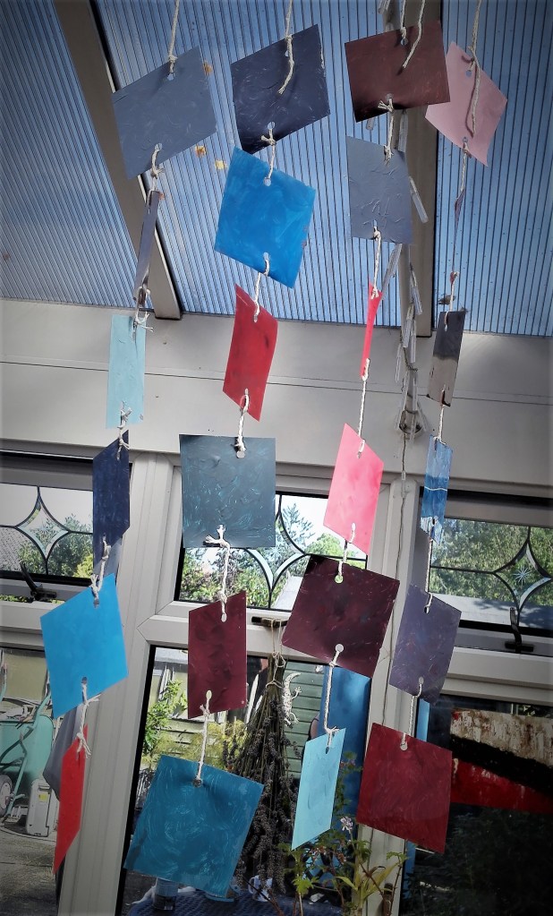
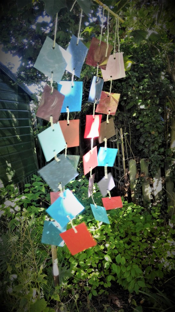
The individual squares would be joined with string in four lines working from right to left. The squares at the right would be at the top of the display.
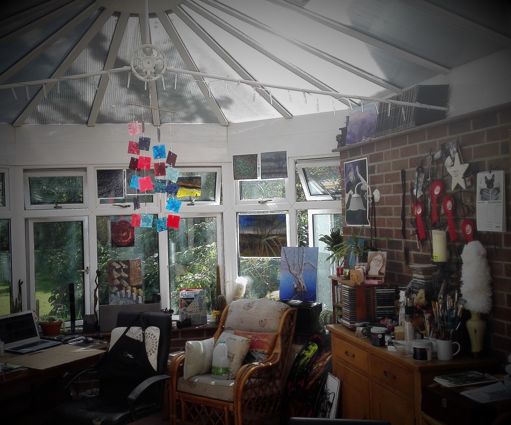
The resultant mobile display is best seen in the photograph below where it has been hung against a pale wall.
3D Colour chart – hung against a pale background
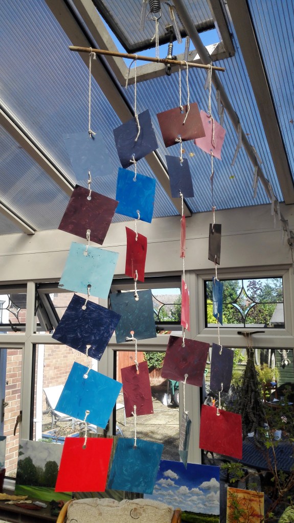
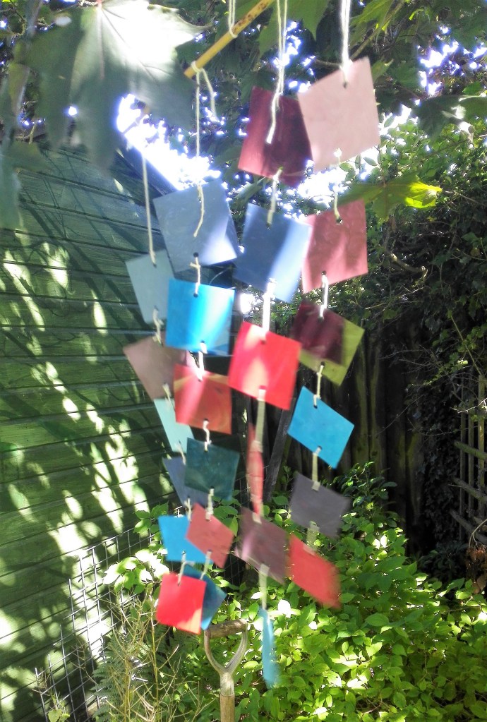
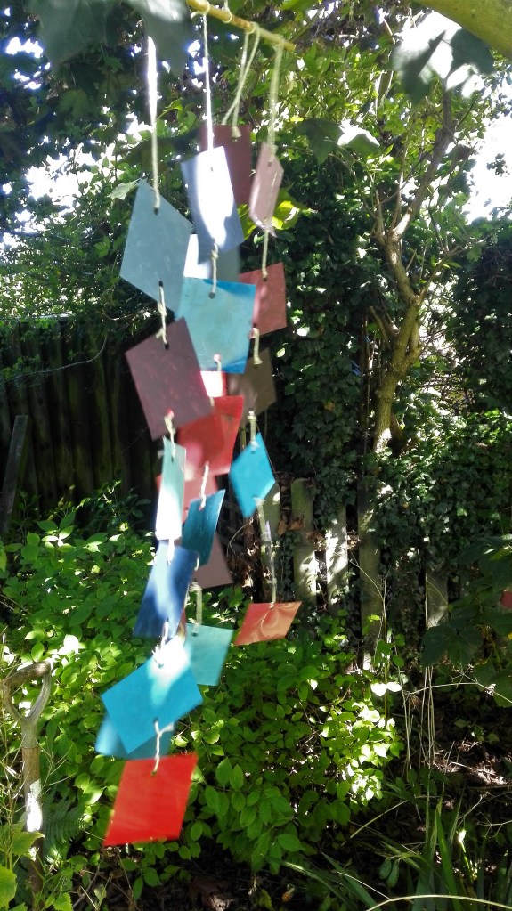
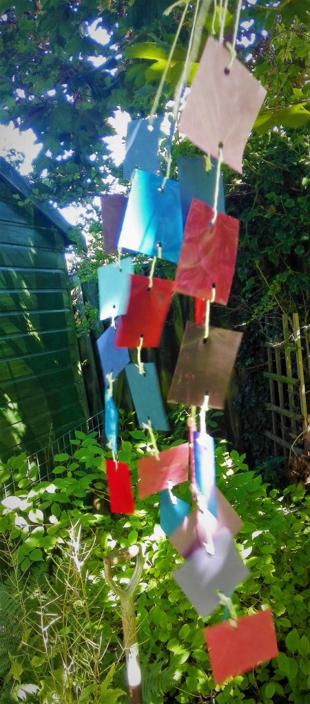
I tried hanging the mobile in various locations around the house and also in the garden. Its rather delicate nature meant that the garden locations were limited.
3D Colour chart – in various locations 3D Colour chart – Final location
I also made four videos of the 3D colour chart, see blow. These are followed by my reflections on the process and the resultant work.
Summary and reflection
The result of this exercise is that I have an interesting addition to my studio. The 3D colour chart is proudly rotating and the reflections from the shiny side of the acetates are creating splashes of light across the surfaces of the room. At present this is quite distracting but is temporary as the sun will change direction before long. So from the viewpoint of creation of a piece of artwork the exercise has been a success. However that was not the point of the exercise. The main focus was on the observation of colour and how it changes in differing backgrounds, differing light conditions and the surface it is on. Throughout the task I have been aware that my knowledge of colour is reasonably well educated. I would not profess to be a student of colour but I do feel that I have gained knowledge over the years, and particularly throughout my OCA studies, of the how colour is impacted by different conditions. I realise that this learning is never ending. The exercise has taught me to continually be aware of the relationship between colour, tone and surface and consider this in my work. The choice of the limited colour palette that I used for this exercise was advantageous in that it allowed the focus to be on the subtlety of tonal variation rather than clashes of colours opposite each other on the colour wheel. It is this knowledge that I will look to take forward when constructing paintings. It will help me in the creating more harmonious compositions.
I thought that I would try to use this exercise to make further use of my utilisation of acetates as supports for paintings. Having read the requirements of the exercise I envisaged that it I could use the acetates for the rectangular planes of colour. My thinking that I would only need to apply paint to one side.
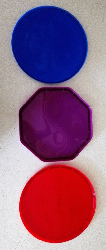
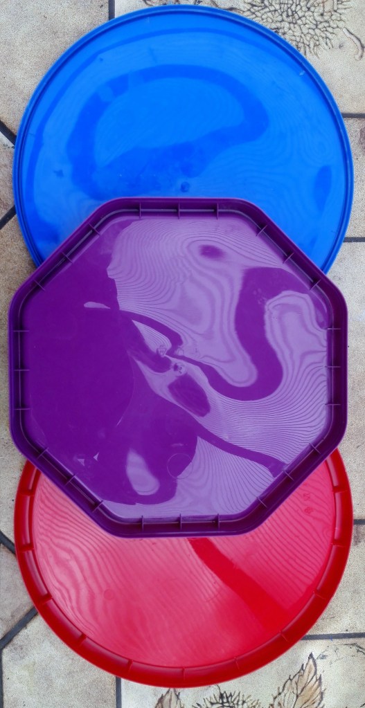
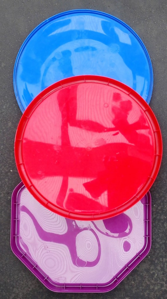
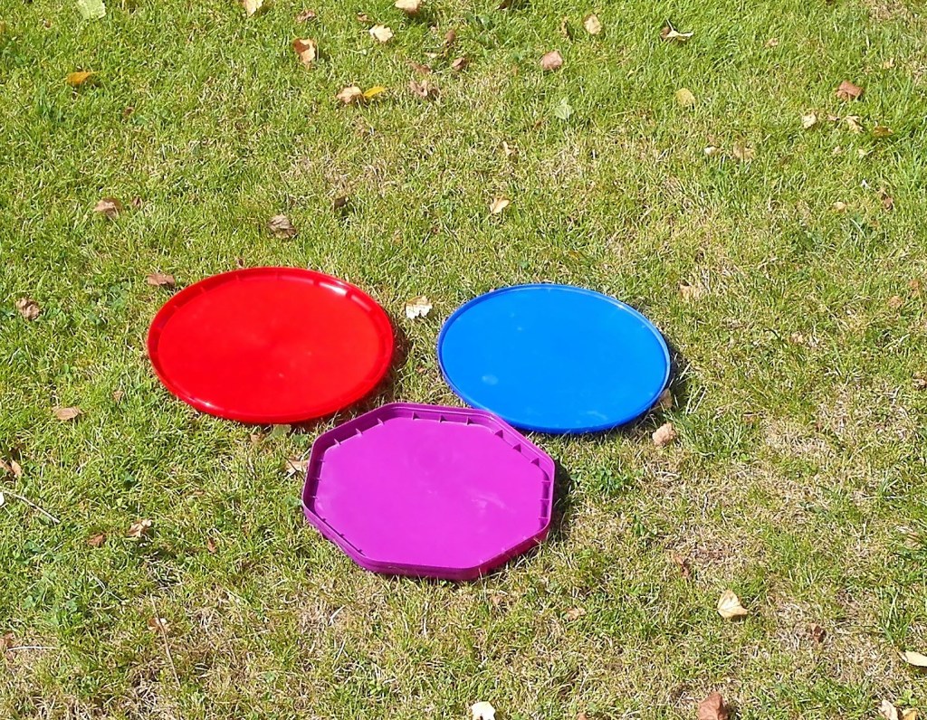
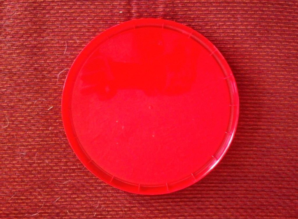
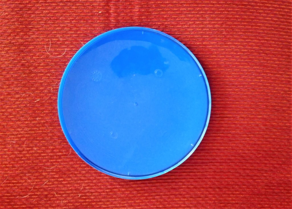
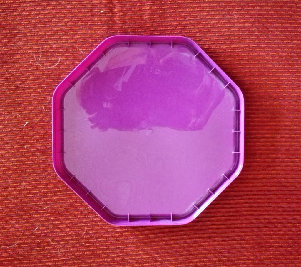
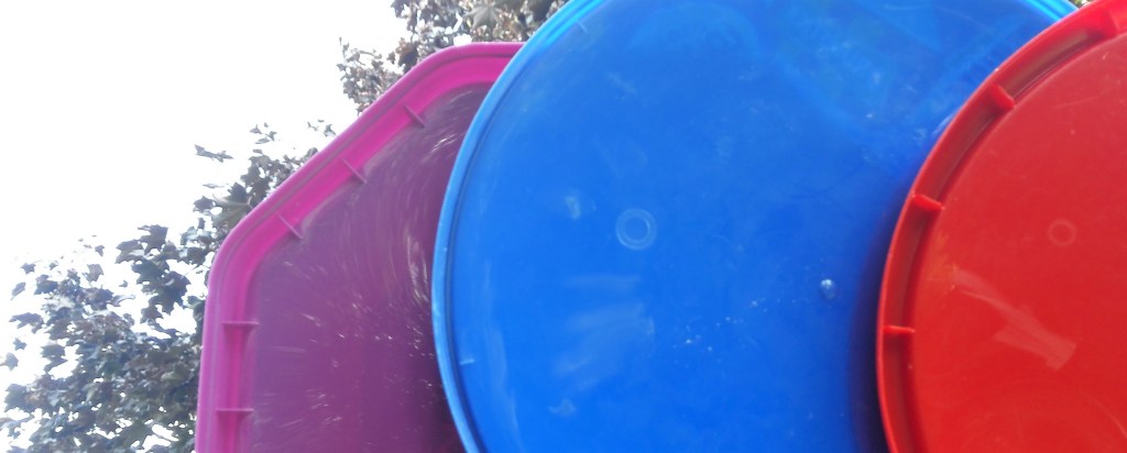
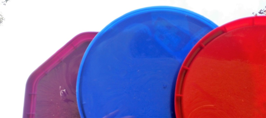
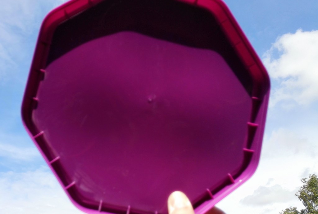
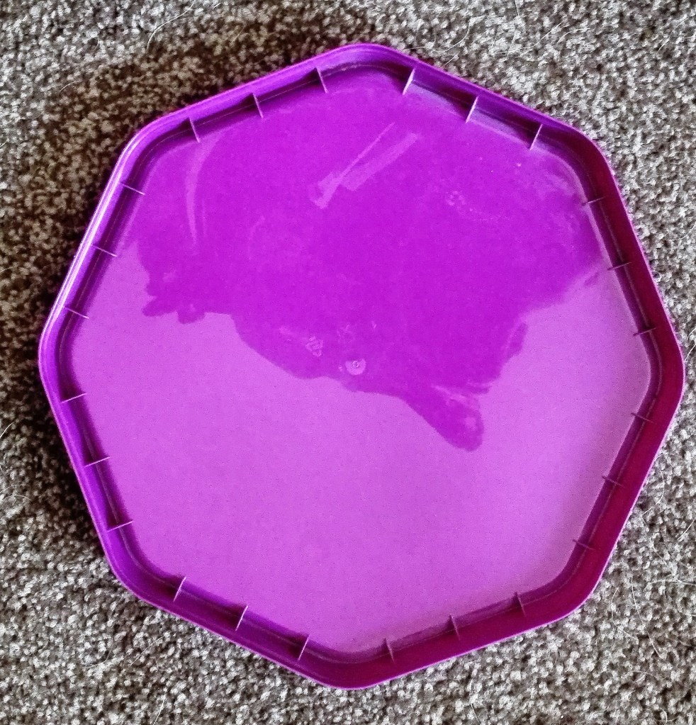
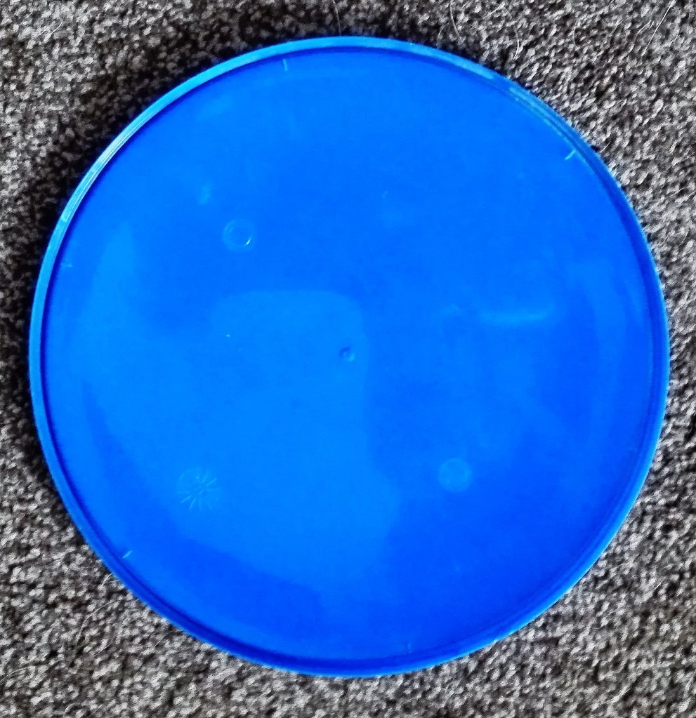
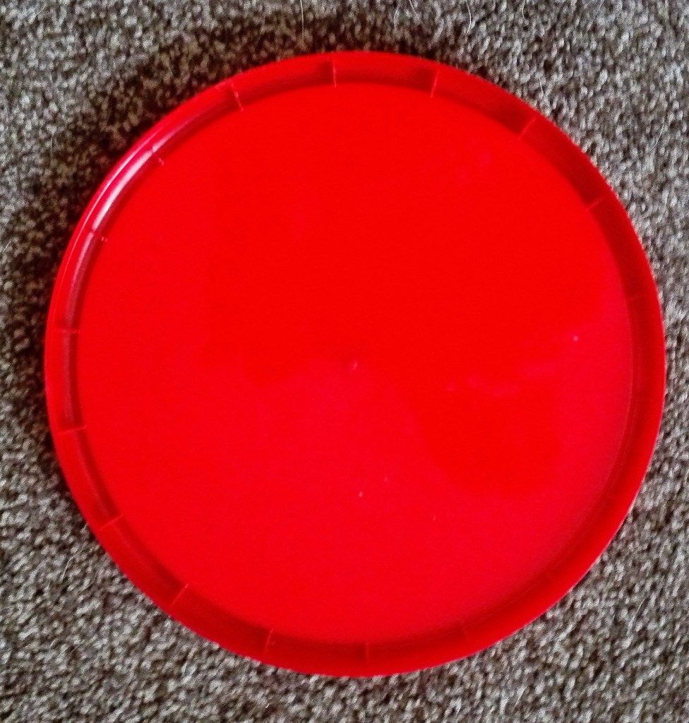
My choice of objects was limited to what I found around the house. I encountered difficulty in finding object of pure colour. Most items that I considered were multicoloured. Additionally I found that the need to be able to move the object to various locations limiting. Eventually I settled on three plastic sweet tin lids. These can be seen below photographed against a pale background.
Three coloured lids against a pale background
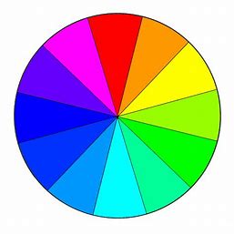
This photograph, taken in natural light, shows the three lids in their true colour as there is very little reflected light. I realised shortly after undertaking the exercise that the three colours were all on the same sector of the colour wheel. Would it be advantageous or detrimental to the exercise? From a colour mixing perspective it would make the reproduction of the differing shades, tones and hues easier to render. Two of the lids were in a primary colour and the third a secondary colour derived from the first two. The detrimental side of this was that I expected that the impact of the colour of the objects in different lighting conditions and situations would be less impactful.
Colour wheel
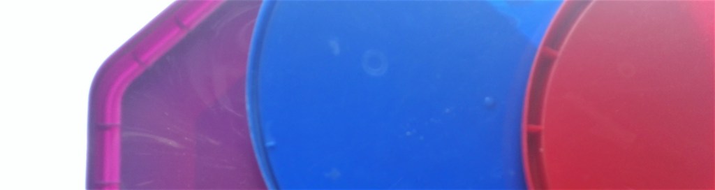
Another aspect that I noticed at an early stage was that the three lids were similar in that their surfaces were reflective. Any light that fell upon them would be reflected back rather than absorbed. Again, as per the limitations of the colour choice, this would have advantages and disadvantages. It would be advantageous in so much as I would know that the observed colours would not be impacted by their differing surfaces. All three would show the same characteristics. On the detrimental side I would not be able to observe the impact of non reflected light on the colours.
Armed with this knowledge I set about trying to explore how the colours were impacted in an array of different locations and lighting conditions. I recorded these via photography. My intention being, as explained in the opening paragraph of this blog, to try to replicate the observed colours on acetates that I could manipulate into a hanging 3D colour chart.
A selection of the photographs accompanied with a brief explanation is below.
On Table top – well lit
The three colours stand out from the background, the reflection of the conservatory roof creates both tonal interest and patterns.
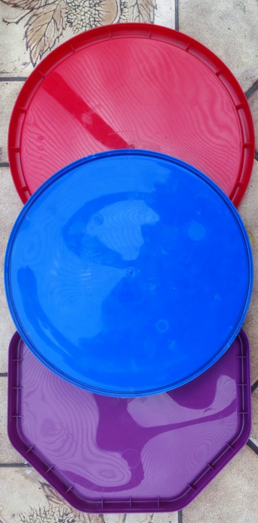
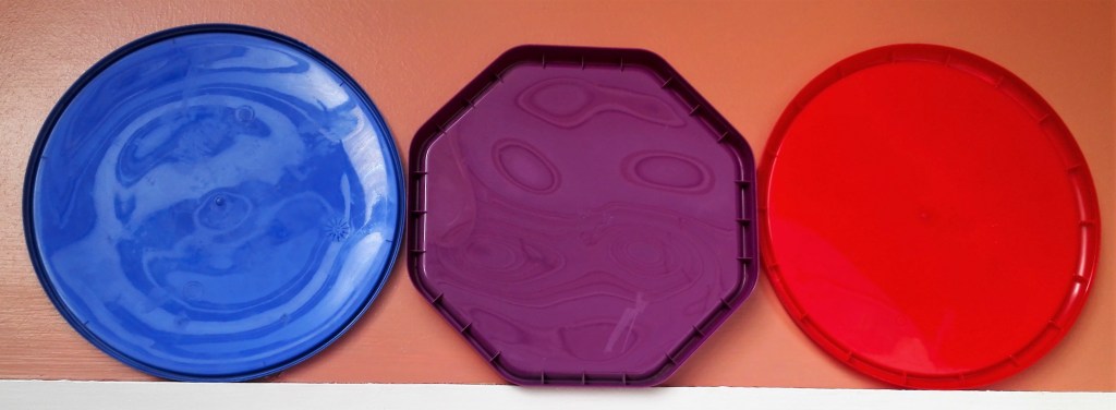
Against a dark plain background
Similar to the previous images the colours stand out but are slightly paler. This is due to two effects, the reflected light and the stronger contrast against the darker background.
On table top and floor in darkish room
In these images the true colours are observed as there is much less light.
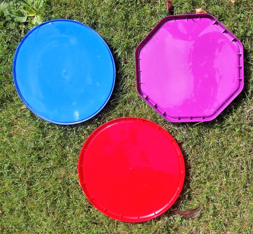
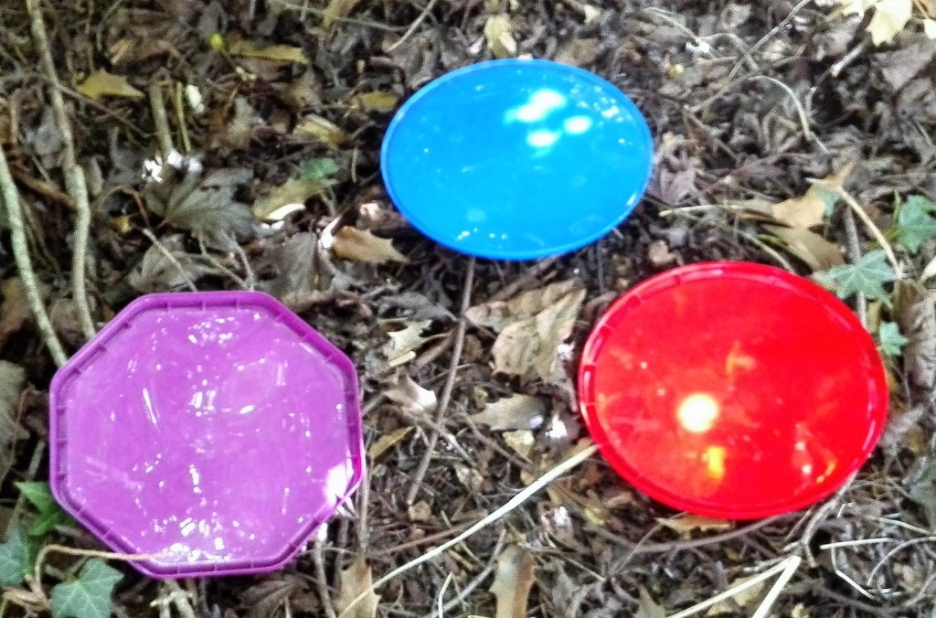
On grass
In these images it is noticeable, particularly in images 1 & 3, how the red lid shines out against the green grass.
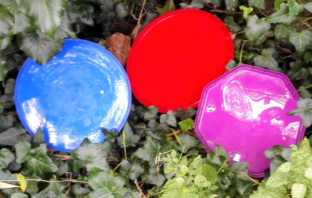
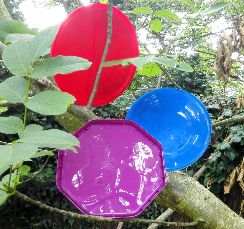
In trees and undergrowth
Again the colour red dominates and is less reflective. This could be an accident of the positioning of the lid. Where there is reflected light it is intense.
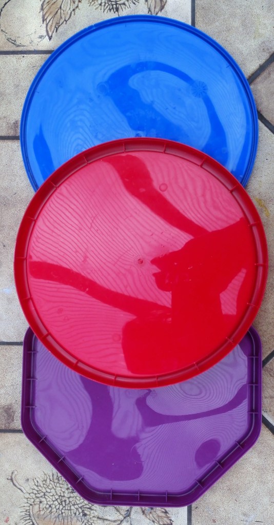
On a red sofa
The red lid is partly absorbed into the background whereas the strong contrast of the blue makes it shine out. The purple lid being somewhere in between, not surprisingly.
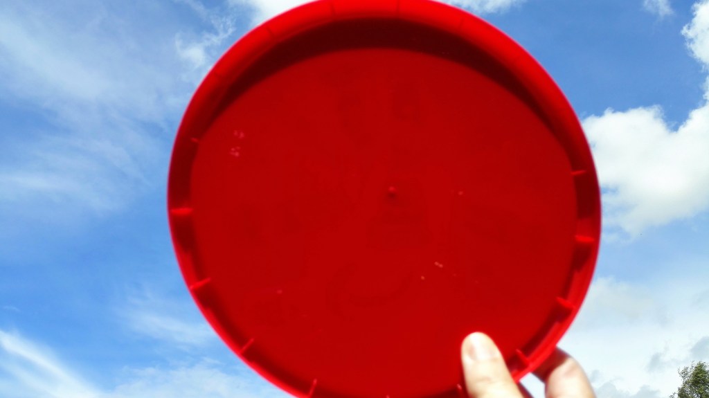
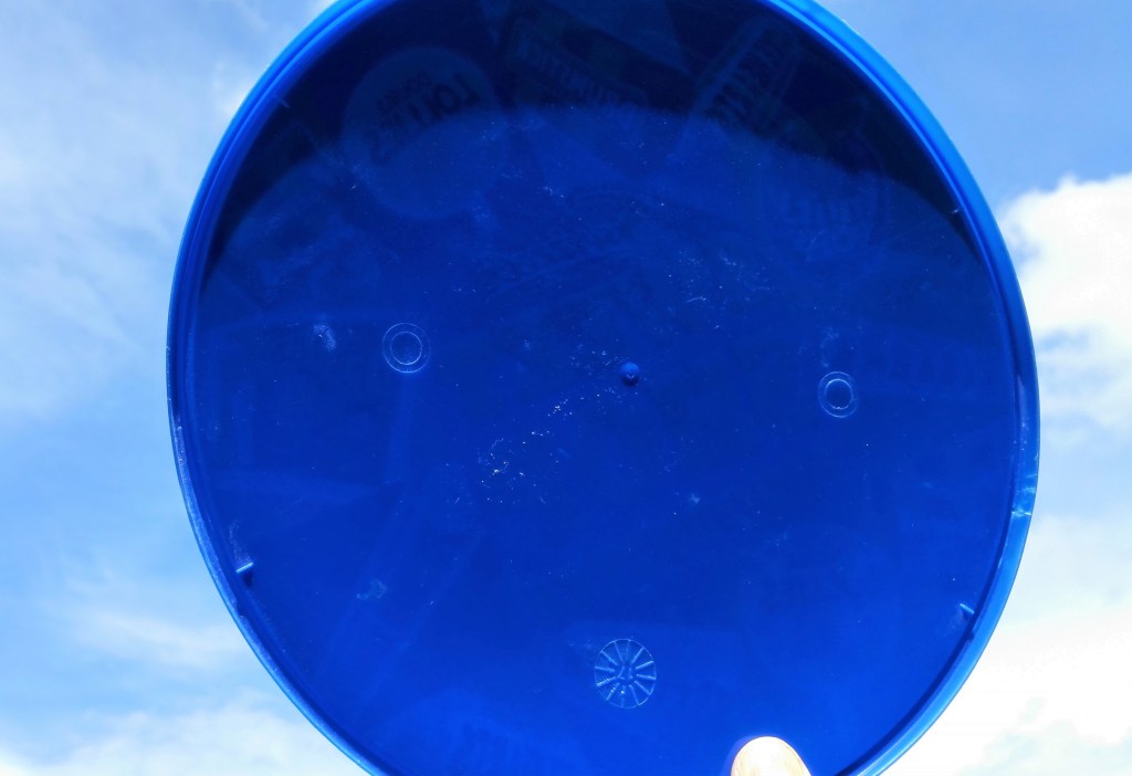
Together against the sky
Singularly against the sky
Against the pale blue sky, minimal light directly hitting the surface the colours of the three lids are vibrant. The dark shadow at the top of each lid will be a challenge to replicate.
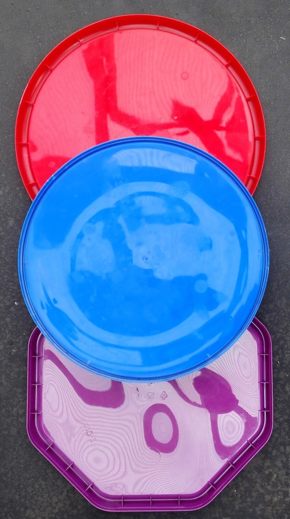
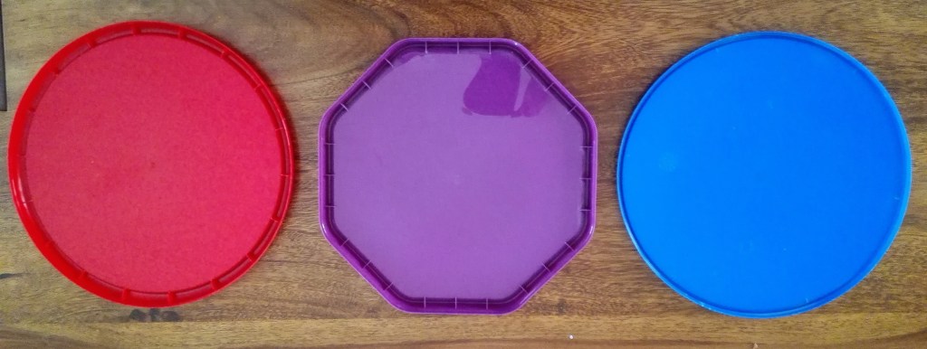
Against a grey carpet in in medium natural light
The final set of images. This is as close as I got to what I would perceive is the natural colour of the three lids.
In summary the perception of colour is highly influenced light, surrounding colours and reflective surfaces. There are many more influences and impacts. Colour theory being a significant line of study in many forms.
This blog follows on from my previous one relating to using feathers as a medium. It was whilst working through that exercise that an additional experimental project was suggested to me. Painting with soap. I had noted previously in the course material the reference to Rashid Johnson using soap as a painting medium but hadn’t followed up this idea. Completely independently the suggestion to try to use soap to paint with had come from Marian, my wife. She had observed my struggles and seen the resulting feather paintings and suggested that I should try soap as a material. I was sceptical but agreed to give it a go. Marian makes soap, one of her hobbies, in doing so she uses different pigments, aromas and chemicals to create interest in the soap. I will document the soap making process later in this blog. The collaborative aspect of this project also appealed to me. I had to rely on a third party to supply my materials. However this is only slightly different from purchasing them from artists suppliers. Note that at this point I hadn’t seen the soap paintings of Rashid Johnson so was in no way influenced by them. The results, unsurprisingly, are entirely different.
The process started by the making of soap from first principles. Not being a chemist or understanding the process of saponification I have had to make notes from Marian. These are below……………………………
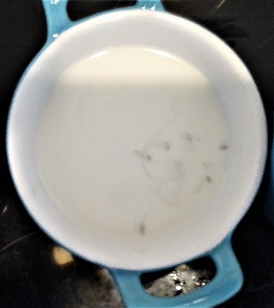
Cold Process SoapI’ve used a cold process soap that relies on the saponification reaction between the hydroxide portion of NaOH (Lye) and the fatty acid portion of various triglyceride molecules. The soap was made using sunflower oil and concentrated NaOH solution. The oil was warmed to a room temperature and the NaOH solution was added. The mixture was mixed using a hand blender until full emulsification was reached. This is a very liquid stage. The mixture was then decanted into several separate jugs and coloured micas, charcoal powder or spinach powder was added to achieve the desired colour palate. The mixtures were then blended again to a ‘slight trace’ and then used.
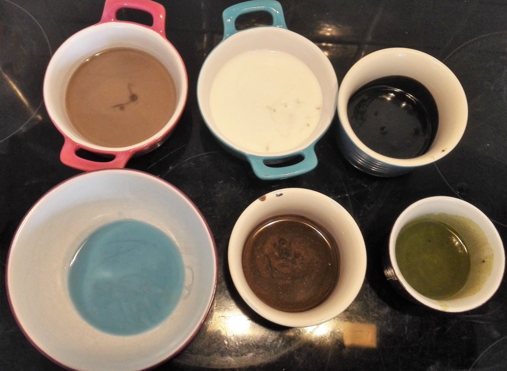
The six coloured soaps that were made from this process are shown below. These would be used for the painting. The corrosive nature of the soap prior to its chemical reaction meant that I would have to wear rubber gloves and be careful not to get any material on my skin. No scratching my nose whilst painting.
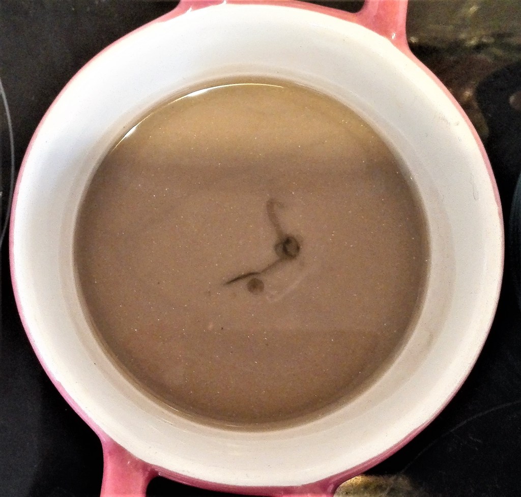
Dark Brown
Dark Grey / Black
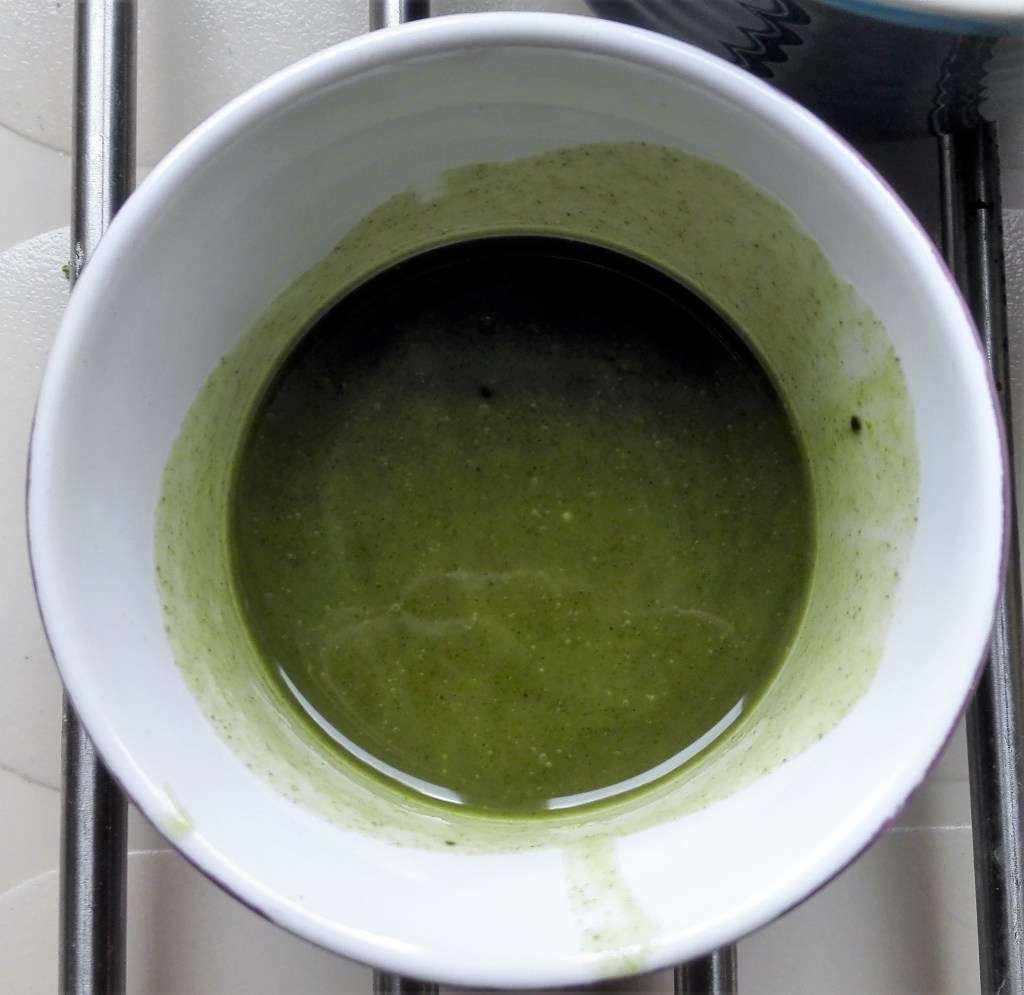
Green ‘Olive’
Light blue
Light Brown
White
Two supports were also created these consisted of soap poured into trays. The coloured soap would then be applied via palette knife to build up a painting. The soap supports when laid down with material measured 19 x 25 cms. The depth of the soap is approximately 0.5cm. Interesting to note at this point that the material is also the support. Prior to painting this is how the supports looked. They could be, and are, paintings in their own right. They are the result of pouring the soap, a technique that could be used to create soap abstract soap paintings. They no longer exist in this form.
Soap supports
My aim was to exert some control over the process. The pouring had created paintings but I wanted to take the act painting with soap to a more interventionist level. To do this I would use palette knives to paint with.
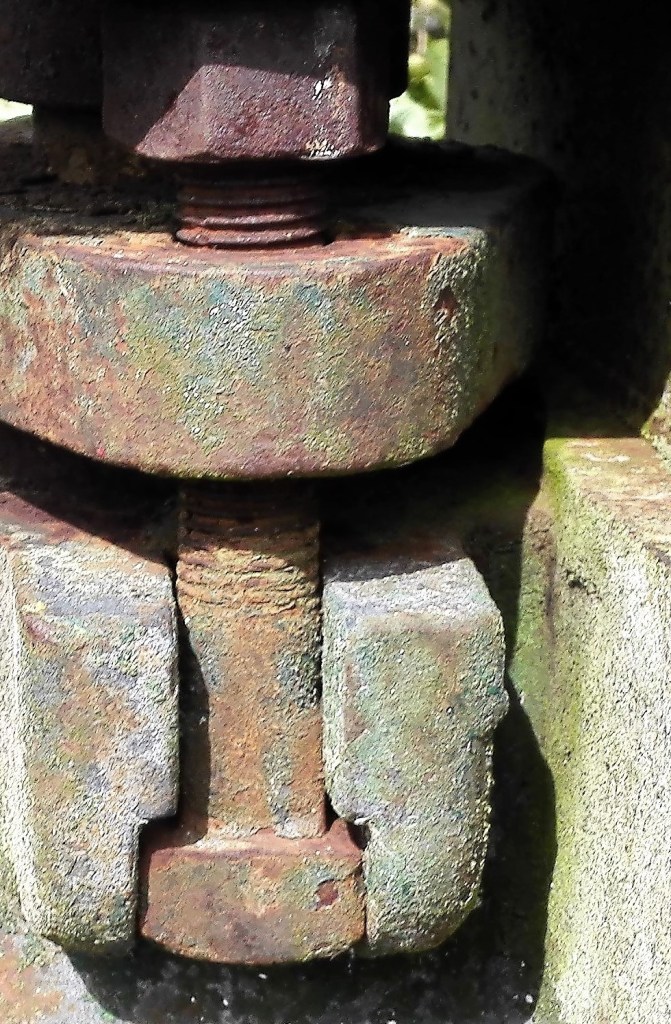
Throughout the project I had an image in mind that I would use as the template for the painting. It was a further image taken from the old pump series that I had used for some of my initial Parallel project paintings. The photograph would predominantly be used a shape, colour and tone guide.
Section from Old pump
I would work on on both supports simultaneously. This was partly necessitated due to the ‘open time’ of the material. This gave me several hours to complete the paintings before the chemical reaction would render the material unusable. The first painting became the more experimental of the two as I was testing out how to apply the soap material. They way it reacted with the support and how to mix and blend colours. The soap had a buttery texture which allowed it be applied in both spreading and dabbing motions. I found that it mixed reasonably well and variations of colour and tone could be achieved.
The work in progress:
It was more difficult to draw partly due to using palette knives. In was during the second painting that I found a solution for this. By pushing the knife into the support this created a line on the surface. I found that I could manipulate this into controlled curves or straight lines. The act of cutting into the support layer changed the textures of both the support and material giving a textured effect. Armed with these techniques I proceeded to create the following two paintings on which I will discuss my thoughts on the results.
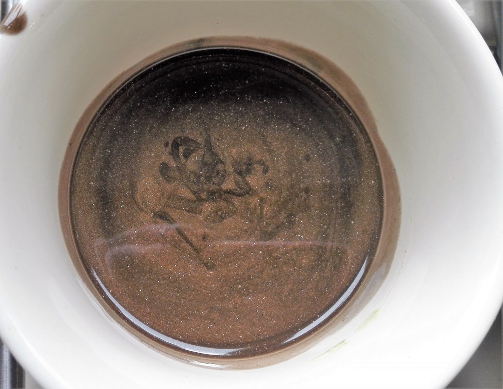
Soap Painting 1
Soap painting 1
This abstract work invokes a feel and look of damp decay. Dark recesses, faded paint, mildew, exposed plaster. A neglected corner of a building ravaged by the effects of water and time.
The textural aspect of the soap, the act of its application, its translucent properties when applied thinly and the way in which the colours mix together can be observed in the two close up views below.
Two Close up views of Soap painting 1
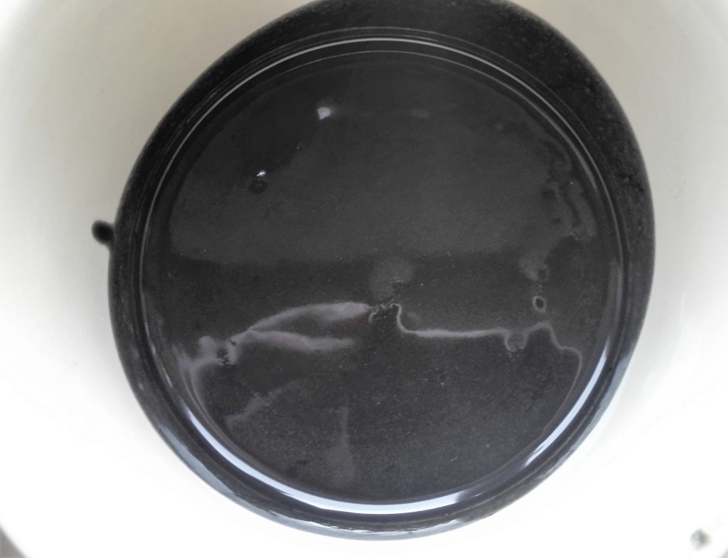
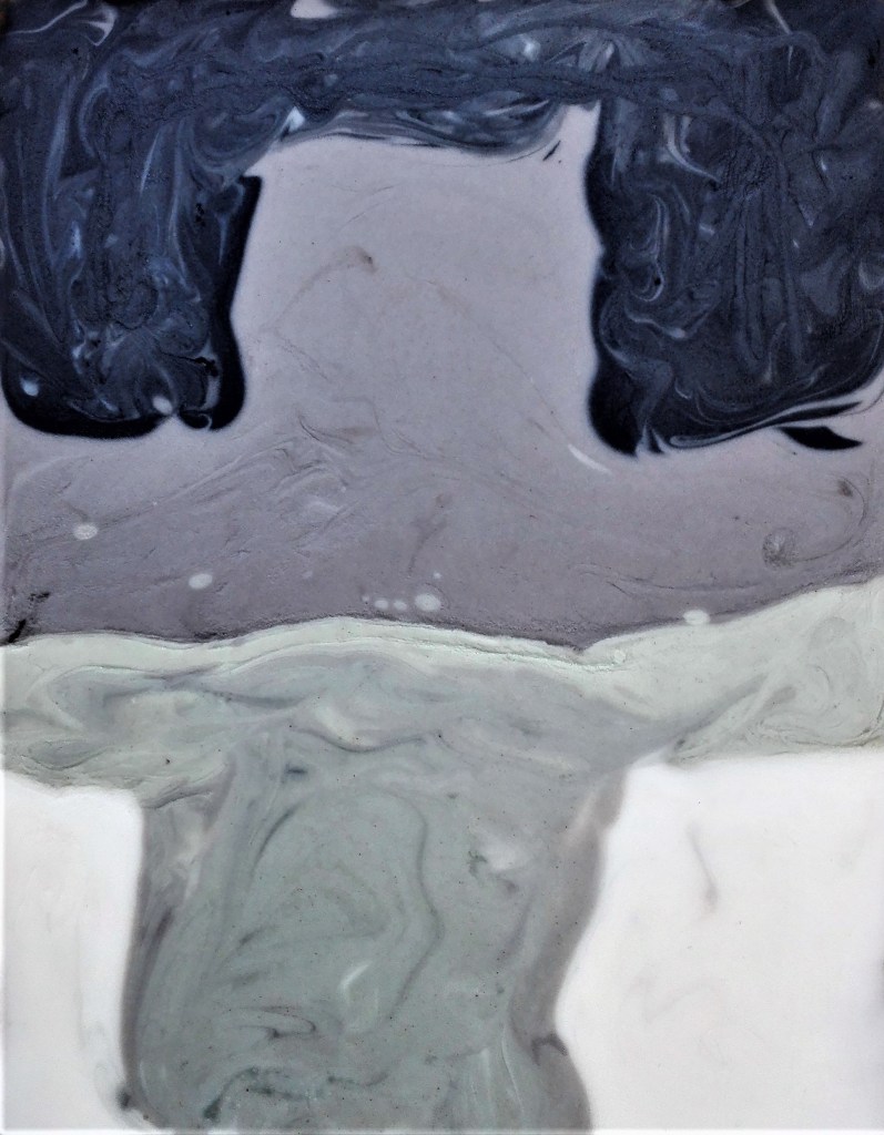
Soap Painting 2
Soap painting 2
In this abstract painting there is evidence of form. This is loosely described leaving much to be explored and imagined. The control of the application of the material is evident. The addition of pigmented salt to the surface adds to the rough look.
Summary, the project has been successful in its learning points, the challenges of the material and the resolution thereof, and the outcome. Whilst I doubt that soap will become my material of choice it is certainly an option. In having to adapt the methodology of applying material it has opened up new avenues to explore further.
Lastly to quote Rashid Johnson in his interview with Alistair Sooke “at the end of the day you can cleanse yourself with the painting”.
Post script: I have noticed that as the saponification process takes place the colours have faded quite dramatically. The green has now become a pale yellow meanwhile the light blue has become more prominent. There is also some bleed through from the lower layers which has increased the translucent effect. This is particularly noticeable under the white. I expect that this effects will continue until saponification is complete. I will document this with a number of photographs which I will post below.
The Soap paintings after two days, saponification still some way off. The material is still very flexible and soft.
After 10 days the saponification process is almost complete and the paintings could be used as soap. In their current shape the would be rather awkward. A better option would be to cut them into cubes. The deterioration in the colours has slowed and I suspect that they have reached a point where they will maintain there current status for several months, if not much longer. To my mind the second soap painting is much the better result. The clear delineation between the parts of the painting, defined by the carefully painted black lines help to give a sense of shape and coherence. It looks deliberate. By comparison the first painting looks a little messy but does have a sense of abandon and has retained a look of deterioration. It is also very noticeable how the blue has become far more prominent. This is partly due to the different lighting conditions when the photographs were taken. However I notice that it is less pronounced in Soap painting 2.
I found it difficult to muster enthusiasm for this project. I have explored different and unusual painting mediums previously and have always returned to paint, either acrylics, traditional oils or aqua oils. I believe that I have become comfortable with these materials although I realise that I have plenty more to discover about these materials. Their application, the way I can apply them. The options seem to be endless. I also consider myself to be, primarily, a painter. My chosen method of communication is via paint. Although I can see the merits in trying out different mediums and this in turn can open up other avenues of exploration i don’t feel that this is beneficial to me at this time.
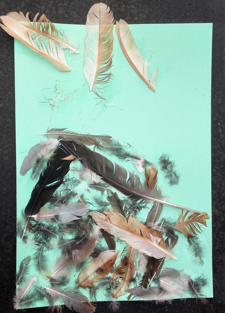
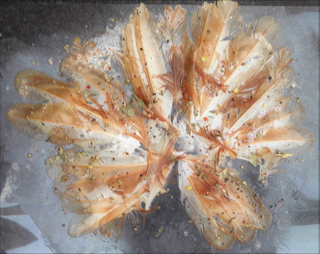
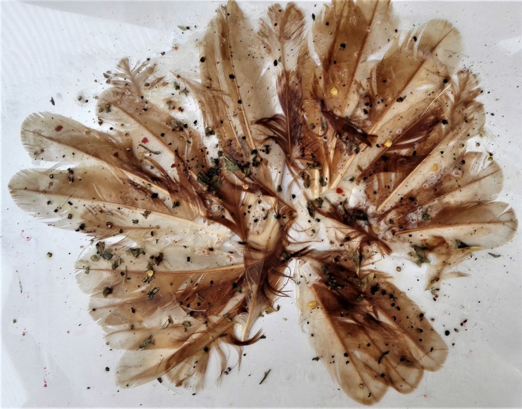
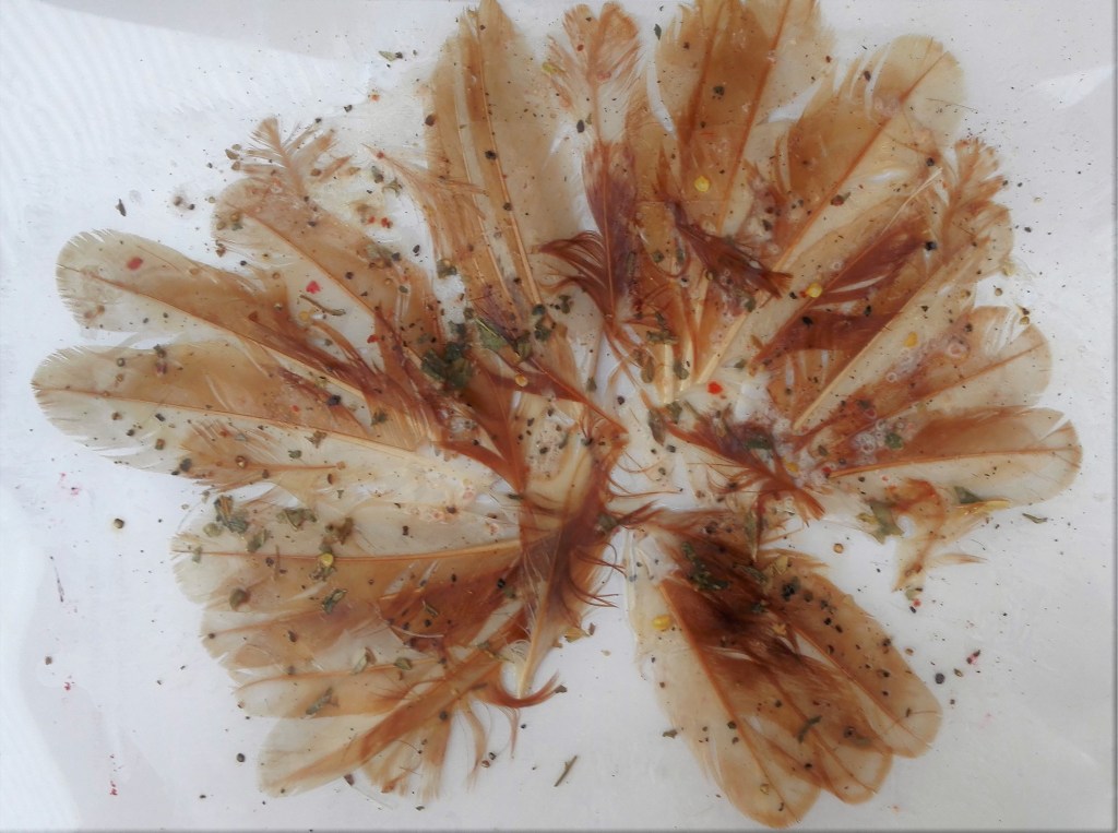
It was with this in mind that I approached this exercise, less than enthusiastic. My first idea was to create a collage type painting using the feathers from one of our chickens plus the remnants of a pigeon that had been mauled in the garden. It was mainly the practical things that took my thinking. How to arrange the feather and how to adhere them to a support? The first method was to apply PVA adhesive to card and stick the feather to it in a random fashion. The result was a disastrous mess.
Feather painting
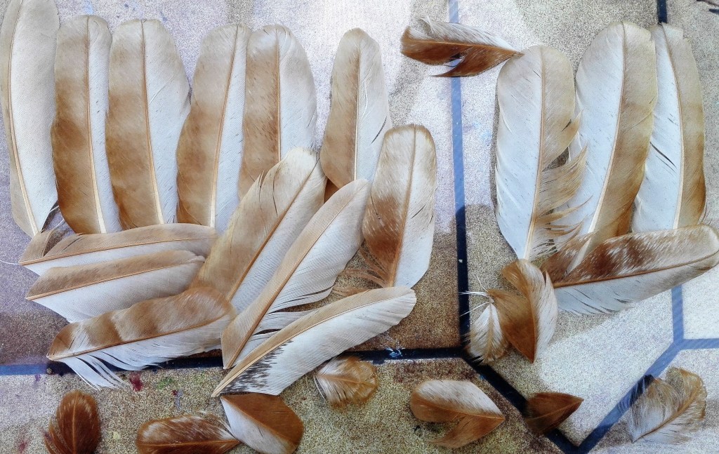
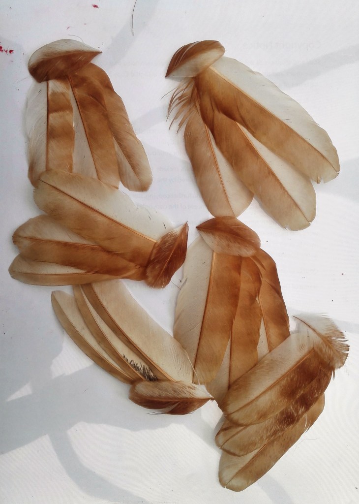
Next I took a more considered approach to arrange the chicken feathers in various shapes and patterns until I had one that I thought would try to make permanent.
Work in progress
Feather arrangements
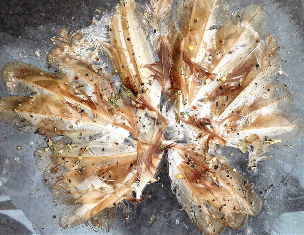
I encountered the same problem of how to adhere the feather to a support. I had chosen to use an acetate as the support as I imagined that the resulting painting could have multiple viewpoints. Note I now realise that using PVA adhesive to fix feathers to a support is not a good idea. The PVA ruins the feathers by ruffling them up. Also it doesn’t hold the feathers in place whilst it is drying. This makes the arrangement difficult to maintain. Applying sellotape to hold them in place doesn’t improve the process. Whilst the PVA was wet I added salt, pepper and some dried mixed herbs. At least the chicken was seasoned!
The resultant collage is reproduced in four formats below. I used two backgrounds, one dark, one white to take photographs. The photographs were enhanced by either sharpening of softening the images.
Four photographs of Feather collage
I realise that rather than a experiment with alternative painting materials I have created a collage with chicken feathers. This misses the point of the exercise I know.
It was whilst working through this exercise that an additional experimental project was suggested to me. Painting with soap. I had noted previously in the course material the reference to Rashid Johnson using soap as a painting medium but hadn’t followed up this idea. Completely independently the suggestion to try to use soap to paint with had come from Marian, my wife. She had observed my struggles and seen the resulting feather paintings and suggested that I should try soap as a material. I was sceptical but agreed to give it a go. I will document this process and the result in a separate blog. Note that at this point I hadn’t seen the soap paintings of Rashid Johnson so was in no way influenced by them. The results are, unsurprisingly, entirely different.
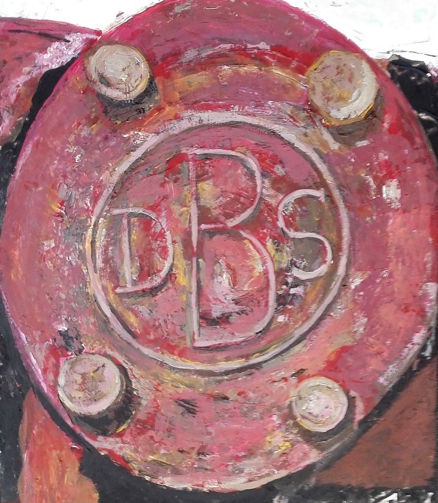
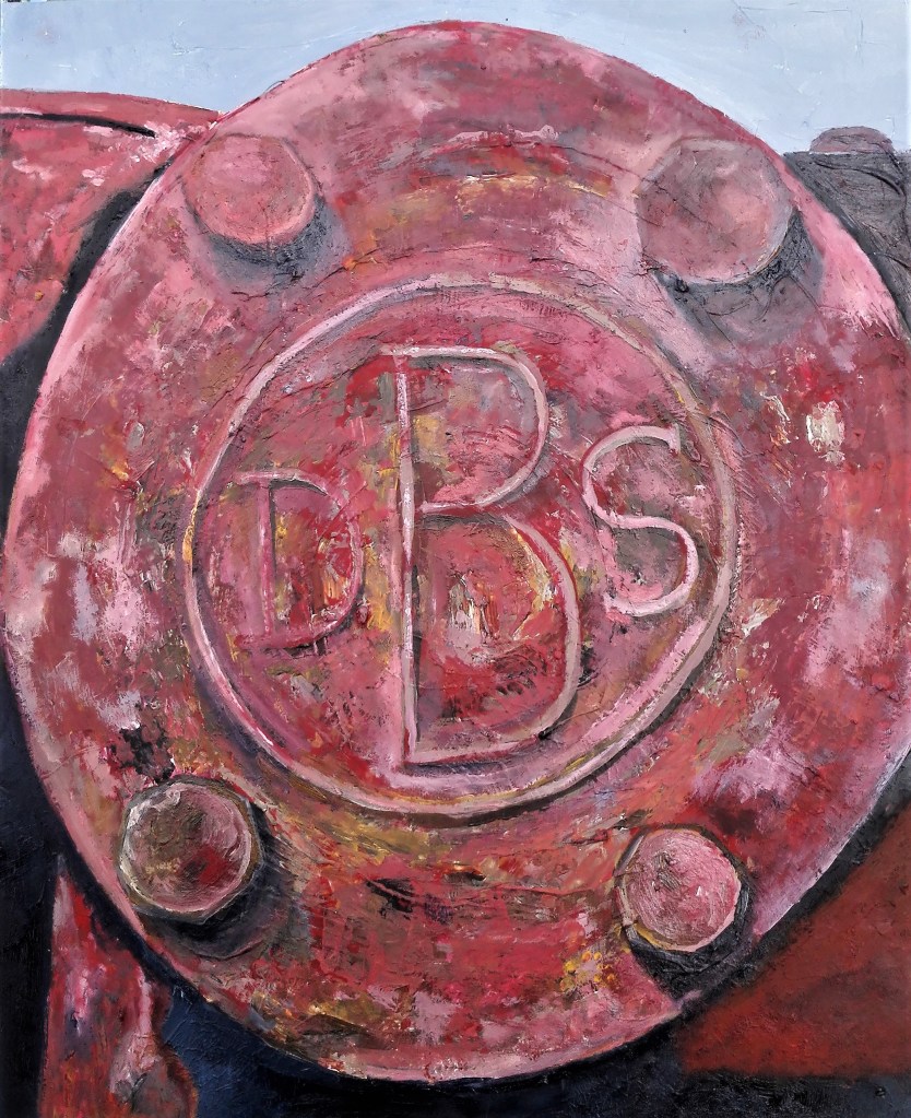
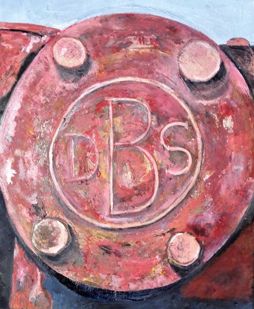
For this painting I return to the old pump and this time focused on a close-up of the name plate. I was drawn to this image for two reasons. The dulled red colours, obviously faded by years of sunlight, and how they contrasted and complimented the brown rust and dark shadows. The composition was rather obvious being a circular in a rectangle. I felt that it worked. For the first time in this series I would introduce Aqua oils to the painting mediums. The underpainting was in acrylics as these adhere well to the acetate support and provide an excellent surface to apply the Aqua oil to.
I took a few photographs of the work in progress, below.
Work in progress
The painting is reproduced below in two formats. The first is photographed against a normal background and the second is against glass which allows some light to pass through.
Pump Plate – Normal background
Pump plate – Against glass (backlight)
I enjoy the contrasting ways of displaying or hanging the painting and the varied impact that it has on the painting. When backlit the whole painting appears darker. The light which permeates the thinner areas of painting becomes where the eye is initially drawn to. Whereas the whole painting is lighter when the light from behind is not present. This is the truer reflection of the subject.
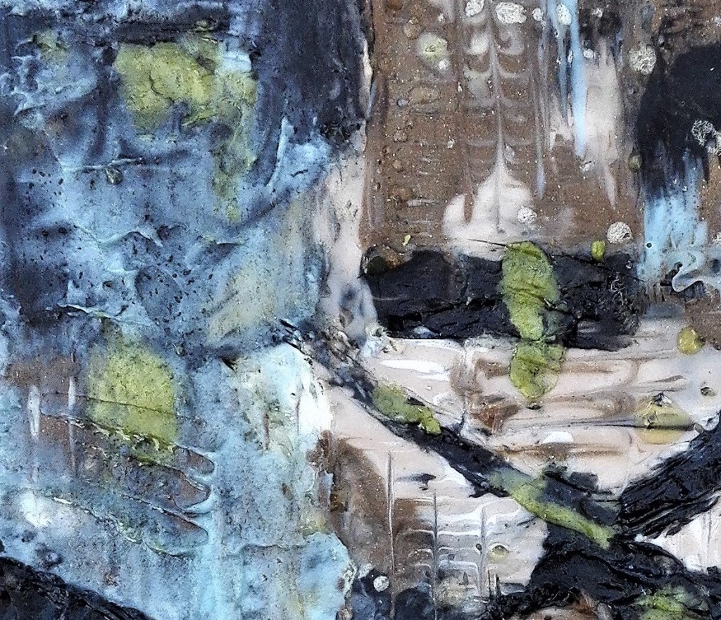
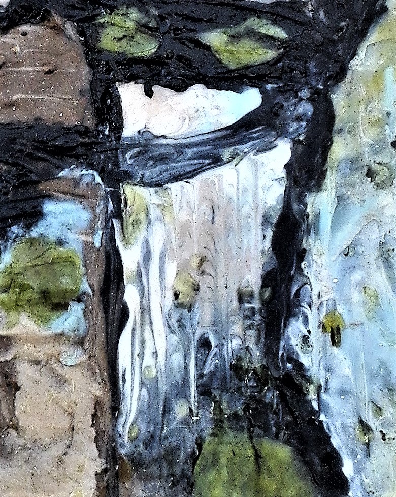
I have now completed four paintings that have used the old pump as the subject matter. They are coming together as a series of works that have a common theme and feel to them. My focus has moved from the original focus of derelict or dilapidated buildings. I will now try to incorporate the feel of the old pump paintings into some building paintings and look to move these to another level.
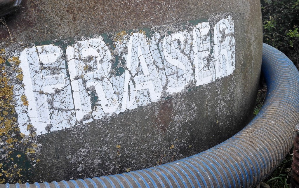
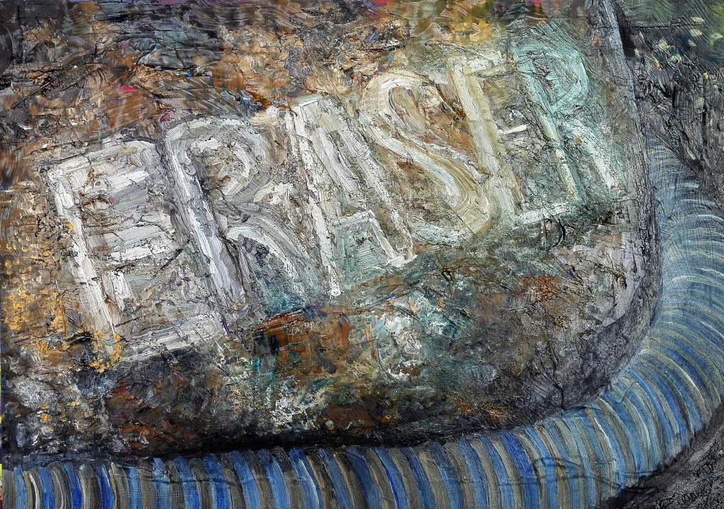
Additional painting completed 26th August 2020. Further to the above I completed another painting for this series of exploratory works. As previously the painting used a 21 x 29.5 acetate as the support and was painted using Aqua oils. Working from detailed section of a photograph taken during a recent trip to North Yorkshire the painting was built up in three distinct layers. A rough underpainting to get basic colour and paint onto the support, an intermediate stage and a final detail / refinement stage.
Below is the photograph, the second stage and the finished painting.
The photograph
Work in progress
Finished painting – Eraser
This is a good addition to this growing project. The techniques used in these paintings is developing in a way that pleases me. The subject matter is hidden, not obvious. To me, this is not the point of the paintings which are more about uncovering the textures, colours and tones and presenting them in a way that is pleasing to look at. At stated before I shall now look to scale up these works.
It hasn’t escaped my notice that Part 5 of the course is titled working with words and the the last two paintings have included words and letters in them.