Part Two – Research point 2 – The influences of Cubism and challenging the conventions of western perspective

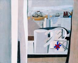
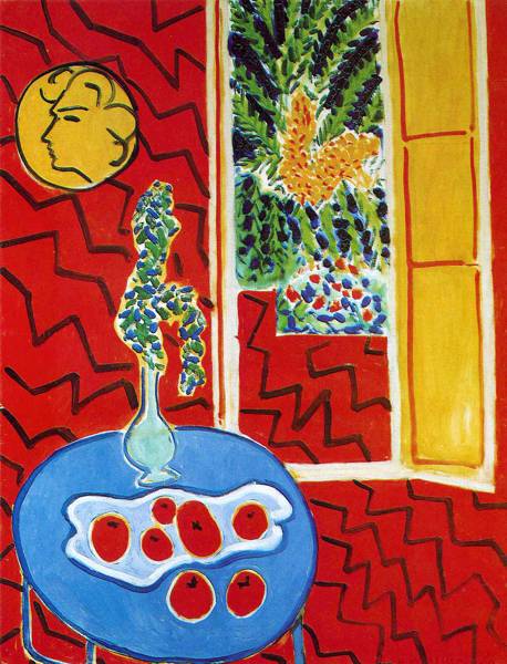
It strikes me that Western art had been stuck within the confines of perspective, whether linear or atmospheric, since its inception. The artist has always had the challenge of facing a two dimensional plane and attempting to convey a three dimensional view. Cubism took this challenge further by suggesting that the view of an object is seen from different viewpoints as our eyes move across it. We can move around an object and see it from a number of perspectives and the relationship between it and other objects that are in proximity to it alter as we move around. The challenge was to dissect the subject and present it viewpoint by viewpoint presenting a fragmented image of multiple viewpoints. The first exponents of Cubism were Georges Braque and Pablo Picasso. An example of an early cubist work is shown below.

Pablo Picasso, Girl with Mandolin, 1910, Oil on canvas, MOMA, New York

In this example the eye can move over the painting and explore the subject from different viewpoints. The colours are simplified so as not to distract from structure and form and are painted in flat slabs. Initially the paintings look confusing and challenging but by looking harder and longer they start to make sense.

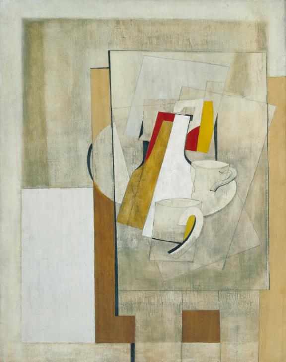
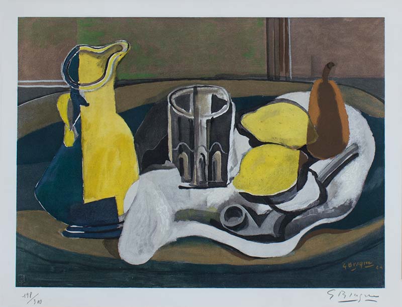
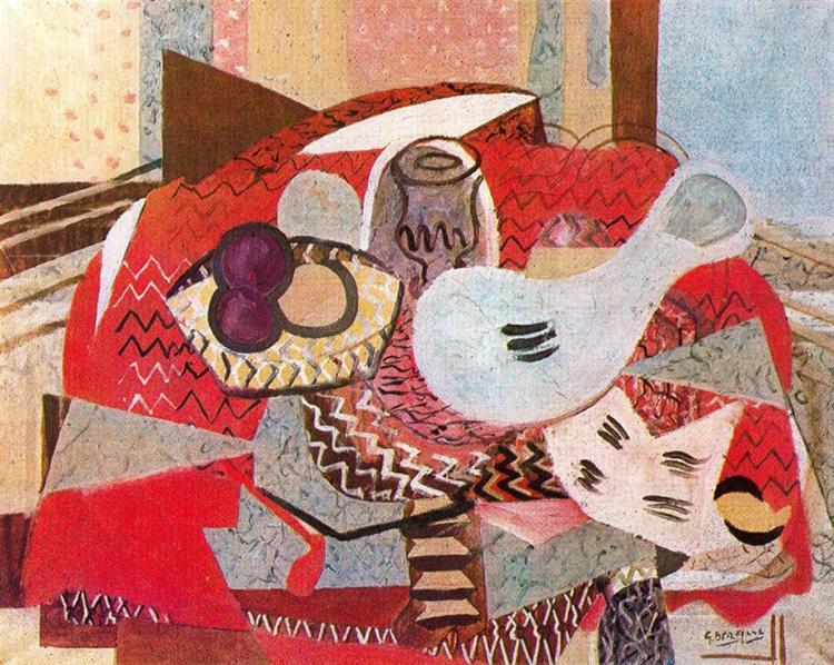
Cubism developed and can be split into two distinct phases, Analytical Cubism 1908-12, and Synthetic Cubism 1912-14. The examples above are from the analytical cubism period. Synthetic Cubism developed as artists started adding more texture and pattern to their paintings and also started experimenting with collage. An example of Synthetic cubism is shown below.

Bottle of Vieux Marc, Glass, Guitar and Newspaper 1913 by Pablo Picasso 1881-1973

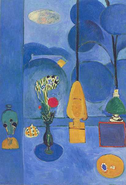
Synthetic Cubism swept away the last traces of illusion of a three dimensional space by flattening out the image. Synthetic Cubism painting often included the use of collaged real elements, papier collie, a French term which translates as pasted paper. A further example of this is Juan Gris’s, The Sunblind, shown below.

The Sunblind 1914 by Juan Gris 1887-1927
The Sunblind 1914 by Juan Gris

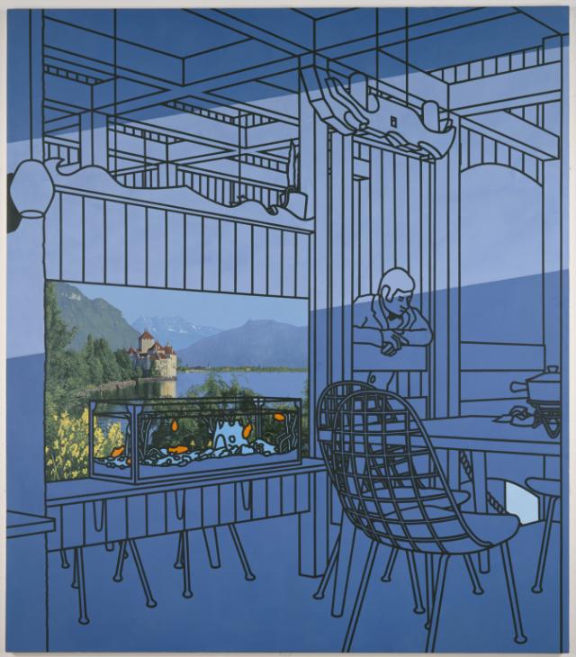
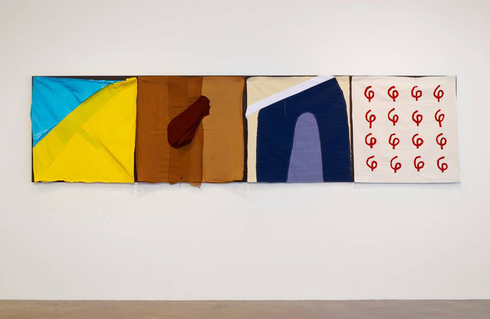
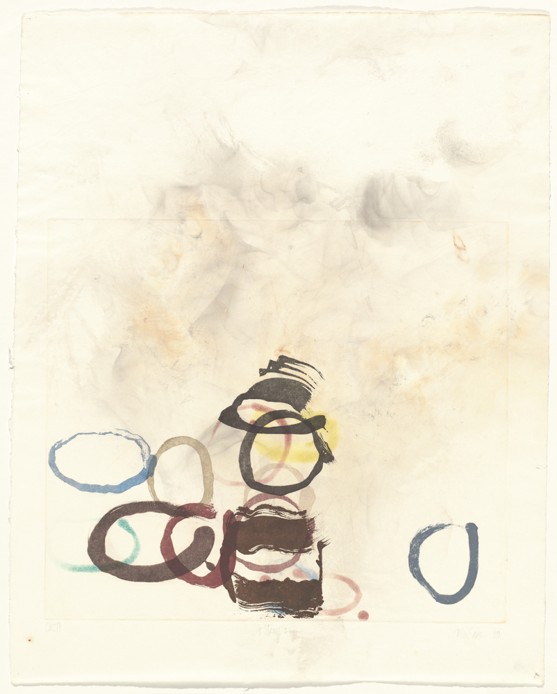
Cubism opened the way for many later abstract styles such as constructivism, neo-plasticism, constructivism and Automatism (example below).

Forest and Dove 1927 by Max Ernst 1891-1976
Dove 1927 by Max Ernst 1891-1976

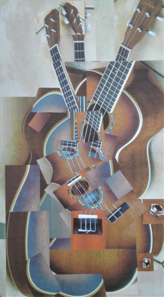
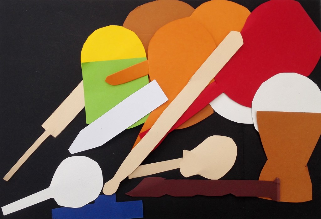
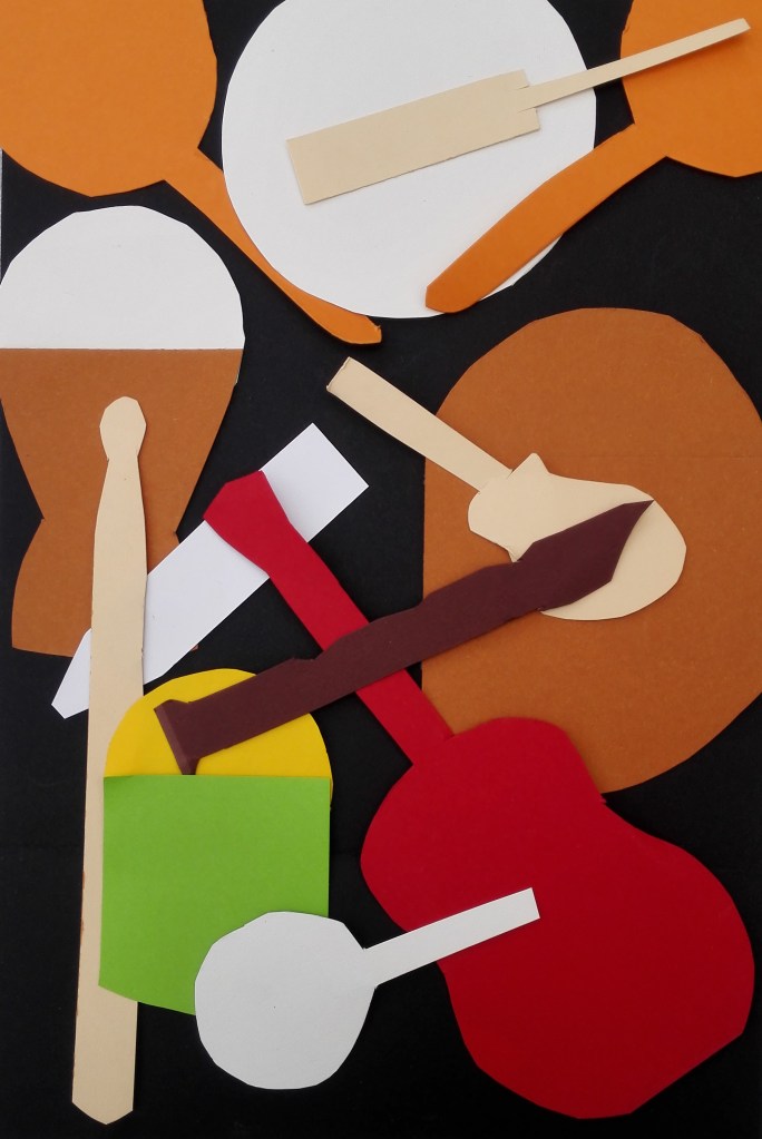
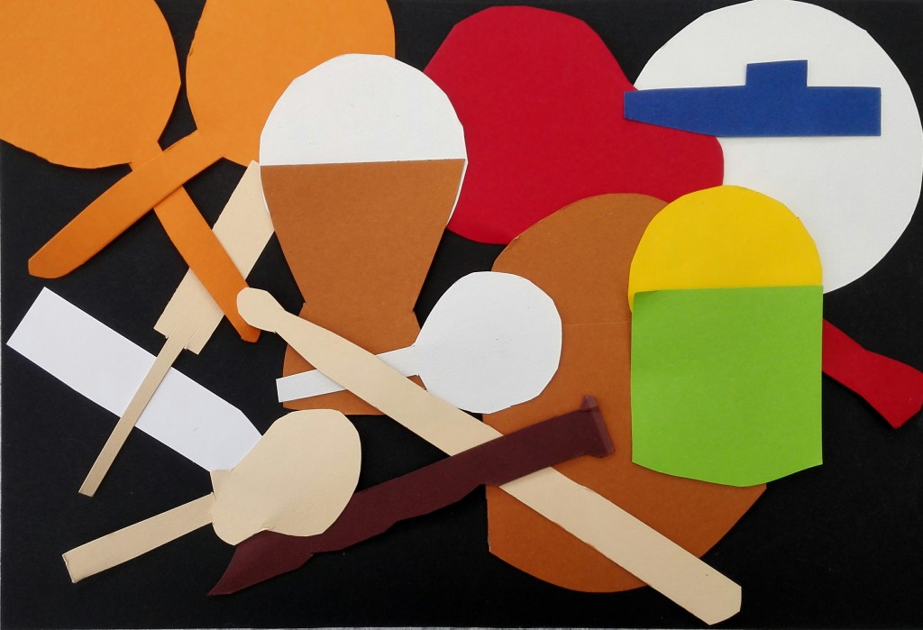
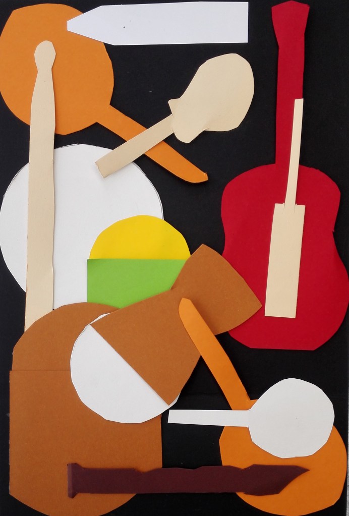
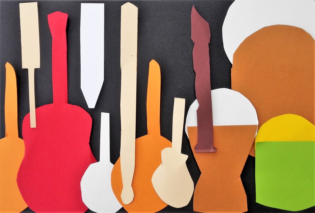
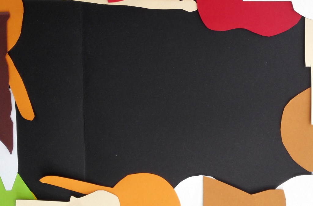
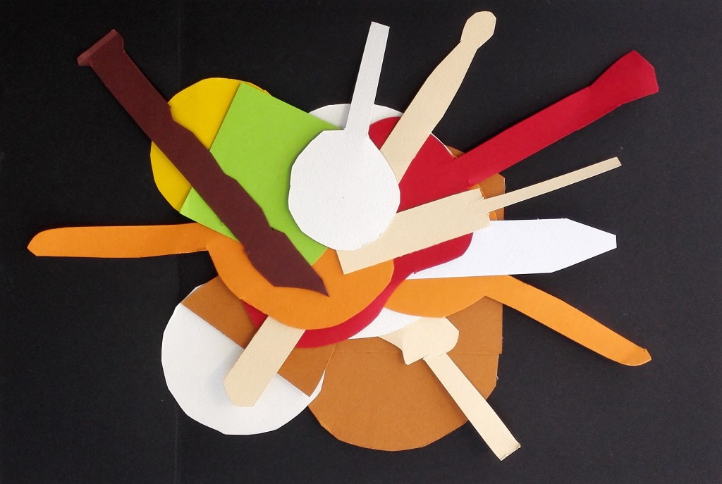
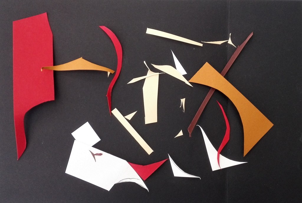
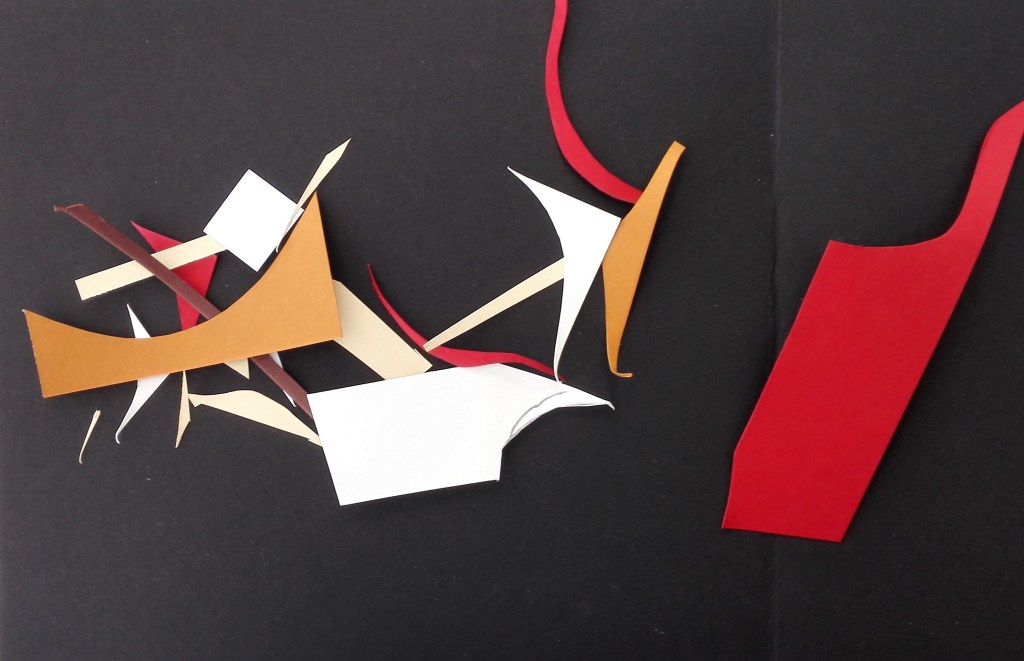
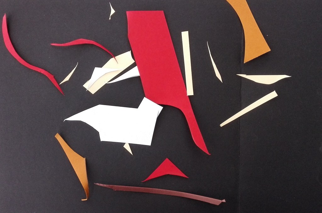
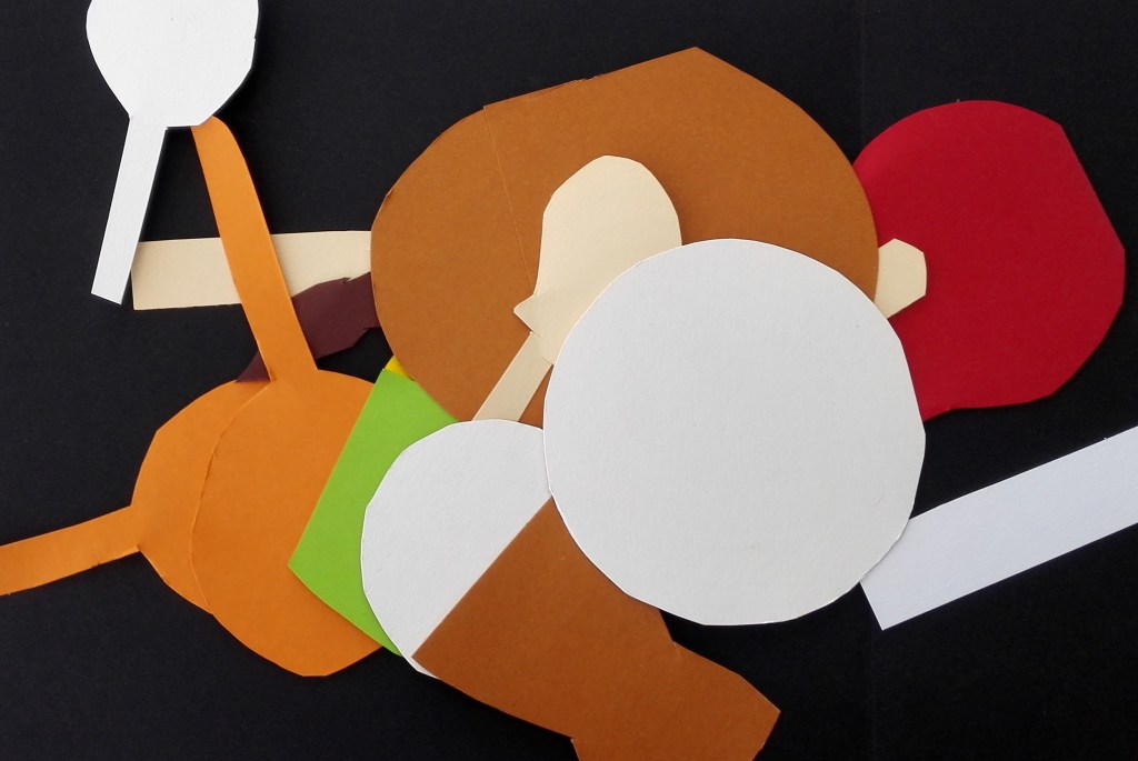
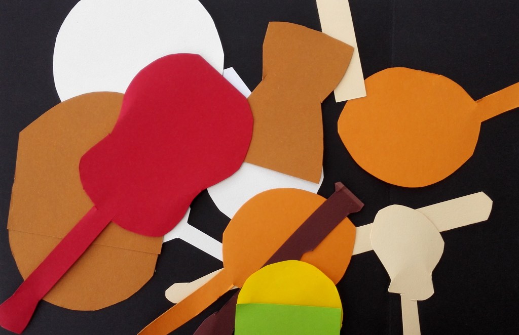
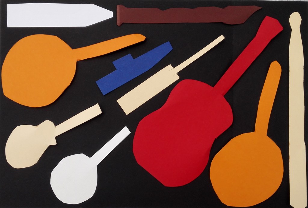
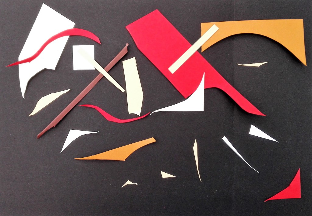
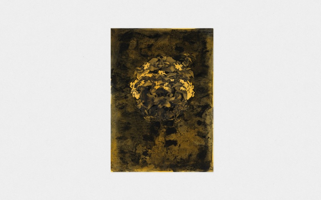
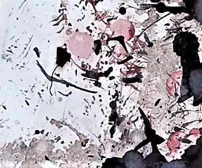
As a conclusion to this blog I have reproduced a photograph cut up that I produced as part of my work during the ‘Concepts in Practice’ course.

Follow up reflection on Exercise 1.2 and comparison

Whilst reading, researching and thinking about the exercises that I have recently completed I made some comparisons with my work to the suggested artists. Firstly Mary Heilmann, whose work looks fairly simple on first look but on close observation reveals perspective, line and colour. An example of this is her ‘Cup drawing, 1983’ where the object has been shown flat against a white background and reduced to seven coloured lines using oil on ceramic. The raised aspect of the ceramic creates a shadow around the lines which gives a slight indication of depth.

Mary Heilmann, Cup Drawing, 1983

A second example ‘Maricopa Highway, 2014’, below, is deceptively simple. The broken straight line of the of the road marking forces the eye up to the horizon line. A dusky sky is portrayed by a dark blue wash where elements of light creep through. The dark blue has been echoed through from the road and the lighter blue from the road markings. The composition is further skewed by being set on two offset canvases.

Mary Heilmann, Maricopa Highway, 2014

I make comparisons between these two paintings and some aspects of my recent work. The ‘Cup drawing’ is conceptually similar to the wire maquette of a ukulele that I fashioned. ‘Maricopa Highway’ uses concepts and ideas that I explored in the blocks of coloured paper and playing with space and perspective. My works are obviously much less sophisticated.

Part Two – Project 3 Contemporary approaches to still life: exploring space – Exercise 1.2 On perspective

I took a slightly different approach to the creation of colour studies. rather than making the colour studies I used some thick coloured paper from which I cut shapes to match most of those that were on the table. I used black to mirror the colour of the cloth and then spent some time arranging the shapes into different compositions. The cut-out are not exactly to scale but approximately keep a similar relationship to each other. Apart from the two drums, where I have included both the top and side of the drums, The shapes are created as simple shapes. My first attempt was to arrange the cut outs in a similar layout as the objects on the table.

1. As Display

With this arrangement the cut-outs appear to be more cluttered than the actual display. The space around them has been reduced due to their flattening out. The three dimensions of the objects has been reduced to two and therefore one dimension of space has been taken away.

With this arrangement I looked to place the cut-outs in a manner that would not be possible with the objects themselves. Either on top of each other or spilling over the edge. I did similar with the next arrangement which is in a landscape format.

3. Landscape

For the next arrangement I returned to the Portrait format. This time my aim was to keep all the cut-outs within the confines of the composition, nothing spilling outside the edges.

4. Portrait 2

Thinking about other ways to display the cut-outs I arranged them in a regimented line up. This necessitated having to have overlaps.

5. In a line

Next was to move the objects to the edge and create a composition whereby the cut-outs were mostly outside the edge. This was followed up by grouping and overlapping them all in the centre.

6. At the edge
7. In the centre

The cut-outs at this stage seemed to have taken on their own life and appeared to me to have a cartoon existence. I could imagine a time-lapse film whereby they marched across the screen forming different patterns amongst themselves.

Having, for the time, reached an end point I noticed the remnants from the cut-out process. The discarded pieces of coloured paper. I used these to create three compositions where I dropped the remnants onto the surface in a random manner. The three compositions are shown below. These have some interest but I feel that it is more to do with the shapes and colours than it is do with any representational look.

I hadn’t previously considered randomly dropping the cut-outs and now set about doing this. I feel that this process didn’t work and there is no cohesion in the resultant images.

How would someone else respond to the challenge of making a composition from the cut-outs? To this end I asked Marian to arrange the cut-outs in a manner that pleased her. She came up with the arrangement below and also gave it a name, Musical direction. It was interesting to learn that the cut-outs were seen to represent the objects that they were based on. It was also interesting to note that the cut-outs had been arranged separately from each other, no overlaps. I had moved away from this and had begun to see them and shapes and colours with which to create patterns.

13. Marian’s musical direction

For the last composition I returned to the remnants and this time made a considered arrangement.

14. Remnants arranged

Final thoughts. The experimentation that I have worked through in exercises 1.0, 1.1 & 1.2 has reconnected me to trying to look at objects and views and to consider different ways of representing them. In some ways it is a repeat of some of the work that I carried out during the early part of the ‘Concepts in Practice’ course that I successfully completed in December 2019. I note that the next research points look at Cubism and Henri Matisse it will again be interesting to re-engage with these. I have an urge to move my practice further away from representational work and take these opportunities to explore different ways of working as a way in.

Research – Six artists

This is the final blog, rather long, following my investigation into the suggested artists from Formative feedback from Part One. The suggested artists show a wide variety of different styles and techniques. I have selected two or three paintings from each of them and have commented on the paintings and why I was drawn to them.

1. Patrick Caulfield

In these paintings the subjects have been reduced to a simple shape. The emphasis has moved to the colour, form and perspective. I choose the three paintings as they seem to follow each other in there scale of ambition. The first depicts a simple sweet bowl placed on a table. The viewpoint is from slightly above the rim of the bowl so that we see the sweets and the perspective of the table. The second painting, Pottery, again reduces the objects into simple geometric shapes with plain colours. However the scope of the perspective has increased. The composition drags the eye from the pots at the bottom which are seen from just above to those in the middle which are seen square on to those at the top which are seen from slightly below. The use of negative spaces between some of the pots and plates heightens the solidity of them and suggests shadows. The third painting expands upon the theme of the changing perspective but in this example, a much more complex scene, is reduced into its many lines of perspective. there is a playfulness in the way the fish-tank is set against a landscape painting. Other than the painting, which in itself uses both aerial and linear perspective, the only other colour is the orange of the fish themselves.

Sweet Bowl 1967 Patrick Caulfield 1936-2005
Pottery 1969 Patrick Caulfield 1936-2005
After Lunch 1975 Patrick Caulfield 1936-2005

2. Ben Nicholson

In these two paintings the subjects are depicted into flattened shapes the second has close ties to early cubism whereas the first has a much grander scope. It is a view through a window over the roof tops to a harbour and landscape in the distance. Similar to the Still Life in the second painting the objects on the tray on the windowsill are flattened and the rooftop and buildings kept to simple shapes. However the boats in the harbour retain more form. The use of aerial perspective also gives the painting a cohesive feel.

1943-45 (St Ives, Cornwall) 1943-5 Ben Nicholson OM 1894-1982
1945 (still life) 1945 Ben Nicholson OM 1894-1982

3. Henri Matisse

The scope of these two paintings is similar. Both are looking out on the world from within a room. The emphasis is on shape although the objects retain some form and tone, particularly in the first painting. The cohesiveness of the compositions is retained by the use of the window and doorway to frame the view and draw the eye. The predominant colours are used in the titles of both paintings.

Henri Matisse, The Blue Window, 1912
Henri Matisse, Red Interior Still Life on a table, 1947

4. Gillian Carnegie

In these two paintings the subjects are reduced to simplified forms. The palette is monochrome which focuses attention on form. The use of shadows in both paintings is what makes them compelling and reveals the form of the subjects and creates the sense of perspective.

Coney 2004 Gillian Carnegie born 1971
Untitled 4 2004 Gillian Carnegie born 1971

5. Hannah Maybank

Initially when looking at the paintings of Hannah Maybank I was distracted by the flower motives that populated most of her work. Once I had got past this distraction I started to observe the settings and the use of tone and texture. In the first painting the leaves and flowers seem to emerge from the background. The lighter tones emphasise the middle tones and focus the eye. In the second paintings it is the deteriorating, peeling paint that creates the image of the flowerheads. It is as if a faded wallpaper is returning to nature. In both paintings the title references ghosts. In the first suggested emergence, the second a fading away.

Hannah Maybank, I begin a Ghost
Hannah Maybank, I am Ghost

6. Rebecca Scott

These paintings on first view look traditional in scope and content and have an illustrative feel. This is particularly true of the first painting which is all about light and shadows and has an impressionistic feel to it. The second utilises a similar technique. It is the composition A Still Life set against the backdrop of African skies and the unusual collection of objects on the table which adds interest. The third painting is a standard Still life which has partly defaced by the addition of white lines and drips. It suggest that the Still life is being viewed through a window on which graffiti has been daubed.

Rebecca Scott, Damson Afternoon, 2006
Rebecca Scott, Still Life under African skies, 2007
Rebecca Scott, Plastic spoons and bowls

Summary

An diverse range of artists in which their paintings tackle some of the many different approaches to Still Life. I have tried to look beyond my initial responses look to uncover something more in each painting.

Research – Georges Braque, Still Life

Third research topic from Formative feedback from Part One. I note the connection with this suggestion and Part Two of the course which starts to look at the relationship between sculpture and painting. This development has close links with cubist ideas. The representation of many views and facets of an object seen from different viewpoints. The paintings that I selected for inclusion in this blog are ones that look at and depict the objects from different perspectives often flattening them and eliminating their tonal qualities. Their shapes being more important. The first painting, ‘Still Life with lemons, retains some tonal qualities particularly on the glass however the lemons are flattened. In the second painting the objects are all flattened. In the third painting it is the surroundings which are flattened and split into different viewpoints, the table, tablecloth, walls and door. The vase and flowers are conveyed in a far more traditional, European perspective manner.


Still Life with Lemons
This image has an empty alt attribute; its file name is georges-braque-still-life-with-red-tablecloth-1934.jpg
Still Life with Red Tablecloth
Still Life with flowers

Research – Richard Tuttle

This is the second short investigation blog following suggested research from Formative feedback from Part One.

Richard Tuttle has used fabric in many of his paintings. I investigated a series of works that are collectively entitled ‘The Critical Edge’. In these works Richard seems to be exploring both the internal and external edges of a painting. Where does a work start and end? Is it within the painting or at its edges? The fabric is used to create lines using both the fabric and its colour. The works are broken down into a number of regular squares on which fabric is attached. The edges between the squares are observed but are allowed to be slightly overlapped or revealed. Additionally the fabric often extends off the squares in an untidy manner. Two more examples below.

Richard Tuttle The Critical Edge III, 2015 view 1 No. 61900 Format of original photography: digital Photographer: Kerry Ryan McFate

Research – Clare Price

This is part of a series of short investigation blogs following suggested artist research from Formative feedback from Part One.

The quote that I noted about Clare’s paintings was ‘Visceral oil paint set against more defined lines to create a tense discourse. Making reference to the body and to abstract expressionism.’

The paintings tend to be large work which I imagine would look far more impressive when viewed at an exhibition. The photograph below gives an example of this. Note the first painting highlighted in this blog is shown on the left of the photograph.

What I like about the paintings is the combination of chance and control. The defined lines suggest structure and rigidity as if we were viewing part of a man made object against a blurred or magnified background.

Two more examples below

Life Drawing – Winter Term 2020

These drawings were all made during the Winter Life Drawing term which ran from January through to March 2020.

I tried to some new techniques primarily one whereby I cover the paper in charcoal and work by removing the charcoal with a rubber to reveal the tones and outlines. There are a couple of drawing where I feel that this has been successful. The confines of the room and the short length of the poses prevents me from using paint but I do want to start to introduce some colour into my drawings. This will be with chalk and or oil pastels. I will experiment with these during the Spring term which starts after Easter.

When I look back over my Drawings I do see a gradual improvement. It is slow but us perceptible. At some point probably after I have hopefully completed my degree I will look to get some tuition with regard to Life Drawing as I’m sure that there are techniques that would help me to improve.


Dexter
Brian

Research Suggestion from Assignment One – John Cage

I was surprised to find out that John cage was also an artist as previously I had only associated him with music. Specifically his famous piece ‘4.33’ pronounced four minutes and thirty three seconds. This piece requires the musicians singular or many to not play their instruments for this length of time and for the audience to listen to the ambient sounds of where ever they are.

The specific art works that it was suggested that I investigate was a series of prints of drawing of stones. Two of these prints are replicated below.

The paintings were created by chance operations of randomly selecting and positioning small stones on a plate, determining their orientation and tracing them with a brush.

The resultant paintings are fragile and delicate. The colours tend towards pastels and are shown starkly against the washed out backgrounds. In some ways they have a similarity to some of the experimental paintings that I worked on during Part One. In particular the piece that made for Assignment One where the colours were washed out and translucent.

Refection on Formative Feedback from Assignment 1

Overall the feedback was good and mentioned that I had made a positive start to the course.

There were some pointers emphasising that I should make more rigorous use of visual and contextual research to support my enquiries into ideas that I find interesting. I have taken this comment on board and will develop this as I work through the course. I have found during the courses that I have undertaken thus far with OCA that that exploration and reflection become more and more important. Thinking about this it becomes obvious that this a window into what is informing my creative process and development as an artist. It is my story of how I see the world and how I respond to it and how it informs my art.

It was also suggested that I should look to explore further with some of the experimental techniques that I had employed during some of the exercises. Namely the blowing ink and diluted paints and also to look for new ways of applying medium to surfaces. I will look to invest in some new colour pastes and shellac inks to compliment these investigations. My aim will be to take time out between exercises in Part Two to complete these tasks.

Lastly I noted the suggested artists to investigate and will do so. These investigations will be reported in my blog under Research.

Wind Painting (Detail from Assignment 1)