Author: swampymark

Assignment Five – ‘Working with words’ – Two pieces and a review of Assignment

I have found Part Five a challenge in so much as it has forced me to confront how I approach my art practice. In doing so I had to use words to explain what it is I am trying to do, why it is important to me and whether I have been successful in achieving my aims?

Whilst considering how to approach this final assignment for the course I was tempted to move away from the approach that I have adopted throughout. This being to look for a solution whereby it involves painting. Should I challenge myself to create a work that was outside these confines. If so what could I do that would meet the criteria assignment?

To answer the questions raised above I reviewed the work that I had completed for Part Five, ‘Cut up technique’, ‘The role of the title’ and ‘Writing an artists’ statement’. Did I want to expand upon the work that I completed for these exercises? It was the upon re-reading my artists’ statement and reflecting on it that my mind was made up. Within my artists’ statement I clearly stated my interest is in painting the Fenland landscape. With this in mind I looked to try to incorporate ‘words’ into a painting or paintings. The additional advantage to this approach was that, if the paintings were successful, they would also be an addition to my Parallel project.

I decided make two paintings, one for each of the two ways that I try to depict the Fenland landscape, the landscape as seen and a close up study. After completing a review of some of my photographs I settled on two that met both my artists’ statement criteria and also included words.

The first was a close up of a another part of the old pumps which I have used in previous studies. The second a landscape scene which included signage.

I have noticed that my approach to these paintings is becoming more refined in that I have developed a technique which enables me a route into the painting. This approach starts with a covering the support in paint whilst mapping the main colours and tonal highlights. The next step is to focus on the darkest area and to work up the detail in gradual steps. Once this part is completed I will work on sections of the painting and define colour, shape and texture. All the time I am cognisant of the whole painting and the need to keep the overall feel consistent.

The first painting which I have called ‘Radicon’ for obvious reasons, I assume that this was the name of the company which manufactured this piece of machinery. I took three photographs of the work in progress.

The finished painting, shown below, has a number of aspects in which it meets my criteria. There is a pictorial element to it, the bottom third invites a closer inspection and the light from the left is well handled. The title is clearly depicted but it doesn’t give much if a clue as to what it is.

‘Radicon’, Aqua oils on linen board, 30 x 40 cms

For the second painting the title ‘Pathway near Purl’s bridge’ is descriptive. The inclusion of words in this painting is a bit forced. Do the words add anything? In an earlier stage of the painting they did the opposite in that they distracted and made the painting as a whole look more like an illustration. I had added a nameplate to the fencepost so as to add some further interest. This also promoted the illustrative quality.

‘Pathway near Purl’s bridge’

To complete the painting the signs were made to look more weathered and the light toned down. The completed painting, below, meets both the assignment criteria and that of my Parallel project.

‘Pathway near Purl’s bridge’, Aqua oils on canvas, 16 x 20 inches’

Paintings 17 & 18

These two paintings were created as my Assignment pieces for Part Five ‘Working with words’. My aim was that they would also be a part of my portfolio of works that I have been building up for my Parallel Project. I have written more extensively about both paintings in the Part Five Assignment section. They are posted here so as they don’t get forgotten about when I come to consider which paintings I will submit for Assessment.

Radicon, Aqua oils on linen board, 30 x 40cm
Pathway near Purl’s bridge, Aqua oils on canvas, 16 x 20 inches

Following Part Five Formative feedback review this painting was reworked. The aim of the rework was to lighten the horizon so as to improve the aerial perspective. Additionally the fence post and the signage was reworked to improve definition and tonal variations. The overall impact is to bring the post and signs forward and to push the background backwards.

Pathway near Purls bridge, Aqua oils on canvas, 16 x 20 inches

Critical Review

Below is the first draft of my critical review. It has already passed through a number of re-writes and correction stages to reach this point.

================================================================

Critical Review by Mark Taylor

An investigation into how the subject of memory is explored within the paintings of George Shaw and Peter Doig

Paintings have the power to transport us through time, and they can act as a vehicle for our memory. These memories can be accompanied by a multitude of different feelings. A painting can act as a reminder of a time, a place or a shared experience, creating a bond between the artist and the observer. Both parties do not necessarily have had to have lived through the exact same experiences however. A common connection could be found in the subject of the painting, the place or the atmosphere that it evokes, for example the image of a dark austere looking building where the emotions that such an image conjures will be dependent upon our individual experiences. For some it will be foreboding or fear, for others it will be comfort and security. Whatever the emotion is, it is a part of our being, a memory. Additionally the feeling doesn’t need to have been experienced first-hand, it could, perhaps, be a scene from a film or a photograph, however the emotion is no less real.

In this essay I will use the paintings of George Shaw and Peter Doig as a reference. Both have documented key periods of their lives in their paintings, in so doing they created a link to a shared past, not between them, but to us. 

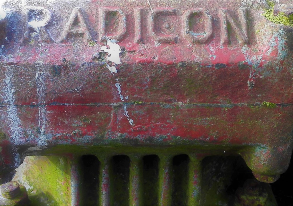
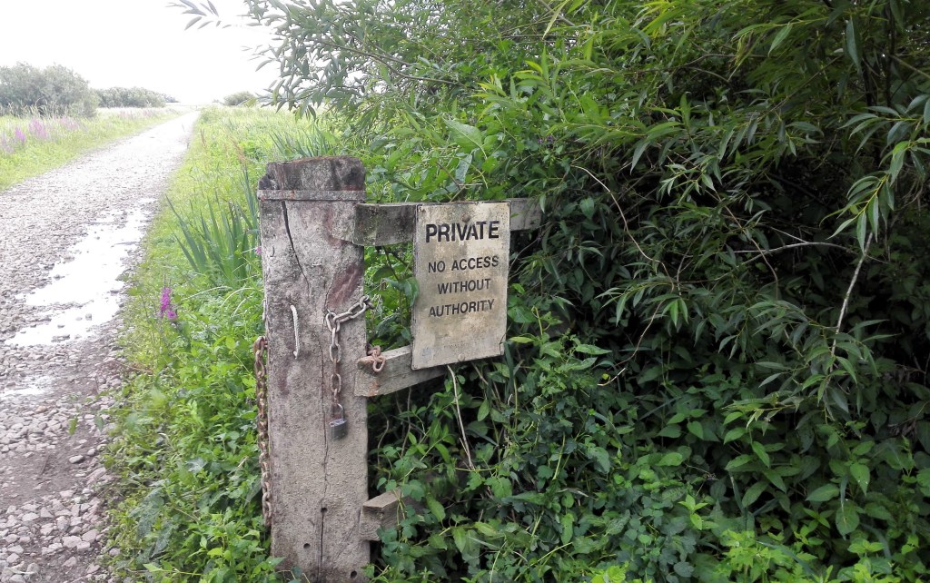
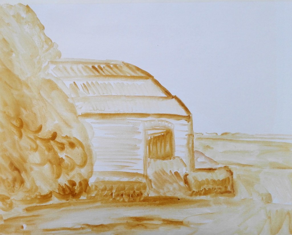
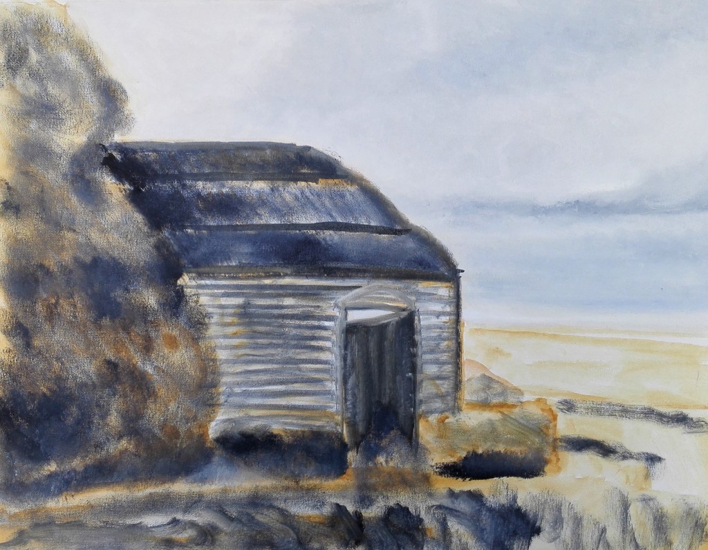
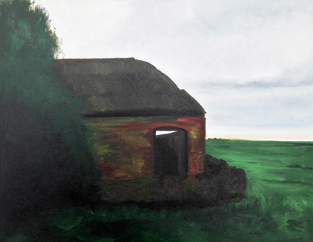
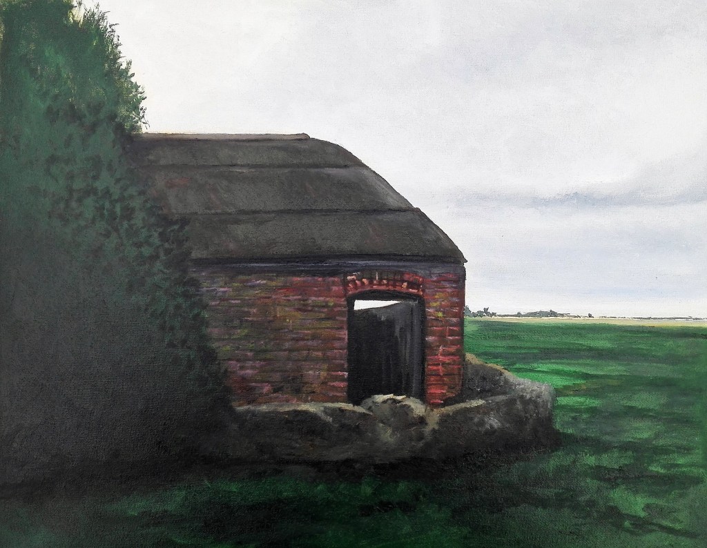
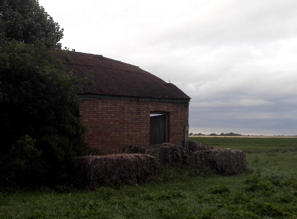
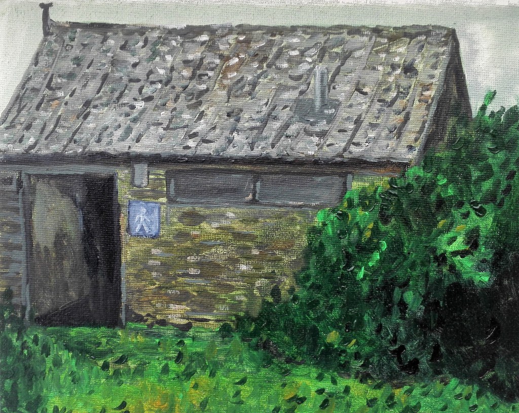
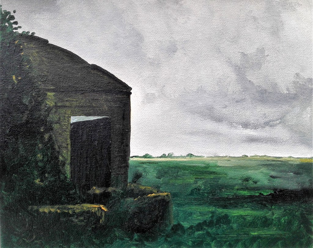
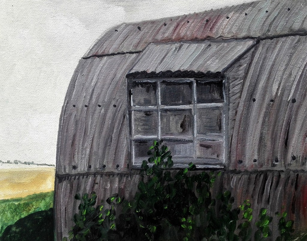
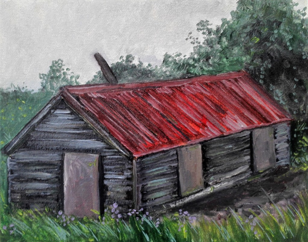
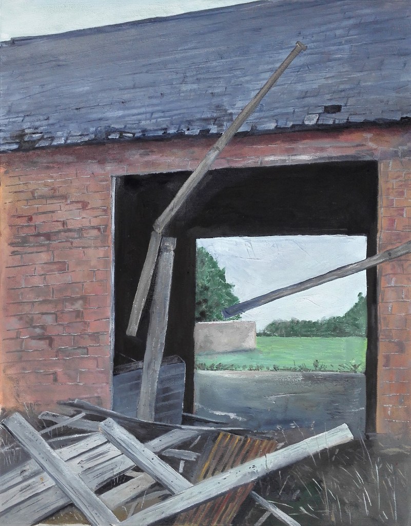
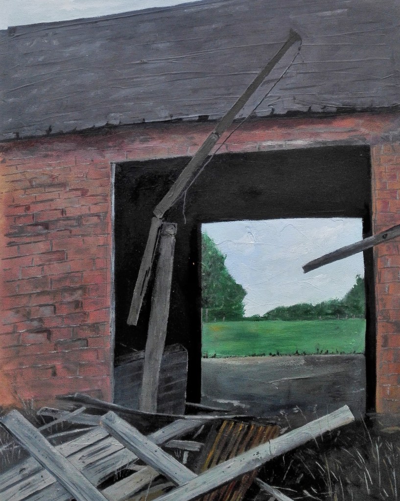
A consistent topic of George Shaw’s paintings has been the place where he grew up, Tile Hill, a suburb on the outskirts of Coventry, a subject with which he has been obsessed since he started painting. Whilst on a personal level I have no experience of Tile Hill the scenes that he paints are familiar to me, as suburban landscapes, similar to Tile Hill, exist all over the UK. His paintings portray the place as it was and is, with drizzly depictions of lock-up garages, muddy playing fields and uniform looking terraced houses on dull streets. These are the real images that are recalled by many that grew up in the UK in the late 20th century. His paintings are infused with memories of childhood and adolescence, of growing up, trying to fit in but remaining on the outside. His paintings do not reflect memory through rose tinted glasses but a realism that is at the same time nostalgic but refrains from being sentimental. What is it about these paintings that elicits these notions?

By contrast the paintings of Peter Doig draw on a wider range of influences. Which is predominantly due to his family’s constant moving house and location. Born in Scotland in 1959 his family moved to Trinidad in 1962 and then in 1966 to Canada. He then lived, studied and worked in London for 25 years before returning to Trinidad in 2002. All of these locations have informed his work. To quote Doig “When I was growing up, I never felt that I belonged anywhere because we never lived in a house for more than three months. That’s all I knew, and that’s why I don’t really belong anywhere.”

 I have chosen to concentrate on the paintings inspired by his childhood and adolescence in Quebec, Canada. The reason for choosing this body of work is because they resonate with the imagery of childhood, houses viewed through trees in snowy landscapes. These paintings are not literal depictions of locations but are remembered scenes, many of which are seen through a veil of snow which acts in part as a filter representing the impact that the passing of time has on the memory, as it slowly becomes obscured from view. Similar to Shaw these paintings treat the subject without sentimentality.

As I delved deeper into the work of both artists I gained insight into how they have both been influenced by where they lived, grew up, the cultural influences of the time and the way that this is reflected in their paintings.

Starting with George Shaw and his depictions of Tile Hill there is an almost documentary appearance to the paintings, it is as if they are photographs taken on a Polaroid camera. The colours are muted, slightly faded, giving them a melancholic look which echo the passing of time. Tim Jonze in an article in the Guardian referenced a photograph of George trying to squeeze himself into a Joy Division T-shirt that he bought when he was 14 he stated that, “It’s a silly photograph, but also a moving one that explores, the passing of time, the roots of who we are and the melancholy of approaching middle age”. Shaw has also talked extensively about his pop culture influences, vinyl by The Fall, Two Tone pin badges, pulpy skinhead novels and Ladybird books about trees. The Ladybird books offer an insight into Shaw’s paintings in that they are illustrated with a similar lack of flamboyance. The pop culture references become clear when, referring to the additional artefacts on display at his exhibition at The Paul Mellon Centre in 2019, Shaw states that “I thought showing people these influences might be more interesting than everyone thinking it all came from Constable or Turner. My entry level into Romanticism was (Factory Records designer) Peter Saville. It wasn’t the National Gallery”. Additionally when talking about his visits to galleries, with his Dad, he states that the paintings they constantly painted said “nothing to him about his life” referencing lyrics from a song by The Smiths.

Two further quotes by Shaw which I feel indicate what his Tile Hill paintings are about. The first from an interview with Sue Hubbard, Shaw states that his paintings reflect “a dream of Britain, an island I have come to know as a landscape of ghosts and haunted houses, of fair to middling weather and stony prehistory but also a backdrop for injustice, criminality, humour, suspicion and sparse grace” The second commenting on his hometown in an article by Lydia Figes in Art UK ‘I don’t think it has ever left me, that sense of possibility and familiarity and possible danger lurking out there somewhere beyond. I haunted the place and now it haunts me.’

Peter Doig’s adolescence and upbringing is a stark contrast to George Shaw’s and this is apparent in his paintings that reference this time in his life. Looking at his paintings of the Canadian landscape they are less about place and more about atmosphere and feeling, an interesting comment by Doig which illustrates this point was referenced in an article exploring his key works, ‘Progression of Art’. Reflecting on his Canadian tree-scape paintings Doig said “The tree line is a mixture of what I could see from my working space in my parent’s barn, where I made sketches of northern-looking pines and dying trees.” This is further reinforced by Katherine Arnold of London auction house, Christies, who stated “In taking up archetypal images of Canada’s landscape, Doig sought to distance himself from its specifics. These were not paintings of Canada in a literal sense, but rather explorations of the process of memory. For Doig, snow was not simply a souvenir of his childhood, but a conceptual device that could simulate the way our memories may be transformed and distorted over time.” The cultural references in Doig’s paintings of Canada are also informed by cinematic and theatrical devices which he uses to create nostalgia, ambiguity and mystery. An example of this, which was touched upon in the extract from Katherine Arnold, is the use of snow in these paintings. “Snow draws you inwards” Doig once said. A technique, that has been used in numerous films to indicate the blurring of memory, is the use of snow to create a barrier between the viewer and the subject. This use of snow to create a barrier becomes a signal of the gap between the past and now. The buildings in Doig’s Canadian paintings are often viewed through a tree-scape, his technique is to paint the houses through the trees rather than paint the house put the trees over it. As he comments in an interview with Robert Enright in 2006 “it was more about looking and picking out bits with the eyes.” As with memory we pick out what we remember and piece it together.

In trying to draw conclusions and comparisons in how both artists approach the subject of memory in their paintings I am conscious that we all experience the world in our own way, we have different lenses and a multitude of varying experiences. The ability to be able to highlight and communicate the commonality that is shared is what draws the observer into these paintings and holds their attention. These paintings create a shared connection which resonates beyond the image.

With Shaw’s paintings of Tile Hill it is more than simply the image itself. The pop culture references, which are not implicit in his paintings, draw on a certain Britishness that runs from the Kitchen Sink dramas of the 1960’s to the anger of Punk, the intellectual writing lyrics and imagery of Post Punk through to Two Tone. A connection is made to the dystopian mournfulness of Joy Division, the rantings and imagery of The Fall through to the poetry of The Smiths and the despair but optimism of The Specials. All of these performers are born from the same sense of wanting to communicate what it was like to live through this time. They pull the same strings in our collective memory, evoking the bleakness of these times. Thatcherism was wreaking havoc with working class lives and was decimating traditional industry. Despite this, it is the beauty found in the familiar and seemingly mundane scenes that invoke our collective memory, especially since clear parallels can be drawn to the present. Shaw was reticent to make further paintings of Tile Hill but after visiting his mother, who still lives there, he once again captured images using photography for his reference. He toyed with his emotions for some time, reluctant to return to the subject, but unable to resist, he made a further series of paintings. One of which ‘The man who would be king’ depicts an English flag draped in the window of a block of flats which sums up the depression, desolation and xenophobia that drove the UK to Brexit.

Peter Doig’s paintings don’t exist in any particular time or place. They inhabit their own space. The transient nature of Doig’s time in Canada, never putting down roots, is represented in the way that the paintings seemingly exist in their own space. Unlike Shaw the specific location of the images can’t be identified, instead they appear as a dreamlike mixture of references which make connections to us. They are made up of new places, far off places, forgotten places. Where Shaw’s paintings draw direct references, Doig’s references are ambiguous, these are fictional places in which we can imagine we might inhabit. The shadowy figures, that are often present, represent ourselves, these figures help to draw you into Doig’s world. With Shaw’s paintings the observer is placed on the outside looking in, however with Doig’s we are located within the painting. 

The two artists explored here involve memory to make the connection to us, however the way that they do so is entirely different, but both harness nostalgia without being sentimental. It is for the observer to locate their personal response to the paintings, to let the images take them back to their memories. The approach of Shaw and Doig to the subject of memory are different, in that George Shaw’s paintings are about a time and place whereas Peter Doig’s paintings have a more timeless quality. Both approaches are valid, it is for the observer to infer their own personal response.

================================================================

Painting 16

Of the four quick studies that I made I felt that the most successful and therefore, deserving of further exploration was, the one with an old barn set against a brooding sky. I had called it ‘Storm at Dusk’

Storm at Dusk, Aqua Oils, 20 x 25 cms

I set about a larger study. The work went through my normal process of building up a painting. Slowly I feel that I am developing a technique which is helping to inform my own personal style.

After some final painting I reached the point where I thought that the painting was completed.

An old barn in the Fens, Aqua oils, 16 x 20 inches

There are some key differences in the quick study in comparison to the larger work. In some ways I prefer the quick study as the painting has a brooding quality which is not captured in the larger painting. This is mainly due to the impact that the sky has on the overall look. In addition the over arching tone is darker and more subdued. The larger painting is more accomplished in its execution, the brickwork, roof and larger tree / bush are more refined. I feel that the larger painting benefits from its photograph and being reduced to a photographic image.

In summary it does fit well into my increasing portfolio of paintings for my Parallel project.

Final re-work. I kept looking at the painting and became increasingly disappointed with it. there was something that didn’t work which detracted from the whole. It was the hint of light coming through the open barn door that didn’t fit. It is in the photograph that I used for reference but looks out of place in the painting. I made the decision to remove it. The resultant painting is reproduced below.

An old barn in the Fens, Aqua oils on canvas, 16 x 20 inches, 2020

Despite this being one of the least successful paintings that I produced towards my Parallel project I decided to rework it. The aerial perspective was improved and the reflected light on the top of straw bails was toned down. The sky was also darkened.

Parallel Project – Four quick studies

Part of the ongoing work for my Parallel project was to explore four compositions to see how well I could interpret them. I had selected four photographs from my portfolio.

All had a landscape orientation. Using the same palette of colours for each painting I made four quick studies taking between 30 minutes to an hour on each painting.

Painting 1

Country convenience, Aqua oils, 8 x 10 inches

Painting 2

Storm at dusk, Aqua oils, 8 x 10 inches

Painting 3

Nissan Hut, Aqua oils, 8 x 10 inches

Painting 4

Boarded up building, Aqua oils, 8 x 10 inches

The four paintings are all satisfactory but two in particular I prefer. These are paintings number 1 & 2. Both have an atmosphere about them. This is particularly true for painting 2 where the brooding landscape evokes the coming rain storm. The building itself is rather undefined giving it a ominous aspect. It leaves the imagination to fill in what is not depicted. Painting 1 has a foreboding look to it. The entrance is open but it is not welcoming. The inclusion of the signage makes it obvious what the building is, but rather than an invitation it acts as a warning. Paintings 3 & 4, although having a similar look and feel to the paintings 1 & 2, do not have an additional element to them. It is the mood and atmosphere that I am attempting to bring into my work. It is partly evident in Painting 4 but lacking in Painting 3. Painting 3 also has perspective issues which could be resolved. In summary a useful exercise. I expect that I will use Paintings 1 & 2 as the basis for larger works.

Parallel Project – Re-work of painting following feedback

A short post on the re-work that was performed on a painting that was completed during Part Four and re-worked during Part Five.

The painting in question is called ‘COGS’. In its pre-reworked state it was commented that the section to the right of the cogs was confusing. It distracted from the composition. Taking these comments on board I decided to tone this section down, making it recede into the background. In addition to this I would work over the whole painting in aqua oils to improve the definition.

The before and after states are shown below and then below that the re-worked painting. It will now be included in my potential paintings for submission.

COGS – Before and after re-work
COGS, Acrylic and Aqua oils, 40 x 30 cms

This painting was discussed during the Part Five Formative feedback session. It was felt that the composition was problematical due to the L shape and the large dark area. After considering and dismissing whether to add further detail to the dark section an alternative approach seemed to be to change the orientation of the painting. I feel that this improves how the painting is perceived. It will be considered as part of my Assessment choices but I expect that it will not make the cut.

COGS, Aqua oils and acrylics on board, 30 x 40 cms (alternate orientation)

Parallel Project – View through an old barn ‘The grass is greener’

A sketch that I had completed at the start of my work on my Parallel project received positive feedback during the feedback session for Part Four. It was a composition that I had intended to take forward into a larger study and this is the result.

The sketch that I referred to is replicated below.

Sketch of View through old barn, graphite pencil, A5

For this painting I took a series of photographs as the work progressed.

Working initially in acrylic I sketched out the composition and then gradually built up the painting using Aqua oils. My aim was to try to get a subdued look with subtle highlights. I reached a point where I considered that I had reached an end point and stopped working on the painting.

View though an old barn, Acrylics and aqua oils, 20 x 16 inches

I lived with paintings for a few days. There were a few aspects that I felt needed to be improved upon. The first was the wall in the view through the barn. It detracted from the sense of depth. It hovered in the middle distance interrupting the eyes travel into the distance. At the same time the partly fallen length of wood needed to be reduced in length. Lastly to roof of the barn lacked definition. The improvements were made and the re-worked painting is shown below.

View through old barn, Acrylics and Aqua oils, 20 x 16 inches

The painting makes a worthy addition to the portfolio of paintings that I am gradually building up for my Parallel project. Whether it gets included in the final submission will be decided later.

Post script: Interestingly and much to my surprise renovation work has recently started on this old barn. It is already starting to look very different. When completed I will take some photographs and perhaps make a painting.

A reworking of the painting was performed following review at the Formative feedback session for Part Five. The landscape viewed through the Barn was toned down to enhance the aerial perspective and give the painting more depth. Finally, 26/11/2020 I added some highlights on the roof and gave the painting a title ‘The grass is greener’.

The grass is greener, Aqua oil on canvas, 20 x 16 inches, 2020

Part Five – Project 4 – Exercise 4.0 ‘Writing an artist’s statement’

I had written an artist’s statement previously as part of the ‘Concepts in Practice’ course that I successfully completed back in July 2019. However that was a much longer piece of writing, 2000+ words.

The requirement of my artist’s statement is to communicate what I do, how I do it and what inspires me to do it in a succinct statement. The length of which should be somewhere between 100 and 200 words. The purpose of the artist’s statement is similar in principle to a curriculum vitae. An introduction to the person and who they are and what they have done. However, I feel that it differs, in that it is more about what to expect from the artists work. Whereas a CV (curriculum vitae) is more about the persons experience.

I read through the requirements for an artist’s statement on the Artquest website and also the extract from the book ‘ How to write about contemporary art’. I have purchased the book and am working my way through it but hadn’t got to that section yet. Armed with the requisite information I made my initial attempt. It took much longer than I anticipated. The hardest part was getting started. Once I had got some words down it became a little easier although I continually re-wrote sections. The process was as much about trying to find the correct form of words, editing these, ensuring that the sentences made sense and that the whole statement was talking about me and my art practice. I used the work that I am doing for my ‘Parallel project’ as the focus for the statement.

Version 1, is shown below.

==============================

Artists Statement

Mark A Taylor

My paintings are about the Fenland landscape where I live. Mainly using oil and acrylic paints my focus is on portraying a pictorial representation of this landscape.

I approach the subject in two distinct ways. The first, is to translate the landscape as I see it when I walk within it. The features of the landscape, the buildings and the place they occupy within it. The second is to look, close up, at objects within the landscape. To show what is hidden away from casual observation. This second approach culminates in paintings that are closer to abstraction.

My fascination lies in trying to depict the impact that the passing of time has on the landscape. I want to show the effect that the elements have on man-made objects. The degradation on them and how they slowly become absorbed back into the landscape.

=============================

I will now leave this statement for a few days.

============================

My statement has now been revised. It came as no surprise to me that part of the first version needed to be completely re-written. What I wanted to say and how I wanted to say it remained the same. The words and how I articulated what I do and what drives me to do it changed. The revised statement had considerable input from Marian, my wife. We both read Version 1 which and highlighted the problem areas. I initially worked alone on rewording the problematic parts. As part of this process I read the reworded script out aloud. I found that this helped to find sections that didn’t flow. I came to a point where I was reasonably content with the statement. At this point I again involved Marian and with her assistance a final edit was completed. The resultant revised statement achieves my aim of stating what I do, why I do it, what it is about. I feel that it is a true representation of my art practice at this time. Final version below.

==============================

Artists Statement

Mark A Taylor

My paintings are about the Fenland landscape in my locale. Mainly using oil and acrylic paints my focus is on portraying a pictorial representation of this space.

I approach the subject in two distinct ways. The first, is to try to convey what I see when I walk within it; to record the features, the buildings, structures and the space they occupy in this often austere environment.

The second approach is to examine objects close up; to show features that may be overlooked by the casual observer. This approach tends to produce paintings that are more abstract in outcome.

My fascination lies in trying to record the effects of the passing of time. To show the landscape as it is today. In doing so I want to show the impact that the elements have had on man-made objects, documenting their slow imperceptible deterioration.

Part five – Exercise 3.1 Part 2 ‘Series of text pieces’ and thoughts about titles and the use of words in art.

I made an edit of the poem ‘Forests forever’ that I had used for one of the painting titles in Exercise 3.0. The edited poem was split into three sentences which were then added to three paintings that I had painted during the course but had not used. The paintings with text were pulled together to create a brief slideshow.

The resultant words and images compliment each other and form a collective piece.

Having completed Exercises 3.0 & 3.1 I have contemplated the use of words in my own work and in the work of others. My thoughts were initially focussed on whether I should use a system for titling my work. At this stage I have reached the conclusion that for paintings where the subject is identifiable I should use a title that explains what, where and when. An example of this would be ‘Old Barn, Chatteris, Spring 2019’. This locks the painting into its time and place and identifies what it is. To call it something like ‘The erosion of agricultural heritage’ is to falsely give the painting an aura of gravitas that becomes pretentious and I feel detracts from the painting. Its better to inform the observer.

For my paintings where the subject is either obscured or the work is abstract I will employ a system where I will use song titles. My thought at this point is that the addition of a title, which may not initially have any connection to the painting, creates a moment where the observer has to stop and consider the title. This break allows the painting a brief respite from its examination. The observer considers the relevance of the title in comparison to the painting. The connection, if one is formed, is with the observer. I am conscious that this could get tiresome for observer and after a while there could be a switch off.

Connecting words and art can be a very powerful device. The image with a strong message can create new meaning to both the words and the image. Whether it is political propaganda, advertising, humour or telling a story the connection can reinforce both the words and the art into an entity that is much stronger than its constituent parts.