I do not intend to compare and contrast these two artists but rather explore their individual approaches to making art with words. I have not made extensive research into their individual practices. My intention was to examine a single work by each artist. To examine each piece and the impact that the artist was intending to illicit in the viewer. In both cases my interest was in trying to identify what cultural influences may have informed the work.
I’ll start with Bob and Roberta Smith. This is the pseudonym of Patrick Brill, a British contemporary artist, writer, musician, art education advocate and keynote speaker. Patrick comes from the leftfield canon of British artists. Although part of the established art movement he remains very much his own person choosing to do things his way. He comes from an artistic upbringing, his father was the landscape artist Frederick Brill who was head of the Chelsea school of art.
The work that I have chosen to examine is titled ‘Make art not war’ 1997. These words and other phrases are claimed to have been spoken to him by his father on his deathbed. Firstly what does the painting look like. It is square, 153 x 152 cm, painted on plywood using commercial paint. The background is split into two halves divided horizontally, the top section is painted white and the lower pale orange. Over this are painted the four words ‘Make Art Not War’. The typeface that Patrick has used is known as Signwriter’s block. This was developed in 1920 and was chosen, the artist explains in a video about the painting, as he enjoys the disciplined structure of the typeface. The letters are mostly black or blue except for two, one being white the other red.
The painting is part of a series of works that use humorous slogans which to promote art over violence. A further example being ‘Easels not guns’. The meaning of these paintings is fairly explicit in that their intention is to challenge the viewer to question human morality.
The simple message brought into the setting of an art gallery or museum forces the viewer to confront the message and to challenge their ideas of what a painting is. On its own a single painting can not change the world but it does set up a dialogue in which an alternative outlook is possible. In my opinion the painting is an expression of the culture and times in which it was created which has informed the artist. However the artist is not merely responding but is choosing to influence, is not making concessions but directing.

===============================
The second artist and second painting is by an artist who comes from a different cultural back ground. Edward Ruscha is an American artist who is associated with the Pop art movement of the 1960’s. He is well known for his paintings, collages and photographs. Originally from Oklahoma he states that his eyes were opened and that his work is heavily influenced by Los Angeles. His interest in words and typography have provided the primary subject of his paintings, prints and photographers. The words either comes from conversations, jotted down or are taken from dictionaries.
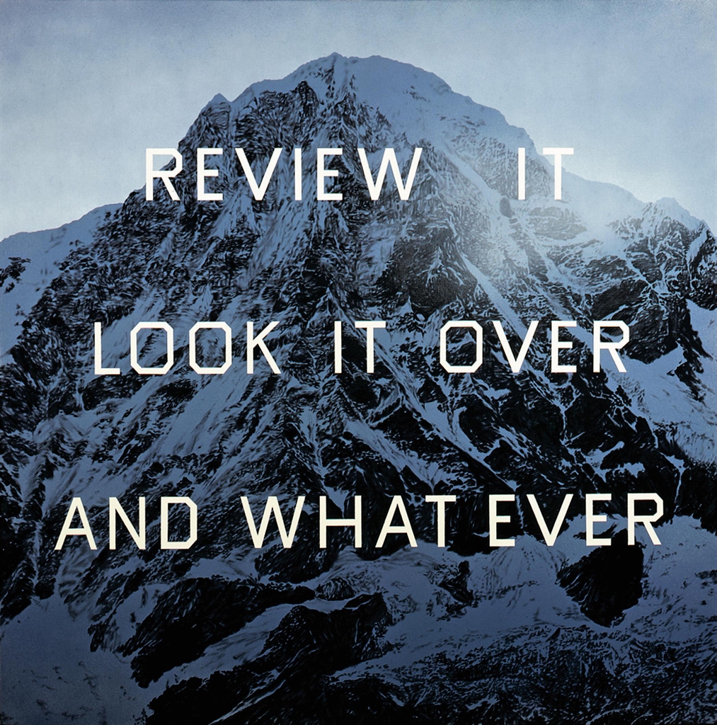
The painting that I selected to examine is called ‘Review it, look it over and what ever’. It was completed in 2004. The painting is on a square canvas, 152 x 152 cms. The background image is a mountain rendered in monochrome of Payne’s grey. It has been created with acrylics, pencil and charcoal. Over the background image of the mountain the words, (1) Review it (2) look it over (3) and what ever, are written in three lines evenly spaced using a simple typeface. All letters are the same size.
In trying to understand the meaning of the painting I visited Tate Moderns website and found a video of Edward discussing his art and the processes he employs. In the video he explains that his backgrounds are just that backgrounds but then goes onto say why he often uses mountains tops as backgrounds. They suggest glory, beauty and evoke the sound of trumpets playing although there is no noise present. When words are added it creates tension. To me, a question is raised in that as the viewer you are immediately drawn to the words and to think about what they could mean? Why have they been placed in this setting? The words or phrase ask to be contemplated. Had they been written on a page in a book would I have stopped and thought about them? I think that this would be unlikely. In this case the phrase is in three parts. The first is a command ‘Review it’ followed by an instruction as to how to ‘look it over’. The conclusion ‘ and what ever’ is yours. It is left to the individual no answer is provided.
You, the observer, are challenged, questioned and instructed by a painting to do something more than merely to observe and then left free to move on. To me this is an instruction to look beyond what is presented or given to you, draw your owns conclusions and from there follow your own path.