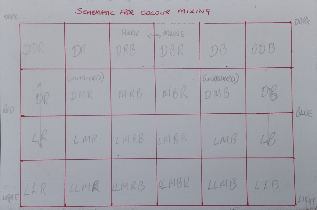
Following on from the previous blog on Part 1 of this exercise. I had already planned how I was going to try to replicate and represent the colours recorded in the photographs on acetates. My main consideration now was how I was going to display the chart. The idea that occurred to me was to try to suspend the coloured acetates by hanging them via some sort of mobile. Before doing this I devised a way of creating the various colours and tones from dark to light. To do this I used the schematic shown below. This took the two primary colours, Red and Blue, from dark to light and various mixes of the two colours with the addition of white or black.
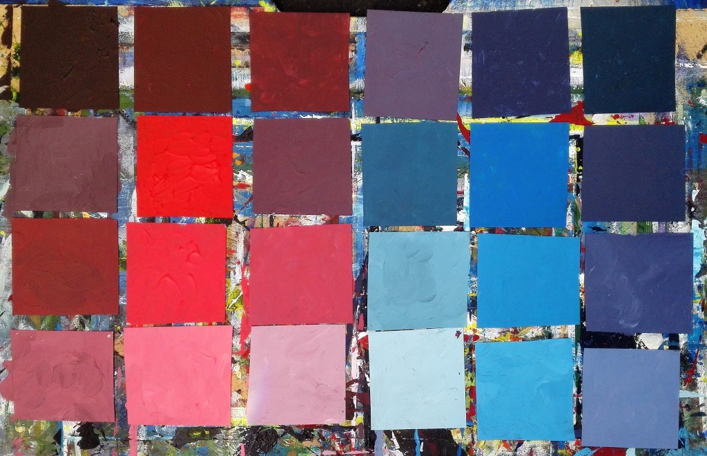
The next step was to cut up the acetates into the required number of squares and to paint them. The result is shown below.
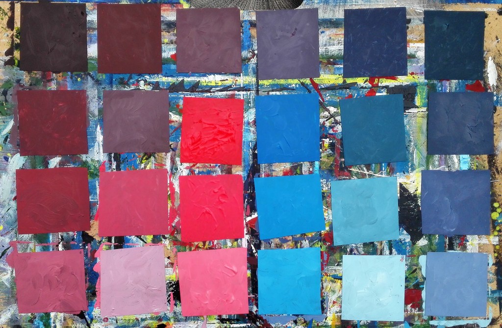
Once the squares were arranged I challenged the order that they should be displayed. It wasn’t clear that the colours ran from dark to light and from red to blue. I was also noticeable that I hadn’t mixed a purple colour that was near to the colour of the purple lid. Partly, I feel, this was due to the red paint that I used which was towards the pinker end of the reds rather than the orange end. First I tried a couple of slightly altered arrangements before dispensing with any sense of order. After shuffling the squares I arranged them in random order until I happened upon an order that pleased me.
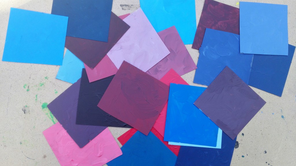
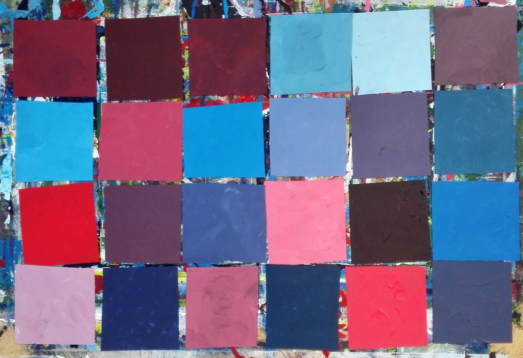
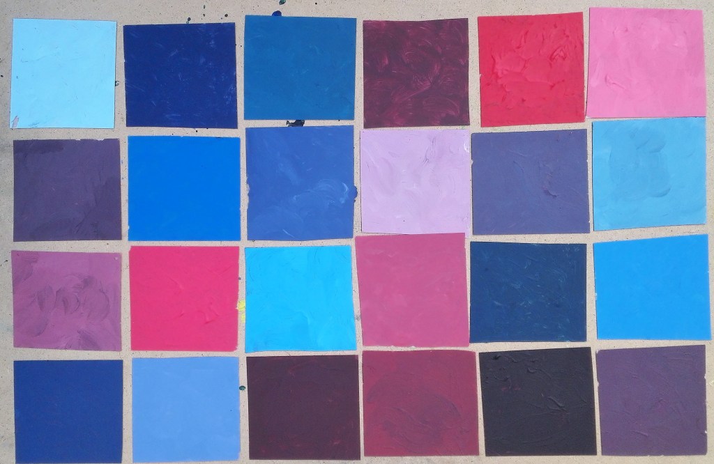
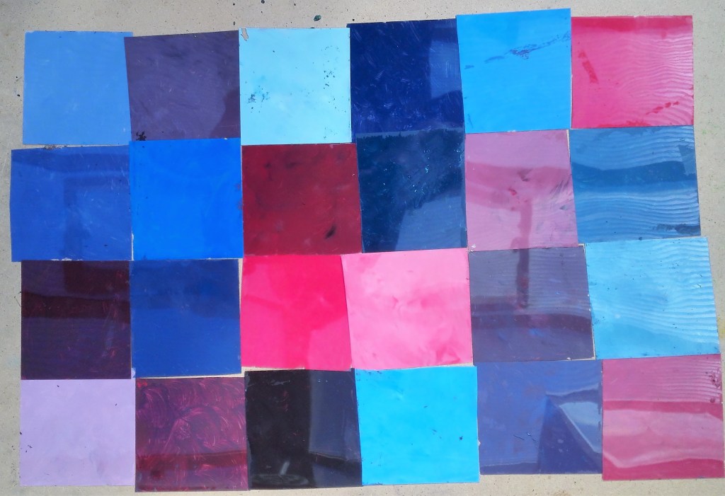
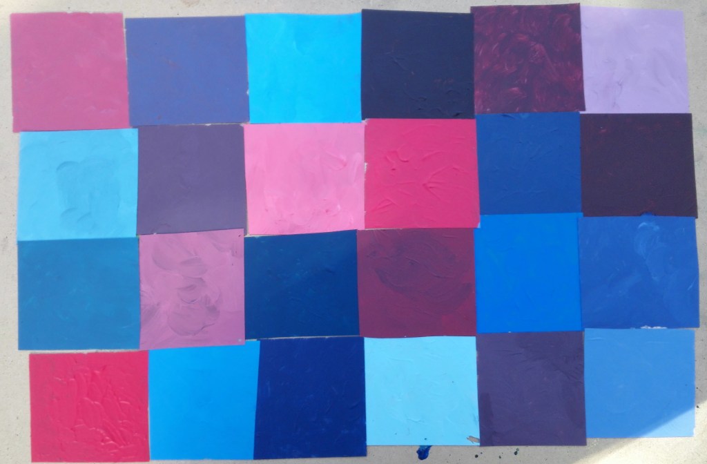
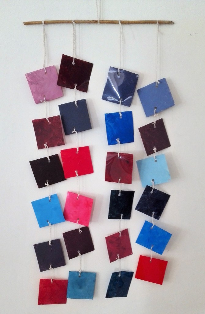
I finally settled on the random order that can be seen in the image below. .
The individual squares would be joined with string in four lines working from right to left. The squares at the right would be at the top of the display.
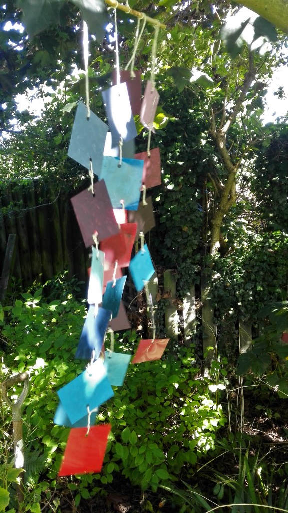
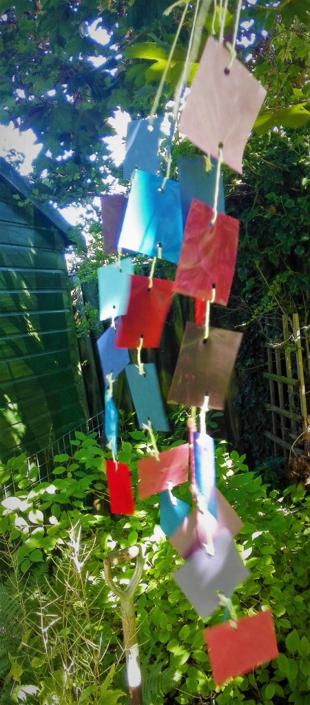
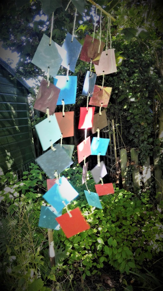
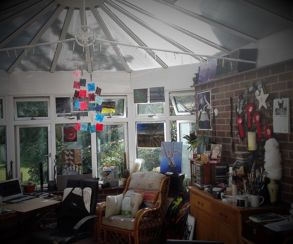
The resultant mobile display is best seen in the photograph below where it has been hung against a pale wall.
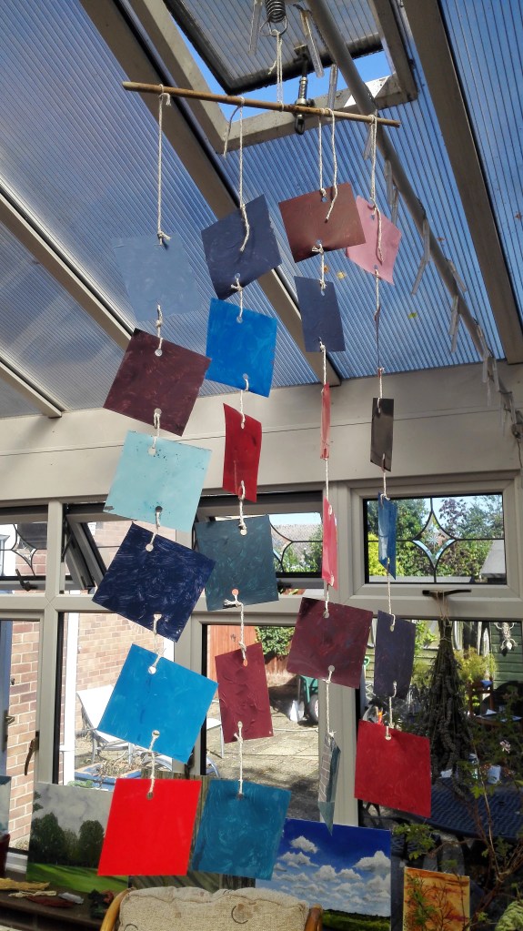
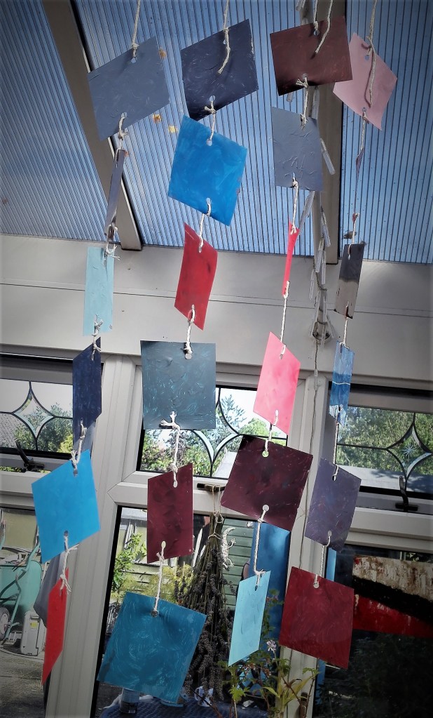
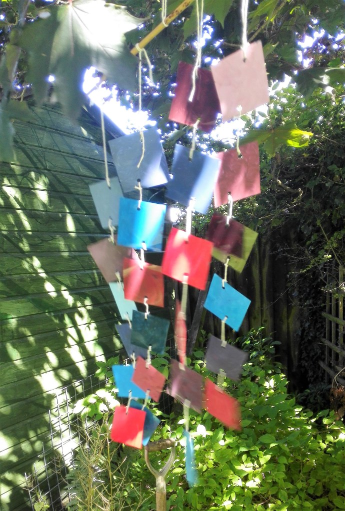
I tried hanging the mobile in various locations around the house and also in the garden. Its rather delicate nature meant that the garden locations were limited.


I also made four videos of the 3D colour chart, see blow. These are followed by my reflections on the process and the resultant work.
Summary and reflection
The result of this exercise is that I have an interesting addition to my studio. The 3D colour chart is proudly rotating and the reflections from the shiny side of the acetates are creating splashes of light across the surfaces of the room. At present this is quite distracting but is temporary as the sun will change direction before long. So from the viewpoint of creation of a piece of artwork the exercise has been a success. However that was not the point of the exercise. The main focus was on the observation of colour and how it changes in differing backgrounds, differing light conditions and the surface it is on. Throughout the task I have been aware that my knowledge of colour is reasonably well educated. I would not profess to be a student of colour but I do feel that I have gained knowledge over the years, and particularly throughout my OCA studies, of the how colour is impacted by different conditions. I realise that this learning is never ending. The exercise has taught me to continually be aware of the relationship between colour, tone and surface and consider this in my work. The choice of the limited colour palette that I used for this exercise was advantageous in that it allowed the focus to be on the subtlety of tonal variation rather than clashes of colours opposite each other on the colour wheel. It is this knowledge that I will look to take forward when constructing paintings. It will help me in the creating more harmonious compositions.

One thought on “Project 5 Colour – Exercise 1.4 ‘3D Colour chart (Part 2)”