I thought that I would try to use this exercise to make further use of my utilisation of acetates as supports for paintings. Having read the requirements of the exercise I envisaged that it I could use the acetates for the rectangular planes of colour. My thinking that I would only need to apply paint to one side.
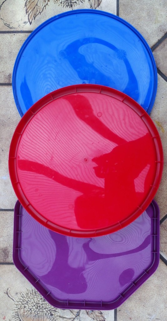
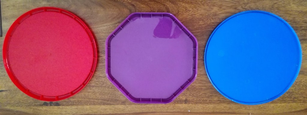
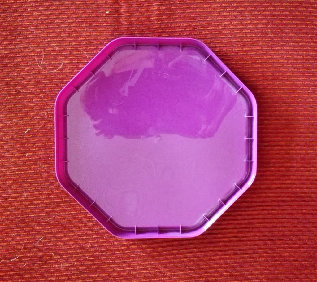
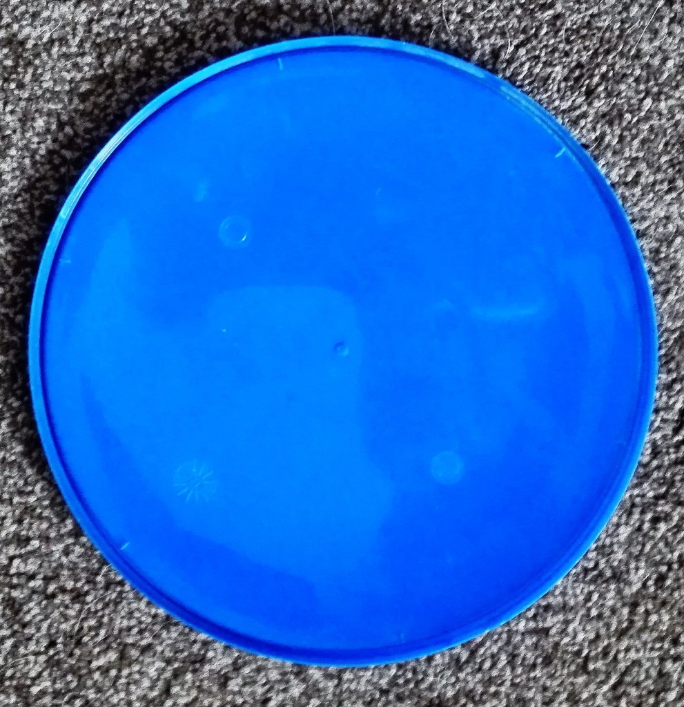
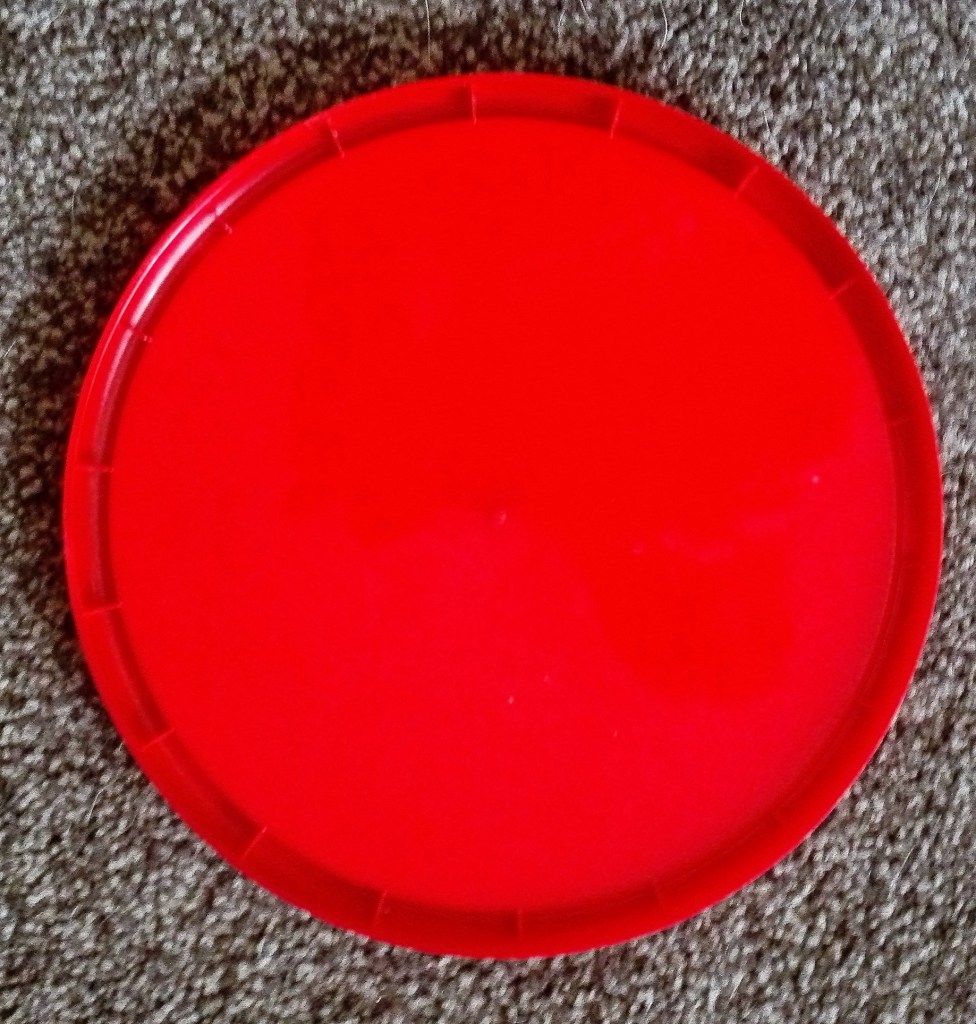
My choice of objects was limited to what I found around the house. I encountered difficulty in finding object of pure colour. Most items that I considered were multicoloured. Additionally I found that the need to be able to move the object to various locations limiting. Eventually I settled on three plastic sweet tin lids. These can be seen below photographed against a pale background.
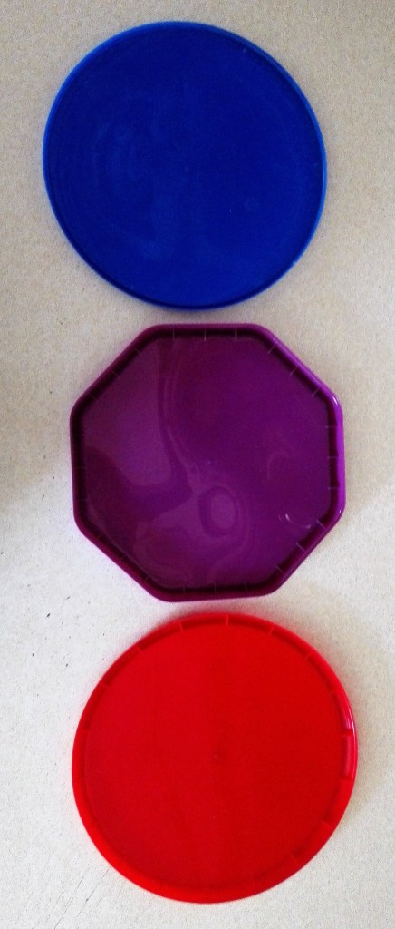
This photograph, taken in natural light, shows the three lids in their true colour as there is very little reflected light. I realised shortly after undertaking the exercise that the three colours were all on the same sector of the colour wheel. Would it be advantageous or detrimental to the exercise? From a colour mixing perspective it would make the reproduction of the differing shades, tones and hues easier to render. Two of the lids were in a primary colour and the third a secondary colour derived from the first two. The detrimental side of this was that I expected that the impact of the colour of the objects in different lighting conditions and situations would be less impactful.
Another aspect that I noticed at an early stage was that the three lids were similar in that their surfaces were reflective. Any light that fell upon them would be reflected back rather than absorbed. Again, as per the limitations of the colour choice, this would have advantages and disadvantages. It would be advantageous in so much as I would know that the observed colours would not be impacted by their differing surfaces. All three would show the same characteristics. On the detrimental side I would not be able to observe the impact of non reflected light on the colours.
Armed with this knowledge I set about trying to explore how the colours were impacted in an array of different locations and lighting conditions. I recorded these via photography. My intention being, as explained in the opening paragraph of this blog, to try to replicate the observed colours on acetates that I could manipulate into a hanging 3D colour chart.
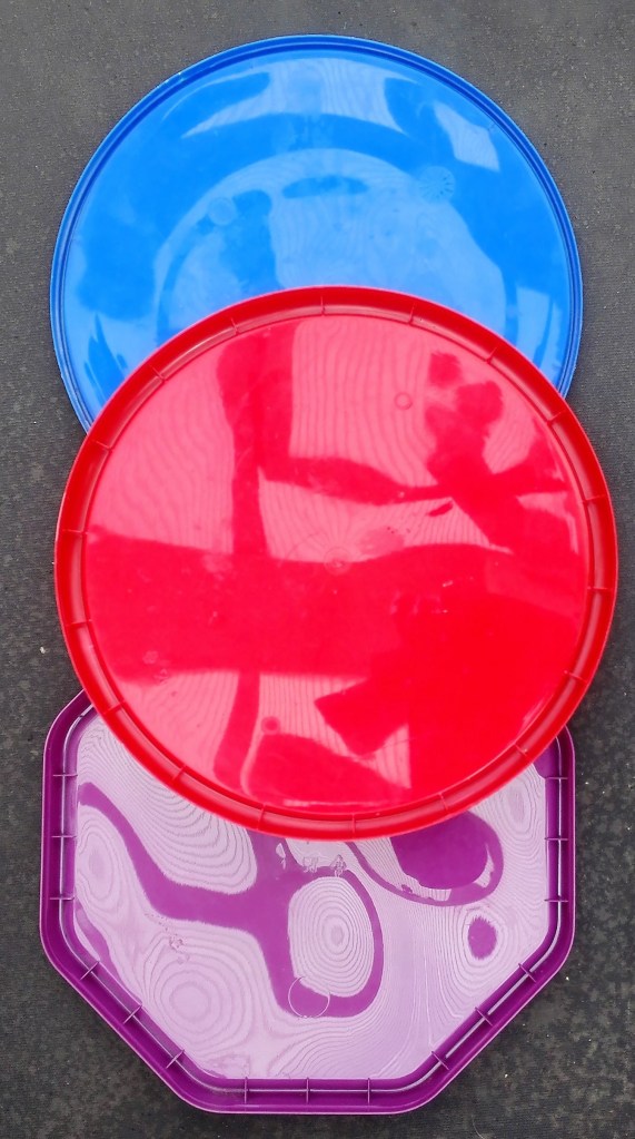
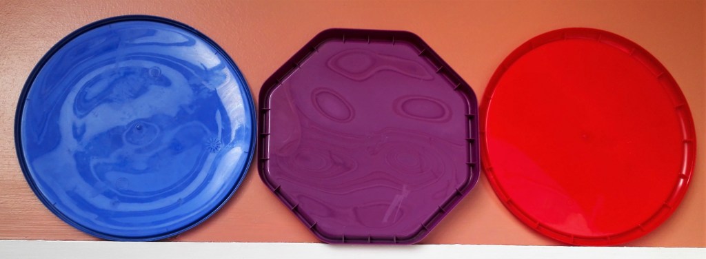
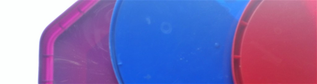
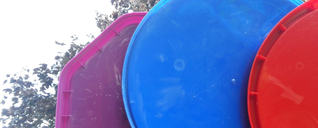
A selection of the photographs accompanied with a brief explanation is below.
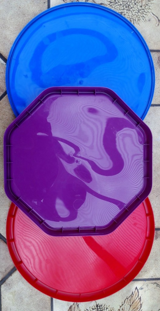
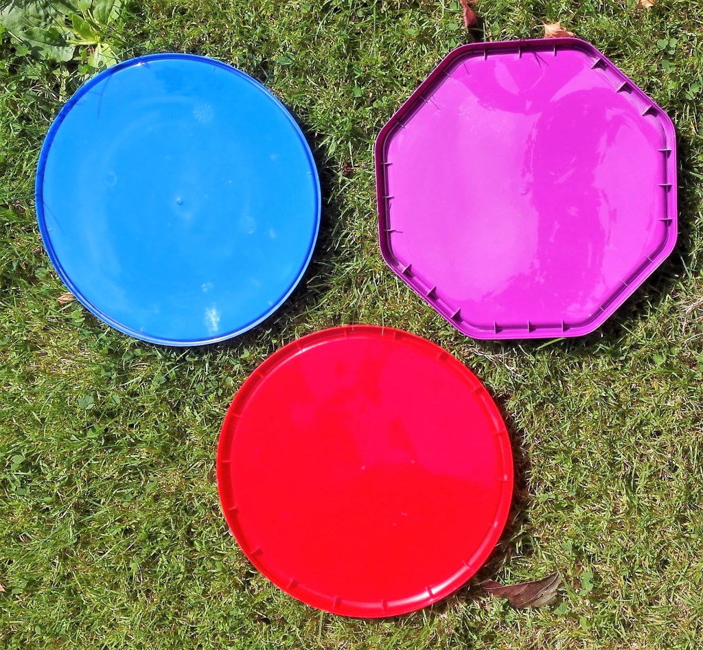
The three colours stand out from the background, the reflection of the conservatory roof creates both tonal interest and patterns.

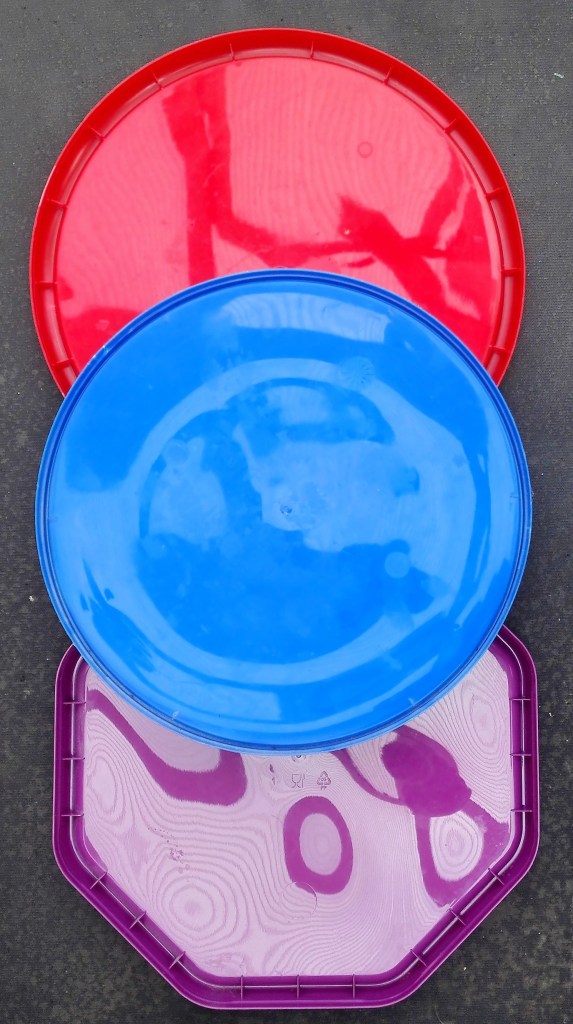
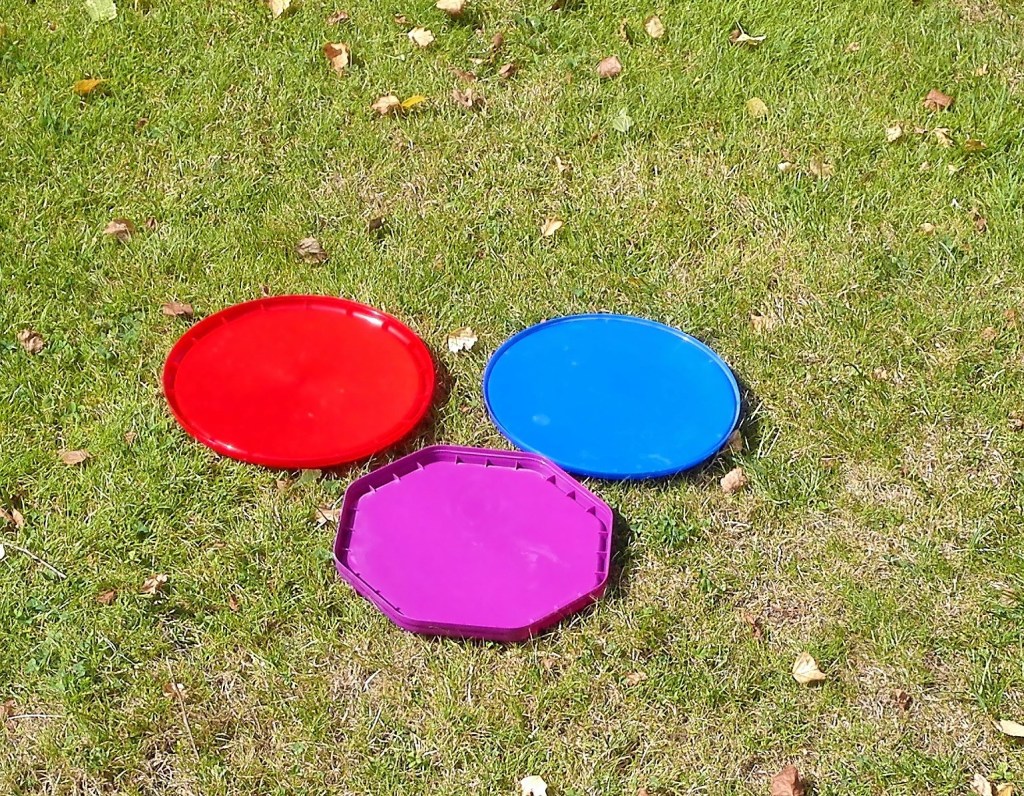
Similar to the previous images the colours stand out but are slightly paler. This is due to two effects, the reflected light and the stronger contrast against the darker background.
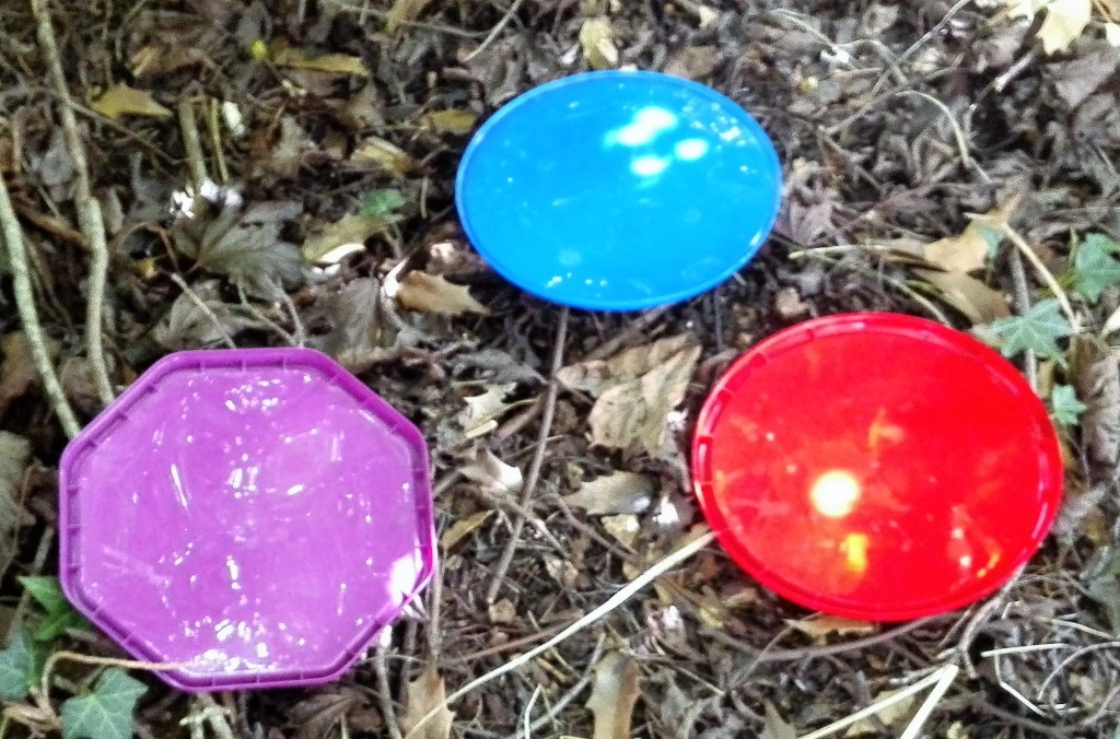
In these images the true colours are observed as there is much less light.

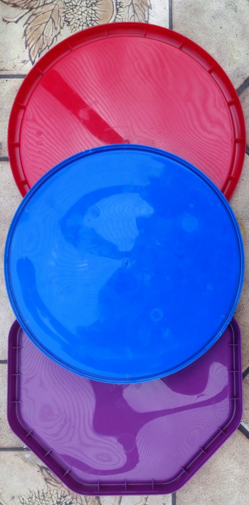
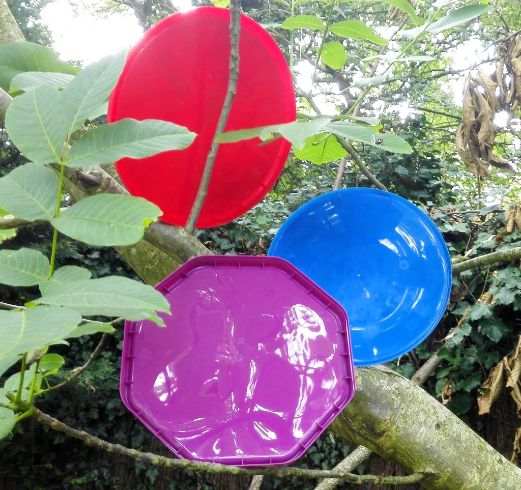
In these images it is noticeable, particularly in images 1 & 3, how the red lid shines out against the green grass.
Again the colour red dominates and is less reflective. This could be an accident of the positioning of the lid. Where there is reflected light it is intense.
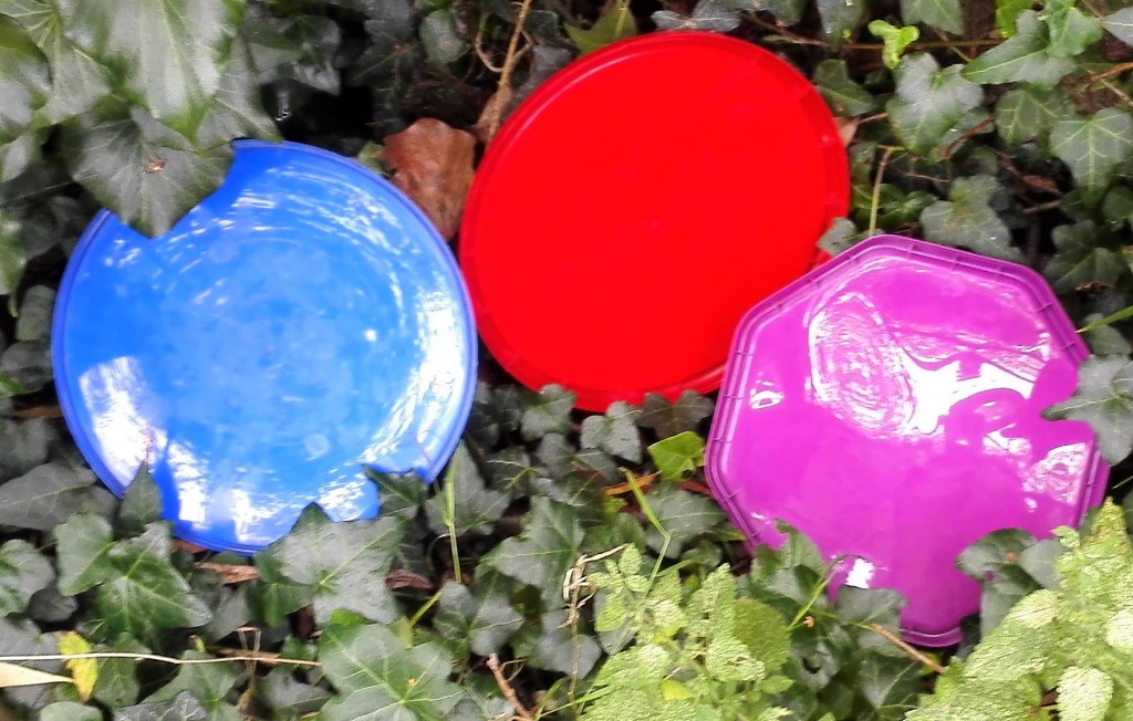
The red lid is partly absorbed into the background whereas the strong contrast of the blue makes it shine out. The purple lid being somewhere in between, not surprisingly.
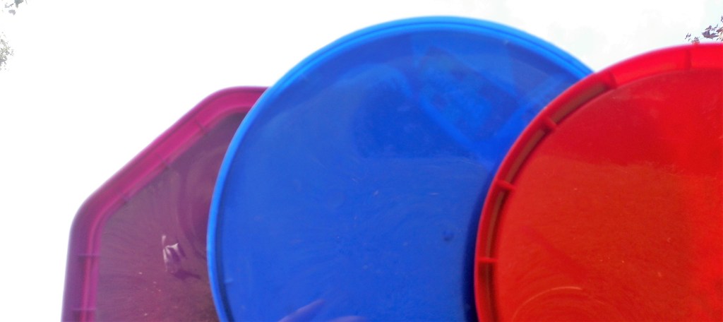
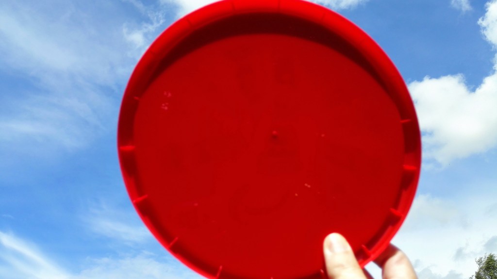
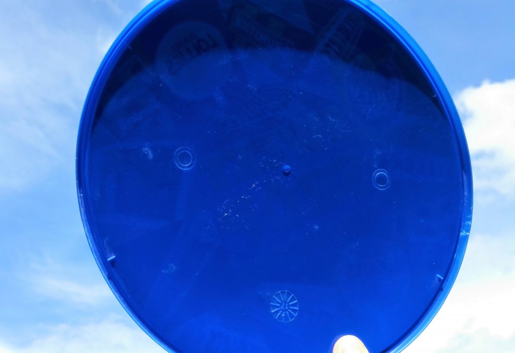
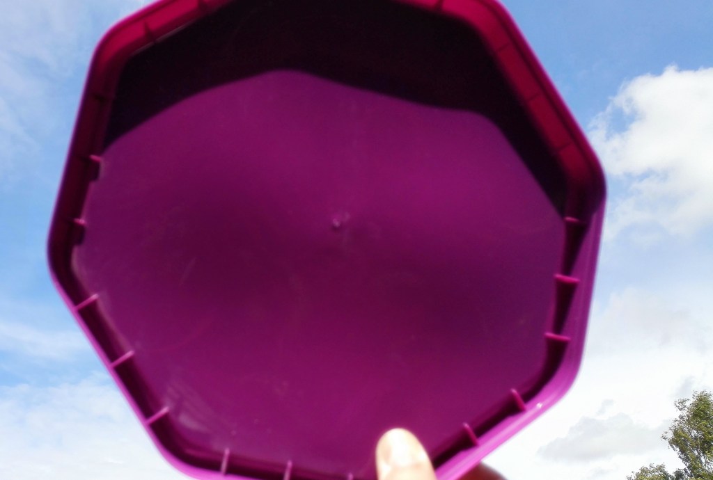
Against the pale blue sky, minimal light directly hitting the surface the colours of the three lids are vibrant. The dark shadow at the top of each lid will be a challenge to replicate.
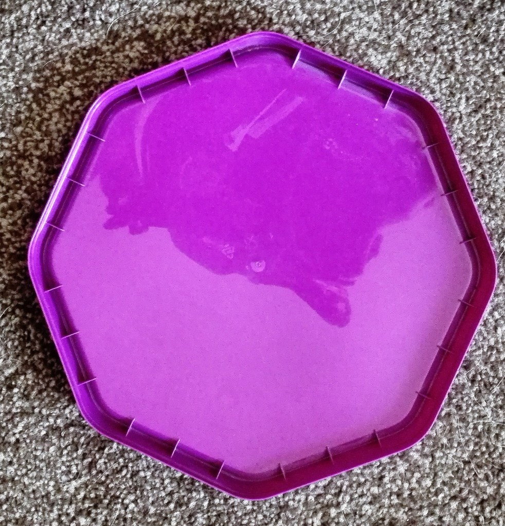
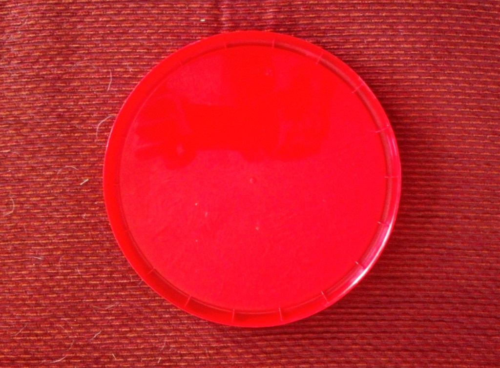
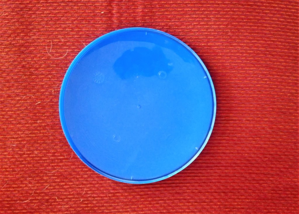
The final set of images. This is as close as I got to what I would perceive is the natural colour of the three lids.
In summary the perception of colour is highly influenced light, surrounding colours and reflective surfaces. There are many more influences and impacts. Colour theory being a significant line of study in many forms.
