These two projects merged into one. I created a series of paintings whereby I experimented with, material, form, supports, tools, processes and application. Some of these would fall into one or other of the two exercises. Exercise 1.0 ‘Stretch, stitch, fold, crease, wrap’ and Exercise 1.1 ‘Exploring form’. In the end I decided to combine all the work into one larger blog and to document and comment on them here. Research points 1 and 2 plus link 34 to the art of Anj Smith will be the subject of separate blogs.
At the start it is worth pointing out that the results of the experiments were a mixed bag. They ranged from poor to pleasing. Some of the pleasing results I will explore further and try to incorporate the methodologies into my practice. In total I created over 30 paintings and other pieces. These are discussed in, more or less, the chronological order in which they were created.
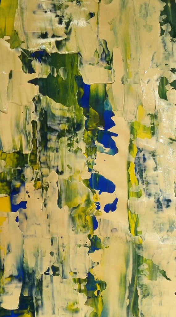
Experiment 1: The first three paintings were a quick rough experiment the results of which are varied. To White and black primed gesso paper I loosely applied acrylic paint and manipulated it with brushes and a palette knife.
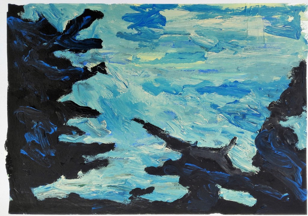
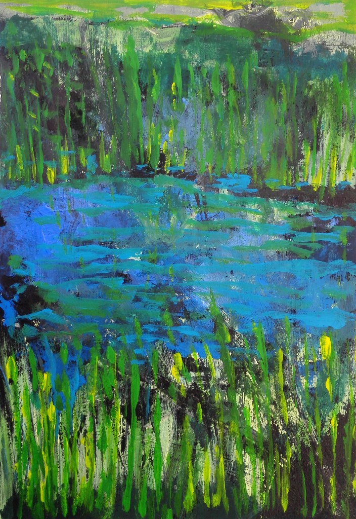
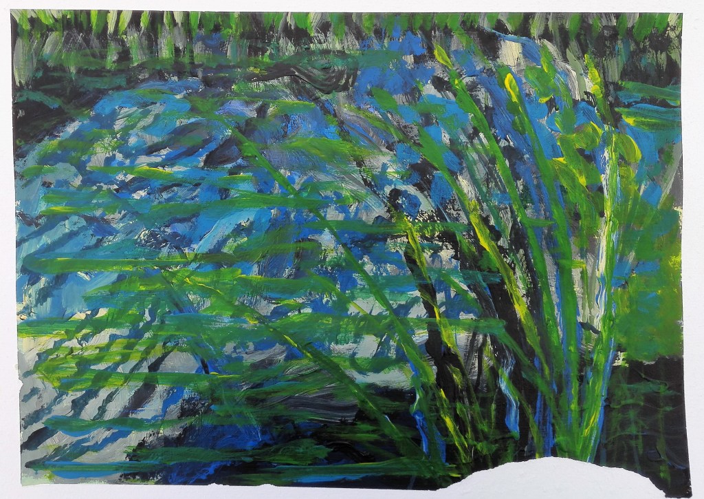
I feel that I was still thinking of reflections from the last exercise from Part Three and my Assignment piece. I was referring to some of the photographs I took and trying to apply the paint loosely. Painting 1 has some redeeming qualities in that the mixture of the blues is interesting. Some happy accidents have created a textured feel. The second, whilst looking non-naturalistic does invoke the look of reeds and water. There is sufficient in this painting for it to be worked up into a more finished piece. The third painting is just poor and has no redeeming qualities.
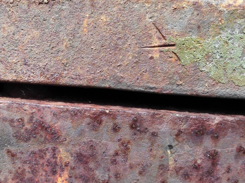
Experiment 2: For these two paintings I used two types of card, one with a shiny surface the other not. The idea was to apply black ink and allow it to run. The inspiration for this was a photograph I had taken a few years previously of a piece of corrugated iron where the paint or bitumen had been eroded by weather and time.

For the most part I did allow the ink to react to the forces of gravity. However I did apply a minimal amount of brushwork.
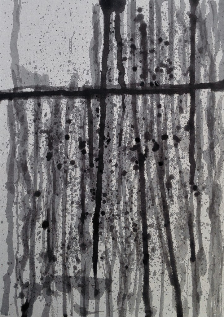
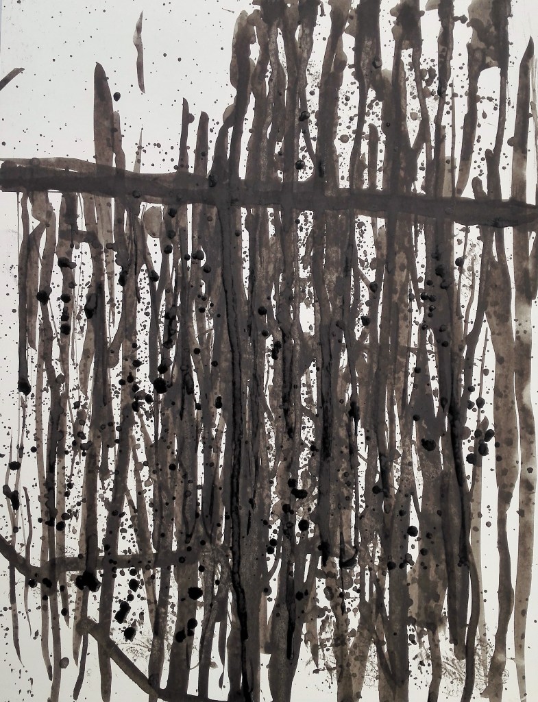
The two different surfaces produced the sort of effects that I expected. In first on normal cardboard absorbed the ink and required more to build it up. This created a layered effect which whilst not mimicking the photograph is a more pleasing result. The second, on the shiny card lacks depth. The addition of flicked ink creates a little more interest. In hindsight I should have also looked to apply bleach and observe the impact of this.
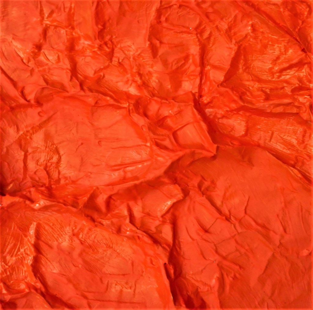
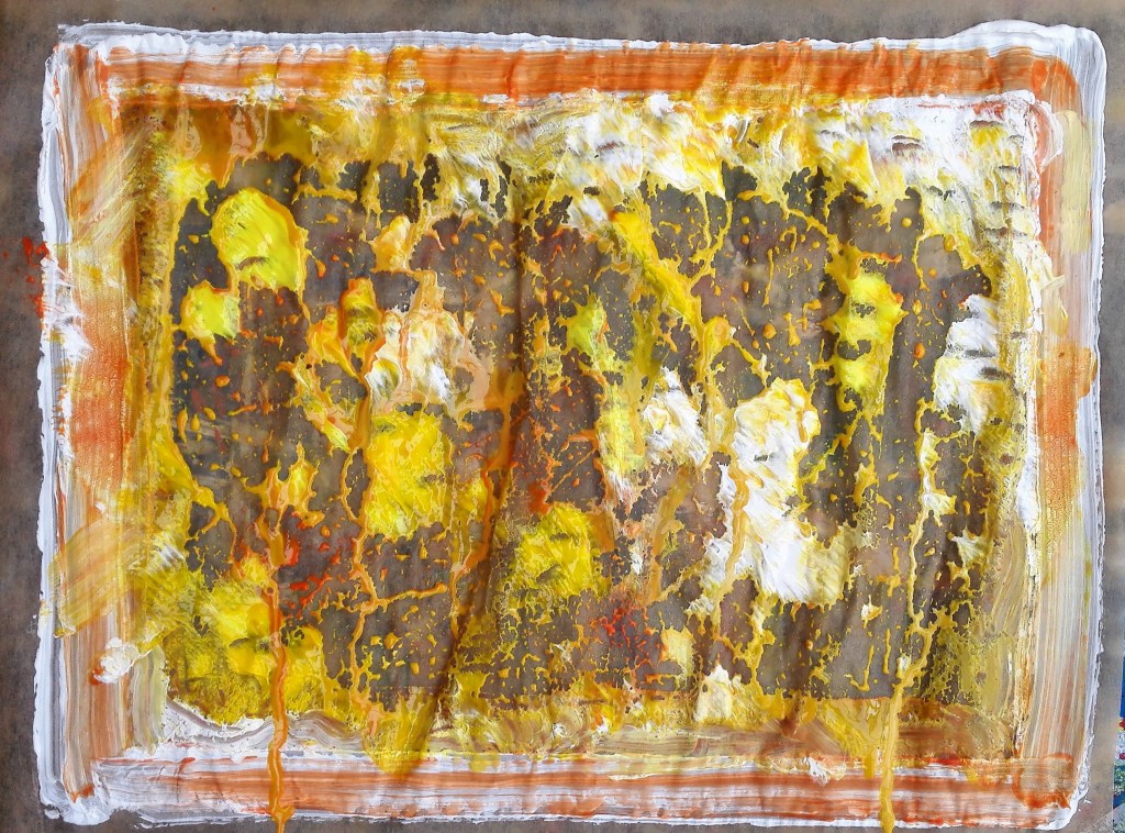
Experiment 3: for this series of experimental work I used kitchen foil as the support. The intention was that the foil could either be pre-creased or creased after it had been painted. This would give texture to the paintings.
I started by painting a single colour onto the kitchen foil that had been partly creased. The results were encouraging. Using acrylic paint it adhered to the surface well and created a richly textured surface.
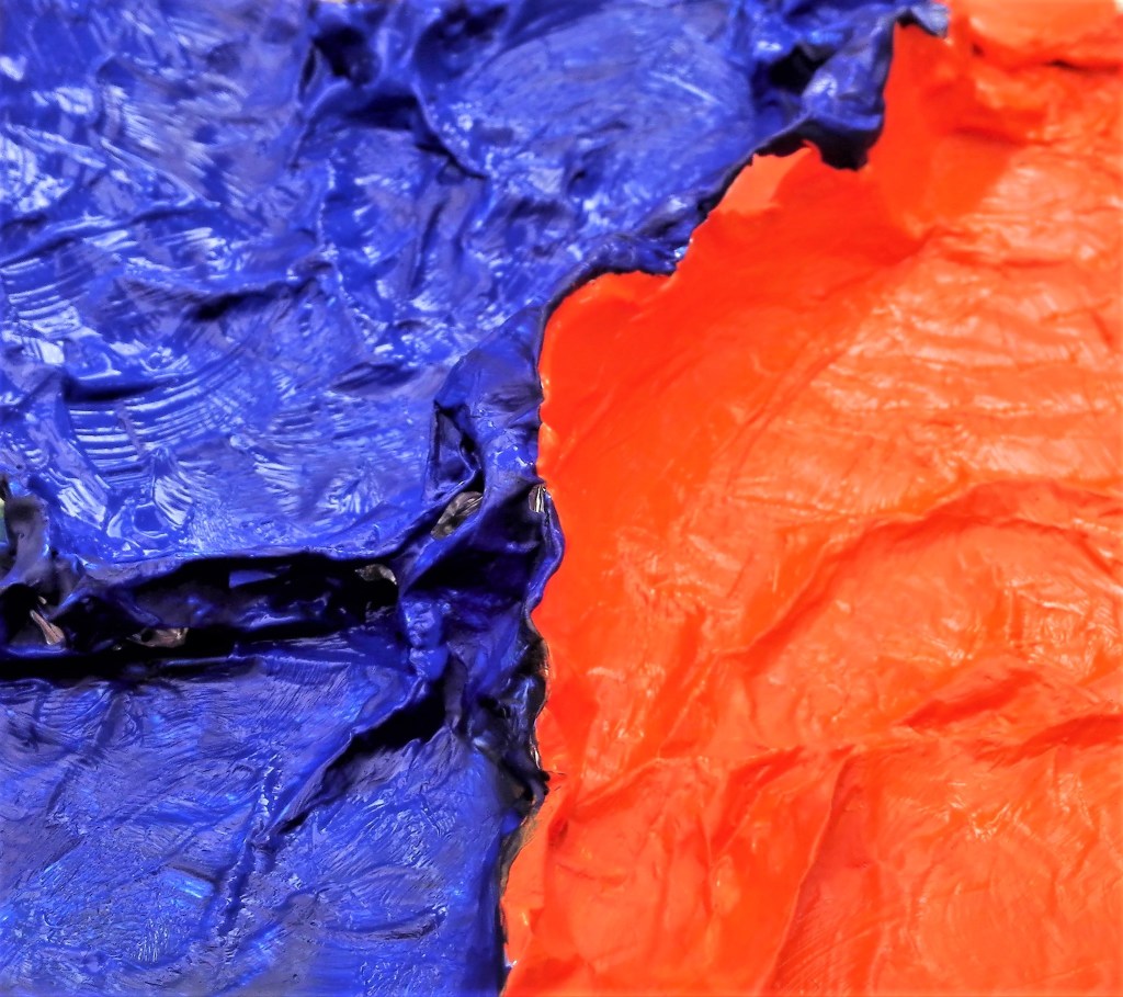
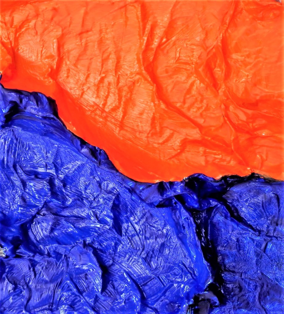
I now created a further painting using orange and its complementary colour blue. This worked well the two colours highlighted each other and tonal interest was created depending on where the light source was coming from. I have banked this idea and intend to created a larger painting perhaps combing several pieces of kitchen foil.
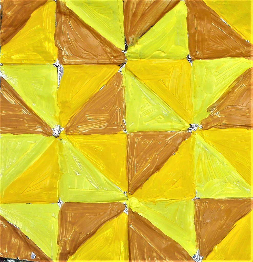
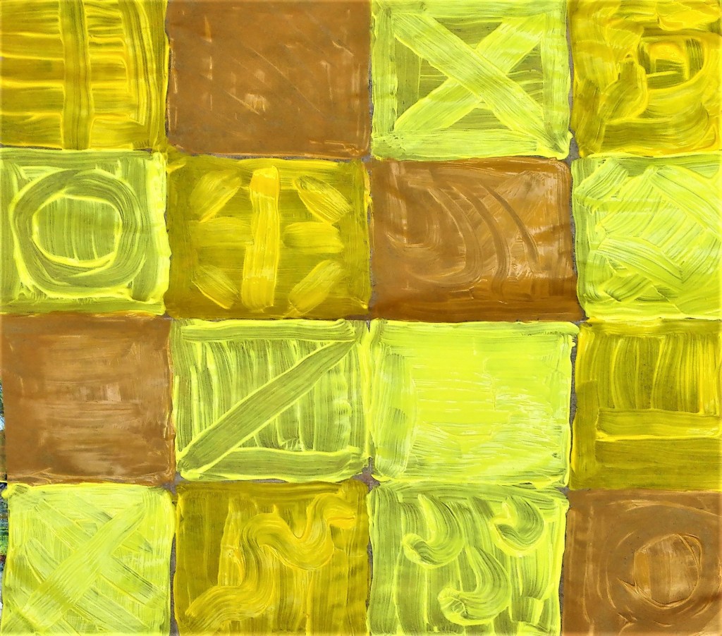
So far I had used randomly creased kitchen foil. I would now try painting onto foil that had been folded into patterns.
Example:

Using three yellows, mid yellow, lemon yellow and yellow ochre, I painted the foil. The results are satisfactory but don’t inspire me to create further works using this methodology.
I completed one further painting on kitchen foil where I applied the paint directly onto the foil and manipulated it with the handle end of a brush. The resultant painting was messy.
Following the cloth and greaseproof paper experiments, documented below, I returned to kitchen foil and produced two further abstract paintings. With these I was looking to build up the paint in layers, allowing some of the previous layers to be visible. The result was patchy at best.
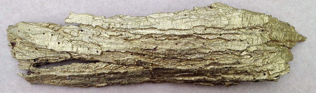
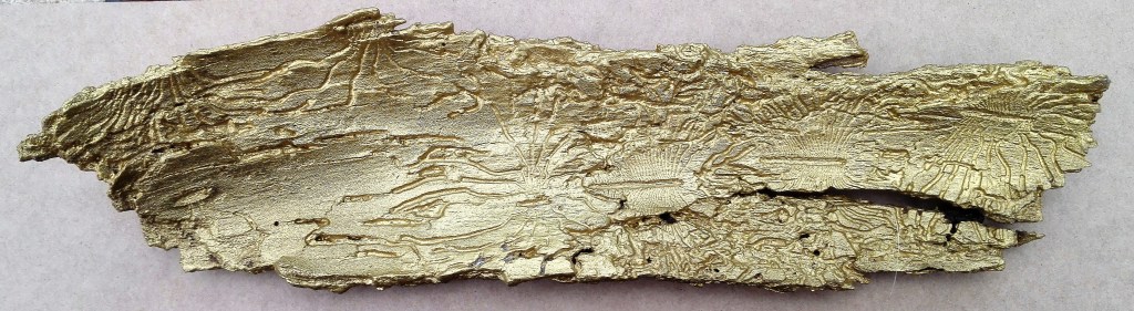
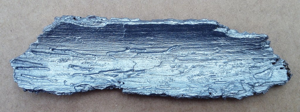
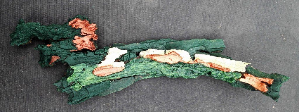
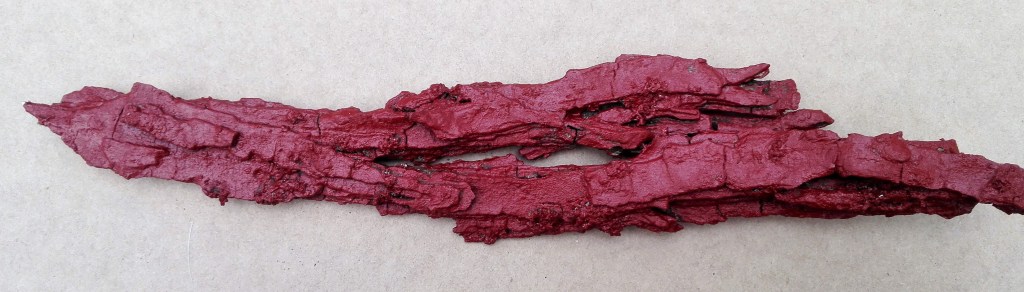
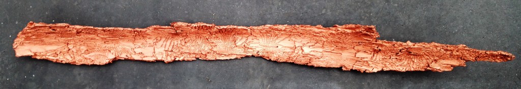
Experiment 4: Using some found material, tree bark, as a support I painted it. The result is pleasing although I feel that on its own it isn’t enough. I have transformed it into a decorative object but is it enough? Does it become art? Could I do more with, for example incorporating it into a more considered work? For the time being I have left the pieces lying in the studio for potential consideration into a future project.

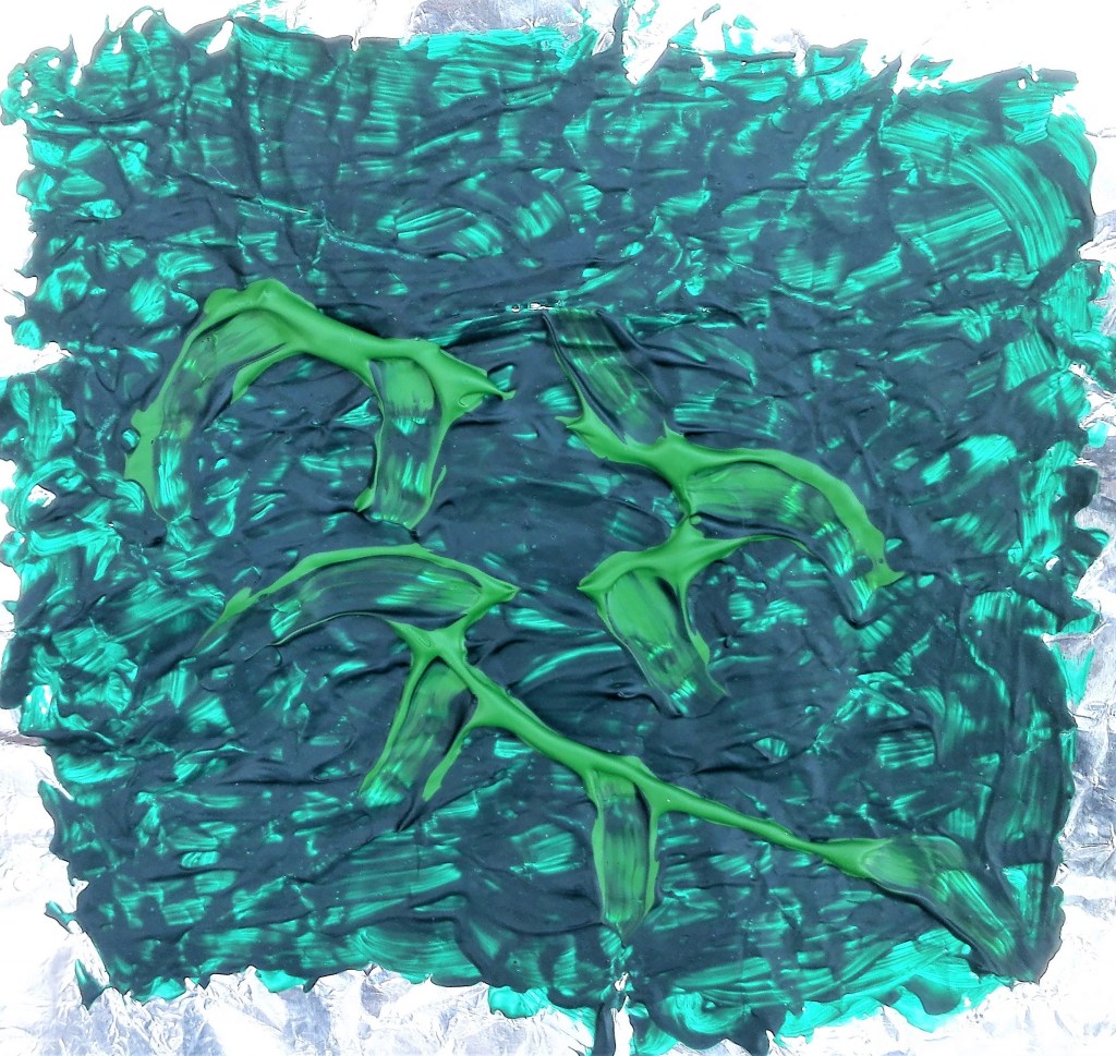
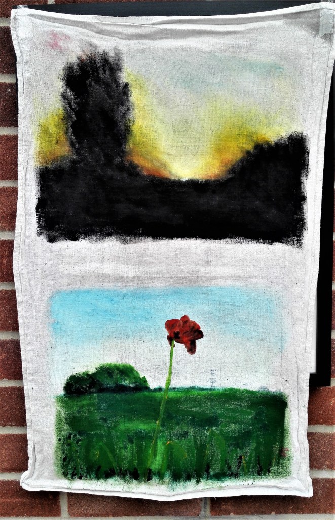
Experiment 5: for this I would paint directly onto cloth, a dish cloth, that was pinned to a board and primed with gesso.

Splitting the cloth into two sections I made two paintings using photographs as references.
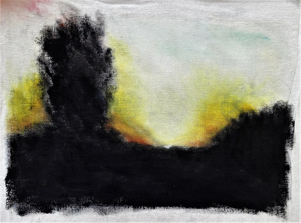
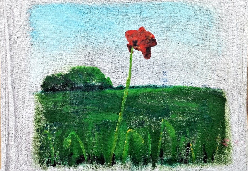
The paint was quickly absorbed into the cloth which due to its roughness caused me to use scumbling brushwork. The resultant paintings have a loose feel that I like, they have an airy atmospheric quality. The cloth is clearly visible through the paint which accentuates the rough look. Direct painting onto fabric is something that I will look to try out again.
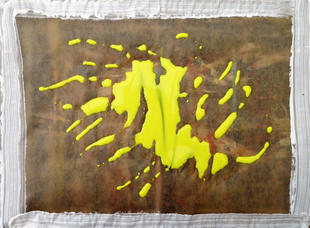
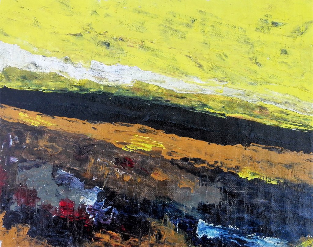
Experiment 6: Greaseproof paper was the next support that I would experiment with. I would try different materials, inks and acrylics and different application methods. I started by using a single colour and found that I needed to apply several coats of paint to cover the paper. I tried to create texture but this was not as easy as it had been with the kitchen foil.
Next I painted an imagined scene.
The paint was easy to apply and manipulate however when dried it had a translucent quality which I didn’t like. The photograph of the painting above doesn’t show this too well. I felt that the paint lost its vibrancy and looked washed out. I next experimented with inks. This was more satisfactory. The ink wasn’t absorbed into the support. I was able to manipulate it via blowing with a shortened straw and lift the paper to allow the ink to run. Applying several layers enabled a gradual build up of colour, this enhanced the tonal value of the painting. Where the acrylics had looked washed out the ink retained its vibrancy. However these effects can be achieved using cartridge paper. I didn’t feel that the greaseproof paper was bringing any specific benefits.
Similar to the work on kitchen foil using pre-folded greaseproof paper to create a pattern and used the same three yellows for the painting. Again the result was disappointing.
I proceeded to make a further investigation using acrylics. This time I would apply the paint thickly by pouring it directly onto the support. The painting went through several stages as I manipulated the paint searching for something that looked and felt right. I didn’t have a clear idea what, I was just playing with the paint.

Finally I added some red with a brush and also tipped a little ink. After all the stages I was left with an unsatisfactory painting. My conclusion being that acrylic paint on greaseproof paper is not a good mix. Greaseproof paper is not a support that I will be turning to.

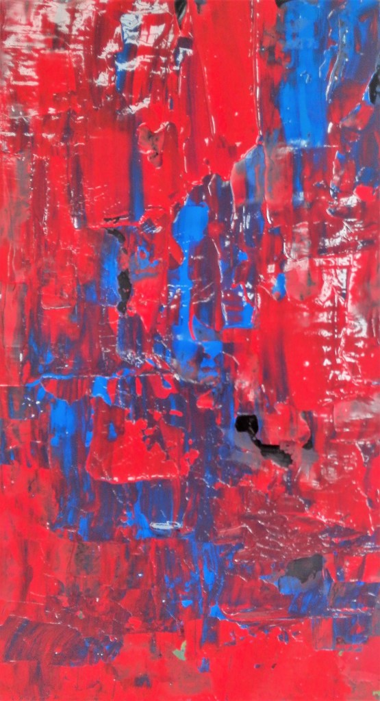
Experiment 7: this was less an experiment and more a return to familiar support and materials. I used a close up photograph of a piece of rusty farm equipment as source material. My materials were water soluble oil paint applied with palette knives. The support was linen based canvas paper.
The photograph of the painting greatly enhances the painting which in the flesh lacks the vibrancy that is apparent in the image. Further layers of paint would improve this. I may return to it later. As stated this was more an escape to a methodology that I have investigated before.
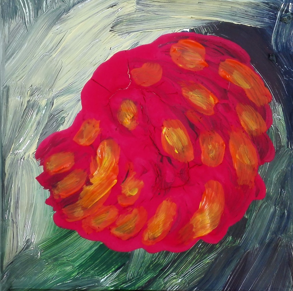
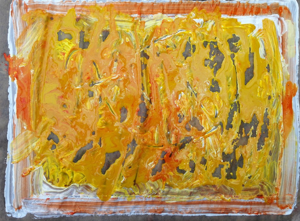
I revisited this subject again. This painting started as a way of using up excess paint that I had on my palette after completing the Pump plate painting, see Parallel project. However I ended up using much more paint than I had leftover. The resulting painting is below.
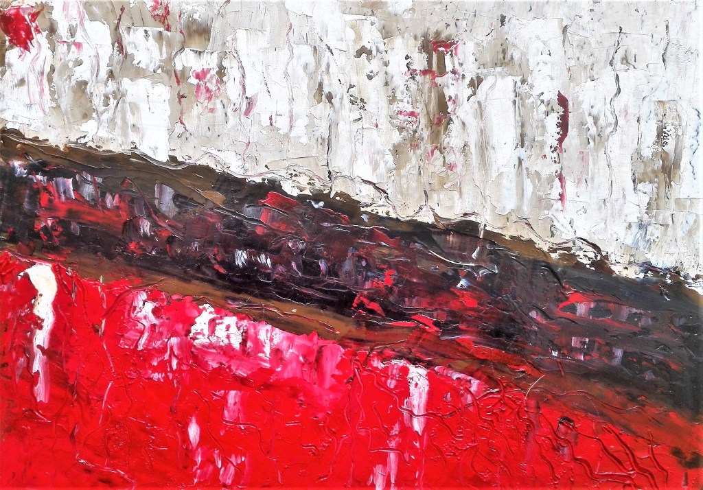
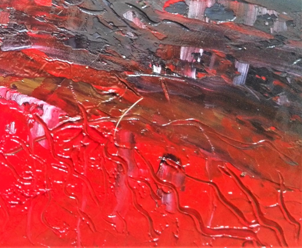
The white and raw sienna works well it has a chalkiness to it which the traces of red enhances. In hindsight it would have been better to have continued this theme below the Payne’s grey band. the use of just four colours works well in so much as the eye is not assaulted with too much colour. I noted that the paint took a long time to dry as nothing is absorbed into the support. I will test its rigidity when it eventually dries. The detail section gives an idea of the lushness of the paint. Thick and creamy.
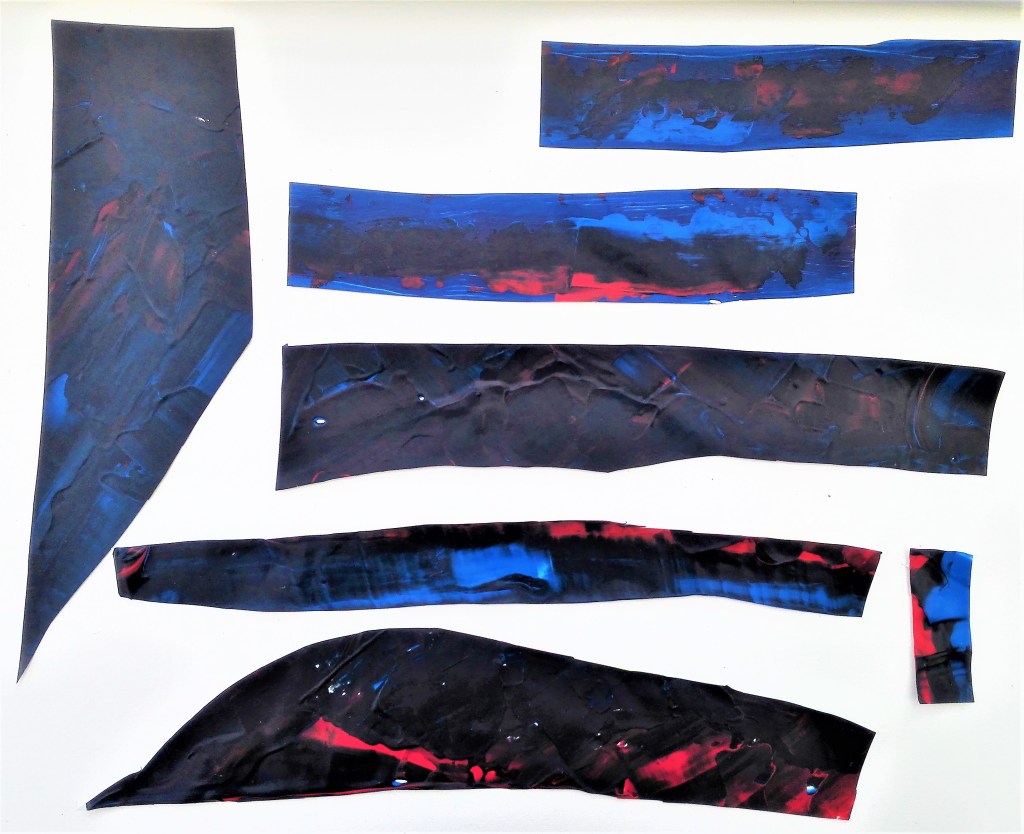
Experiment 8: this evolved into a long series of explorations investigating the impact of applying acrylic paint to plastic. The materials were applied directly from, tubes, manipulated with palette knives, brushes, sticks and other tools. In some cases PVA adhesive was painted onto the dried paint to give it strength and allow it to be removed from the plastic support. Below is the result of these explorations, the paintings and the different ways I have tried to use them to create further works.
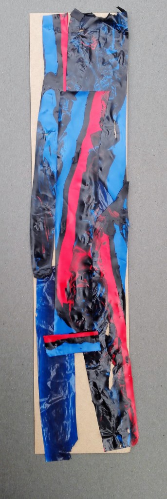
- Collaged figure
The individual pieces prior to putting them together and securing with PVA adhesive.
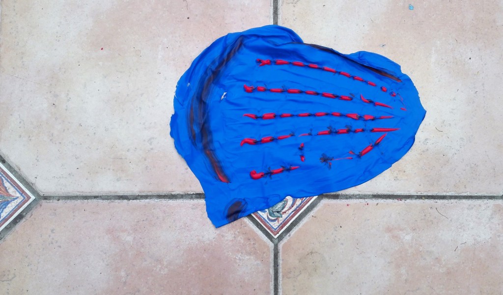
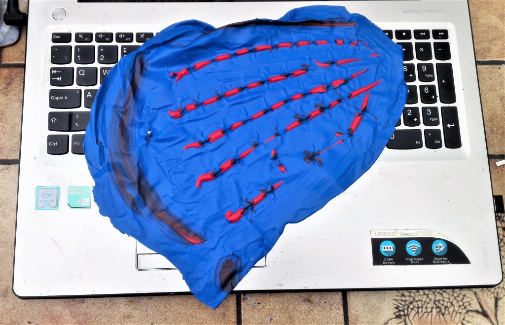
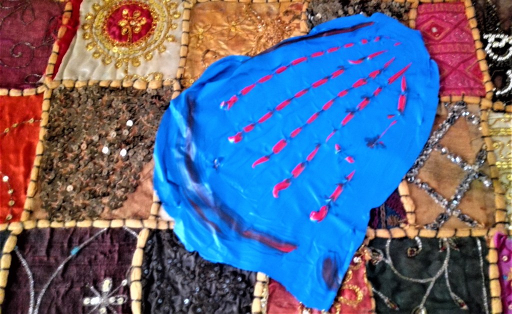
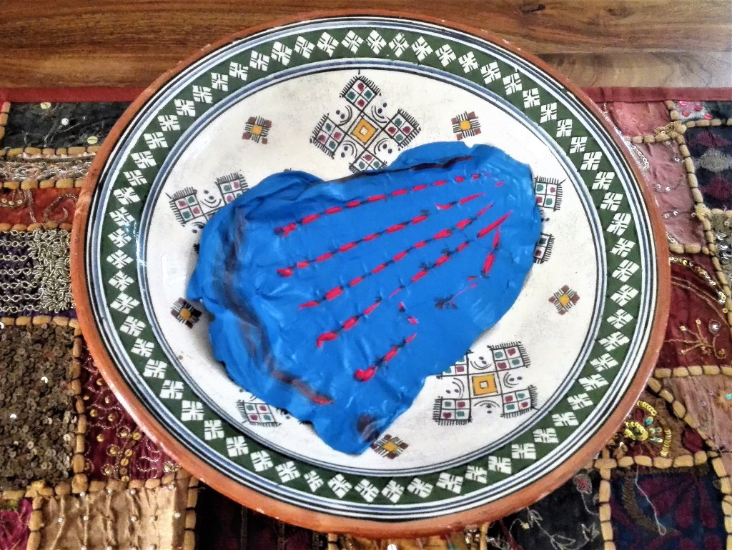
2. Blue frog
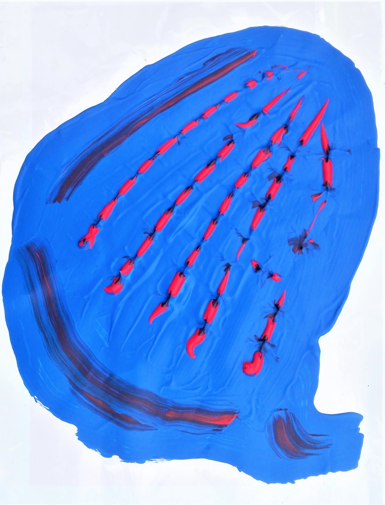
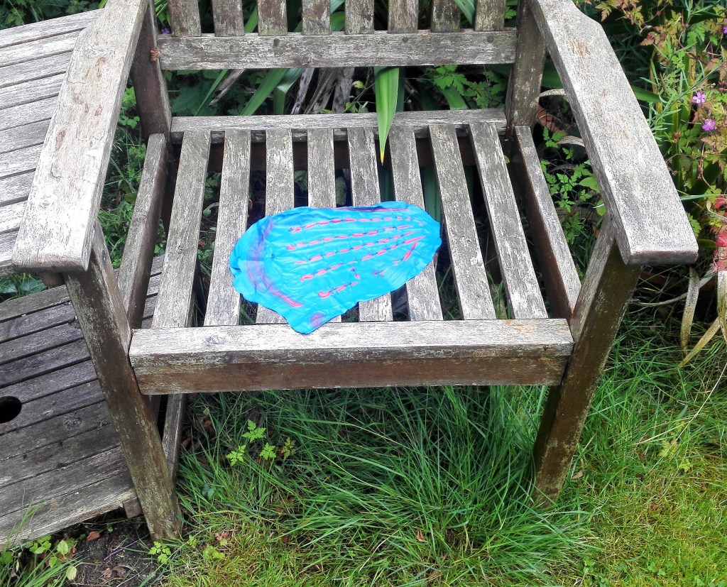
I moved this painting around the house and garden and photographed it in a number of locations. Its forms and appearance changed dependant upon where it was located. The idea of being able to move painting from the confines of the support began to intrigue me. It was notable how the location of the painting had an effect on both it and its surroundings. In some of the photographs it appears to take on form.


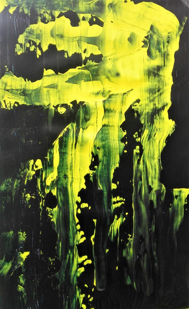
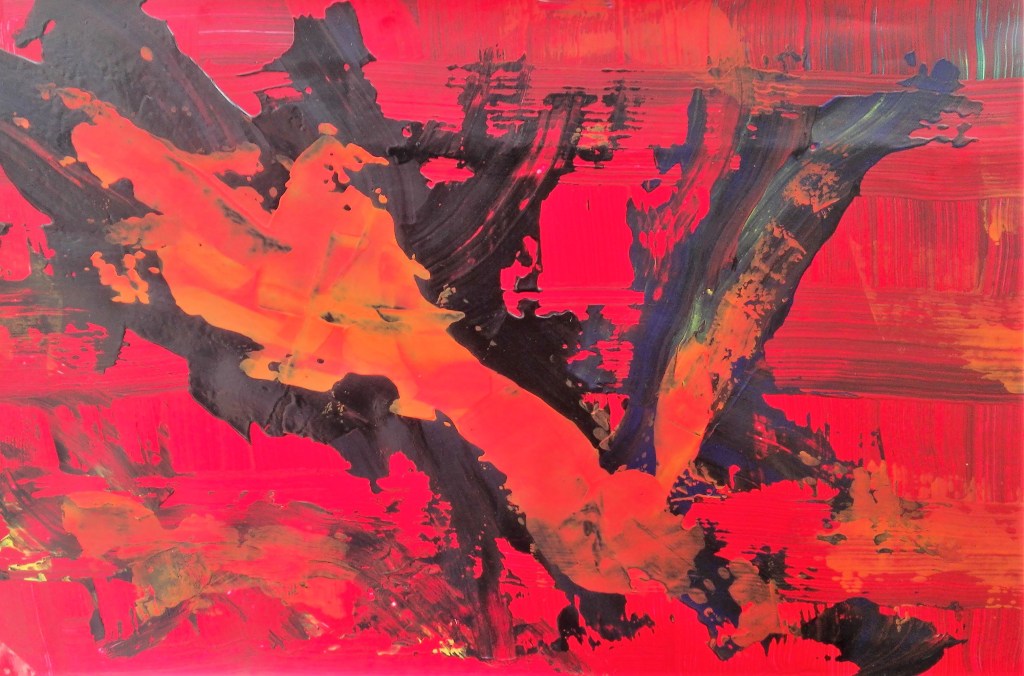
3. Four paintings on plastic bags. The plastic bags used were of a good quality, a thick plastic. I found that this helped in the application and manipulation of the paint which was mainly done with palette and painting knives. The paintings need to remain on the plastic as I feel that removing them from it would damage them. The resultant paintings are pleasing, particularly paintings 1,2 & 3 where both the colour and texture of the paint looks rich and textured. I feel that painting 4 looks less cohesive. It does have an look of Scotland about it though.

I considered what further I could do with these paintings after having these paintings on display in my studio for a couple of weeks. Could I bring them together into one larger work. Knowing that my assignment piece would be an expansion on work completed during Part Four could these paintings become the basis. These considerations are currently ongoing.
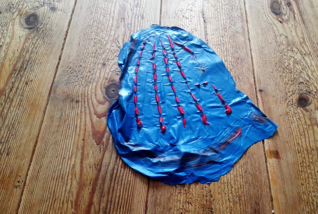
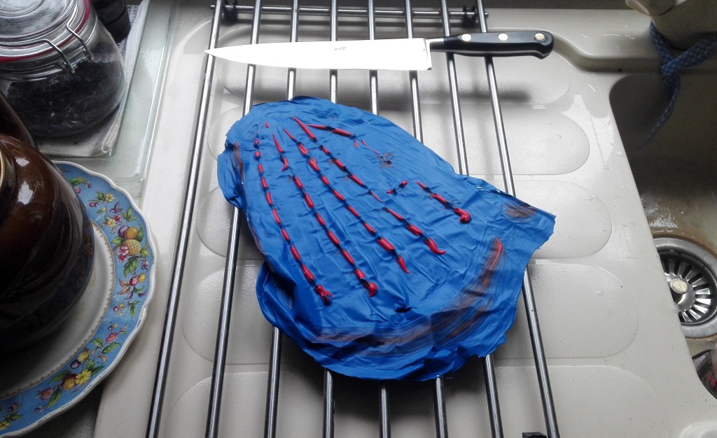
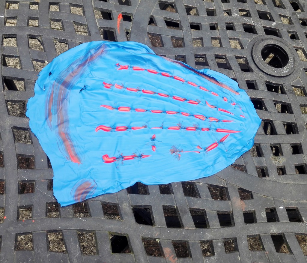
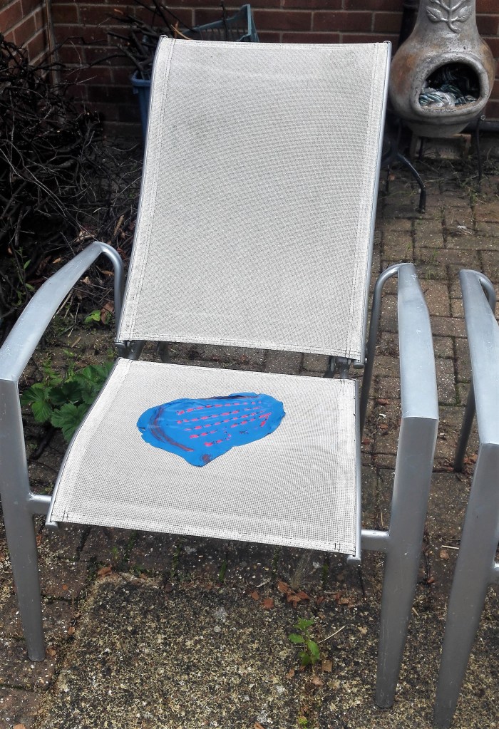
I made a further two paintings on plastic. with these I applied the paint thickly and built it up to a level where I would be able to remove it from the support. The two paintings are displayed below.
As with the four paintings on plastic bags I wanted to do something with the paintings. To display them in a manner that was outside the usual framed, hanging on a wall but how.
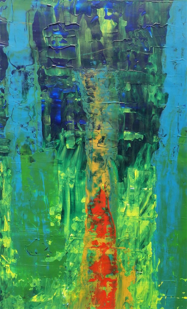
Experiment 9, Whilst thinking about how to display / use the paintings above I had obtained some A4 size acetates. These should be good to apply paint to as it would not need to be removed and the resultant paint could be viewed from either side.
Using the acetates I painted two works. The first:
The second:
Painting on acetates produced a good outcome. Both of these paintings have a number of pleasing aspects. They can be viewed from both sides, although the backs were less interesting as only the base layer of paint can be seen. They can be displayed on glass windows which allows them to be backlit. Also the acetate support gives the paintings strength and enables the painting to be displayed in positions other than flat.
A number of options and ideas were beginning to present themselves. I took one of the plastic bags paintings, the thickest one, and carefully removed the bag from it and adhered it to an acetate. Placing this on a window gave it a new light. Before and after are shown below.

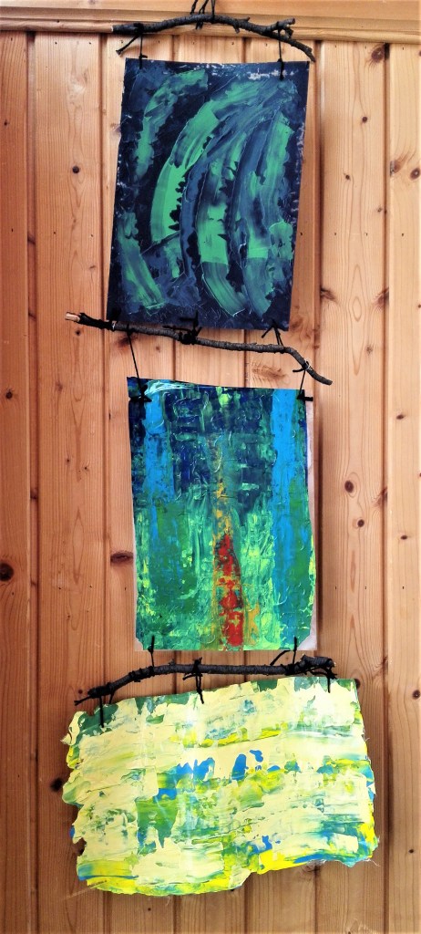
Experiment 10, the object of this experiment was to try to move beyond the obvious way of displaying paintings. I looked to join three paintings into one piece. I would use one of the paintings made directly onto acetate, one that had been fixed to an acetate and lastly one that the paint was thick enough to support itself. The paintings would be tied to large twigs with wool and joined together. An abstract hanging triptych.
Conclusion, this is a long blog that has documented a series of experiments and explorations into paint, ways of applying paint, use of different supports and different way of displaying the resultant paintings. The process has given me many ideas that I shall take forward into my practice. I anticipate that it will impact my parallel project and also the way that I will approach future exercises and assignments.
+++++++++++++++++++
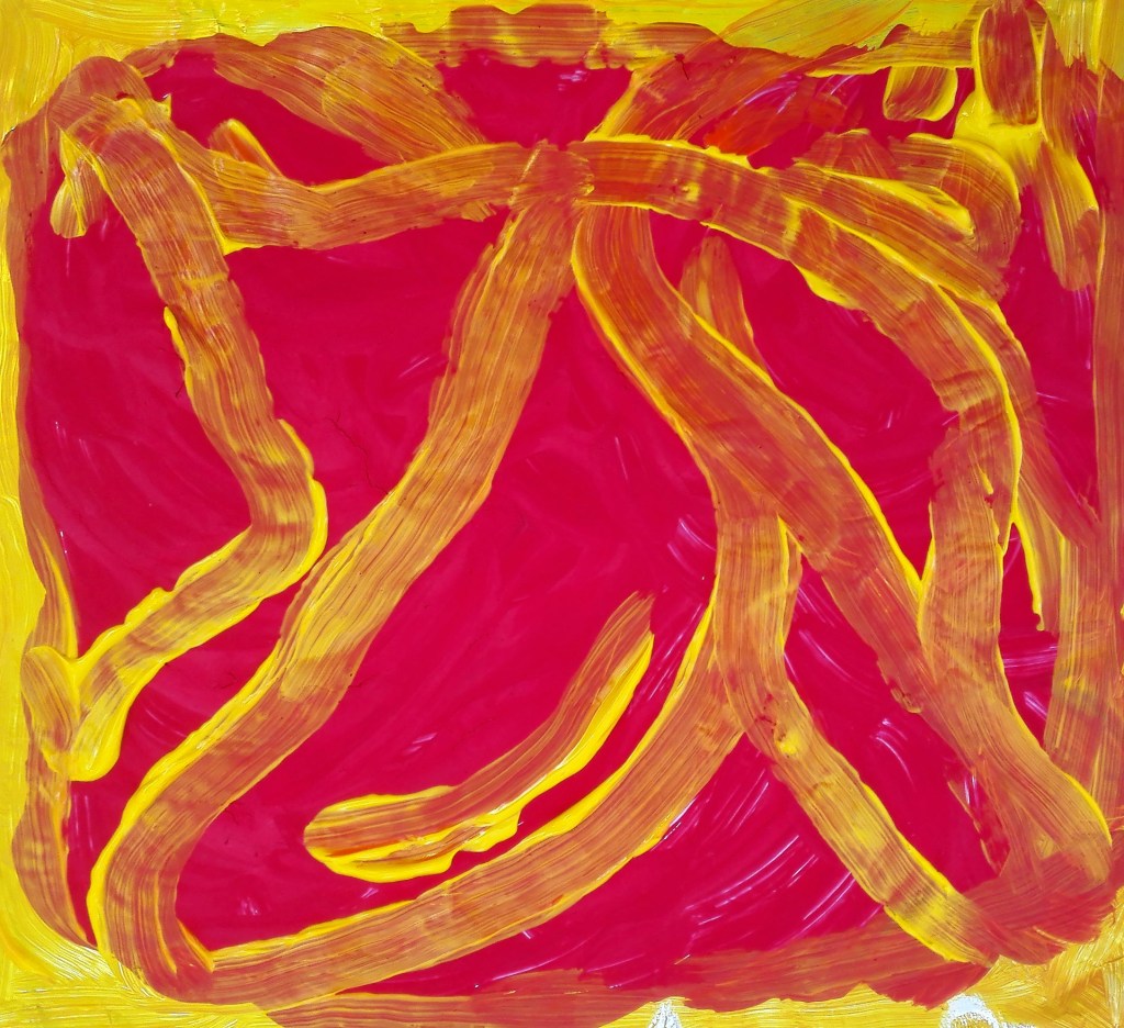
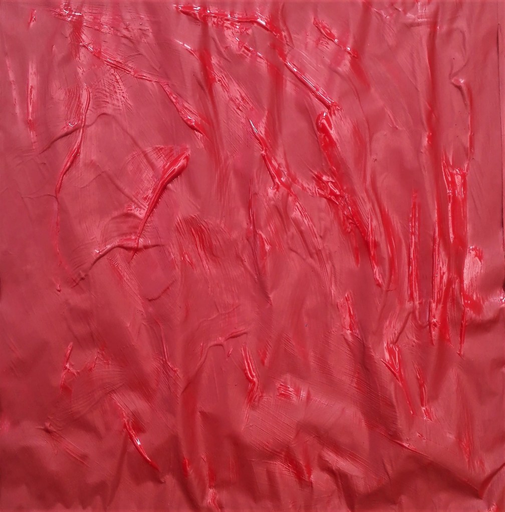
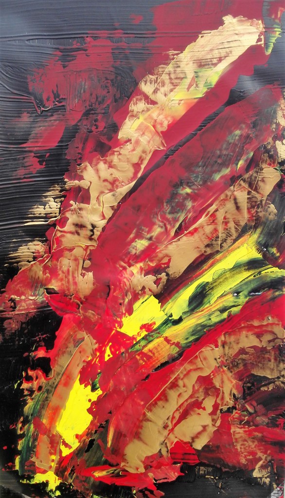
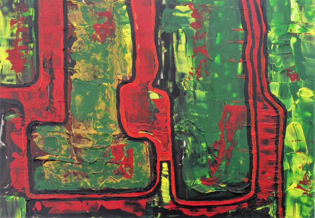
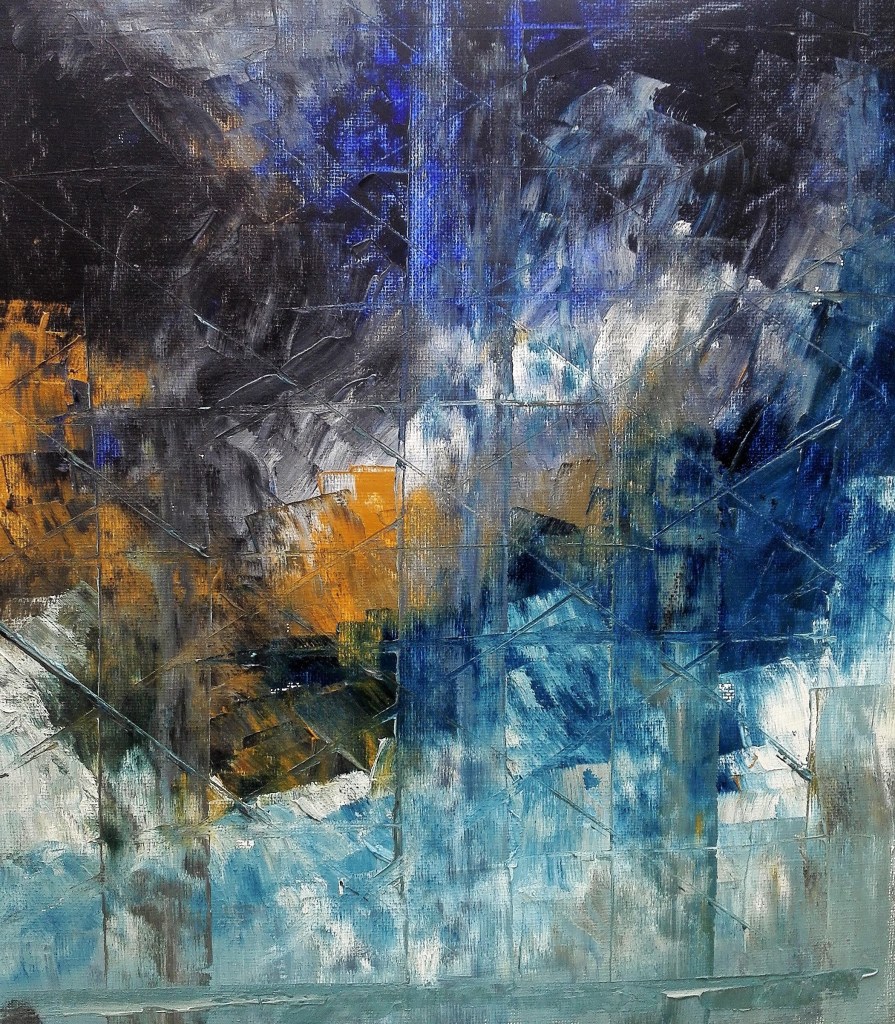
A further work completed later which I feel deserves to be included in these exercises is shown below. It is an abstract work, untitled, which has movement and drama.

One thought on “Part Four ‘Parts of a painting’ – Project 1 & Project 2”